There's certain things you expect from a new home, especially one built by a developer and not for an individual client. The modern approach to these builds isn't void of character, as such, given architectural features can be a big selling point — but you'll often find that they're "inoffensive" in style, and often channeling one particular style of architecture and design.
'In this Studio City neighborhood, charming older homes were routinely being demolished and in their place were bigger and more generic "modern farmhouses",' says Sam Donnely, designer and property developer at Merchant & Mercantile, who designed the home with architect Ryan Perella. 'While we both appreciated the need for more practical structures for modern living and obviously more space, we felt that there was probably a want and need for a home that felt more in keeping with the neighborhood.'
The vision was to provide a modern home with old soul, and one that could provide a practical option for people who want a fully renovated or new build property in California, but do not have the funds, or strength of will even, to work through what can seem an endless process of development, along with navigating permits, contractors and paying two mortgages. Everything in the home was bespoke, custom and fully-designed, and while not aiming to court mass-market appeal, captures a beautiful, characterful, transitional style that's been unsurprisingly popular, with the option to buy all the furnishings so it's move-in ready.
Here, Sam gives us the full tour.
An asset to the neighborhood
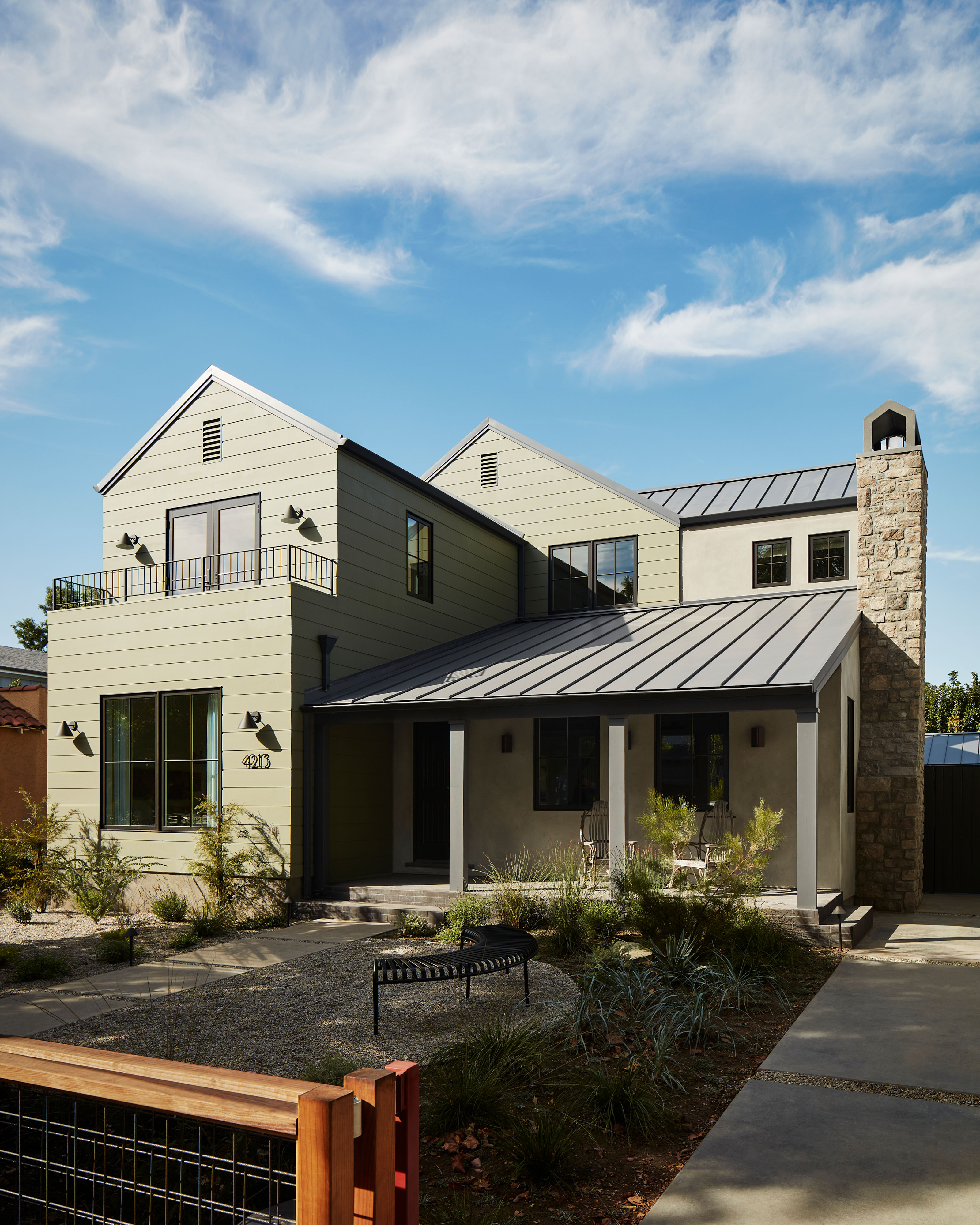
Let's be clear — this isn't the same home that once stood on this spot. It's vastly bigger, with the remodel adding 1,900 square foot. However, unlike many modern renovations that would have eradicated the original home, this was something that architect Ryan Perella wanted to retain. 'This home was originally a single story, but it did have a charming porch and chimney, and inside the main living room had a very pretty vaulted ceiling and a cute little den and well proportioned main bedroom,' Sam explains. 'Ryan truly values historical buildings and prefers to preserve where he can, so this porch and original structure was something that he felt he could incorporate into his overall design without the house feeling that it had been swallowed up by an enormous addition.'
Outwardly, it was a way to retain the property's presence on the street, while enhancing it, too. It's a project that comes with a new level of curb appeal thanks to front yard landscaping that plays into the friendliness of the neighborhood with outdoor seating.
'Builders often scale back on the landscaping but we really wanted to extend our design ethos to every corner of the project,' Sam says. 'We sadly had to remove a tree from the rear garden and so replacing this in the front with an established tree was not only an LA permit requirement, but an investment that we were always going to make.'
Bolder than builder grade
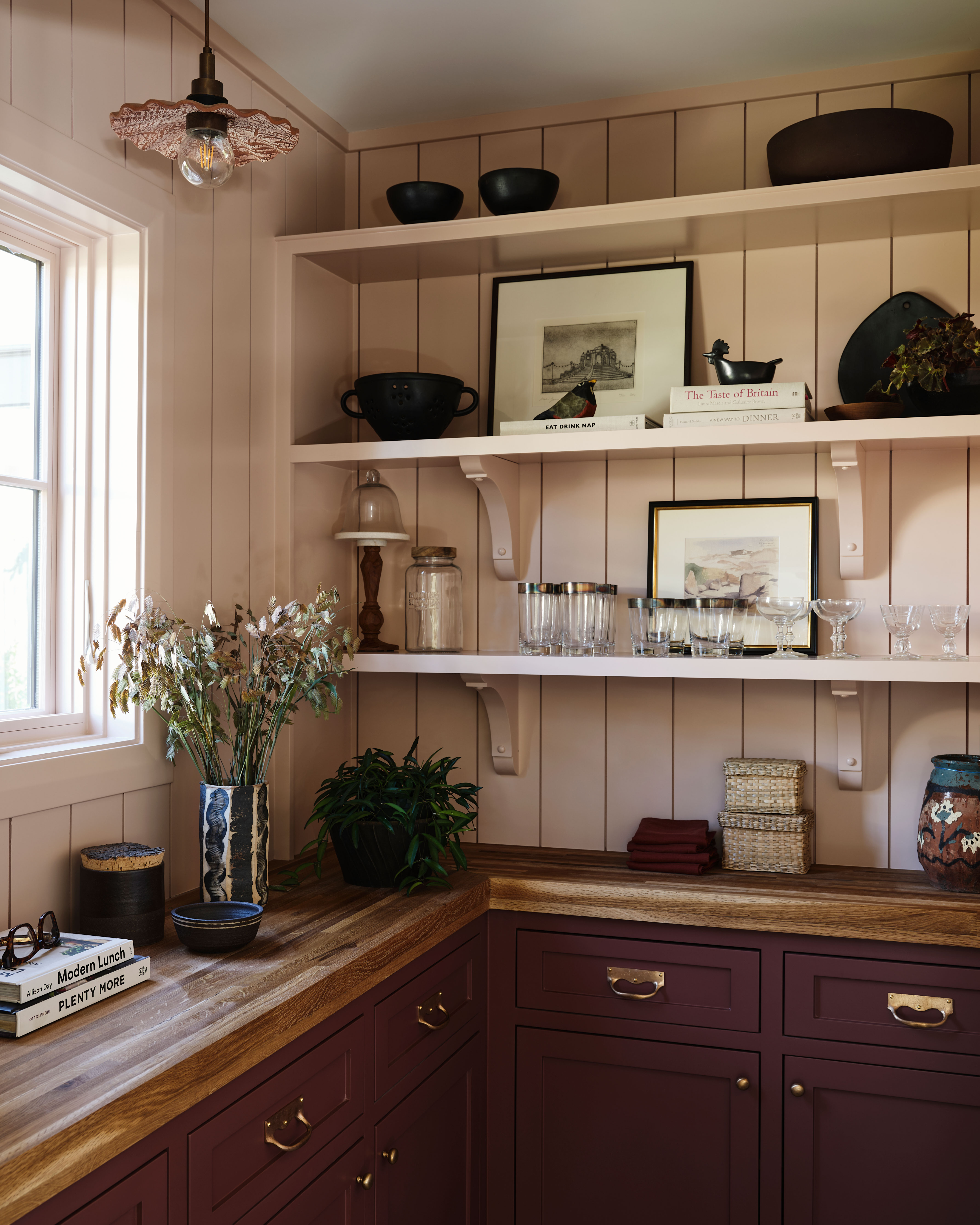
While there might be some elements that we'd consider design classics in the space, the designers have taken bolder swings with the finishings to ensure it's a home that has a design perspective, rather than catering to the broadest market appeal. 'We collaborated closely on our vision for a 'Modern English' interior,' Sam says. 'Ryan's sense of color and details brought to life our shared love of traditional craftsmanship. So committed were we to our belief that there were buyers out there who wanted a fully designed home, and not a white box, that we went to town.'
There are elements of surprise in the home's smallest spaces with color introduced into the likes of the pantry and bathrooms, while wallpaper - such a personal choice - is used in many of the spaces, including the dining room and bedroom. 'When the time came to put the house on the market the voices of all the haters who warned us this was total folly, would keep me awake at night,' Sam says. However, thankfully, the response to the design was the complete opposite.
Creating with color
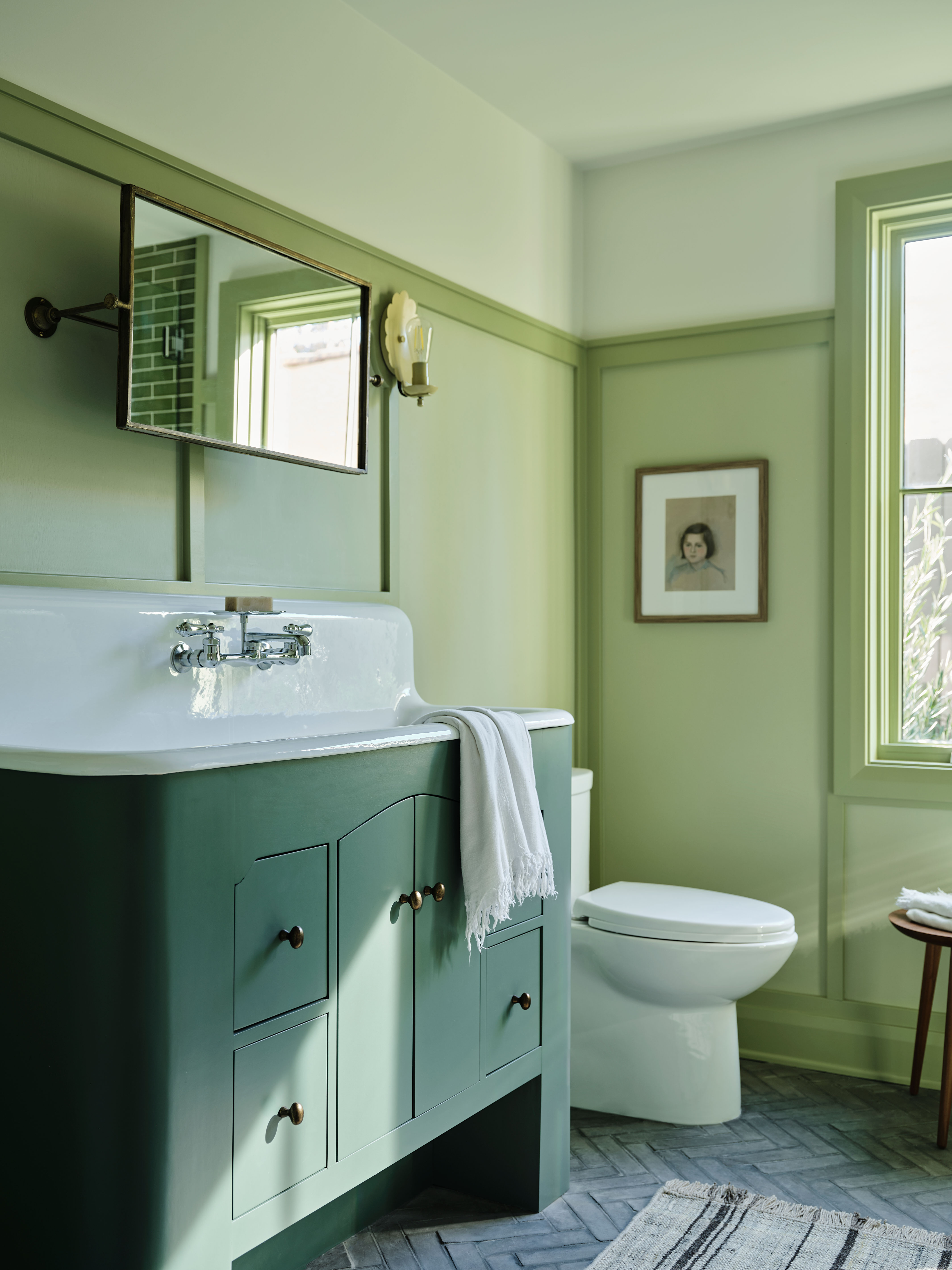
While you might expect these bolder undertakings to be restrained to places deemed "easier to change", like wall paints, Sam and Ryan made particularly colorful choices for the bathrooms — real wow-factor spaces within the house. 'The sage green bathroom color came from Ryan and evolved as we worked through it,' Sam says. 'Since there are a few layers to the design, we decided to keep the color palette monochromatic, and play with the color and tint of each layer to give the design a bit of depth. It took a couple of go's to get the color blend just right. Sam wanted to do a very different type of vanity — something vintage inspired but with scale and storage,' she explains.
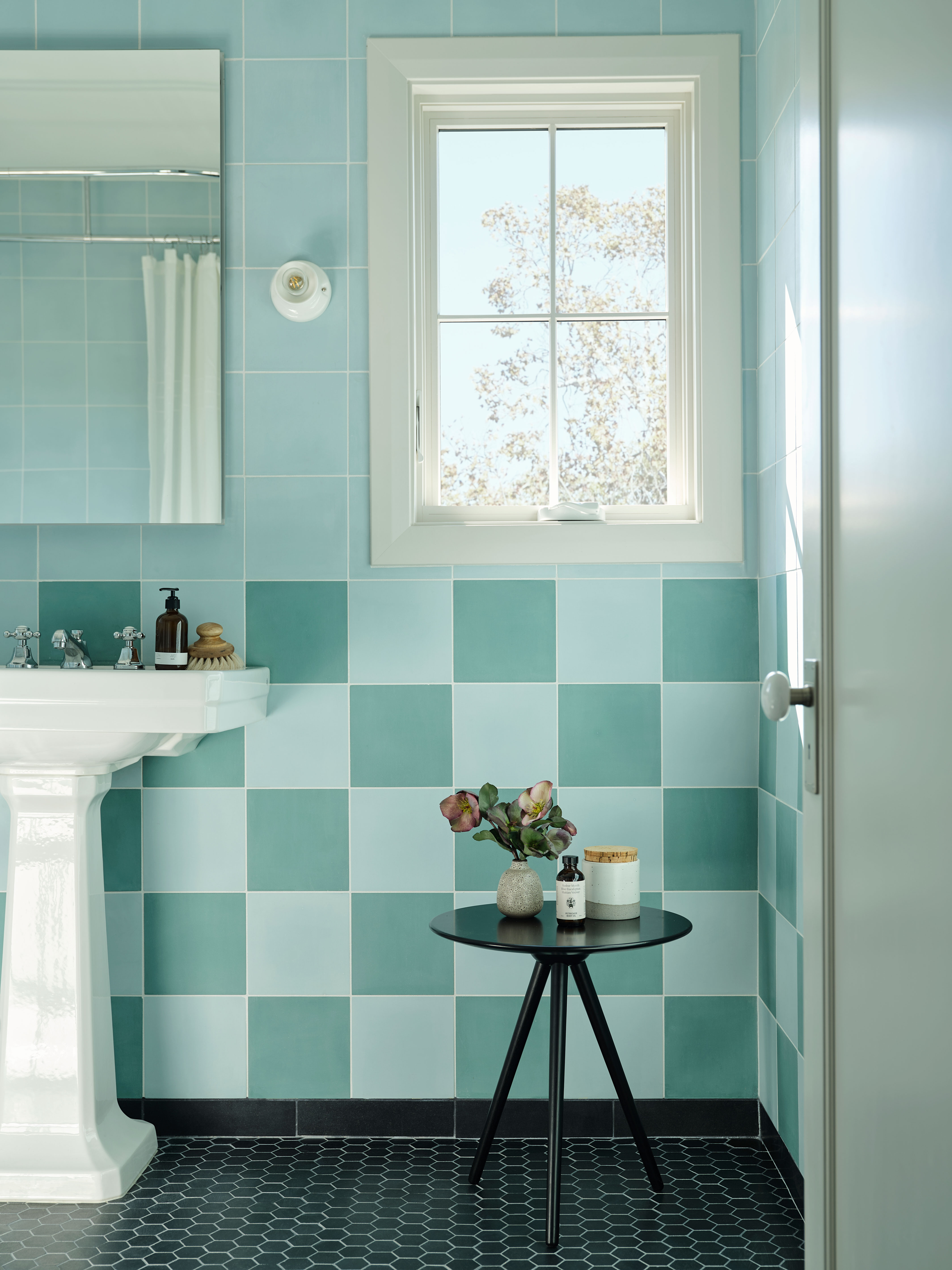
It's a color scheme that's used as a through line to another bathroom in the home. 'As far as the blue bathroom, as it's the secondary bathroom upstairs, we chose to make it a fun riff on the primary bathroom (not pictured),' she says. 'The primary bathroom is fitted in stone checkerboard flooring, so we echoed that in the secondary bathroom, only executed in a bright pop of blue and teal.'
Old meets new
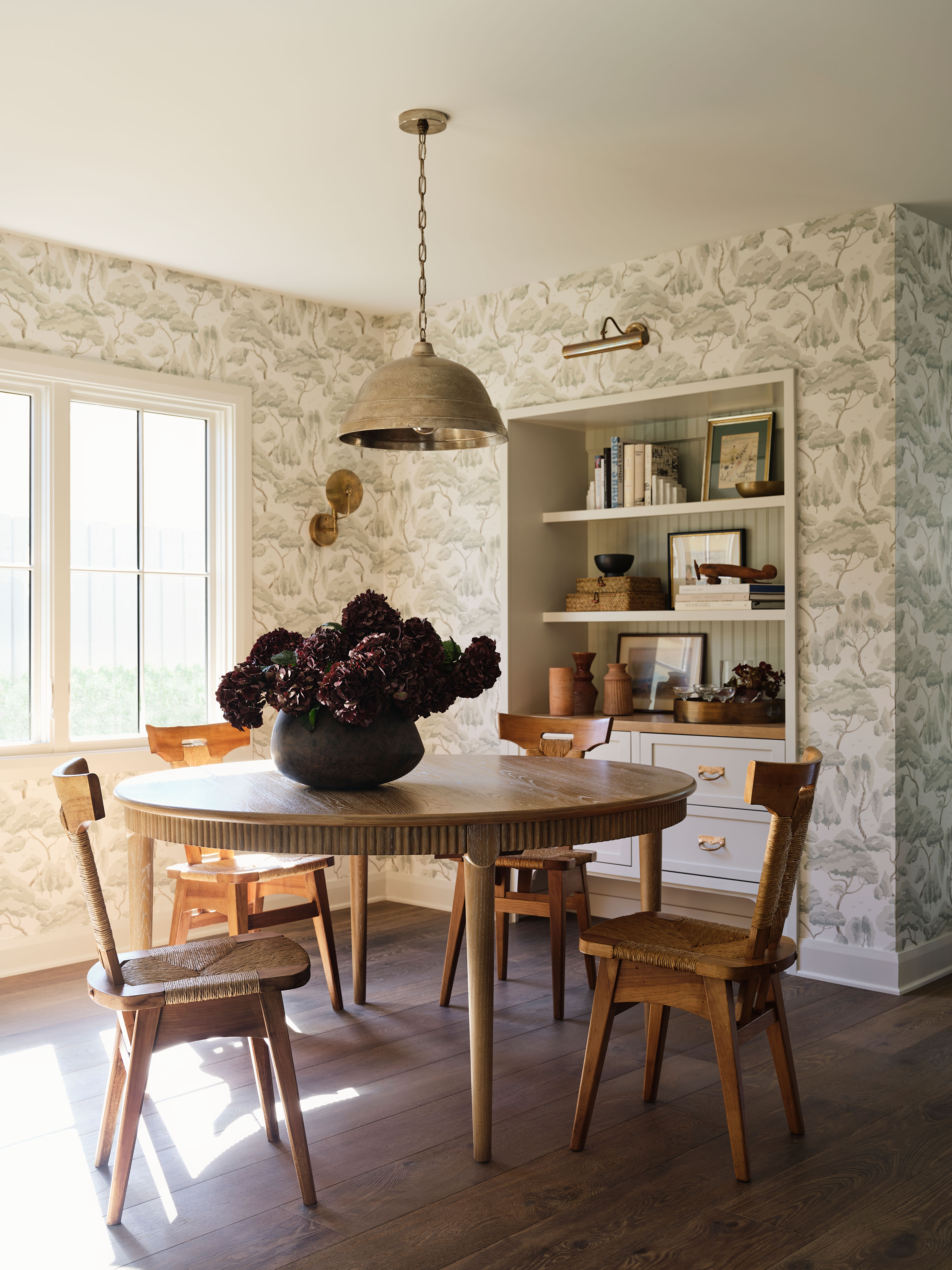
In furnishing the space, the designers took the approach of mixing new pieces with thoughtfully sourced antiques. 'In keeping with the idea of creating "new homes with old souls" the furnishing throughout are a mix of new and vintage,' Sam explains. 'Vintage furniture is an instant way to bring warmth and quality into a house.'
'I like to create homes that feel 'curated' rather than 'showroom fresh' and the dining room is a good example of my approach,' she adds. 'The table is Cerused Oak from CB2 and the chairs are vintage finds attributed to Charlotte Perriand. They come from a Kansas City based antique dealer whose entire stock I would kill for!'
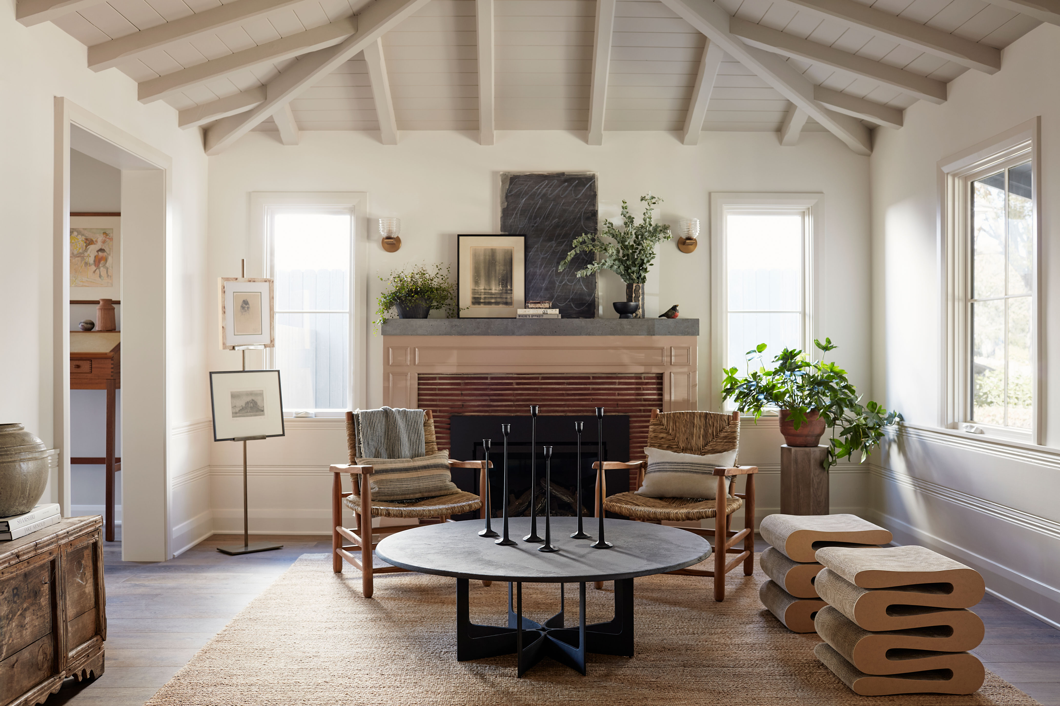
Likewise, the home combines different design eras in a way that helps Sam achieve the goal of a curated, lived-in space. In this walk-through living room, classic-leaning lounge chairs are combined with cool, curvaceous Wiggle stools by VitrA to bring a playful character.
'The transitional living room is part of the original house, and it's also the room that you land in when you enter the house, so we wanted the furniture to not cut the space too much, to be lower, so that sight lines would remain open and clear,' Sam explains. 'In scale, this room is smaller than the loungy family room and we envisioned this room as a cosy place to read, play games or chat after dinner, whilst the larger family room would be the place you watch tv and cuddle the dog on the couch!'
Modern English style
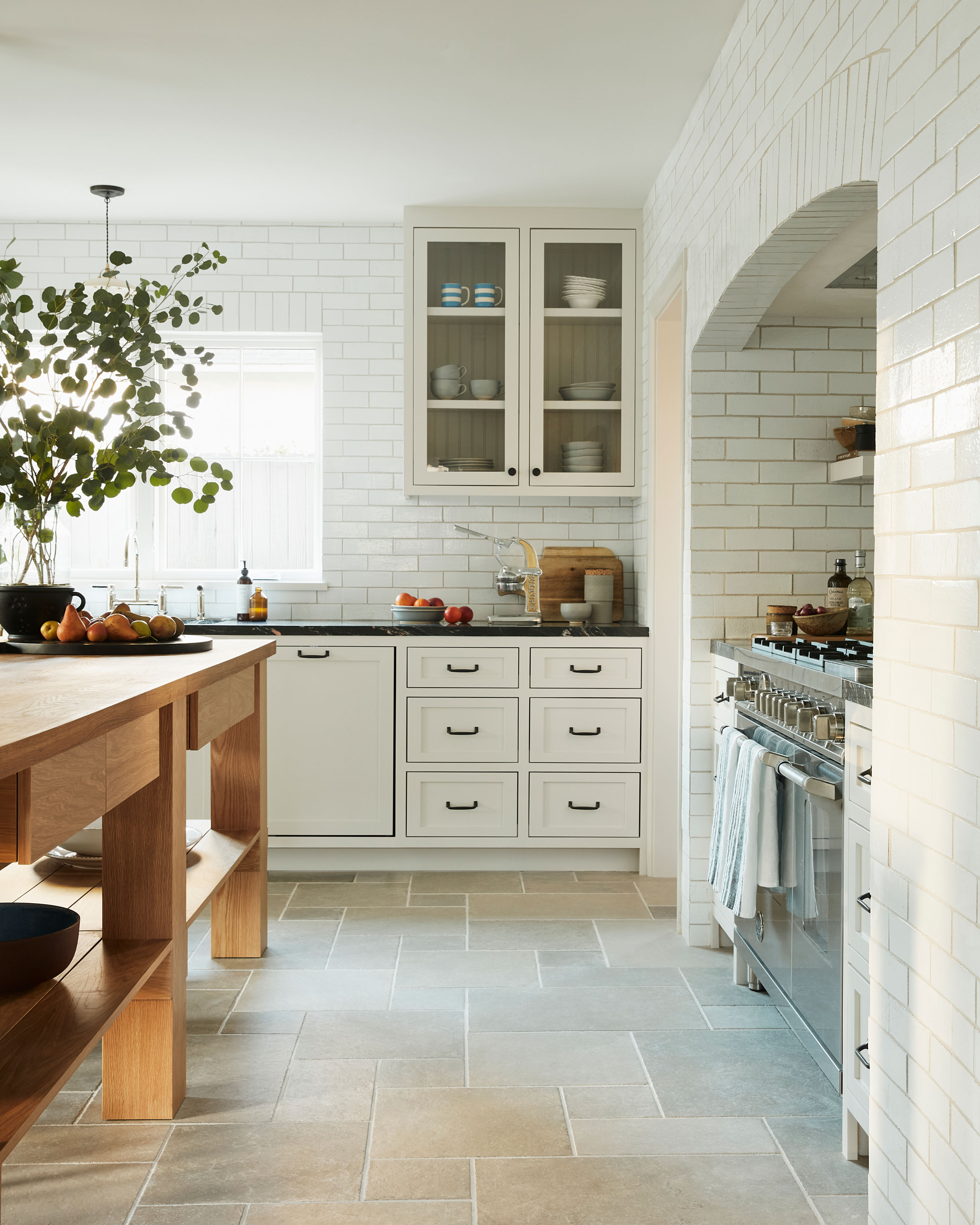
The Modern English theme continues into the kitchen, with a classic-style range at the heart of the space. 'Continuing the theme of an updated European home we chose appliances by Italian Brand Bertazzoni and set the stove in a fully enclosed tiled alcove,' Sam says. 'The floor to ceiling tile was inspired by traditional kitchens in great English houses and was intended to bring a feeling of the kitchen having been established a while, rather than newly installed.'
'My favorite piece is the Giant bespoke wooden prep table. In place of the traditional kitchen island,' she says. 'Since the kitchen and living room are a blended space, we were concerned that a traditional island would visually chop up the room too much. The kitchen felt like it needed a more flexible solution, one that can be used both for prep work and cooking, as well as a casual place to eat and entertain. The table was custom made with a solid oak planked top, by the cabinet maker who crafted the kitchen.'
Flexing for the family
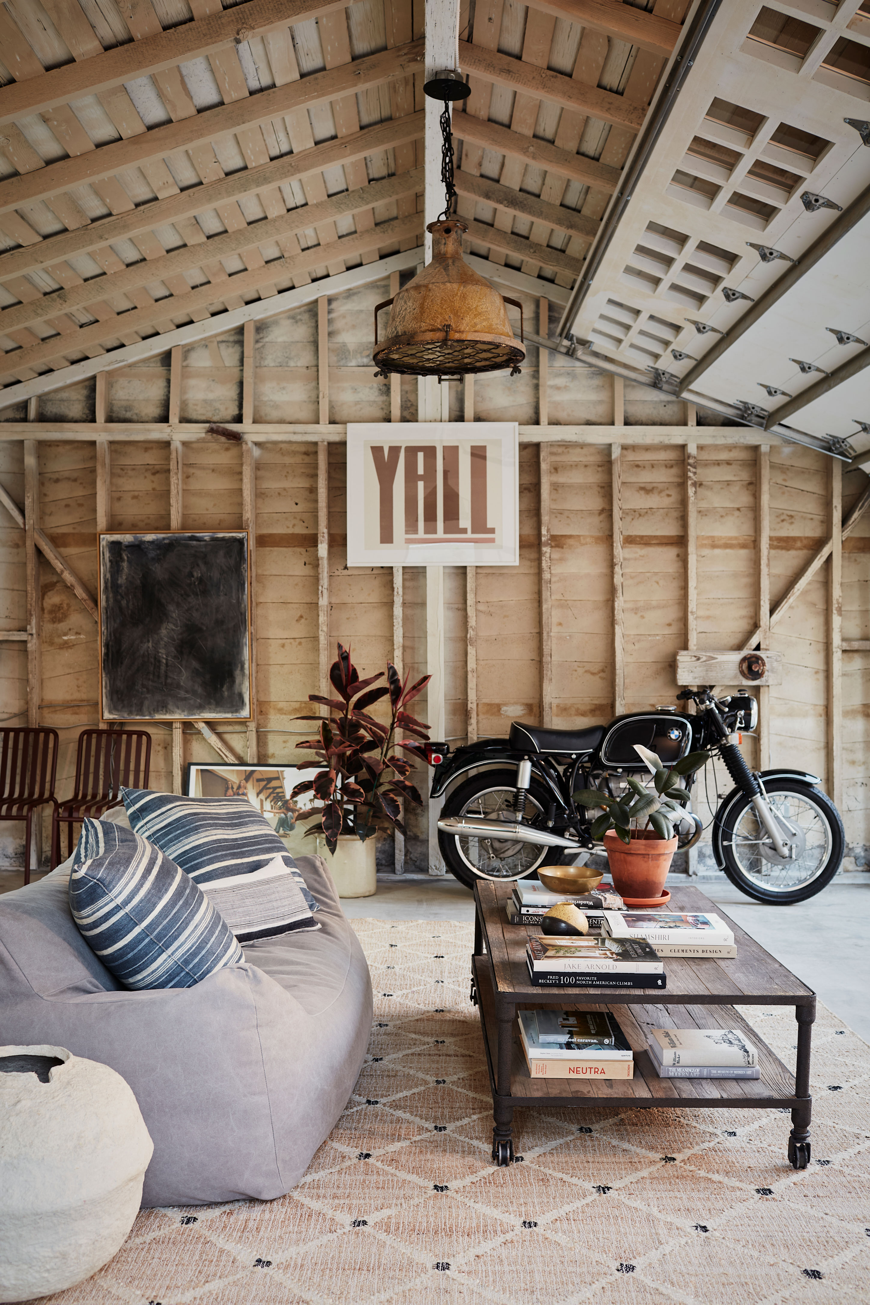
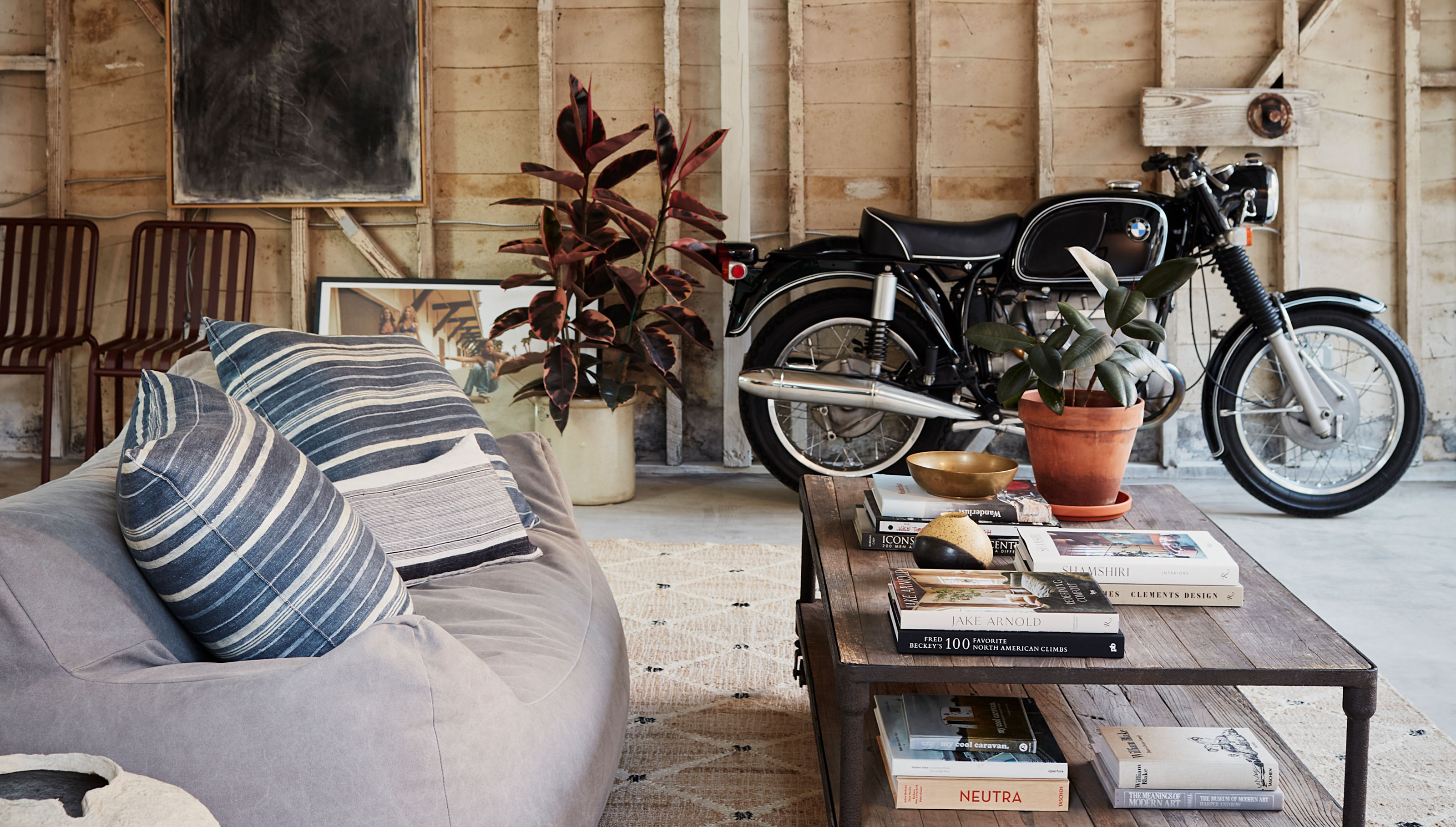
Out in the backyard, there's a cedar shingle clad garage that houses a flex room for family hangouts. 'We chose to make the garage a bit more of a 'flex' space,' Sam explains. 'Knowing that Studio City is primarily a family friendly area, we thought a teenage breakout spot, close to the pool would probably get more use than a traditional garage.'
However, it's the sort of space that lends itself to a multitude of uses: 'If you wanted to park your car in there, that option still exists,' Sam reassures us.
The duo's goal for the remodel of this 1936 home, in which they added nearly 2,000 square feet, became about ensuring that the project didn't feel like a "loss" for the street — and it feels anything but. 'Essentially the brief became — how do we create a modern home that not only fits into the neighborhood but is hopefully even additive, while serving the needs of a family in 2024?' Sam says.
A house with this character is sure to draw the right owner to it, too — someone willing to respect the bones of the original property as much as Sam and Ryan did.


