For the owners of this home, Katie and John Fayard, the remodeling of their kitchen was never going to be a simple fix. Having first met in New York while working in advertising, the couple had moved back to Katie’s hometown, Nashville, to be closer to relatives when they decided they wanted to start their own family.
A few years down the line, now with an eight-year-old daughter in tow and having outgrown their home, they came across this property for sale on a nearby Nashville compound. It had been passed down through generations of a local family, holding great sentimental value for them, adding to the pressure for Katie and John to remodel with sensitivity to its past life.
Despite having great bones and character, it hadn't been touched for over 50 years so it needed attention. Built in Georgian-pastiche style, the home had a refined charm that belied its age – it went up in 1966. The homeowners wanted to respect its traditional style while introducing their own more colorful and eclectic tastes, so they enlisted the expert help of architect, Brandon Ingram, and interior designer, Rachel Halvorson.
Both Katie and John are well-traveled and wanted the style of their new kitchen to express a worldliness, incorporating the edginess of Brooklyn style where they had shared part of their lives, as well as the traditional Southern homes of Atlanta. This motivated them to seek out the expert services of Plain English Design when it came to the kitchen remodel.
Rachel explains, ‘Striking just the right balance of restraint and personality was a fun challenge. I think that is when I leaned into the English influences – not to overthink the mix of colors. It feels lived in, a kitchen where you can tape kids’ artwork on the walls and it works. That’s the kind of vibe I wanted it to have'.
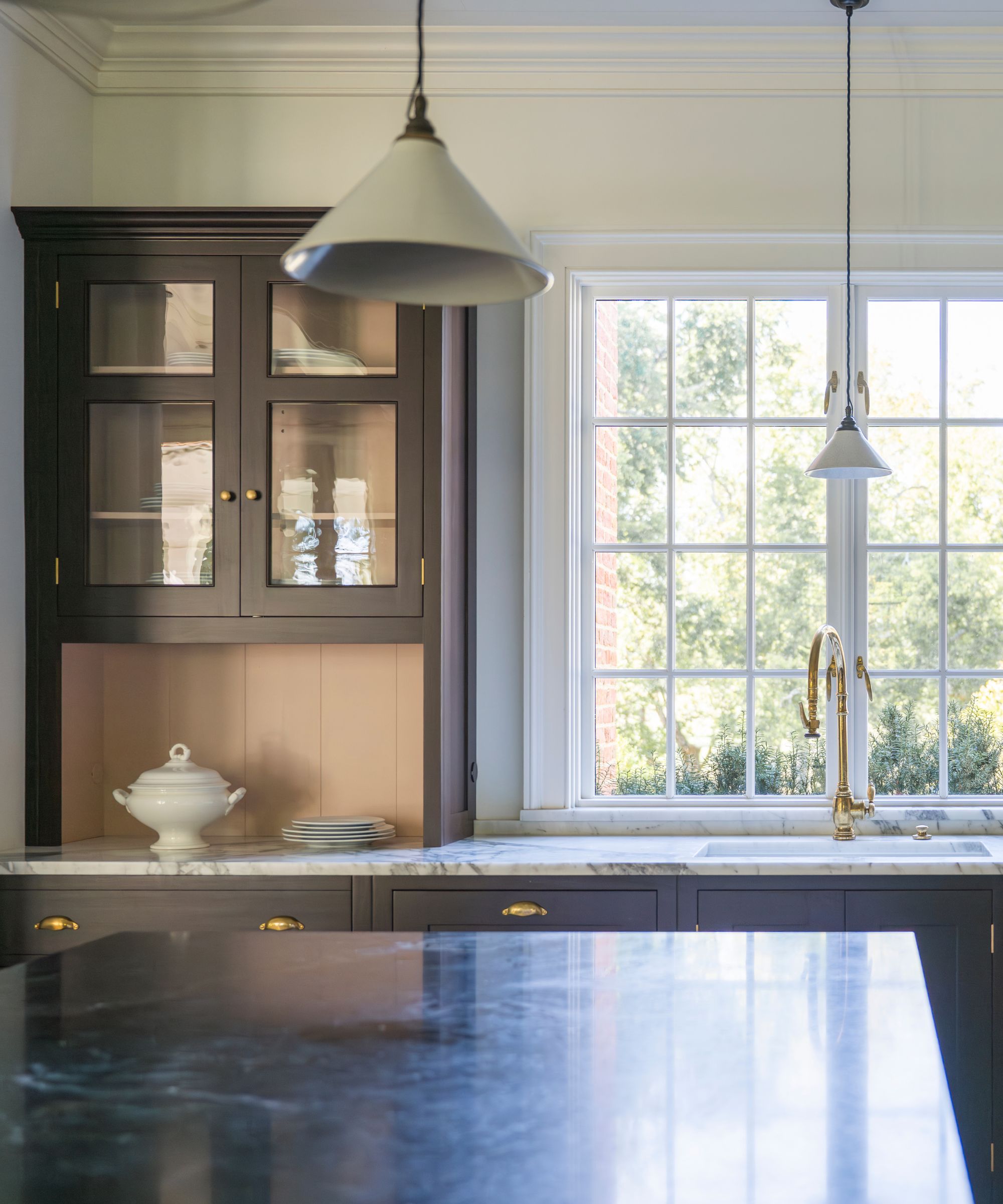
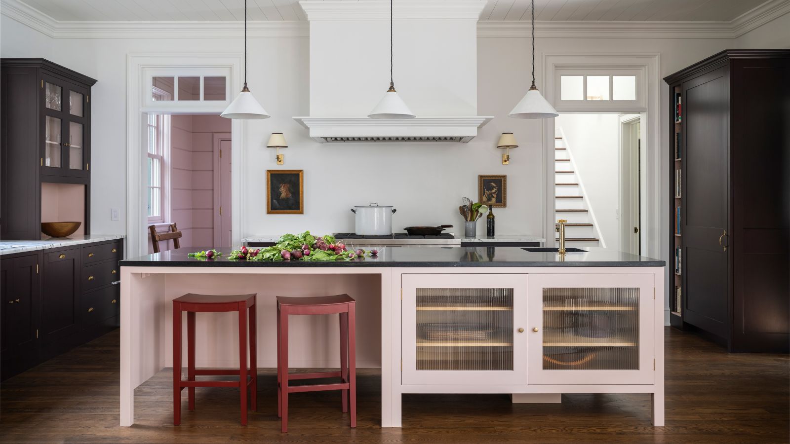
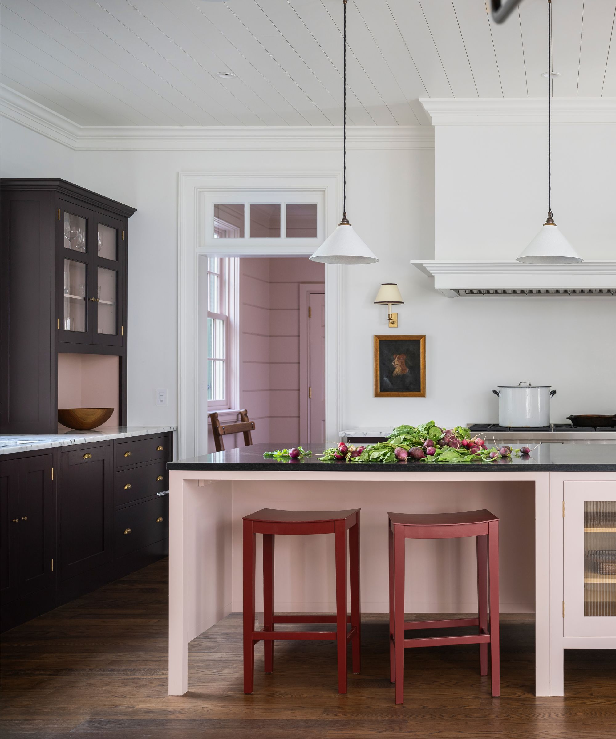
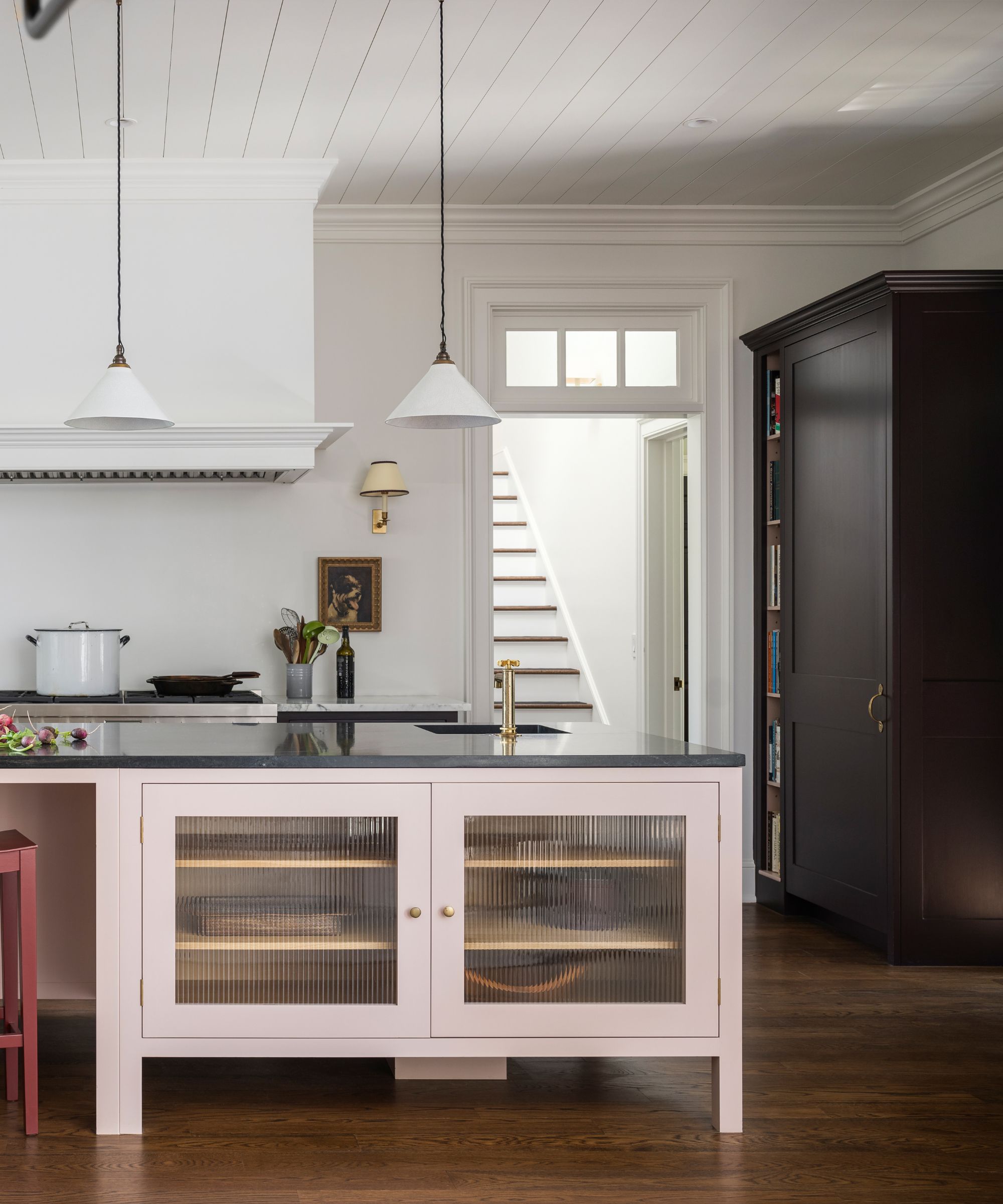
For both Rachel and the owners, the kitchen became their favorite part. It perfectly toes the line between traditional and contemporary, conveying a transitional style. The simple kitchen cabinetry with brass hardware nods to historical style, yet touches such as ribbed glass cabinet doors and smooth granite worktops keep it feeling modern overall.
To add a sense of fun and casualness, unexpected color combinations are embraced. The smart dark brown 'Burnt Toast' cabinetry is contrasted with a pale pink kitchen island and mudroom in 'Silver Polish'; both colors are from Plain English Designs Color Collection 3. Deep red bar stools add an extra layer of color interest, popping against the dusty rose backdrop.
Rachel comments, ‘I love how the space evolved into more of a ‘family room’. Katie seconds this, telling us, ‘We spend the majority of our awake time in the kitchen. We get morning and afternoon light, it’s an open space, and it leads out to the garden, so in summer, the two spaces feel interconnected. It is truly the heart of the house, where we catch up in the evenings, share family meals, and where homework is completed.'
One of the must-haves for Katie and John was for their kitchen to be highly practical as well as beautiful. They love to cook and entertain, so they wanted both a functional kitchen and pantry with plenty of storage for all their spices and gadgets. Plain English Design helped them to personalize their kitchen storage solutions to maximize efficiency.
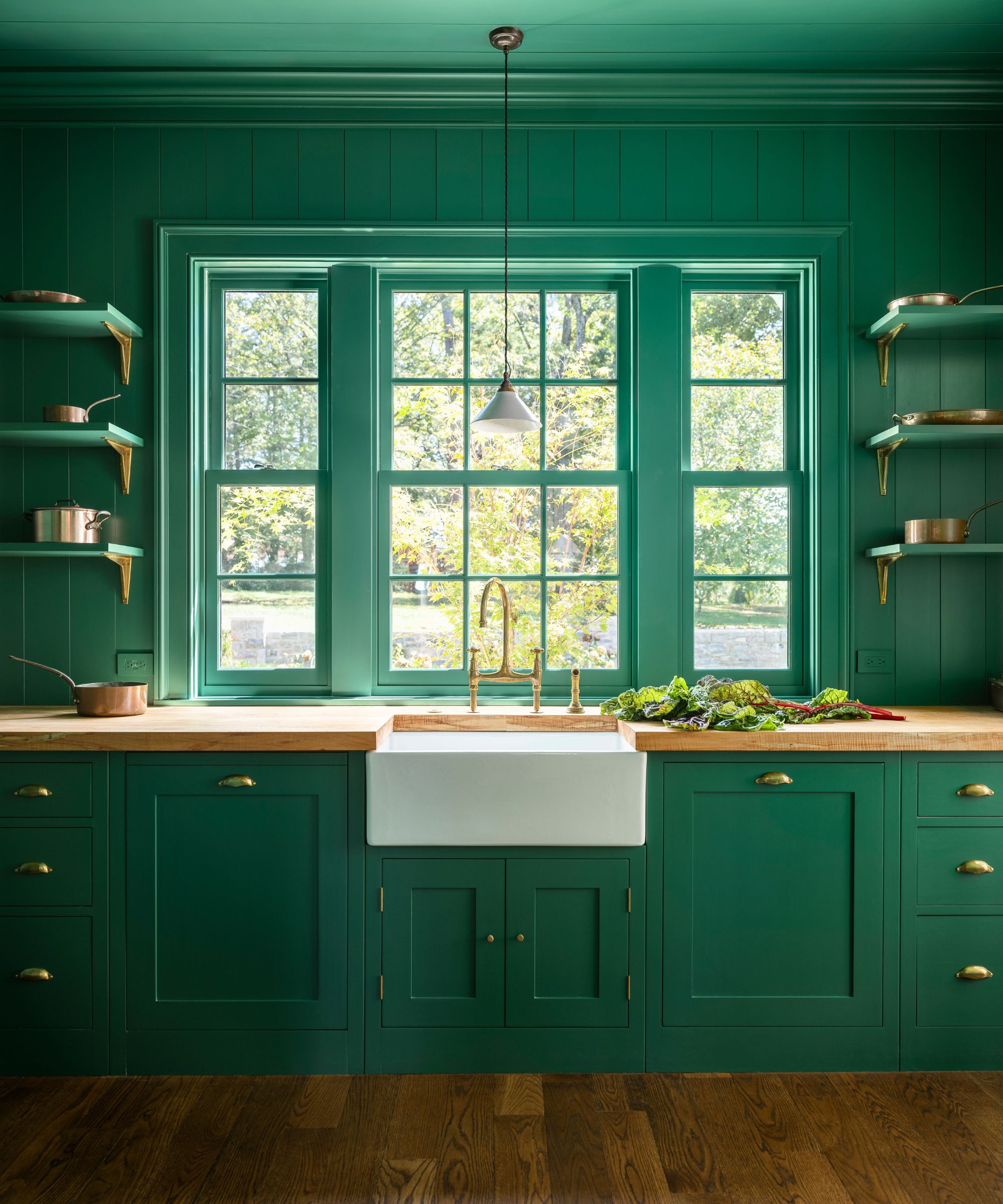
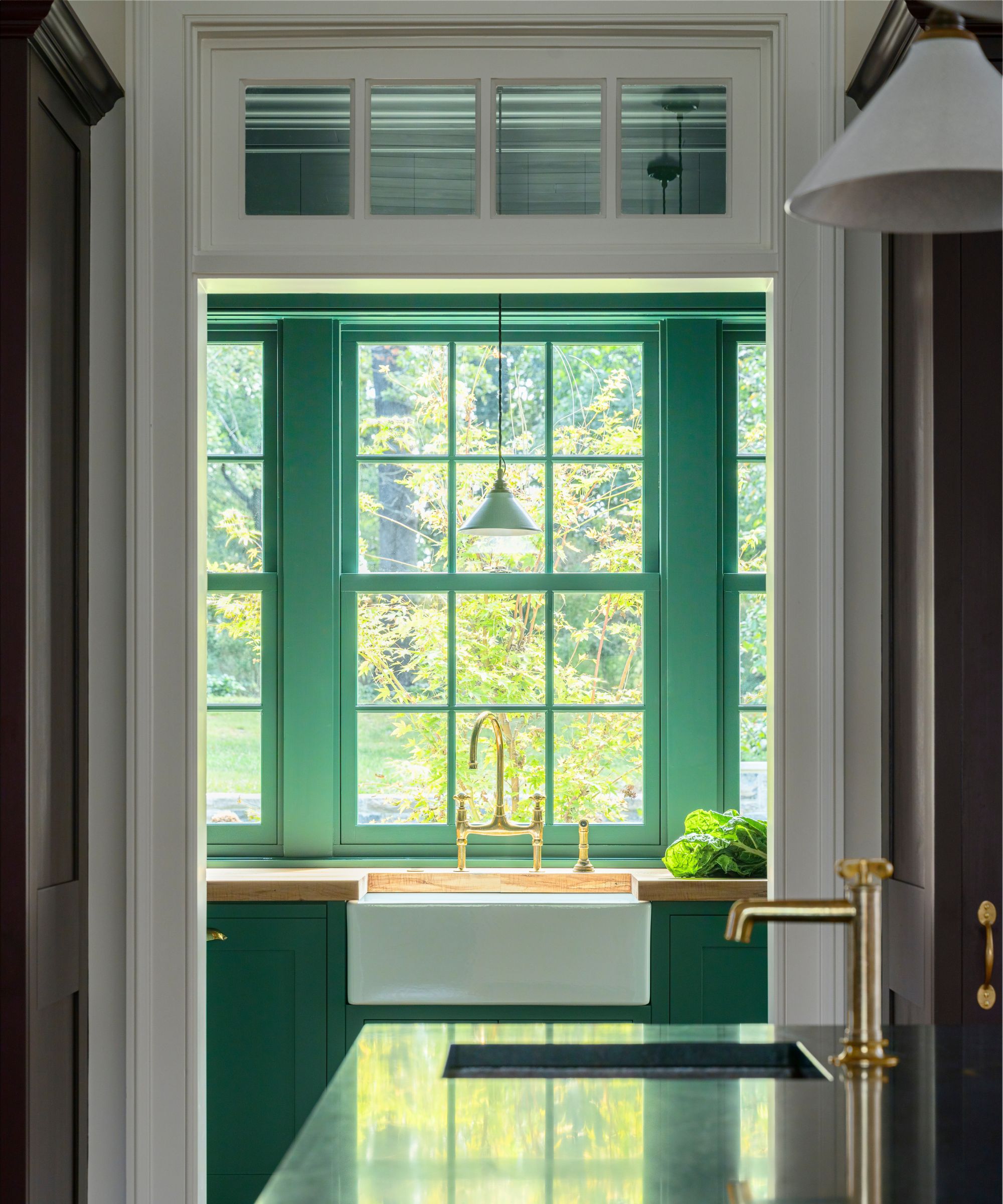
Yet the utility space is far from a drab room for practicality. A lively Veridian green adorns the walls, drawing the eye from the kitchen into the extra space, and creating a connection to the acres of nature that sit beyond. The green is brought up onto the ceiling, creating a mood-boosting color-drenching effect.
Despite the makeover, elements of the past are woven throughout, ensuring that there is a connection to its history. For example, the utility sink was saved and repurposed from the old house, as were various light fixtures.
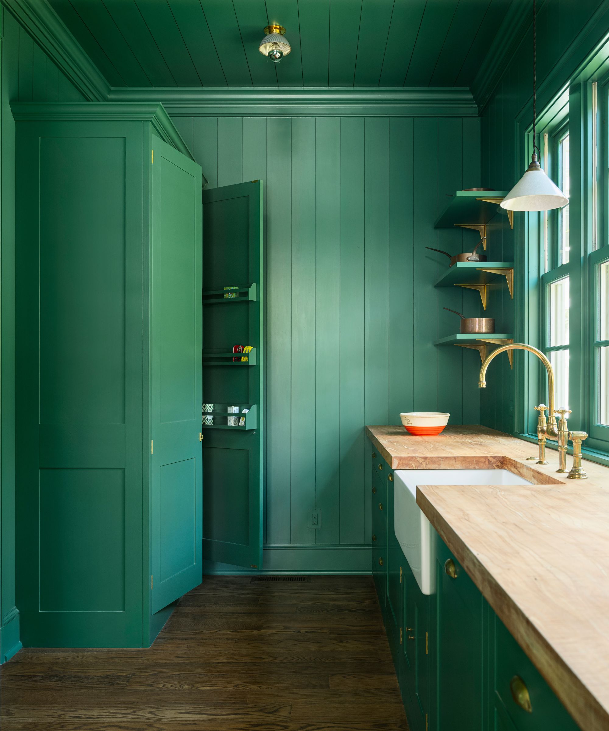
Details that are personal to the family are also incorporated, like the wooden countertop in the larder, sourced from John's family’s farm in Alabama. It’s this considered thinking that has successfully created a new kitchen rich with character, in harmony with its Georgian-style bones while being a contemporary, playful, and practical room for family life.
On seeing the remodeled space for the first time, one of the grown-up family members who used to live here said to Rachel, ‘Y’all captured it perfectly. It is like the childhood house I grew up in, but better'. It was the best compliment I could’ve asked for,’ says Rachel.
Plain English Design work on bespoke projects worldwide, and have showrooms in New York, LA, and London.


