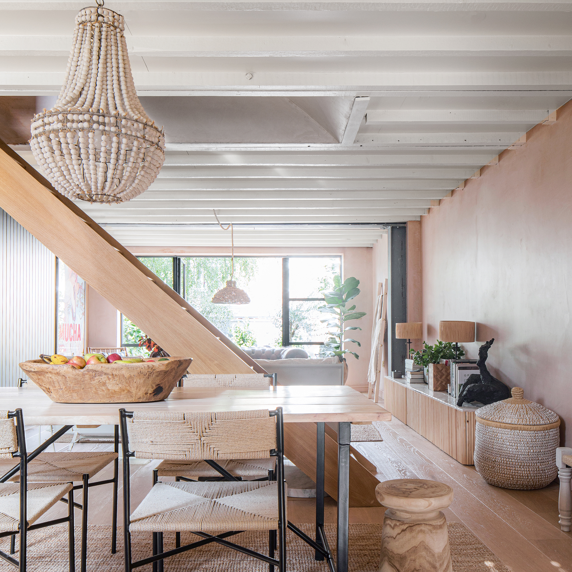
Olive Haller-Nuaman, a building contractor, and her husband Mejd turned their boxy, characterless 1950s council house in southwest London into a warm and welcoming light-filled retreat.
The beautiful space has been opened up with a new open-plan layout and exposed beams to flood the house with light and create the feeling of space. The home is packed with character and inspiration from holidays and travels to Morocco. Each space has been cleverly created around a boho-inspired scheme, and these are the 11 design ideas we'll be taking away from it.
1. Open-plan spaces suit modern living
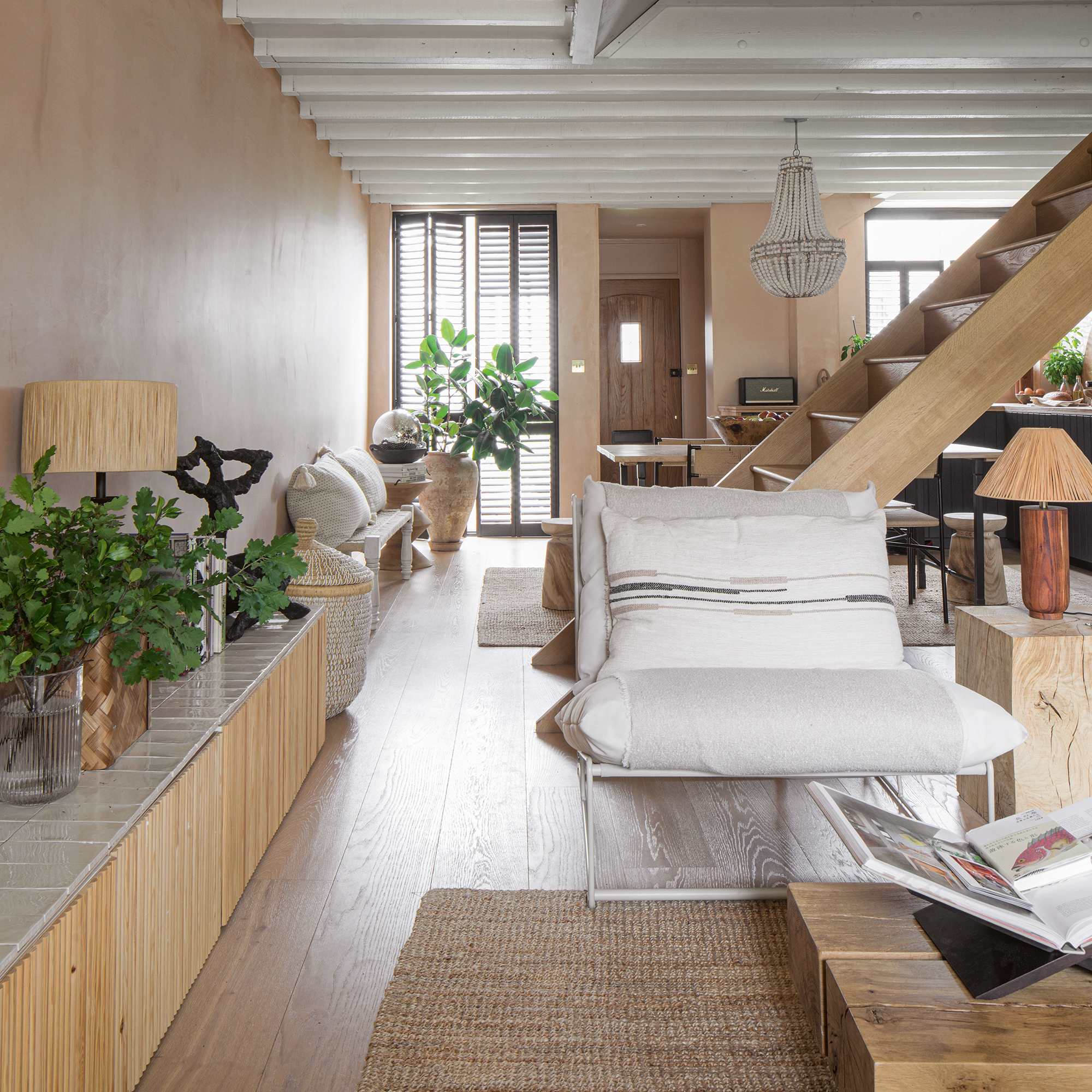
'We knocked through the three small, dark rooms on the ground floor of our 1950s ex-council house and added a small two-metre extension at the back to create an airy, open-plan kitchen, dining and living area. The house lacked period features, but this gave us free rein to completely re-imagine the space,' says Olive.

2. Get the lighting right
'As the new electrics were part of the build process we really had to think about the lighting in each area and how we wanted it to feel.
'We opted for target, pendant lighting above the dining table and sofa, and for softer lighting options, dimmable wall lights in the kitchen. I also added many lamps around the house, which create a warm glow in the evenings.'
3. Not everything needs a high price tag
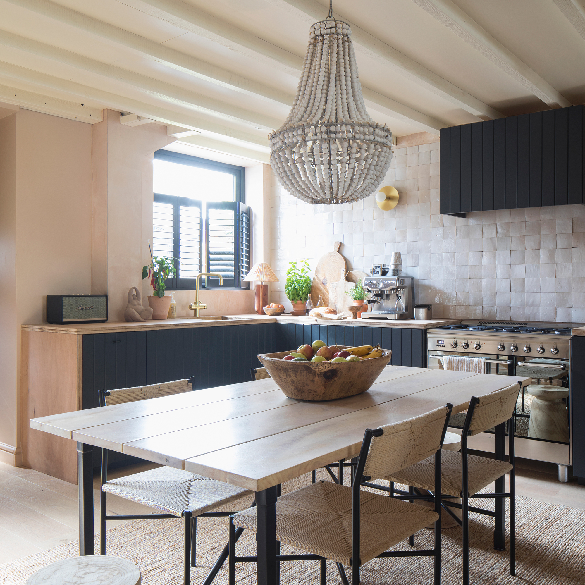
'We had initially bought this property with the intention of renovating it and moving on in a few years, so wanted to avoid spending lots of money on things like marble or Corian worktops in the kitchen.
Mejd fashioned our worktops from lengths of plywood which he doubled up and stained as a cheap, short-term solution, but we have grown to love them! The plywood is surprisingly robust and I love the aging patina of the work surface – it really adds to the character of the space.'
4. Create the illusion of more space
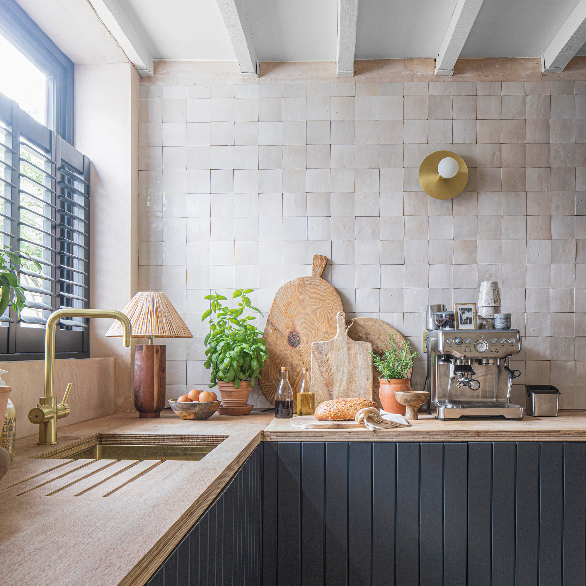
‘The ceilings in this house are lower than in older properties, so to gain height, we decided to pull down the plasterboard to expose the beams. It was a risk, as you never know what you might uncover, but luckily the beams were in good condition.
'The height gained was probably only a few inches, but once painted it gives the illusion of much more and the beams add character to what was a dull rectangular space.’
5. Think about the flow of light
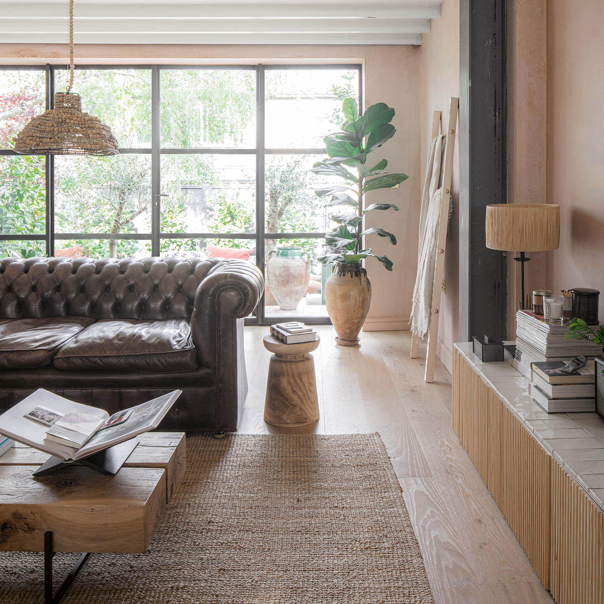
'The house was built with a large picture window at the front that we wanted to keep. We updated it, along with all the other windows, with an energy-efficient uPVC window that has a black woodgrain effect. With the open-plan layout and new French doors to the garden, there is an abundance of light all day.'
6. Create inviting areas for relaxation
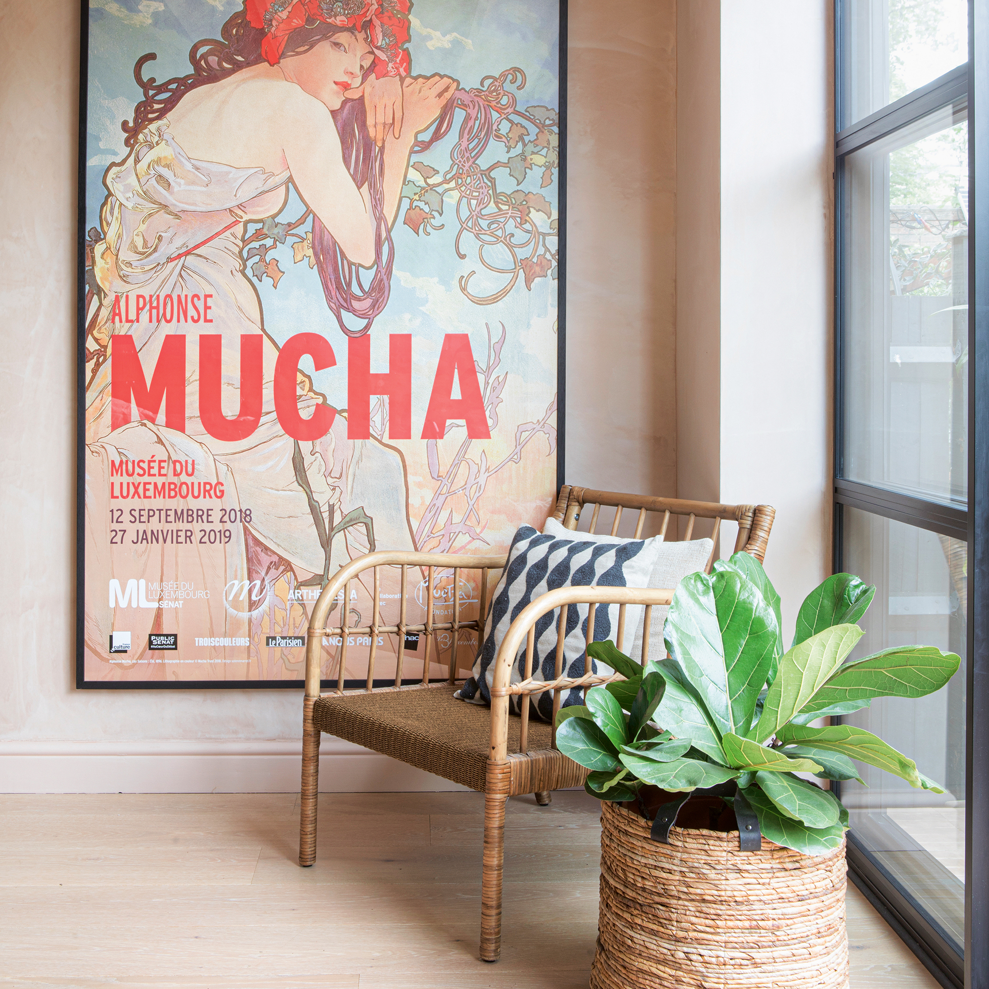
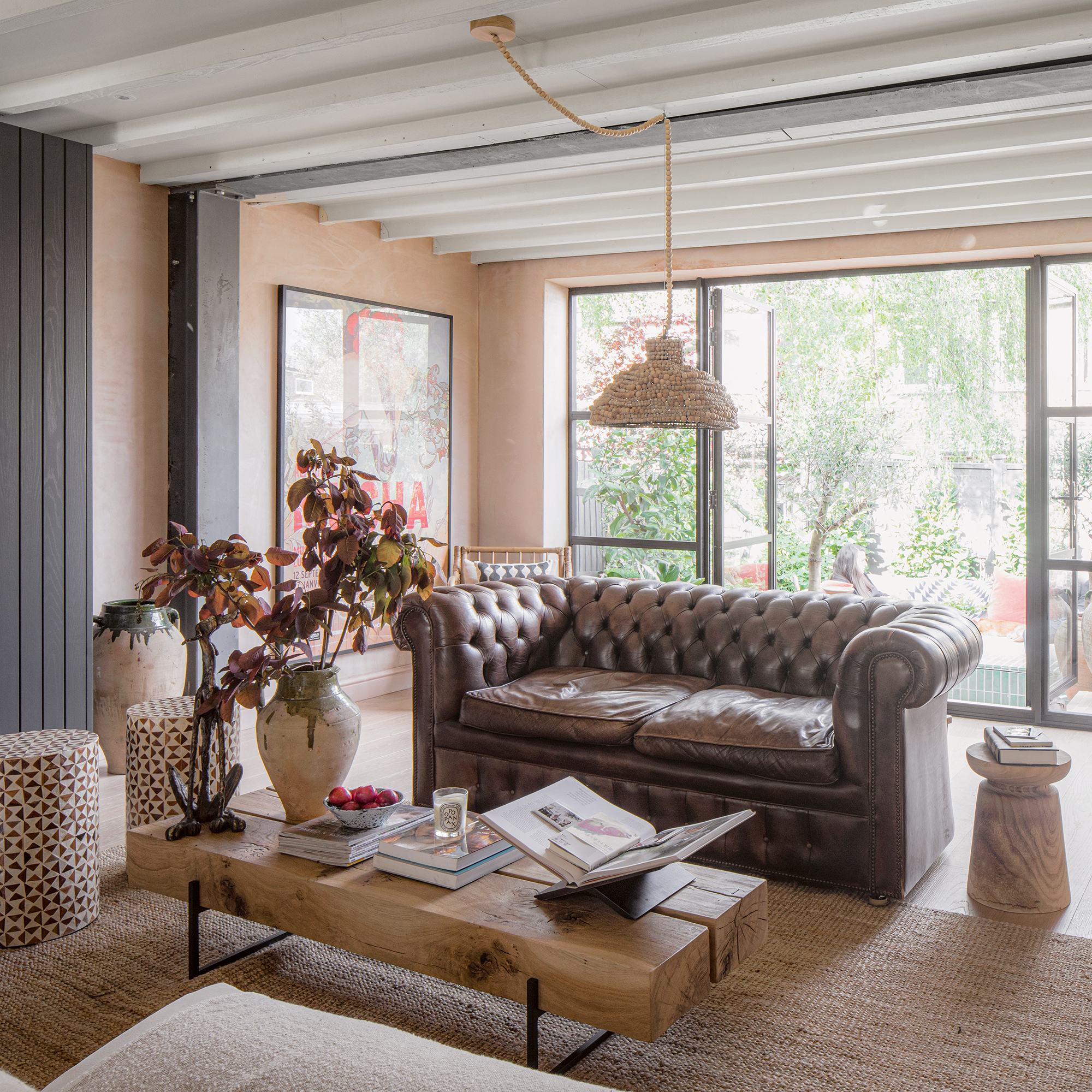
'We quickly realised with the style and proportions of the property that it was important to have furniture lower to the floor to keep the space feeling open and airy. A Chesterfield sofa, comfy armchairs, low stools and linen cushions and throws have all contributed to a relaxed and inviting communal space, which our friends gravitate towards. It’s full but balanced and a comfy zone to relax in.’
9. Soft tones and rustic textures create calm
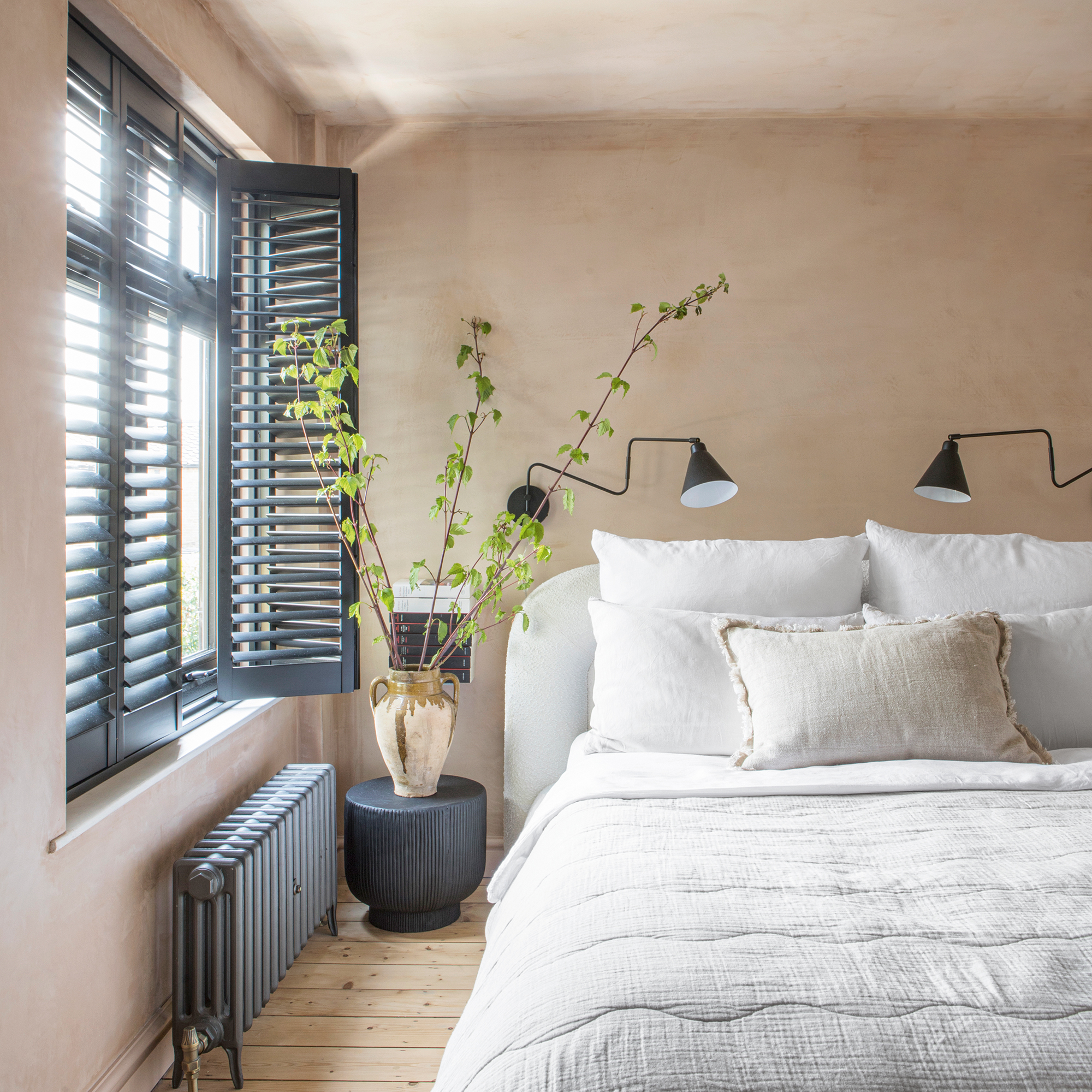
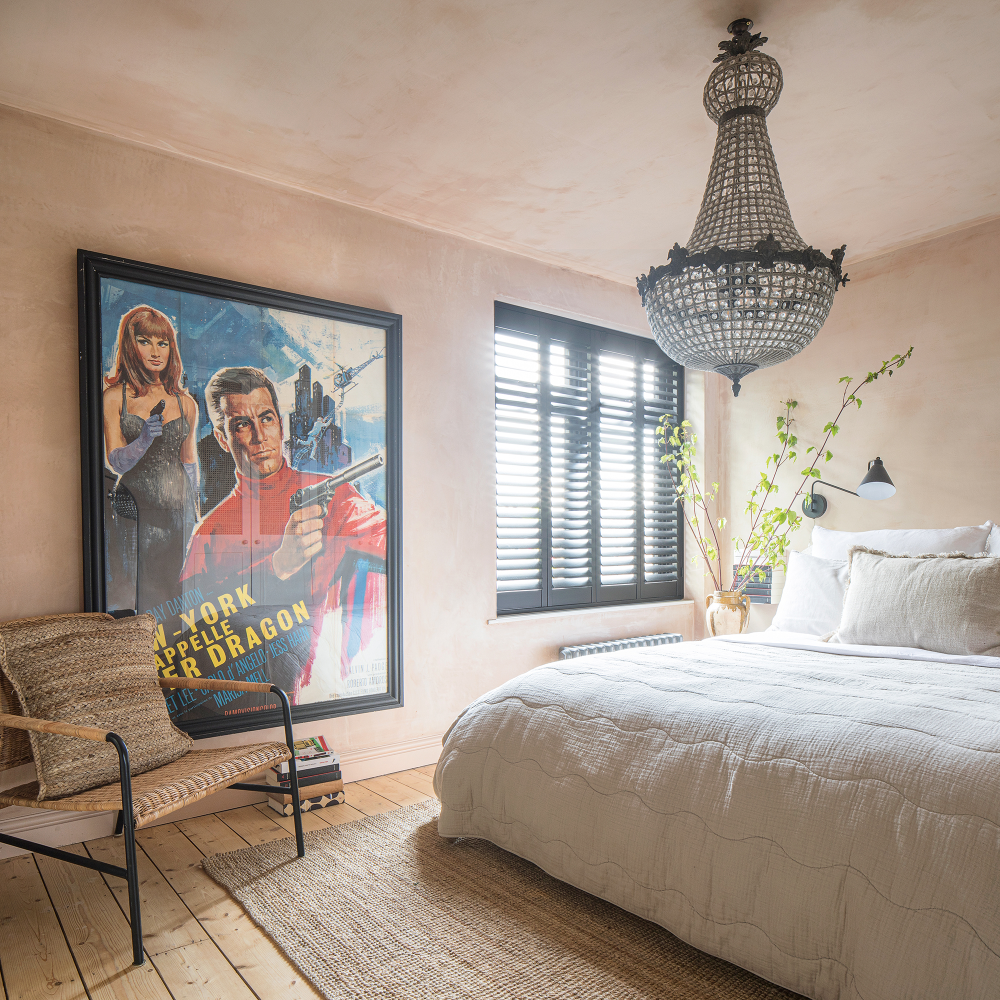
'Using a soft colour palette and natural fabrics and textures has created a relaxed bohemian look throughout the house. In our bedroom, rattan-fronted cupboards hide away our belongings, ensuring it’s a calm sanctuary.’
7. Rich, earthy tones add warmth and character
'Raw plaster has become a really popular paint colour over the past few years, but we love the texture and imperfections of the real thing. If you look closely, our walls are not smooth, and I love the organic feel it adds to our home.
'The soft pink is warm and inviting and it really reminds me of the rich colours you see everywhere when travelling around southern Europe and North Africa – I’m yet to find a colour that doesn’t sit well against it!'
8. Be inspired by your travels
‘Morocco holds a special place in our hearts and Mediterranean and North African influences can be seen throughout our home, from the beautiful large Turkish terracotta pots we’ve planted with olive and fig trees, to the clay hand-made tiles, and the natural textures of the rugs, cushions and accessories.'
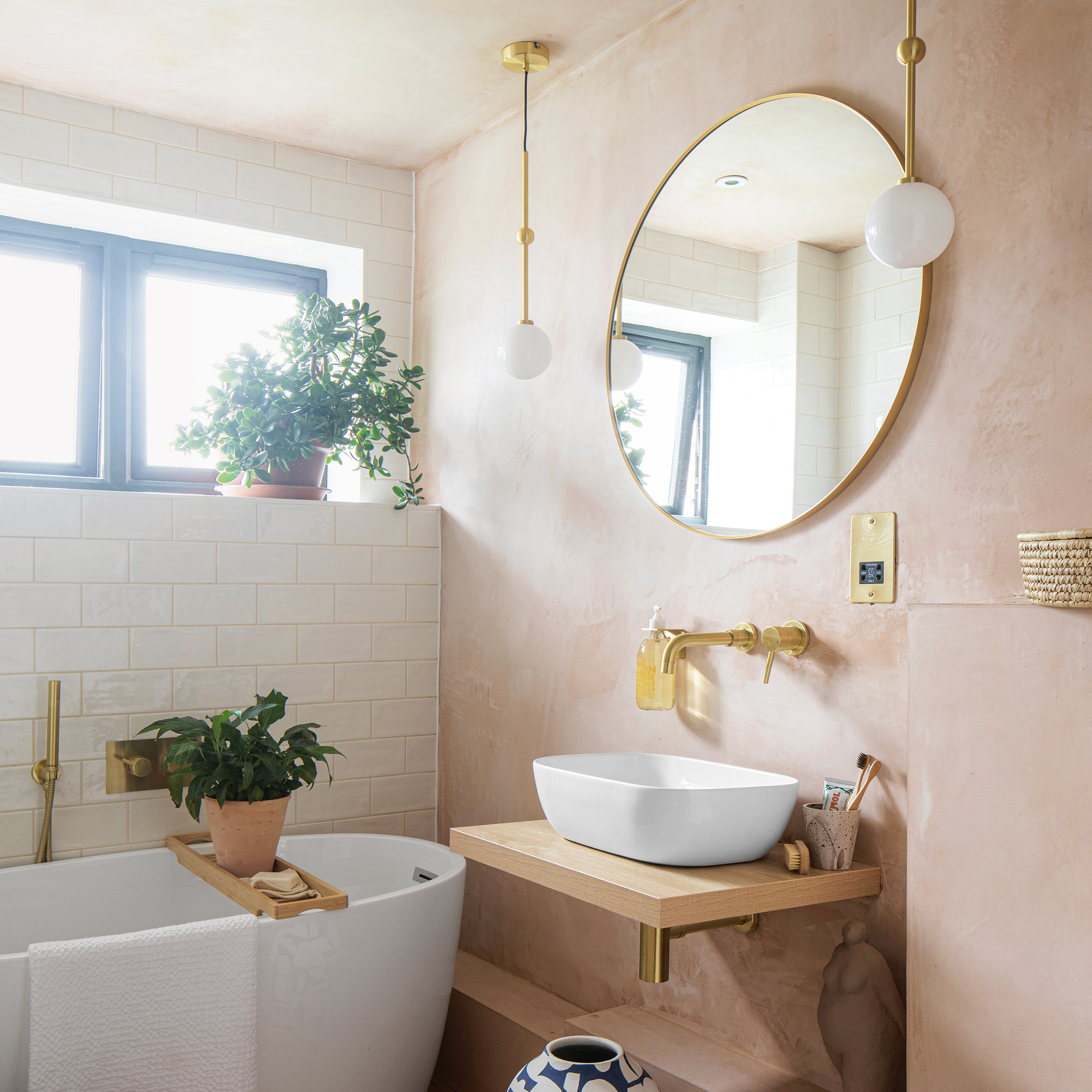
10 Add a luxurious feel to a compact bathroom
‘Wall-mounted taps and a soap holder attached to the wall keep the small basin area clear and uncluttered. Brass fixtures and fittings shine against the white zellige tiles – a timeless scheme.’
11. Reconfigure small spaces
‘We wanted a freestanding bath positioned centrally underneath the window in the bathroom, but because of the pipework we had to choose a smaller bath. However, fitted with a shower handset and tap, and floating cabinet, the clean lines and symmetrical shape add that all-important touch of luxury. ’
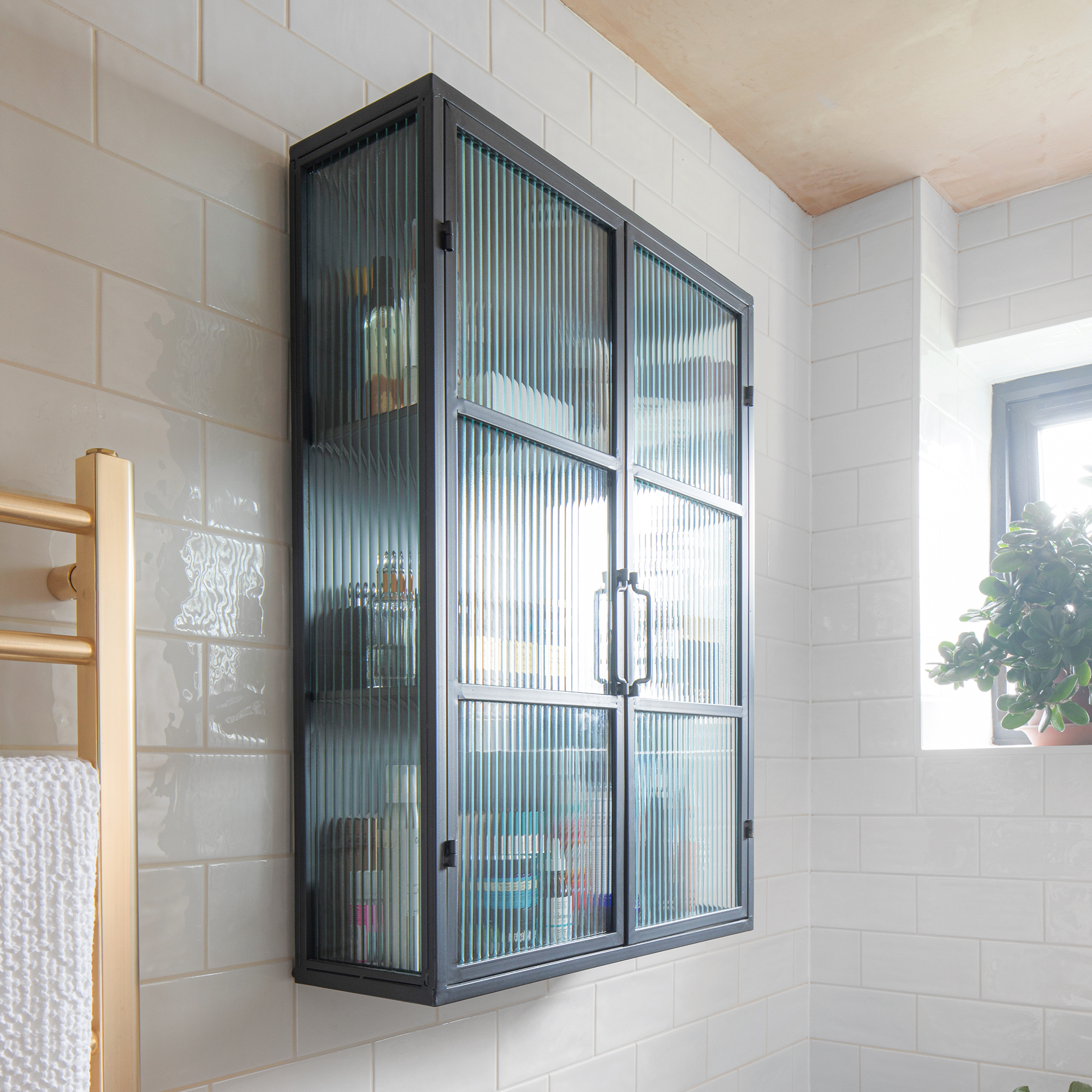
'Mejd and I have always adored raw and rustic materials – nothing too curated as our space needs to feel lived in.'


