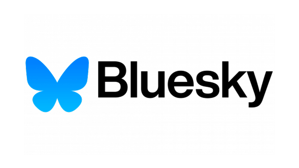
Bluesky is often touted as the new Twitter. People have been flocking to the social media app amid Elon Musk's chaotic rebranding of Twitter to X, and the platform is starting to look more like the old Twitter. It already used blue as its brand colour, logically, and now it has a suitably friendly winged logo that feels a little like the late Larry the bird reincarnated.
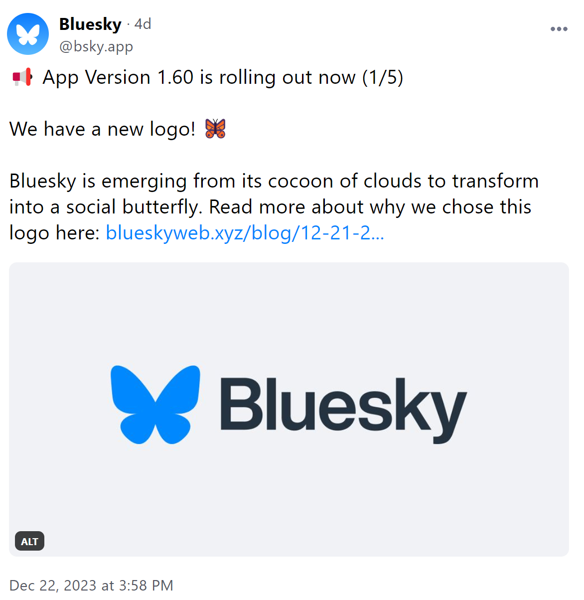
The new Bluesky logo is more flutter than twitter: instead of a blue bird, it's a blue butterfly. The applications don't seem to be standardised quite yet, but the design is much simpler and more memorable than the previous cold and techy logo. It plays on the concept of the social butterfly as Bluesky opens up, strenghthening the idea that it will become one of the best Twitter alternatives.

In a blog post announcing the change, Bluesky CEO Jay Graber says the butterfly was chosen as the new logo because it's a symbol of change and transformation, reflecting a "mission of transforming social media into something new". He also said that people were organically using butterfly emojis to indicate their Bluesky handles. "We loved it, and adopted it as it spread," he said.
A butterfly with wings outstretched viewed from above does vaguely resemble the shape of a certain letter located towards the end of the alphabet. That might be reading a little too much into it, although some users of the app detect an intentional reference. I expect the similarity to the Twitter blue bird is not entirely accidental, however.
"Digging that new logo. Worlds away from 𝕏 😂," one person commented. "Either masterful trolling by the Bluesky team or you’ve just revealed a lot in an unconscious Rorschach blotch test," someone else wrote.
Some aren't convinced by the new design, however (or maybe they're just on the wrong platform?) "Globally, the butterfly symbolizes something fragile, frivolous and short-lived - not the kind of associations I would like to have with a news service that I would like to use for many years," one person wrote.

Bluesky began as part of Twitter in 2019, as a project to build an open social protocol on which multiple social media apps can work. It was spun off and hired its own staff in 2021. Graber is a former Twitter software engineer, and Twitter co-founder Jack Dorsey is on the board of directors.
The butterfly metaphor seems relevant to Bluesky's AT Protocol, conjuring up the idea of users flitting between different apps on the same network. Graber notes that someone who prefers birds could build a 'Birdsky' app and use that with the same friends to see the same posts. He suggests this aspect makes Bluesky “billionaire-proof” because users will be able to change to a different app.
The Bluesky app itself still has a waiting list and has some way to go to improve its UX and UI. The platform's post about the new logo was met with a long list of asks from users. But it is now possible for non-members to view posts on its site and app, and there are plans to open the app to all eventually.
Again, the metaphor of the butterfly is used here. "Like a butterfly emerging from its chrysalis, we are starting to open up," Graber says. "Posts on Bluesky have been public from the start through the open protocol, but today we’re making them publicly accessible through the app. We’re unfolding a little bit at a time, and are excited to bring you along on this journey of metamorphosis!"
For a less successful latecomer in 2023 rebrandings, see the confusing new WHSmith logo.


