HBO is no stranger to controversy. There's recently been all that hoo-ha about it changing its name from HBO Max to Max and then back again.
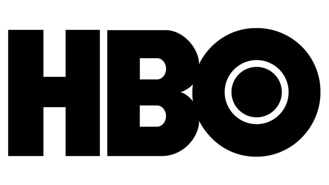
But are things even more embarrassing than that? Is there a mistake in the HBO logo? Look closely. No, even more closely. Look again. What you'll see is that the 'B' sits slightly lower than the 'H' and the 'O' is higher than both the 'H' and the 'B'. And that 'O'? Its centre isn't perfectly, well, centered. Is this a mark of one of the best logos of all time? Perhaps not.
According to logo designer James Barnard's first video (note I say first, that's important), the 'H' and the 'B' being lower than the 'O' is not important, that's because of overshooting. But the 'B' and the 'H' being off? That, says James, is a boo boo.
But, the plot thickens. Because a few weeks later James posted another video. Following his first post, he received a message from the designer who created the HBO logo in the 1970s, Gerard Huerta (Gerard is also responsible for the ACDC logo amongst others). And Gerard wanted to chat. "I designed that logo in the 1970s," he said. "Email me."
Gerard sent James the original trace of the HBO logo, designed on tissue paper. If you look very carefully at the tissue paper (see video below), you'll see there isn't an error at all. The 'H' and the 'B' are perfectly lined up.
"The transition from the straight line of the 'B' to the curve is a bad drawing of that," explains Gerard.
Elsewhere, in the tissue paper drawing, the overshoot on both sides of the 'O' is the same at the top and the bottom, which isn't the case with today's logo.
And the bottom bowl on the 'B' sticks out just a little further, "as it should," says James.
"Somewhere on the way they vectorised the original logo for the digital world, and they made some mistakes," explains James.
So there you have it, the HBO logo was designed perfectly. But over the years, mistakes were made. It wouldn't have been that noticeable on a small TV a few decades ago, but now, you can see it. "In print," says Gerard, "it matters".
For more logo secrets, read all about The Traitors logo and the BMW logo.