Like most design rules, they're there to safeguard you. They prevent you from making any major mistakes that can make a space feel uncomfortable (figuratively and literally) or in any way less livable. But following them too closely can also prevent you from adding the sort of tension interior design often requires to be truly remarkable.
Heard of the 60-30-10 color rule before? It’s an approach where you use a dominant shade in 60 per cent of your space, a secondary color in 30 per cent, and the last 10 per cent is for accents. It's the science behind the art, if you will, and helps avoid overwhelming a room with color.
But in 2026, designers are decorating with color in bold and brilliant ways, which begs the question: Is the 60-30-10 rule outdated? Of course, the method still works — but breaking it can also lead to some truly memorable spaces. Here are some ways designers are rebelling to create more sophisticated rooms.
1. Aiming for Balance Rather Than Percentages
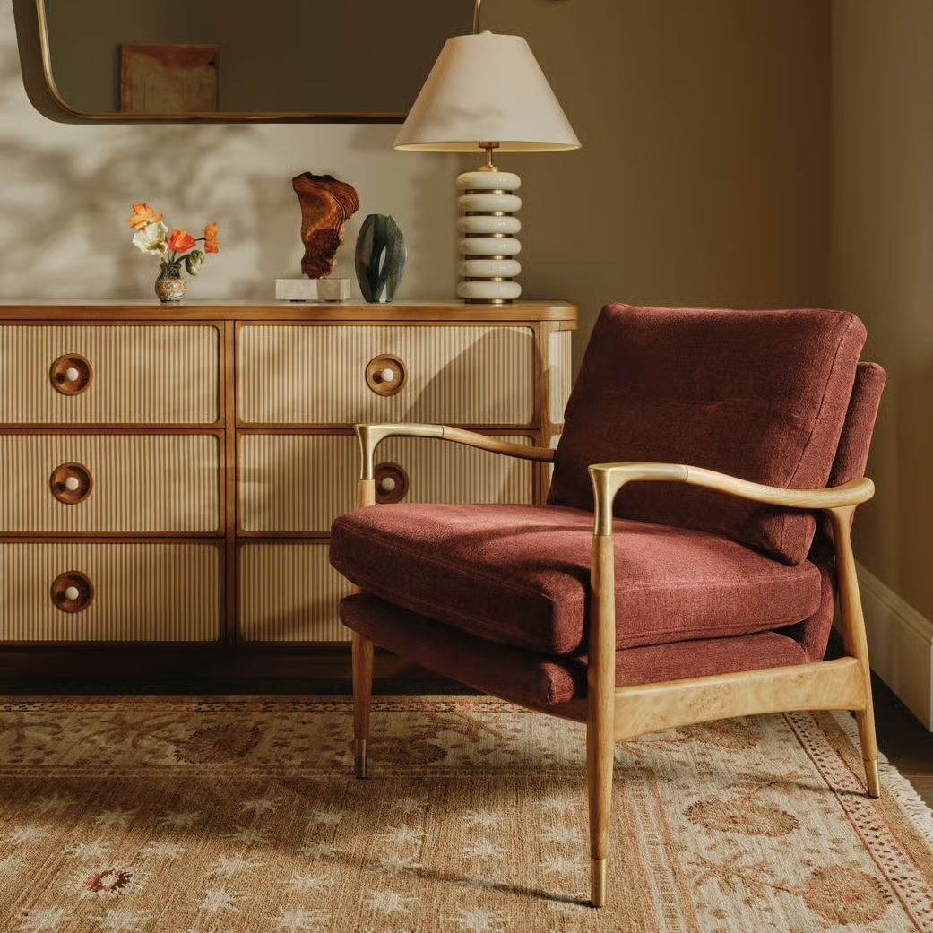
"The 60-30-10 rule is a helpful starting point, but the most sophisticated schemes rarely come from following color formulas too rigidly," explains Rebecca Hughes, the founder of her eponymous interiors studio.
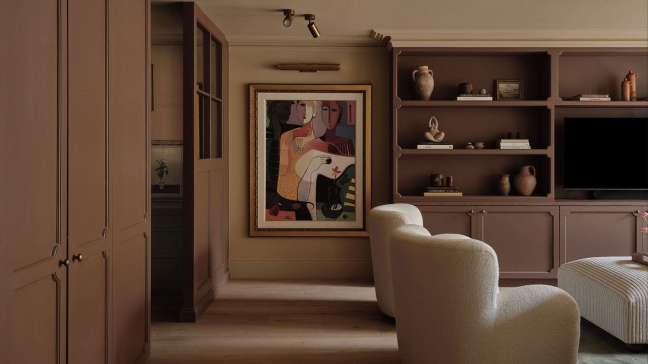
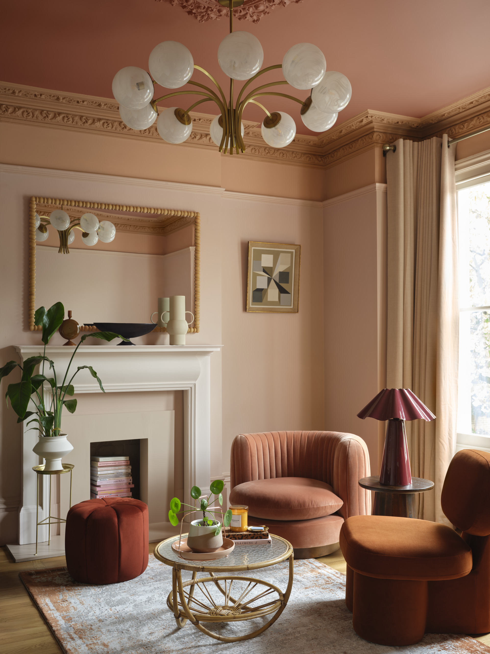
“Great spaces feel intuitive," she adds. "They respond to the light, architecture, and mood you want to create." Indeed, for a recent project in London (pictured above), Rebecca broke the rules by layering a series of warm, tonal hues — rich walnut joinery, terracotta upholstery, deep rust accents, and soft neutrals — rather than adhering to a dominant color hierarchy to create a more nuanced and interesting palette.
"Sometimes, rooms need far more tonal layering and very little contrast, while other spaces benefit from unexpected color dominance," she explains. "The key is balance rather than percentages. When you trust instinct alongside color theory, homes tend to feel far more personal and timeless."
2. Stick to a Timeless Palette
Brian Jerauld, founder of Blank Slate Studio, is also a rule-breaker — in fact, he never followed them in the first place.
“There's no shortage of design rules telling you how to distribute color, which tones to pair, and what to avoid. Formulas that promise balance, harmony, and a foolproof result — I don’t follow any of them," he says. "Not because I’m contrarian, but because rules like these can’t account for how color actually lives in a space, how light moves through a room, how materials breathe, and how a client inhabits their home."
Instead, what he comes back to time and again is a timeless palette that feels soft, neutral, grounded, and calm. “Colors that don’t demand attention but reward it,” he says. “Tones that age well, sit quietly alongside natural materials and make a room feel like it has always been exactly as it is. It’s not something you arrive at through a formula. It’s something you feel your way towards.”
Complement warm, earthy interiors with something like this contemporary armchair upholstered in stonewashed, terracotta linen.

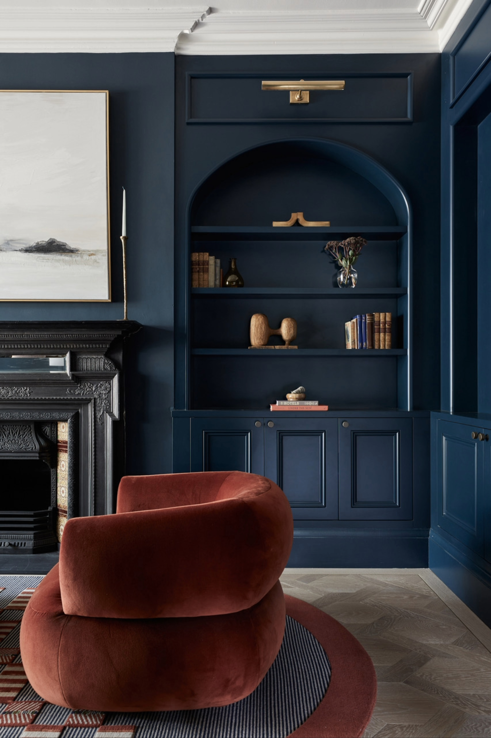
There is something so timeless about decorating with blue, and this Benjamin Moore shade, with its blackened undertone, certainly won't date any time soon.
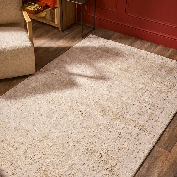
Complement a grounded scheme with this neutral-colored rug or calm a colorful interior with its neutral tones.
3. Prioritize Tension and Texture, Instead
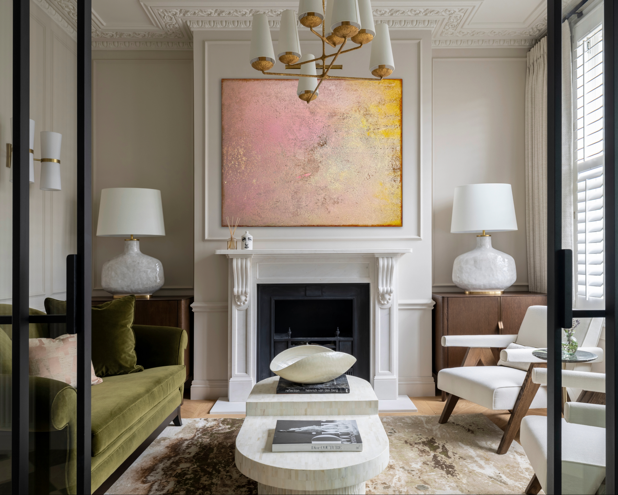
Marcelina Janizewska, head of interior design at Project London, also likes to be guided by her intuition and responsiveness rather than strict rules. "Today's interiors are more personal, collected, and expressive, which naturally challenges the rigidity of color ratios," she explains. "The best spaces don't feel formula-driven but feel layered and instinctive."
Importantly, it's about more than just how color works in a space. Texture, materiality, and tone carry just as much weight, Marcelina explains, adding that wood, stone, linen, and metal can create balance and visual harmony without any obvious color-blocking. Often, more elegantly, she adds.
"In open-plan homes, color-zoning tends to be fluid and atmospheric rather than prescribed, which makes strict percentages feel less relevant in practice," Marcelina continues.
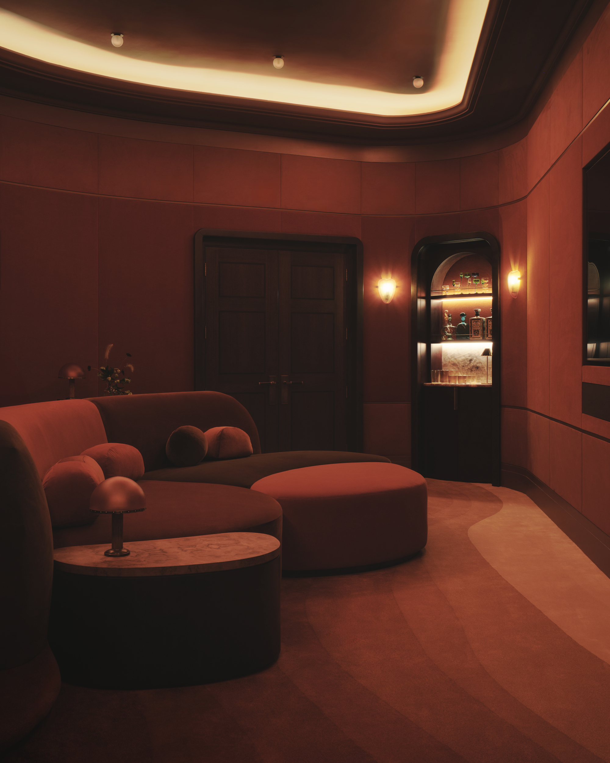
And perhaps the color-drenching trend is partially to blame for the 60-30-10 rule starting to feel outdated, she suggests. "It sits entirely outside the framework — the whole principle is about immersion, not splitting color into neat proportions," Marcelina explains. "And some of the most compelling spaces deliberately break the rules — that color tension is often exactly what creates personality and emotional impact."
4. Scrub Up On the 'New' Color Rules
Marianne Shillingford, creative director at Dulux, is also a color renegade — and nobody knows the rules more than her. Even still, she says being creative is all about breaking them and making new ones.
"The 60-30-10 color rule works beautifully if you think beyond paint when it comes to adding color to your interior, and the result is a look that’s classically balanced," she says. "But," she adds, "it won’t always stop you in your tracks or surprise and delight in a way that new and unexpected color theories do."
Marianne admits the 60-30-10 color rule is feeling dated only because a fresh rule book is currently being written. "It includes drenching the room in just one or two colors, capping it with a beautiful shade on the ceiling, creating ‘peek-a-boo’ color surprises from one room to another, and going all out-maximalist with bonkers clashing palettes and patterns," she says. "Rules are there to be broken. Go and get that hammer and have some fun."
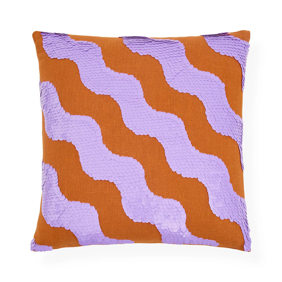
Jazz up any scheme with this bright and sparkling cushion by designer Jonathan Adler. Sure to add a little punch to neutral interiors or more color to bolder spaces.
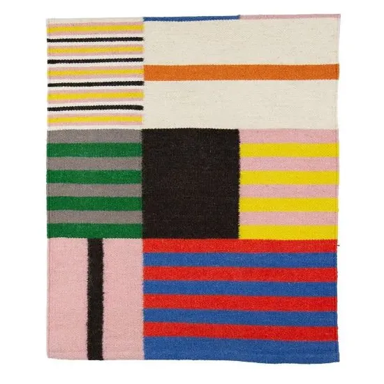
Throw out the 60-30-10 color rule and throw down this dhurrie-style runner instead, featuring a bold patchwork design in multi-colored stripes.
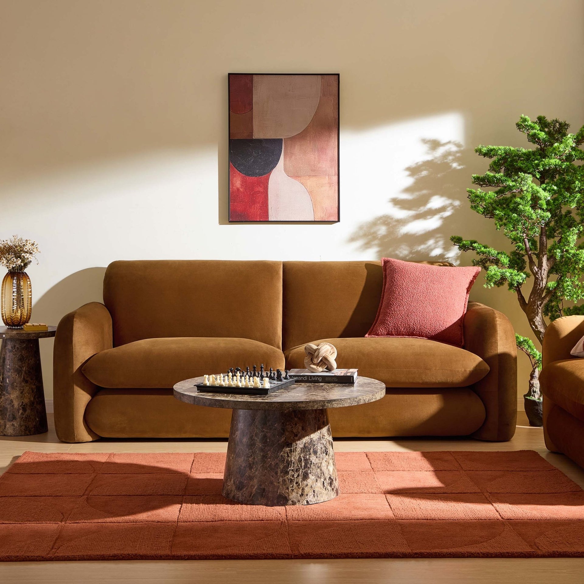
Inject color and personality into subdued interiors with this bold mustard-yellow sofa. Add a colored rug and paint on the walls, and it'll pop.
5. Push the Percentages Slightly
Color expert Helen Shaw from Benjamin Moore is a fan of using the timeless 60-30-10 formula to create balanced spaces, but appreciates the way designers apply it has evolved, and today, it serves more as a guiding principle.
If you want to break the rule, she recommends color capping as a way to introduce more colour without risking too much of a bold contrast. "It uses tonal layers from the same color family across walls and ceilings to create a seamless wash of color that deepens gradually throughout the space," she explains. "The result is a room that feels sophisticated and balanced but still works within the principles of the original rule." Rule-bending, perhaps?
Alternatively, focus on that 10% accent, she suggests, and get creative with highlighting architectural features with splashes of color or hand-painted decorative touches. "Hand-painted elements, in particular, introduce an informal, personal feel while subtly incorporating tones from the 30% secondary and 60% dominant colors to help to create a more cohesive scheme," says Helen.
While I wouldn't go as far to say the 60-30-10 color rule is outdated, it's clear there's flex when it comes to how designers are using it in 2026. Perhaps the focus should be on colour harmony instead? Interior designer Sam Grigg hits the nail on the head in telling me: “Real homes aren't made up of neat blocks of color. They're created by weaving color through pattern, artwork, textiles, and furnishings with little touches repeated and dotted around the room so everything feels connected.”
For more design inspiration and advice, subscribe to Livingetc's newsletter.