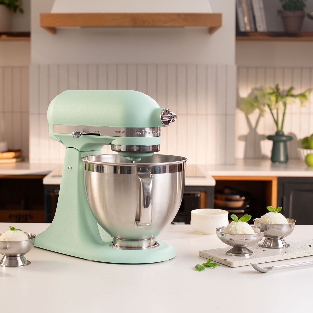
KitchenAid has unveiled its new colour of the year for 2026 as spearmint, a minty green shade with a 'sand-texture' finish.
Each year, KitchenAid announces a new colour of the year, which its best stand mixer, the Artisan Mixer 4.5L, will be available in for £699, alongside several other appliances. As masters of beautifully coloured kitchen appliances since 1955, KitchenAid is usually at the forefront of the latest kitchen colour trends. However, I think it's safe to say they don't always get it right.
While some colours of the year will continue to be lusted after for years to come and result in a dozen copycats, others are swiftly forgotten. However, this latest colour of the year has divided the Ideal Home team, with half of the team impressed by its 'anti-trend' and timeless look and the other half unconvinced by the 'dated' colourway.

'It feels a bit dated'
I will start by saying I love green, adore it. On my desk right now, I can see three different things I own in various shades of green. However, I was disappointed by the new KitchenAid colour. Rather than fresh and uplifting, it feels very 2016, and not in a good way.
For all my love of green, this spearmint shade in a kitchen feels a bit dated and out of sync with all the colour trends we're seeing at the moment. I would have put my money on a grown-up primary or a rich earthy colour, but this pastel green shade feels a tad like the ghost of Great British Bake Off's past. My favourite part about this COTY is the sand-texture, but even that doesn't make up for it.
Last year, we did see minty shades try to break out as a trend in the summer homeware collections; however, they never quite landed as a look with longevity. Unlike KitchenAid's Colour of the Year 2025, a gorgeous yellow shade, which I think will go down as a classic, I reckon this is a colour we'll be politely forgetting about in a couple of months.
'I like its retro edge'
After the bland nothingness of Pantone’s Cloud Dancer Colour of the Year (the TLDR is it’s literally just white), I’m so glad there’s at least a little substance in KitchenAid’s unveiling of Spearmint as the chosen shade for 2026.
As a purveyor of kitchen appliances, I’m all for people choosing ones that bring a point of focus or intrigue into the mix, rather than just opting for all white everything. This minty shade can do just that, even if it is startlingly similar to Pistachio, which is one of the brand’s bestsellers.
It has a bit of a retro edge from where I’m standing, which certainly ticks the ‘refreshing’ box for me that KitchenAid are going for.


