
When a color has a moment in the world of interior design, it's rarely an enduring one. Color trends are often fleeting as shades quickly become overused and our eyes tire of seeing them on our walls. There are, of course, a few exceptions; for starters, there's sage green, and - dare I say it - for many years magnolia took the top spot, but now we're asking, is Greige next to join the color trend Hall of Fame?
The calming neutral mix of grey and beige has been the tone of 2023. You may have seen it all over Pinterest and the walls of your design-conscious friends this past year, but before you commit to using it for your own paint ideas you'll want to know if it's still in fashion, or just a passing fad.
'After a decade with grey being at the forefront of interior trends, this versatile tone has given way to an altogether warmer and more comforting hue – greige,' says Helen Shaw, color expert at Benjamin Moore. 'If you love neutrals and grey tones, greige offers the best of both worlds; it still feels contemporary and harmonious but with an added warm.'
The question is, can we count on greige as a timeless trend, and what tips do experts have for making it feel fresh as we edge ever closer to 2024? We found out below.
Is Greige still on trend?
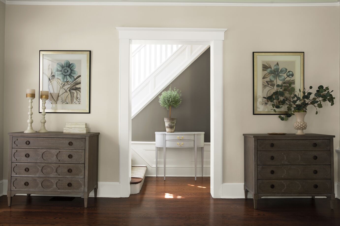
With 2024 just spitting distance away, we're all keen to know if we're carrying Greige with us or leaving it in the dust. So, what do the experts say - has the paint trend had its day?
'In my humble opinion, greige will always be trending,' says Adriana Schor, interior designer and founder of ICONIQUE Studio. 'It's the perfect neutral - neither too blue nor too yellow - and is strong enough to be the star of the show or the supporting actor. I love its depth and sophisticated tone, and for this, I don’t think it is a matter of trend but rather that it has become a permanent tool in the design world.'
Sue Wadden, color forecaster at Sherwin-Williams, agrees. ‘Although we're seeing some silvery blue tones rising through, I predict we’ll be sticking with the warmer taupes and beiges for a couple of years yet, so for now, greige isn’t going anywhere,’ she says. ‘It’s earthy and natural, and coming out of the pandemic we needed those warmer tones to anchor us.'
5 expert tips on using greige in your home
With Greige receiving the seal of approval for all we're concerned, the next question on everyone's lips is how to use it in a way that it still feels fresh. Soft, minimalist schemes decked out with boucle may have had their day in the eyes of many, but there are plenty more ways to incorporate this color that don't feel so overdone.
1. Pair with hard finishes
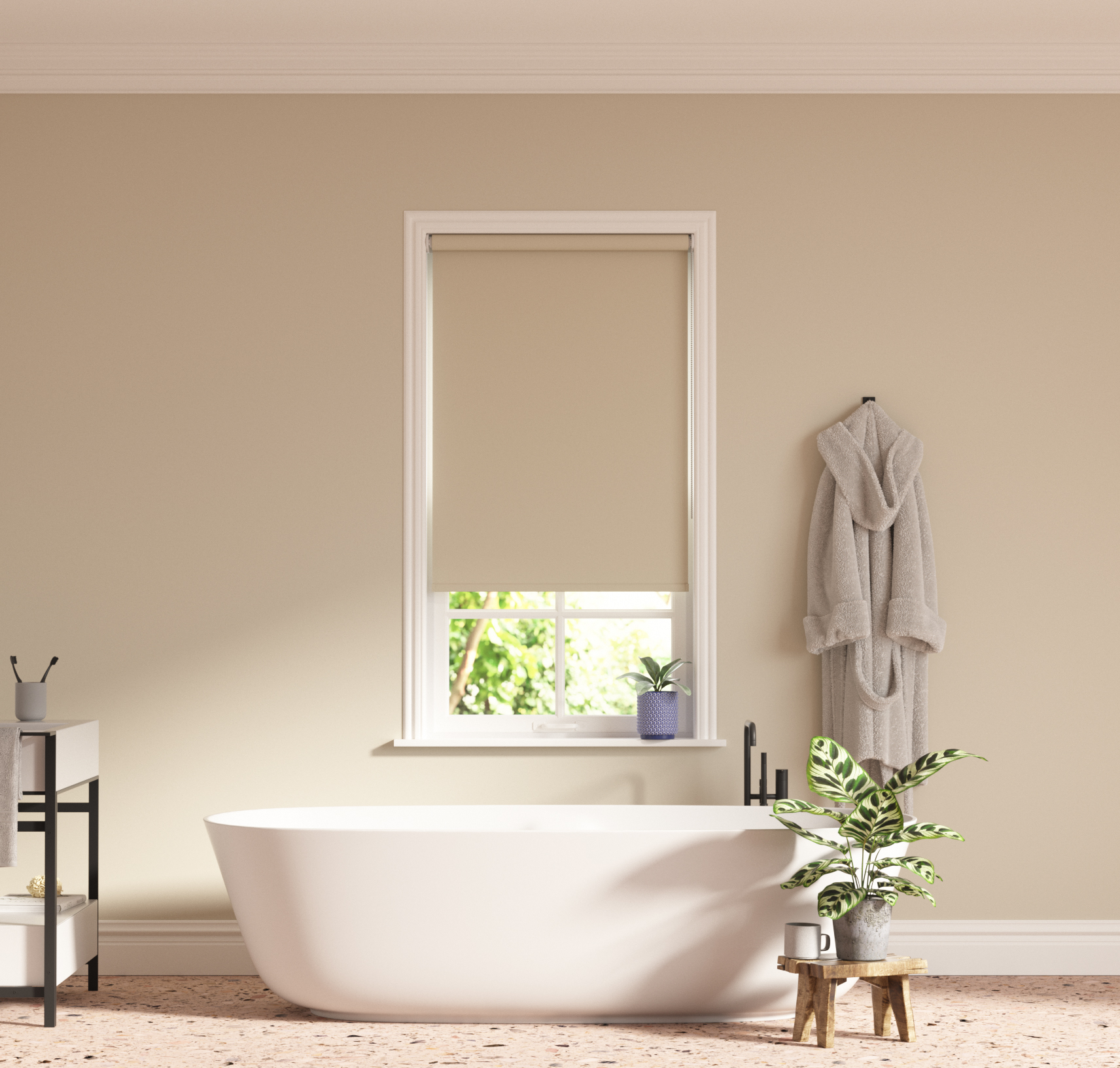
Besides boucle and the soft textures we often associate with greige living rooms, you could try using it in rooms with harder, glossier surfaces, such as kitchens or bathrooms.
According to Adriana, pairing greige with hard finishes such as stone floors or glossy marble countertops will offer an injection of soft warmth that those heavy materials lack. 'Greige tends to be the perfect partner as a paint tone or in hard finishes,' she says. 'You immediately feel serene and happy in a space with this light tone, and yet you feel that a significant amount of thought and work have gone into its simplicity.'
A lot of this comes down to the way Greige casts light around a room. Choose a warmer greige that falls harder on the beige end of the scale if you want a warmer light and a cooler grey tone for a fresher feel. If you're struggling to decide, opt for a perfect greige that falls flat in the middle. 'I love Elephant’s Breath - the quintessential greige - from Farrow & Ball, the best greige paint for an all-rounder,' says Adriana.
2. Group color families together
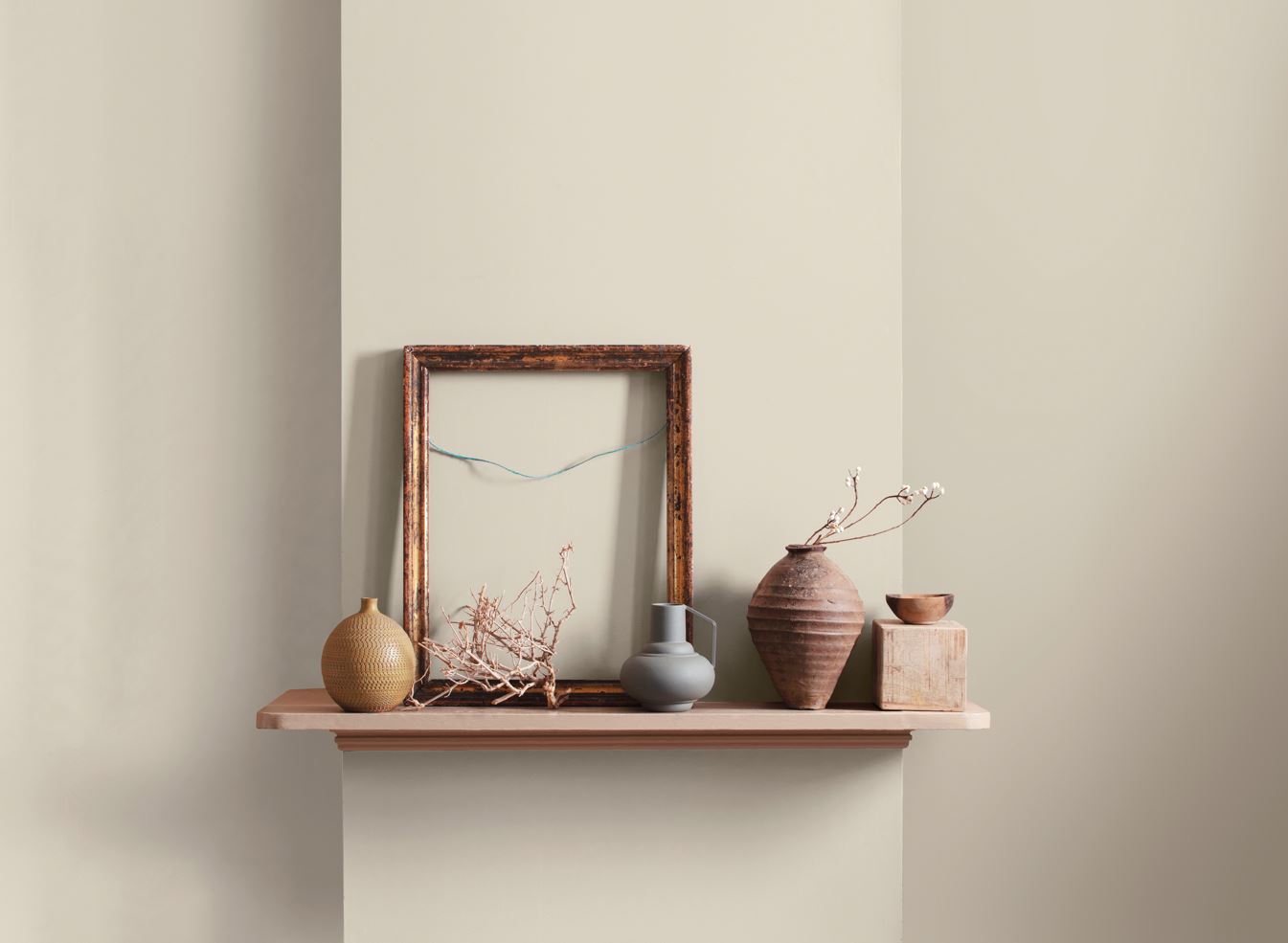
One of the advantages of greige is its versatility, but when incorporating it into a wider color palette, Helen emphasizes the importance of considering color families.
'Combine warm greys (such as greige) with reds and oranges, and cooler greige hues with blues and mauves,' she says. You can also use these color schemes to lean into particular decor ideas. 'Pair with pale pink and crisp white to create a smart Scandi decor style interior scheme,' suggests Hannah. You could also use warmer greiges alongside deep browns and rich purples for a quiet luxury vibe.
3. Incorporate into more traditional design styles
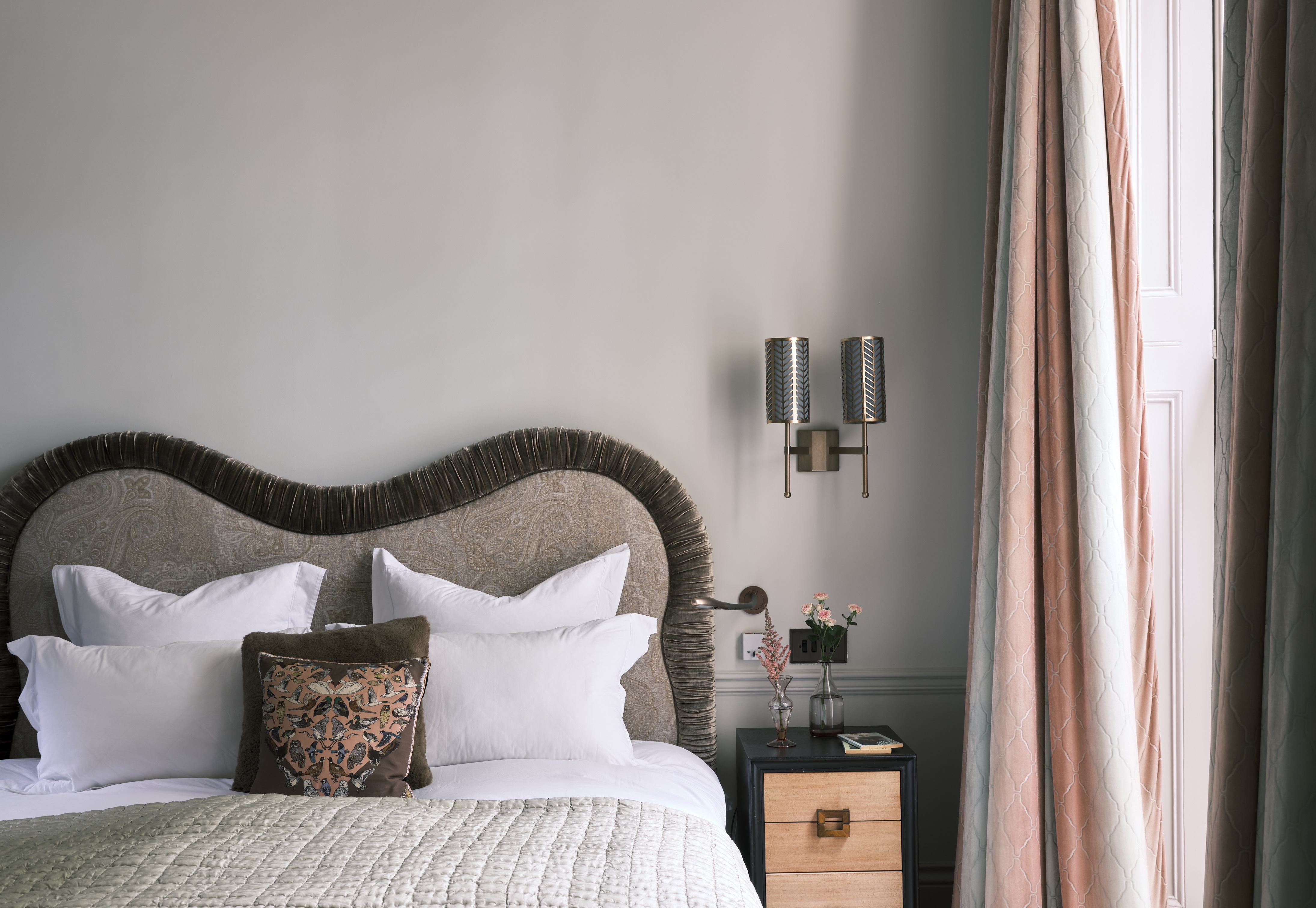
In a similar vein, greige doesn't have to be used in modern interior design styles only. 'People tend to associate greige with more contemporary designs, especially combined with white plaster and boucle furniture,' says Adriana. 'Interestingly though, I have used it with more traditional designs inspired by the 30s, 40s, and 50s.'
Being a subtle neutral, Adriana suggests letting greige shine when there are already strong architectural or design features that make the room sing so that greige walls can act as the perfect backdrop. 'My favorite was combining it in a series of cabinets we made for a hotel project where the lines were inspired by Willy Rizzo, Jean Royere, and Eileen Gray,' she says. 'The greige tones were an anchor that tied everything together.'
4. Pair with other neutrals or browns
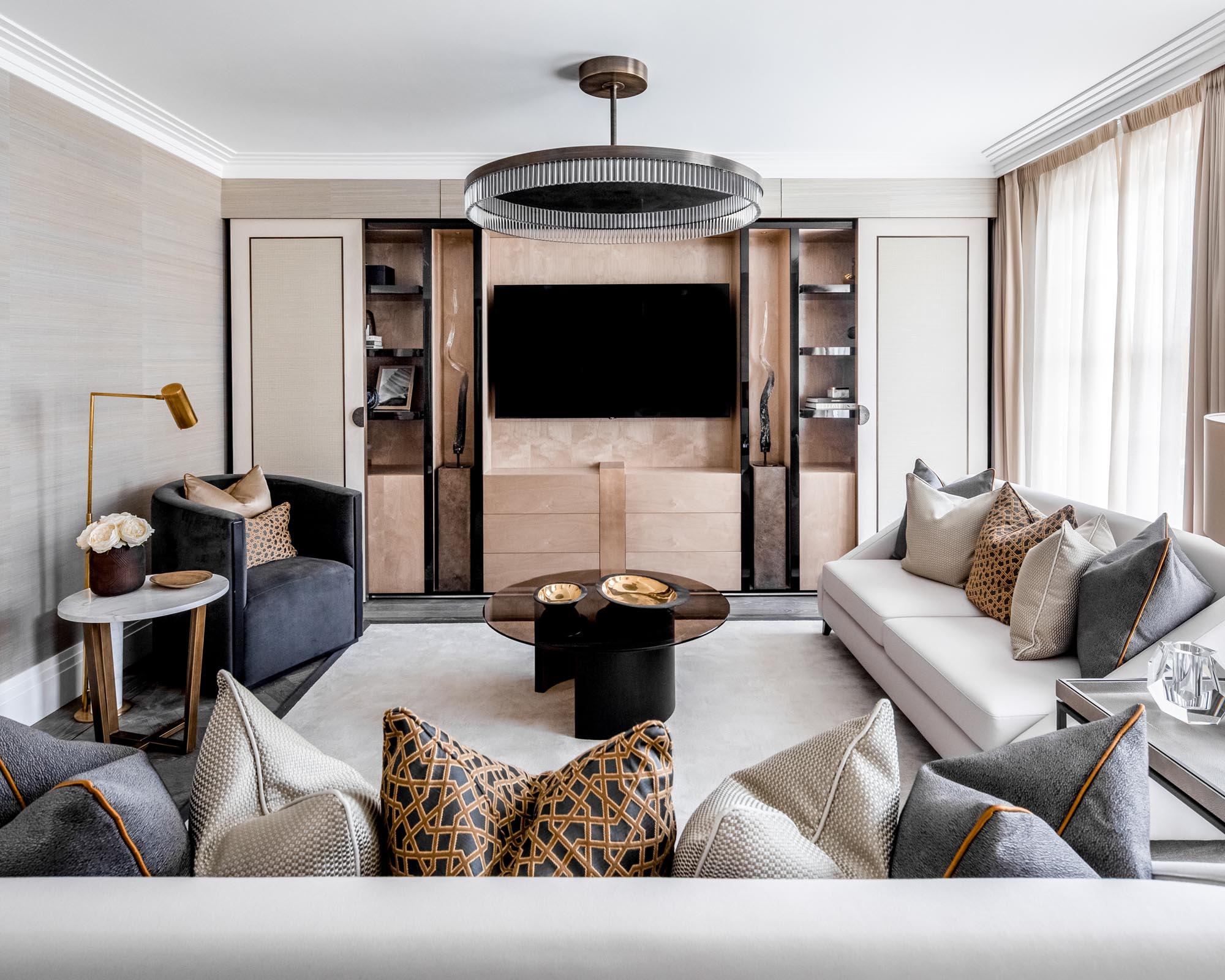
As mentioned earlier, greige makes a beautiful pairing with other neutrals and brown tones. 'I love pairing greige with other neutrals - grey, white, black, and every shade in between - for a contemporary, often more masculine feel,' says Adriana. 'For a warmer application, I enjoy combining it with rich browns and caramel tones – this is probably my favorite.'
This tonal approach can help add depth and dimension to a room, as seen in the living room pictured above. Don't be afraid to mix in different textures and textiles through pillows, throws, ceramic vases, and other decor items, too. 'Brochier makes a decadent mink-colored velvet that I love using with Greige,' Adriana adds.
5. Remember to consider your room's natural lighting

Last but not least, it's crucial you consider the natural lighting of your space before taking greige to the walls. 'As with every part of the color spectrum, greige colors are influenced by light, and it's always important to try a color in your space before taking the plunge,' says Helen. 'Greiges on the green-grey end of the scale may read cool in a north-facing room, yet be perfectly balanced in a south or east-facing room.'


