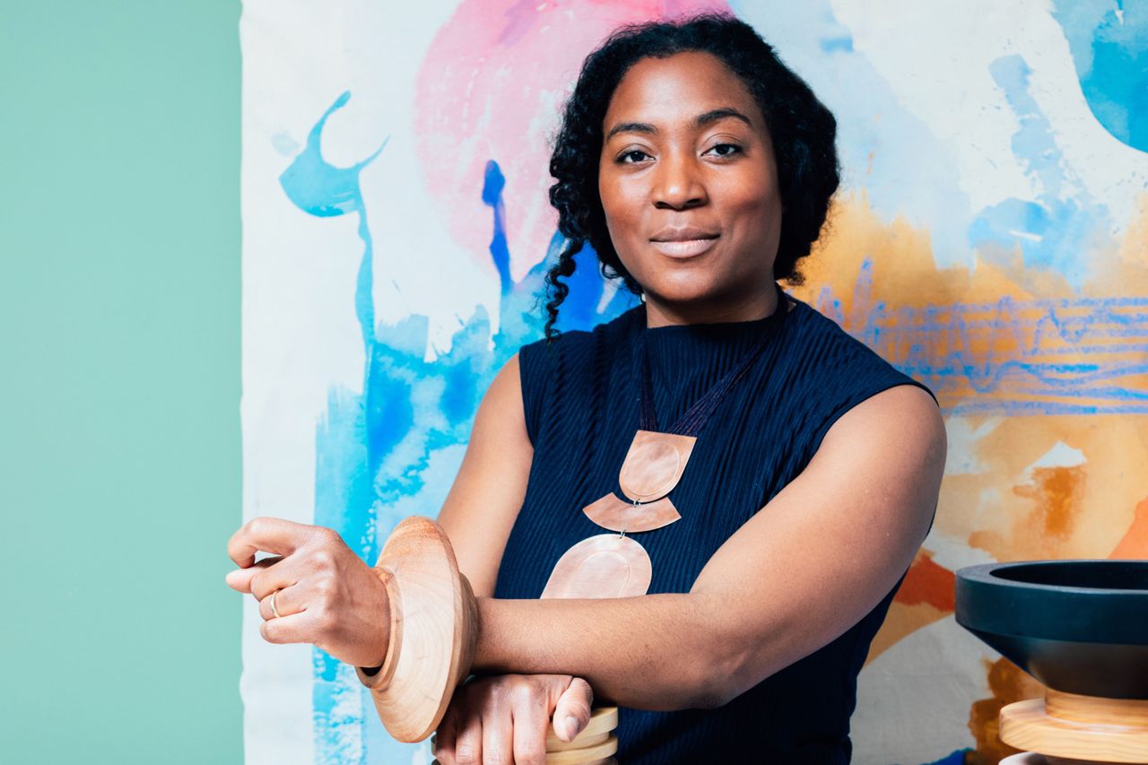
Some people find the idea of decorating with vivid, primary colors absolutely intimidating. But for artist and designer Simone Brewster, no project starts without having a striking palette ready to manifest across her boldly sculptural furniture, jewelry, and canvases. In many ways, it feels as if her three-dimensional creations wouldn't even exist were it not for the swathes of pigments that define their silhouettes. And so, who better than Brewster herself can make a case for interiors that start and end with a predetermined color scheme?
Whether applied to the canvas over instinctual brush strokes celebrating the essence of Black womanhood, relied on to emphasize or break down the different segments of her sinuous wooden sculptures, or applied in block to the ceremonial passageways that punctuate many of her walk-through public artworks, color is a constant and comforting presence in the burgeoning designer's work. One that, however, Brewster doesn't want us to take at face value.
Below, she tells us about how approaching color "architecturally rather than decoratively" could help you get the most out of the spaces we inhabit by leveraging the emotional side of its materiality.
"Something I have been thinking a lot about recently is the value that comes from bold, expressive color in interiors. For me, color isn't simply decorative; it's emotional and spatial. It may take confidence to embrace it, but color has the unique ability to shape how we feel within a room and how we relate to the objects within it.
"In my own work, color is often the starting point. My paintings explore the female form through layered washes and gestural brushstrokes, and the palettes I develop there often migrate into my design work.
"Those color relationships — deep blues, rich greens, ochres, terracottas — become part of a wider visual language that moves between painting, furniture, and installation. It's a way of creating continuity across disciplines.
"At the moment, there's still a tendency in interiors toward neutral, restrained color palettes — the safe beige or greige sanctuary. While there's nothing inherently wrong with that, I think it can sometimes limit how expressive a space can be. Color has the power to bring life, energy, and personality into a room. It can create rhythm and contrast, or it can unify different elements within a scheme.
"One way to approach bold color is to think about it architecturally rather than decoratively. Instead of using color only in small accents, consider how it can shape the entire atmosphere of a space. Color drenching — using a single strong color across walls, ceilings, and architectural details — can create a really immersive environment.
"I've done this in my own home: my bedroom is fully drenched in a deep, dark blue, which creates a calm but enveloping space, while other rooms use combinations like Yves Klein blue and soft pink, or ochre and terracotta.
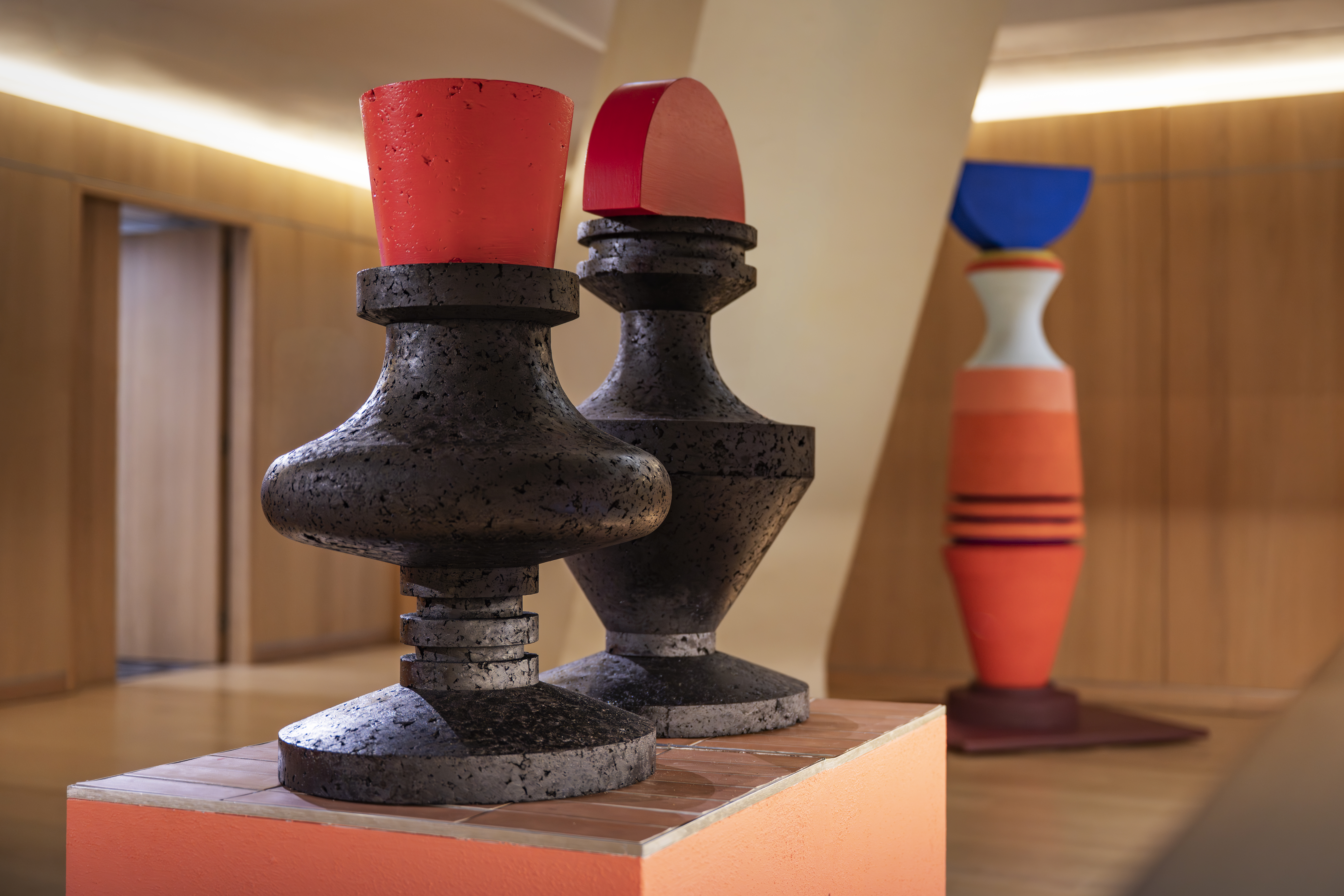
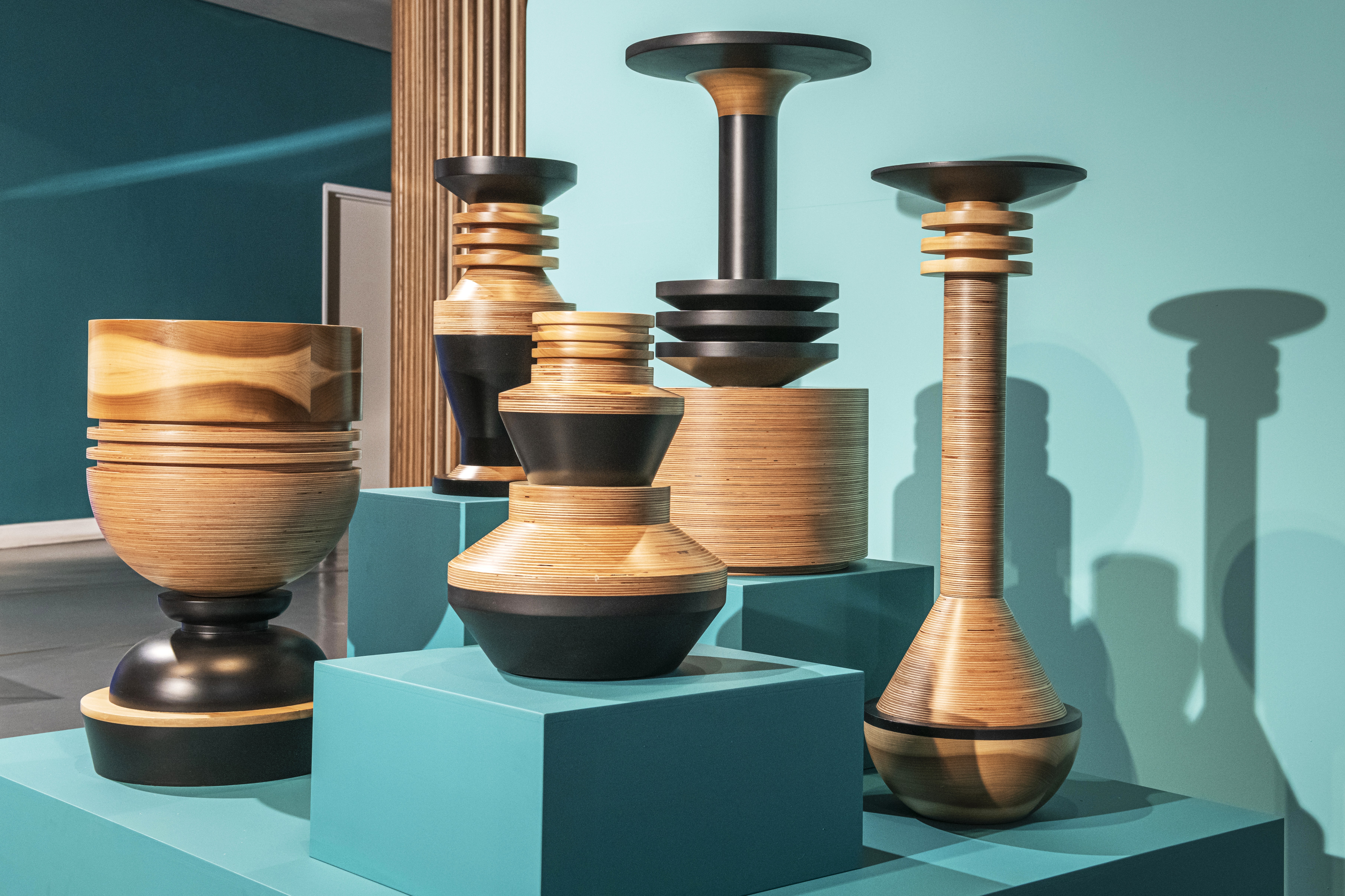
"In my furniture design work, color often begins in painting. The palette used in my series Woman in Parts, for example, later informed the colors of the Strata plant pot collection.
"Painting allows me to experiment freely with colour relationships before they move into three-dimensional objects. That process gives me the confidence to be braver with color in design projects, including exhibitions such as Spirit of Place.
"For readers thinking about their own interiors, my advice would be to treat color as a material in its own right. Consider how it interacts with light, texture, and form. Don't be afraid of depth — darker or more saturated colors can often create spaces that feel more intimate and layered than pale neutrals.
"Ultimately, color is about connection. It's one of the most immediate ways a space can communicate with us emotionally. When used with intention and confidence, it can transform a room from something simply functional into something that feels alive and deeply personal."
Absorb the beauty of Simone Brewster's sculptural creative world with this newly published monograph dedicated to her Design Museum PLATFORM show (complete with her autograph).
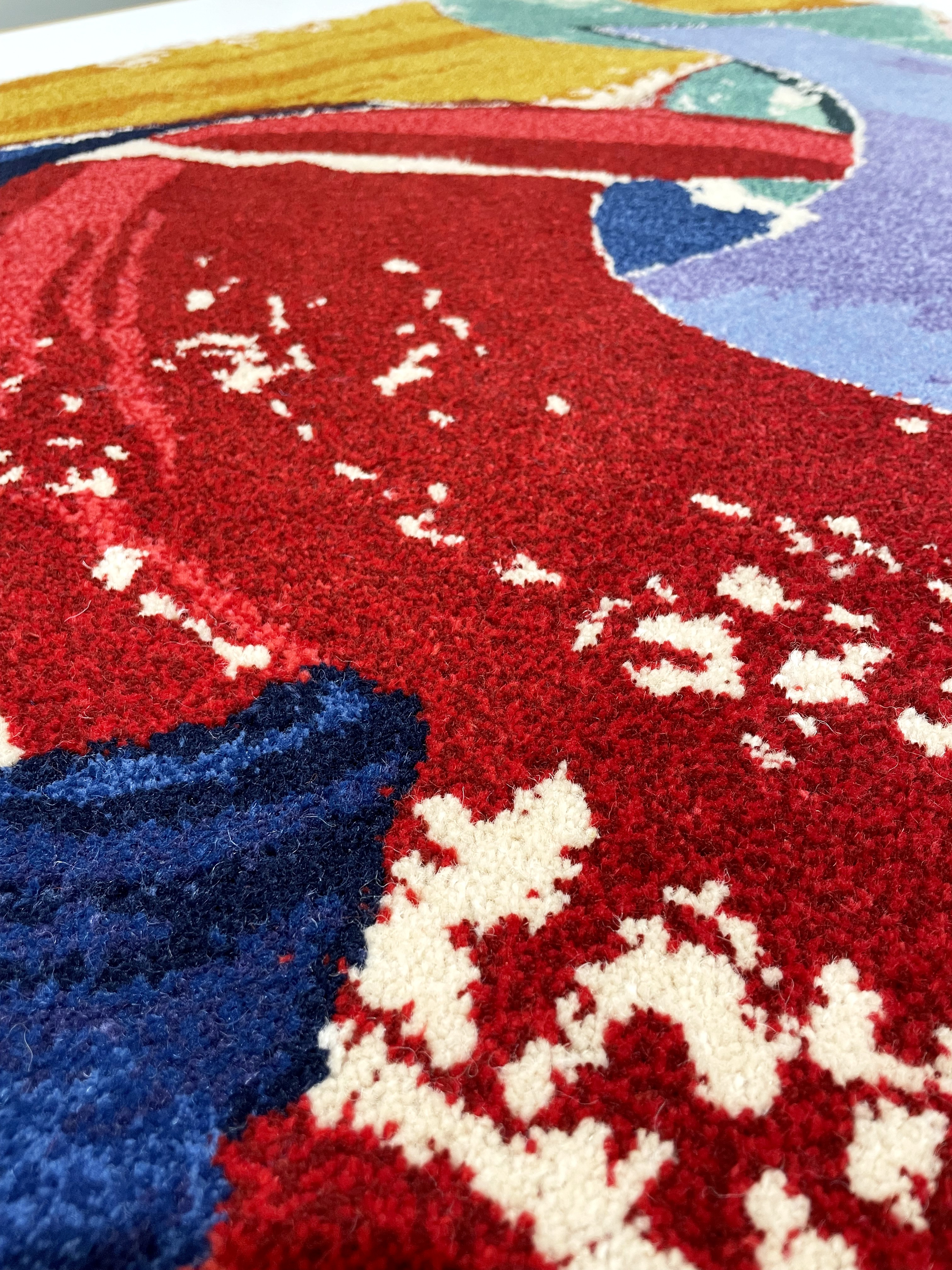
We told you Brewster takes her color... bold, but in case you still had any doubts about it, the Ripple Rug captured above will solve it all. And how good does it look combined with those red chairs in another primary color?
The styling of this Ripple Runner by the artist and designer takes her love of color drenching to the next level, proving that there is nothing wrong with more extravagant choices of color.
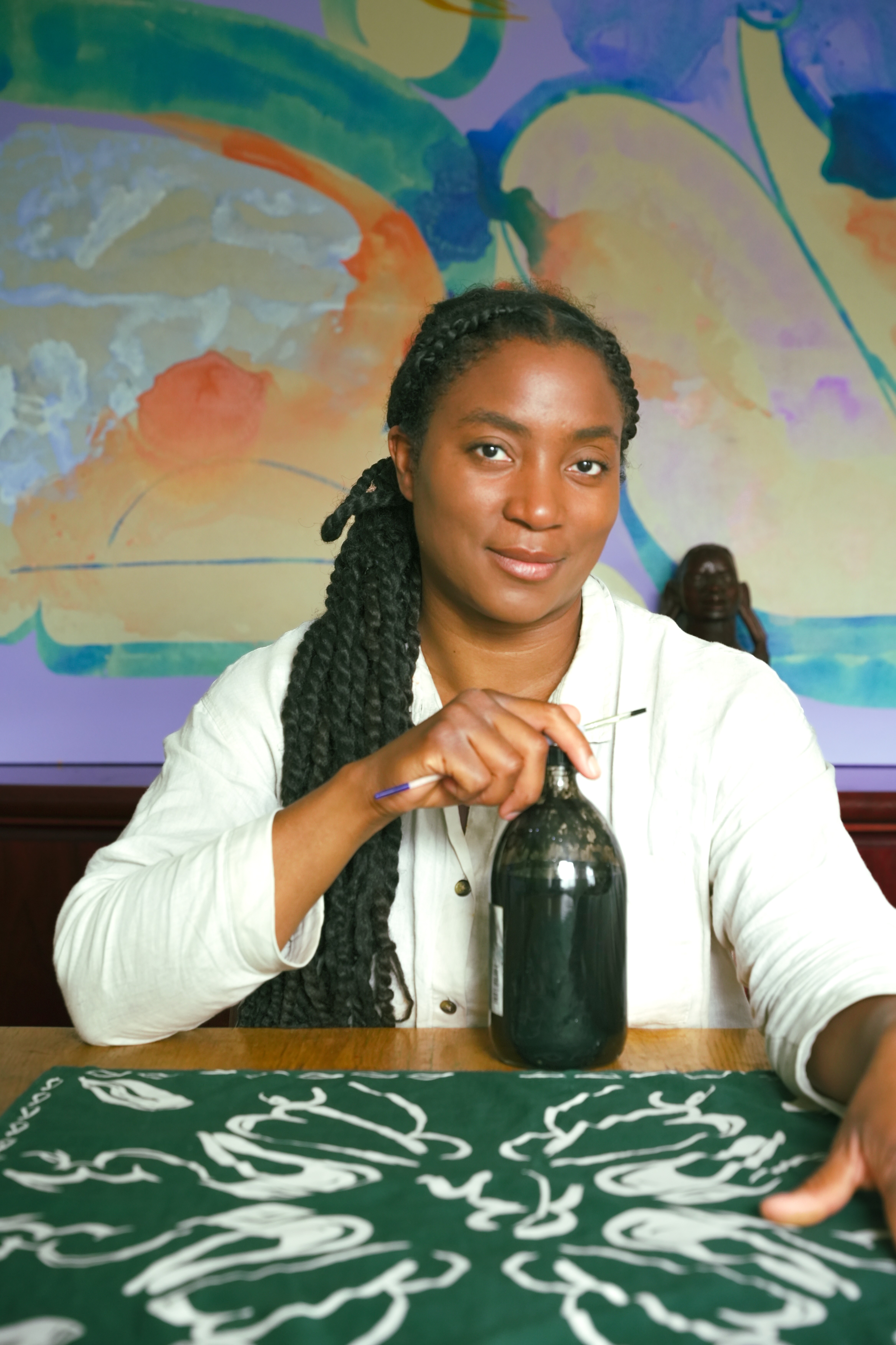
Brewster's ability to seamlessly straddle multiple media at once, marrying present and past, aesthetics and function in her craft, hasn't gone unnoticed. Just last month, her timeless furniture, jewelry, and fascinating totemic works, each of which carries ancestral stories, rituals, and artisanal knowledge forward, landed in the second iteration of the Design Museum's PLATFORM (through January 2027), an ongoing exhibition series spotlighting the work of designers who are reshaping the creative landscape from within.
Debuted last year with a selection of speckled, uplifting designs by Bethan Laura Wood, this solo showcase marks the first time Brewster's pieces take center stage in a museum. The event sees her introduce Negrita, a minimally maximalist bench carved from ebonized tulipwood, with radically different and slightly tongue-in-cheek shapes for legs, and a sound piece referencing the domestic, spiritual, and natural places that define her process, presented alongside her color-blocked forms, paintings, and more.
When facing a home renovation, people tend to look at a full architectural and interior makeover as the only way to bring fresh flair into their domestic space. Textile designer Mia Sylvia's densely draped work shows us the power of fabric by capturing how textiles can be used to completely transform the look and feel of your house. Become part of our newsletter community for round-the-clock style advice and inspiration delivered straight to your inbox.