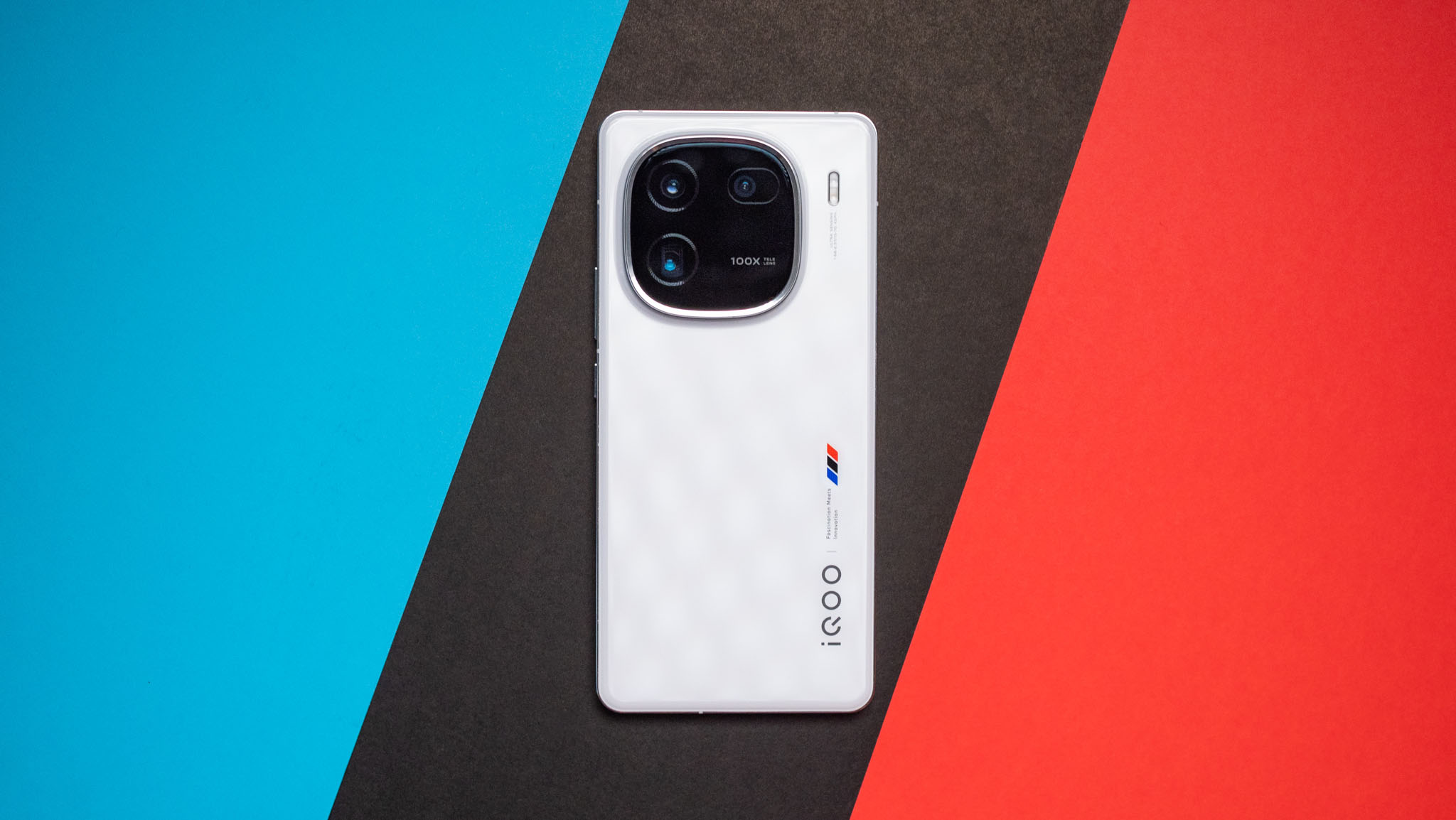
I generally like what Vivo does with the iQOO sub-brand. It has consistently delivered gorgeous designs, powerful hardware, and decent cameras, and the best part is the value; iQOO phones have always been among the most affordable to feature Qualcomm's latest silicon.
That's still the case as we head into 2024. The iQOO 12 is the first device I'm using that features the Snapdragon 8 Gen 3, and it retains the brand's long-standing collaboration with BMW's M division, leading to a striking design. The phone has plenty of upgrades across the board — including a 3x telephoto with OIS and 50MP wide-angle lens — and you get Android 14 out of the box.
That focus on value hasn't changed either; coming in at just $660, the iQOO 12 significantly undercuts its immediate rivals, and I don't think we'll see another Snapdragon 8 Gen 3-toting device for this low. So if you're due for an upgrade and want the latest hardware and camera tech, here's why you should consider the iQOO 12.
iQOO 12: Specs, price, and release date
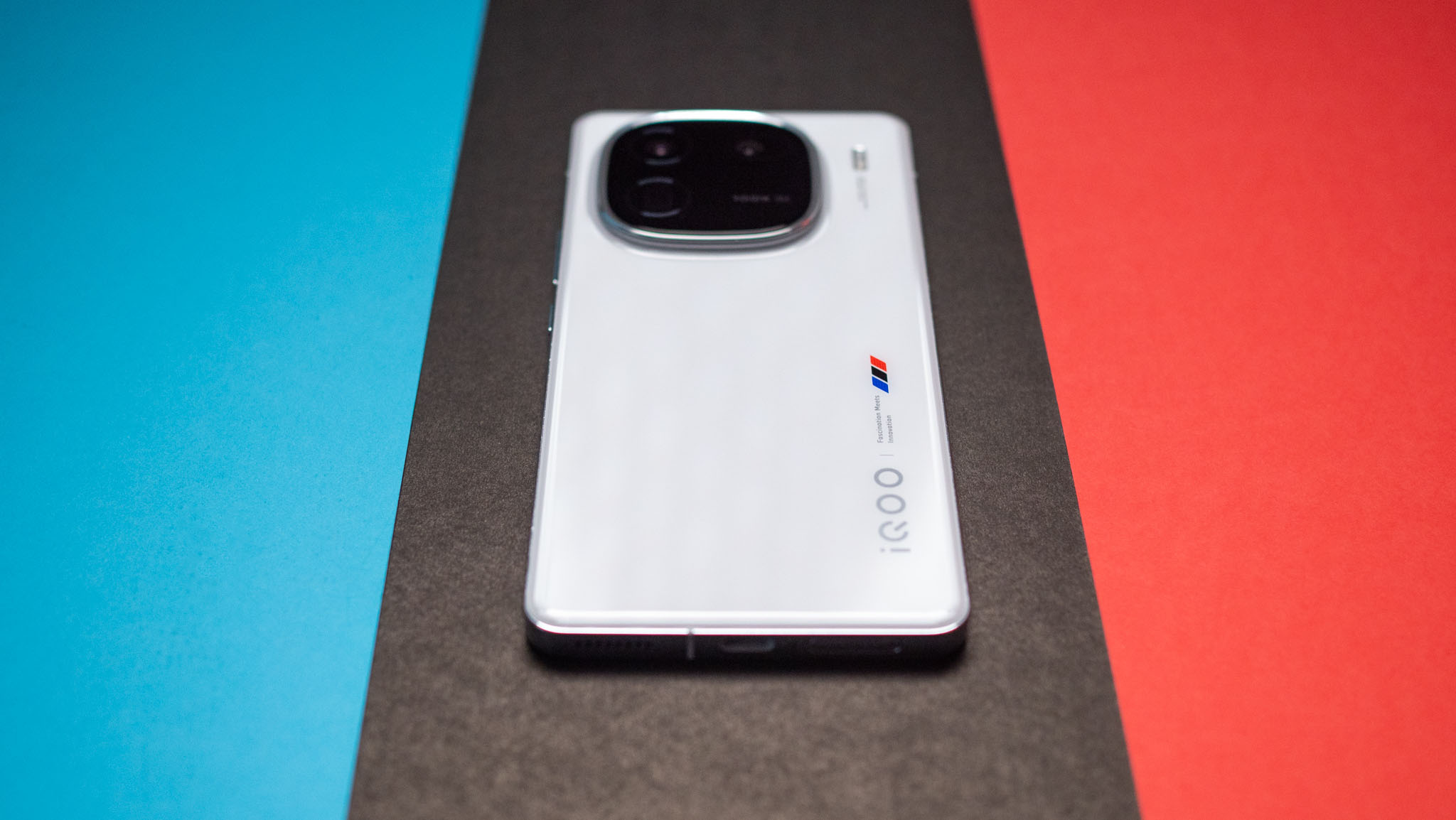
The iQOO 12 was unveiled in China on November 7, and the phone made its debut in global markets on December 6. The phone is now available in Thailand, Malaysia, and Indonesia, and launched in India on December 12. It costs the equivalent of $660 in most Southeast Asian markets.
In India, there are two versions on offer: the 12GB/256GB model is estimated to retail at ₹52,999 ($635), and the 16GB/512GB version is available for ₹57,999 ($695). That's less than what the iQOO 11 launched at last year, and given the upgrades on offer, it makes the iQOO 12 a downright bargain.
As there isn't much differentiating either model, I'd suggest picking up the 16GB/512GB model if you're eyeing the iQOO 12. It is a fantastic value, and while the likes of the OnePlus 12 and Xiaomi 14 haven't made their way to India just yet, I doubt they will be anywhere as affordable — particularly considering all the upgrades they're rocking this year.
Like previous years, global availability is going to be restricted to select regions in Asia, and while the device would clearly find an audience in countries like the U.K. and Germany, it doesn't look like Vivo is ready to bring its latest value flagship to that part of the world yet.
iQOO 12: Design
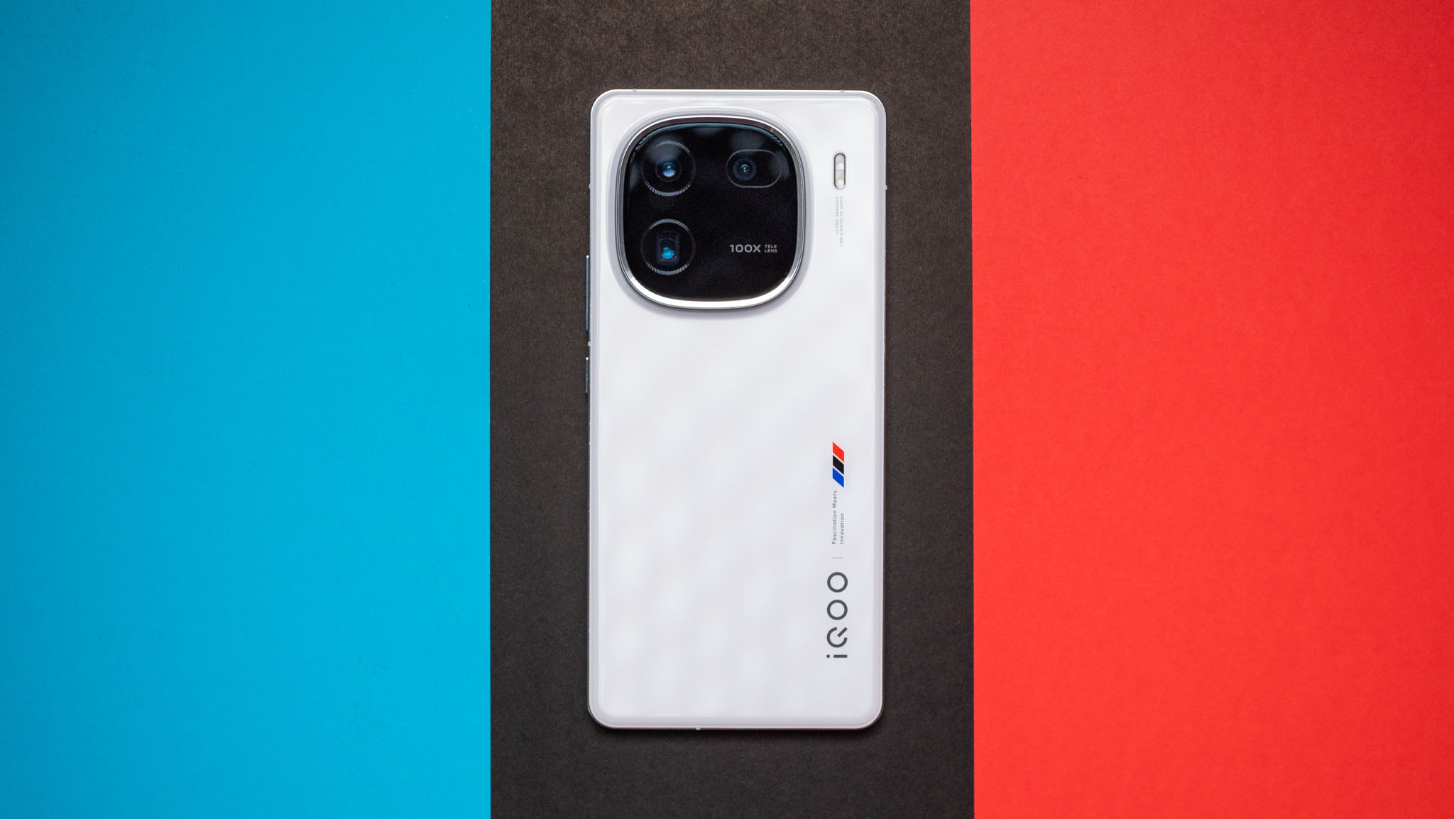
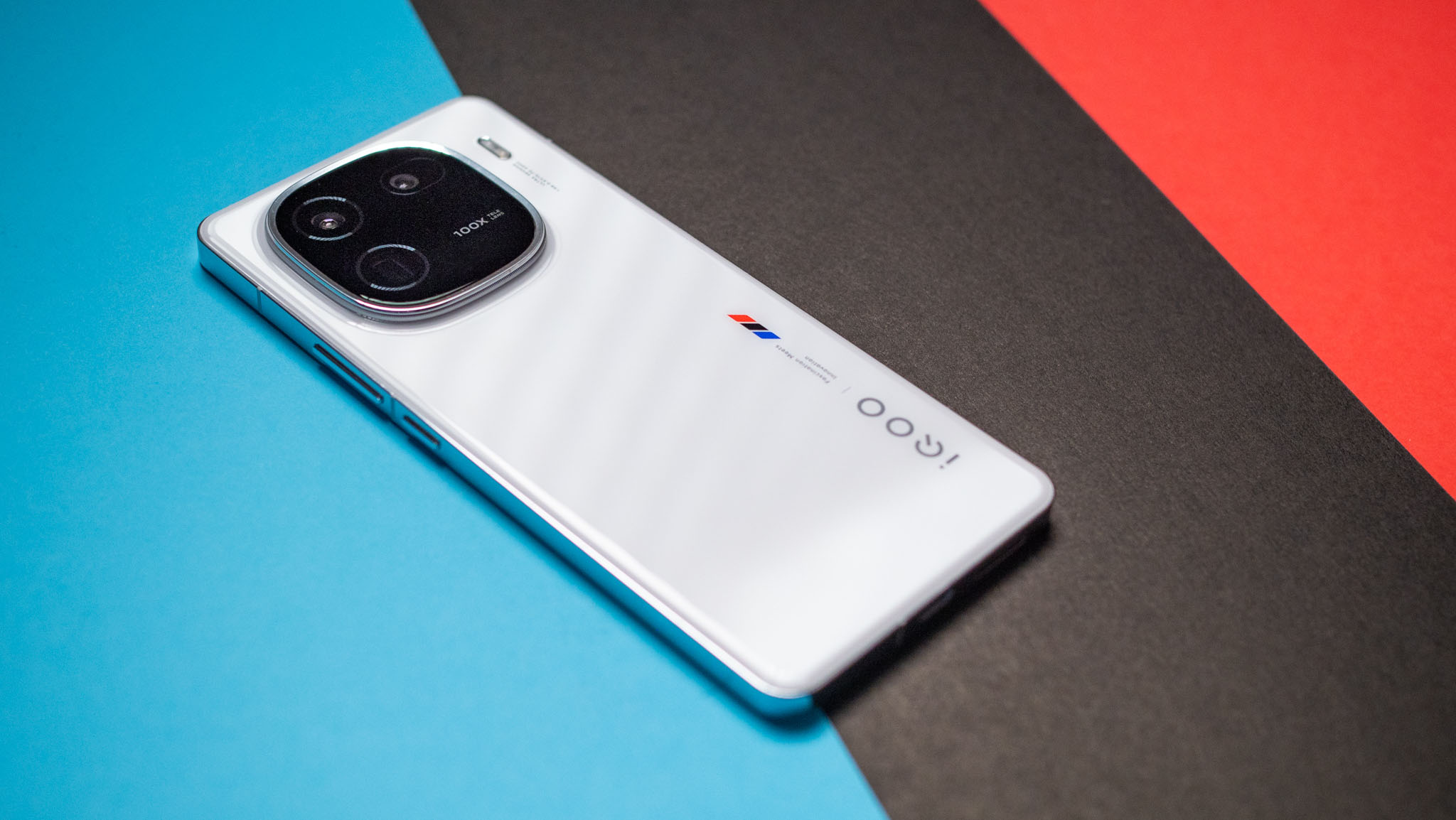
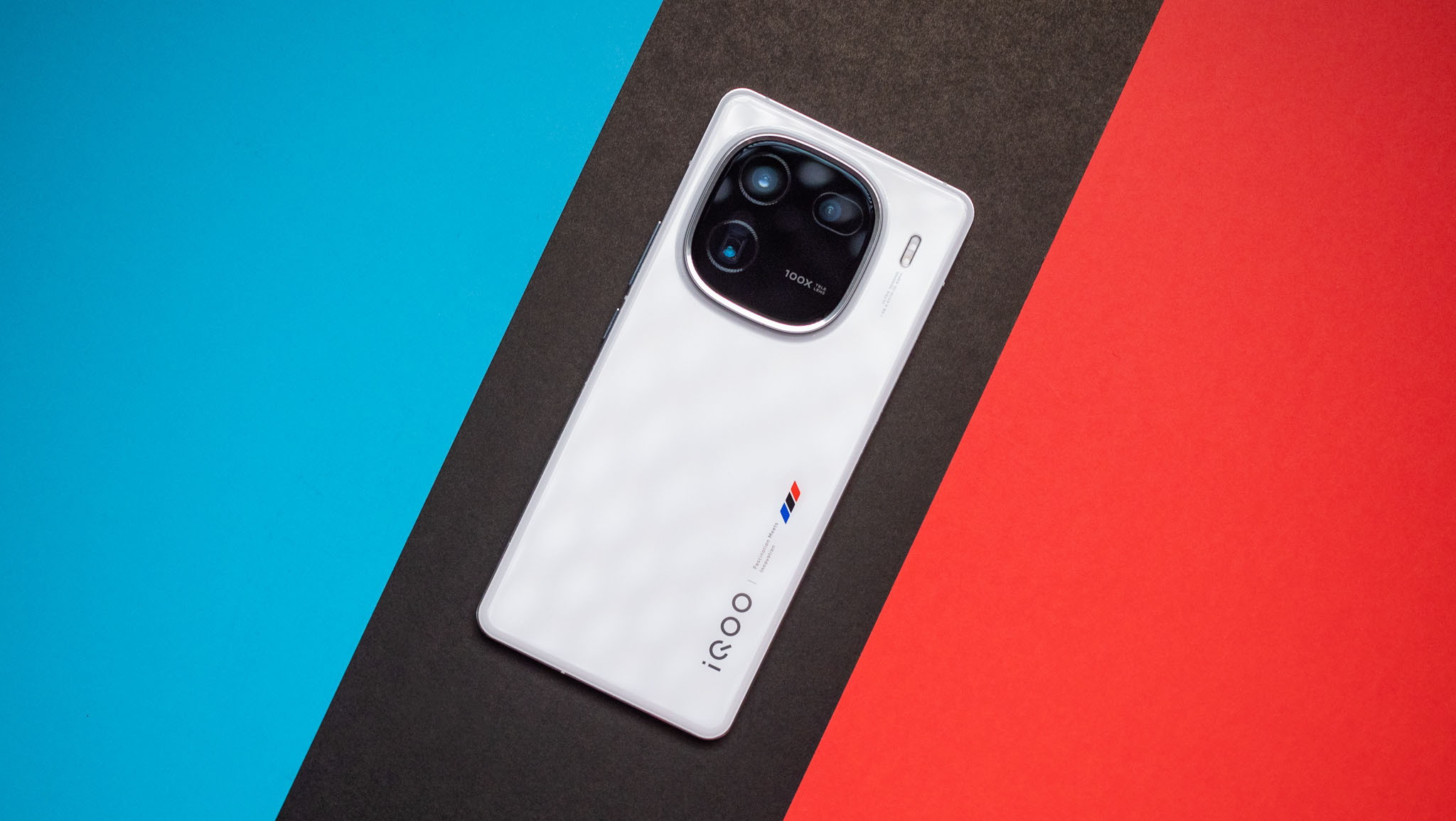
Vivo overhauled the design of the iQOO 12, and while you still get the BMW M branding, it's limited to the logo at the bottom and a tiny tri-color pattern next to it. The back of the phone is a lot cleaner as a result, and it looks much more upmarket than its predecessors. You don't get a textured leather back either, with the iQOO 12 instead offering an enamel glass made up of "countless three-dimensional pyramid nano-optical textures" — think of it as a middle ground between a fully glossy and a matte finish.
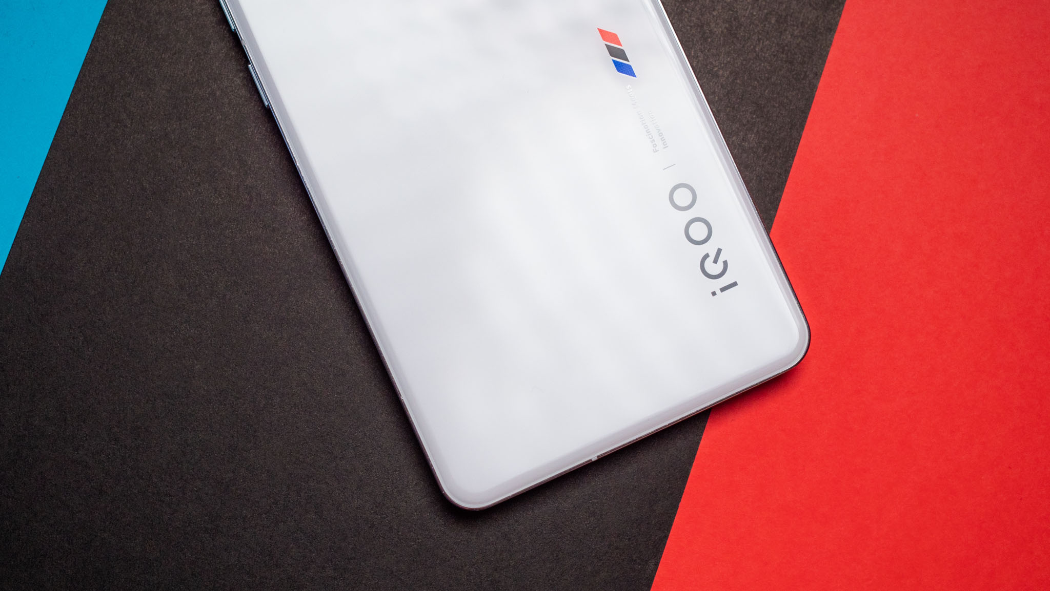
The texture makes holding and using the phone a little easier, and it prevents smudges from showing up against the white back. Another change at the back is the introduction of a "porthole" design for the rear camera module, and the larger housing along with the steel ring encircling it gives the phone a lot of character. The size of the camera housing means the phone doesn't wobble when it's on a flat surface.
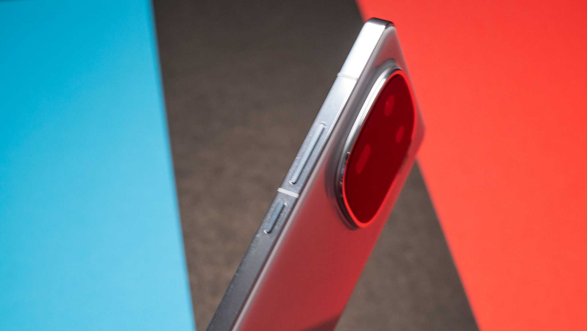
But the biggest design change is the switch to flat sides — the iQOO 12 doesn't have smoothly flowing curves from the back to the mid-frame. That said, you still get beveled edges that make the device easy to use, and thanks to the added width on the sides with the aluminum mid-frame, the device is much more comfortable than the iQOO 11.
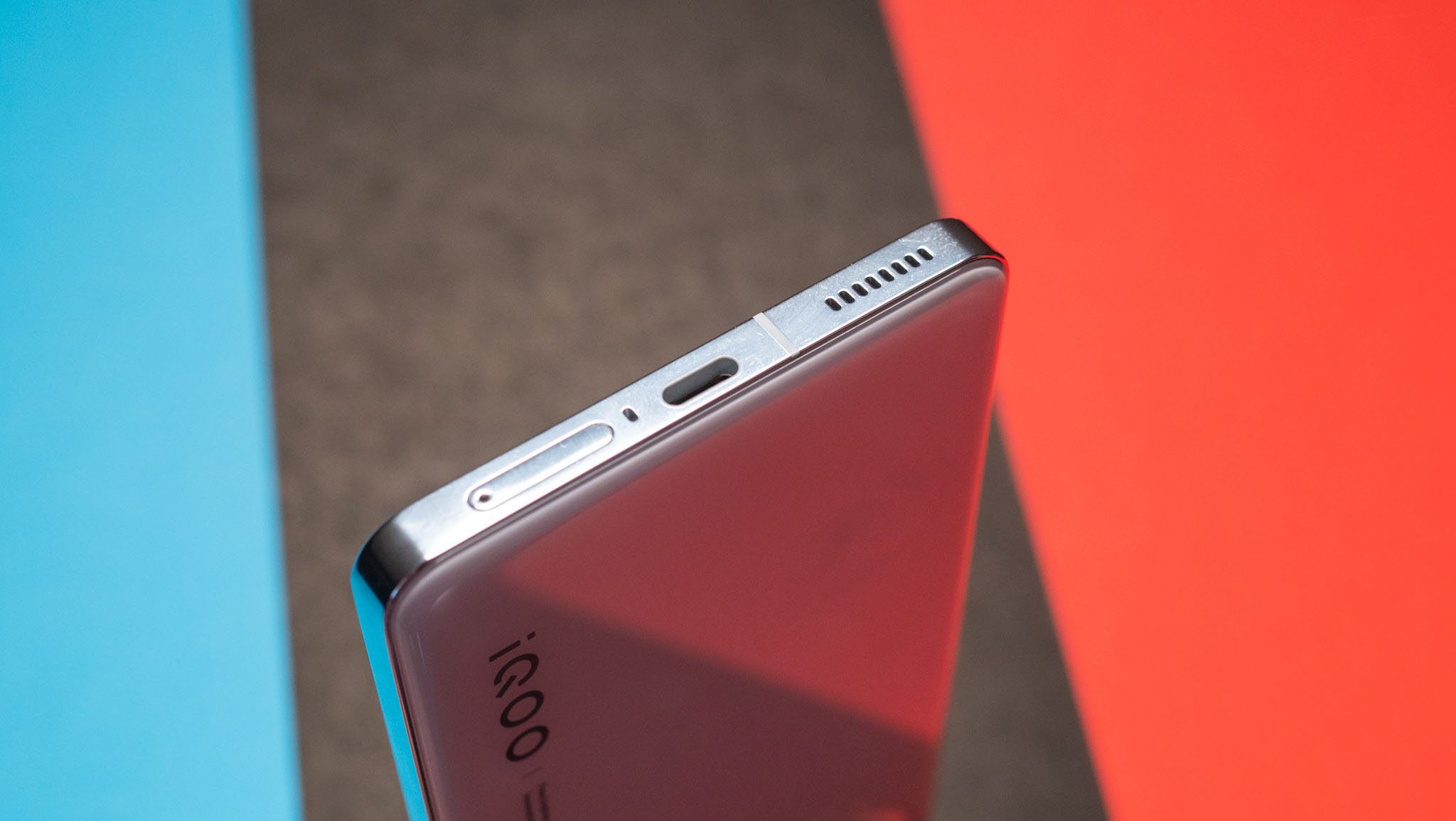
The right houses the power and volume buttons, and you get the SIM card tray and USB-C charging port at the bottom. There's an IR blaster up top along with a secondary mic, and the phone has IP64 ingress protection. That's not quite on par with the IP68 rating that's a mainstay on flagships, but it is a far sight better than what we got last year.
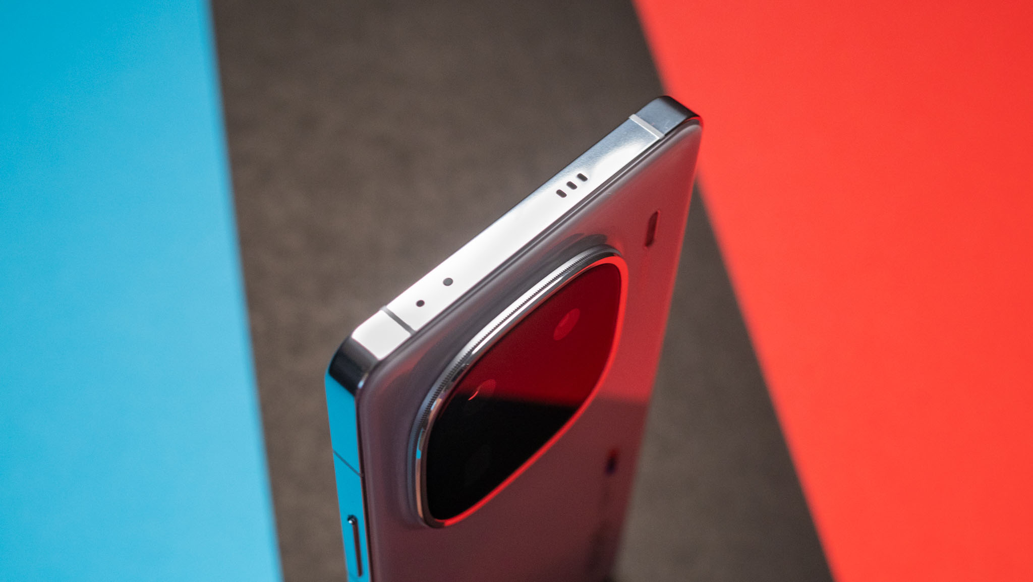
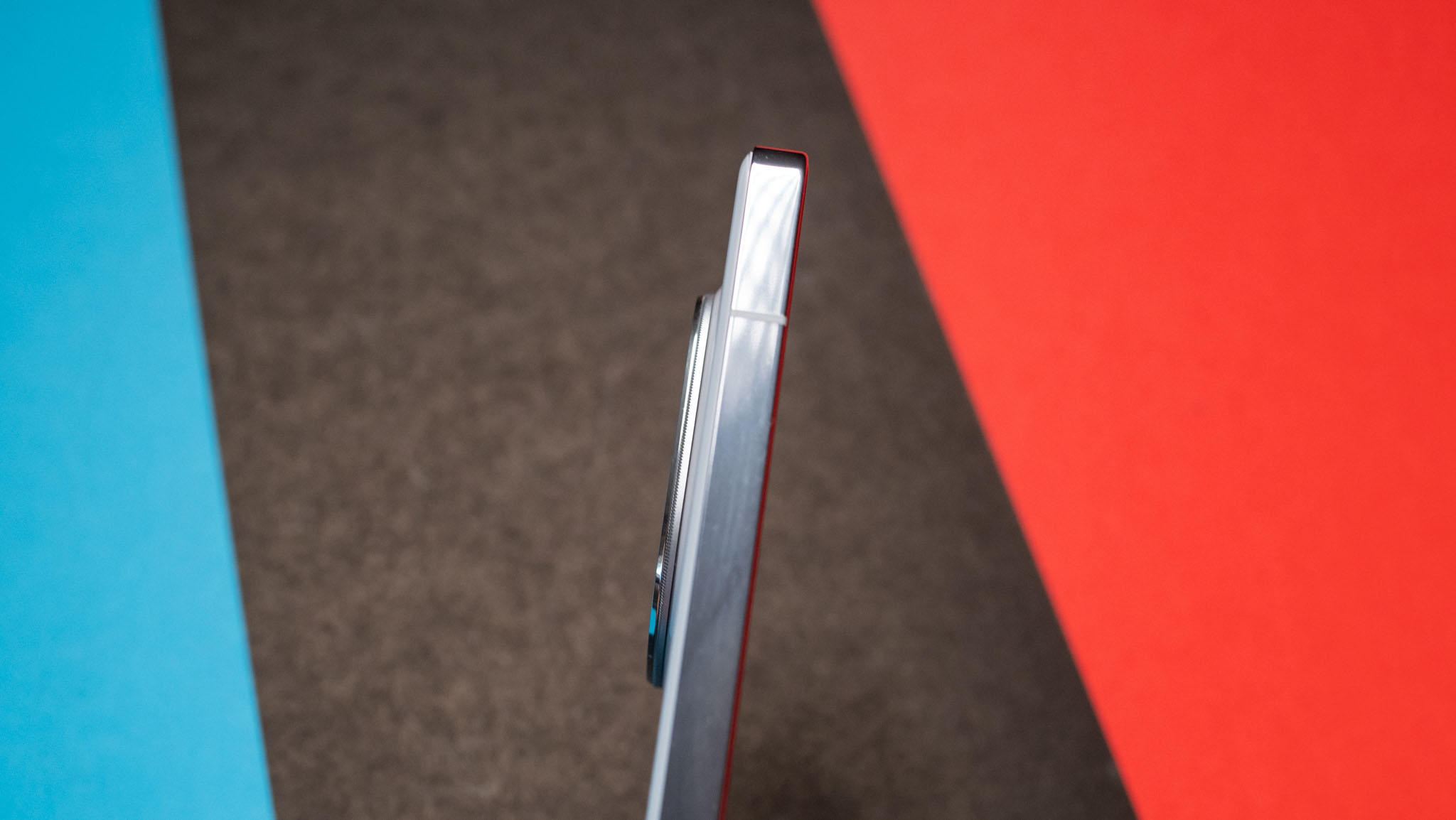
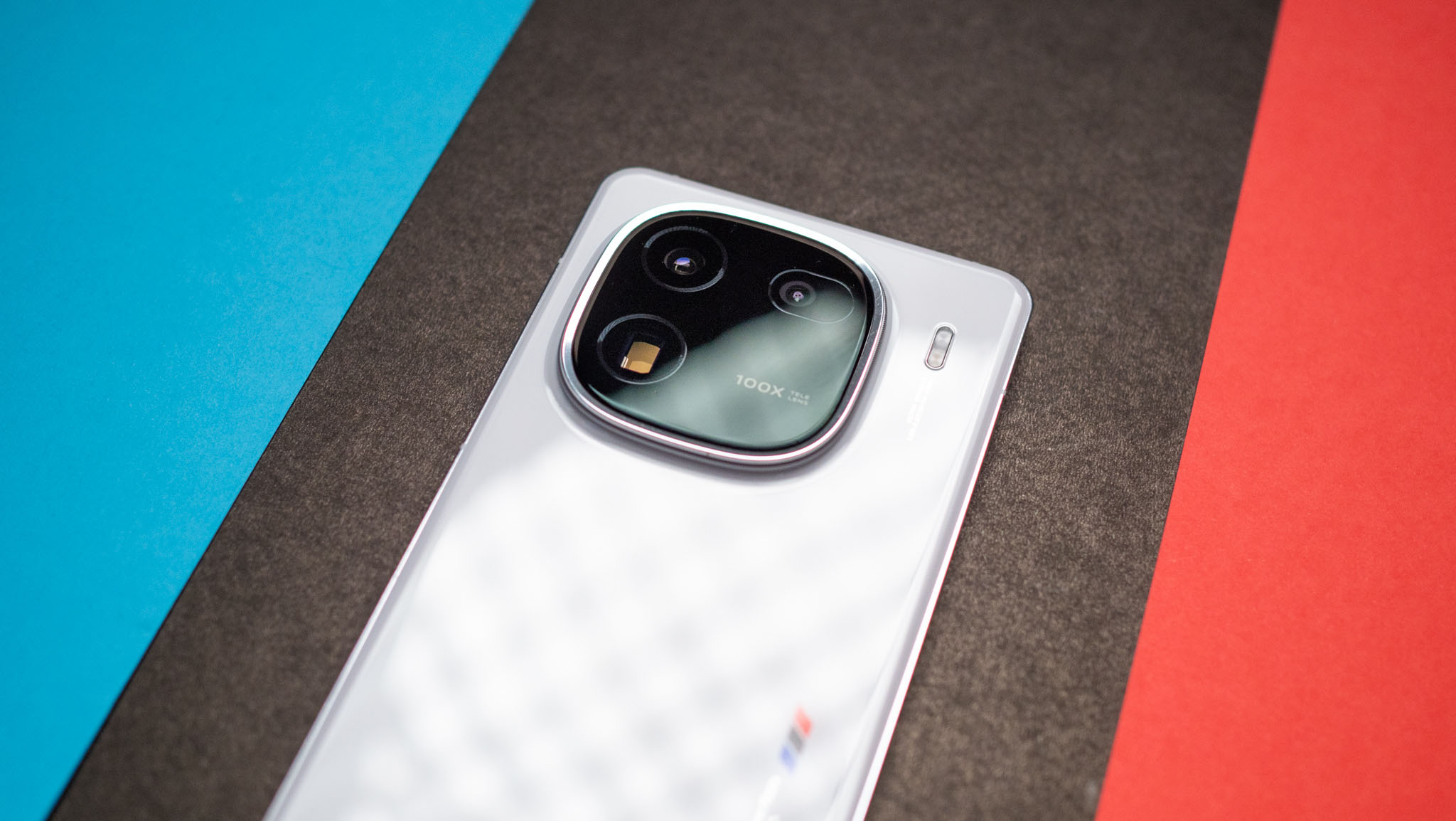
The use of steel on the sides adds to the device's premium credentials, and Vivo deserves credit for the way it evolved the design — the iQOO 12 feels like a mature phone, and it looks just as good as phones that cost a lot more.
iQOO 12: Display
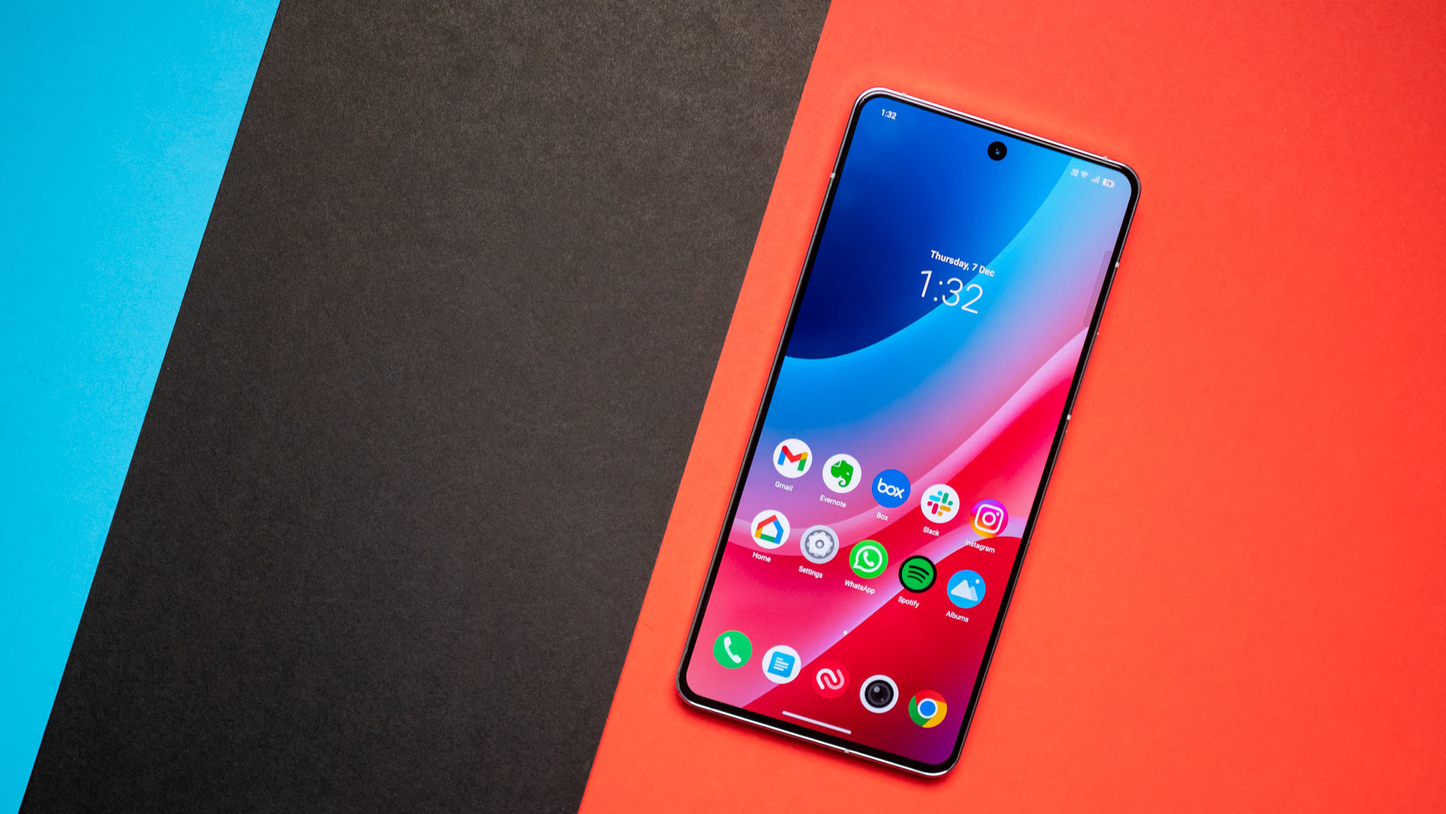
The iQOO 12 retains the same 6.78-inch screen size as its predecessor, but it is using a brand-new AMOLED panel. The key highlight of the screen is that it is able to hit 3000 nits of peak brightness, a sizeable achievement. It can manage 1400 nits in daily use, and you get HDR10+, 144Hz refresh with dynamic refresh that goes down to 1Hz when viewing images.
Color accuracy is excellent out of the box, but if you prefer cooler or warmer hues, you can tweak the settings to your liking. There are three modes available — Standard, Pro, and Bright — and Standard is selected by default. At 2800 x 1260, the screen resolution itself is lower than last year (3200 x 1440), but you don't notice the difference when using both phones side-by-side.
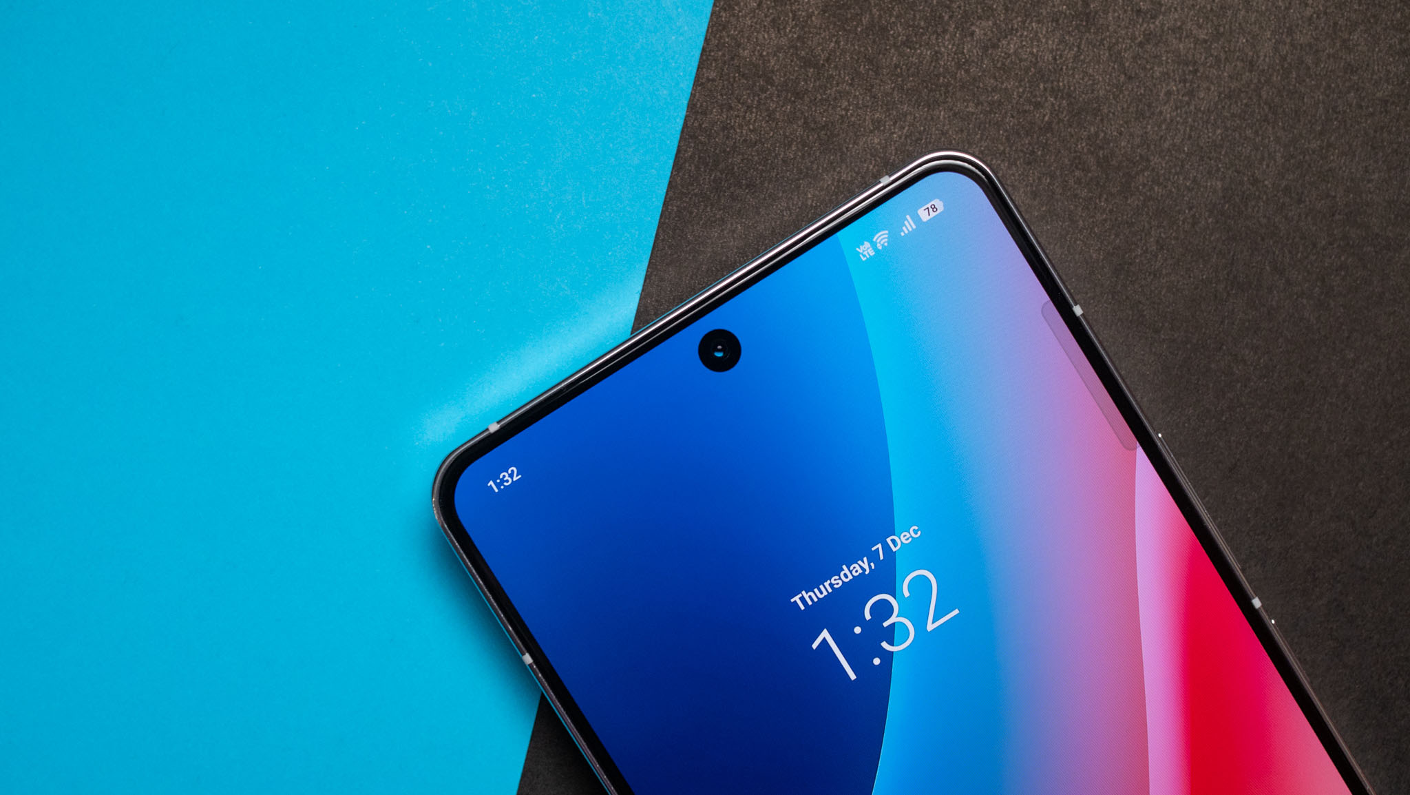
The phone did a great job switching refresh rate dynamically based on the content playing on the screen, and you also get the ability to lock it to 60Hz or 144Hz. You get the usual upscaling effect that's standard on Vivo, OnePlus, and OPPO phones, and there's motion smoothing as well — which makes a difference if you like streaming sports on your phone.

On that note, streaming HDR content on the iQOO 12 is a delight, and the phone does a great job balancing colors and brightness in dynamic scenes. Playing games is similarly fun, and thankfully there's no 60fps limitation — if a game goes up to 144fps, you can unlock its full potential on the iQOO 12.
The onboard sound is pretty good too, and you get clear stereo separation although the second speaker is noticeably smaller. With 2,160Hz PWM, the iQOO 12 is easier on the eyes as well — particularly if you're sensitive to PWM dimming.
iQOO 12: Performance and battery
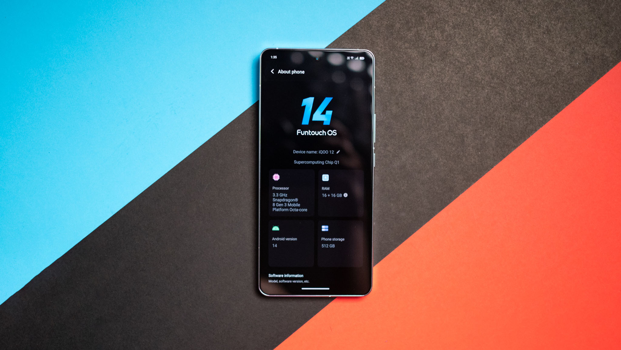
As for the hardware, the key talking point is the fact that the iQOO 12 is powered by the Snapdragon 8 Gen 3. It has a unique 1 + 5 + 2 core configuration, uses all-new Cortex X4, A720, and A520 cores, and the Adreno 750 has considerable upgrades that make a difference while gaming.
The phone is fluid in daily use, and I didn't run into any lag or overheating issues in the week I used it. That said, it doesn't feel quite as well-optimized as the iQOO 11, but this can be easily sorted out with firmware updates — Vivo rolled out two updates with stability fixes in the testing window, so by the time the phone goes out to retail customers, it should be able to take full advantage of the hardware. Regardless, I'll revisit the phone after a month and see if there's any difference.
Outside of that small quibble, there are no issues with the iQOO 12. It has excellent performance in demanding games, and it doesn't throttle easily either, so you get good sustained framerates. In 3DMark's Wild Life Extreme stress test, it had a stability score of 55.9%, and that's just fine. You'll notice the phone getting a bit hot during extended gaming sessions, but it isn't too different to current-gen phones.
There's plenty to like with the rest of the hardware, with the iQOO 12 featuring 12GB of LPDDR5 RAM and 256GB of UFS 4.0 storage on the base model. I'm using the 16GB/512GB version, and it has been faultless in this area. You get the latest connectivity as well, including Wi-Fi 7, Bluetooth 5.4, the AptX Lossless audio codec, NFC, dual-band GPS, and global Sub-6 5G bands.
The vibration motor is pretty good as well, and while it doesn't deliver the same level of granular feedback as true flagships, you only notice that when using the phone next to the likes of the Xiaomi 13 Ultra or iPhone 15 Pro Max.
Now, the only issue I have on the hardware side is the positioning of the in-screen fingerprint module; it once again sits too far down on the screen, making it awkward to access when using the phone one-handed. I have no idea why brands continue to do this; if anyone at Vivo is reading this, move the sensor a little higher next year. That said, the sensor itself is fast to authenticate and reliable in daily use.
Coming to the battery side of things, the iQOO 12 has a 5000mAh battery that easily lasts a day. There's no reason for battery anxiety with this phone, and even on days with heavy use, I didn't see the battery go below 15%. This has largely been the case with most phones I used over the last 15 months, and the only devices where battery life is still an issue are foldables.
And as for charging, you get Vivo's 120W charging tech here, and it takes a smidgen over 28 minutes to fully charge the iQOO 12. It goes to the 50% mark in just over 11 minutes, so if you're running low on charge during the day, it takes just a matter of minutes to get enough power to last several hours. On that note, there's no wireless charging on the device, and that's okay — this isn't a phone you leave charging overnight anyway. And as is the case with all Vivo and iQOO phones, you get the requisite charger in the box.
iQOO 12: Cameras
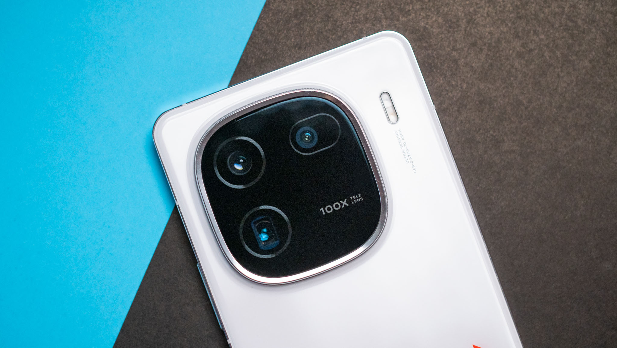
While earlier models in the iQOO numbered series had decent cameras, Vivo isn't messing around with this generation. The iQOO 12 has considerable upgrades on this front, and the phone features a 50MP OmniVision OV50H main camera that has much better light intake and color accuracy, and you get OIS.
It's joined by a 50MP wide-angle lens with autofocus, and there's a 64MP telephoto lens with 3x optical zoom and OIS. The zoom lens doubles as a 3x portrait lens, and you get gorgeous portrait shots. In a similar vein, the wide-angle camera can take macro shots. The front camera is unchanged to last year, and you get the same 16MP module.
The camera interface itself is the same as last year, so if you've used a Vivo phone recently, you'll be familiar with all the toggles and buttons. What's new this year is the ability to choose a photo style, and you can pick between three choices — Vivid, Textured, and Natural. The Vivid mode has photos with high levels of saturation, and they're great for sharing on social media. Textured has a gritty texture to the photos and a vignette, and I wasn't a fan. Natural is the mode I went with most of the time as it delivered true-to-life shots.


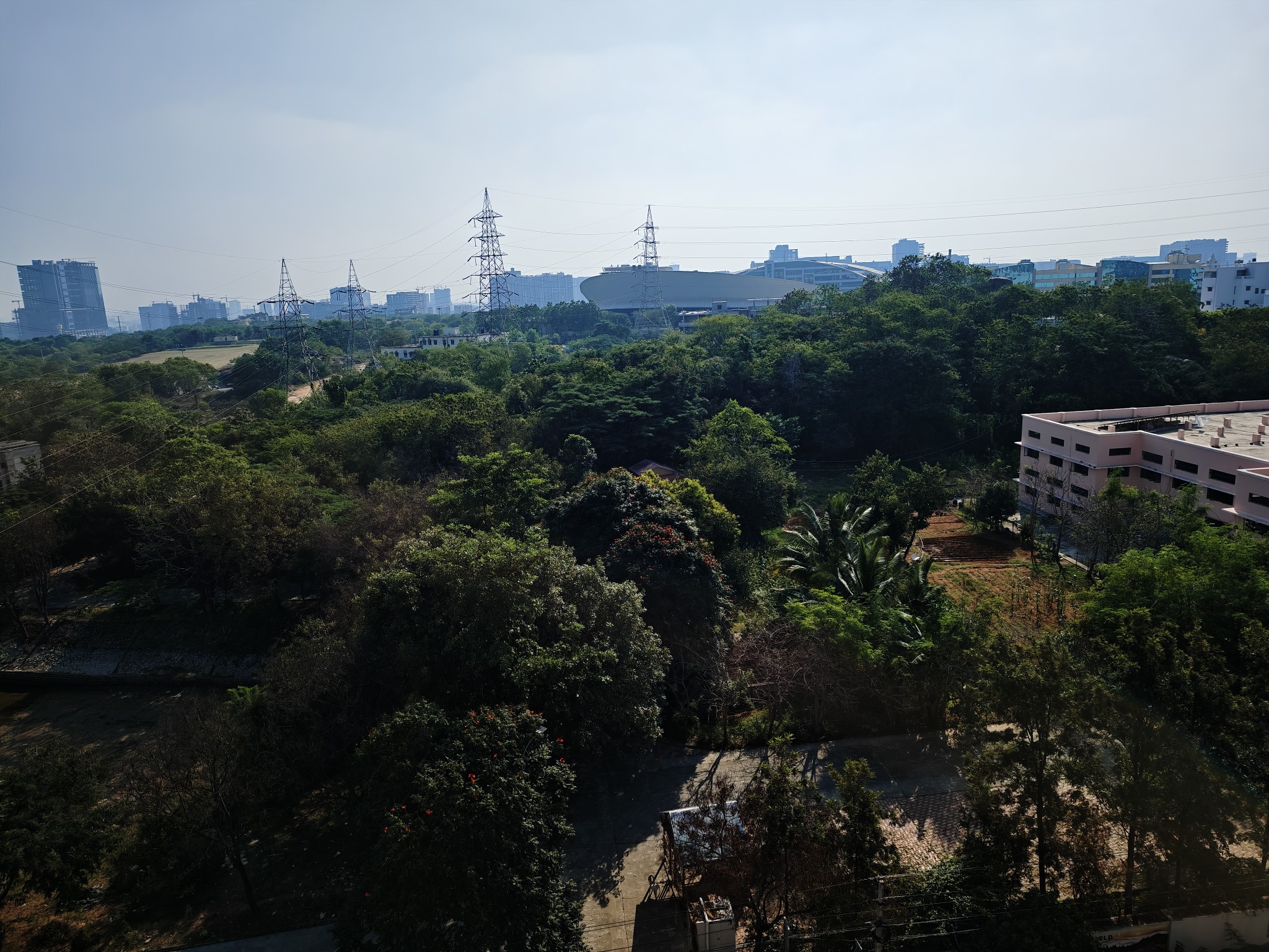
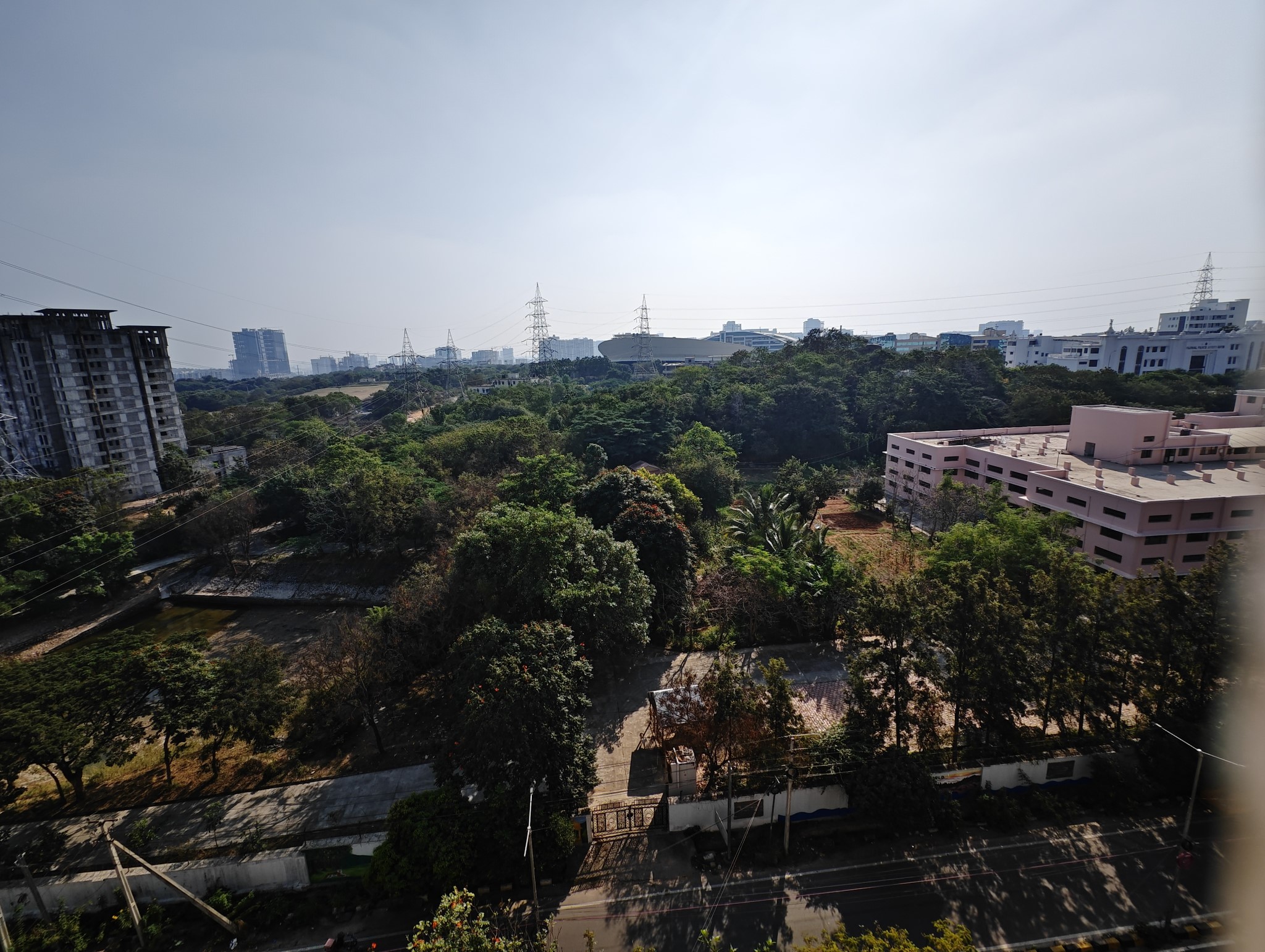


Daylight photos taken with the iQOO 12 have plenty of detail and dynamic range, but that was a given anyway. Older models had issues with foliage rendition, and that's still the case with this device. That said, the Natural mode does a better job in this area, and honestly, I liked the photos I got out of this mode than the other two.
You get great photos out of the wide-angle lens as well, and while it doesn't measure up to the Pixel 8 Pro or the Xiaomi 13 Ultra, it takes usable shots in most scenarios. Similarly, the 3x telephoto lens is fantastic, and it adds much-needed versatility to the device. More than anything else, I like that brands are using this module for portrait shots, and while I don't take many shots at 2x or 3x zoom, I use the portrait mode quite a bit, and just like the Xiaomi 13 Ultra, the iQOO 12 does a great job in this area.
Low-light shots are predictably great, and I don't have any problems with the caliber of the main camera or the wide-angle lens in this area. Overall, the iQOO 12 does a terrific job with photos, and while videos could have received a little more attention, it's not a huge drawback. The phone isn't on the same level as true flagships, but considering what it costs, the cameras are pretty great.
iQOO 12: Software
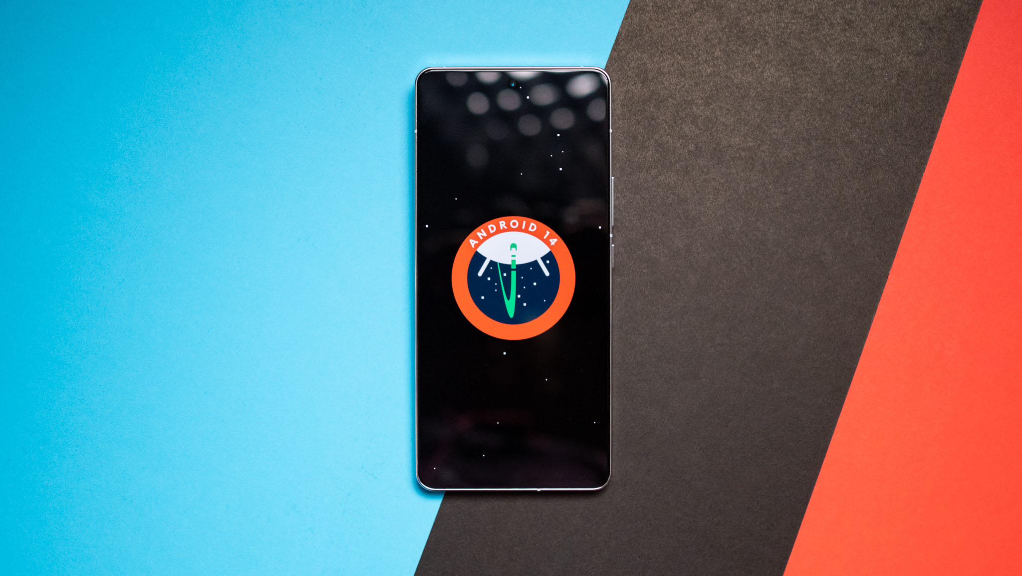
Vivo made a lot of positive strides on the software front with its Android 14-based Funtouch OS 14, and as a result, the iQOO 12 feels much more polished than its predecessors. The software has a cleaner design and looks modern, and it has a consistent design aesthetic. While you don't get much in the way of Material You here, the software still feels good to use, and it doesn't come across as a poorly-implemented iOS clone.
The notification pane now has two large rectangular tiles — much like what you get in OxygenOS 14 — along with the usual rounded tiles at the bottom, and you can easily customize the toggles based on your preferences. The app drawer is largely unchanged, and you get a row of recommendations at the top, and you still get the ability to access widgets via a dedicated page; and no, I don't know why this feature still exists.
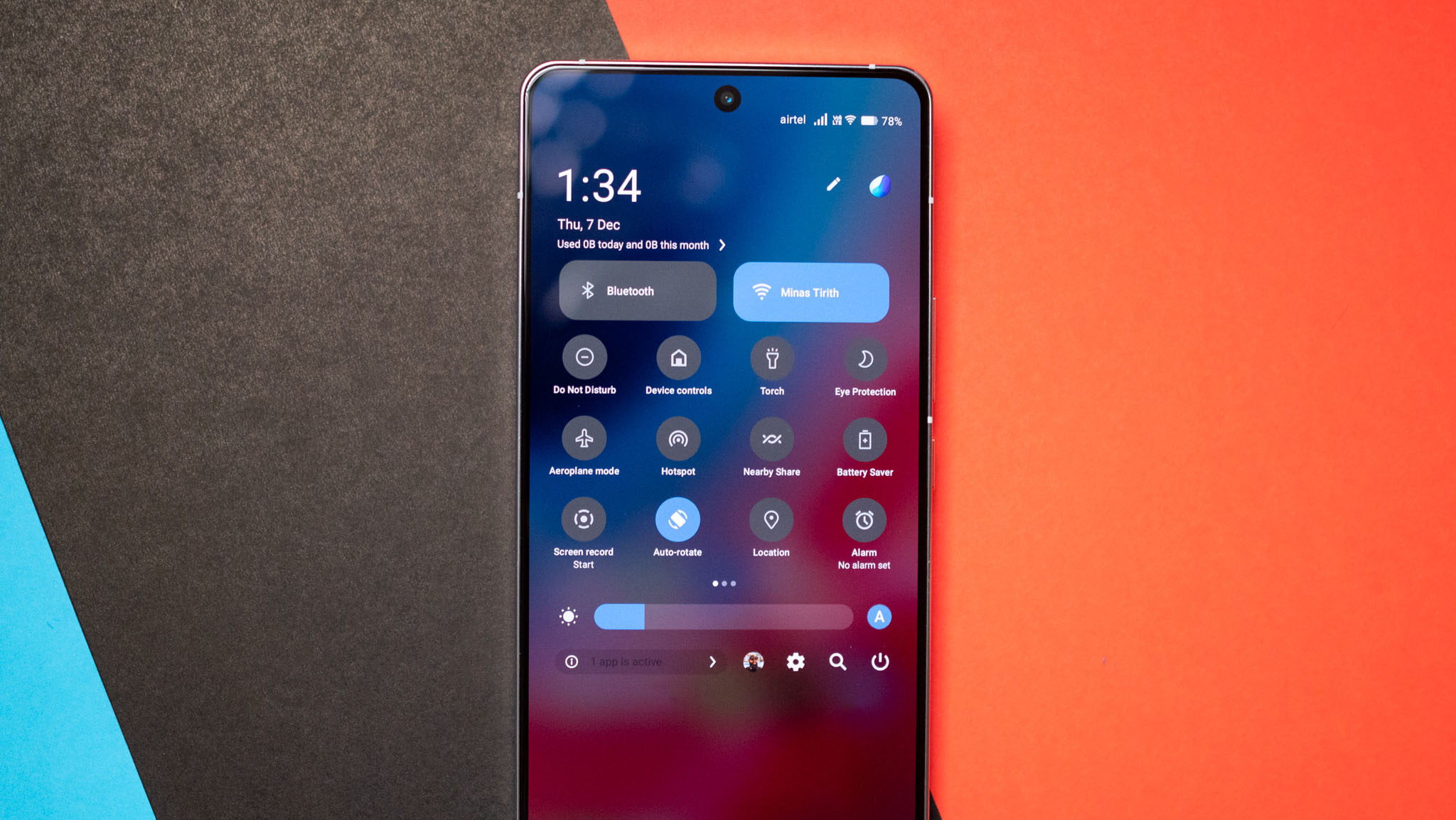
This wouldn't be a Vivo review without mentioning bloatware, and you'll find plenty of that on the iQOO 12. Thankfully, you can uninstall all the apps that come pre-installed on the phone, but it's irksome that vivo continues to do this. In a similar vein, Jovi Home is intact, but it isn't as visible as previous years; it's just tucked away in the settings. Vivo also continues to bundle its own dialer and SMS app instead of Google's default, but again, it's easy enough to switch those out.
Moving on to the positives, there's plenty of customizability on offer, and you can set up dynamic lighting effects for just about every facet of the phone — unlocking the screen, charging the phone, plugging in a USB device, and so on. There's also a nifty option in the overview menu that lets you switch to a horizontally-scrolling configuration, much like MIUI.
Overall though, Funtouch OS 14 feels closer to ColorOS 14 than earlier versions of the interface, and that's a great thing. Another positive is that the iQOO 12 will get long-term software updates, with Vivo guaranteeing three Android OS updates and four years of security patches.
iQOO 12: The competition

The iQOO 12 is the first out the door, so it doesn't really have any rivals as of writing. The rest of the devices powered by Qualcomm's latest silicon are due to launch at the end of January, so if you're interested in getting your hands on the latest hardware and camera tech and don't want to wait another two months, this is the device to get.
Otherwise, you should hold out for the OnePlus 12 and Xiaomi 14. Both devices have a lot of interesting upgrades, and at least in the case of the OnePlus 12, the Indian launch will be at the same time as the global unveil, so it should be available by the end of January. With Xiaomi, however, there's no telling when — or if — the Xiaomi 14 will make its way to the country.
iQOO 12: Should you buy it?
You should buy this if:
- You need a powerful phone that's terrific for gaming
- You want versatile cameras that take great photos in any situation
- You need stellar battery life and ultra-fast charging
- You want an AMOLED screen that's easy on the eyes
- You're looking for long-term software updates
You shouldn't buy this if:
- You need wireless charging
- You want a phone with Material You interface
If other phones follow a similar pattern as the iQOO 12, 2024 will be a pretty interesting year. The iQOO 12 has considerable upgrades on offer, whether it's the brighter AMOLED panel, better main camera and the addition of the 3x telephoto lens, upgraded internals, or the refreshed design that looks much more premium.
It's not often that we get as many upgrades, but what ultimately differentiates the iQOO 12 is that it has the same great value even though you get much better cameras and a brighter screen. More than anything else, it's this value that gives the iQOO 12 a distinct edge, and I can't see how any other phone can come close to the device in this particular area.


