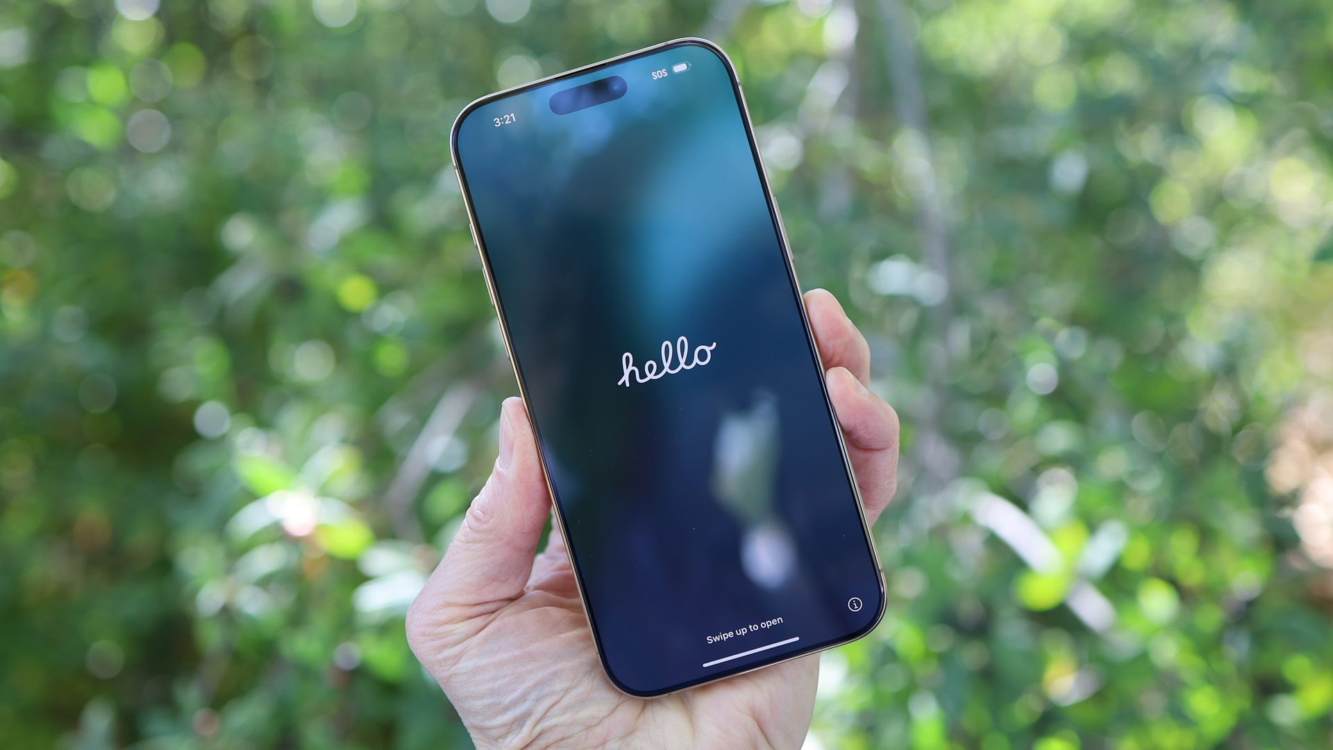
Apple iPhone 16 Pro Max: Two-minute review
I get the frustration. From a certain perspective, the iPhone 16 Pro Max looks the same as the iPhone 15 Pro Max, but after spending a week or so with Apple's newest iOS phone I can assure you that there are significant and noticeable differences, including some that will forever change the way you use an iPhone.
First, this iPhone is bigger. The titanium body is slightly larger, and six grams heavier, than the iPhone 15 Pro Max. The screen is a hair's breadth away from seven inches. But the Super Retina XDR OLED screen is larger not just because of the chassis; Apple slimmed down the bezels on the iPhone 16 Pro and Pro Max to give you a giant 6.9-inch canvas of bright, colorful pixels.
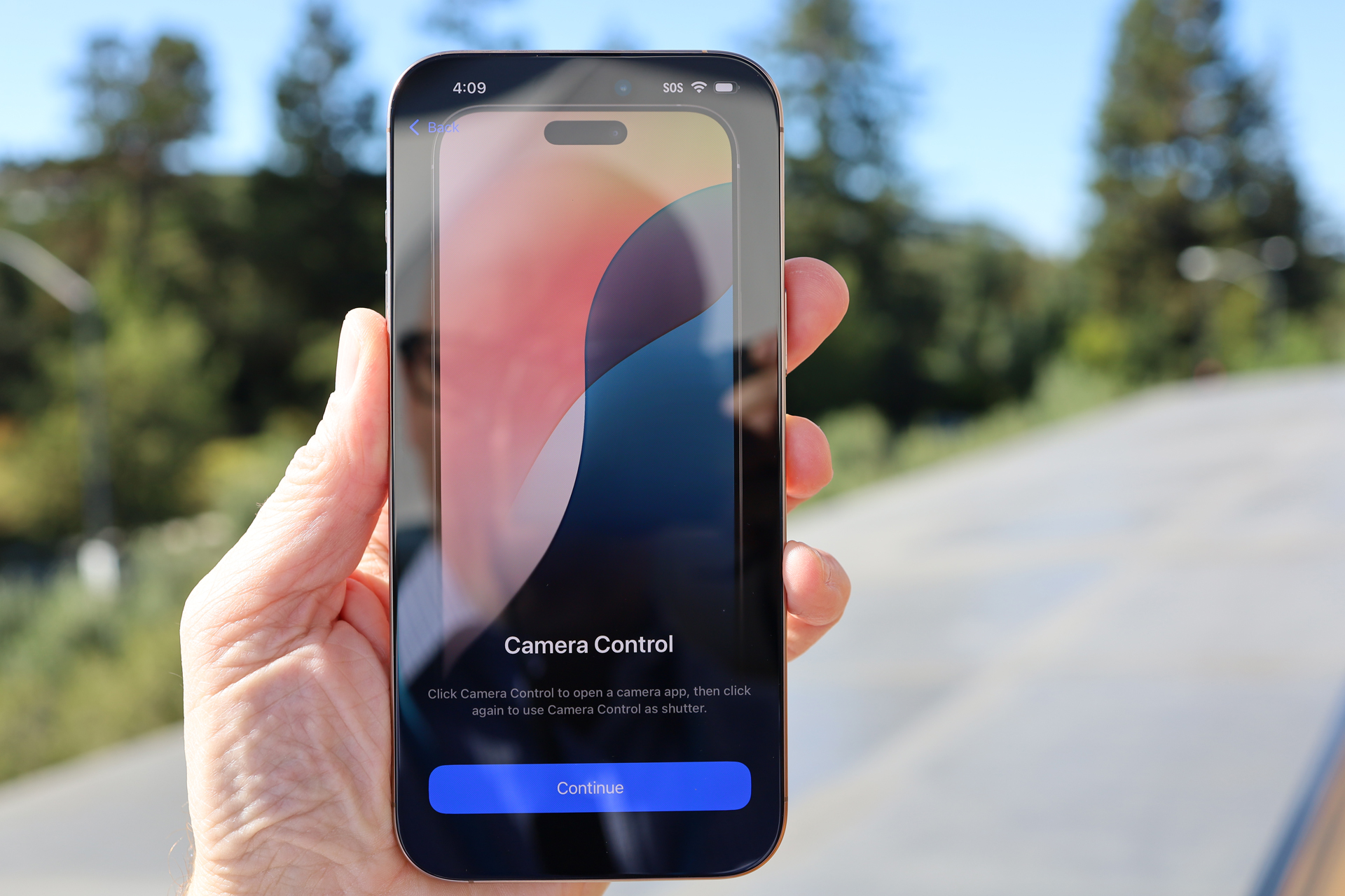
The other major difference is a new button on the right side, below the power/sleep/Siri button. Apple would prefer that we do not call it a button though it is, in part, one. You can press the recessed Camera Control button down and it moves, but it also has a haptic response that makes light presses feel like the button is moving. It even includes gesture recognition.
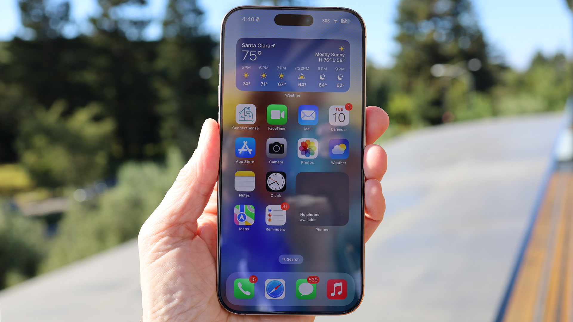
While the new button's name and its primary utility speak to photographic pursuits, this is a customizable control that will soon offer one-press access to (among other things) Apple's new Visual Intelligence object identification feature.
On the inside of the iPhone 16 Pro Max is a faster and more efficient A18 Pro. It's not hugely different from the A17 Pro that came before it, and most customers will never tap into its true power; but it's clear to me that Apple's Pro line of smartphones are more than ready to live up to their names. If there was ever a pocket supercomputer, the iPhone 16 Pro Max might just be it.
All this hardware is in some ways no more than a vessel for Apple's Next Big Thing: Apple Intelligence. However, Apple's own take on AI is also the greatest source of frustration, as it's far from complete. In fact, early iPhone 16 customers won't see much of it at all unless they install an iOS beta. Features like Writing Tools, a prettier and somewhat smarter Siri, summaries of long emails, and Photos updates such as creating your own memories based on a prompt, should show up soon after the iPhone 16 Pro Max starts shipping, but other features are essentially 'to come.'
There's no image generation, Genmojies, ChatGPT integration, or support for languages other than English, and Siri has yet to display any of its exciting personal context capabilities, which might be Apple's secret weapon when it comes to winning the AI battle. Siri with Apple Intelligence will eventually be able to use what it knows about you from all your information on the phone to better help you get answers and get things done. All of this might show up this year, or it might be next year; and that fact puts a little damper on my iPhone 16 Pro Max enthusiasm.
If you're not buying this new iPhone for Apple Intelligence then allow me to direct your attention to the formidable camera array. While it's not entirely new, there is a new and faster sensor behind the 48MP main fusion camera, and the ultrawide makes a leap from 12MP to 48MP (in both cases you'll usually shoot at 12MP, which is stuffing four pixels worth of information into each pixel). The 5x optical zoom is mostly unchanged, as is the 12MP True Depth selfie camera.
There are, however, myriad new imaging and even audio tricks that I'm certain every iPhone 16 Pro Max owner will love. There's 4K 120fps (still no 8K video) videography that can, via a new speed tool, be stopped down in increments to give your videos a truly cinematic feel. There are also new audio mix tools that, in certain environments, can add studio quality to audio that wasn't captured with a microphone.
Apple has also added some new image styles and undertone controls that I'm not sure will get as much use as Apple would prefer.
If you were to ask me, the choice between the base iPhone 16 and the iPhone 16 Pro Max is simple: you gain a Pro Motion display (1Hz to 120Hz), a 5x zoom camera, and Apple's most powerful mobile chip.
The differences between the iPhone 16 Pro and 16 Pro Max, however, are more subtle this year. There's the screen size – 6.3 versus 6.9 inches – and the battery size, which results in at least an hour of extra battery life, and that's essentially it. The 5x tetraprism lens is now on both phones. Perhaps the only other notable difference is that the iPhone 16 Pro inexplicably starts with only 128GB of storage.
In short, I love the iPhone 16 Pro Max. It's big, powerful, and up for anything. Yes, I was playing a console-level game on it using an Xbox controller because I can. It takes lovely photos that, even if you choose not to try out the new styles and undertones, are clear and color-accurate.
Apple Intelligence, which I accessed by installing iOS 18.1 Developer Beta, is a nice start, with some cool features, but it's not yet a compelling reason to upgrade. I feel similarly about the Camera Control button. Don't get me wrong; I like the new button and I think it's full of untapped potential, but there's almost a bit of competition now between the one-year-old Action button and this new, arguably more sophisticated one. Those who buy any of the new iPhone 16 models will probably get a lot of use out of the Camera Control button, and wonder how they used their iPhone without it. In the meantime, the Action button might sit unused until Apple eventually shows it the door.
Apple iPhone 16 Pro Max review: Price and availability
- Priced at $1,199 / £1,199 / AU$2,149
- Pre-orders started September 13 and it ships from September 20
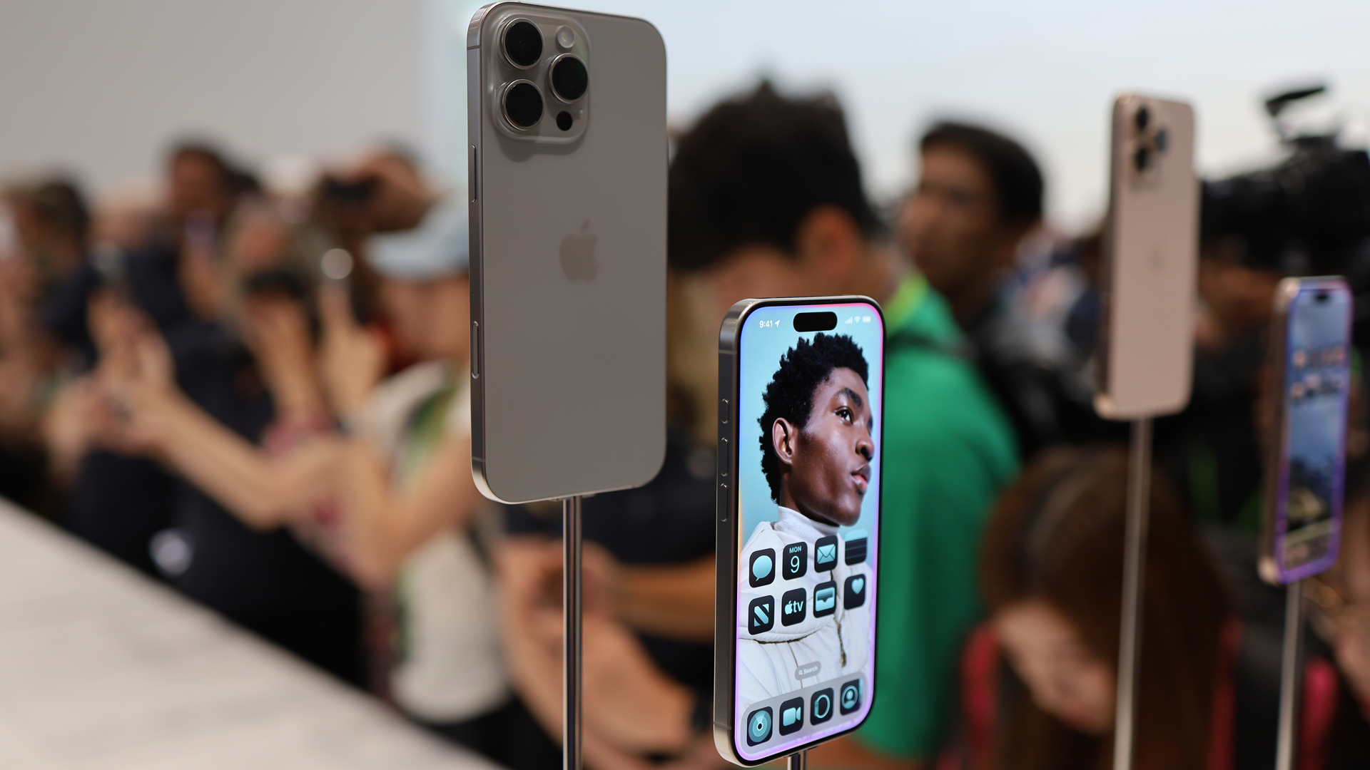
The iPhone 16 Pro Max was announced at the Apple 'Glowtime' event on September 9, 2024, and it's shipping from September 20.
This is a larger phone with more screen, more power, AI, and a brand-new Camera Control button, but it still costs the same as last year's iPhone 15 Pro Max in the US and UK; it's actually a little cheaper in Australia. I'm not arguing that $1,199/ £1,199 / AU$2,149 for a 256GB iPhone is cheap, but at least Apple didn't raise the price by $100. Apple also made a point at this year's iPhone 16 launch event of talking about some big trade-in deals. Its point, I think, was that you probably won't be paying full price for these phones (also, Apple would love to kick off an upgrade supercycle.).
The virtually identical iPhone 16 Pro costs $999 / £999 / AU$1,799, but starts with half the storage space. If you like big screens and want a reasonable amount of storage for all that 4K 120fps video, you probably want to choose the iPhone 16 Pro Max.
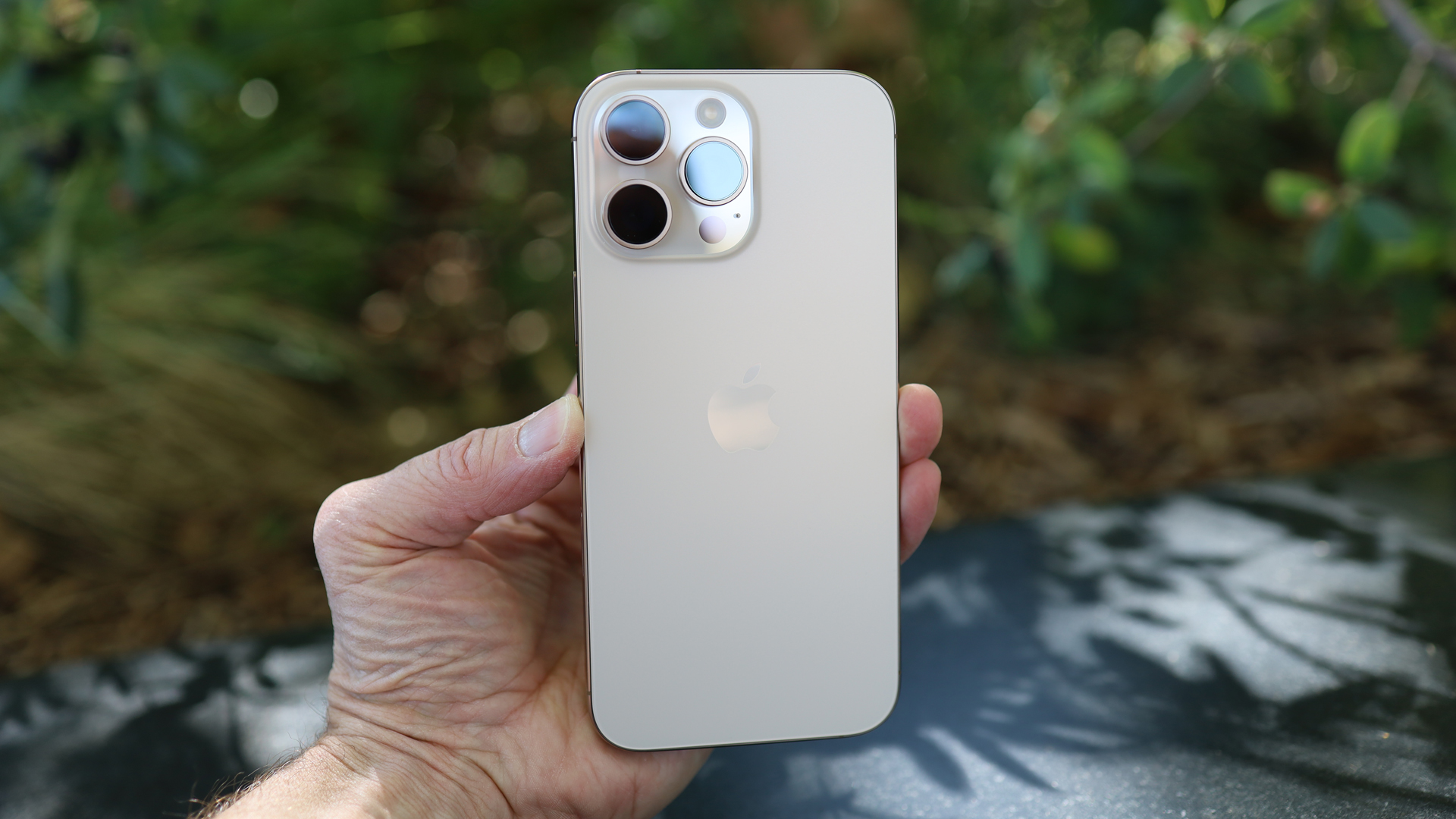
The iPhone 16 Pro Max is available in Natural Titanium, White Titanium, Black Titanium, and Desert Titanium, which is the color of my test unit. I still prefer the black.
- Value score: 4 / 5
@techradar ♬ original sound - TechRadar
Apple iPhone 16 Pro Max review: Specs
Apple iPhone 16 Pro Max review: Design
- Apple has settled on an iPhone aesthetic
- Bigger but not unwieldy
- There's a new button in town
It might seem like Apple's iPhone design strategy is now "Why mess with a good thing?" In some ways, that's true. The iPhone 16 Pro Max doesn't stray far from the aesthetic first established with the iPhone 12, but also carries forward the myriad changes made over the last few generations, like the smoothed-out edges and new Action button, which replaced the silence switch on the Pro models last year.
Its dimensions are close to those of the iPhone 15 Pro Max, but enlarged by a few millimeters here and there. The 16 Pro Max is 163mm x 77.6mm x 8.25mm and weighs 227 grams. That's six grams heavier, 3.1mm taller, and 0.9mm wider than the iPhone 15 Pro Max. If you're comfortable holding and using the Phone 15 Pro Max, I suspect you'll have no trouble with the iPhone 16 Pro Max. I can't say the new phone felt substantially larger in my hand, but I do notice the difference in screen size.
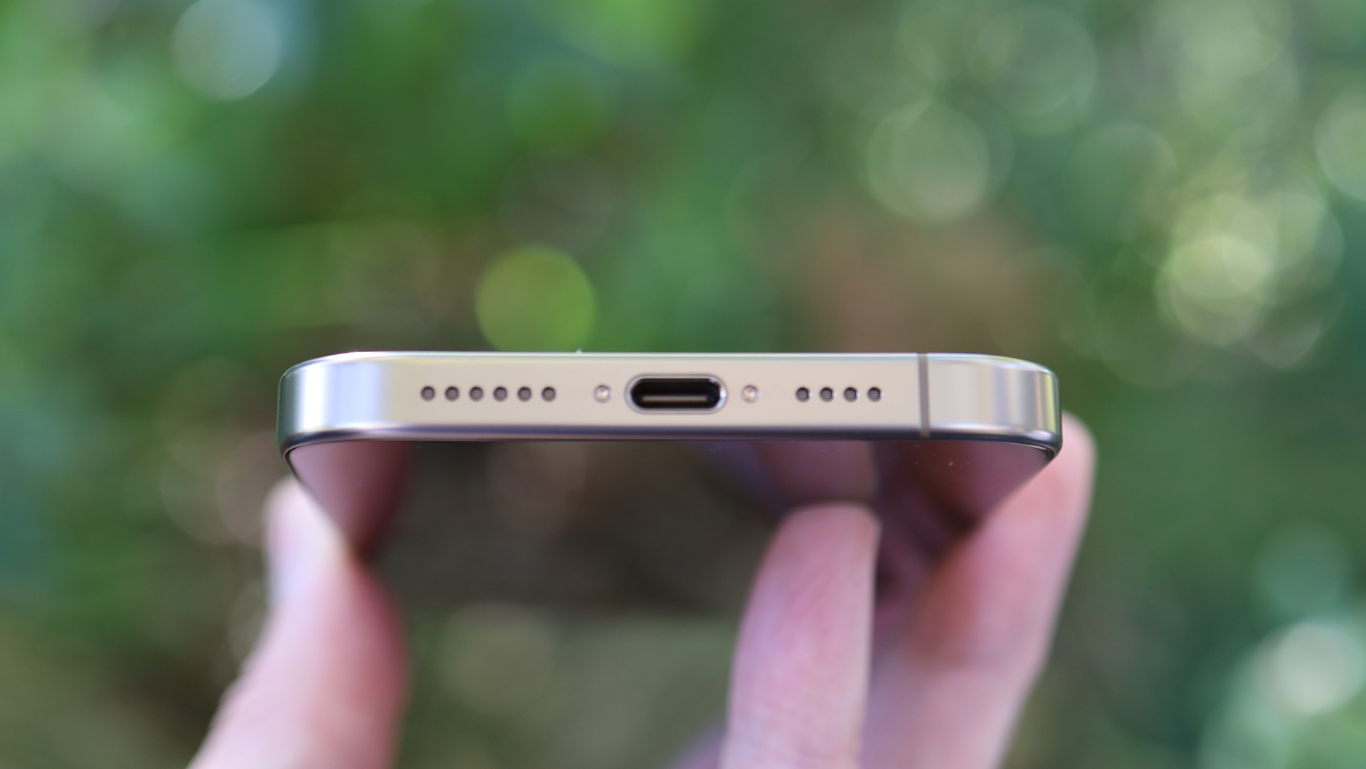
The bottom edge features microphone and speaker perforations along with a USB-C port that, with the right cable, can support Thunderbolt 4 data-transfer speeds. There's also a speaker slot along the very top edge of the display. Together with the bottom edge speaker, this phone can produce undistorted, room-filling sound – highs are sharp, mids are strong, and bass is good for the device size.
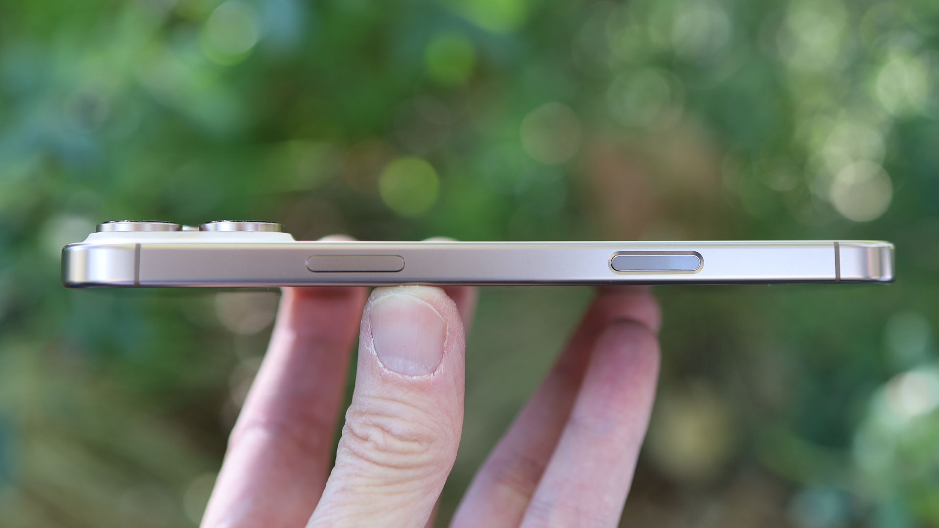
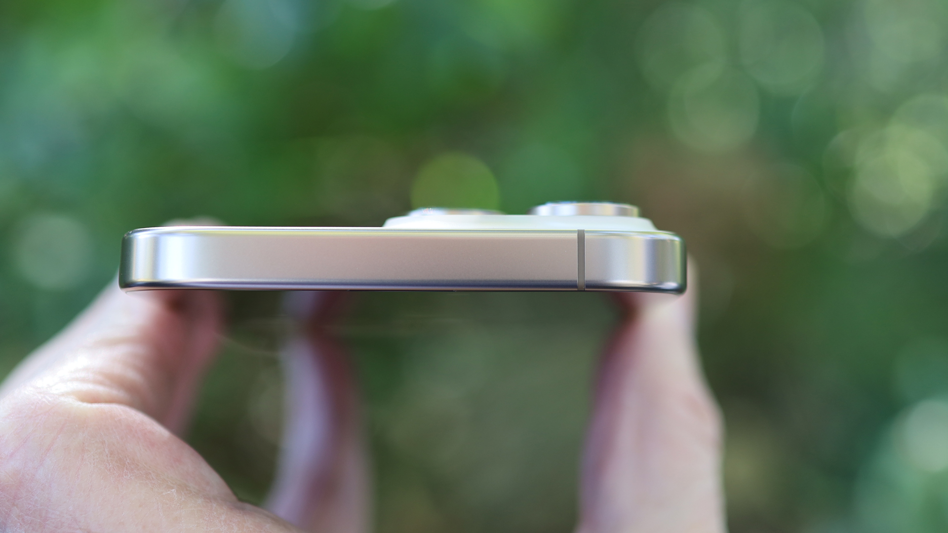
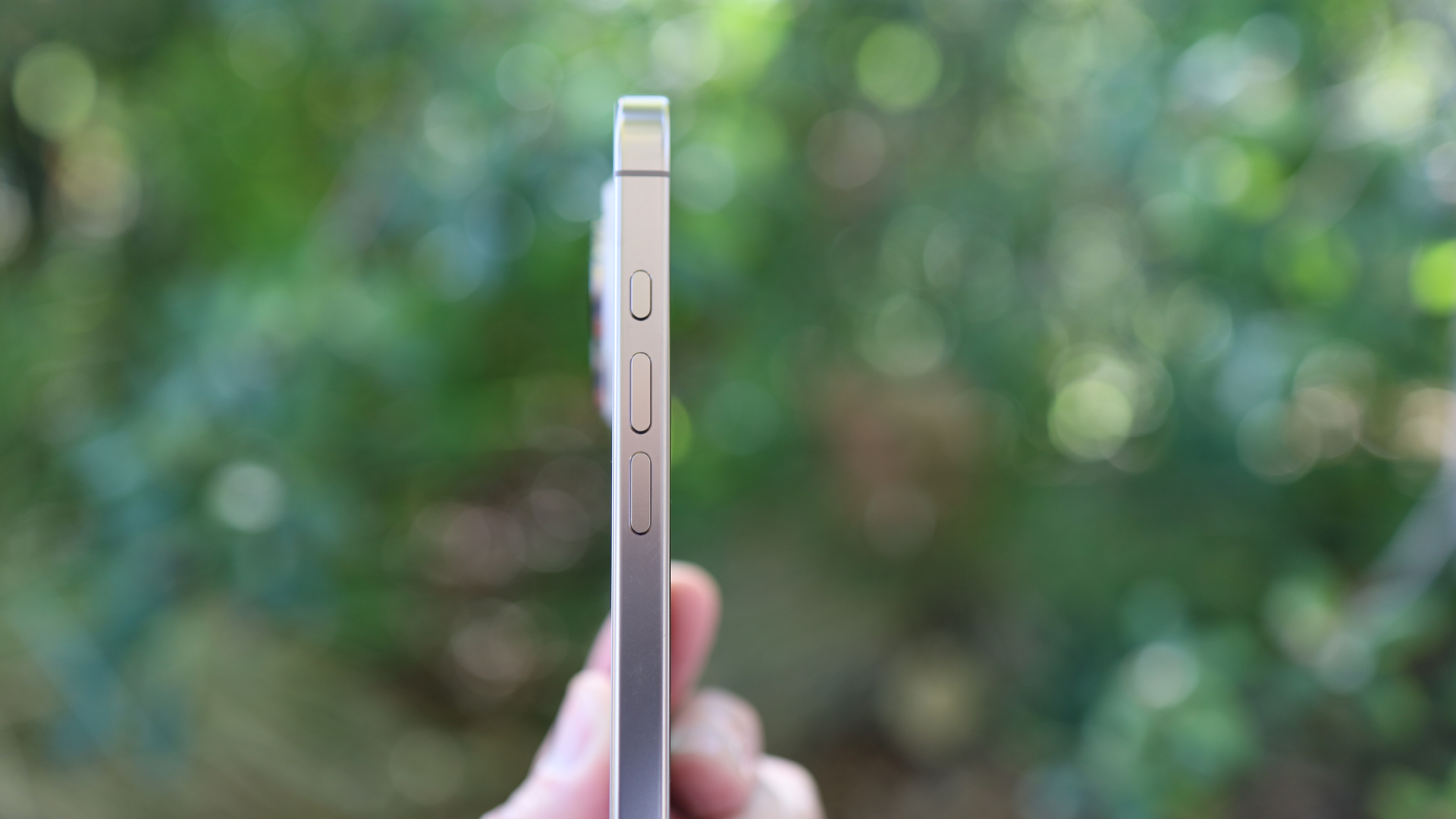
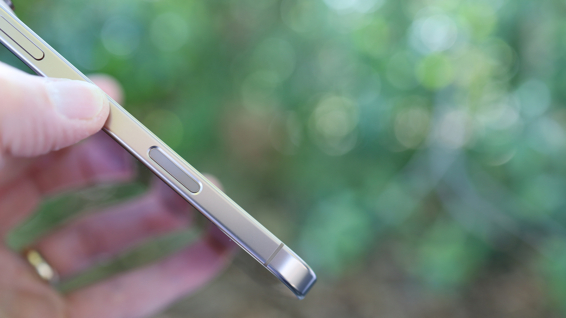
Button placement is mostly identical to last year, with the volume buttons and Action Button on one side and the larger power/sleep/Siri button on the other side. They are joined, however, by a new button (Apple insists it's not a button): Camera Control. Roughly the same size as the power button, the Camera Control button is a multipurpose control that can recognize physical presses, and lighter pressure to enable haptic response and gestures. It offers instant access to the camera and, with those other presses and gestures, to various, virtual millimeter lenses and camera settings.
Camera Control replaces the old antenna cutout on the iPhone 15 Pro Max (it looks like the newer phone doesn't need one anymore), and it's recessed, so there's little chance of accidentally triggering it. On the other hand, I noticed that when I put the phone in a pressure-grip iPhone holder, there's no longer a clear spot where no button falls under the grip. As a result, the Camera Control did press in a little bit but it didn't trigger any action. What I saw on the iPhone screen was a tiny bit of the virtual screen deformation that appears when you start to press Camera Control.
The materials and build quality are once again excellent. Apple used grade 5 titanium on the body over a graphite-clad aluminum substructure (which apparently also helps with heat dissipation and can improve efficiency). Apple has also upgraded its ceramic shield, which may make it less susceptible to cracks and scratches, although I was quite careful with my 1TB Desert titanium test unit, so I can't say for certain if this is the case.
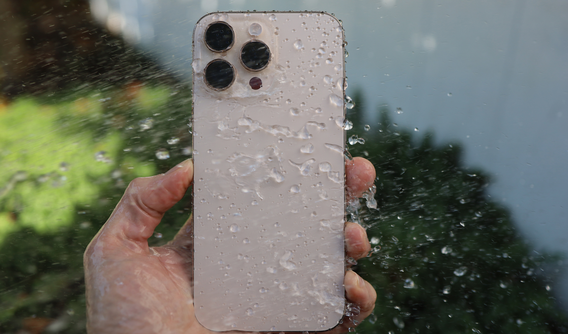
Okay, I did get it wet, purposely running the IP68-rated iPhone 16 Pro Max under a garden sprinkler. It was fun to watch the screen activating as if it was touched by a thousand tiny fingers when it was just water droplets, but the phone was otherwise unmoved and unharmed by the deluge.
- Design score: 5 / 5
Apple iPhone 16 Pro Max review: Display
- Still excellent Super Retina XDR display
- It's sharp and very bright
- Apple's largest iPhone screen ever
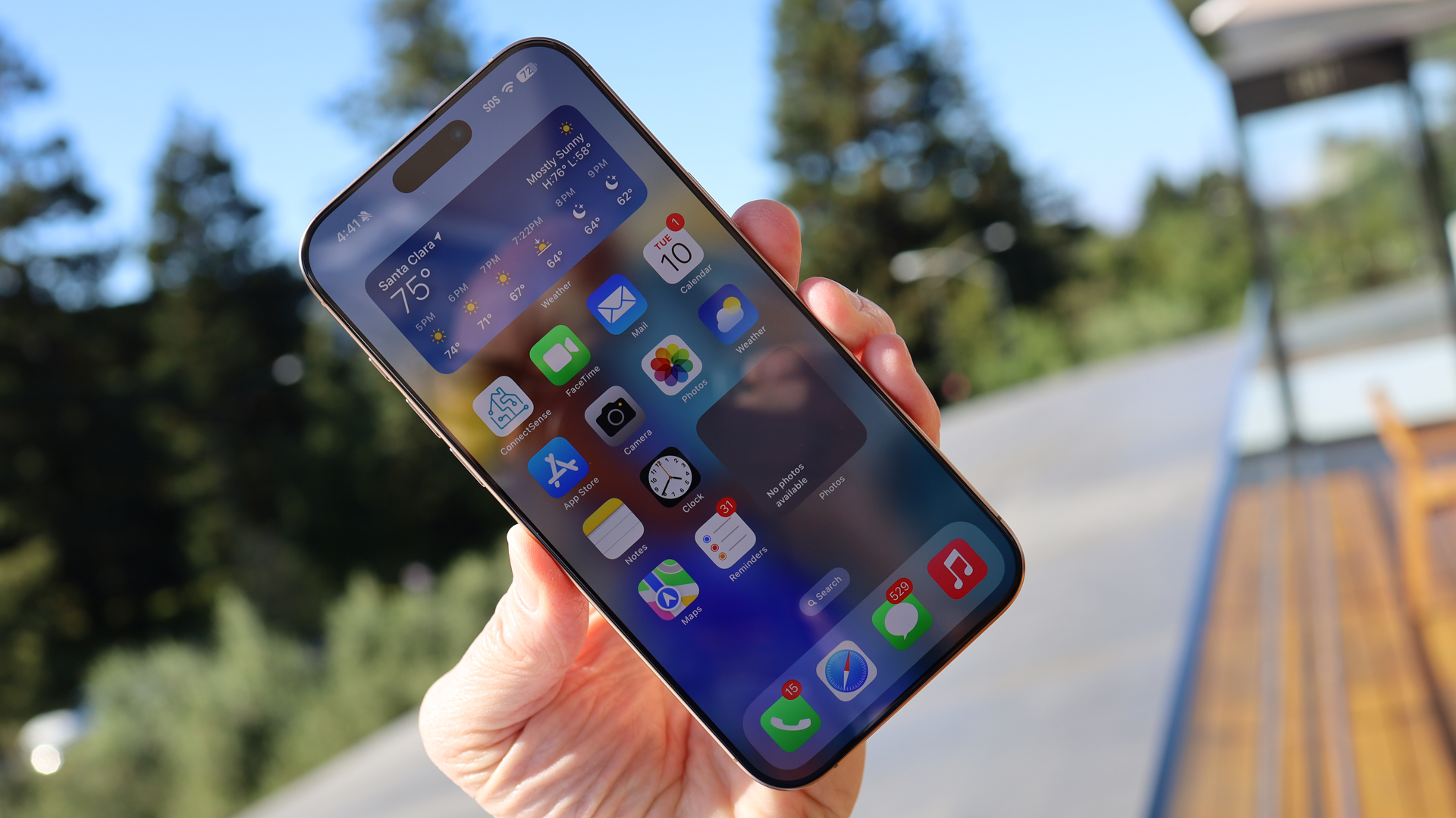
Sometimes I wonder how Apple might name its next screen technology. Will it add 'Duper' to it, so it becomes 'Super-Duper Retina XDR' display? I mean, it may have boxed itself into a corner, but Apple skirted the issue this year by leaving its iPhone display technology pretty much untouched.
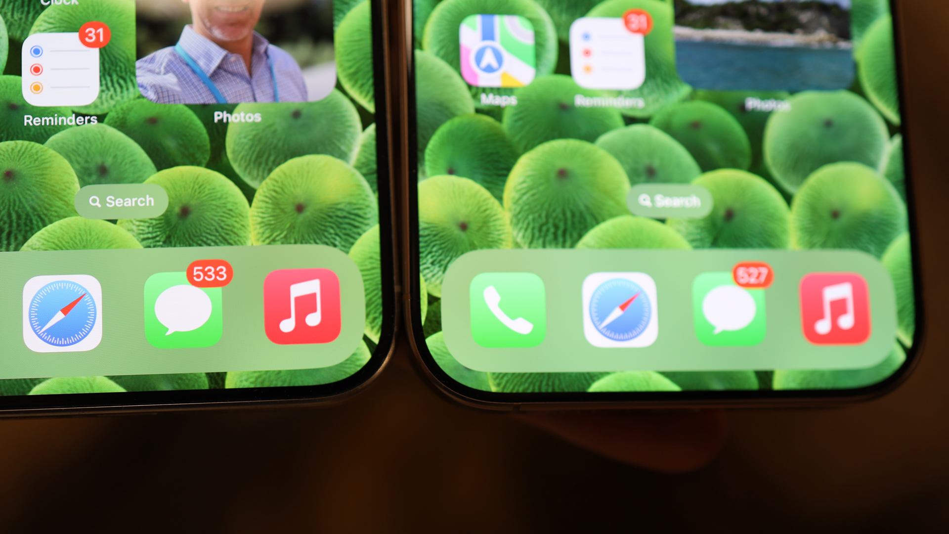
This is a giant screen: 6.9 inches, achieved through a combination of a slightly larger chassis and a pleasingly thinner bezel. There are more pixels than last year. The iPhone 16 Pro Max screen is 2868 x 1320, while the iPhone 15 Pro Max is 2796 x 1290. That's more pixels, but not a higher density. This is still 460ppi, and so falls behind the Samsung Galaxy S24 Ultra's QHD+ display at least on the ppi front (it's 501ppi).
Apple also didn't mess with the Dynamic Island, which remains a useful and fungible information pill in the upper portion of the screen. It houses Face ID, depth sensors, and a 12MP TrueDepth camera. The camera takes excellent selfies, and is my go-to for biometric unlocking.
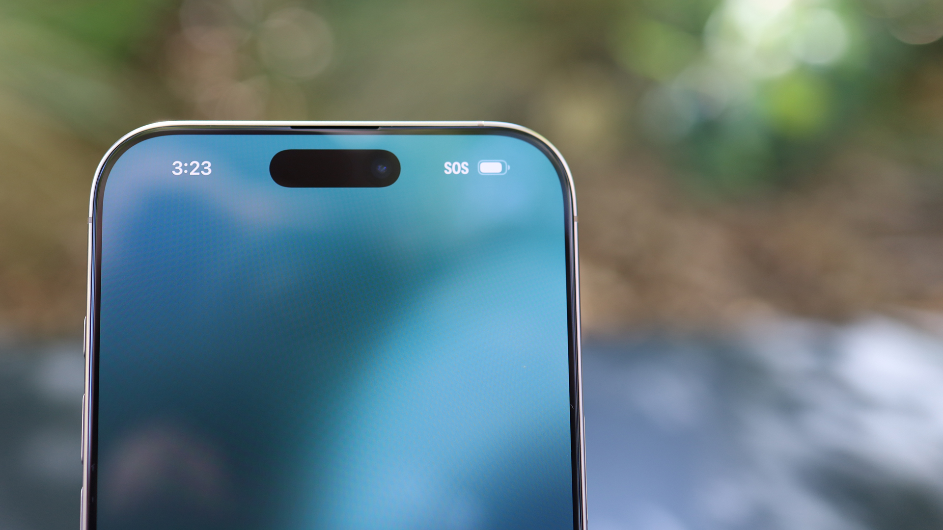
While the display's core specs haven't changed, they're worth touting. It's a wide-color-gamut screen that supports HDR, True Tone, always-on (which means you can see a less-saturated version of your lock screen without unlocking the phone), 2,000 nits of peak brightness outdoors (in my experience, it can beat back direct sunlight), and ProMotion. The latter lets the screen fluidly adjust from a power-sipping 1Hz up to a speedy and super-smooth 120Hz, which is great for gaming and watching sports.
Speaking of which, everything I did on the iPhone 16 Pro Max looked fantastic. I don't even notice the dynamic Island when it's inside one of my games, and streaming video via the likes of Netflix tends to crop out the cutout.
- Display score: 4.5 / 5
Apple iPhone 16 Pro Max review: Software and Apple Intelligence
- iOS 18
- Apple Intelligence is a glimpse of the possibilities
- The furniture's been rearranged
I know everyone (especially Apple) wants to talk about Apple Intelligence, but it's the changes to the core iOS 18 platform that will have the biggest impact on your iPhone 16 Pro Max day-to-day use.
Photos, for instance, has gotten a huge overhaul, and one that I'm not entirely sure makes it better. It's a situation of "Who moved my cheese?" as many of your core features may have shifted or been replaced. The Photos app now defaults to Search and Collections, which might throw people who are expecting to see their photo library. Still, if they get used to using Search for some natural language queries that yield useful image results, they might be pleasantly surprised.
The iOS interface is now more customizable, and if you want, you can leave spaces in your app grids. You still can't place an app icon in space that, say, straddles two spaces in the invisible grid, but I think people will appreciate this new level of flexibility.
Apple seems a bit obsessed with summarization. Summaries exist in Writing Tools and in the new Safari, which has a slightly hidden Highlights feature; look for a tiny hamburger menu on the left side of the address bar. You can use that to turn it on and it will take, for example, a lengthy New Yorker article about Ronald Regan and condense the thousands of words into a paragraph summary. Impressive, though I worry that such a boil-down might leave out important nuances.
There's even a new Passwords app that consolidates and surfaces all the password features Apple has previously hidden in features like Keychain (which was findable under Settings). Now you have an easy-to-access app to manage a sometimes confusing password and security world.
One of my favorite new iOS 18 features is Math Notes. Inside Notes, you can scribble any equation (use your finger), and when you put an equal sign at the end of it, Math Notes automatically solves it and writes the answer in what will look just like your own penmanship. It's a smart bit of machine learning.
None of this is as sexy as Apple Intelligence, but these and the myriad of other changes coming with iOS 18, might be more readily practical than what you can currently do (and some of what's promised) with Apple's AI efforts.
Apple Intelligence, to the extent that it’s available on the iPhone 16 line at launch (most of the features will be rolling out from October, I accessed some of them by, with Apple's blessing, installing the iOS18.1), has some impressive tricks up its sleeve. The most visible and noticeable is Siri.
Apple's 13-year-old digital assistant has burst out of its floating bubble and now, when you summon it, takes over the whole screen. I switched between calling Siri by name and using a long press on the power button to call it, and each time the entire screen was encased in a beautiful multi-color glow. The display almost appears to flex when you press that button, and when you make your request, the screen pulses in response. Siri really seems more alive than ever.
This, though, might be the most exciting part of the update. Apple Intelligence features that give Siri access to information about you on the phone to make its responses more contextually relevant are not here yet. Nor are app insights that might help dig into applications to enable features and actions.
Instead, we get a Siri that is somewhat better at handling the "uhs" and "ums" that sometimes happen when you're trying to craft a Siri prompt. I found that Siri can understand some confused talk, although if you're nearly incoherent, Siri will be lost, too.
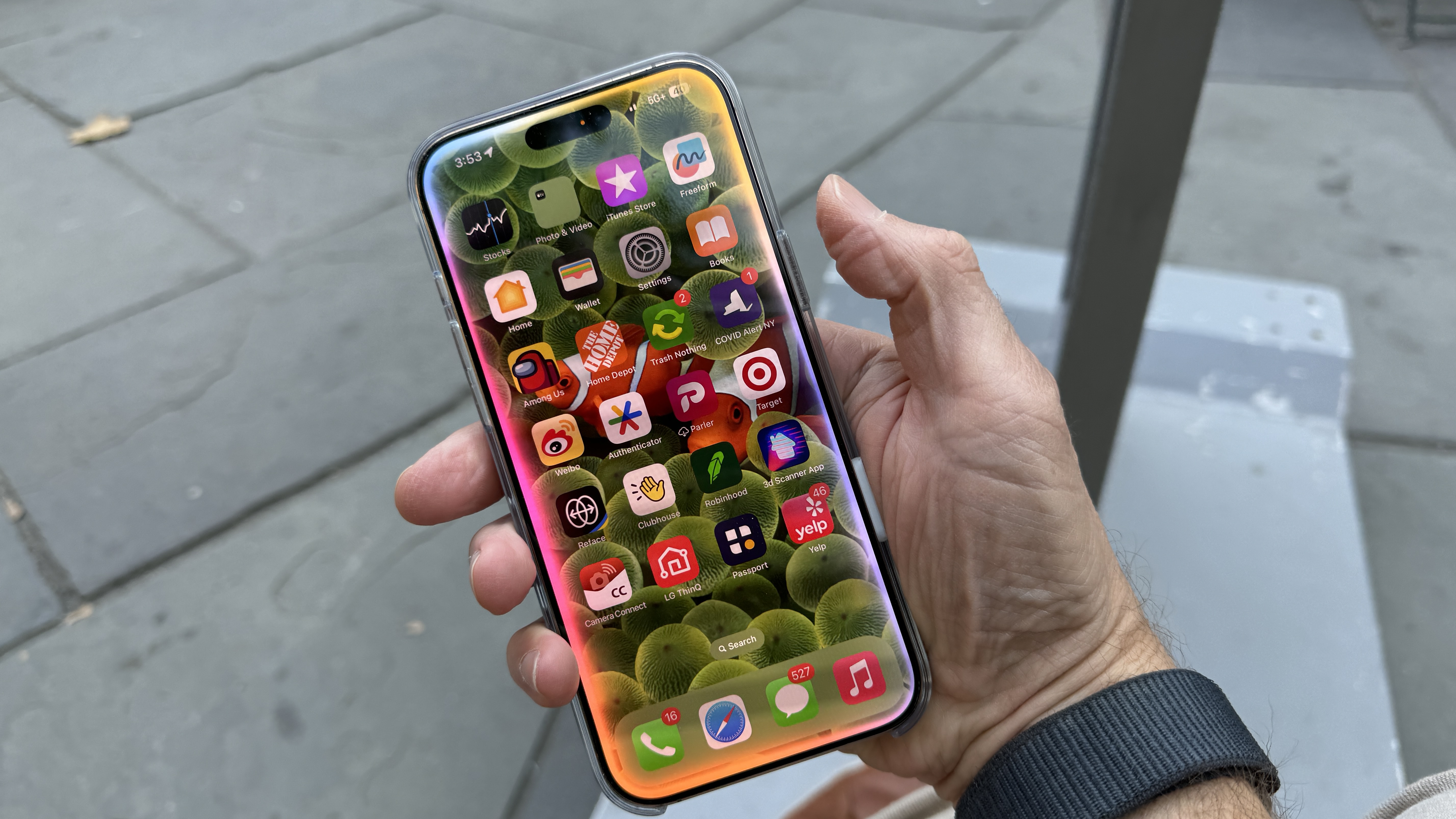
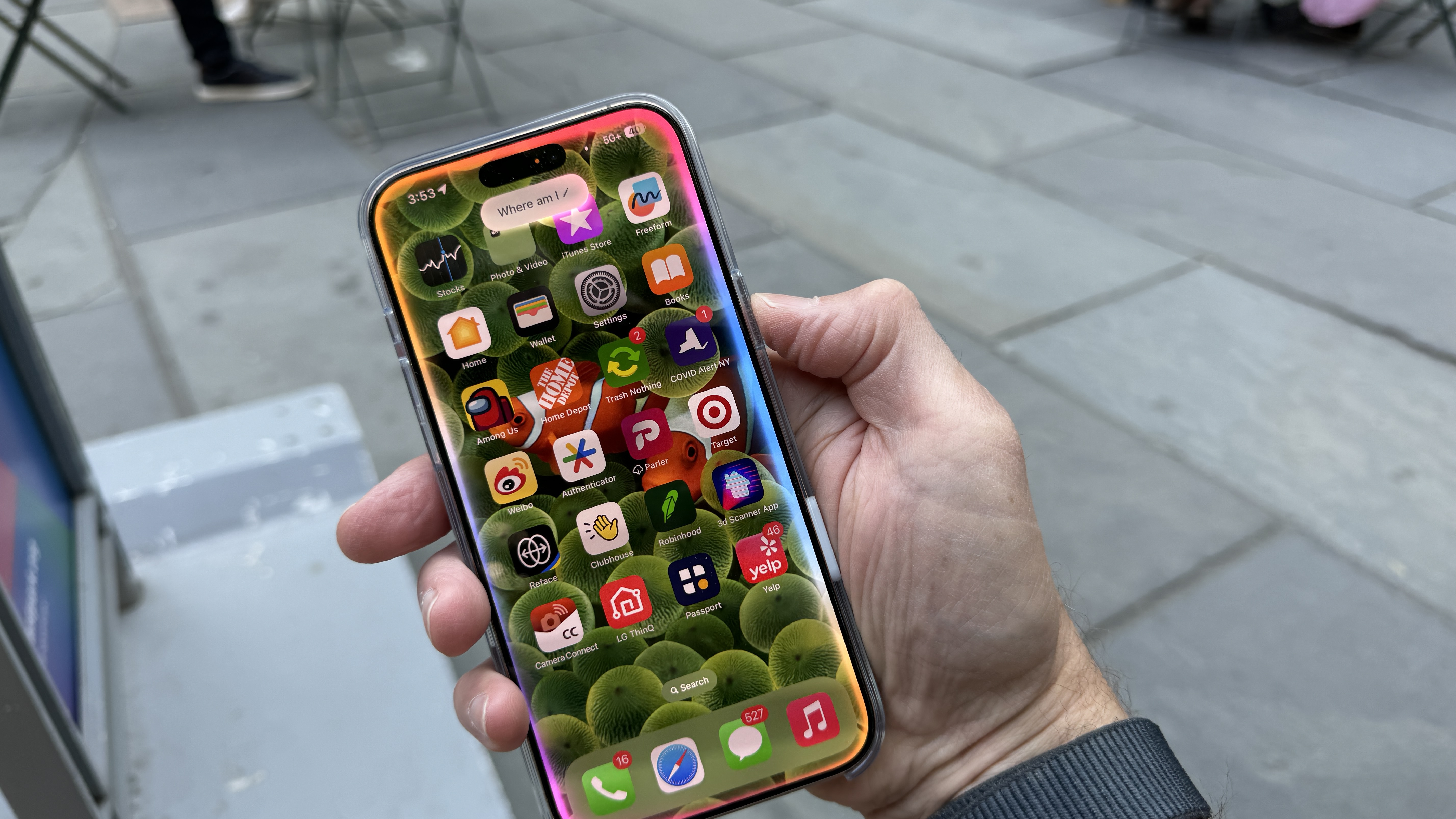
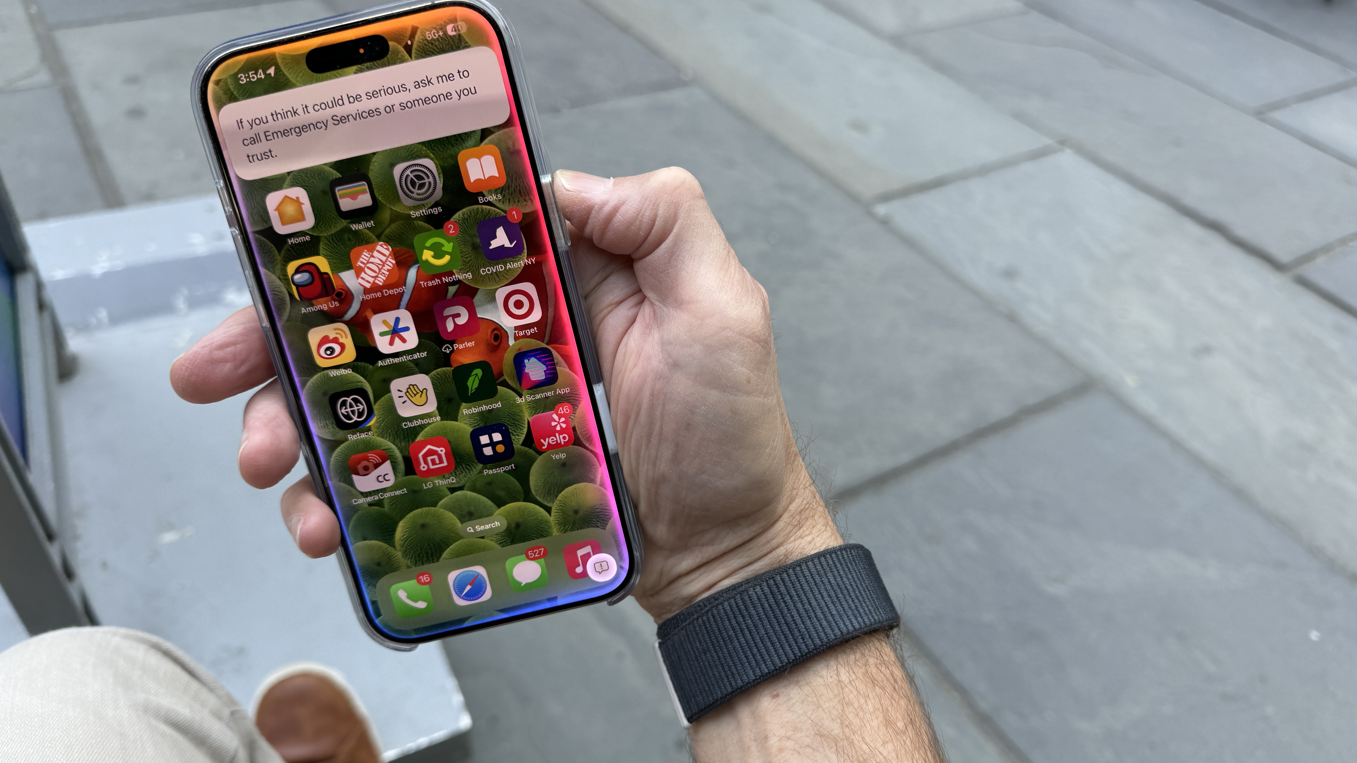
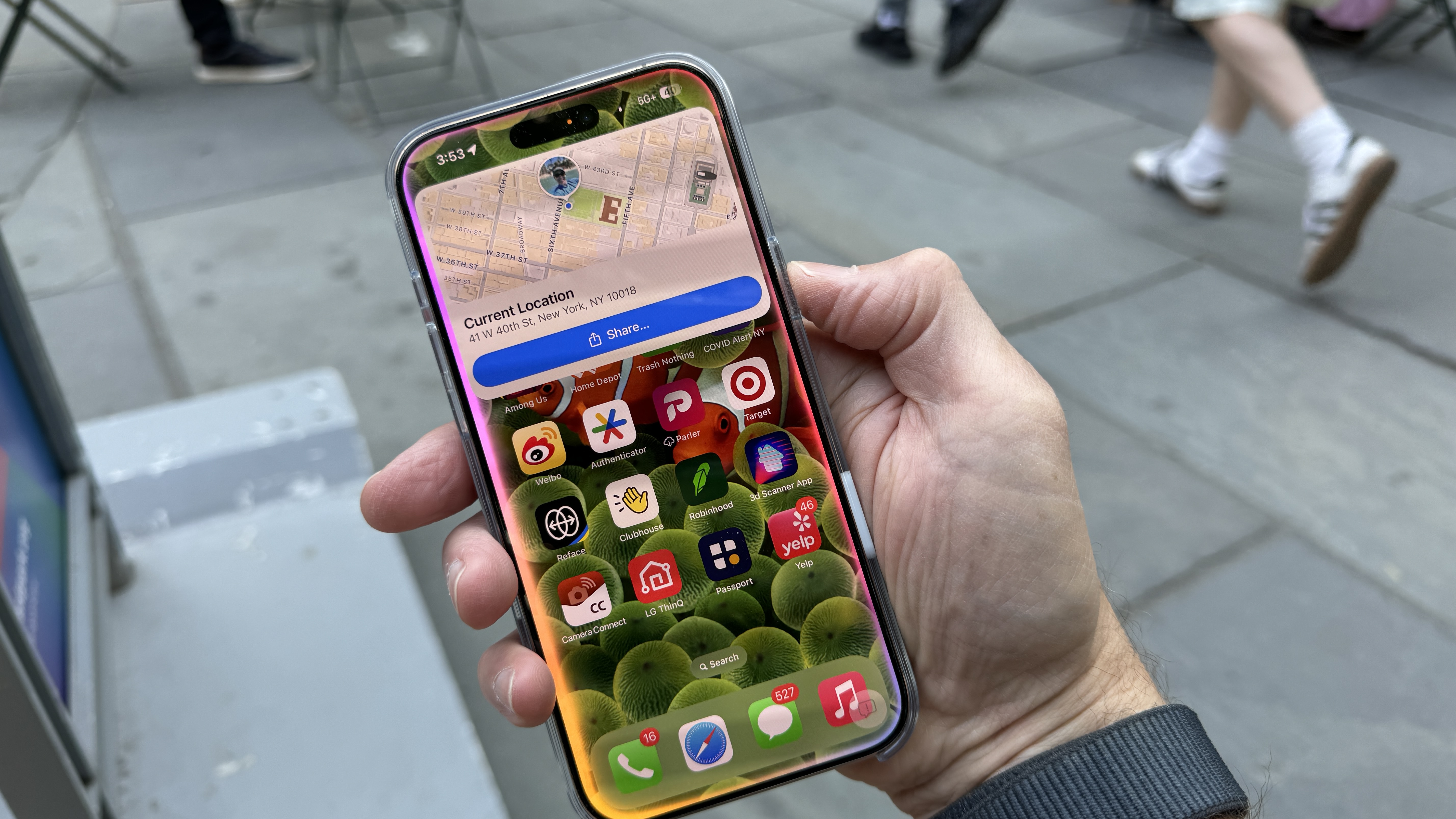
Siri did well on some questions, and was effective at opening the FaceTime camera when I said I wanted to take a selfie. It also did well when I asked how I could share my Wi-Fi password, returning a concise step-by-step guide.
It's generally better at maintaining the context of a conversation than before. I asked where I was, and it brought up a map with my location. Without saying "Siri" again I followed up with a question about if there was any place good to eat around here. Siri instantly brought up a list of local restaurants. I then asked, "What if I needed a place to stay tonight?"
This last question seemed to trigger something in Siri because it responded by asking if I needed emergency services. To double-check I asked the question again and got the same answer. At least Siri has my best interests at heart.
One other nice Siri update is the surreptitious "Text to Siri". All it takes is three taps on the bottom of the screen to open a Siri window in which you can type in your prompt. It's a nice, discreet way of getting the answer or help you need.
Writing Tools, which you can find when you type text in Notes, email, or Messages, offers to make your writing better in a variety of ways. I'm a confident writer and communicator in email and messaging, so AI assistance in these tasks doesn't appeal to me. There are, though, millions who feel otherwise and may find these tools helpful. I noticed how while Writing Tools offers to make your text more Professional, Concise, and Friendly, it does a stellar job of never losing or misconstruing the meaning of your original text.
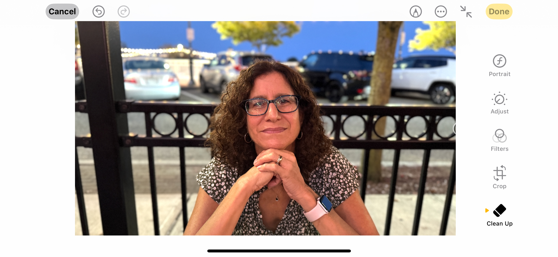
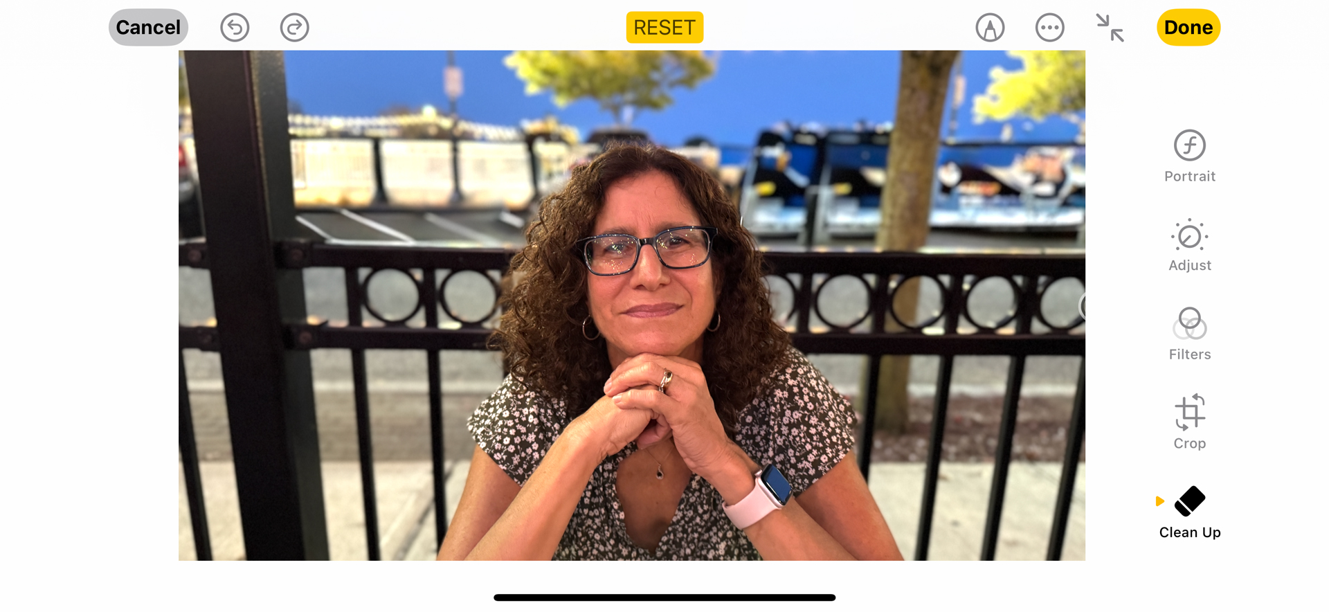
Photos is where Apple Intelligence shines. The new Clean Up option in Edit is effective at removing unwanted objects from photos. When I opened a photo and tapped the Clean Up eraser icon, it immediately offered to remove a few people from the background of my photo. I wanted to keep them, so I chose an object I wanted to remove drawing over it. Precision is not a necessity; I drew over parts of it and Clean Up identified the complete object. When I took a picture of my wife at an outdoor restaurant, I noticed that you could see all the cars parked behind her. I used clean-up to remove them one by one. It did a good job.
In all Apple Intelligence shows early promise but, compared Google Gemini and Galaxy AI, it seems a bit limited. Siri still doesn't have that open LLM feel, where you could ask it almost any question or solve any problem. There's no AI image generation, not even the promised Genmojis. It's still an English-only tool, and the promised third-party integrations with ChatGPT and, potentially, Gemini, have yet to materialize.
It's a good effort, but this version of Apple Intelligence is not the one that will spark a billion upgrades.
- Software score: 4 / 5
Apple iPhone 16 Pro Max review: Camera
- A great array of lenses
- Apple isn't pushing the envelope on megapixels
- So many tools that you're unlikely to use them all
- There's a new way to quickly access the camera
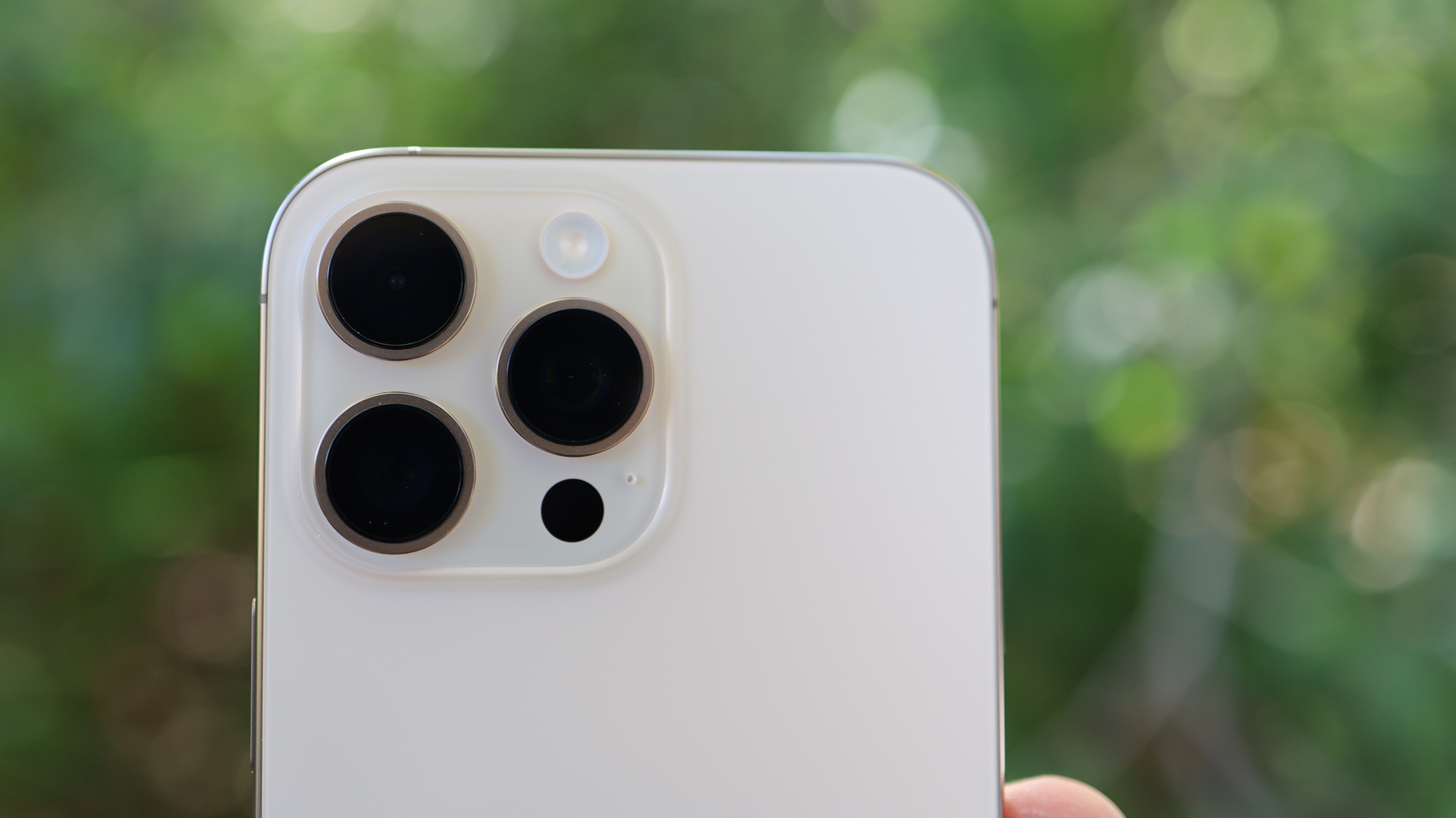
While Apple hasn't radically changed the iPhone's camera array, there are enough changes in hardware, software, and image processing, along with the aforementioned Camera Control button to make the imaging system feel fresh and new.
On paper, we have just one notable megapixel upgrade: the 48MP ultrawide camera, which will not only improve wide-angle shots but has a measurable impact on macro quality (though if you know how to fiddle with settings on the iPhone 15 Pro Max, the image quality leap is more like a hop).
Still, even though Apple didn't squeeze a much higher pixel count into the main camera, it did upgrade the sensor, and is promising much faster shutter speeds. And the autofocus is now enhanced with dual autofocus sensors. These are the kinds of incremental changes that should improve both the experience of using and the quality delivered by the main camera sensor, but they're also hard to measure. More on that in a bit.
The 12MP 5x optical zoom is essentially unchanged from last year's iPhone 15 Pro Max. The biggest news here is found not on this phone but on its little brother, the iPhone 16 Pro, which also gets the tetraprism lens. Last year's Pro model was stuck with just a 3x optical zoom camera.
Similarly unchanged is the 12MP FaceTime camera on the front.


Apple has also made some impressive updates in the video and audio arenas. No, the iPhone 16 Pro Max is not finally shooting in 8K (and why I wonder if we really need this) but the addition of 4K 120fps and Audio Mix tools are worth celebrating.
At the iPhone 16 unveiling, Apple described something called "cinematic slow motion", which sounded like a new mode that combines the iPhone's Cinematic video option in the camera app with a new slow-mo mode. That's not exactly what Apple meant. Cinematic video is still on the iPhone 16 line, but what's new is 4K 120fps video, which enables cinema-quality slow-motion effects.
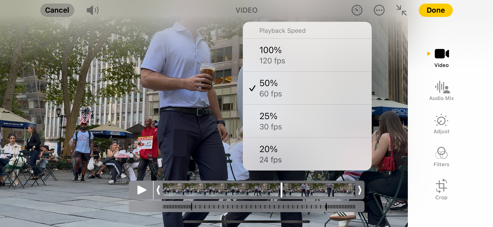
I shot video in 4K at 120fps and used the new Speed Control, which is under Edit and can be found in a new clock icon that appears on the top-right of the screen, to step through four dramatic speed options. There's 20%, which is 24fps, 25% (30fps), 50% (60fps), and the default 120fps (100%).
Since I shot at a high speed, slowing down the frame rate created smooth, high-resolution slow motion that makes even the most mundane shots look like something from a blockbuster movie. Cool.
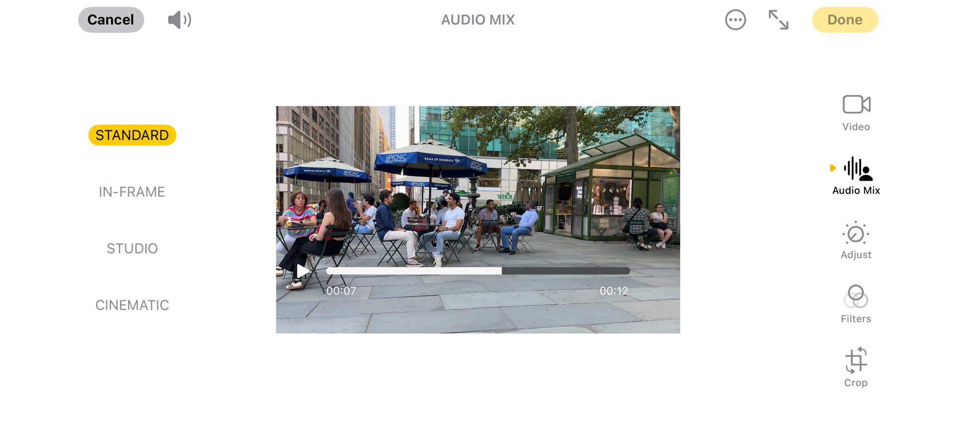
Audio Mix is another exciting update that in the right environment can transform open-air audio into something approaching film or studio quality.
I used it in a meeting booth, which has a noisy overhand fan, to record my voice, and found that it could bring the audio to near-podcast quality. There is, perhaps, the tiniest bit of over-processing, but I could see myself using it when I forget to pack my mic.
The In-frame audio mix, which focuses on whatever is in the video frame and tries to cut out background and side noises, does a good job. I tested it by recording some video of people talking on a video on my iPad while I chattered away out of frame but just six inches from the iPhone. When I turned on the In-frame mix, my voice was reduced to a background whisper.
I recorded video in a local park and used both the In-Frame and the Studio mix settings to cut back on some of the ambient noise, but I think they will be better used in a real Studio environment where engineers are struggling to cut out airplane and siren noises that leak through into the recording space.
If you've been keeping count, the iPhone 16 Pro Max has four cameras. Apple, however, likes to say that this phone (and the iPhone 16 Pro) has seven lenses. That's because it's measuring the millimeter options in much the same way a pro photographer would talk about all the lenses he has in his bag. For the iPhone 16 Pro Max, there's the macro lens, 13mm ultrawide, 24mm, 28mm, classic 35mm, 48mm 2x, and the 120mm zoom lens. And because you can choose among all these lens options in the Camera app, it makes some sense to describe them in this way. For the average user who's not so into photography, it's a nice window into the prosumer camera world, and I would encourage you to try all the different 'lens' options to see how they change the look of your images.


I tried to test the new speed of the iPhone 16 Pro Max cameras by snapping photos of a fan. I also shot it with the iPhone 16 Pro and the iPhone 15 Pro. What I found is that all were good at freezing the rotating fan blades. If I upped the camera capture quality to 48MP raw, that introduced some motion. I had better luck with a series of photos of pigeons on a New York City art installation. I noticed that the main and telephoto cameras did an above-average job of freezing the birds mid-flight, and I could make out clearly defined wings as opposed to a blur.
On the macro photography front, I can see some differences between the macro skills of the iPhone 16 Pro Max and iPhone 15 Pro Max, but when I upped the capture to 48MP HIEF raw on both phones the differences were minimal. The iPhone 16 Pro Max shoots excellent macros, but I don't think it's miles ahead of the last-generation phone.


Apple's baseline photography across all these cameras is excellent. There's a sharpness and color fidelity that will be the envy of most competitors. Low-light performance is excellent. I took shots in deep shade, and at night, where I captured some of the best astrophotography from an iPhone I've seen to date.
Apple is also upping its game on the image style front. There are now Skin Undertones and a selection of Moods that you can apply during or after capture.
Undertones, which are supposed to alter the look of skin while leaving the rest of the image generally untouched, come with names like Standard, Amber, Gold, Rose Gold, Neutral, and Cool Rose. You could use these as one-offs, or set it so all your photos have the same effect applied. Also, it should be noted that Undertones do, in my experience, alter the look of the rest of the image, although far more subtly.
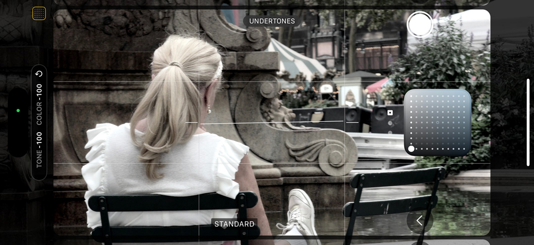


Both Undertones and the broader-brush Moods (which you get by swiping left instead of right in the camera app, and which apply a look to the entire photo) can all be adjusted through a new grid on which you drag around the center point to this quadrant or that.
This is a lot of control over the look and feel of your images, but I don't think I understand why we need it. Maybe fashion photographers and influencers will love it. My goal is always to capture people exactly as they are. Sure, I want to make them look good, but I don't want to alter the tone of their skin. As for the Moods, I like a moody black-and-white photo as much as the next guy, and I've experimented with this look on previous iPhones and other smartphones.
No new lens, megapixel count, or photographic style adjustment is likely to have as big an impact on iPhone photography as the new Camera Control button.
Almost since the day we started using iPhones, it was acknowledged that having a decent camera in your pocket might be more important than being able to make a call. Within five years of the iPhone's launch, Instagram arrived, cementing the marriage between social media imagery and the smartphone lifestyle. In the dozen years since then, Apple has worked to make the iPhone not just a point-and-shoot replacement, but one that would allow you to feel confident leaving your prosumer camera behind – and now there's a dedicated camera button to support this notion.
The Camera Control button lives on one long side of the iPhone 16 Pro Max, a couple of inches away from the Power button. It's a true sandwich of technology, featuring a touch-sensitive surface and haptic response. Ringed in metal, it features a sapphire cover that's slightly recessed from the body of the iPhone.
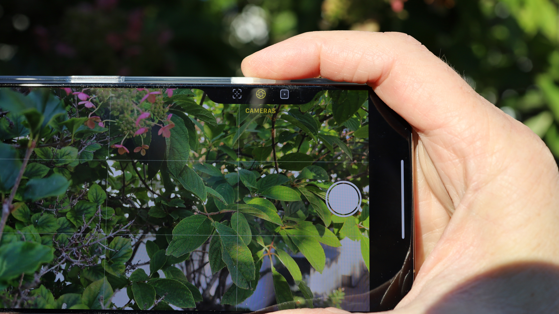
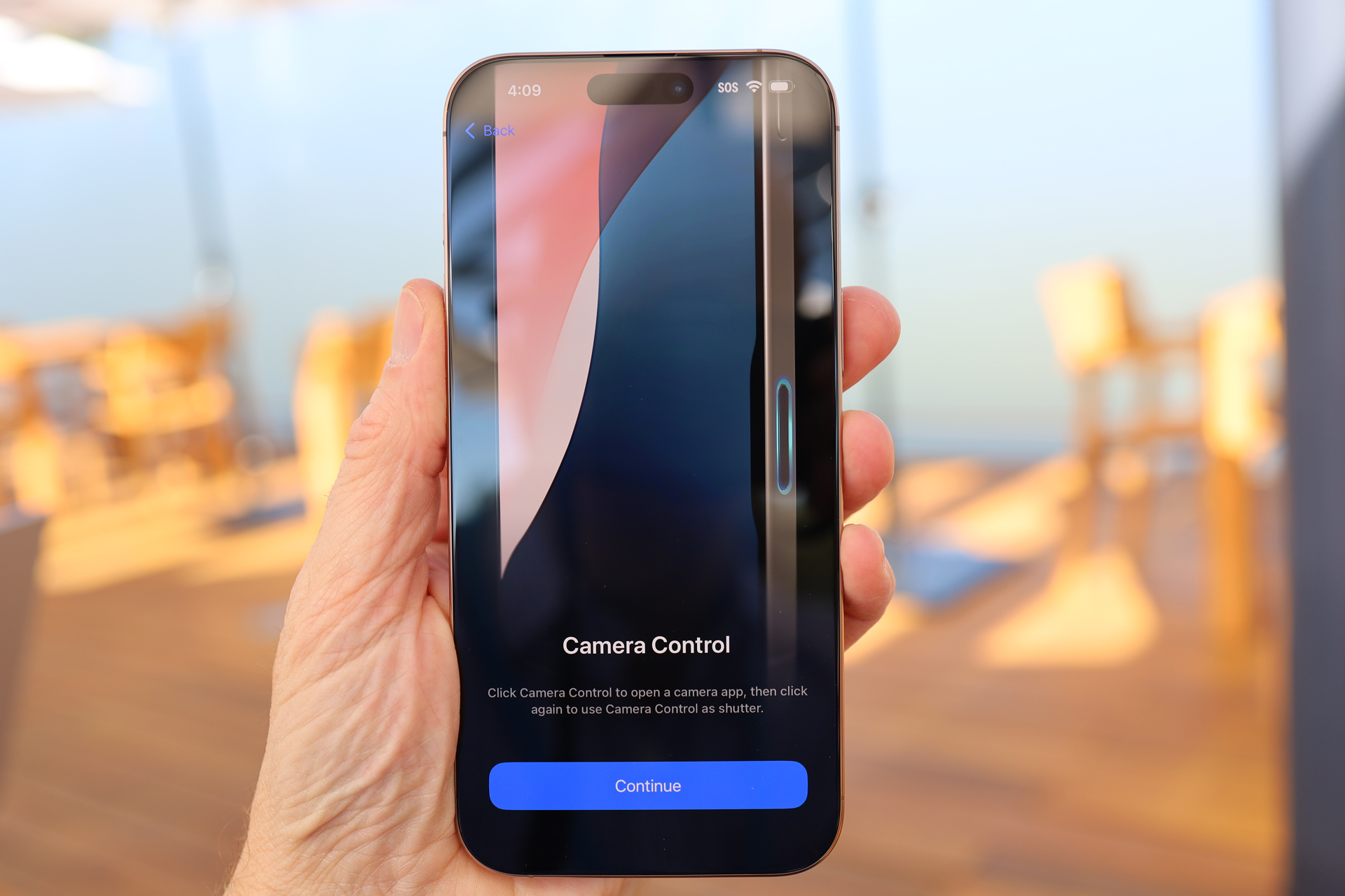
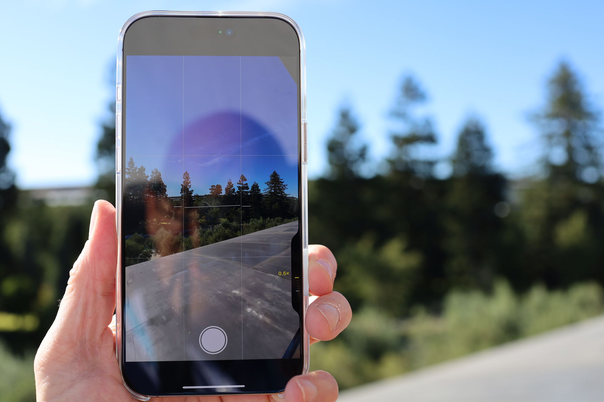
If you hold the iPhone in landscape mode, your index finger may discover it naturally. If the phone is locked, a hard, physical press will open the camera, and another press will take a photo; if the phone is asleep, it'll take three presses. If you press lightly until you feel a haptic response, this opens up camera controls in a small window that appears on the screen alongside the button. A swipe across the button scrolls through features like zoom level, camera lens choice, exposure, and depth of field. You select one with another light press, and then dial through your choices. A double haptic press digs deeper into the camera menu, where you'll find Moods and Undertones. Camera Control remembers your last settings, so you might be double-pressing to find your camera lenses, and if you're using, for instance, the FaceTime camera, you'll notice that 'Cameras' appears in the menu, but does nothing because there's only one camera option on the front of the phone.
When you hold the iPhone 16 Pro Max in landscape mode, Camera Control can make the phone feel a lot like a real camera. At launch, though, it's lacking one crucial feature: the ability to press and hold to focus and then fully press to take the shot. That's how other digital cameras work, and this feature will arrive on the iPhone at some point in the not-too-distant future.
I used Camera Control quite a bit in landscape mode, but found it awkward to use if I held the phone vertically. This made me wonder how often social media fans will use the button, since they shoot so many photos and videos in portrait mode. Perhaps Camera Control will launch a landscape-mode trend.
Despite the name, Camera Control is a versatile piece of hardware that will automatically capture video if you hold it down (it will default to whatever video quality setting you used last) and can be customized to launch the QR Code scanner, Magnifier, or do nothing. Expect to see a lot of third-party camera apps using it in the future.
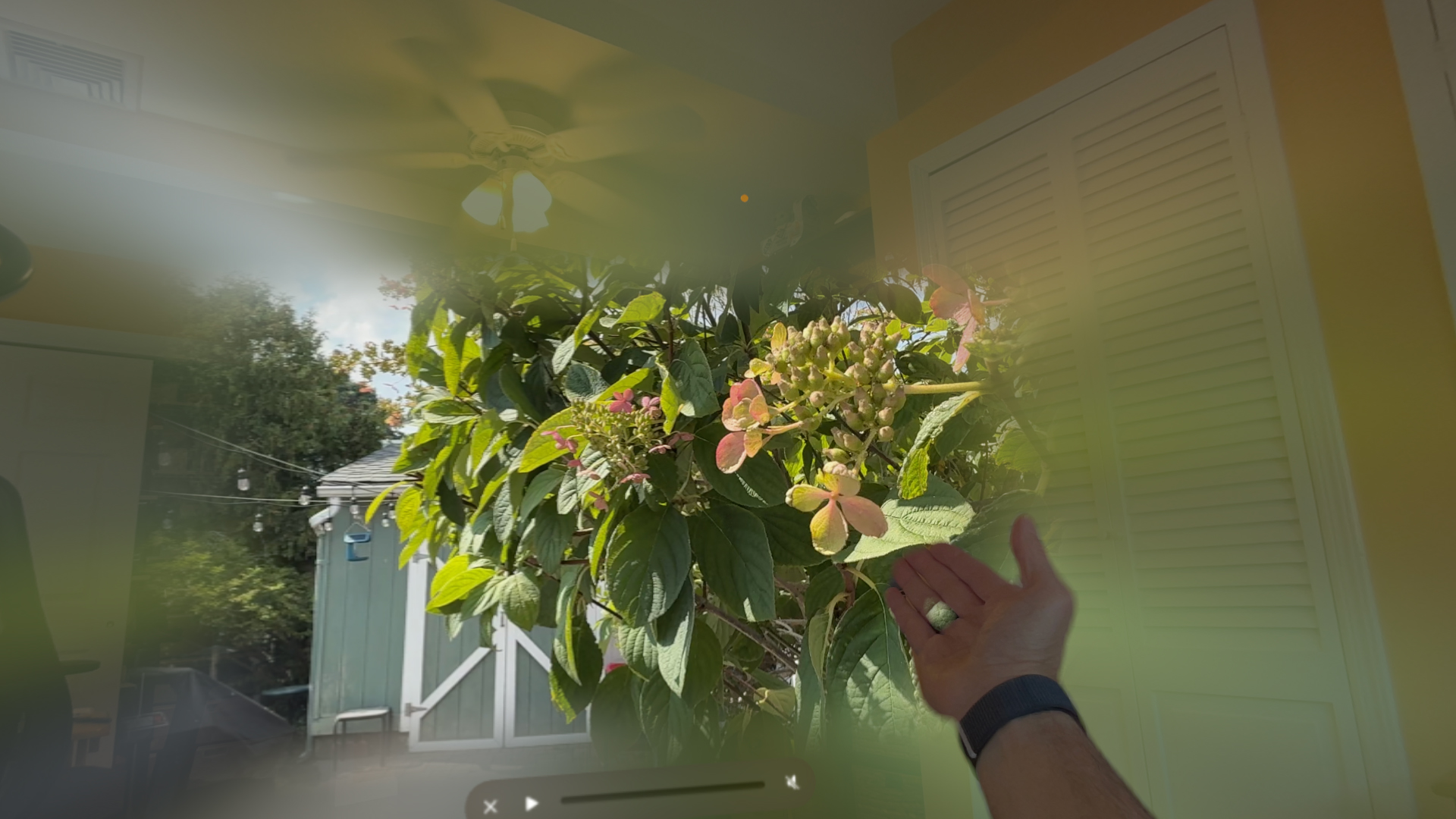
One other camera feature worth mentioning is the facility to capture spatial photos and videos. This first appeared in the iPhone 15 Pro and 15 Pro Max, and now spans the entire iPhone 16 line. The way it works is that two of the cameras – the 5x and ultrawide on the Phone 16 Pro and 16 Pro Max – are lined up so that when you hold the phone in landscape mode they can capture stereo imagery.
I took photos and videos in my backyard and then transferred them to my Apple Vision Pro. Inside the headset the stereo effect was very good, My only issue with this feature is that it's only useful if you have a VR headset – and how many of us have one of those?
Apple iPhone 16 Pro Max camera samples


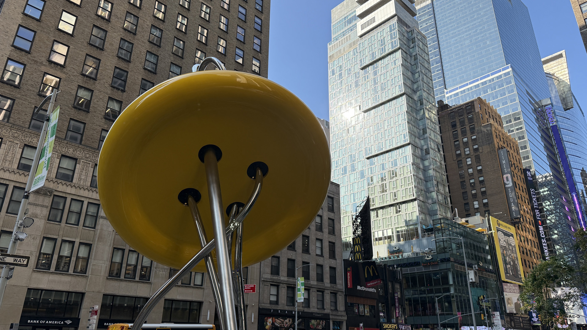


- Camera score: 4.5 / 5
Apple iPhone 16 Pro Max review: Performance
- A18 Pro is more power than most will need
- 8GB is enough
- Feel the heat
By every metric, the iPhone 16 Pro Max's new A18 pro SoC is a beast. It outperforms the A17 Pro and Qualcomm's Snapdragon 8 Gen 3 in most benchmarks. While Apple isn't backing the CPU with as much memory as you might find in, for instance, a Google Pixel 9 or Samsung Galaxy S 24 Ultra (both have 12GB of RAM), the iPhone 16 Pro Max and its A18 Pro chip make good use of the 8GB it has.
That the iPhone 16 Pro Max is essentially a mini-computer in your pocket should surprise no one. Apple Silicon has provided ample power for everything from everyday productivity tasks to 4K video editing and AAA console gaming (it now gets the benefit of iOS 18's Game Mode, which prioritizes game-related activities). The A18 Pro is no different, but in this case we have an even larger canvas on which to enjoy its benefits. I'm not sure I could find a task this phone couldn't handle. If I have one criticism it's that the phone does seem to get a bit warm during, for instance, gameplay (Death Stranding, anyone?) and video editing in Capcut (Adobe Premiere couldn't open any of the videos I shot on the phone).

I don't know if this is the graphite-covered aluminum substructure more efficiently delivering heat from the chip to the body, or the phone overworking. The good news is that this does not adversely impact performance or battery life.
Call quality was good, and I'm pleased to see that this is now a future-leaning platform with Wi-Fi 7 support. There's also Bluetooth 5.3 support, and second-generation Ultrawideband. It helps in the Find My app, which I used when I purposely misplaced my new AirPods 4.
In the US, the iPhone is now eSIM only, which I like, although some people miss the physical SIM card. I appreciate the ease of switching eSIMs from one phone to the other, and how easily the iPhone 16 Pro Max lets you switch between multiple eSIM numbers on one iPhone 16.
Apple also upgraded its satellite services. In addition to Emergency SOS, which lets you text, and even share your location, photos, and videos with, emergency services, there's now the ability to send and review text messages via satellite with anyone – even when you're not in an emergency. I couldn't find a cellular dead zone to test this, but I did notice that when I was flying the phone asked if I wanted to share my location via satellite. The satellite service is currently free for the first two years of iPhone ownership.
- Performance score: 4.5 / 5
Apple iPhone 16 Pro Max review: Battery
- More battery life than ever
- Qi 2 support
- Buy your own adapter
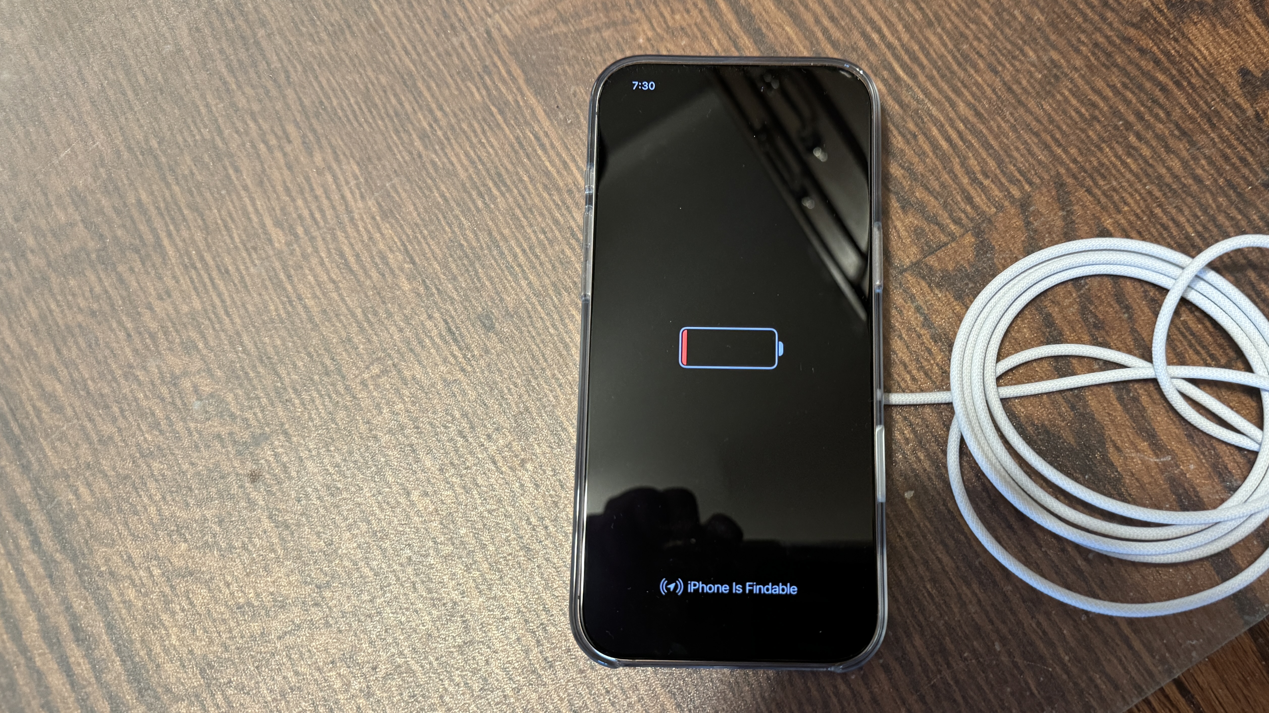
The iPhone 16 Pro Max delivered some of the best Future Labs battery-drain results I've seen. We got on average 16 hours of battery life on our tests, and anecdotally I saw between 14 and 17 hours depending on activity. That's impressive.
Apple is finally supporting Qi-2 wireless charging technology, and provided me with a new Qi-2 supporting MagSafe charger and a 30W charge adapter. The iPhone 16 line ships with a 60W-capable USB-C cable but no charging adapter.
Using those two accessories, I recharged the iPhone 16 Pro Max to 44% in 30 minutes. Apple claimed 50% in 30 minutes, so this is pretty close. A full charge took about two hours. One thing not a lot of people know is that, with a standard USB-C cable, you can charge your AirPods or Apple Watch off the iPhone (I tried it. It works).
There's even some movement on the Right to Repair front. Apple is claiming that the iPhone 16 line offers the simplest battery replacement yet. Instead of stretch-release adhesives, the iPhone 16 line uses ionic liquid adhesive to hold the battery in place. It will react to a low-voltage current (even a 9v battery) and release from the enclosure. I don't know if this means more consumers can replace their own batteries or that it'll be simpler for Apple geniuses. Either way, I can't wait to see this in action.
- Battery score: 4.5 / 5
Should you buy the Apple iPhone 16 Pro Max?
Buy it if...
Don't buy it if...
Apple iPhone 16 Pro Max review: Also consider
Apple's latest flagship iPhone not exciting you? Here are three alternatives from the Android frontier.
How I tested the Apple iPhone 16 Pro Max
- Review test period: I received the phone on September 10 and tested it through September 17.
- Testing included: everyday use including web browsing, photography, video calling, gaming, streaming video, music playback, and test-driving Apple Intelligence
- Tools used: Geekbench 6, Geekbench AI, GFXBench, 30W charge brick and Qi2 MagSafe charger
I used the iPhone 16 Pro Max alongside an iPhone 15 and a new iPhone 16 Pro, primarily to compare interface and performance differences. Where possible, I used the iPhone 16 Pro Max as if it were my everyday smartphone.
I've been testing smartphones for over 20 years, and I've been writing about the iPhone since it launched. I've also been tracking and writing about AI since the dawn of consumer-grade experiences more than a decade ago, and I've been covering technology for 38 years.
First reviewed September 2024


