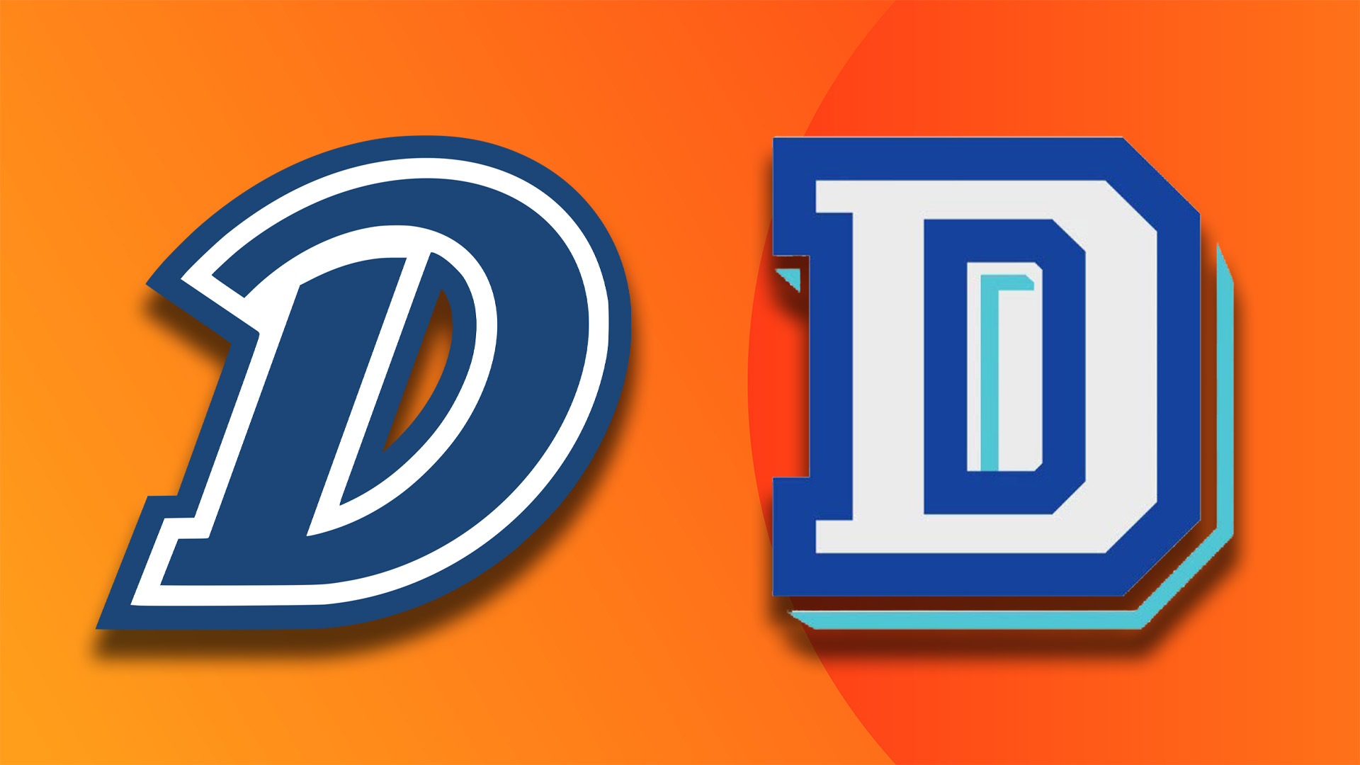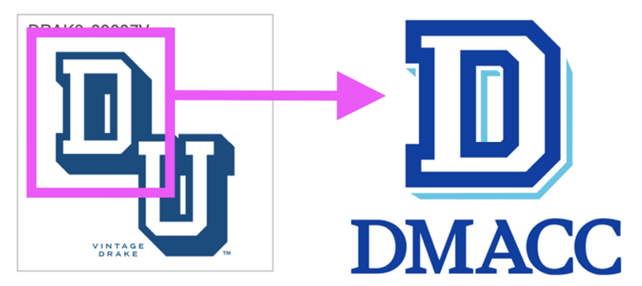
Drake University is suing fellow Iowa-based education centre Des Moines Area Community College (DMACC) over the letter 'D'. The bizarre move comes as a result of DMACC using a similar bold varsity style font in its new branding, which Drake claims infringes on its trademark identity that has been used since 1902.
There's no right way to design a logo, but often it's best to carve out an identity that stands out from the competition. But while there are certainly similarities between the two parties' logos, in my opinion trademarking the letter 'D' seems like quite the stretch.

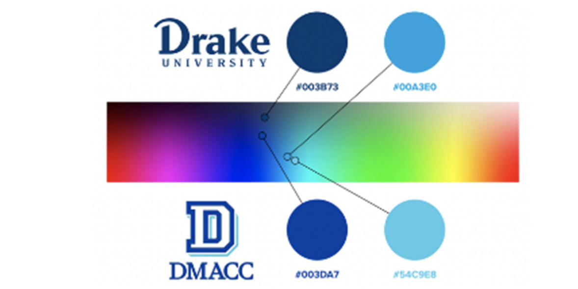
In a detailed lawsuit, Drake University highlighted the heritage of its logo, showcasing the various merchandise, sports uniforms and website motifs that have spanned the logo's more than one-hundred-year legacy. Citing similarities between the design of the 'D' emblem, a similar colour blue palette and "competitive proximity" concerns, Drake has called for DMACC to cease all use of its alleged infringing 'D' branding.
In response to the lawsuit, the DMACC issued a statement reading "Drake University simply does not own the letter D. In fact, multiple universities use the letter D in their branding and many own federal trademark registrations for the same. Our hope is that we can move forward with our joint mission of providing students with a high-quality education.”

For more logo news, check out the Starbucks design feud between the coffee connoisseur and a New York-based marijuana dispensary. If you're looking for some design inspiration, check out our definitive list of the best logos of all time.


