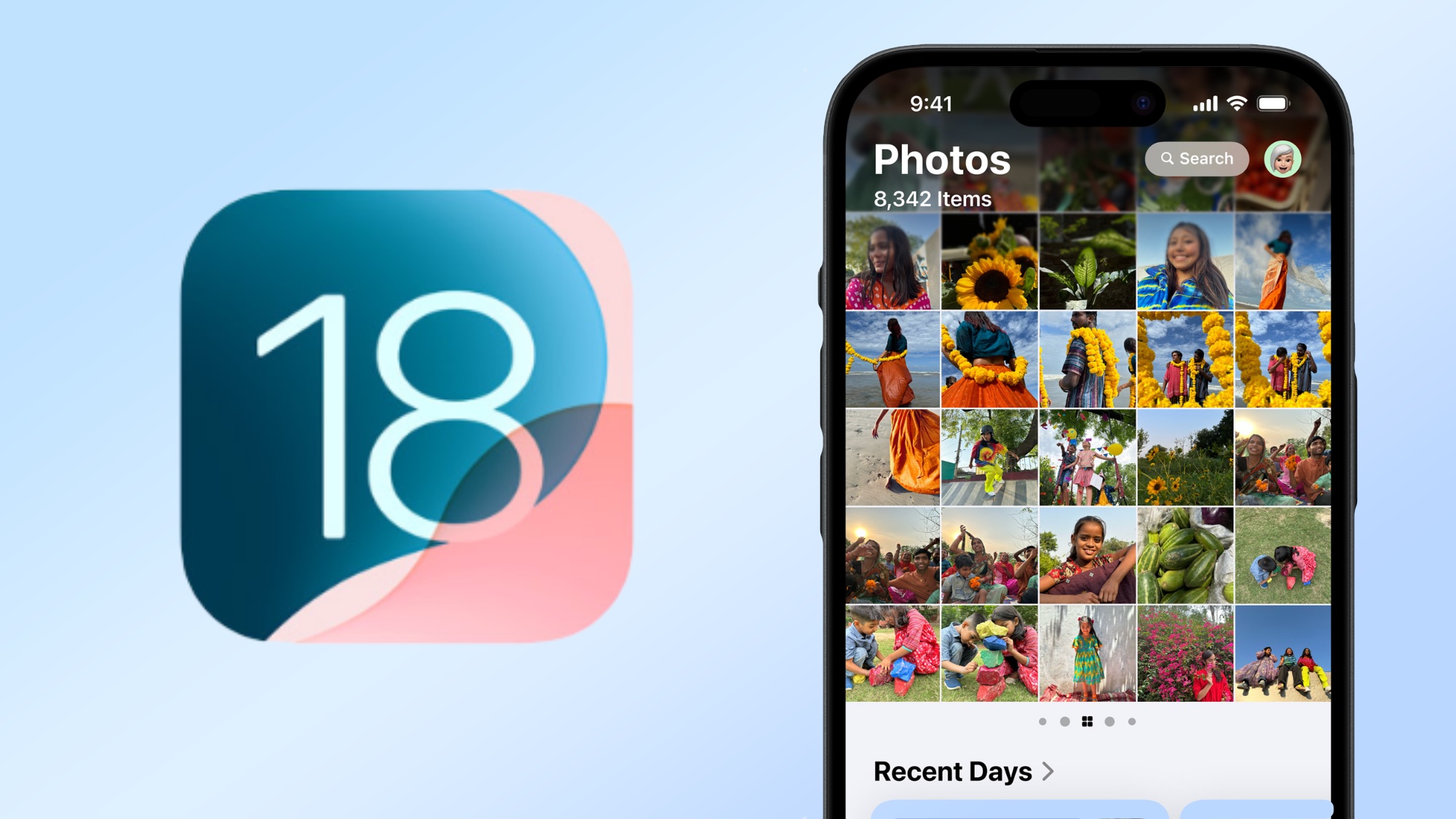
The arrival of iOS 18 in September brought a new version of the Photos app to your iPhone. The multiple tabs from the previous versions of Apple's built-in photo management tool are gone, so you're no longer jumping between your main library, different albums and the app's search tools. Instead, there's just one unified screen, where swiping and scrolling are the order of the day.
There's a motivation behind these changes, Apple says. Starting with the WWDC 2024 keynote this summer that gave us our first look at iOS 18 and continuing through the company's own iOS 18 preview page, Apple has been touting the new design as a way for streamlining photo searches and rediscovering images you may have even forgotten you captured. Or as Craig Federighi, Apple's senior vice president of software engineering, put it during WWDC, Apple thinks this redesign will help Photos users "get to the good stuff."
Now that iOS 18 is available to anyone with a compatible iPhone, it's time to dive into the new Photos app and look at what's changed. We can also explore the features coming to Photos via Apple Intelligence when the iOS 18.1 update shows up in October.
iOS 18 Photo Library
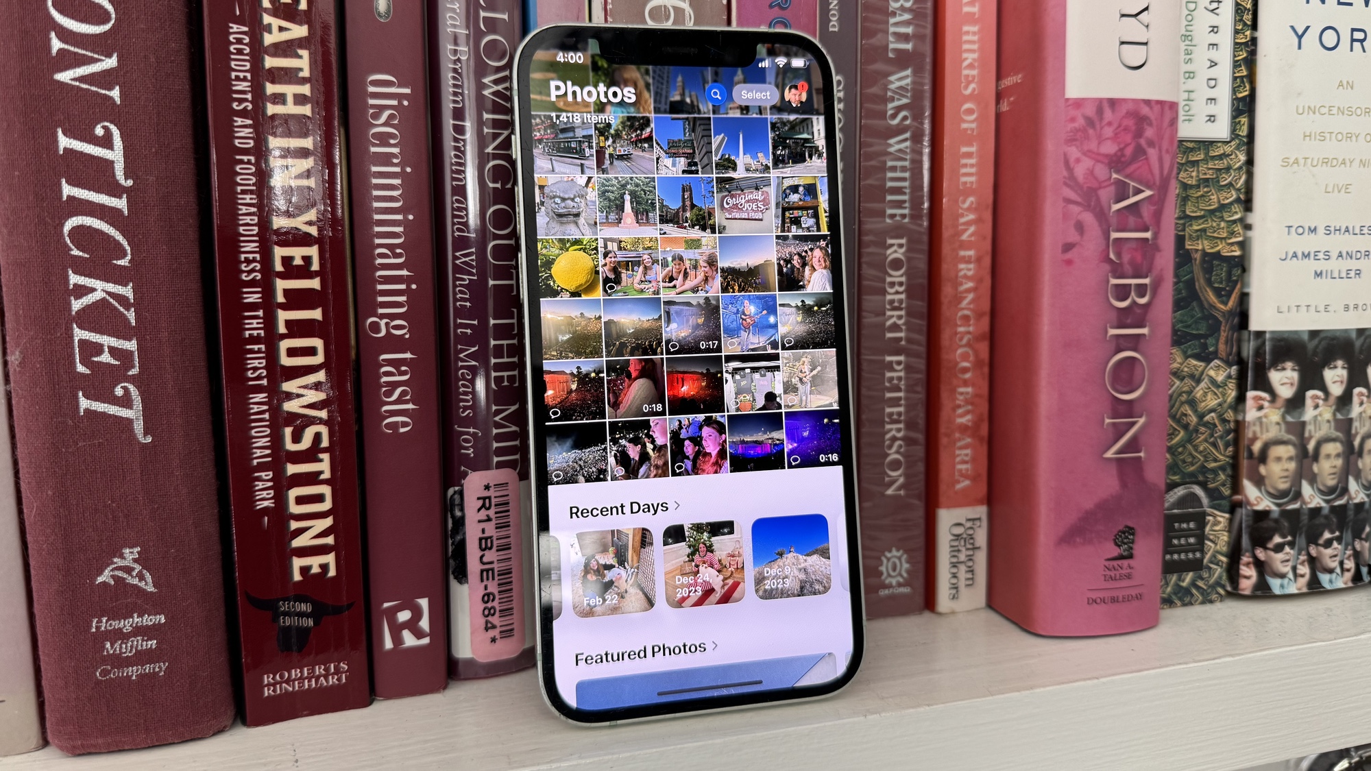
The iOS 18 Photos app takes up a single screen that's split into two areas. Your Photo Library — the main view in the iOS 17 version of Photos — now sits on top of a group of photos that Apple's dubbed Collections. (More on Collections shortly.)
To dive into your library, you swipe down. That gives you a grid of every photo in the library, but a toolbar at the bottom of the screen lets you view photos by year and by month.
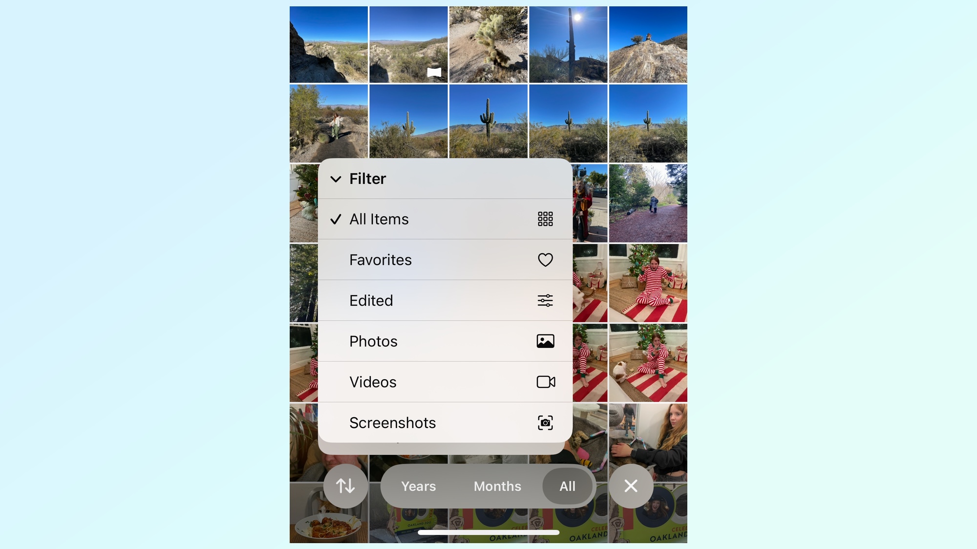
Apple has also included buttons for further filtering your Photo Library. When you're scrolling through your library, there are filters to show photos from specific years and months. Another button on the far left of the screen includes a way to filter library contents to show favorites, edited photos, videos and screenshots, among other items. I've found it's a great way to filter out screenshots from my browsing, as I can highlight just photos and videos.
Collections
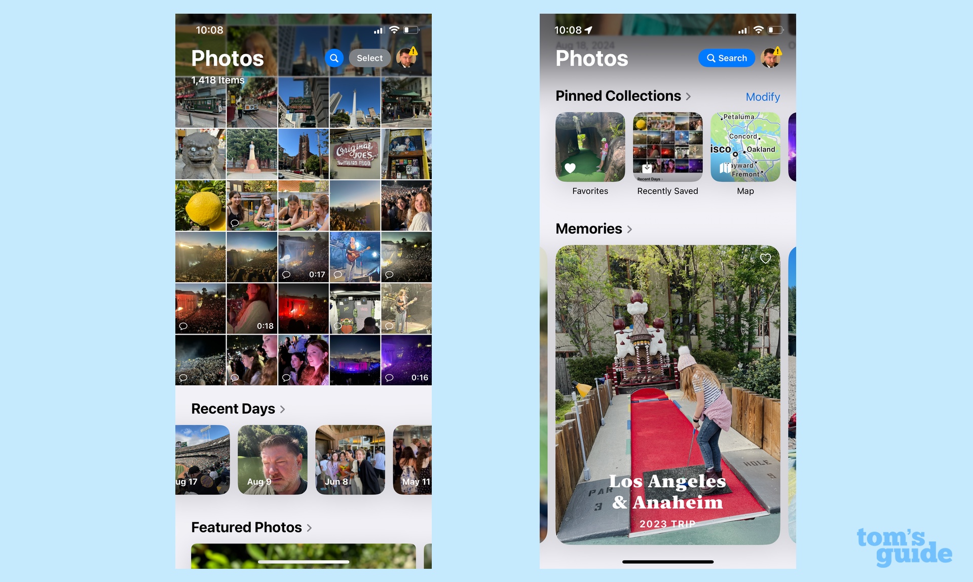
Apple intends for the Collections area of the iOS 18 Photos app to be the place that helps you either find specific photos or discover old favorites from your albums. It does this by listing photos both by time and topic.
The time element is represented by the Recent Days section, which organizes the shots you've taken in the last little while. You start off with today's photos, but you're able to swipe between days to go back and find recent shots.
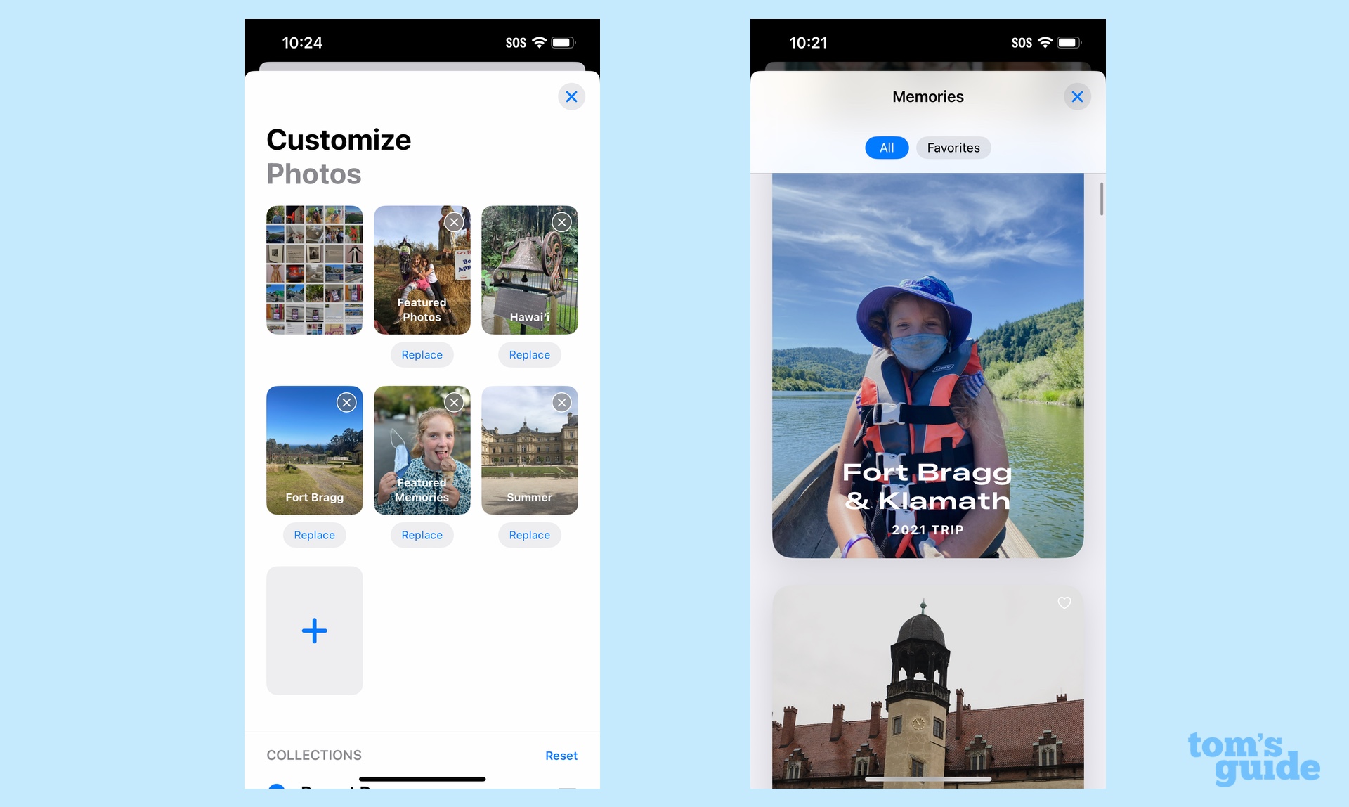
Just below the Recent Days section, Collections organize your photos by topic. These include things like Trips, People and Pets and favorite memories, among other sections. The Memories strip features an auto-playing slideshow of the photos and videos in a particular collection, while the People and Pets screen has a grid of faces that taps into the facial recognition features built into Photos. Collections also has a Pinned Collections section, for groups of photos you like to have at the ready.
The very bottom of the screen includes various photo albums that you've created over the years. You can also find sections for Media Types that let you find specific types of images (Videos, Selfies, Portraits and so on) and Utilities, where you'll find hidden photos and recently deleted images.
Perhaps the best thing about Photos in iOS 18 is that you're able to customize the order in which all these collections appear. Want Memories to appear higher up on the screen? Just dig into the Photo app settings and rearrange things. Our guide on how to customize the Photos app can walk you through the steps.
iOS 18 Photos: What's changed since the beta?
If you used an early beta of iOS 18, you may be wondering what happened to the carousel feature that Apple included in initial builds of its software update. The carousel lived at the top of the Photos app, and it allowed you to swipe right or left from your photos library view to see selected collections and favorite photos. Naturally, you could customize what appeared there.
Somewhere along the way in the iO 18 beta process this summer, Apple axed the carousel, apparently the result of user feedback. You could argue that it did duplicate the Collections area below the photo library, though I appreciated the ability to more prominently display favorite photos without having to scroll downward. That said, I've subsequently gotten used to the carousel's disappearance, so perhaps it's not that big a loss after all.
One other change i've noticed from the beta is that the Recent Days section is more compact than it used to be. Apple apparently decided to shrink down this section to squeeze in more of the main photo library.
iOS 18 Photos and Apple Intelligence
Apple is not done introducing changes to the Photos app. If you've downloaded the iOS 18.1 beta, you'll know that the first round of Apple Intelligence features introduces more new capabilities, though only if you have an iPhone 15 Pro, iPhone 15 Pro Max or any iPhone 16 model introduced this fall.
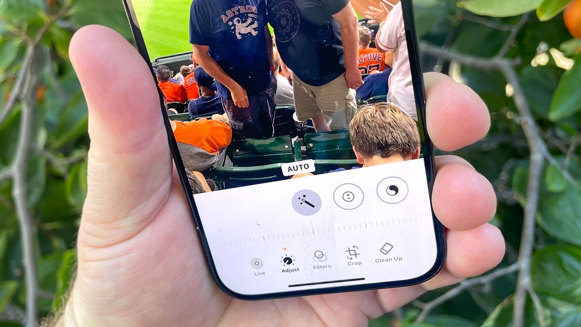
The biggest change introduced by Apple Intelligence in Photos is a new Clean Up tool, which is essentially Apple's take on the Magic Eraser feature Google has included on its last several Pixel phones. Like Magic Eraser, Clean Up lets you excise unwanted people or objects with just a tap.
You can read our Clean Up first impressions, but the long and short of it is, Apple's take on AI-powered photo editing is pretty-straightforward, though it can struggle with fixing images when faces are obscured by objects. We've got a step-by-step guide on how to use Clean Up in Photos.
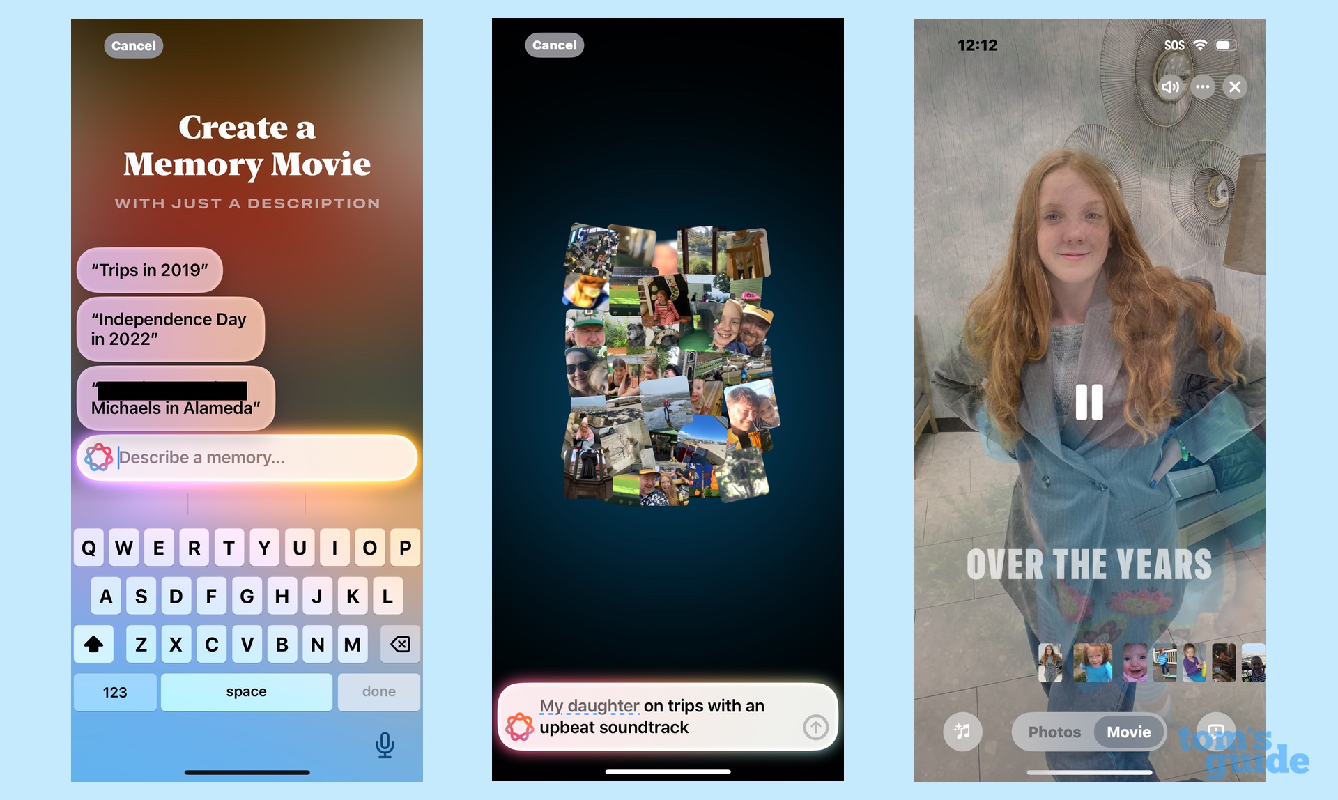
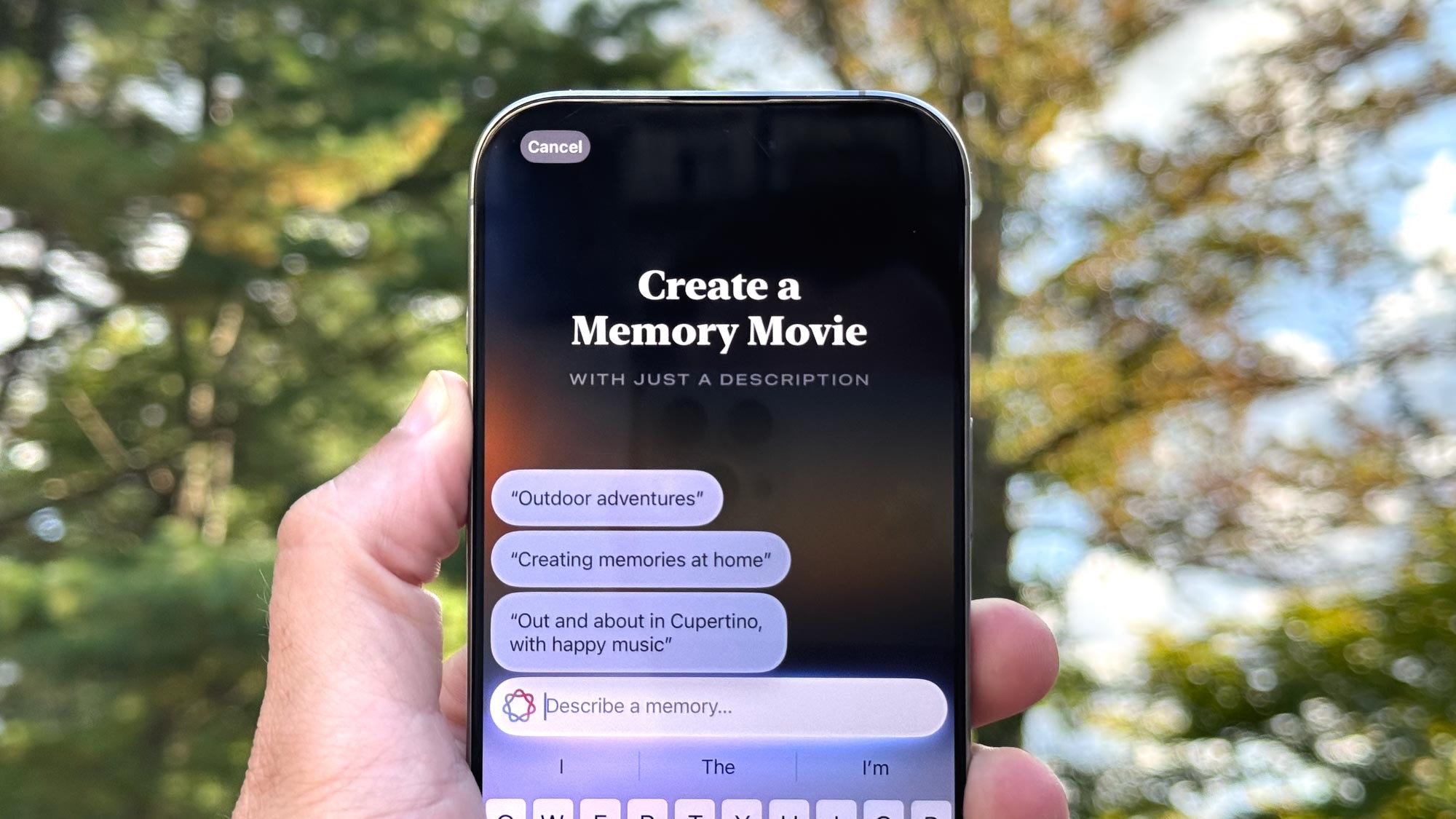
Memory Movie gives you the power to create your own version of those Memories that populate the Photos library, using just a text prompt. Typing something like "photos of football and baseball games set to marching band music" will generate a slideshow of images pulled from your library that fit your criteria. You also have the ability to tweak filters and music — the latter feature works best if you subscribe to apple Music — and edit the auto-generated title.
In my hands-on experience with Memory Movies, I found that the feature generally performed well, though it lacked some of the polish Apple promises. (For instance, Apple says the assembled movie will offer a recognizable storyline; in my experience, that storyline is usually "here are photos shot in chronological order.") You can use our guide to create a Memory Movie to find out for yourself how the feature performs.
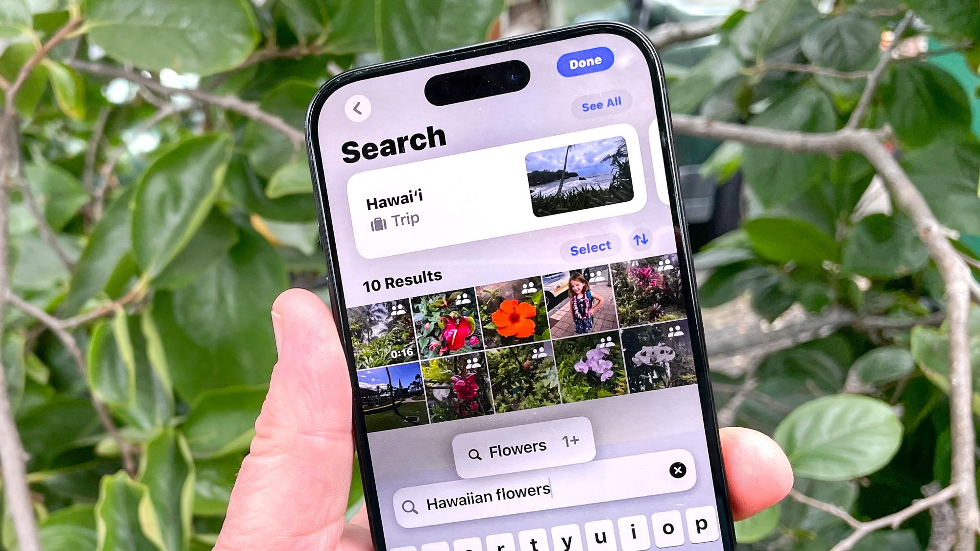
Apple Intelligence also spruces up the search functions in Photos. Before, you were essentially limited to typing in keywords and hoping for the best, but Apple Intelligence supports natural language search. A query like "flowers in Hawaii" will turn up all the photos in your library that match that term.
There's some good news if you don't have a phone that runs Apple Intelligence. Some natural language search capabilities seem to have found their way to all iOS 18-compatible devices. When I tested the new search tools on both an iPhone 15 Pro and iPhone 12, I found the latter phone produced similar results in some cases.
iOS 18 Photos outlook
Photos probably sees the biggest changes of any app in iOS 18, even before you get to the Apple Intelligence capabilities coming in October. In listening to other iPhone users, I've found the new look to receive mixed reviews, with some people objecting to the changes and others appreciating the more streamlined look. Me, I've found that I've gotten used to it over time, and the improved search features — both filters and natural language searching — are worth the price of admission.
Anyone with an Apple Intelligence-capable phone will likely get more out of this update. But even if you've got an older device, you'll still appreciate the customization tools that let you make the app look like you want it to.
