It's a small thing, really, but I can't stop thinking about the new iMessage App menu in iOS 17, or rather the look of it. It is, how should I put this, distinct?
When Apple blazed through a host of platform, product, and spatial computing updates and launches (including macOS Sonoma, watchOS 10, the Vision Pro) at WWDC 2023, it was easy to miss something. I know that as I tried to cover it all I either overlooked or at least didn't stop to think about a few things. But I do remember seeing something during the iOS 17 reveal that gave me pause: the new location and design of the iMessage Apps.
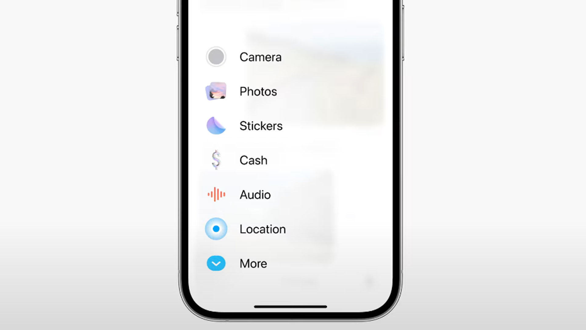
What was formerly a horizontal tray right above the keyboard and below your message conversation is now hidden under a large "+" sign next to your text box. Selecting it brings up what Apple called "a sleek new box." Instead of seven selections, there's now a large vertical list of six apps and a down arrow to find more. The number of available apps, though, is not what's important. It's the look of the thing.

Going pastel
First, there's the distinctly pastel hue of it all. During the presentation and in a screenshot I grabbed I see hints of purple, pink, and baby blue. These are not colors I typically associate with Apple. This is not a Jony Ive look. The former Apple Design Chief who left the company in 2019 favored bold but never cartoony colors.
Perhaps the early iPhone's most distinctive interface design feature and Ive's signature was skeuomorphism, where elements of a real-world object are translated into the digital form. The icon for photography looks like a camera. Your mic icon looks like a shiny silver mic, and the notepad features the yellow lines of the physical original.
Over the years, Ive and Apple moved away from skeuomorphism. Icons flattened and instead of nodding enthusiastically at the physical counterpart, they maybe offer a glancing recognition. Sure, the flashlight and calculators in your Control Center still look like the real thing, but they're monochromatic and just a basic suggestion of the physical devices.
The pastel iMessage App Center is something else. It's definitely not entirely flat and, yes, it's inviting back in just a bit of that classic Apple skeumorphism.

New direction or outlier?
Look at the new Stickers icon. It looks like a peel-and-stick sticker in the process of being peeled off the screen. The Cash icon is a bold, 3D dollar sign. Photos are a pair of photos fanning out, which is barely skeuomorphic but also nothing like the current, flat Apple "Photos" app icon.
Apple didn't go wild with this new look. The camera is...actually, I'm not sure what it's supposed to represent. Maybe a gray version of the Camera app's shutter button. I wonder if that app icon design is even complete. Audio is a basic, red audio wave. Location pushed hard on the pastel but doesn't really say "location" to me.
Taken as a whole, though, you have a very different Apple menu, one that looks little like anything else on the iOS platform. It makes me wonder if this is a sign of things to come.
What if Alan Dye, Apple's current software design lead, decided to use iMessage Apps as a little aesthetic flag in the ground, a sign of the shape, color, and style of things to come? Is Dye's color pallet more tie-died than monochrome?
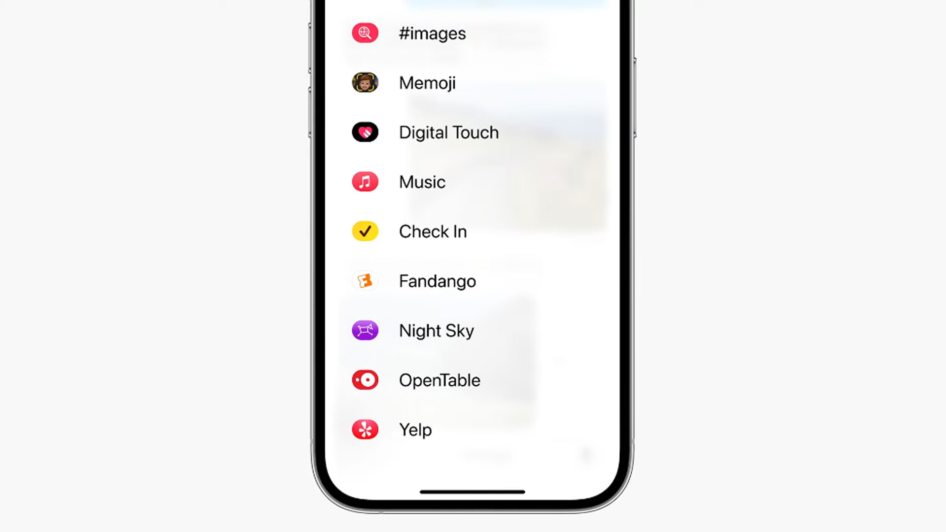
It is early days in the iOS 17 beta cycle and whatever we see in Apple's first Public Beta could be different. Maybe Apple adjusts the iMessage App center to be more like the rest of iOS (the app icons you see under "more" are unchanged from iOS 16), or perhaps we find more iOS 17 features that look just like this, with warm pastel colors and just enough skeuomorphism to make them seem accessible.


