It's been six weeks since the iOS 17 public beta debuted, giving people plenty of time to familiarize themselves with the changes coming to Apple's iPhone software with the full release this fall.
If you've installed the iOS 17 public beta, I'm going to assume your experience is a lot like the one I described in my iOS 17 hands-on — an uneventful upgrade that nevertheless manages to introduce some welcome enhancements and new features to the iPhone.
Which is not to say there haven't been hiccups along the way.
I'm not referring to bugs, though like plenty of beta releases, iOS 17 has its shares of those. The two most persistant I've run into are on-screen widgets that don't show any data — my Move ring from the Fitness app occasionally shows up as blank — or the on-screen keyboard momentarily disappearing from the Messages app. These are momentary annoyances, certainly, but I imagine they'll be smoothed out by the fall. The blank widgets, for example, have become less of a problem with each subsequent update to the public beta.
No, the hiccups I've run into are the features that are more or less working as intended, though maybe not as smoothly as they should. In some cases, it'll be a matter of Apple fine-tuning things while in others, it's just taking time for my brain to relearn how to do something in the updated OS.
Nevertheless, these are the biggest iOS 17 frustrations I've run into during my time with the beta. Maybe they can serve as a guide to you once you're ready to try the new operating system, whether that's now or once the full version arrives in the fall.
Live Voicemail inconsistencies
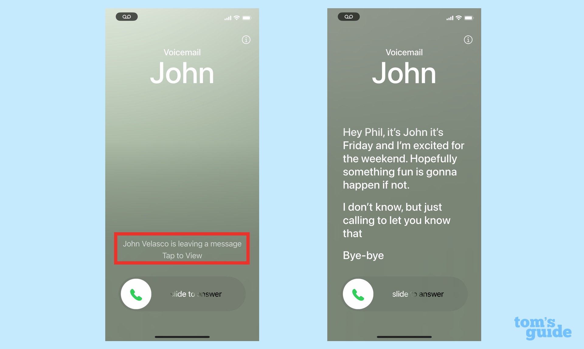
List all the promised changes in iOS 17, and the one that likely generates the most anticipation is Live Voicemail. That's the addition to the phone app, where messages from callers appear in real time, transcribed on your iPhone screen. That lets you know if it's an important call you need to take right now or something that can go to voicemail. It figures to be a real time-saver, not to mention a way to keep spam calls at bay.
The trouble I've run into is that Live Voicemail doesn't always leap into action in a predictable way with every call. Sometime, that transcribed message will pop right up. Other times, I've gotten a notification that someone is leaving a message with no other indication of the message's contents.
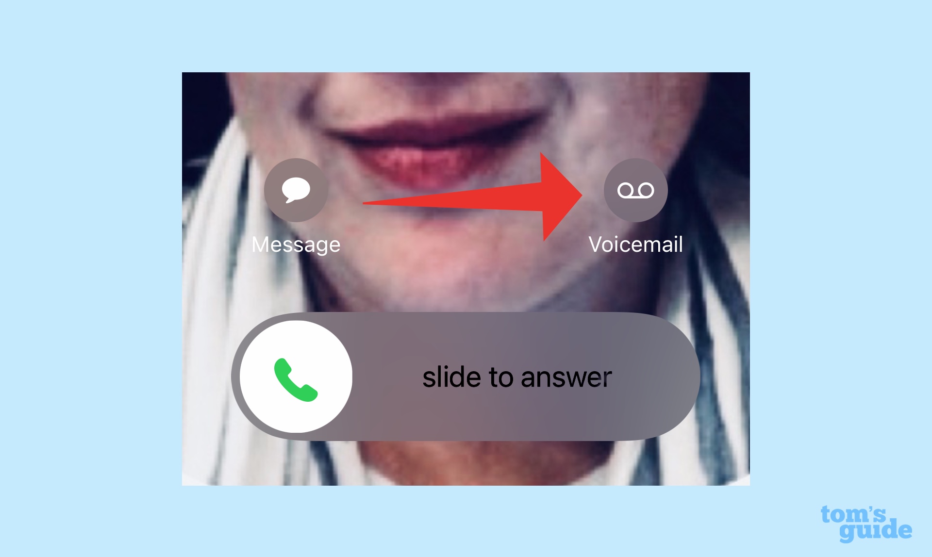
Near as I can figure, using Live Voicemail requires a modest amount of intervention on your part. I've gotten my best results when an incoming call appears, and I tap on the voicemail button that pops up on my iPhone lock screen. A message will generally appear then, though sometimes I'll be prompted to unlock the screen first. That certainly seems to work better than just letting the phone ring — a live voicemail message almost never appears in that circumstance.
FaceTime voicemail
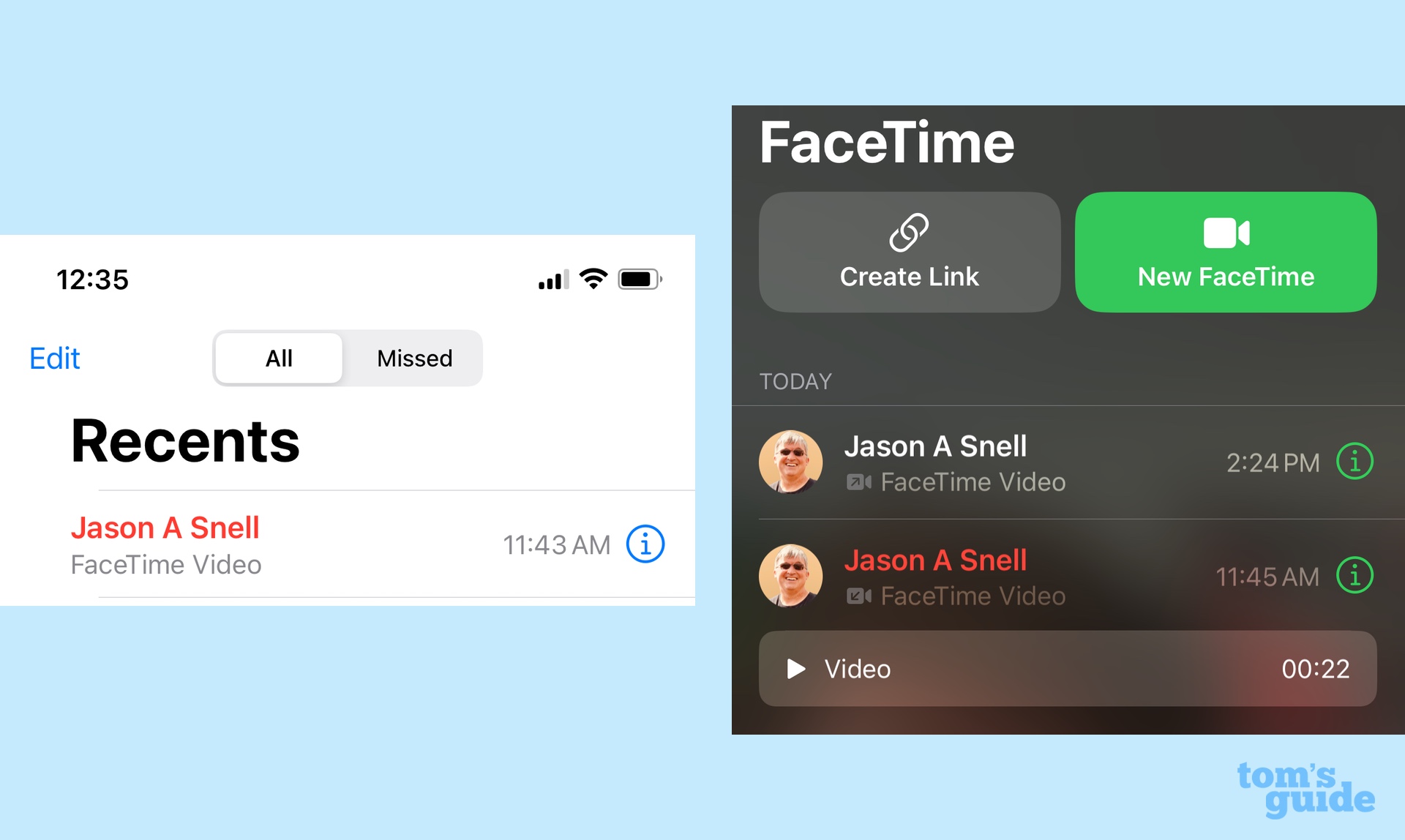
Live voicemail isn't the only message-based improvement introduced by iOS 17. The software update now lets you leave voicemail messages when you try to make a FaceTime call and you wind up not connecting. I think this is a handy addition that lets people know you were trying to reach them and even provide additional details like whether they should call you back.
What I'm less keen on is the clutter caused by FaceTime messages. You'll get a notification in the FaceTime app, along with a link to the video message that's been left. (It's not immediately intuitive how to get rid of this message if you don't need to keep it, but just swipe left for the delete button to appear.) A missed call also appears in Recents tab of the phone app for any FaceTime call you didn't answer.
Some people might appreciate the multiple ways to let you know an incoming call came in, but I think it adds needless clutter, especially since tapping the missed call in the Phone app will immediately launch a FaceTime call without seeing the message left for you. I'd prefer FaceTime messages live in FaceTime and missed phone calls live in the Phones app, with never the two meeting, but it doesn't appear that Apple is letting me vote.
The limits of Standby mode
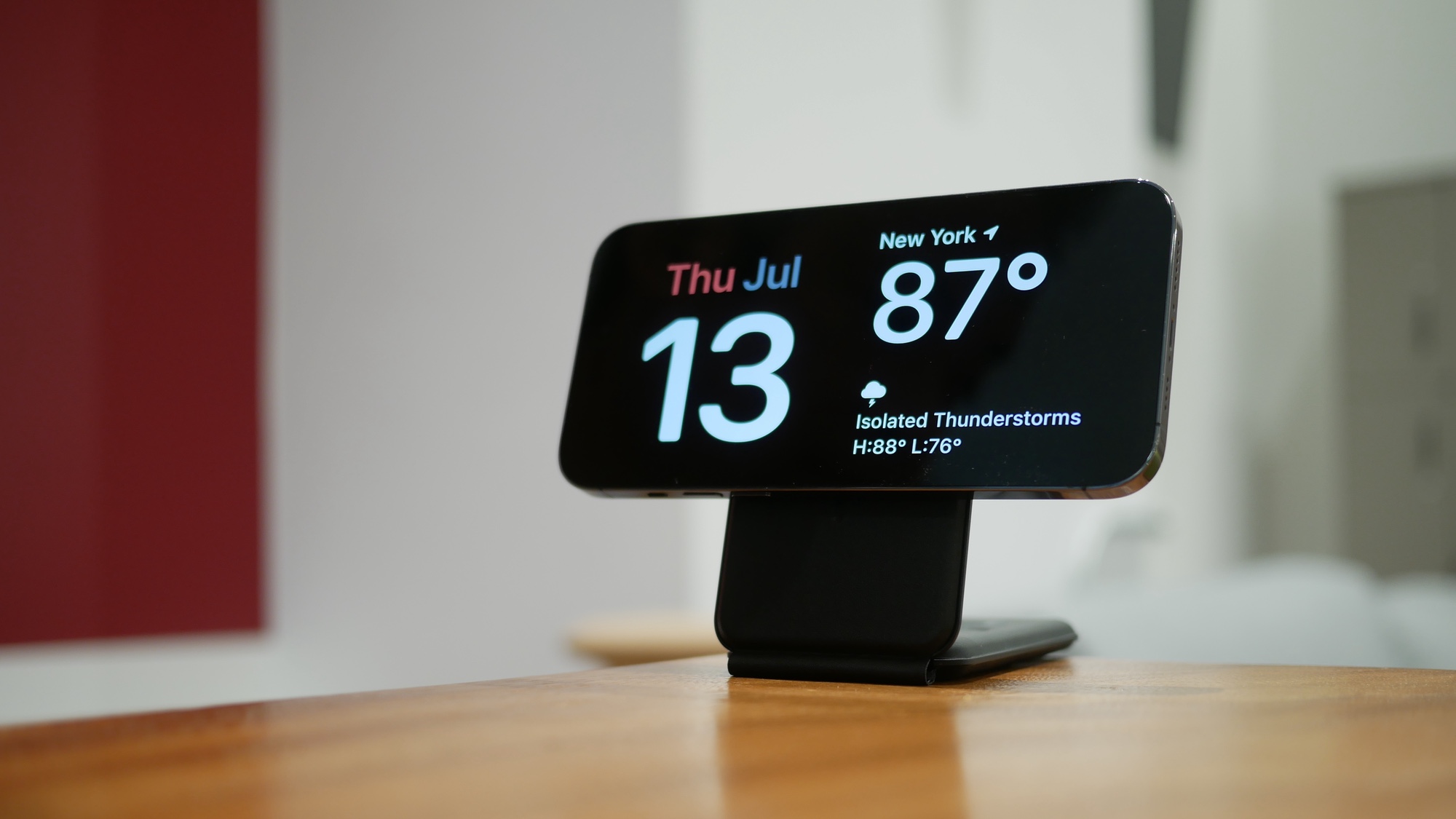
I like the idea behind Standby mode, which brings new smart screen-like functionality to an iPhone that's being charged. Prop up your phone horizontally — a MagSafe stand can help that happen — plug in your phone to charge, and the screen will display a clock and a calendar, a photo slideshow or other widgets you'd find on a smart home hub. That's a pretty useful addition.
Or it would be if I had an iPhone that supports always-on display functionality. Alas, I'm using an iPhone 12, and after about 20 seconds, my phone's screen goes to sleep, taking all that informative smart screen data with it. Yes, I could jostle the phone away, but that kind of defeats the "set it and forget it" nature of Standby mode. Clearly, this is a feature that requires an iPhone 14 Pro — or any new iPhone that has an always-on display, he said, anticipating the iPhone 15 launch — to reap the full benefit.
Passcodes cleanup caveats
There's a promising change to the Messages app in iOS 17. All those texts you get containing one-time codes for two-factor authentication are supposed to vanish, keeping your list of conversations in the Messages app free of clutter. You just go into Passwords section of the Settings app and turn on the clean up automatically feature to make those messages go away.
There's a caveat, though — those messages only disappear instantly when you use AutoFill to enter the passcode on your iPhone. The problem is that two-factor authentication doesn't always work like. Sometimes, those passcodes are something I typing in manually on my nearby Mac. And so, those messages containing passcodes don't always get deleted right away. (Maybe this will change once I upgrade the software on my Mac to macOS Sonoma, but one beta program is enough for me at the moment.)
My colleague Peter Wolinski insists that messages with passcodes are eventually thinned out of your conversation list whether you use AutoFill or not. I confess that I haven't had the patience to test this yet, usually swiping to delete such messages when I spot them. But I'll keep an eye peeled to see if this passcode cleanup feature is a little bit more seamless than I realized.
Proximity-based AirDrop
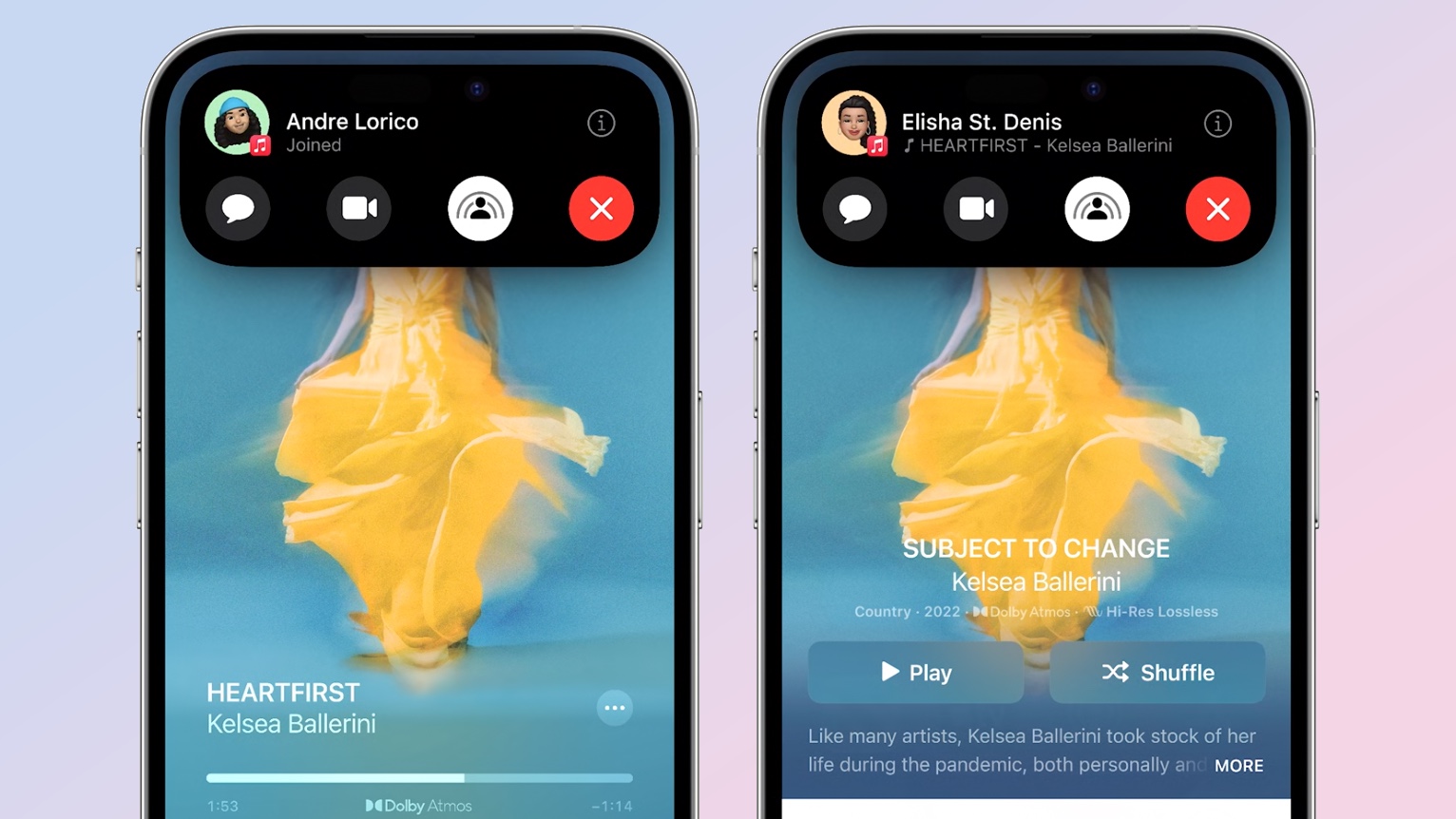
In iOS 17, you're supposed to be able to bring your iPhone near another person and automatically share whatever it is you have open, like a photo or video. (The feature also works with contact information and iOS 17's fancy new contact cards, where it's billed as NameDrop.) The idea is that instead of having to summon up the share menu, all you have to do is bring your devices next to each other, confirm the share and enjoy a hassle-free transfer.
I haven't quite gotten the hang of this yet, and I have to confess it is for a lack of trying. I work out of a home office, which means the only person running the iOS 17 beta in my immediate vicinity is me. Testing a proximity-based feature like the revised AirDrop requires hunting down a friend or colleague who's running the iOS 17 beta, too, and the last time that happened, I was still fumbling with the share button, when I needed to just sit back and let iOS 17 do its thing.
Chalk this up to a "It's not Apple, it's me" frustration, but it's probably something a lot of people will experience when they make the initial leap to iOS 17 without someone nearby to AirDrop with.
The new Plus button in Messages
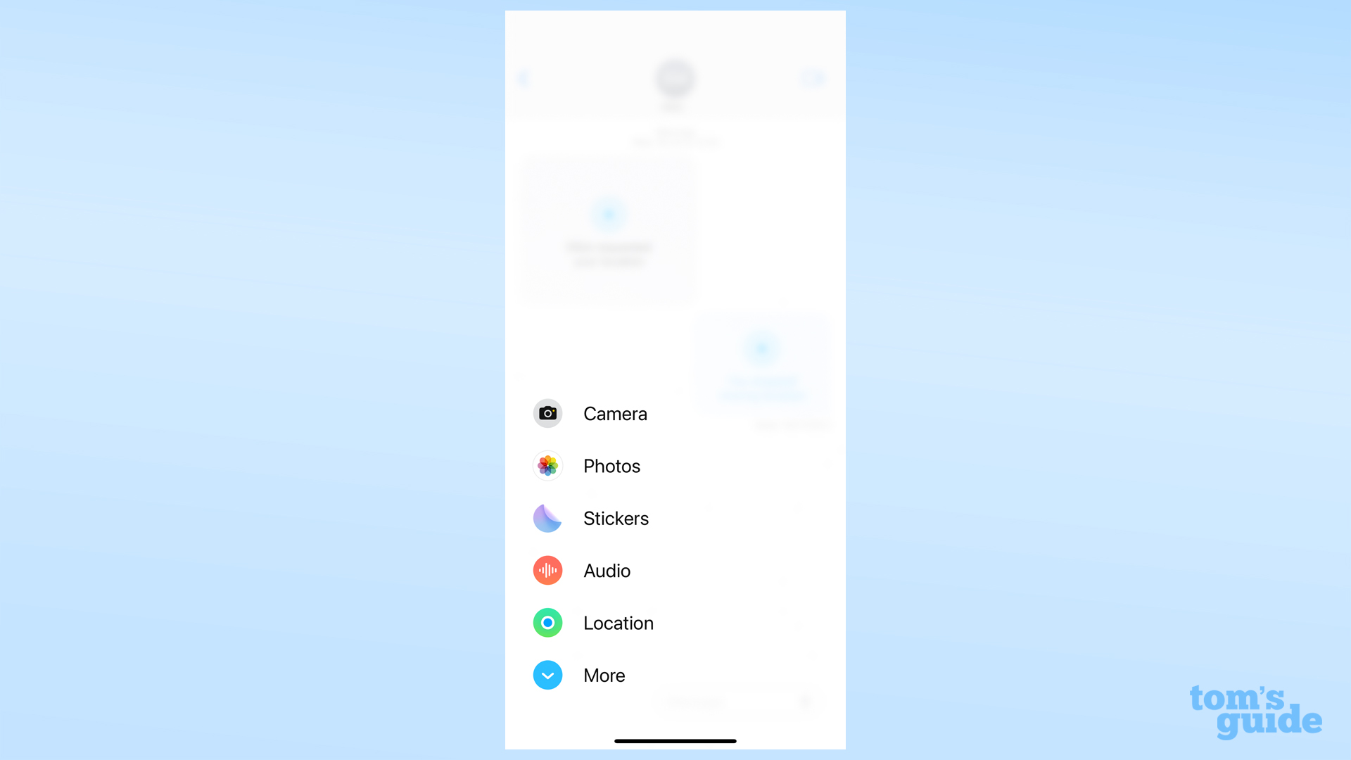
Apple is trying to reduce some of the visual clutter in the Messages app by finding a new home for the iMessage apps. In the current version of Apple's chat app, those shortcuts for sharing photos, sending GIFs, exchanging cash through Apple Pay and accessing all of the other apps available to Messages appeared right above the keyboard. In iOS 17, Apple moved the iMessages app to behind a single button; tap that plus button, and the apps fan out showcasing your most frequently used apps at first.
I think this a great change, actually, though I admit that frequent Messages users are going to need some time to get used to tap on that Plus button and then scrolling to find the iMessage app they want. Also, if the order of the list is supposed to change over time, it really hasn't for me during nearly two months of beta testing. But that's really a small complaint.
The End Call button, on the move
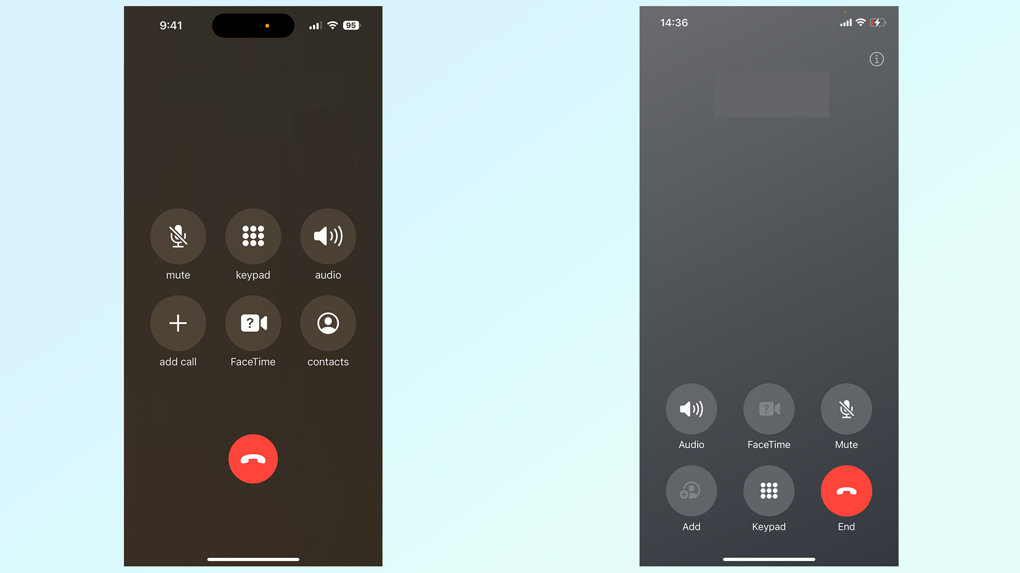
When I started testing iOS 17 earlier this summer, I noticed something when trying to hang up at the end of phone calls — my finger kept hitting the FaceTime button instead. It's not that I can't recognize the different icons; rather, my muscle memory had been used to tapping the End Call button in the middle of the screen where it had been located in iOS 16 (and long before that). iOS 17 moved the FaceTime button into that area, with End Call joining the second row of buttons in the lower right corner.
"Maybe I'll get used to that change," I thought. But I never really did.
And a lot of iOS 17 beta testers were equally flummoxed, judging by the flood of stories about the Phone app's button switch-a-roo that started surfacing at the beginning of August. I don't know why the story only took on momentum then — maybe that was when people started installing the iOS 17 beta on their full-time devices and realized how the rearranged buttons were throwing off their phone call game. Whatever the reason, there was an outcry.
More importantly, Apple did something about it.
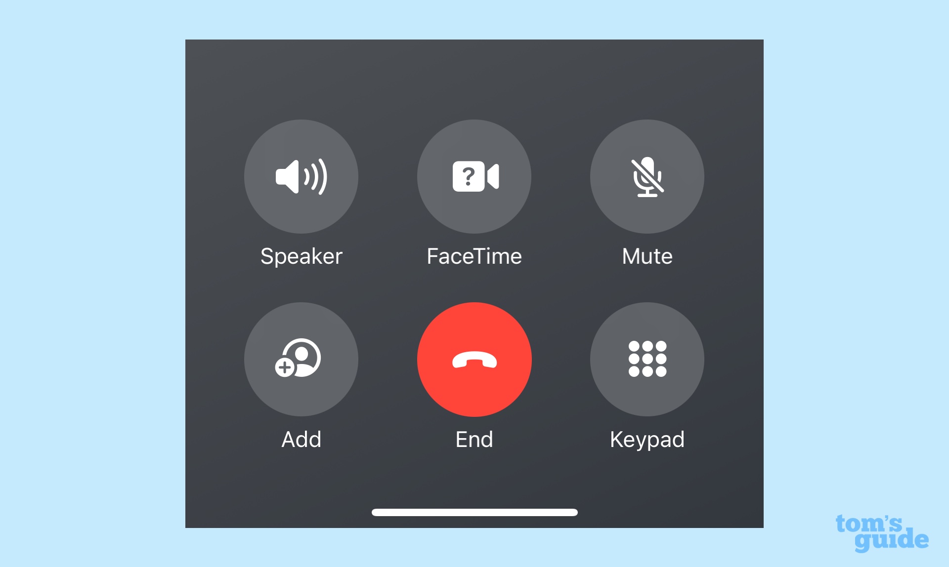
As I write this, the current version of iOS 17 features a Phone app with the End call button back in the center of the bottom half of the screen. The FaceTime button is still closer to where the End Call button used to be, but at the new location is at least in the vicinity of the old one. I imagine you're going to hear many fewer complaints as more people try out iOS 17, whether that's no or when the full version comes out next month.
And I think that's good news. The purpose of these beta programs is to try out new features and see which ones still need tweaking. That Apple was willing to respond to feedback on this particular issue suggests there's hope about any other iOS 17 alterations that rub people the wrong way, whether it's the changes on this list or something else entirely.


