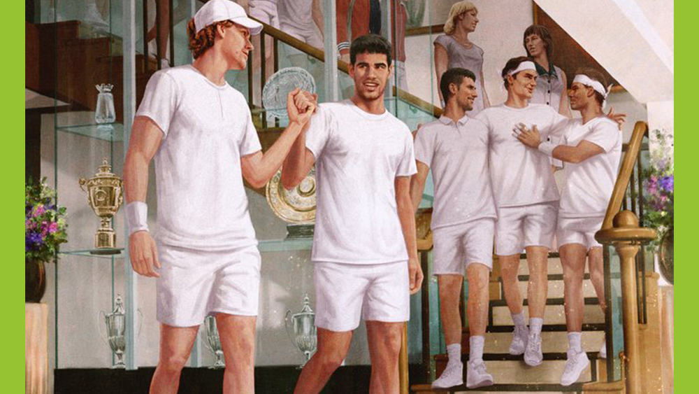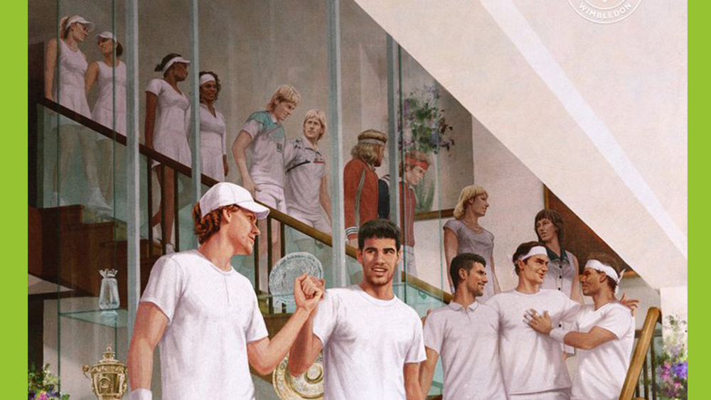
Tennis fans can be fiercely loyal, so Wimbledon should have known it was courting controversy with a new piece of artwork celebrating "epic rivalry" in the tennis championship. With Wimbledon 2023 underway, the official Twitter account shared an illustration of 15 players descending a staircase at the All England Lawn Tennis Club.
But the image was promptly torn apart in the comments, both because of who was and wasn't included in the artwork and because of where some of the players are located. Even two-time Wimbledon champion Andy Murray has an opinion (suffice it to say, this isn't one we'll be including in our favourite poster designs).
At Wimbledon, we've witnessed epic rivalry after epic rivalry, lifting the sport to new heights ✨Here's to the next generation of headline acts... pic.twitter.com/Lq9J2qVQEnJune 20, 2023
The controversial Wimbledon poster shows 15 tennis stars walking down a staircase. The Italian Jannik Sinner and Spain's Carlos Alcaraz– neither of whom has ever won the event – lead the way, followed by Novak Djokovic, Roger Federer and Rafael Nadal.
Six women are represented, but it seems very notable that they've been mainly placed at the back: even the Williams sisters who won Wimbledon 12 times between them. What's proving most controversial, however, is the absence of Andy Murray. The artwork has variously been described as a 'disgrace', an 'insult' and a 'disaster' on Twitter.

"I’m in no way shape or form a Murray fan but this is borderline insulting," one person wrote. "Whoever commissioned this 'artwork' just insulted Scotland," someone else tweeted. "The whole timeline of these rivalries is utter rubbish. Nadal has only appeared in 3 Wimbledon finals, the same as Murray," someone else wrote.
"Appalling at every level, all about the men in the forefront and your own British history maker nowhere to be seen. You should be ashamed of yourselves," one person lamented. "They put Serena & Venus in the back like we back in the Civil Rights era," someone else wrote.
Murray himself has waded in on the issue. According to Sky News, he said that "Me not being on it is certainly not a problem" but that lamented the women players being placed in the background. "For me, Alcaraz and Sinner are unbelievable players, but it just seems strange that they were all sort of behind them," he said.
It seems people may have missed the point of the artwork. Wimbledon said the work was to commemorate rivalries, including between new generations, and Murray never had an arch-rival like the players pictured. But perhaps the response means that the whole concept was badly conceived (see our pick of the best sports logos for examples of more successful design in sports).


