
Nostalgia is having a moment in interiors right now, but more often than not, this translates as cozy schemes filled with hand-crafted pieces, natural materials, and heritage prints. However, Ina Garten's sunshine-filled living room is making us think about nostalgia of a different kind. Her unexpected color combination of olive green walls and a vibrant orange sofa is giving unequivocally 1970s vibes, and we can't get enough.
Far from feeling dated, these shades bring a wonderful warmth – emphasised by the rays of sunshine streaming in through that floor-to-ceiling window – and create a scheme that looks both chic and modern.
Jenny McGillicuddy, Founder of Rosenqvist Interiors in Maine, shares her insights: 'The key to using a 70s palette today is leaning into softer, earthy tones rather than the era’s brighter colors – shades that feel especially relevant now for the warmth and calm they bring to interiors. Paired with warm neutrals instead of crisp white, they work well in today’s spaces that feel layered and lived-in.'
Shop Living Room Accessories Inspired by Ina Garten's 1970s Color Palette
These buys from furniture to accessories will help you to try Ina Garten's orange-and-green living room look
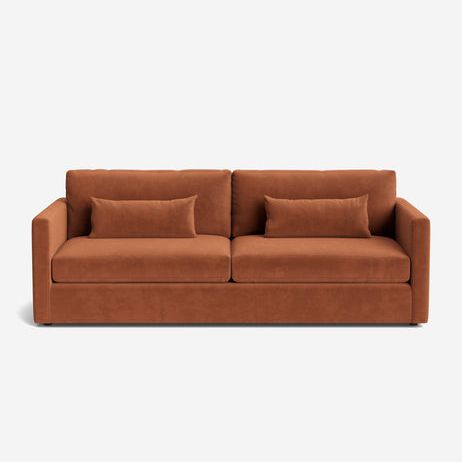
This hand-upholstered sofa in a faux mohair finish is a timeless design that transcends trends, while the saffron shade is spot on for leaning into Ina Garten's 70s-inspired color palette.
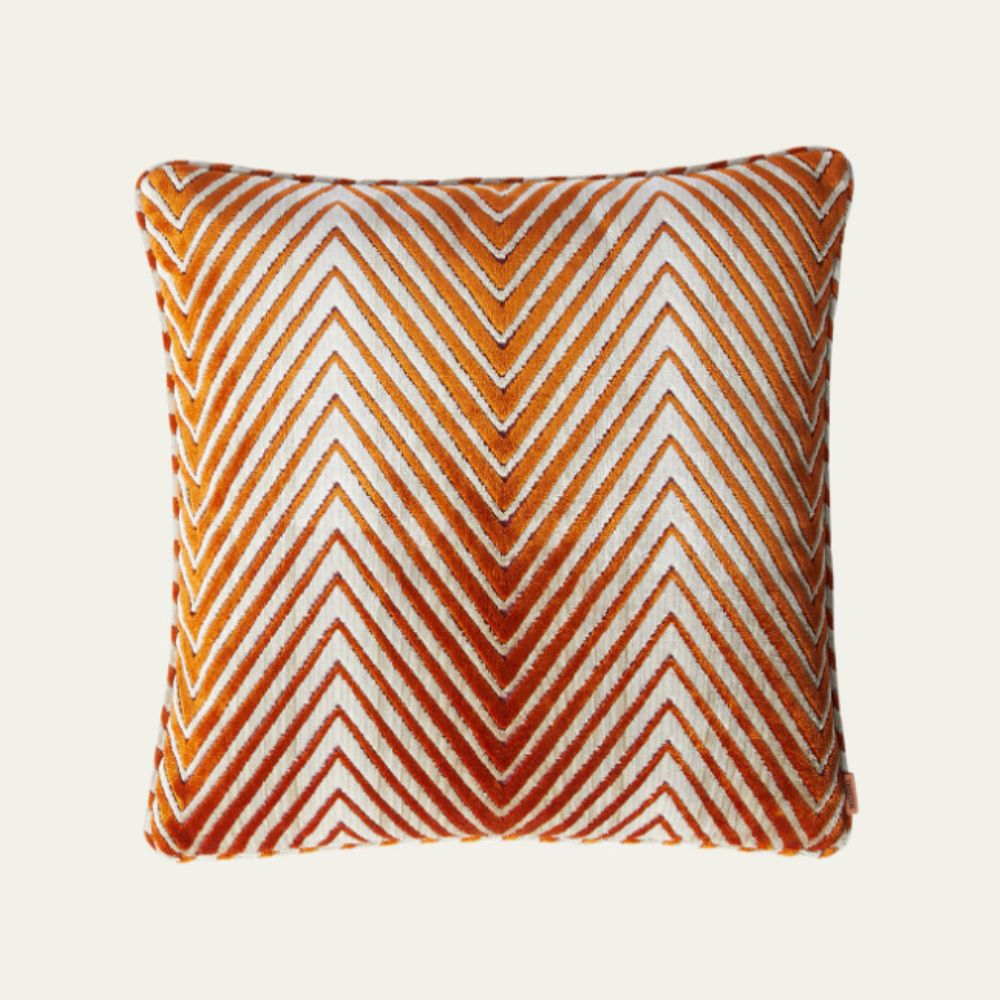
Designer touches like this throw pillow by Missoni – a brand that's synonymous with 1970s color and pattern – will really elevate a basic sofa, making it look chic and intentional.
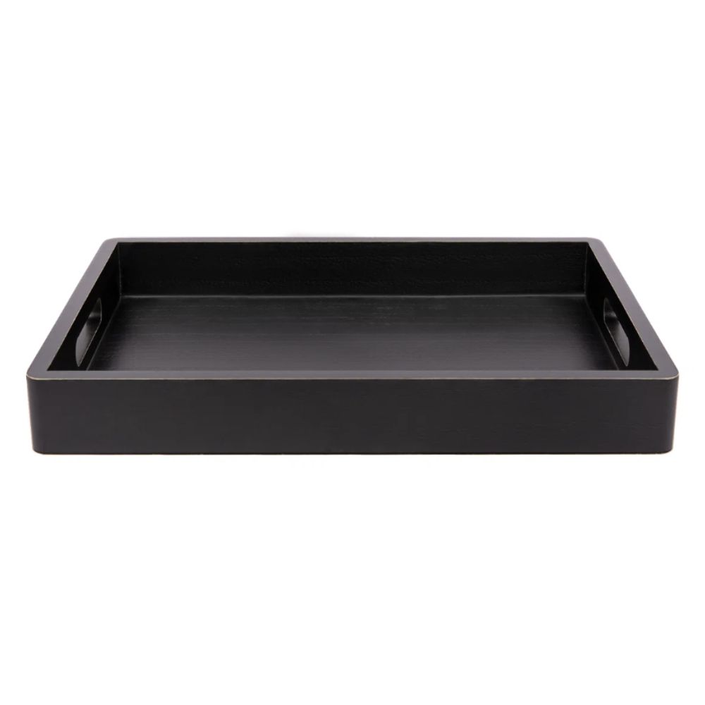
A splash of bold black, like the tray Ina Garten has used in her living room, adds a contemporary twist to a retro color palette. Add coffee table books or a vase of flowers to keep it intentional.
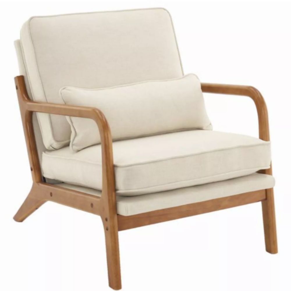
We love the mid-century-inspired shape of this armchair. It has an heirloom quality, while the neutral upholstery brings the style into the modern era and keeps the room looking fresh.
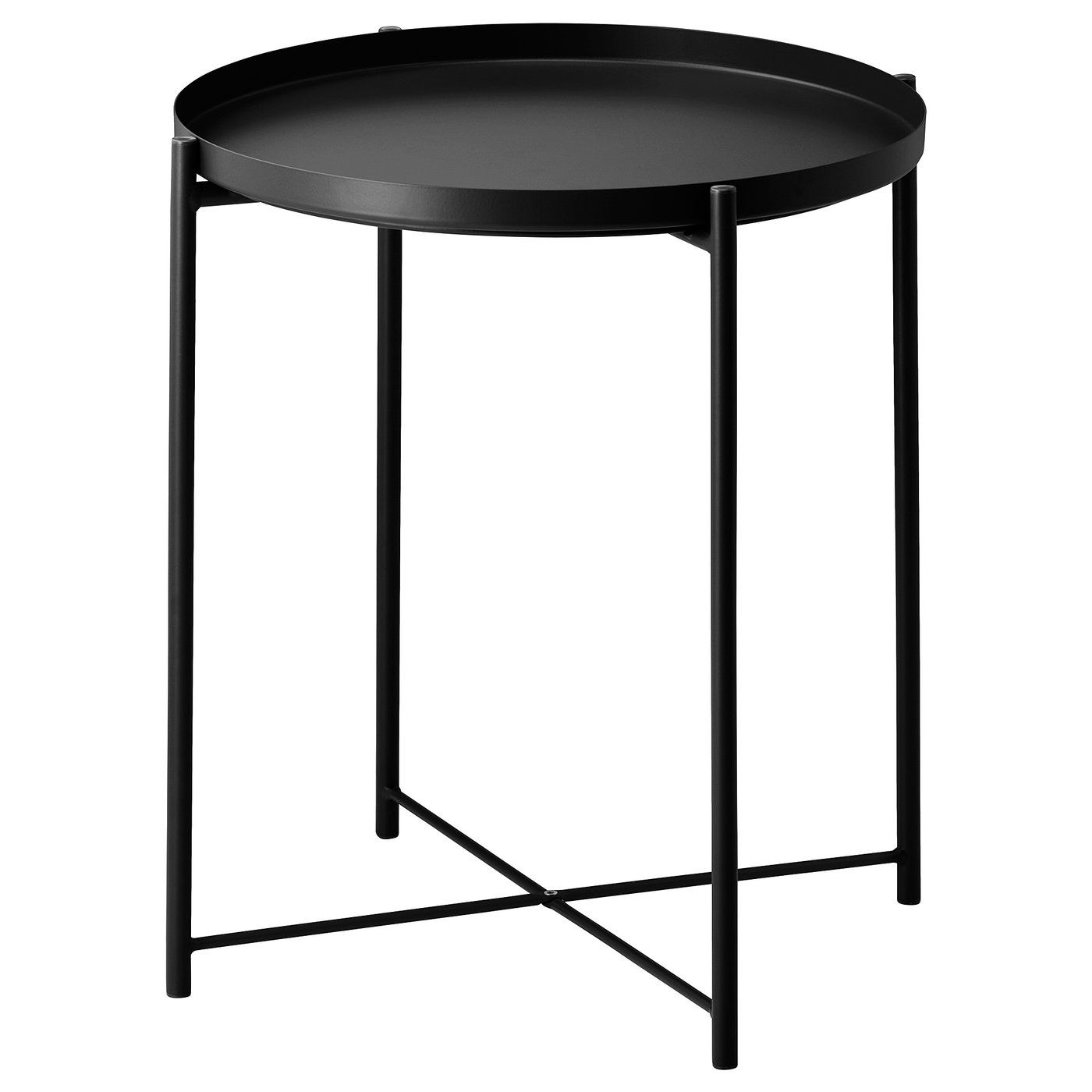
Ina Garten's clever use of black throughout her living room helps to punctuate the space and break up blocks of similar colors. This contemporary tray table is the perfect size for a reading lamp.
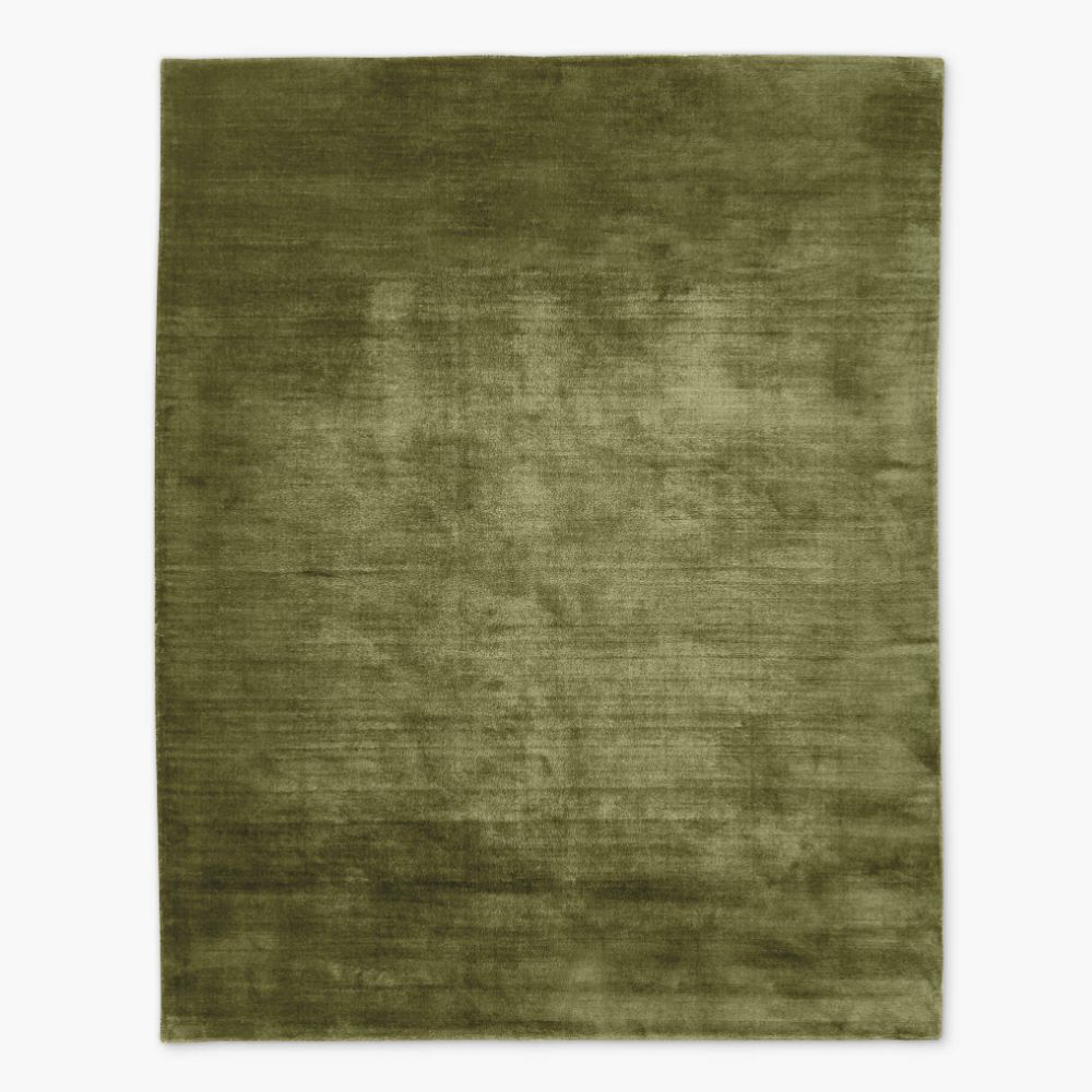
If you're not ready to commit to painting your walls olive green, try it on the floor with a rug like this. The lustrous finish means it will catch the light and alter the tone throughout the day.
Whilst an orange and green color pairing is certainly a bold one, Ina Garten has combined it here with a classic rectangular sofa, and a contemporary lamp and coffee table, to keep the look firmly rooted in modernity.
The mid-century armchair adds a storied feel to the room, but is upholstered in a neutral fabric to avoid a clashing effect with the sofa, and the teddy plush texture is a welcome contrast to the crisp linen sofa covering.
Another main focal point of the room is the patterned ottoman, yet it blends with, rather than dominating, the space thanks to the fact that it mirrors the other shades used in the room, from earthy rust to soft grey. When it comes to decorating with pattern, Jenny advises: 'To avoid a time-capsule effect, skip bold geometric patterns that feel overtly retro, and opt for smaller-scale designs that add depth while remaining timeless.'
Finally, the olive green paint really works to brighten the space and actually enhances the warmth of the orange. Combined with the neutral shade on the angled ceiling and the light wood storage unit, it's a color that feels surprisingly versatile.
Ina Garten’s 1970s-inspired living room proves that retro color pairings can feel fresh and modern – by following a few simple rules, timeless combinations that worked decades ago can look just as stylish in today’s homes.


