We often hear about our homes feeling cold and uninviting, but the opposite can be just as much of an issue. In our kitchens, so much emphasis is placed on creating a warm and inviting atmosphere, but what happens when our paint choice is a little too warm?
Kitchens that feel smaller than they really are, enclosed or even claustrophobic are often signs that your kitchen colour scheme isn't quite right. A cooking space should feel inviting, but also open and spacious.
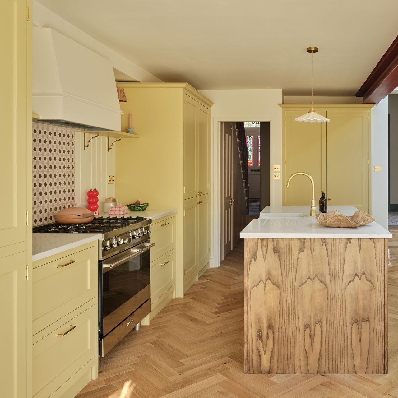
Another warning sign might be that your walls don't work in cohesion with the cabinets or surfaces - too much warmth will have them all blending into one.
Creating the perfect colour balance is essential for making your kitchen feel well-designed and visually cohesive. Here's how to fix your paint ideas to avoid a kitchen that feels too warm.
While warmth is something to aim for, too much of anything is never a good thing. Whether your space feels too yellow (I'm looking at my own magnolia walls, here) or has red undertones peeking through, there are ways to fix it.
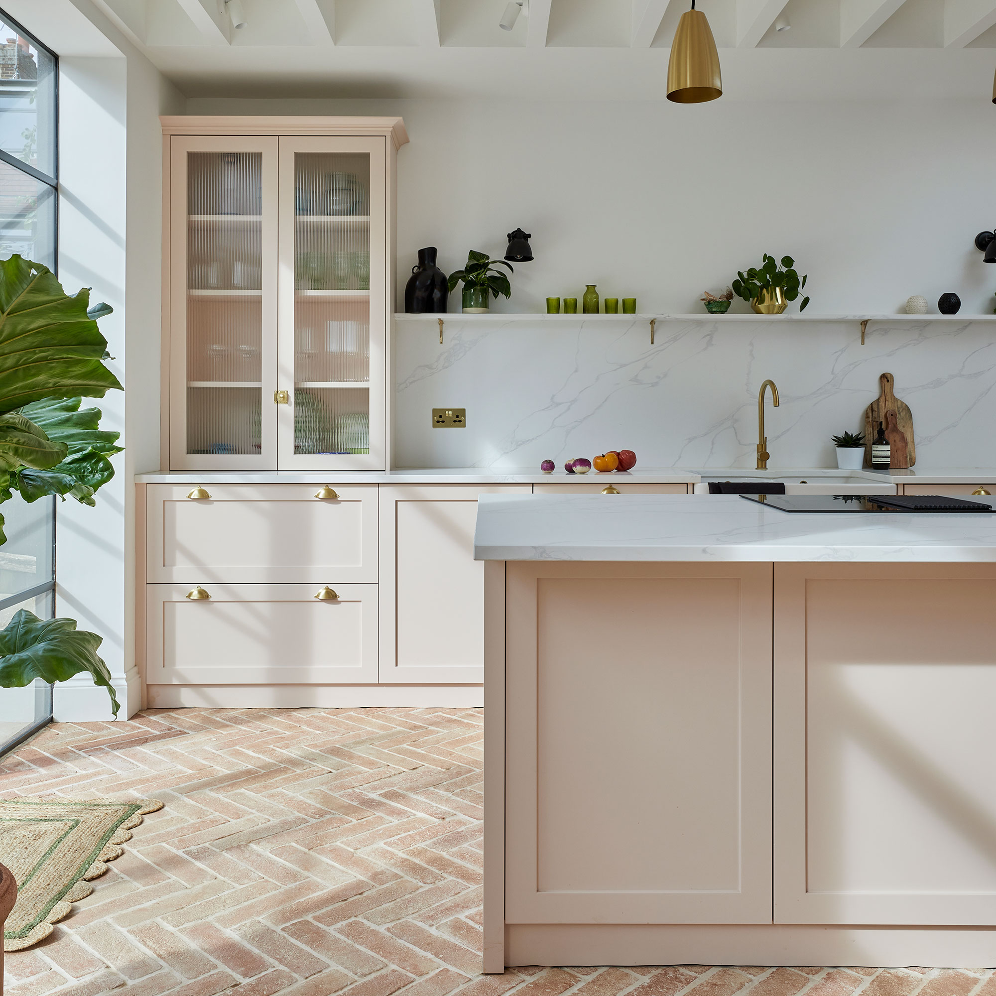
No matter the colour of your space, a neutral tone is what we should aim for. Warmth can be brought into the space with smaller accents, but a neutral paint tone will avoid that too warm or too cold look.
'If your kitchen faces south or west, it's likely getting strong, warm direct light for a lot of the day - and that will amplify any yellow or red undertones in your paint,' explains Rob Abrahams, Co-Founder and CEO at COAT.
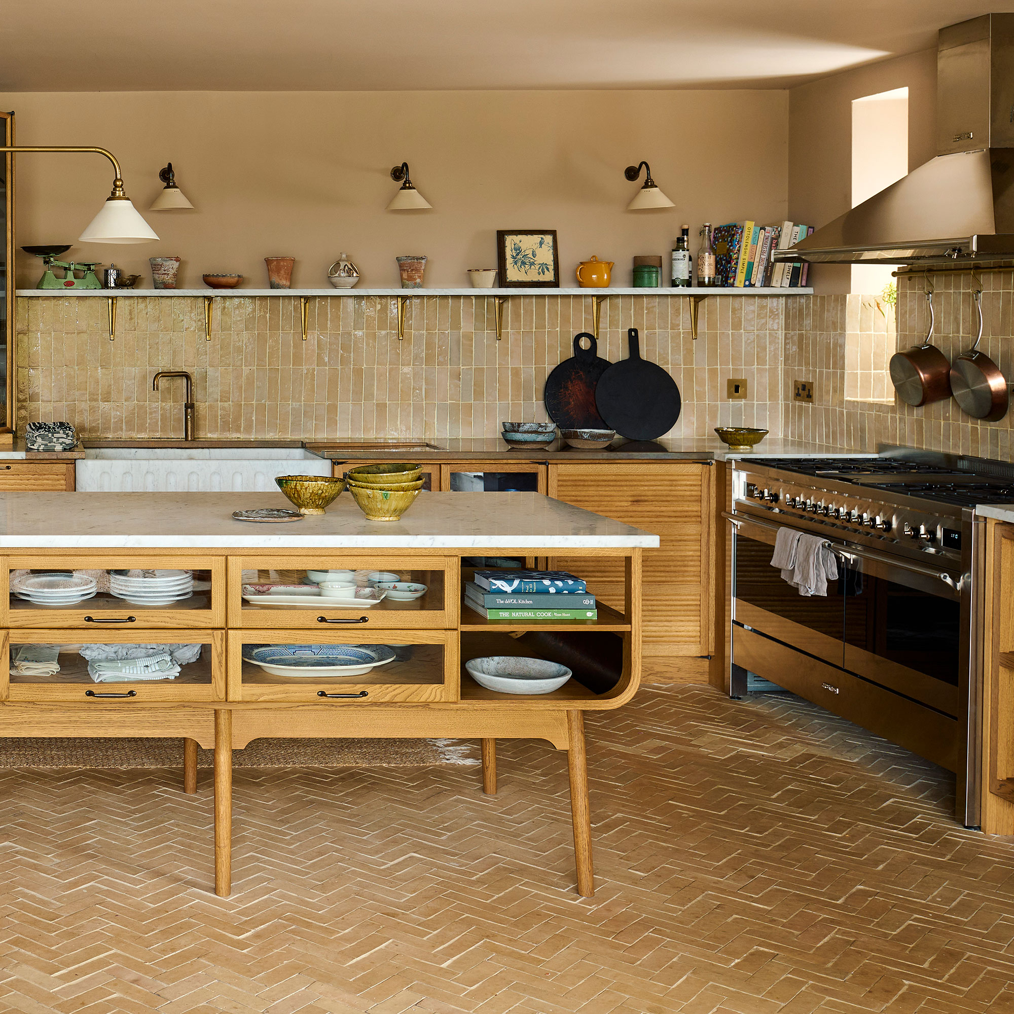
Lucy Steele, senior brand manager and resident colour expert at Valspar, adds: 'Rich shades such as terracotta, chocolate brown and deep maroon, with warm red, orange and yellow undertones, naturally create a cosy atmosphere but can also make a space feel more enclosed. These colours absorb more light rather than reflecting it, which can reduce the sense of openness, particularly in smaller kitchens.'

'If the shade feels too warm, don't overcorrect with something cold - that rarely works. Instead, introduce a cooler counterbalance nearby. A greyed white on the ceiling or a soft cool-grey or sage-white on an adjacent surface can bring the whole room back into balance. COAT shades like Fresh Start or Low Salt work really well in this role - clean, composed neutrals that quietly cool a space without draining the warmth entirely,' Rob adds.
For example, if opting for butter yellow kitchen cabinets, opting for a cooler-toned wall colour will balance out the warmth and pull out the cooler elements within the yellow hue.
Rob continues, 'One clever paint trick that can balance the incoming natural light, but that few people think about, is to paint the recess of the window frame - called the Reveal - a different colour. Choose a darker colour with cooler undertones to make this work.'
Window treatments are also a powerful tool for balancing warmth in a kitchen. Sheers and cafe curtains will help to let light into the space, all through the veil of fabric that has a specific undertone.
In my own kitchen, I recently DIYed a cafe curtain using a linen voile curtain in a soft cream. This way, it ties into the magnolia walls but softens the cooler outside lighting that floods in, thus controlling the overall atmosphere.
In the winter months, artificial lighting is just as powerful.
'Warm-toned bulbs - anything under 3000K - will amplify yellow and red undertones significantly. It's one of the most common reasons a colour looks great on the colour chart but can feel off once in situ. Swap to a neutral daylight bulb (around 4000K) which is cooler, and you'll often see the colour settle back to where you expected it,' Rob explains.
Adding lamps to the corners of your kitchen with cooler toned bulbs will still add ambience, but it won't feel like yellow lighting that makes a warm kitchen feel even warmer.
Shop the tips
4000K is the ideal colour temperature for lighting in a kitchen. It's clean, crisp, not too blue and also not too yellow.
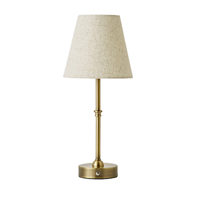
Brass is great for adding warmth to a kitchen, whereas the subtle linen shade neutralises the look.
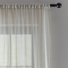
This sheer voile panel is perfect for a kitchen window treatment idea.
Paint is a powerful tool to use in a kitchen scheme - colour drenching is our favourite way to create a cosy, enveloping atmosphere in a kitchen without it feeling too enclosed.

If you enjoyed reading this, sign up for the Ideal Home newsletter for all the latest home decor trends and inspiration delivered straight to your inbox