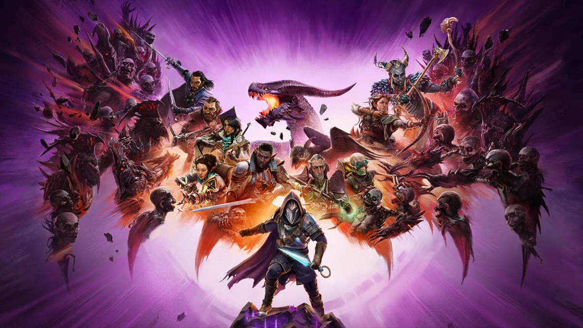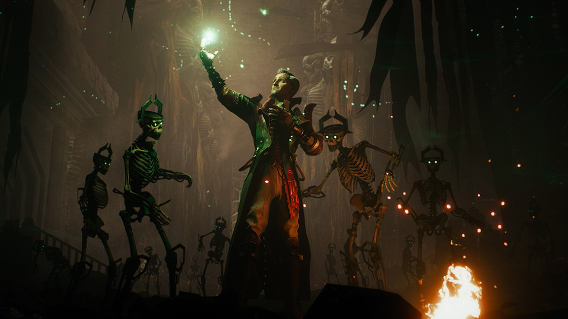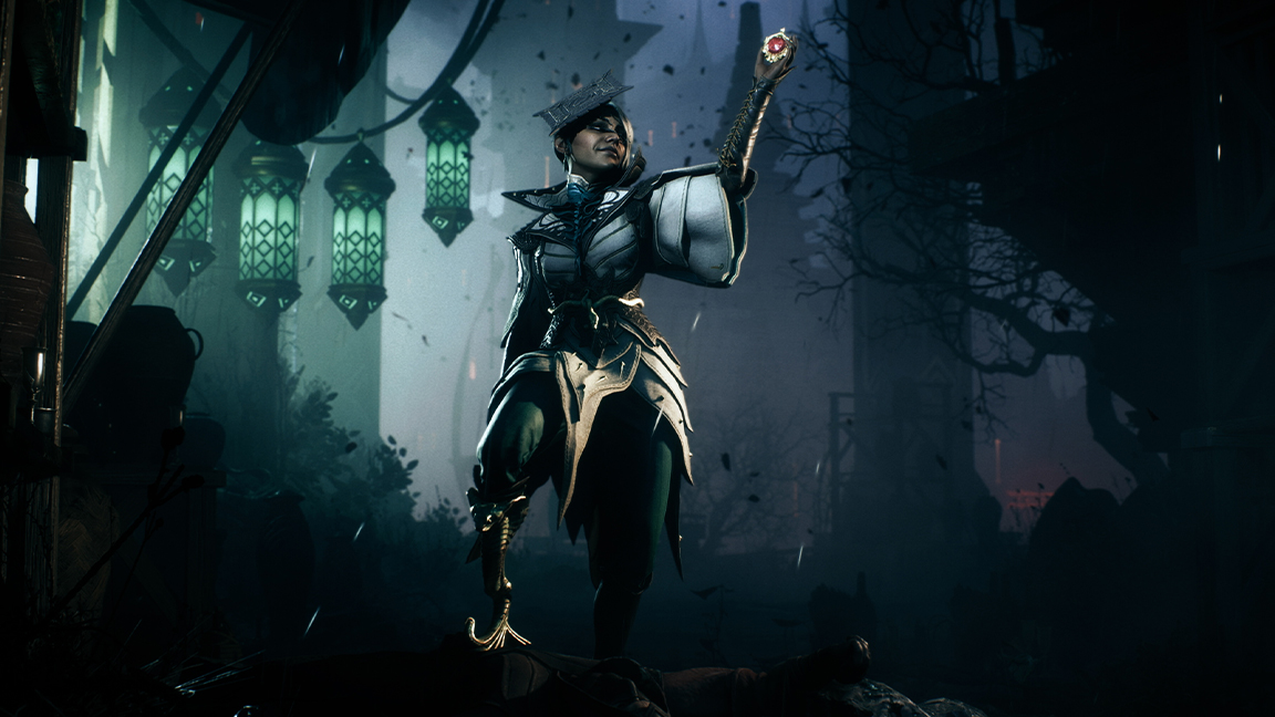
The highly anticipated Dragon Age: The Veilguard was revealed at the weekend, during Microsoft's Xbox Games Showcase, and of course 'fans' are hating on the new art direction. The game is the latest in the long-running role-play series from genre stalwarts BioWare, and its new colourful, snappy design and presentation has some fans slapping their keyboards in disgust.
The breakaway from 'hyper realism' and further towards a curated, artist direction can only be a good thing
"This is like Fortnite… gonna pass," banged out @SuperChampzLive on X/Twitter. @SavvaSmith banged out, "The good news: they’ll likely to go broke and that means they won’t be able to desecrate mass effect". While @neirdolife1 spanked the keys and gave us, "Dragon Age just went Overwatch x Baldurs Gate. These new generation developers are ruining IPs left and right. Every game doesn't need to be a Fortnite, a Overwatch, or a Baldurs Gate. Dragon Age has its unique flare. Now you just hashed it to whatever is in now".
Now, the thing is, I think Dragon Age: The Veilguard looks incredible, and a genuinely artistic evolution of a game series I played at launch in 2009 with the release of Dragon Age: Origins, and have been enjoying ever since. The breakaway from 'hyper realism' and further towards a curated, artistic direction that recall's Arkane's Dishonored series can only be a good thing - giving The Veilguard a sense of self and a timeless quality guaranteed to last beyond the tech it's being developed for - Xbox Series X.

Thankfully there are fans out there who are enjoying the new art style, and in many cases simply happy that, finally, a new Dragon Age game is releasing, and this year too.
As @KawaiiFoxita wrote on Twitter, "God forbid anything changes in TEN YEARS! People need to calm down and cheer up", while @LarkOneironaut added "People are so negative about it and it looked just as different when DAI first came out, I avoid every comment section with the trailer, everyone's just making me depressed", and finally I can hear the shrug in @banalnadas' typing - "it’s always the dudebros".

The truth is we don't like change but it's been twenty years since the last Triple-A Dragon Age game, Dragon Age: Inquisiton, and a lot has happened, both in terms of tastes, trends and technology. The new visual direction of Dragon Age: The Veilguard feels, to me, relevant and vital. Simply recreating the look and style of a old game for today's hardware and players would be the laziest, narrowest thing to do.
Maybe, let's hold off killing the thing we love, and have waited twenty years for, just for now, until we've all had a chance to actually played it.
I recently caught up with a number of game artists, including the team behind Destiny 2: The Final Shape and the talented creatives making SPINE, who all explain the reasons behind the design choices they make.


