This morning was off to a good start. The Browser Company’s highly anticipated mobile app version of its Arc web browser, officially called “Arc | Mobile Companion” on the Apple App Store, launched and I could not wait to check it out.
Only it didn’t work.
After downloading Arc Mobile (let’s just call it that for simplicity), I signed in with my desktop credentials and was hit with an error message: “No tabs in iCloud.” Something was wrong with my iCloud settings. Per The Browser Company’s instructions, I checked that my login was the same; my iCloud account matched on my Mac and iPhone. I was told to make sure iCloud Drive on my iPhone was turned on (it was). I rebooted all my devices. I updated macOS Ventura to 13.3. Nothing worked.
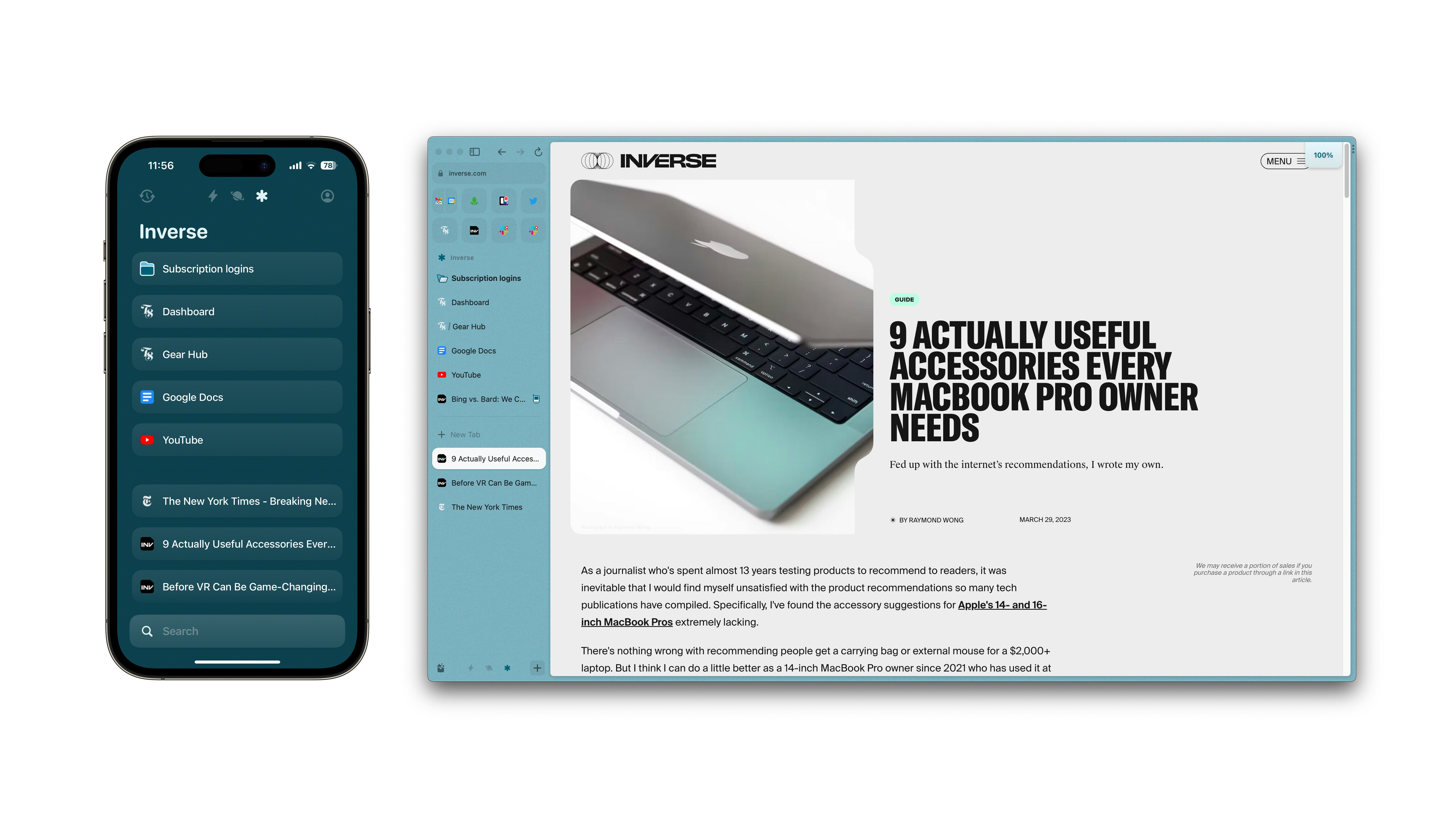
I opened the Settings app on my MacBook Pro and found the culprit that was blocking the path to syncing my Arc sidebar on Mac to Arc Mobile: iCloud Drive wasn’t enabled. I turned it on and Arc Mobile roared to life, welcoming me to nirvana. I opened Inverse’s homepage, pinned it, and watched as it instantly appeared in the same space on Arc desktop.
But what was originally intended to be a deeper dive into Arc Mobile is now a partial rant about how iCloud Drive syncing ruined all my desktop files and might do the same to yours if you want to give Arc Mobile a whirl today.
A Sculpted Down Browser

Before I get into the whole iCloud drama (which again might impact you), let’s talk about Arc Mobile and what it is and isn’t. The app isn’t just a shrunken version of Arc on Mac, and that’s by design. As The Browser Company CEO Josh Miller told me back in December when I wrote my 6,500-word feature on the new web browser, Arc Mobile is sculpted down to its core feature: the sidebar.
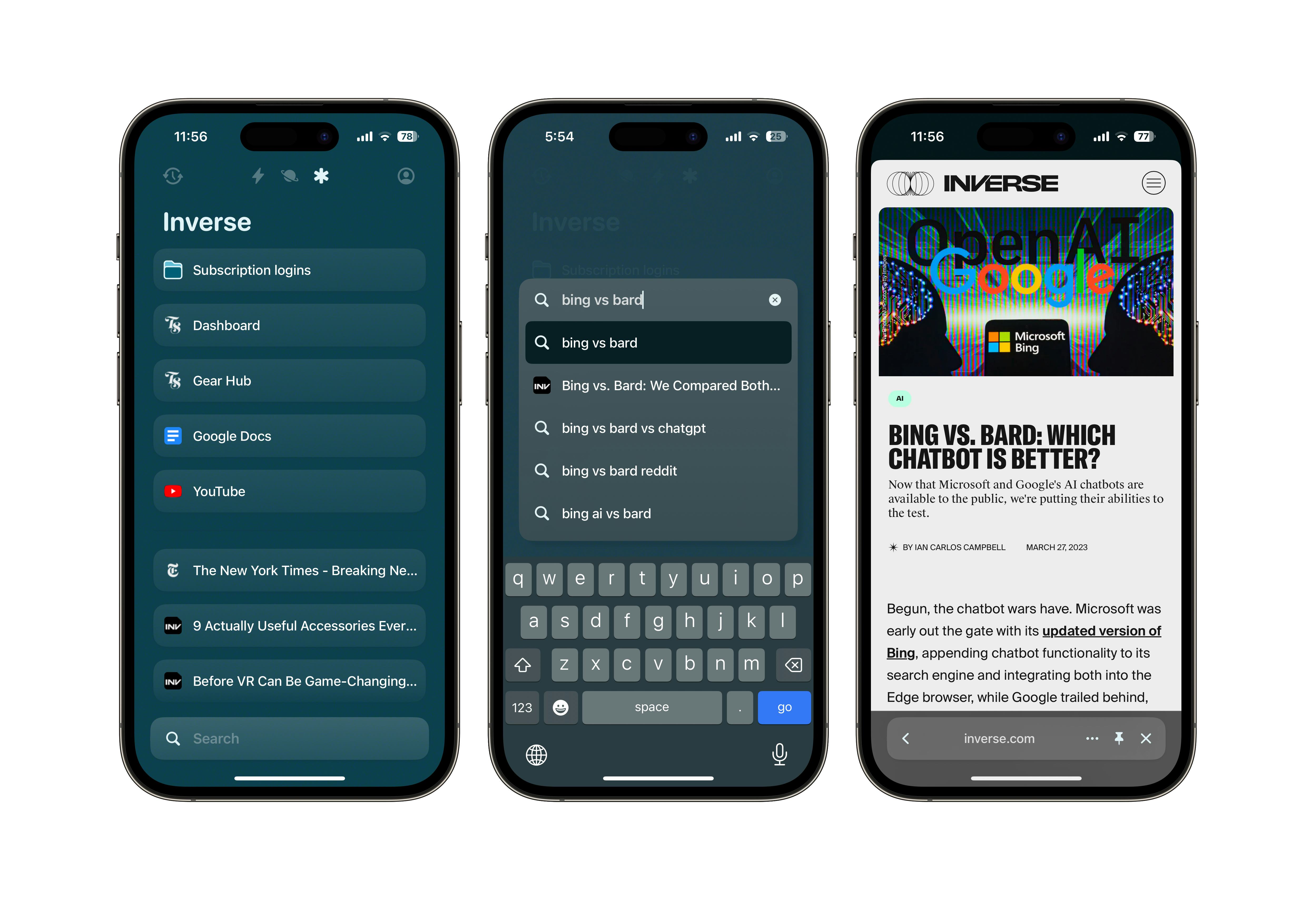
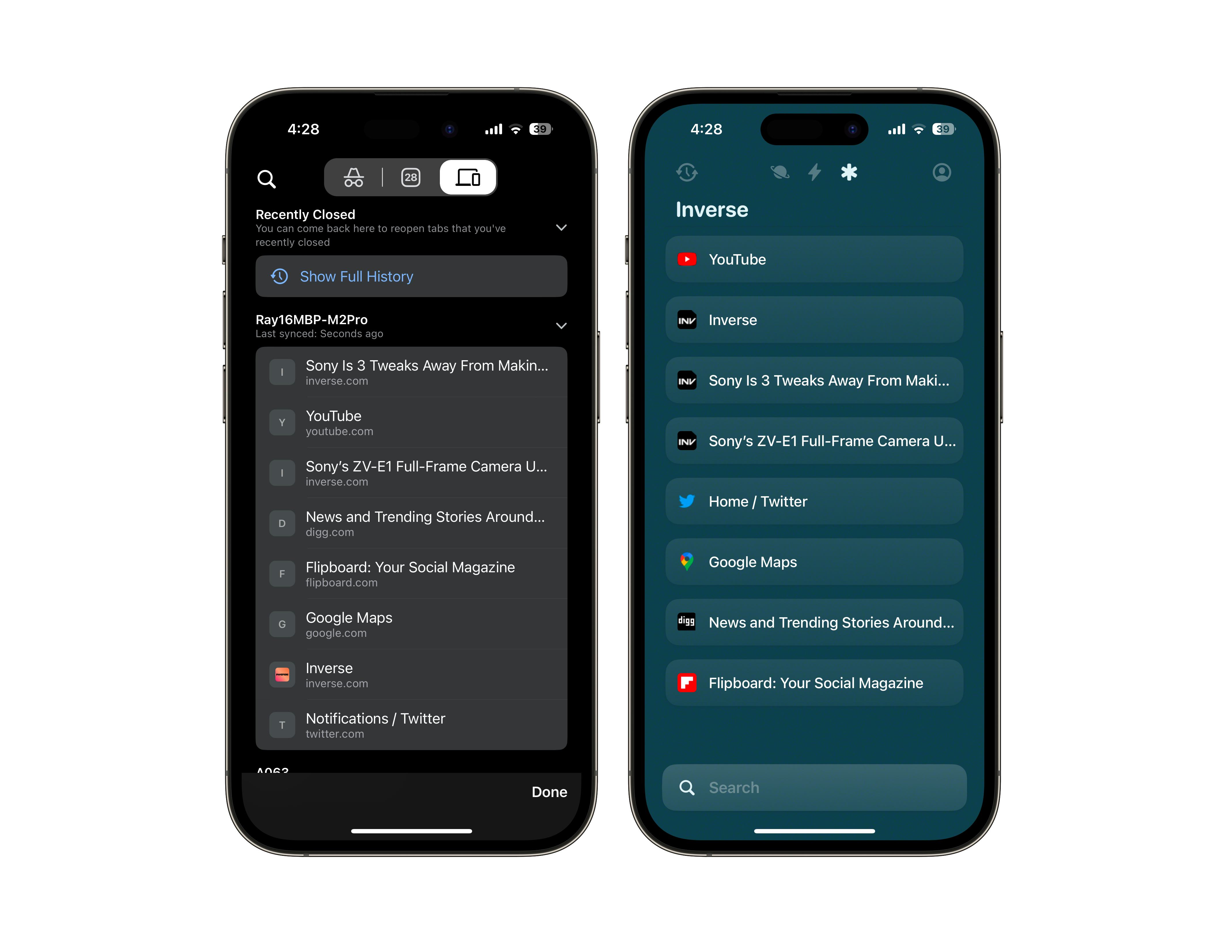
Once your iCloud Drive settings are properly switched on, Arc desktop and Arc Mobile sync up in near real-time — it works like magic. All of the pinned tabs in your Arc desktop “spaces” appear right in the iPhone app. The Browser Company even brought over the swipe-on-trackpad-to-switch-between-spaces feature on Arc desktop to the iPhone’s touchscreen. There’s a “Recents” space that shows your recently viewed tabs on the left of your spaces and a profile button on the right. Inside of the latter, you’ll find a fun QR code stamped on a spinnable ticket that others can scan to become Arc converts, and a section with six home screen icons, including one that’s inspired by Netscape Navigator.
At the very button is a search bar, which is a place where you look up things. These can be a Google search, a recently viewed tab, items within a pinned folder (Arc’s replacement for bookmarks), or a URL.

Missing from Arc Mobile are all the settings in Chrome and Safari. There are no tabs; there’s no incognito mode; there are no extensions. All of that stuff doesn’t exist on Arc Mobile version 1.0 and might never be added because the app isn’t trying to be a full-blown web browser so much as it’s a companion app (it’s right there in the official name, duh). The idea with Arc Mobile is to be an Arc sidebar in your pocket that syncs to Arc desktop. Come across a cool article while on the train? Pin it to your sidebar and it’ll be there on Arc desktop when you return to your computer; it also works the other way around. Even split tabs sync across Arc.
Arc Mobile might sound a bit barebones, but it’s actually quite powerful when you think about how people work nowadays. We do not simply work on one device and in one place anymore; we are constantly mobile. We want to start on our laptops, continue on our phones (wherever we are), and ping-pong back and forth as we so wish. The Browser Company is not the first to create an app that syncs across devices, but the simplicity of Arc Mobile and desktop is what makes it so effective.

Just a few hours ago, I was preparing to step out to get lunch as I do almost every day, and I pinned a few tabs (a CMS tab for a story I’m editing and a feature on AI that I’ve been meaning to read this week but haven’t gotten to) on Arc desktop, one in my workspace and the other in my personal space, each set up with different Google accounts. While waiting for fresh pizza to come out of the oven, I tackled the edit and read the article on Arc Mobile. It was frictionless and instant. I didn’t have to juggle between different accounts in Chrome’s iPhone app to manage two Google accounts; I didn’t have to text myself links; the inviting presentation made it enjoyable to open a tab away from work.
Chrome’s tab sync in comparison is a few ticks slower to sync; I observed a few seconds of lag from desktop to mobile; and the tabs are all out of order compared to my desktop tab bar. There’s also no way to sync tabs from phone to desktop in a single list; opening a tab on Chrome on my iPhone doesn’t also add the same tab to my desktop Chrome. And just look at the design of the two on mobile. One looks fun, while the other makes me feel nothing. One lets you reach out and move a pinned tab up and the sidebar while the other doesn’t let you rearrange anything.

I already know the knee-jerk reaction most people will have about Arc Mobile is: where’s all the other web browser stuff? But ask yourself how often you use all of a web browser’s features on your phone. Do you need the kitchen sink? I’m a power user and I don’t. There is beauty in simplicity, and efficiency too. But people are so conditioned to accept the bloat that they don’t stop to ask why they need it. Arc Mobile is light, fast, and native to iPhone — but you need to shift your mentality just a little bit for it all to click into place.
Of course, there’s still more that can be done. My first reaction was: where the hell are all my favorites — my most-visited pinned sites at the top of Arc’s desktop sidebar. My second thought was: where are all the fun personalization features like the grain textures on the desktop sidebar? Where is the iPad version? What about Android? I don’t know about the iPad, but Miller did say Android is coming, as is Windows. For now, iPhone and Mac users have first-class tickets into the browsing future. There are also some bugs. For some reason, Arc desktop starting duplicated some (but not all) of my favorites in my spaces, an issue I didn’t have before syncing with Arc Mobile.

iCloud Drive Hell
Now, for the bad part: iCloud Drive. It sucks. Designed as a way to sync your files in the cloud for access from iPhone, iPad, Mac, and Windows PCs, the feature has always wrought havoc on my computers.
Activating iCloud Drive on my Mac activated a sync of my entire desktop to iCloud. I own several Macs and each one has different files on their desktops and documents folders. iCloud Drive merges all of them, replacing your local desktop and documents folders with iCloud Drive versions that update across devices. In theory, this sounds great, but in practice, the implementation is really messy. This is now the second time in a year that iCloud Drive has completely mangled my desktops, leaving me to turn off the iCloud Drive desktop and documents folders syncing, and then having to manually figure out which files synced and didn’t sync to each Mac.
As I type this, I’ve yet to sort out my screwed-up desktops. Today should have been a celebration of Arc Mobile. Instead, it’s a reminder of how bad iCloud Drive is. A Browser Company rep was apologetic for my iCloud Drive issues and the trail of fire it’s left behind. I’m really hoping the company can figure out another way to sync Arc across desktop and mobile. Maybe this story will reach someone at Apple and they’ll actually make iCloud Drive better. For a company that’s always touting hardware and software synergy, and services, Apple’s most basic service leaves a lot to be desired.
As to whether you should try Arc Mobile today? I guess that comes down to how badly you want Arc on mobile. Are you totally hooked on Arc on desktop like am? Do you see it affecting your workflow and making you more productive? Less stressed navigating the internet? If you’ve read through all my warnings about iCloud Drive and you’re still curious, you might find the app’s boldness to think differently to be worth the trouble. Or maybe you’ll just curse yourself when iCloud Drive inevitably screws you over.


