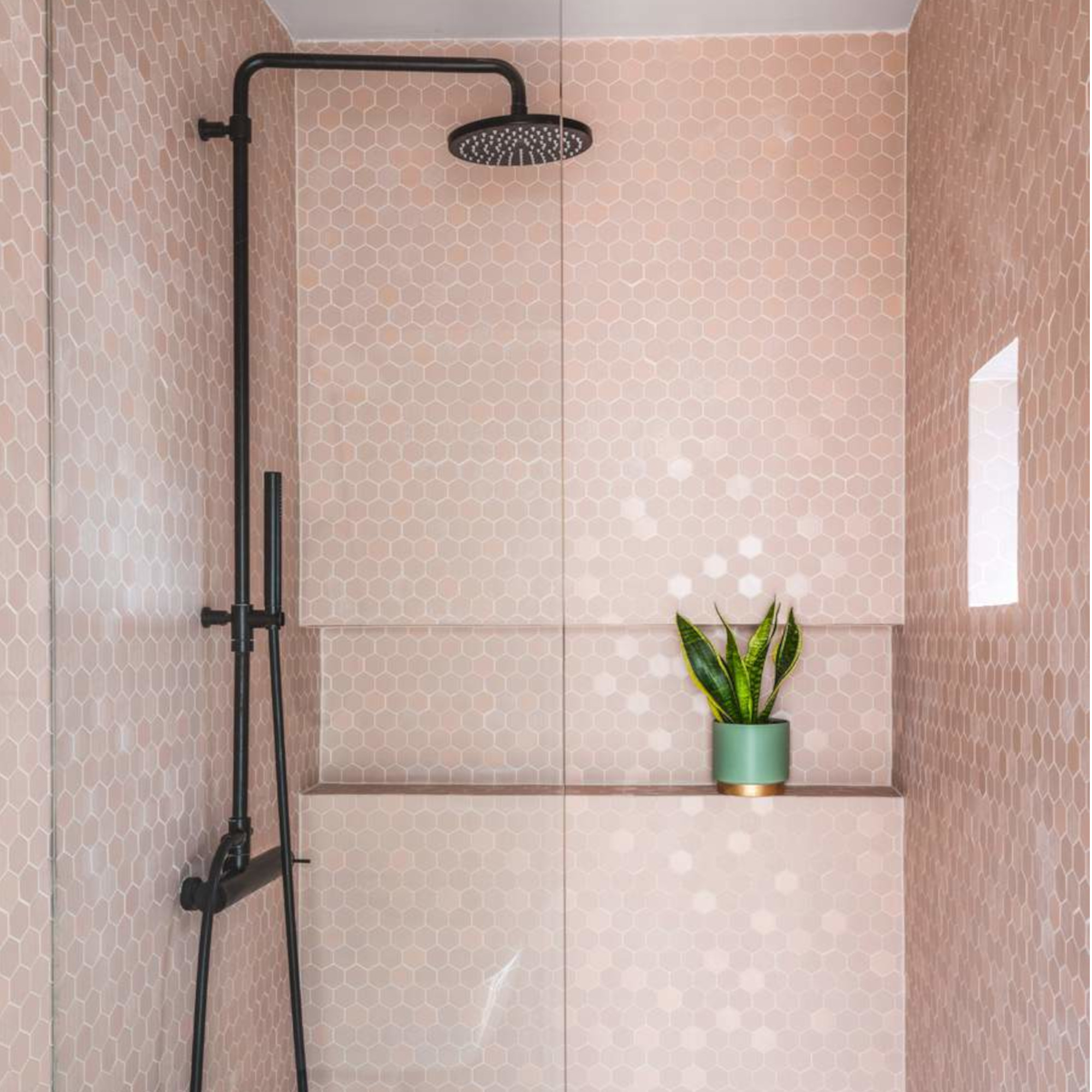
Besides the kitchen, scheming a new bathroom is my favourite reno project ever. I love the anticipation of a fresh new space, gleaming fittings and the chance to fix all those annoyances that have been standing in the way of true spa-style relaxation for too long.
Whenever I start any new reno project, I usually have a vague idea of the kinda look and fittings I’m after. To refine my choices, and make sure I’m not missing anything interesting, I’ll always do a deep-dive for the best bathroom trends on Pinterest, Instagram and of course the websites of all my fave interiors magazines.
While this research process takes time, I’ve always found it useful. All six times I’ve discovered some new bathroom tile ideas or inspiring bathroom colour combinations that I’ve shamelessly copied. But although I’m mostly proud of the results, I’ve also fallen for some major bathroom design crimes. Trends that seemed stylish and fashion-forward at the time, but, in the cold light of day, turned out to be really annoying, properly ugly, or total functional fails.
Here’s what I regret most, and how you can avoid falling into the same trend-led traps when planning your next bathroom renovation.
1. OTT tiling
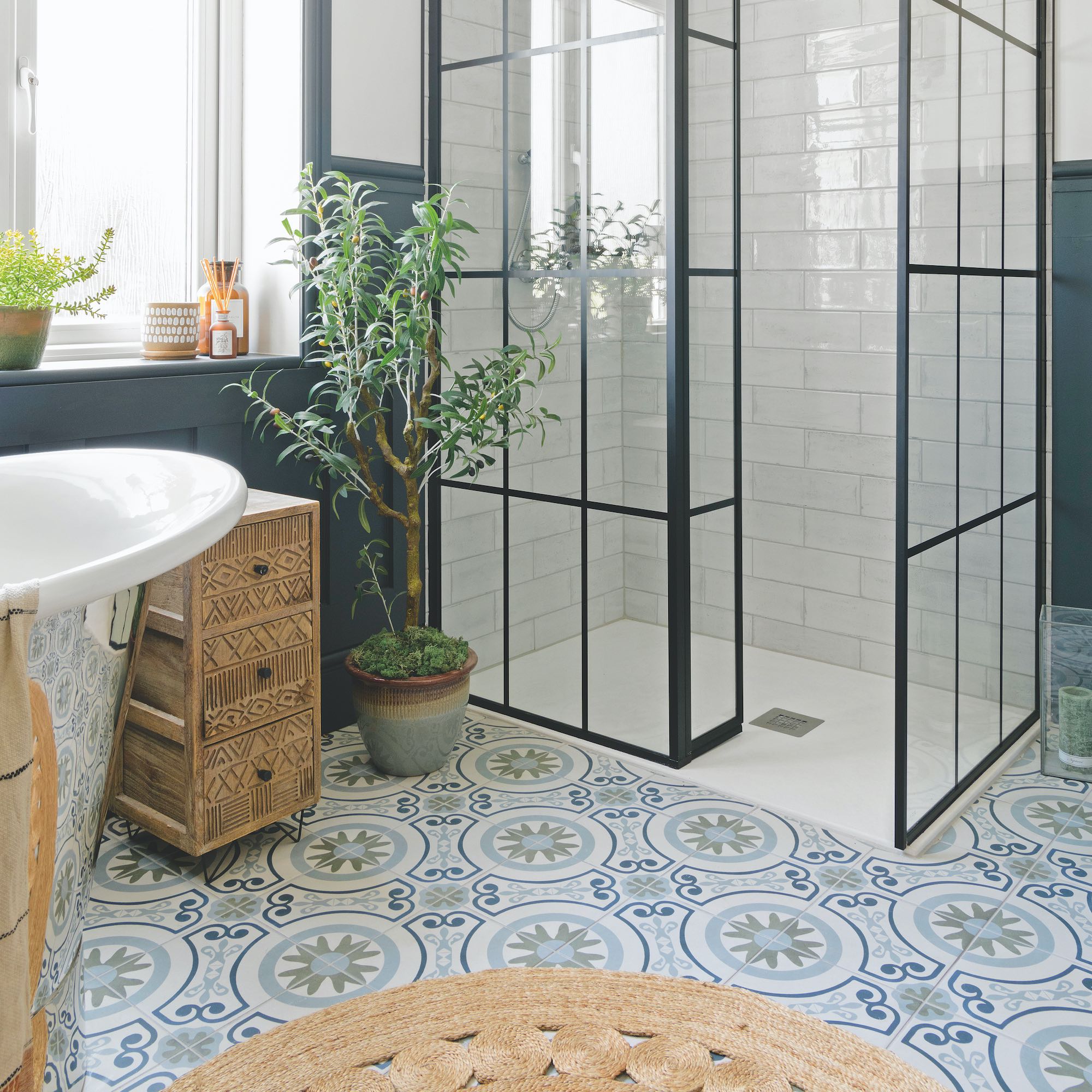
What I fell for: In my defence, we’re talking at least 20 years ago now and I was possibly a bit over-excited about buying my first home, but one of the first bathrooms I renovated was absolutely swamped in tiles by the time I was done. I’d fallen hard for massive monochrome tiles with a mad, geometric pattern, which felt very avant-garde at the time, and I wasn’t afraid to use them. Right up to the ceiling in fact, and not just in the shower enclosure (yes, showers were fully enclosed back then).
Why I regret it: Tiles with a very strong, contrasting pattern can quickly feel outdated and going hard on them is one of the worst bathroom tile mistakes out there. Mine were 3D too, so they were really overwhelming and after a late night out somewhat disorientating. But it wasn’t just the pattern I fell out of love with, it was also the echoey, coldness of too many hard surfaces. I still feel chilly at the thought.
What I’d do instead: I’d still choose patterned tiles but in a more sophisticated design with staying power, and I’d be careful where I put them. The floor is the only place I’d consider a large-scale patterned tile now; and I’d balance it out with something calmer on the walls, perhaps a classic subway with a crackle-glaze finish for interest or elegant marble-look porcelain with a delicate vein.
2. Vessel basins
What I fell for: Counter-mounted vessel basins were huge news when I got sucked into this trend. They were also known as lotus-mounted at the time, which sounded so refined (others might say pretentious) and, being a new trend, they felt really different. Vessel basins have got this artsy, sculptural air about them and I really thought installing one would make my bathroom look like it’d just fallen out of a boutique hotel.
Why I regret it: I still think vessel basins look incredible but they’re a nightmare to live with, especially once the kids came along. Toothpaste gets up the sides and around the back and the height is all wrong for little ones. The bowl also wasn’t wide enough for shaving without leaving bristles all over the surrounding worktop; a very impractical slab of slate that showed up toothpaste spills like bird poop on a dustbin lid. But that’s another story.
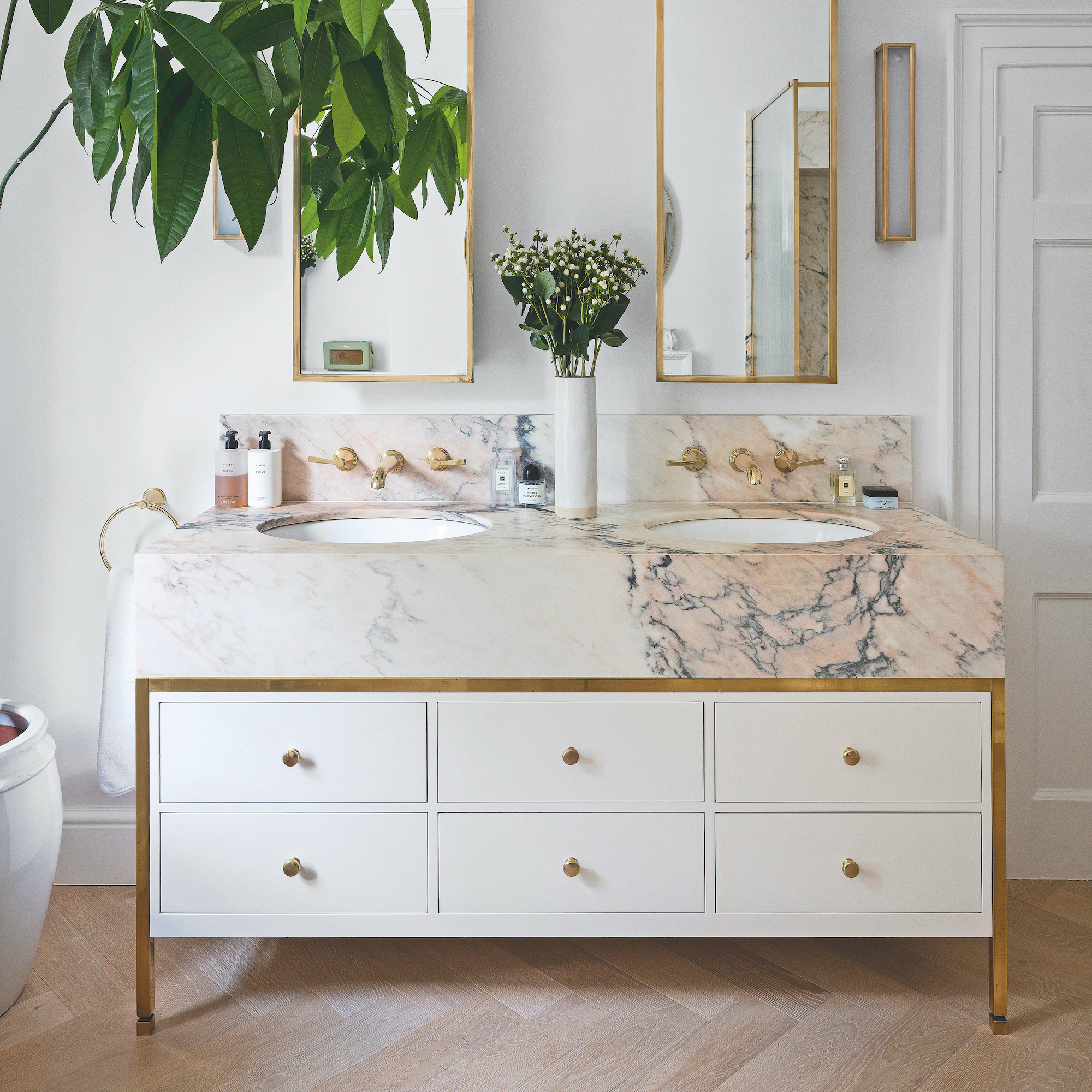
What I’d do instead: Now I always go for an undermounted or integrated basin, ideally one that’s a single seamless piece of ceramic with plenty of space around the bowl for soap and toiletries. They’re so easy to clean and, in crisp white, are unlikely to fall out of fashion before the kids leave home.
3. Shower curtains

What I fell for: The allure of a floaty white billowing shower curtain with Ibiza-style coastal feels. I was on a seriously tight budget with this bathroom – we’d majorly underestimated the work involved when we bought a barn to convert – so I was also thinking of the pennies I could save!
Why I regret it: Shower curtains are actually coming back into fashion again now, and while they can work to add softness and pattern around a bath, I urge you to resist if you’re planning to shower behind one. Sure, shower curtains are super renter friendly shower ideas, but if you’re a homeowner, don’t go there. The curtain would cling to my legs the minute the shower was turned on – yuck – and don’t get me started about the black mildew all along the bottom. We had a decent extractor, we had windows that opened, but nothing would stop that curtain becoming a biohazard.
What I’d do instead: Go for glass with an easy-clean coating that repels limescale and soap deposits. Or if space allows, I do like a deep walk-in shower with a solid wall divider finished in polished plaster that’s seamless and avoids the cleaning of grimy grout entirely.
4. All-white décor
What I fell for: Another trend miss-step that was inspired by continental coastal feels was the bathroom I decided would look amazing in white from floor-to-ceiling. White tiles, white walls, white accessories, lighting, towels…you get the picture. Did I mention we’d been to Ibiza that year?! In my head it would transport me back to those heady sun-filled (child-free) days dancing on the beach, every time I stepped inside.
Why I regret it: The all-white Ibizan villa we stayed in was filled with the most beautiful light from clear blue skies, but in our north-facing bathroom on the edge of Dartmoor (which gets ALL the rain), it just felt sterile and cold. Colder than a penguin’s toenails cold. It also hurt my eyes first thing in the morning – wearing sunglasses in the shower isn’t ideal.
What I’d do instead: Light, uplifting colour palettes are still a good choice for bathrooms – they feel clean and fresh and are also timeless. But to make a white bathroom more interesting and avoid the visual chill, go for warmer neutrals. The walls of my current en-suite are in Little Greene’s Portland Stone, which is a putty shade that’s very pale but cosy. Layer in darker colour on accessories, art and window treatments if you want, but do be led by the light in the room. If you’re decorating a north-facing room, avoid cold colours like the plague.
5. Open shelving
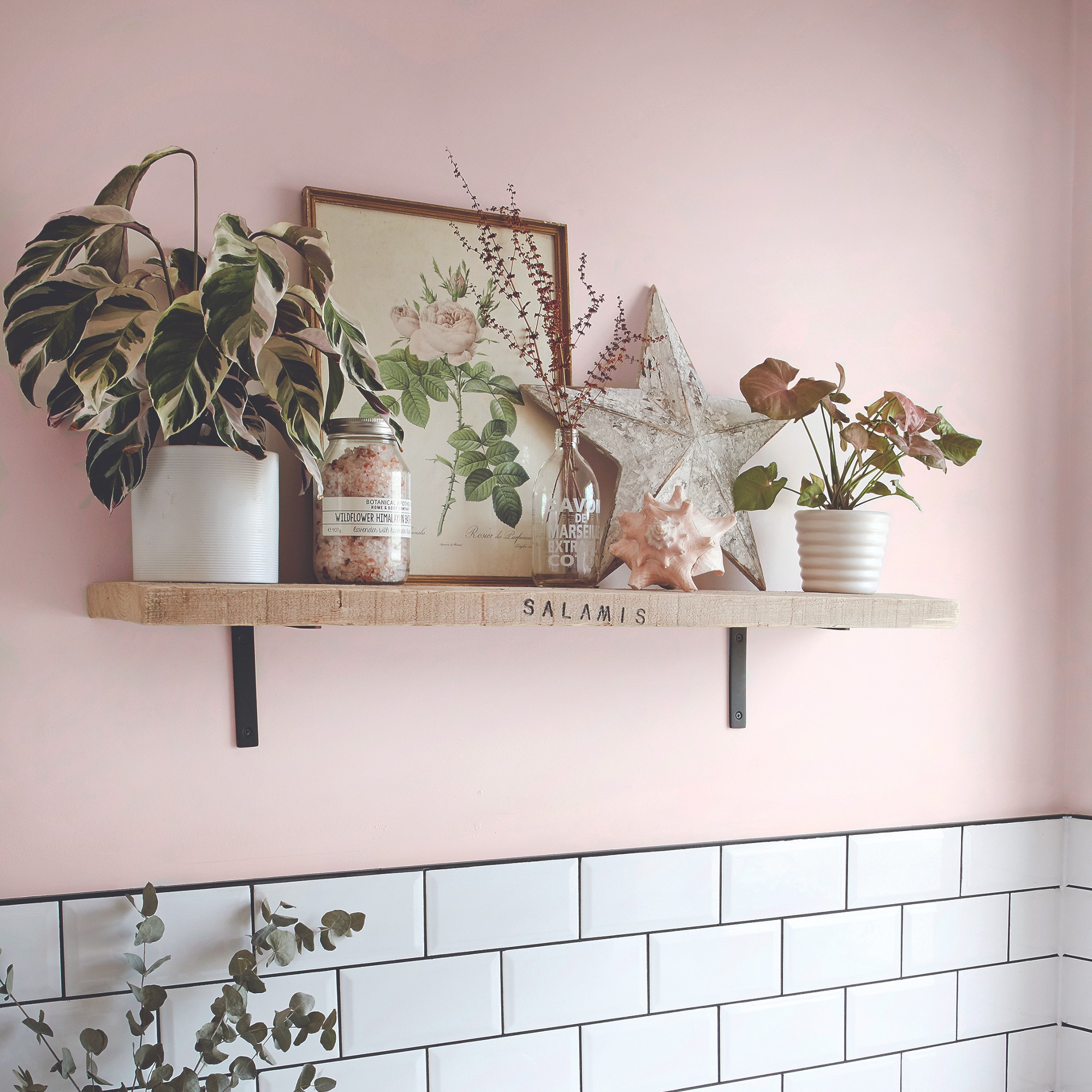
What I fell for: I loved the open shelving in our kitchen so thought I’d carry the trend into our family bathroom. My Pinterest boards were full of spacious, airy bathrooms sporting artfully curated shelves loaded with decanted toiletries, candles and a bazillion plants.
Why I regret it: Back in the real world, the open shelves soon became a dumping ground for the kids’ bath toys, and the Asda-own shampoo/eczema-friendly lotions I didn’t have the time or energy to decant. I was endlessly decluttering the bathroom. The dust was also a major issue, and the plants all died.
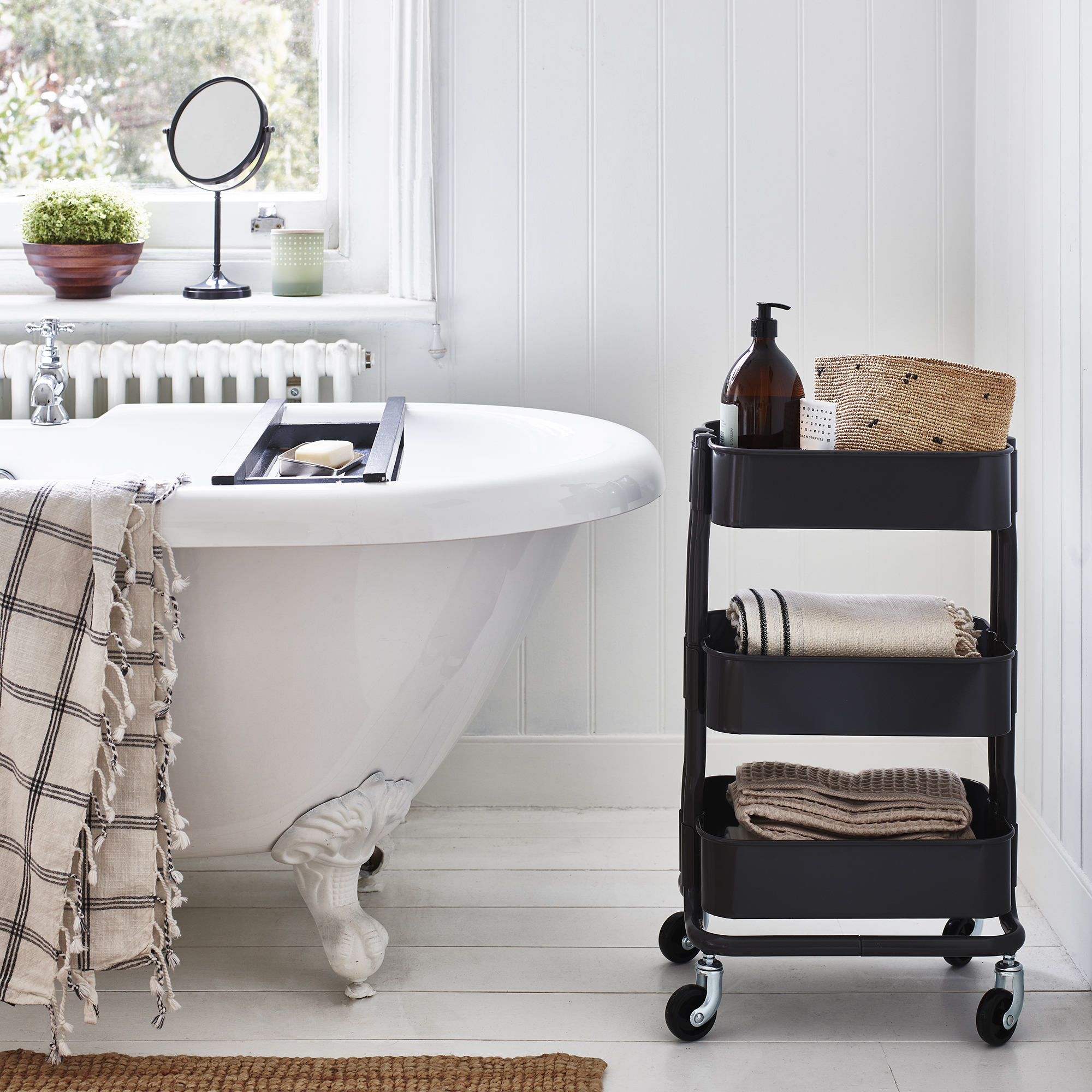
What I’d do instead: One simple shelf with just a few pretty (but easy to dust under) items is great for introducing colour, shape and personality but for actual storage, go for closed doors all the way. A decent vanity unit, ideally with deep drawers, plus a mirrored cabinet for smaller items is far more practical. For accessible storage in the shower or near the bath, choose recessed niches, and only allow items in daily use on them!
6. Mirror overkill
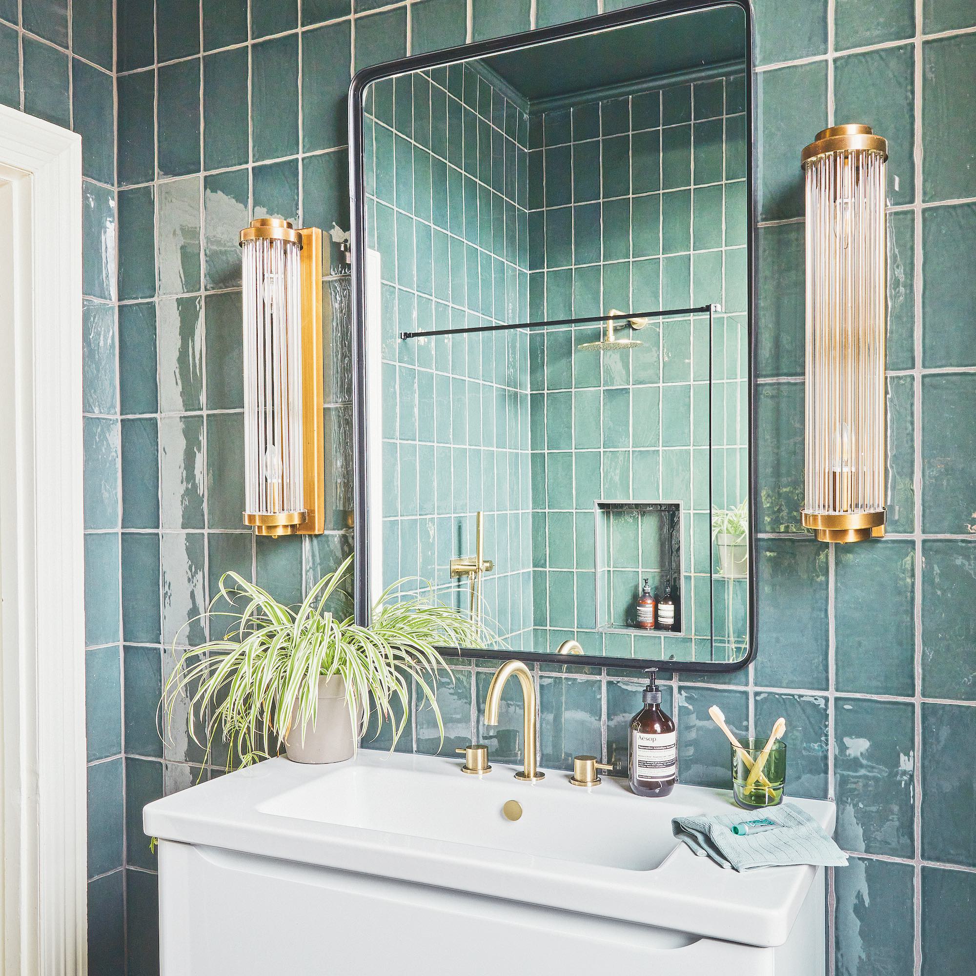
What I fell for: The urban myth that you can never have too many mirrors in a bathroom, especially a small one! It will be space-boosting, it will reflect light in, it’s an easy-clean surface that won’t harbour bacteria. What’s not to love? I saw pics of several bathrooms that were mirrored from the top of the bath to the ceiling – across the full wall – and decided that was exactly what our mouse-size bathroom needed. It wasn’t.
Why I regret it: There were a few reasons that the mirrored wall was awful, but the main one was the view it afforded when sat on the toilet, especially that important loo stop before one gets into the bath or shower, i.e. naked. I don’t think I need to expand. It was also expensive to get custom cut to size, and a complete (stressful) pain to get into the room. Plus, it mostly steamed up, counteracting all those light-reflecting, space-boosting benefits.
What I’d do instead: Absolutely go for an out-sized mirror, just position it wisely. Out of direct view from the toilet for one thing, and not too near the steamy shower. On the opposite wall to the window can be beneficial if you’re trying to get more natural light in. Framed wall-hung mirrors look more stylish than plain sheet glass and provide the opportunity to introduce another shape, finish or colour to the décor. A large black framed arched mirror sits above the vanity in our family bathroom, and I love it.
7. Statement baths
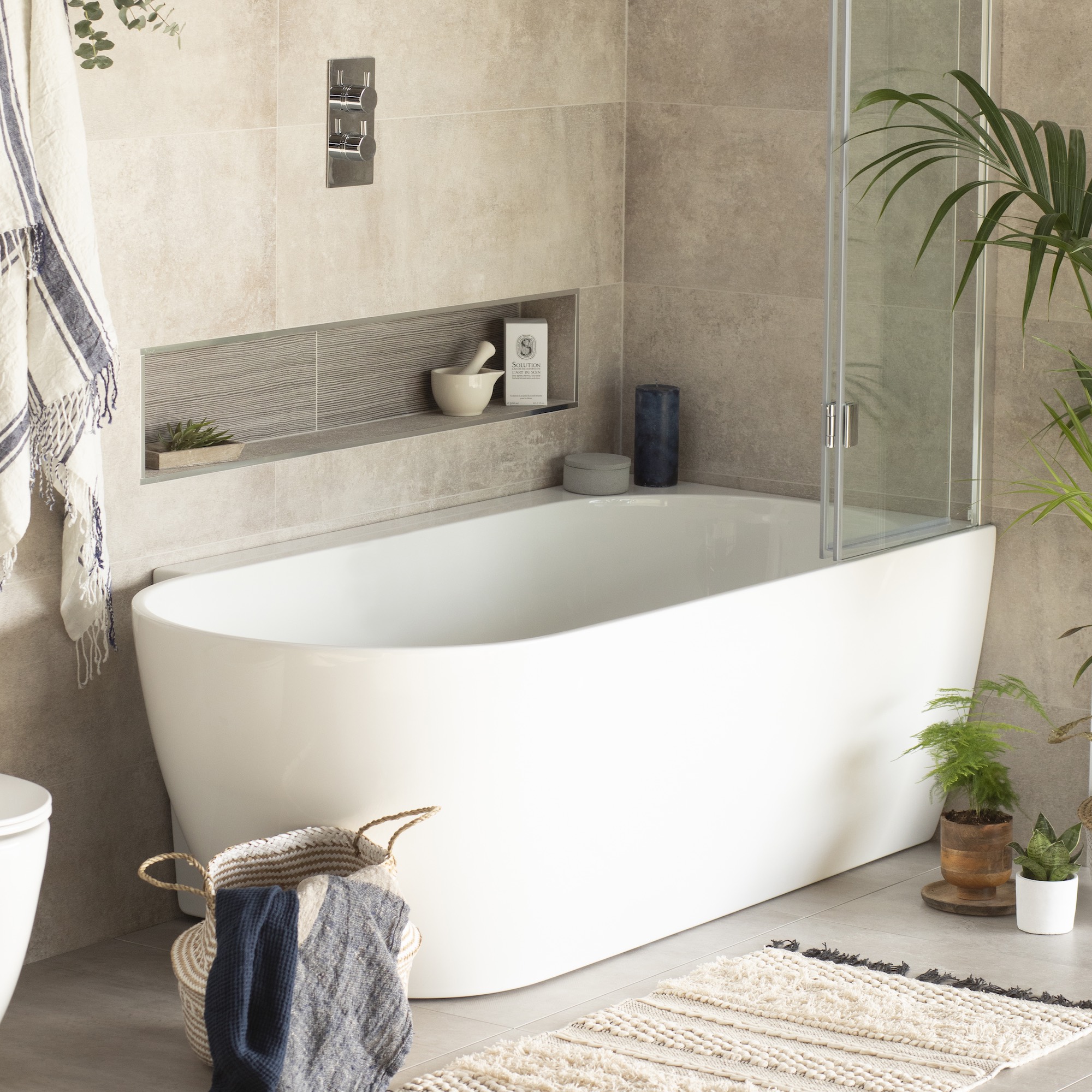
What I fell for: This might be a bit controversial (and specific to my circumstances/bath choice) but I fell hard for the glamorous tub trend, and almost immediately had regrets. The bath in question was a massive double-ended roll top on ball and claw feet that was perfect in our Victorian home, and an absolute design classic. What could possibly go wrong?
Why I regret it: In reality, the bath was too big for the space and also torture-grade uncomfortable. The sides were too steep so it would have been better suited to bathing in a seated position, but although I am quite tall, it was too long to do that without sliding underwater. I tried a bath pillow but that just made by chin touch my chest, painful.
Being too big for the room, it was hard to get around it to clean, too, and the biggest dust bunnies in existence gathered underneath. Oh, and I had to buy a bath caddy to put toiletries on otherwise I’d be stranded in the bath without shampoo/wine within reach. Disaster.
What I’d do instead: First up, get a bath that fits the space. If your bathroom is small, a back-to-wall or inset bath really will work better, and if you choose a stylish cladding on the front, can look very attractive. But most important of all, check it for comfort. Go to a showroom, take your shoes off and climb right in. If a friend raves about their new bath, ask if you can try it (wet or dry) for comfort.
My current bath is a brilliant design called Ebb, which is curved at one end for freestanding vibes but tucks into the corner to make showering easier. It has a flat rim for toiletries, and, above all, its sloped end is so comfortable. I’ve been known to fall asleep.
My top tips for choosing timeless bathroom trends
So, how can you swerve making similar mistakes and design a bathroom you’ll still love for years to come? Here’s my advice for choosing trends with longevity:
Start with the classics – If you make classical choices for your base materials, your bathroom will be anchored by this timeless core. I’m talking marble, stone, and timber, whether real or credible fakes, and chrome or brushed nickel hardware, which are all neutrals and trend resistant.
Focus on function – No trend will stand the test of time – or your patience levels – if it isn’t functional or fit for purpose. The bathroom’s moisture-rich atmosphere means there are some trends that just don’t work. I’m looking at you, wallpaper in bathrooms. Unless you get specialist moisture-proof wallpaper (expensive), only take cold showers or have a vast bathroom, wallpaper will get mildewy and peel.
Invest in quality – When it comes to the permanent fixtures, particularly those with parts that move, like sliding or hinged shower doors, tap handles, cistern flush and light switches, it’s worth going for the best you can afford. Known as the ‘touch points’, you’ll feel the benefits of high-quality construction every day.
Be honest with yourself – You may have fallen hard for the latest Colour of the Year or a seriously sexy style of tile but take the time to imagine how you’ll feel about it in three or more years’ time. Is it really you? In truth, the colours you’re most likely to remain true to are the ones hanging in your wardrobe, so peek in there for colour inspo before sloshing lemon yellow all over the walls.
Go for trendy accessories – The best way to embrace trends in the bathroom, or any room with lots of permanent fixtures, is by accessorising. High street stores like H&M, Oliver Bonas and Zara are brilliant at picking up on the hottest looks from the fashion world, meaning you can snap up on-trend accessories for a snip.
After upgrading six bathrooms, I’ve learnt the hard way that falling for trends can lead to costly and irritating regrets. Don’t be a sheep; instead make considered choices with timeless style and create a bathroom that still makes your heart sing when you're old and grey.


