Vacation homes are, at their core, retreats – built to rejuvenate, refresh and quiet a tired soul. While many homeowners leave the city to find quietude in these tranquil havens, some homes also serve as the ideal socializing sanctuaries where space is aplenty and privacy is a guarantee.
Such is the story of this 4,000 square feet modern home in Napa Valley, designed by Kristen Pena, founder of K Interiors. Owned by two San Francisco tech executives, the interiors were to be designed such that it would be the perfect hub for congregating Silicon Valley elite and C-suite executives.
'We met the clients a couple of years ago for this project,' explains Kristen. 'While they have limited time in their busy lives, they share a huge appreciation for art and design. They wanted their home to be an oasis of beauty, style, and personality.'
'They like to host friends and they appreciate unique things, and we approached this project almost like a gallery,' Kristen adds. It's these two tenets that inform the clever design of the house, where sculptural pieces meet high-end materials and carefully chosen artifacts. You can see this in pieces like the home's bespoke dining table, a clever irregular shape that fulfills its function as a space for hosting dinner parties expertly.
The kitchen
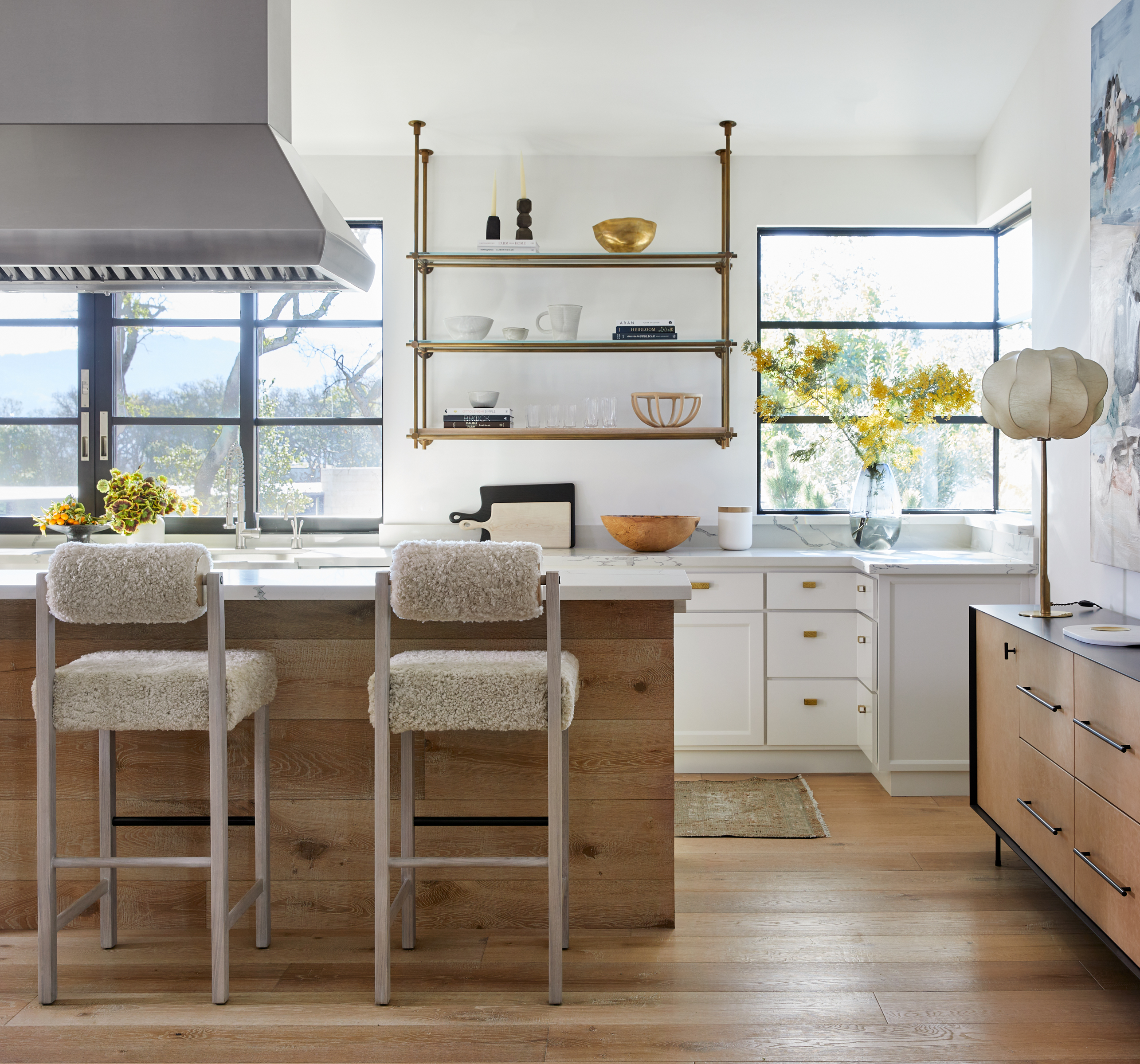
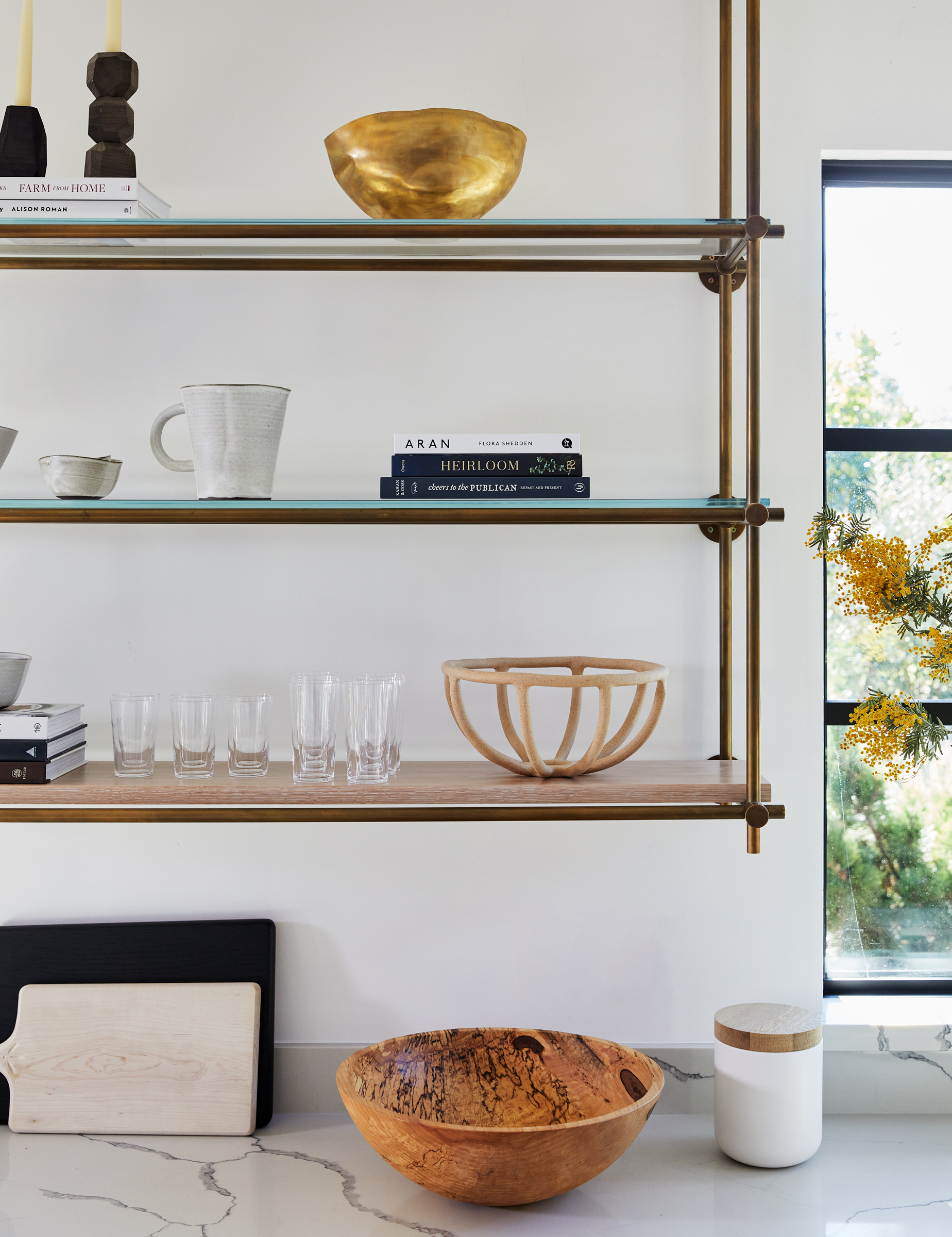
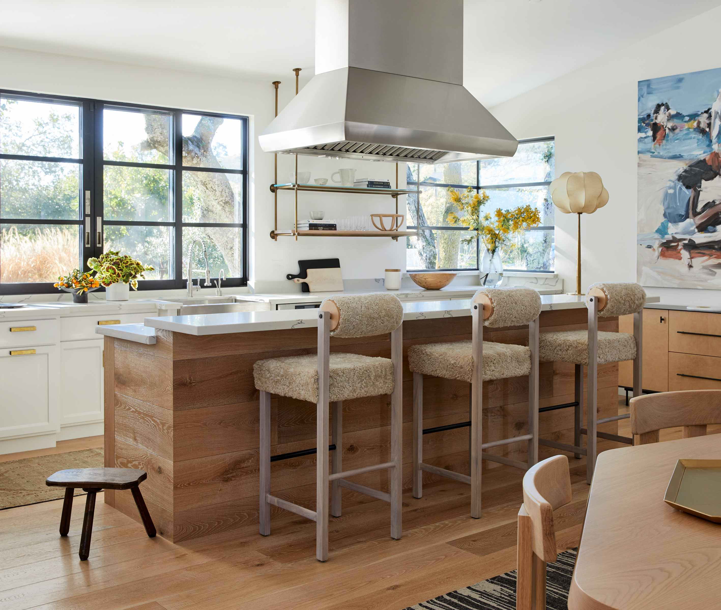
In this modern kitchen, custom brass and glass shelving, and cabinet hardware by Hoffman Hardware take center stage for curated decor. 'We wanted the open storage to house both functional items and styled items,' says Kristen. 'We carefully selected what would be seen vs. what would not. We like the idea of this open brass and glass storage because it is beautiful and takes away the heaviness of upper cabinets.'
The console is from Croft House, and the stools are Thomas Hayes. 'The counter stools are leather and sterling,' Kristen says. 'We love his edgy style, but also the comfort that is also delivered in this particular stool.'
The dining table
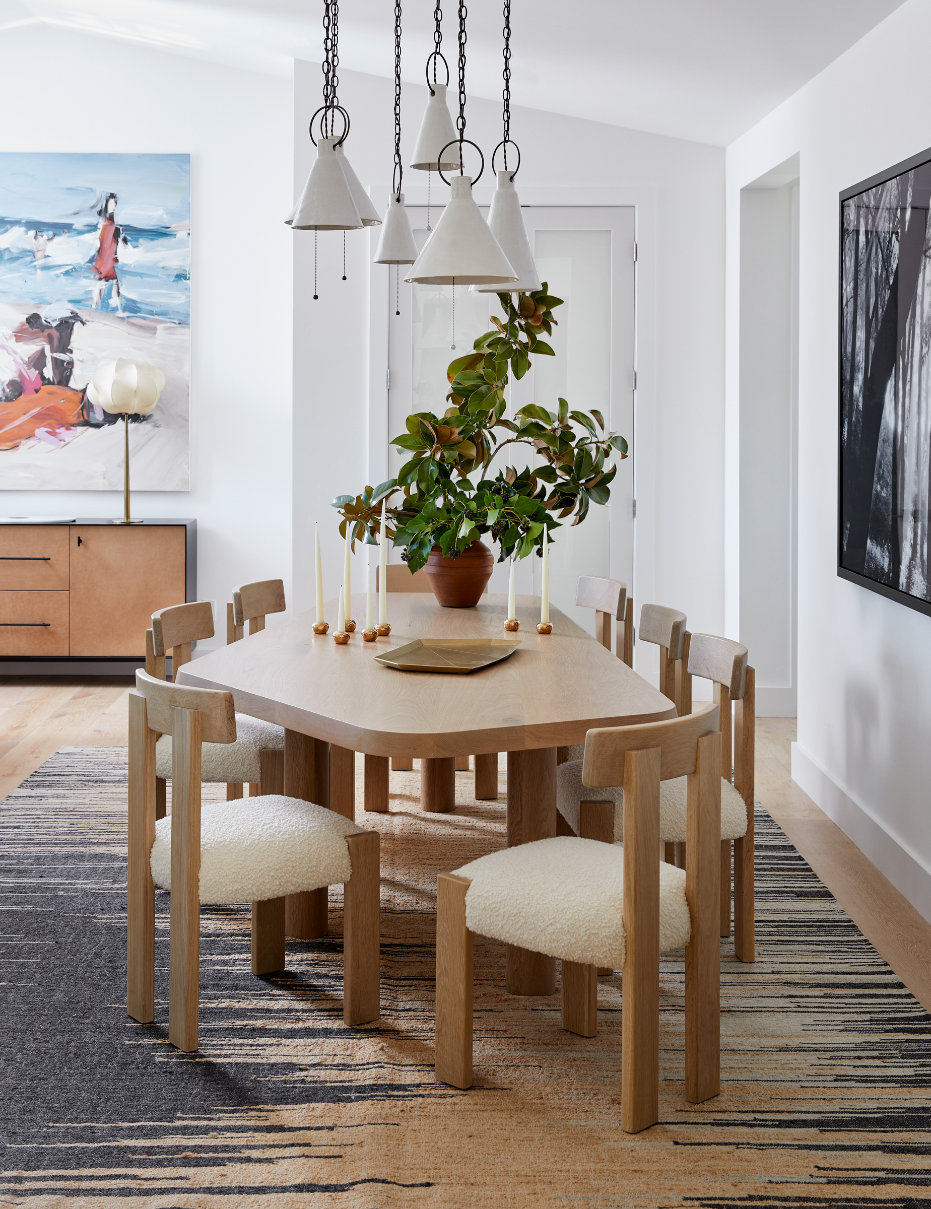
The crown jewel of the home, this bespoke dining table has been designed with a lot of thought.
'The formal dining is not so formal and shares an open floor plan with the kitchen,' says Kristen. 'The proximity to the kitchen keeps it a little more casual, but perfect for the type of usage the family likes.'
'We wanted to play with shapes in the dining room,' Kristen adds. 'The custom table allowed for a fun shape and interesting leg placement, so many people can accommodate it at once. Its design also makes it a piece that encourages convenient conversations. The chairs provide both comfort and interest with their back design.'
The custom table is paired with chairs from Stahl + Band, a design studio in Venice, California. Elsewhere, a handcrafted dining room lighting by Natalie Page, a Philadelphia artist whose work includes ceramic lighting, decorative art, and product design, can be seen.
Entrance
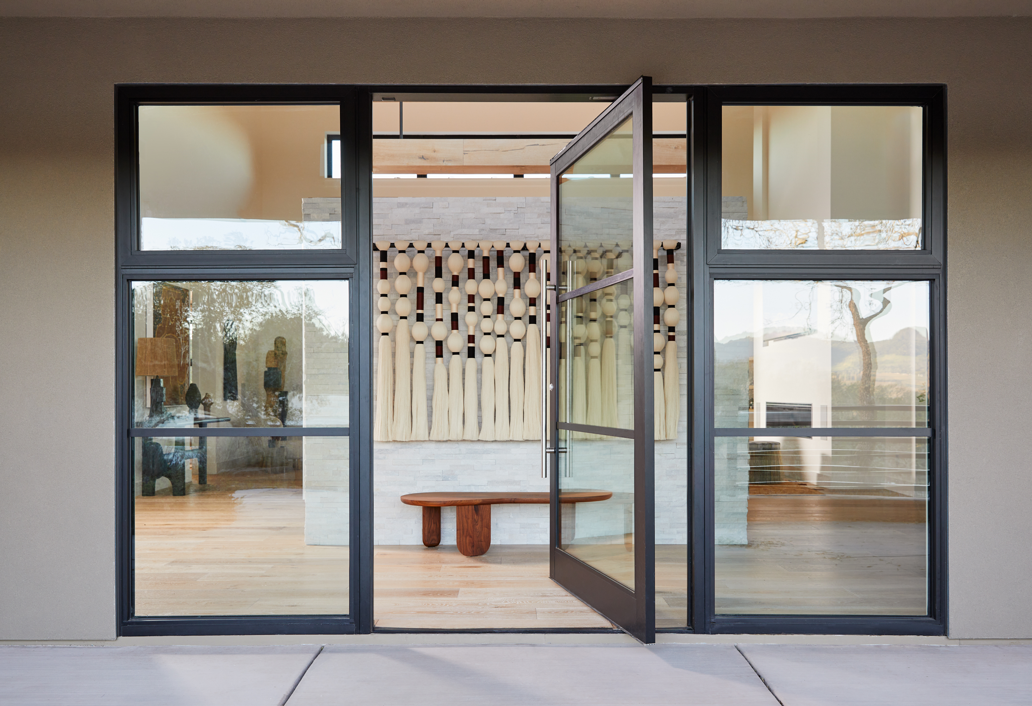
The home's bold yet considered design makes a statement right at the front porch, and the entrance with a wall-hung art piece, and wide glass doors.
'This is a fiber art piece made by the brilliant Caralargafrom Mexico City,' says Kristen. 'We felt the stone wall at the entrance needed some softness and when sourcing art for this space we felt the softness and organic nature of this piece would be incredible.'
'I was brought in on a very clean slate, and the clients and I wanted to honor all the lines of the interior architecture,' says Kristen. 'We also wanted to provide accessibility and comfort in the house by using lots of artisan designers to help foster a unique sense of space.'
Living room
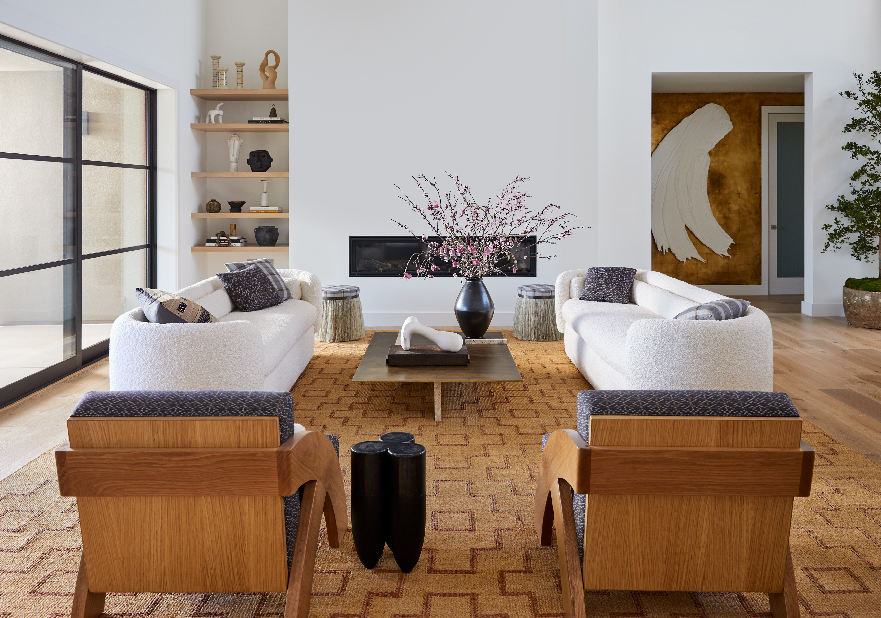
The living room color scheme is soft and muted, and warmed up by natural tones from the carpet and the wooden seaters. Large artworks, unique curios, and a gold-tinted bar make a statement.
Softness and tactility ensure the feeling of coziness is a forever staple. Take the bouclé sofas by British Canadian designer Philippe Malouin for instance which creates a comfortable seating environment. The center table is a travertine and burnished brass piece is from Banda. In the connecting hallway, you can also see the gold-leaf wall, created by Bay Area decorative painter Caroline Lizarraga.
'We needed to balance a level of comfort with an artful contemporary sleekness,' says Kristen. 'We created a space that has visual interest at every turn that also serves as a relaxation spot. We choose a luxe boucle for the sofas to provide that nest vibe, and paired it with a natural fiber and leather rug that is both interesting and textured in a more ridged way.'
'The two avid, contemporary art fans had a wide collection encompassing pieces by a diverse roster of artists who specialize in various media,' says Kristen. 'Today, the interiors are dotted with works by the likes of British fiber artist Sally England and Denmark-based sculptor Nicholas Shurey.'
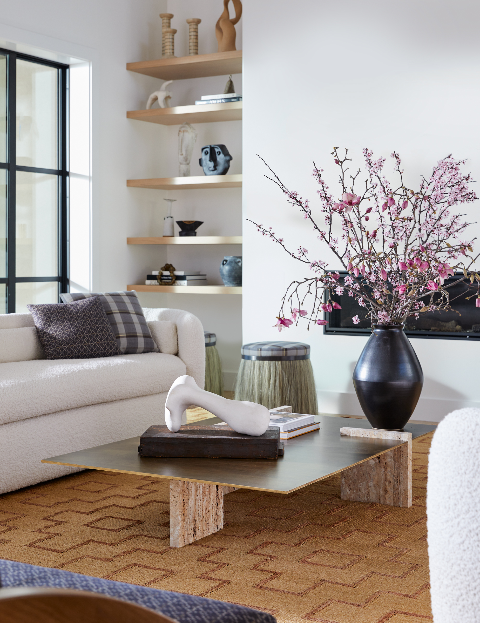
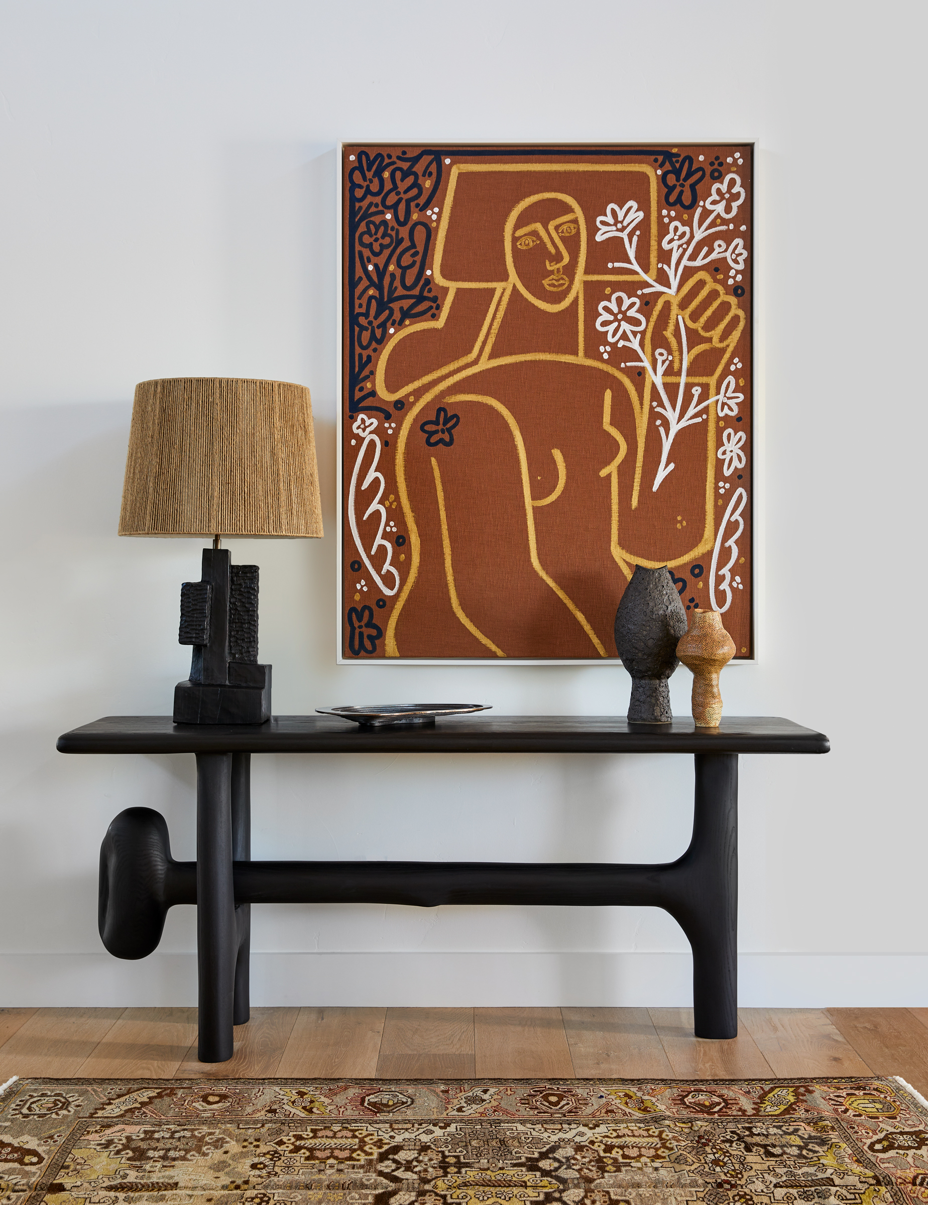

'The Thing stools by Konekt Studio are a favorite of ours,' says Kristen. 'We are big believers in creating interest through materiality and texture over color and pattern in a home like this. For the side shelf decoratives, we went on a sourcing trip to New York City and LA. Ceramics from Heyja Do Pottery to vintage candelabras, we layered this space with as much attention and love as all others.'
The custom living room bar cabinet adds a wonderful dose of hue to the otherwise muted space. 'It stores all glassware, a custom mixing station, and plenty of alcohol!' says Kristen.
Balcony

The socializing area extends beyond the living room, over to the outdoor seating, where two plush sofas on the balcony offer views to the rolling hills. The cocktail table is from Ralph Pucci, while the carved side tables are vintage.
'We wanted to use fully upholstered sofas, but with morning dew we wanted to be sure that they were protected from the elements a bit and are therefore on wood platforms,' says Kristen. 'A range of performance textiles are used outside that include Rosemary Hallgarten and Elitis.'
Powder bathroom
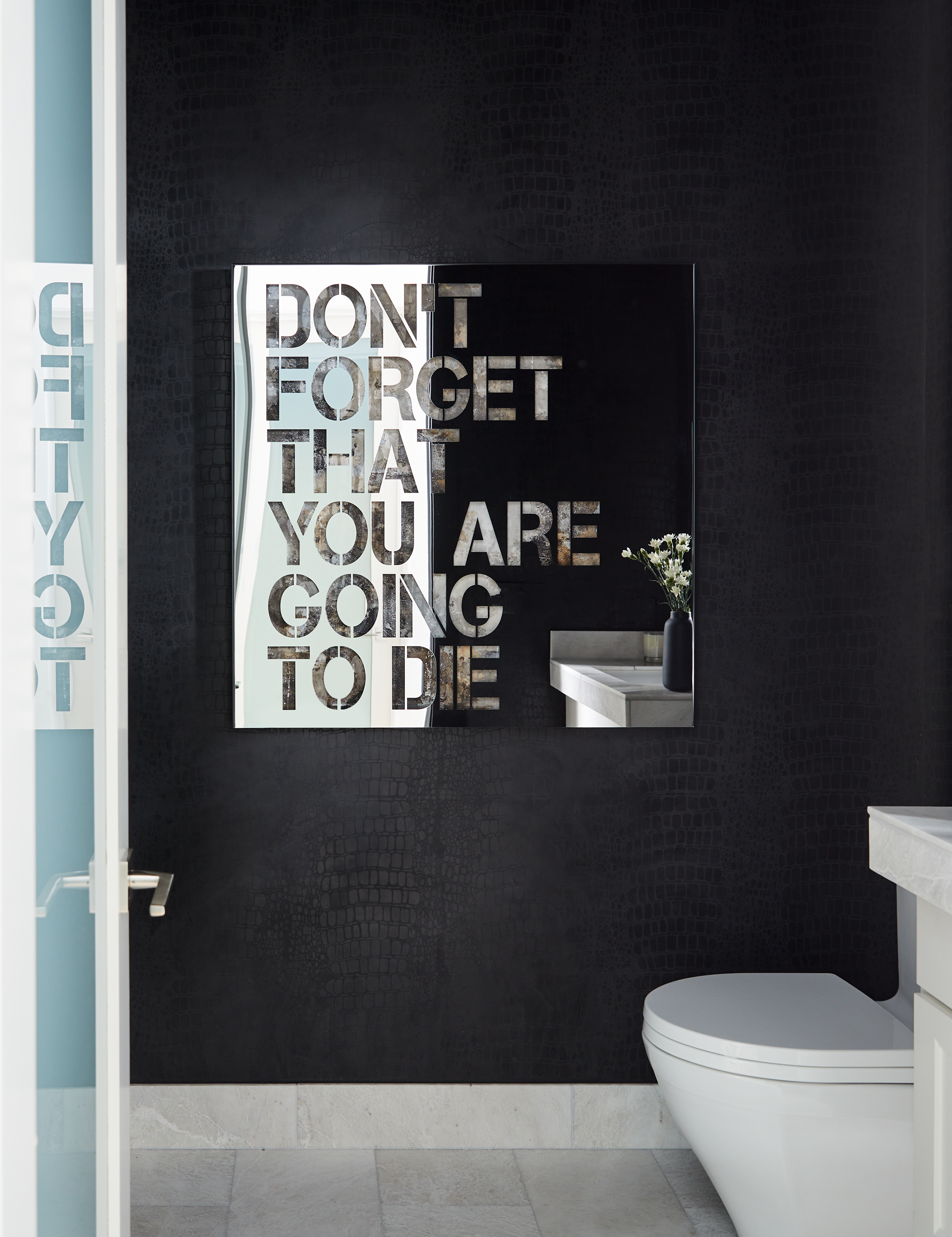
Just next to the living room and the home office is the powder room, brimming with design ideas. Art, as with most other spaces pulls focus and the dark-toned walls keep the interior moody. 'We used a crocodile skin pattern on the wall done all in paint by the incredible team at Caroline Lizzaraga,' says Kristen. 'The client sourced this piece of artwork herself.'
Main bedroom

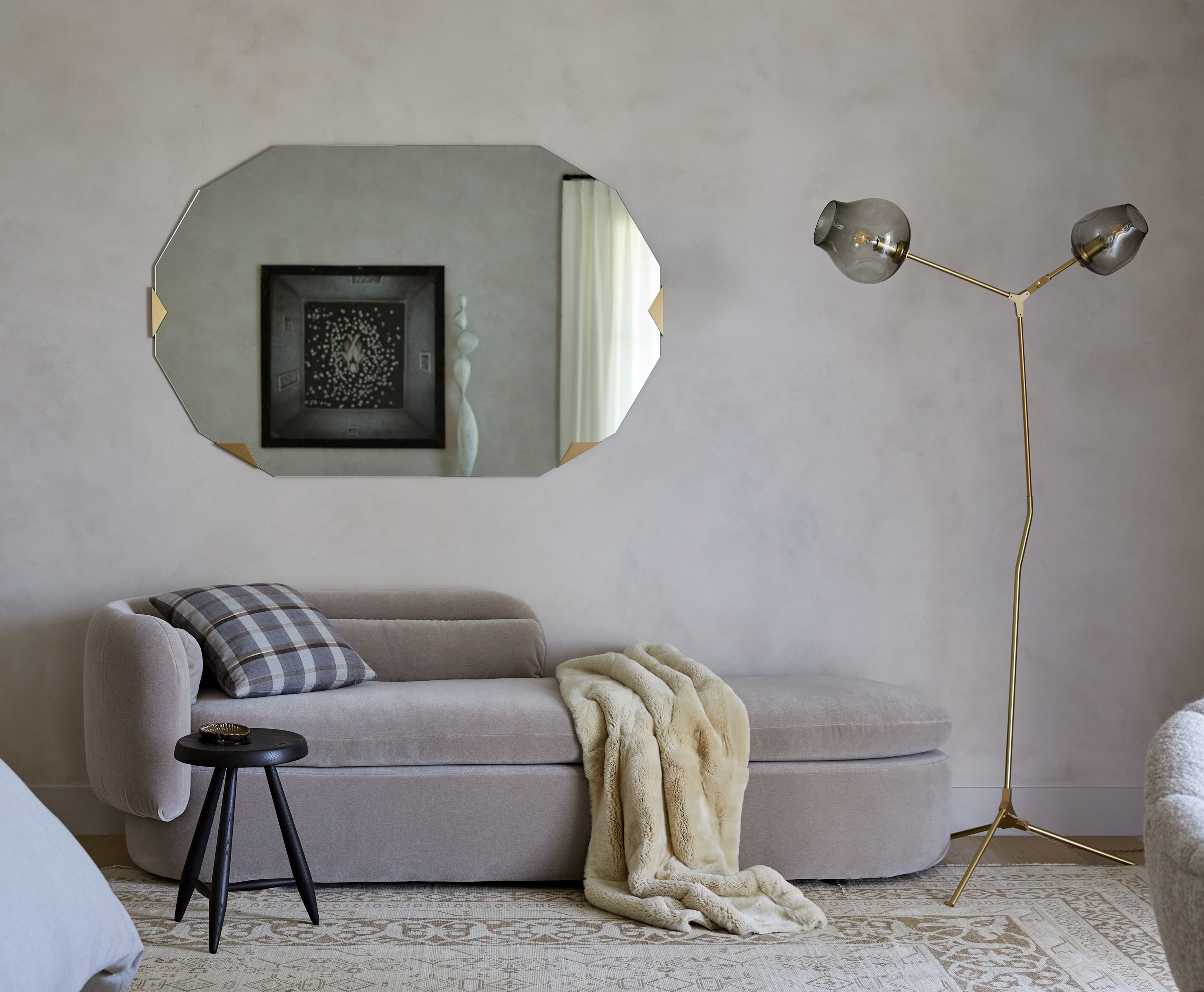
The large, plush, and deeply indulgent modern bedroom features a custom bed, from Hardesty Dwyer & Co. The overall muted palette keeps the mood calming. Flanking either side of the bed are Thomas Hayes nightstands and a rug from vintage and contemporary carpet dealer Tony Kitz adds playful warmth to the entire room. The textured wall treatments are by Caroline Lizarraga. 'The idea for the primary bedroom was to create a serene but also luxe space to relax in,' says Kristen. 'With very little relaxation time for this couple, it needed to envelop them in comfort and luxury. To add layering to the space, we chose plaster finish walls that create subtle movement and texture while keeping the palette light with the feeling calm.'
The room has a lounging area as well with boucle chairs, that allow the couple to spend some alone time reading, writing, or working. This is also a lovely space to socialize with very close family members. 'The room is spacious and has gorgeous views. We felt two seating opportunities allowed for multifunction use, and was a better option than having a storage piece that they didn’t need anyway,' says Kristen.
Guest bedroom
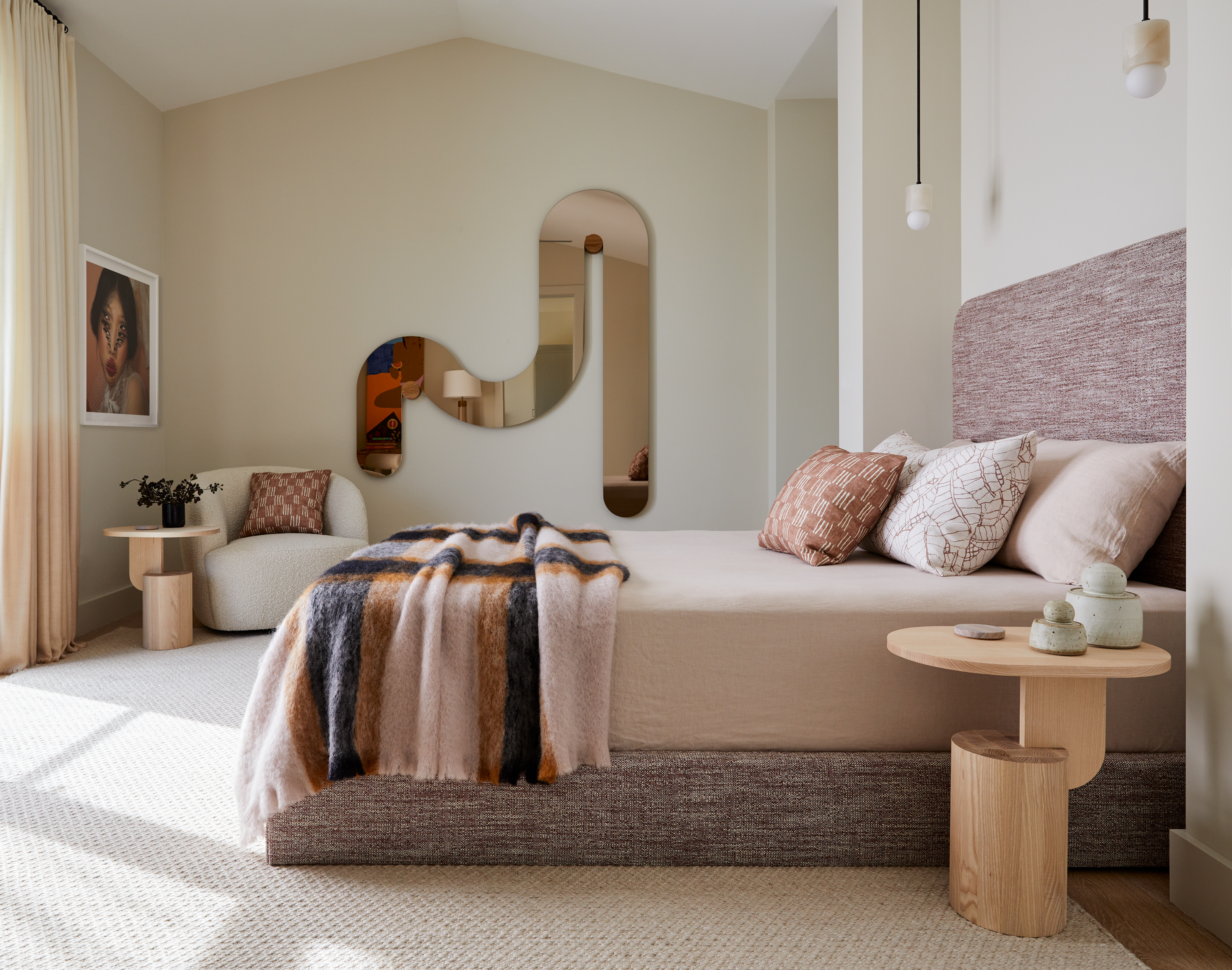
Soft pink tones waft across the guest bedroom, making it one of the most welcoming rooms in the house. The theme of sculptural and organic forms is reflected via a Bower mirror. The bed is custom and a pair of Allied Maker pendants add a serene touch. The nightstand/side tables are from Insert via Horne.
'We love the playfulness of the mirror's shape, and also that it reflects the beauty of the art and desk placed opposite it,' says Kristen.
Home office
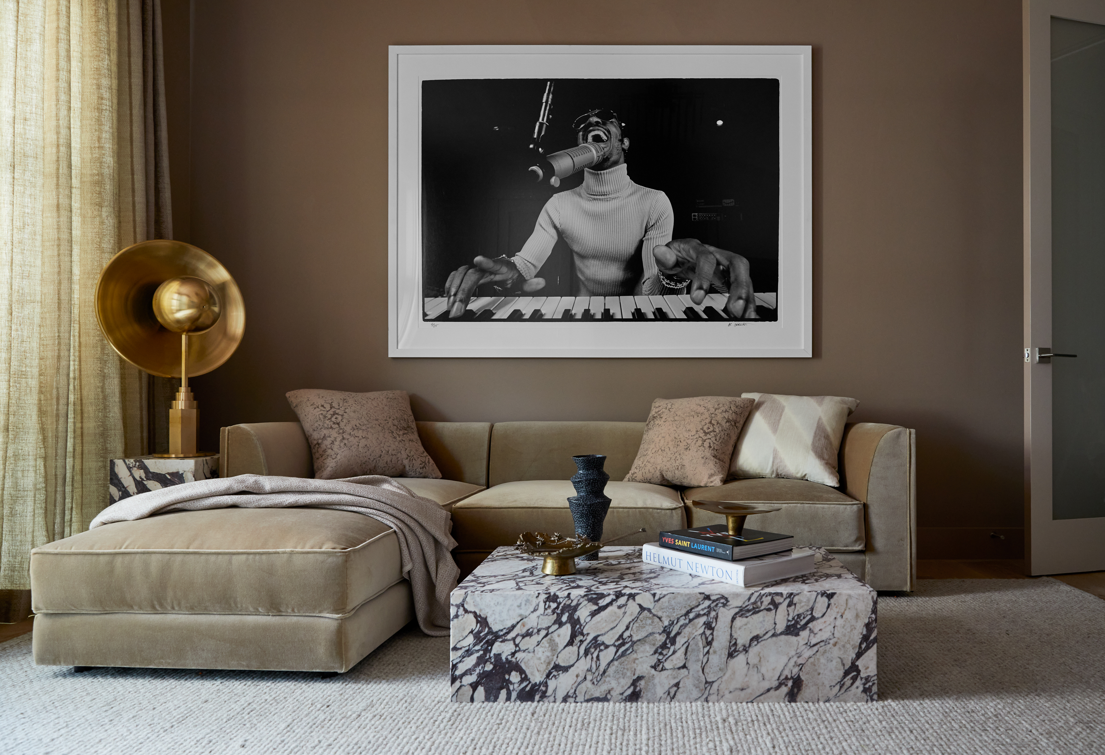
The modern home office has a workspace and a lounging area, both wonderfully fitted within a common space. The lounge space features a blush silk wallpaper from Phillip Jeffries. The sofa is the Amura sectional from Trnk, and the Kelly chandelier is by Gabriel Scott.
'The lady of the house wanted her office space to be a 15/10 on the Zoom coolness meter. I think between the wallpapered ceiling, the chain chandelier by Gabriel Scott, we achieved it all,' says Kristen.
Office bathroom
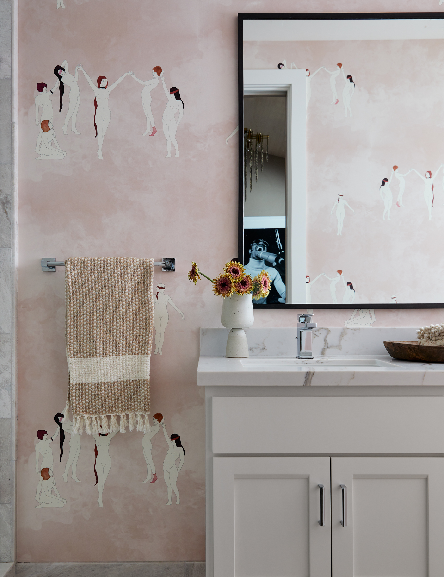
Just like the home office, the modern bathroom next to the home office is full of ideas and personality. The space with its artwork almost tells a story – of the strong women who rule the world. 'This bathroom is next to the client's office,' says Kristen.
Discover more projects by K Interiors.
