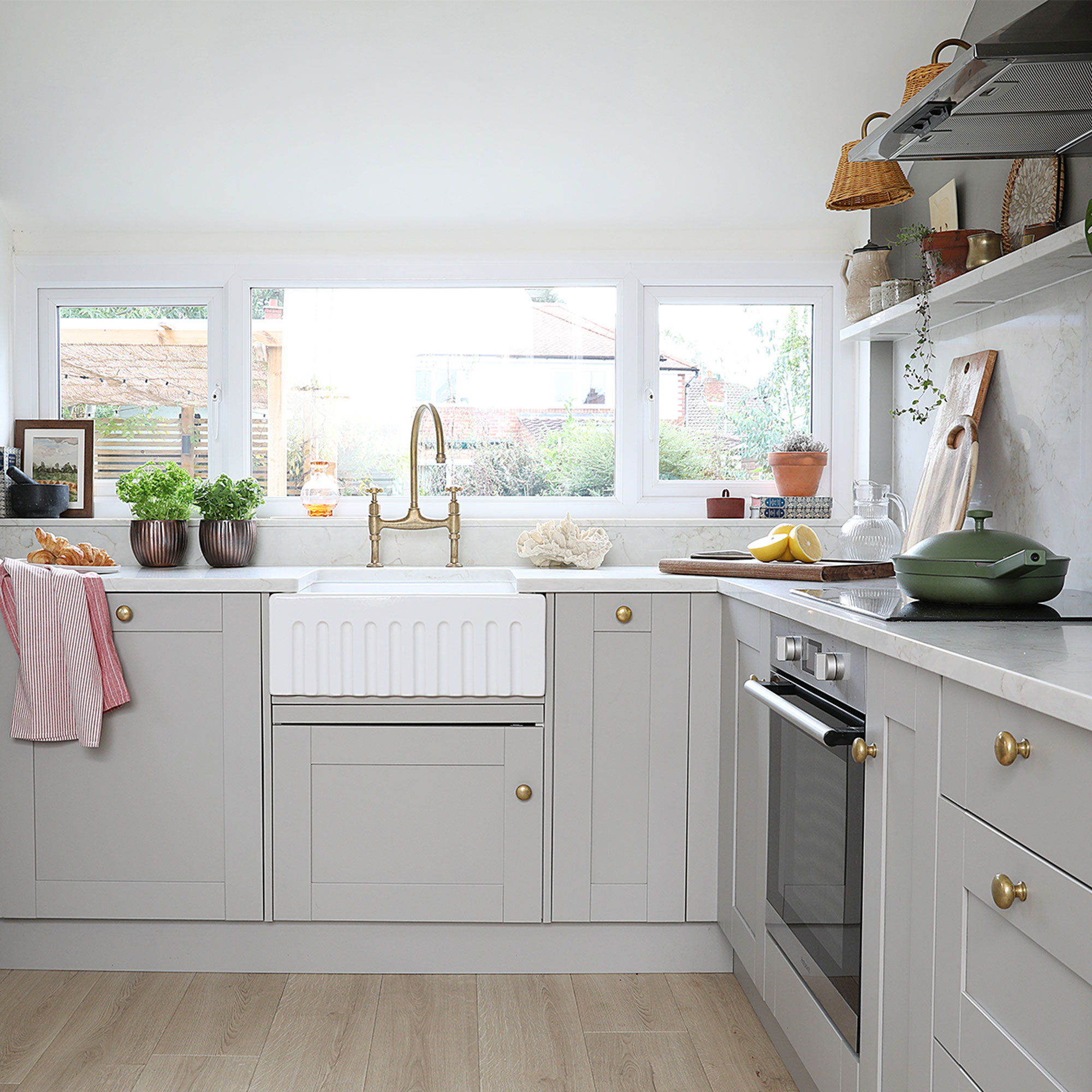
Although this 1930s three-bed semi was in a great location on a desirable street, the interior of the property hadn’t been updated in years and the garden was a bit of a jungle. But up for a challenge, the homeowners could see the property’s potential and decided to take it on.
The plan was to replace the kitchen and bathroom, decorate the house throughout and landscape the garden.
‘There were no handles on the windows, none of the doors locked and the garden was completely overgrown,' remembers the homeowner. ‘On day one, my dad cut back all the bushes and trees, while my husband and I filled up the removal van with garden waste and we made five trips to the tip!’
The kitchen

'The kitchen had a patchy varnished wood floor in the dining area and a tiny step up to a black tiled floor in the kitchen area, which was a bit of a trip hazard,’ says the homeowner. ‘I initially spent £100 on a quick glow-up by fixing the cupboards that were hanging off, painting them and vinyl wrapping the worktops until we could afford a new kitchen.’
‘When it came to replacing the kitchen, we went for a similar kitchen layout, but with integral appliances and a floating shelf on one side. It looks much better than the wall cupboards that used to encroach on the window. A segment of dividing wall was also removed to make it feel more open-plan.’
Kitchen cabinets
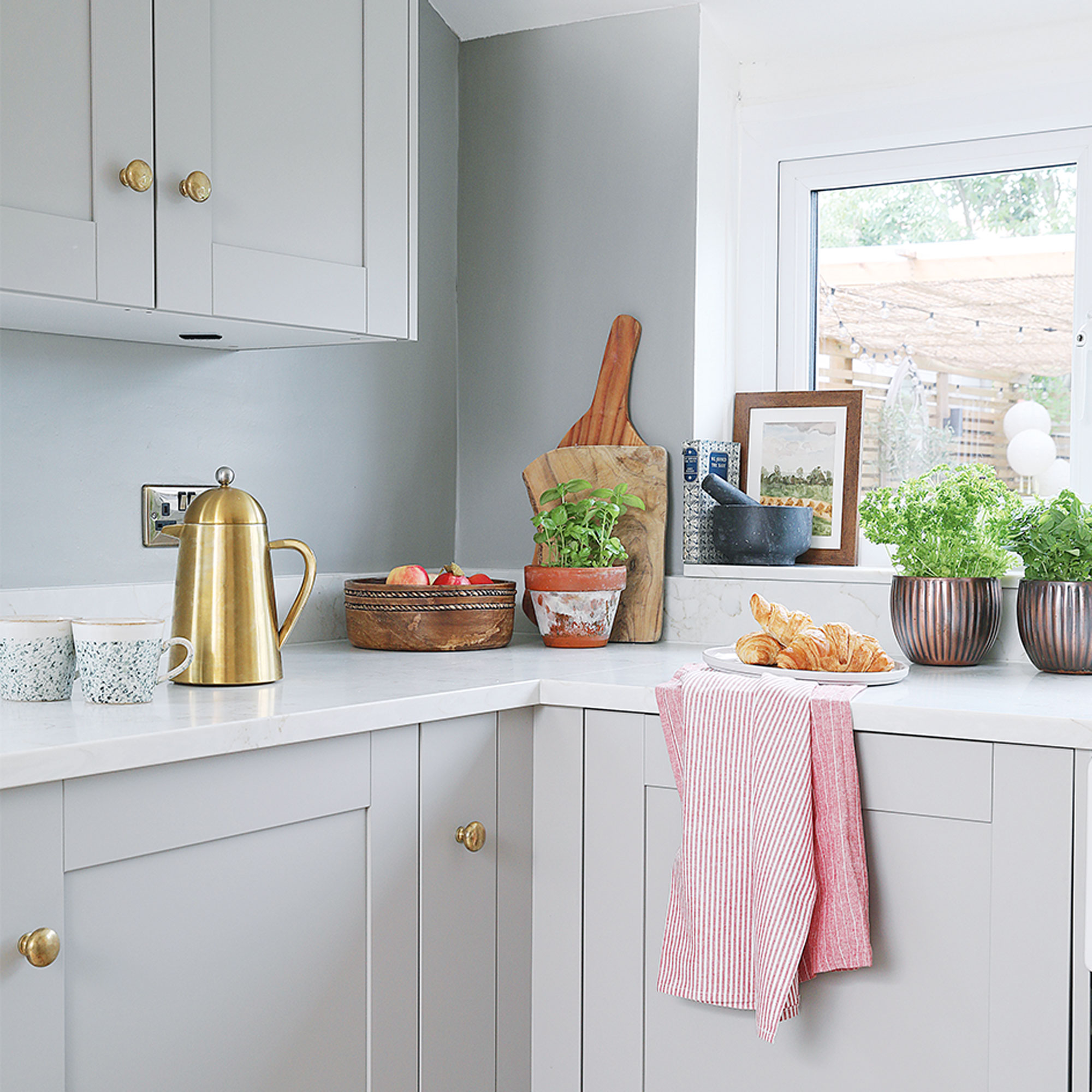
‘My inspiration for the kitchen was the Devol brochure. I really took time to notice the small things they do like cabinet handle placements and the thickness of the Shaker units,’ says the homeowner. ‘However my budget was much lower so I had to think creatively – like removing some of the shelves in a tall larder to make a coat cupboard or cutting back a 1000mm unit to make a 300mm deep counter-top larder.’
‘While I had quote of between £4,500 to £6000 from various kitchen companies, Benchmarx was the cheapest at £2,600, which included a pull-out bin and pan drawers, so I decided to go with them. I love the Pebble colour which goes so well with the brown-veined quartz worktops.’
Finishing touches
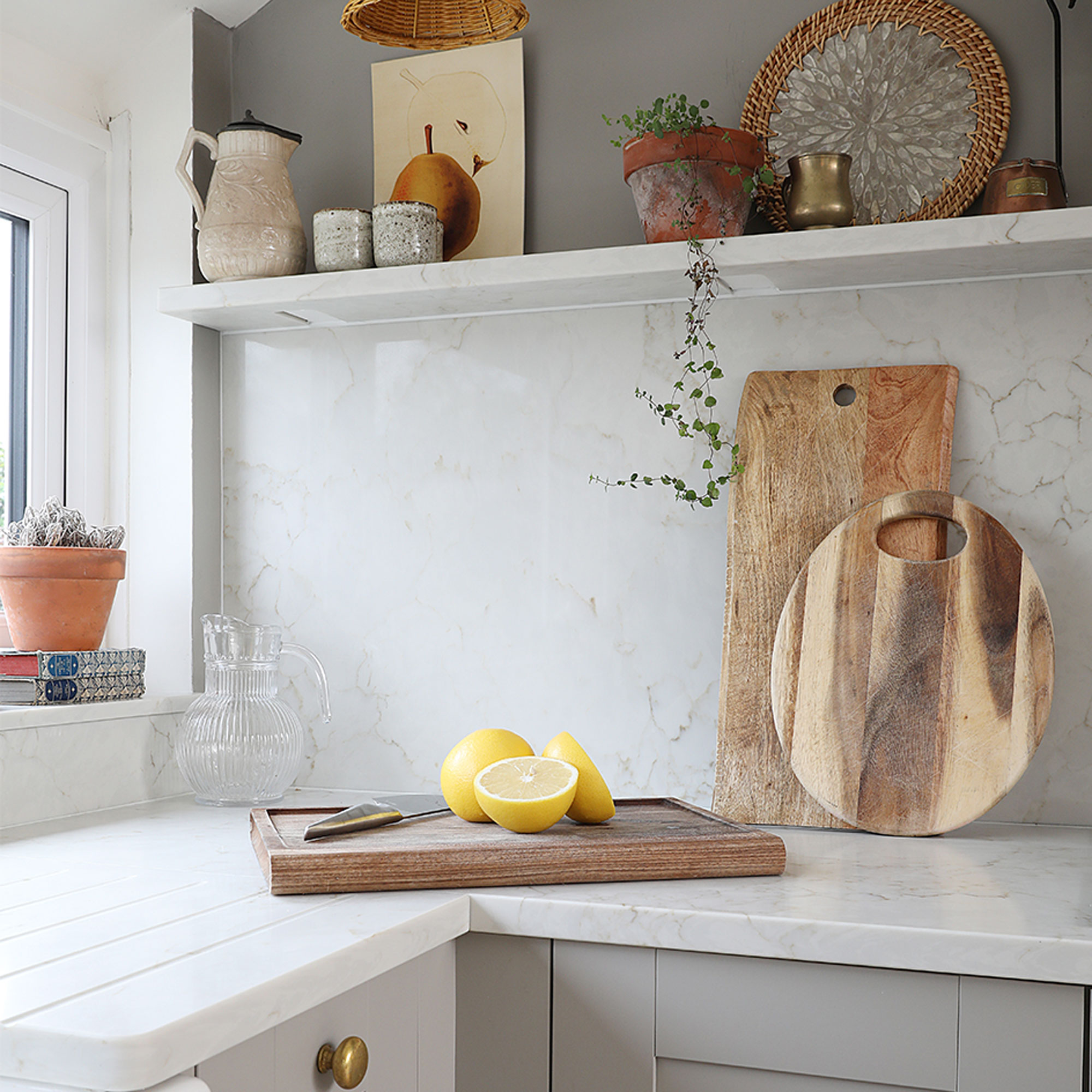
‘Although I saved money on the Oxford Pebble kitchen units from Benchmarx, I always think it’s worth spending more on touch points like the kitchen worktops, knobs, sink and tap to make it look more expensive. I particularly love the Belfast sink and brass tap, bought via inderkitchen.co.uk.’
The dining area
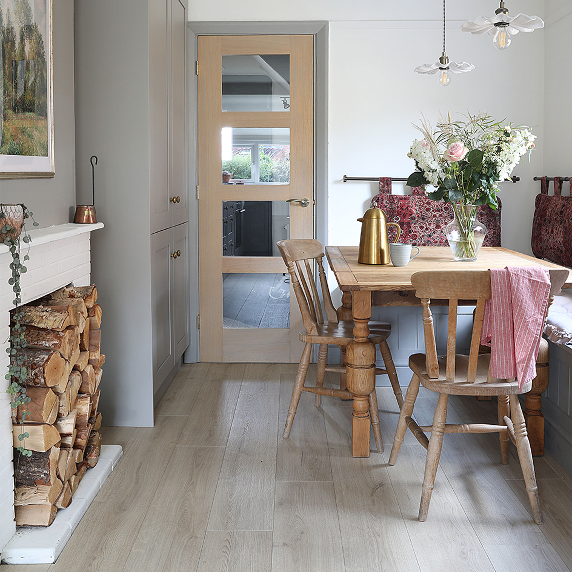
‘My husband built the Devol-inspired bench seating in the dining area with storage, which was painted the same colour as the kitchen. I sourced French-style ceramic lights from John Lewis.’
‘I’d seen the hanging cushions in a pub and thought it was a great idea as they're so comfy. I picked the fabric and a local seamstress made them up with wadding, then we hung them on brass rails from Yester Home.’
‘I considered replacing the brick fire surround, but I just painted it white and filled it with logs so it suits the space better.’
The living room
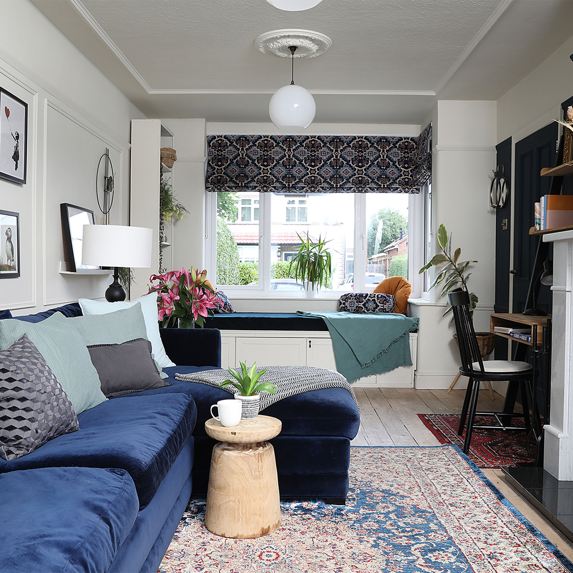
‘As the living room is long and narrow, we wanted to add interest with a reclaimed fireplace, panelling made from mouldings and ceiling roses. To tie everything together we’ve used the same mouldings as the panelling and painted it the same colour as the walls.’
‘We opted for a nice big, comfy, corner sofa from sofa.com, although it’s a bit too low and deep for elderly visitors. I also love the Fritz Fryer bespoke light globes as they’re locally made.’
Built-in window seat
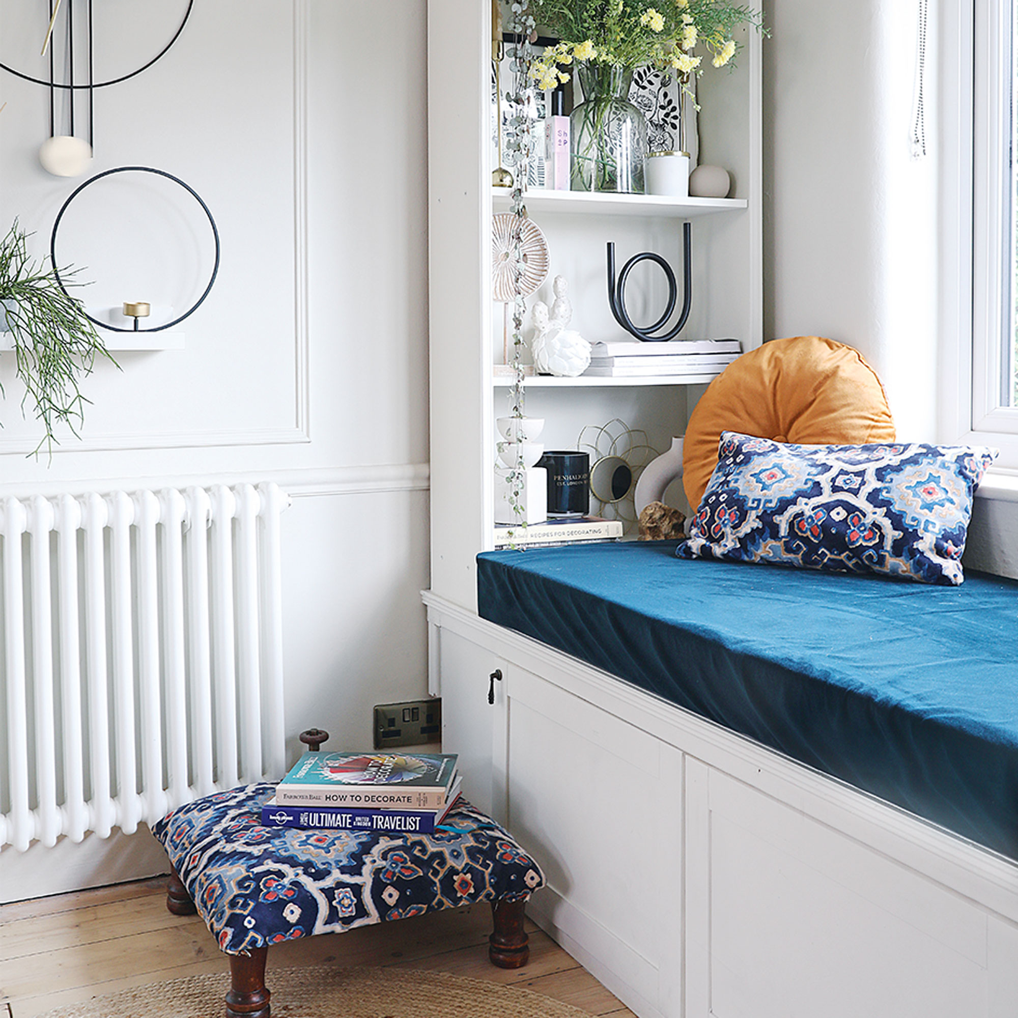
‘My husband made a window seat by constructing a wood frame then adding a Gersby bookcase and Hanviken door fronts from Ikea.’
‘I had some MDF and foam cut to the exact size, then stapled fabric around it to make the seat. Although it meant taking out the radiator under the window and getting a new vertical design at the opposite end, it was well worth it.
The garden
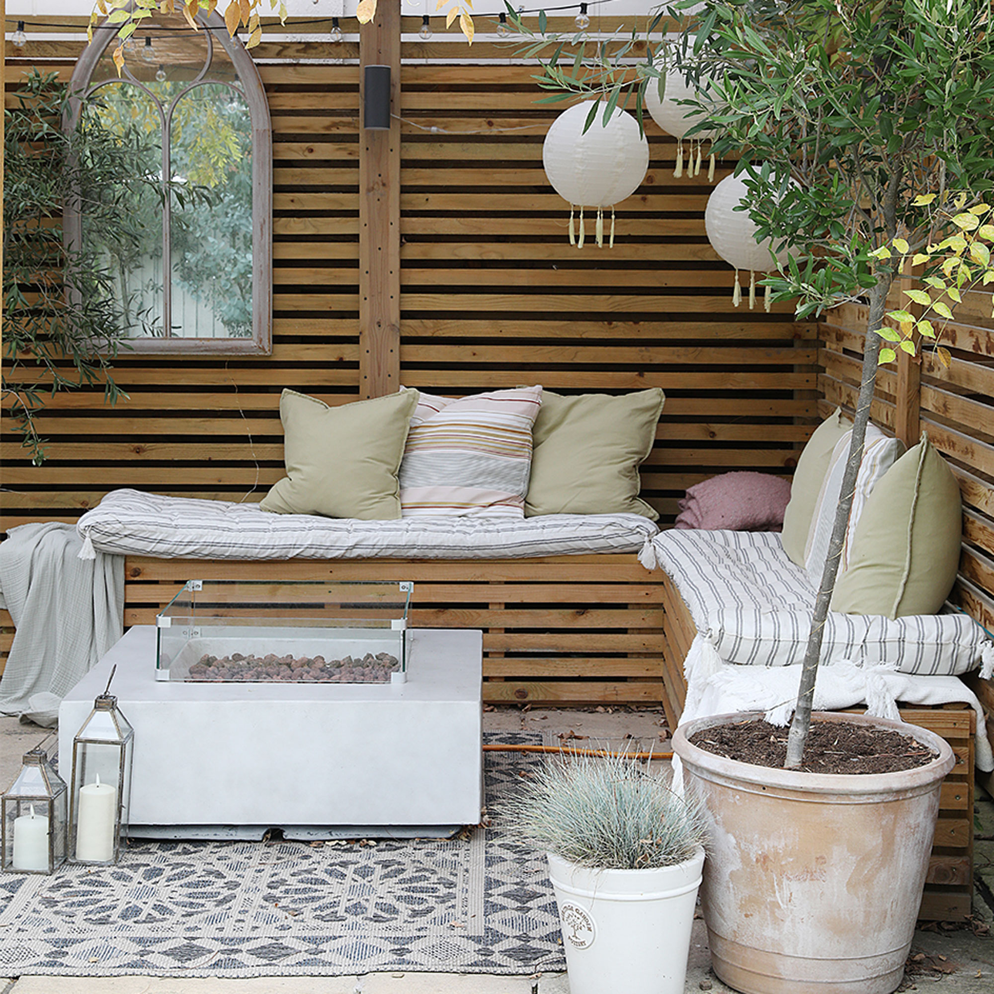
‘Even though we both work, we spent a lot of evenings and weekends finishing off the south-facing garden. My dad built a wooden pergola with a corrugated plastic roof where we have both a dining and seating area. It means we can use the space whatever the weather. My husband also made an outdoor kitchen and built raised planters from decking.’
The house exterior
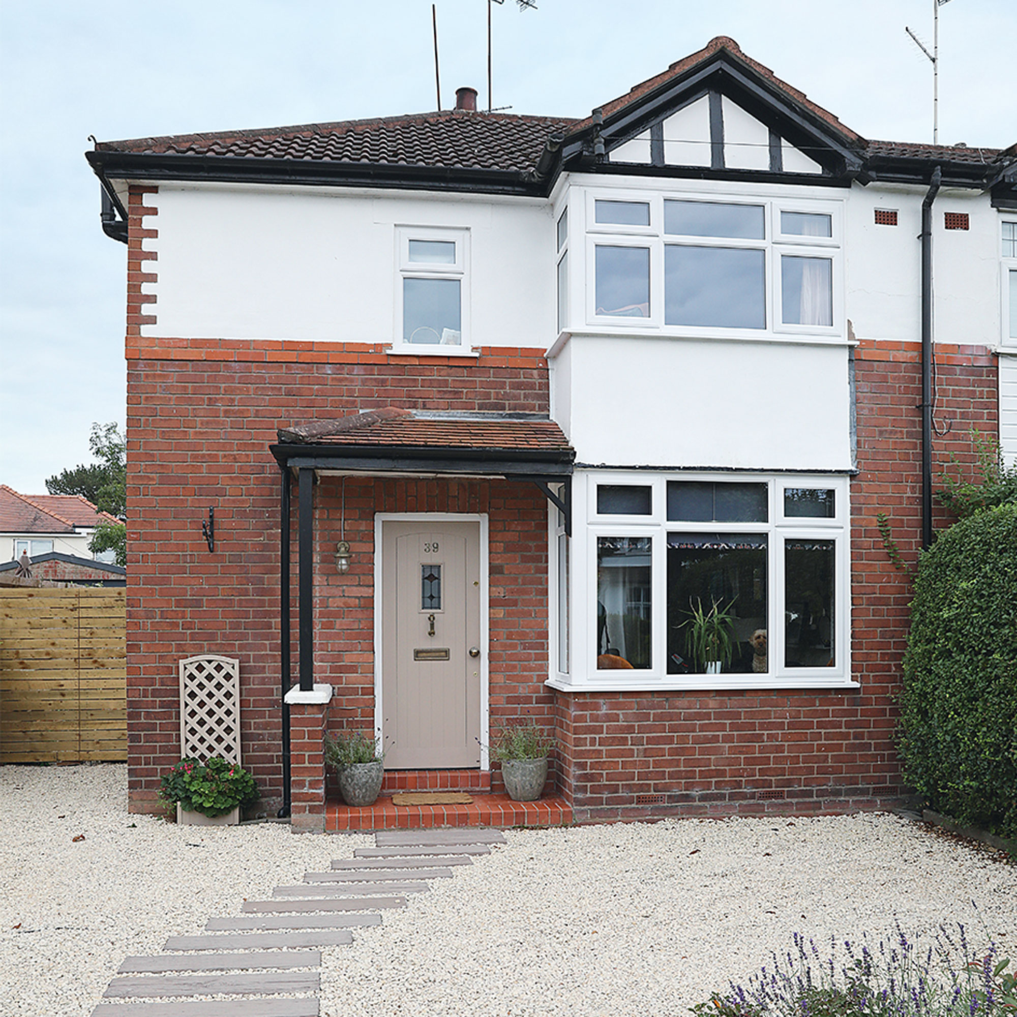
‘We’ve also done a lot of work at the front of the house. It had uneven grey paving slabs before, which shot water up your leg when you walked on them! After digging out the flagstones, we made a path from wood-effect concrete that looks like sleepers. We also removed a pillar from the driveway so it’s easier to park, and took down the privet hedges.’
The master bedroom
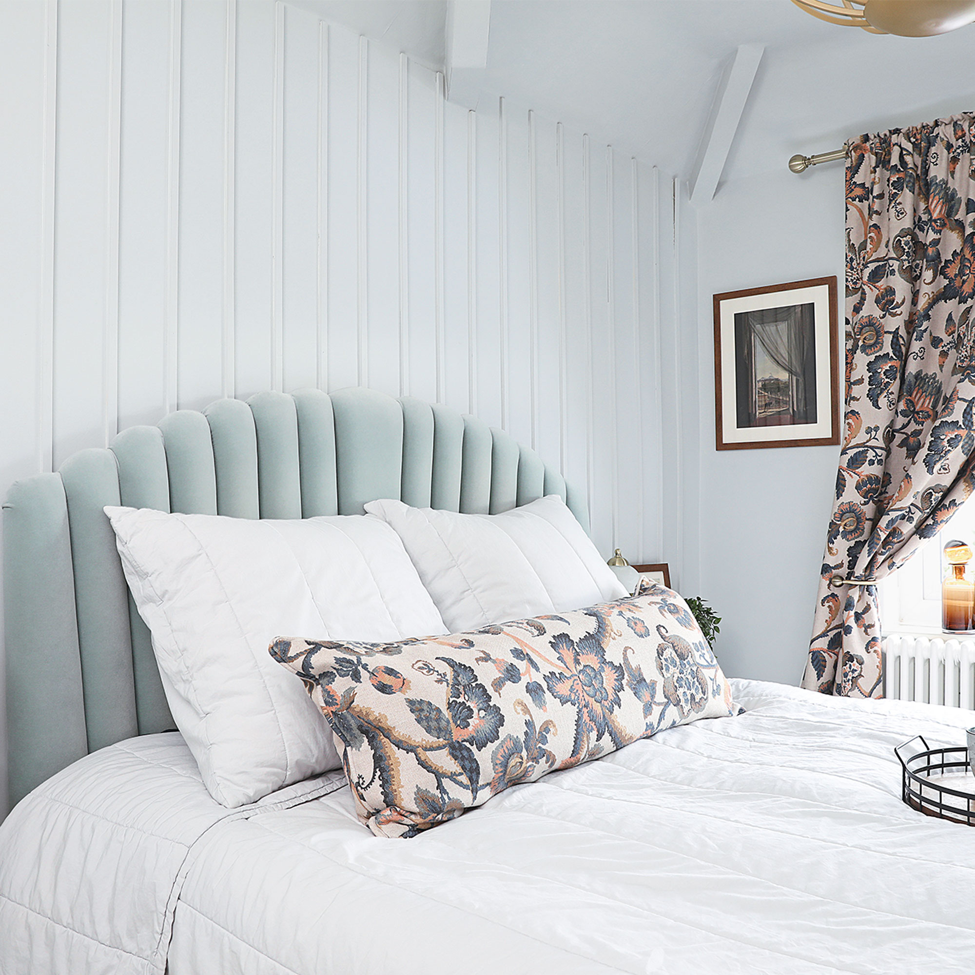
‘In the master bedroom, we made a panelled feature wall using softwood strips. This was painted in a beautiful shade called Pearl Colour by Little Greene, along with the other walls and ceiling for a cocoon-like feel.’
‘There are no wardrobes in here, which isn’t ideal as most of our clothes are in our daughter’s room, but I didn’t want to walk through the door and be faced with the side of a wardrobe.’
‘The starting point for my moodboard was the soft greeny-blue wall colour and then I fell for the bed from sofa.com with its showstopping Sage velvet headboard. From there it was easy to pick the Assam curtain and cushion fabric from Linwood Fabrics as it came in several colourways.’
Girl's bedroom
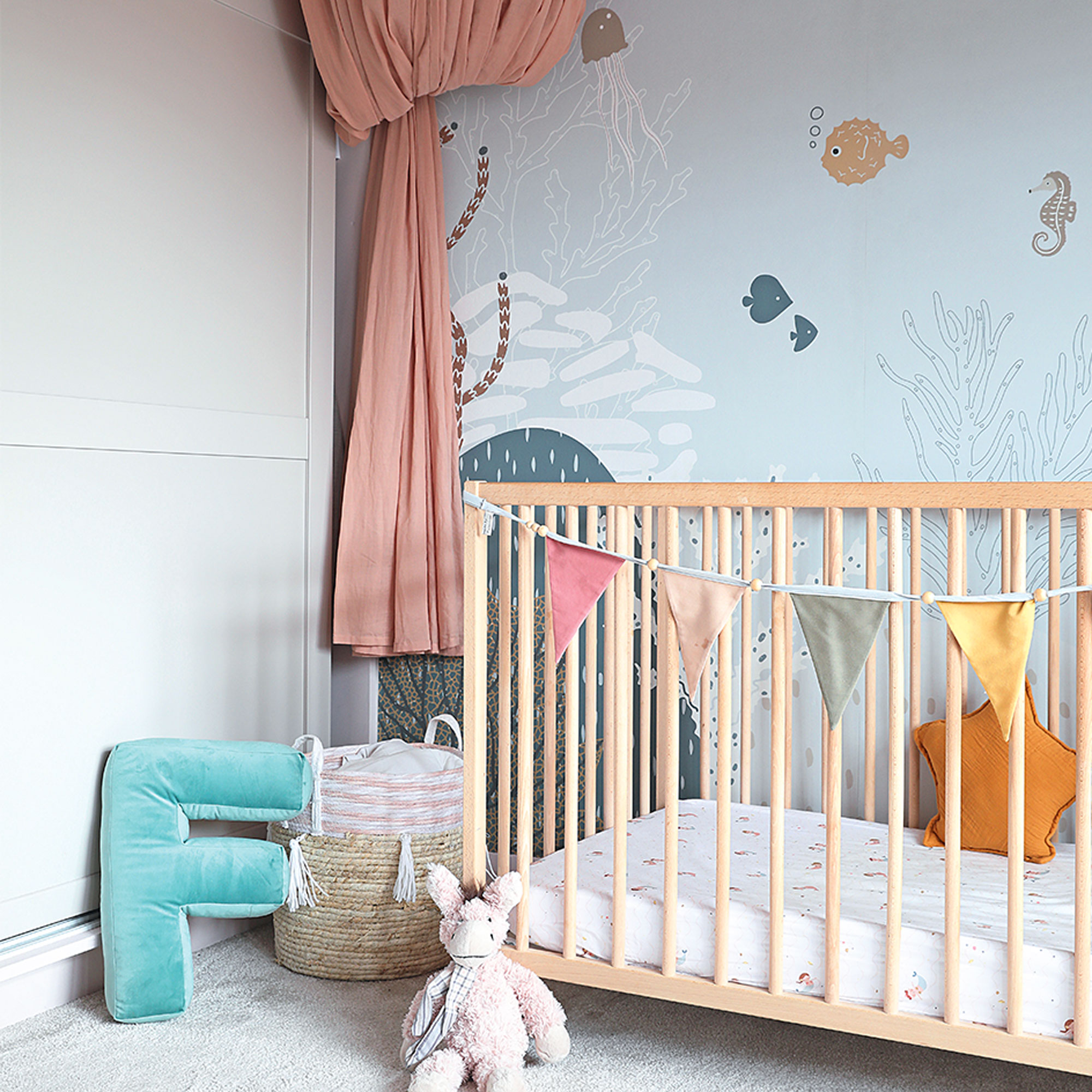
‘The children’s bedrooms didn’t need too much work, just a lick of paint, new lighting and wallpaper murals.’
‘The wall mural from Munks & Me feels like a big piece of art. It really draws the eye so you can save money by keeping the rest of the walls simple. My friend says the bed canopy looks like a jellyfish, which wasn’t intentional but feels quite apt with the theme!’
Upcycled chest of drawers
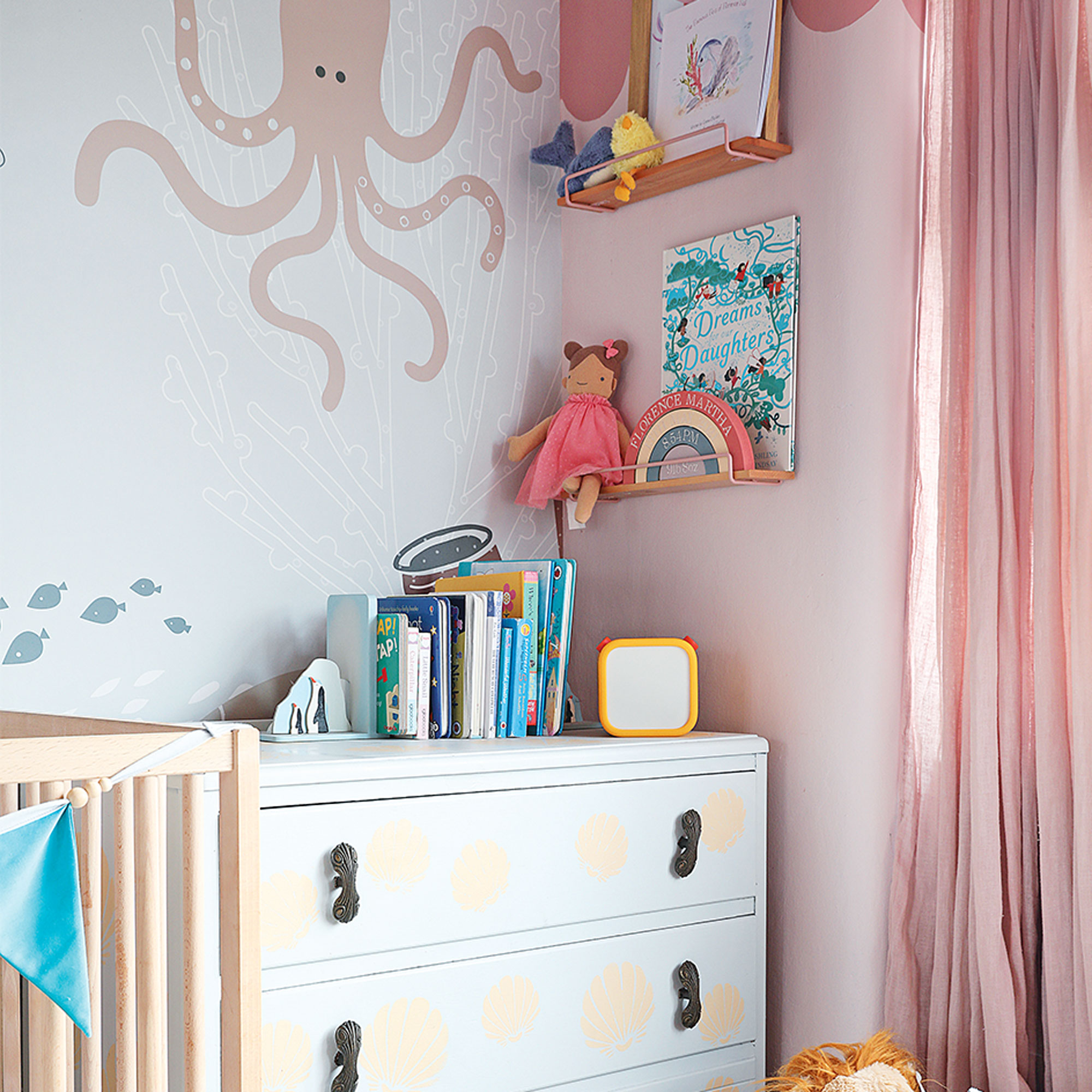
‘The chest of drawers cost £5 from a charity shop and used to be our TV unit. I upcycled it with a shell motif and painted the wall scallops in Blossom and Potter’s Pink by Dulux Heritage.
Boy's bedroom
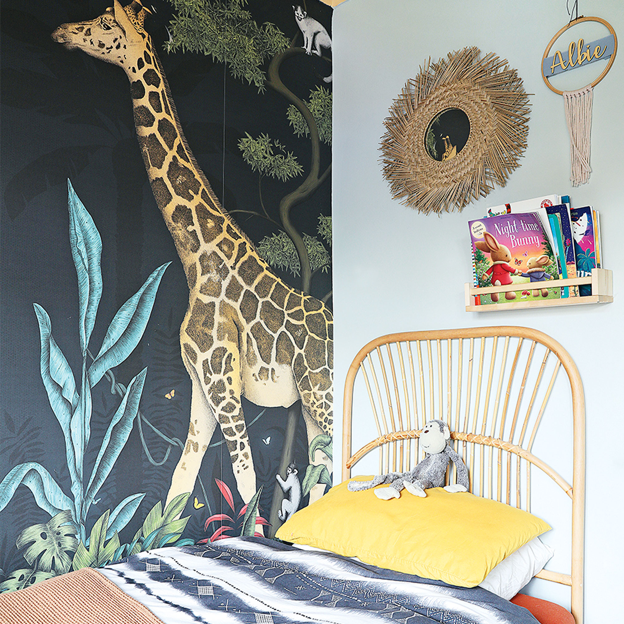
‘My son loves animals and going to the zoo so the wall mural from 4 Murs was perfect. We spend five minutes every evening naming animals and pretending we’re on Safari.'
The Bathroom
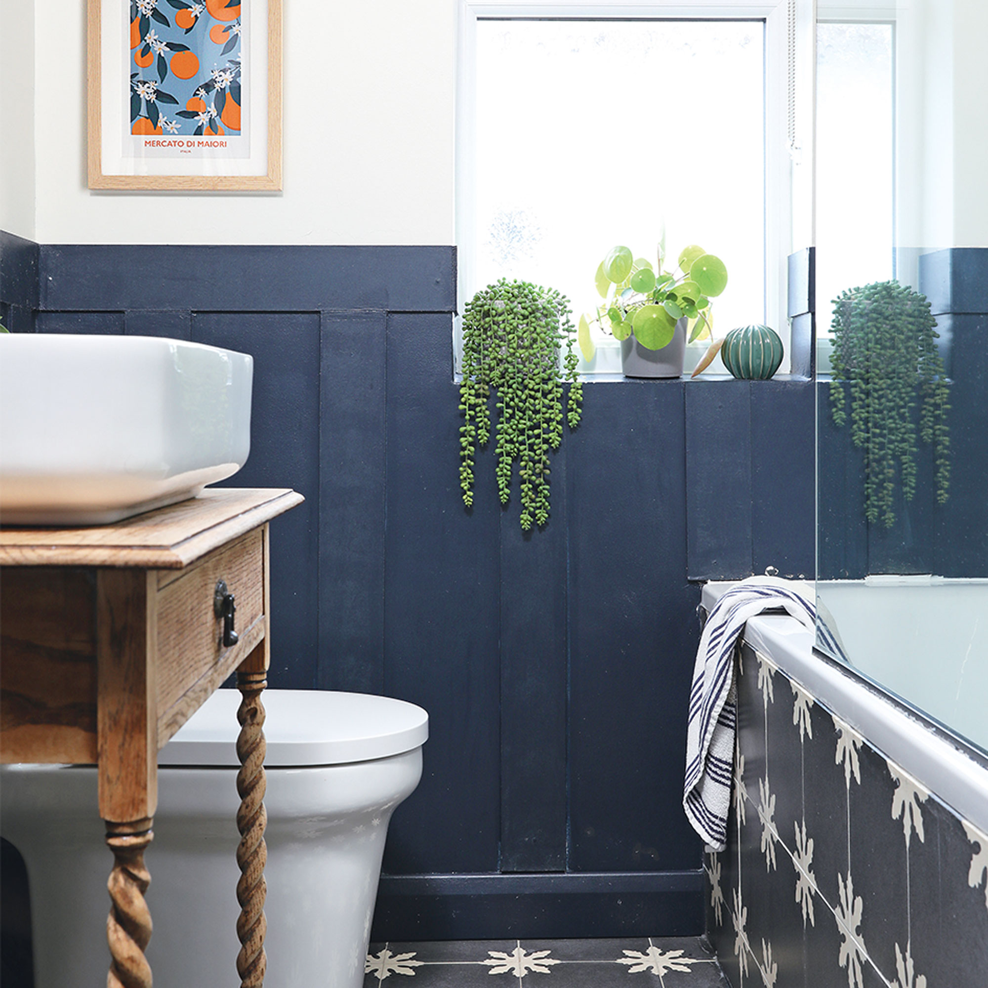
‘When it came to re-designing the bathroom, a friend who was studying interior design, did a CAD drawing for me. It was invaluable in helping me see how the tiles and dark panelling would look alongside a vintage vanity unit.’
‘Moving the toilet to the side wall – so it wasn’t the first thing you saw as you walked in – was a game changer. We also put in a bigger bath with a shower above to replace the tiny bath and separate shower, squeezing in a slim linen cupboard too.’
‘Although we might be lacking in bedroom space and the loft pitch is too shallow to convert, we’ve managed to almost double the space by transforming the garden. I can’t wait for the next project…hopefully a semi in the same area with bigger rooms. It should be easier as we’ve learned loads of new DIY skills and I know where to source everything having researched everything to within an inch of its life!’


