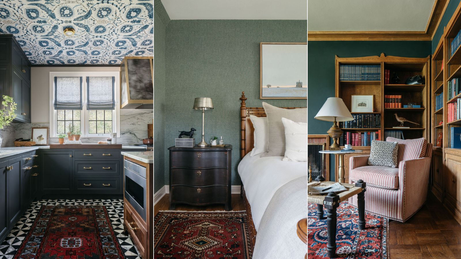
It's a sign you trust an interior designer when you not only work with them on your home's original remodel, but keep them close at hand for nearly two decades to help with upgrading the space as and when it needs it.
Designer Emily Winters Posselt of Peabody's Interiors not only helped the owners of this home give it a facelift 20 years ago, she's seen the home and the family within it grow and evolve. So it just made sense that when the young family she'd designed the original home for grew up, she worked on a second large-scale remodel for this new phase of life.
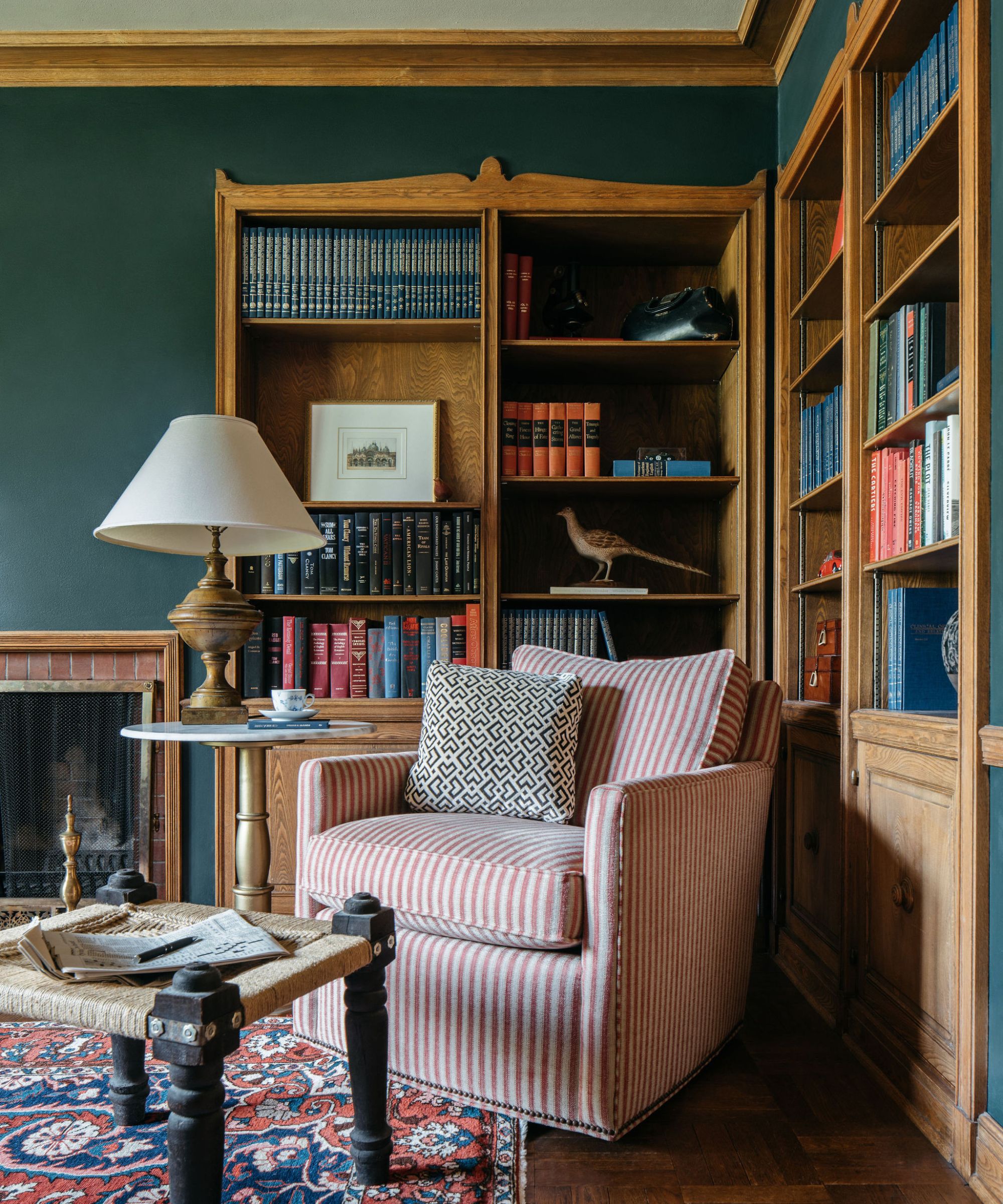
'These are long-time clients of mine whose children are now grown and out of the house. I’ve been working with them on interiors and renovating since their kids were small, so I’ve had the privilege of watching their family grow up,' explains Emily.
'They originally hired me all those years ago to help furnish the house and make things more functional for the ever-changing needs of their young family. Many years and projects together later, it was time to rethink the kitchen, dining room, and primary bedroom.'
'The home was feeling a little tired, as four kids had been raised there. The space needed a breath of fresh air and the sophisticated approach that comes with designing for empty nesters. Our thoughts could turn from “What lives best with kids?” to “What lives best for this house? And what brings maximum interest?”'
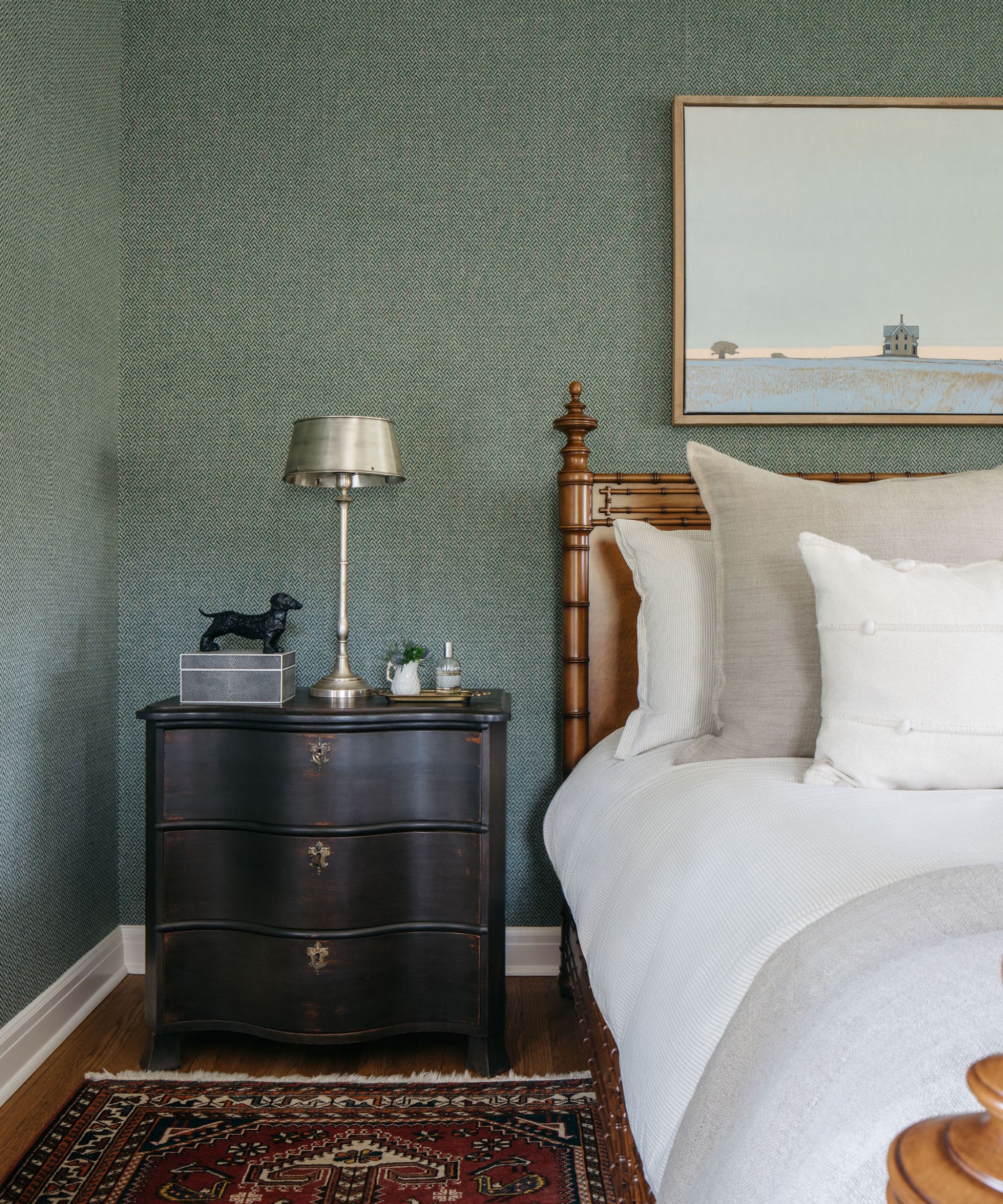
The 4500 sq ft home was originally a convent, built in the 1930s but Emily had remodeled it a couple of decades ago, and as she mentioned had stayed close with the family, so it was already familiar territory. This time around, the homeowners wanted to update the house to better suit hosting their children (now grown up and moved out) and their grandchildren.
'The primary bedroom lacked closet space, and the primary bath needed an overhaul, lacking both vanity storage and a proper shower. The kitchen felt very cut off from the remainder of the house and the dining room went largely unused,' Emily explains.
Emily says her clients loved to cook and entertain, so the kitchen and dining room were top of the list to remodel. A better flow between the two spaces was needed so they could host, prep, and socialize at the same time
'My client loves to entertain, is an amazing cook, and wanted a comfortable space to cook and entertain,' explains Emily. 'Her children are now raising their own kids, so she envisioned a dining room that was more open to her kitchen and wanted the room to feel sophisticated enough for formal entertaining, but comfortable enough for day to day living. Her words were, “I trust you here. Do what you do best!”'
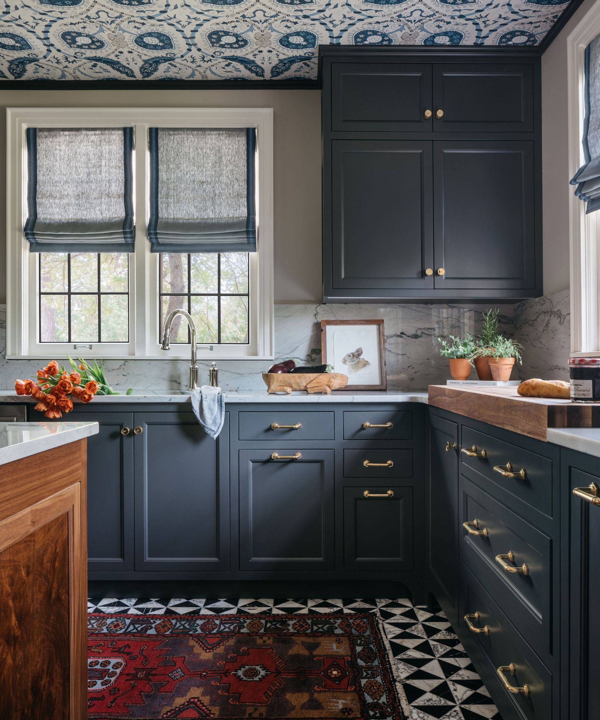
'While the sink, range, and refrigerator stayed in their original locations, the rest of the kitchen got a good shake-up. The old kitchen had two small island carts, which we eliminated in favor of one longer kitchen island with storage and seating. We created a 4-foot opening to the dining room, allowing the two spaces to flow more naturally,' says Emily.
'We added the bar sink to the kitchen and then created the walk-in pantry/wine storage just beyond the kitchen. The original kitchen felt like it was two separate spaces because of the way cabinets were turned to create a cooking area then a separate coffee/wine and baking area. We were able to run cabinets around the perimeter of the kitchen, place the island in the middle then still dedicate areas to tasks, but in a way that created one cohesive space.'
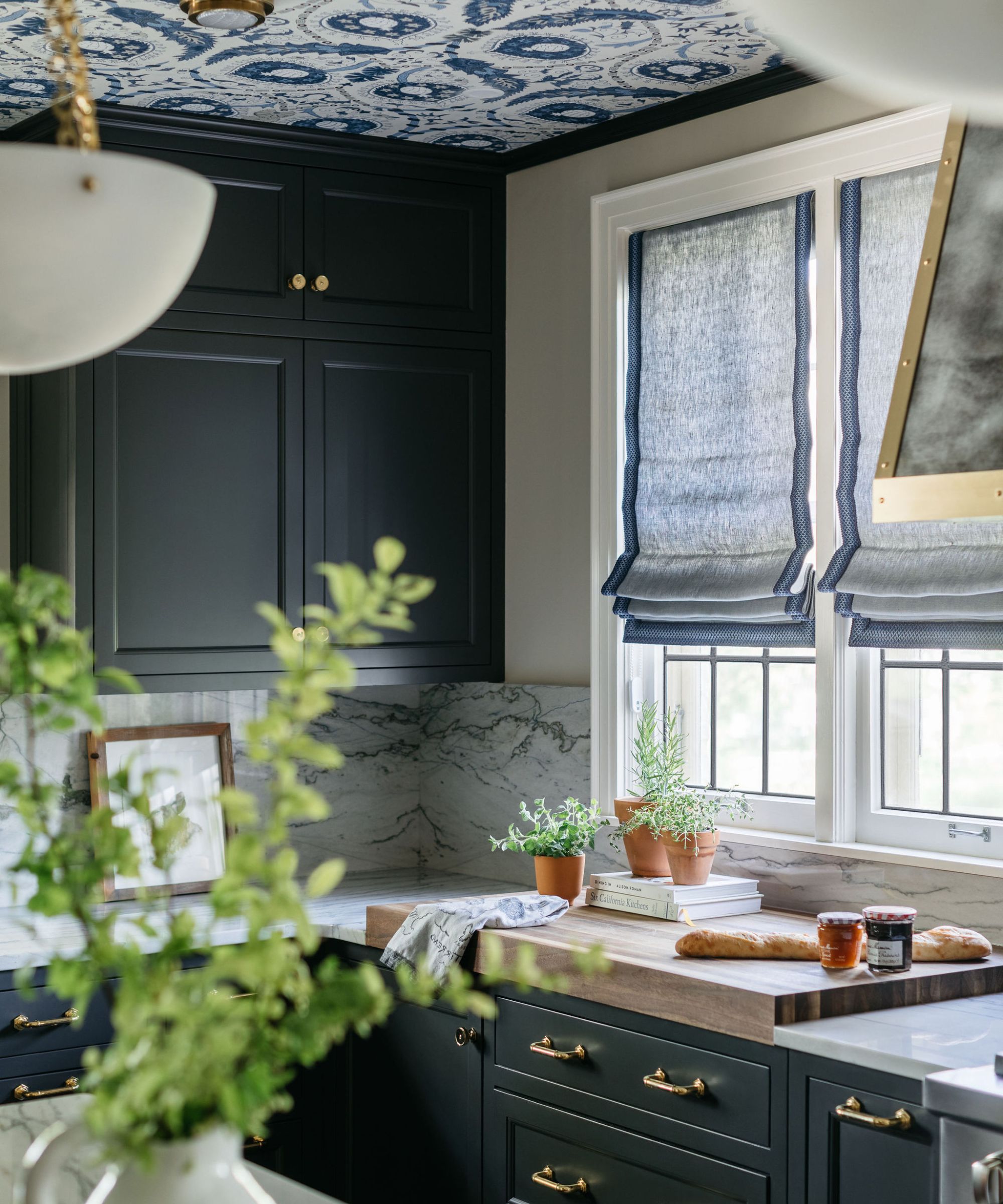
'We eliminated a small mosaic tile floor in favor of the high contrast marble floor in an effort to create a more sophisticated look. The darker cabinet color (Sherwin Williams SW7069 Iron Ore) was chosen for several reasons, but primarily because we wanted something very classic and not white. The previous kitchen we did together was navy, so that was off the table as well. Black seemed like a very natural choice,' Emily continues.
'The countertops and most backsplash are quartzite, with the exception being the metallic tile at the coffee bar sink. We felt the backsplash could be a neutral spot in the room for your eyes to rest. Another pattern here would’ve distracted from the moments created with the floor and ceiling patterns. We collaborated with a local artisan on the range hood and metal leg detail at the seating end of the island.'
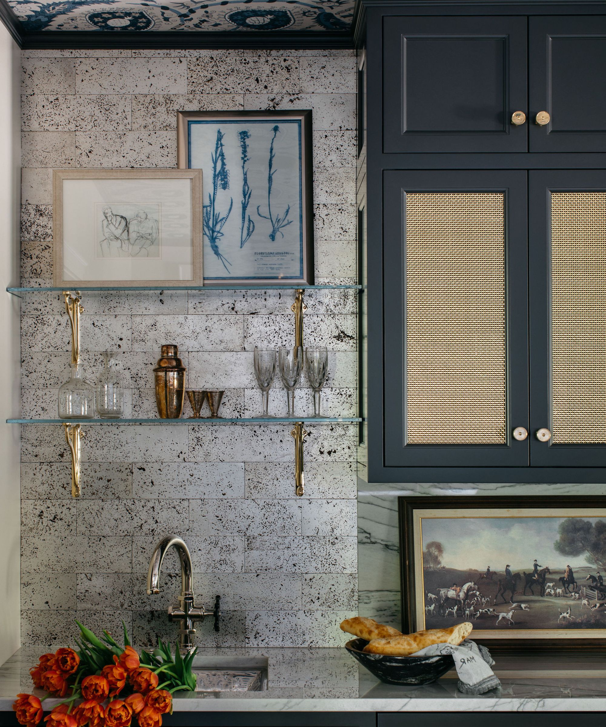
The clients had a love for color and patterns so as well as making the home more practical and suitable for the whole family, Emily wanted the place to reflect their bold tastes. With her guidance, they chose gorgeous Thibaut wallpaper to bring drama to the ceiling in the kitchen and then almost reflected that pattern on the floor with the high-contrast marble tiles on the floor.
'In both of these spaces, we added pattern to the ceiling (the kitchen and the new dressing room) the walls are primarily millwork or cabinetry, and I wanted to add some warmth and texture to the space. Both spaces needed some pattern to give that extra edge. The ceiling often gets overlooked, but I’ve found that doing something unexpected, on the ceiling provides so much visual interest.'
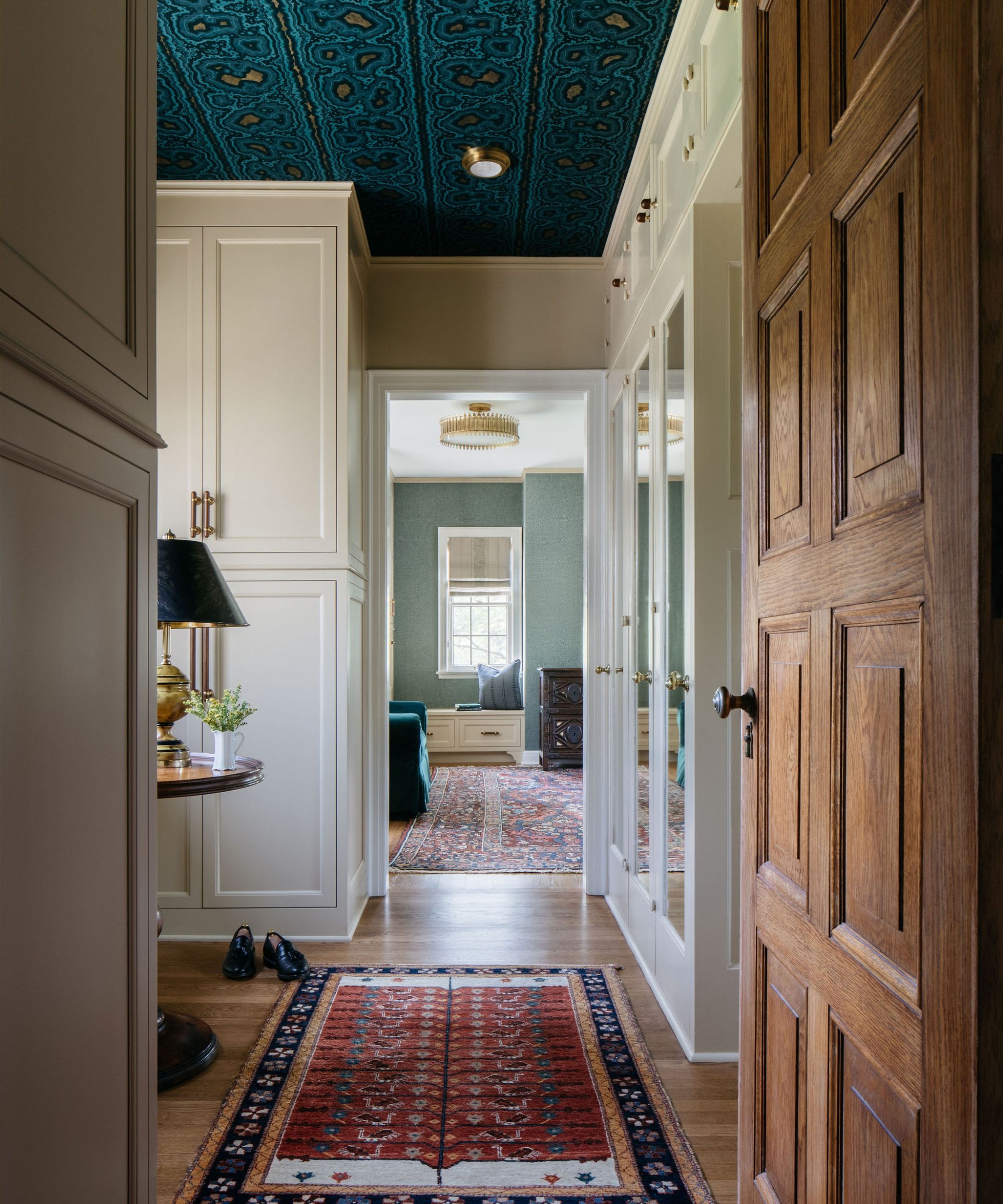
'We wanted to honor the bones of the Tudor style house and tried to avoid incorporating things that felt “too old, or stuffy” or “too new, and modern.” It’s a delicate balance! We also worked hard to figure out how to best incorporate storage and in a way that was visually pleasing. Our amazing architect, Meg Baniukiewicz, helped to create beautiful storage solutions,' adds Emily.
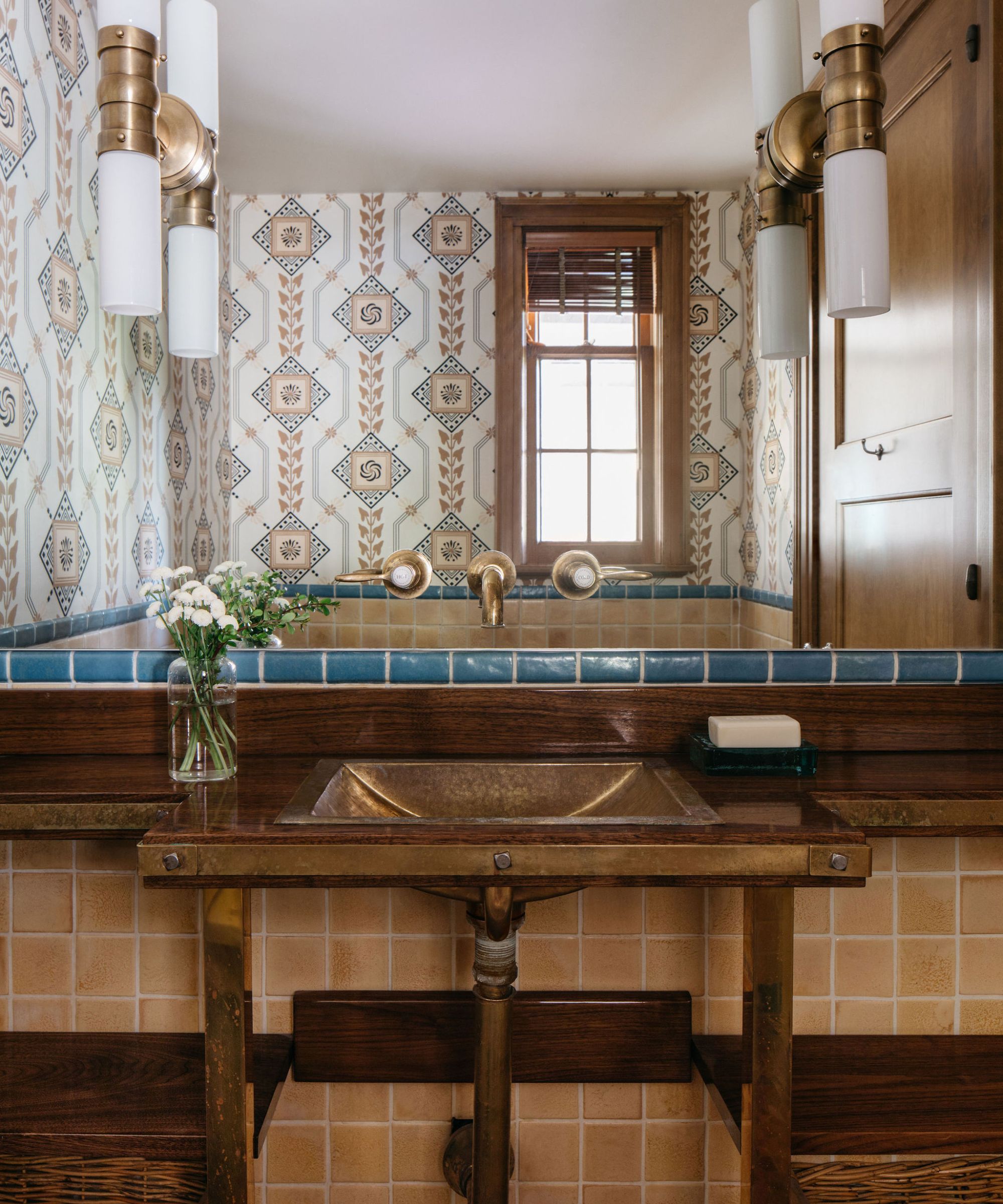
'My favorite part of this whole project was the excitement this brought my client. Our long-standing relationship brought with it freedom and license to create that doesn’t come with every project. The result was a space so reflective of my client and her personality, it brought an extra layer of excitement to the finished product.'


