I want to like the new Camera Control button on the iPhone 16 and iPhone 16 Pro series. And there's some really neat features it unlocks, but I'm also torn about its execution based on my iPhone 16 Pro hands-on review.
To be fair, I need to live with the new iPhones to make a final judgement. But I left Steve Jobs Theater with an iffy first impression. Let's take a step back though. What is the Camera Control and what can it do?
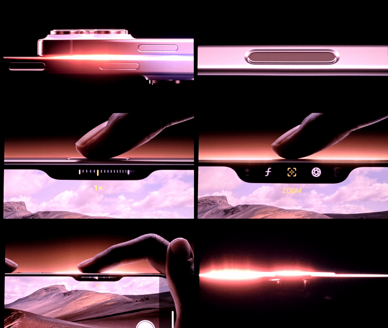
The Camera Control is not a physical button. It's a recessed tactile switch on the right side of the iPhone 16 series that provides the feeling of a click via a capacitive sensor. With this control you can launch the camera with a press, then quickly take a photo with another press. And if you want to start a video, you just long press.
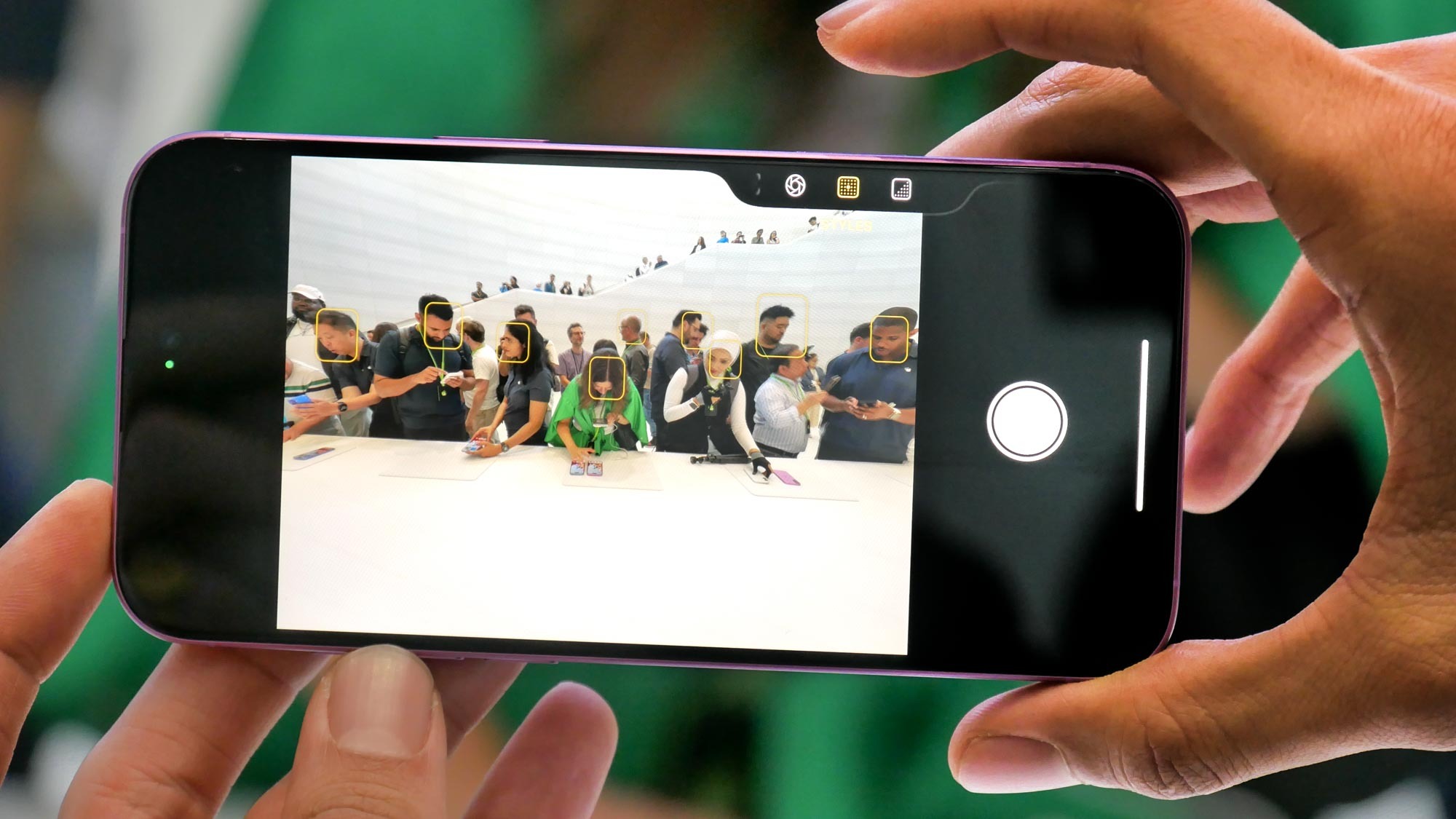
But this is just the start of what the Camera Control can do. You can toggle between multiple options — such as zoom, exposure and depth of field — by sliding your finger along the button.
@tomsguide ♬ original sound - Tom’s Guide
This is the part that got a bit confusing when I tried Camera Control. It's a bit too easy to skip past the option you want or to not move where you want in the menu. It's a bit finicky. And you need to do a double soft press to bring up the menu to switch from one Camera Control option to the next. It's kind of like pressing Home.
But this can be tricky, too. While zooming in, I accidentally activated the Camera Control menu and all of sudden I was controlling the exposure instead of zooming in. Once I got the hang of it, though, it was indeed satisfying to zoom in and out with a slide of the finger.
Camera Control is going to get better over time, too, thanks to Apple Intelligence. You'll be able to do things like fire up the camera while you're in front of a restaurant and get the rating and hours or point your iPhone 16 at a flyer for a concert and add it to your calendar.
This is very much copying Google Lens and Gemini Live, but I'll take it. In fact, Apple is working with third parties like Google for search and ChatGPT for, say, solving a math problem.

My problem with the Camera Control is that is that you once start digging into the features, it's not necessarily better than using a touchscreen. It's a small button and not as precise as just tapping your iPhone 16 or iPhone 16 Pro's display. I'm not saying it's as vestigial as the scroll wheel on the disaster that is the Rabbit AI device, but I was reminded of it.
So for now I'm lukewarm on the Camera Control. It's a bit finicky for my tastes, but I'll need to live with it for at least a week before I can say if it's worth the hype. And even then I'll need to use the visual intelligence features (once they're available) to make a final judgement.


