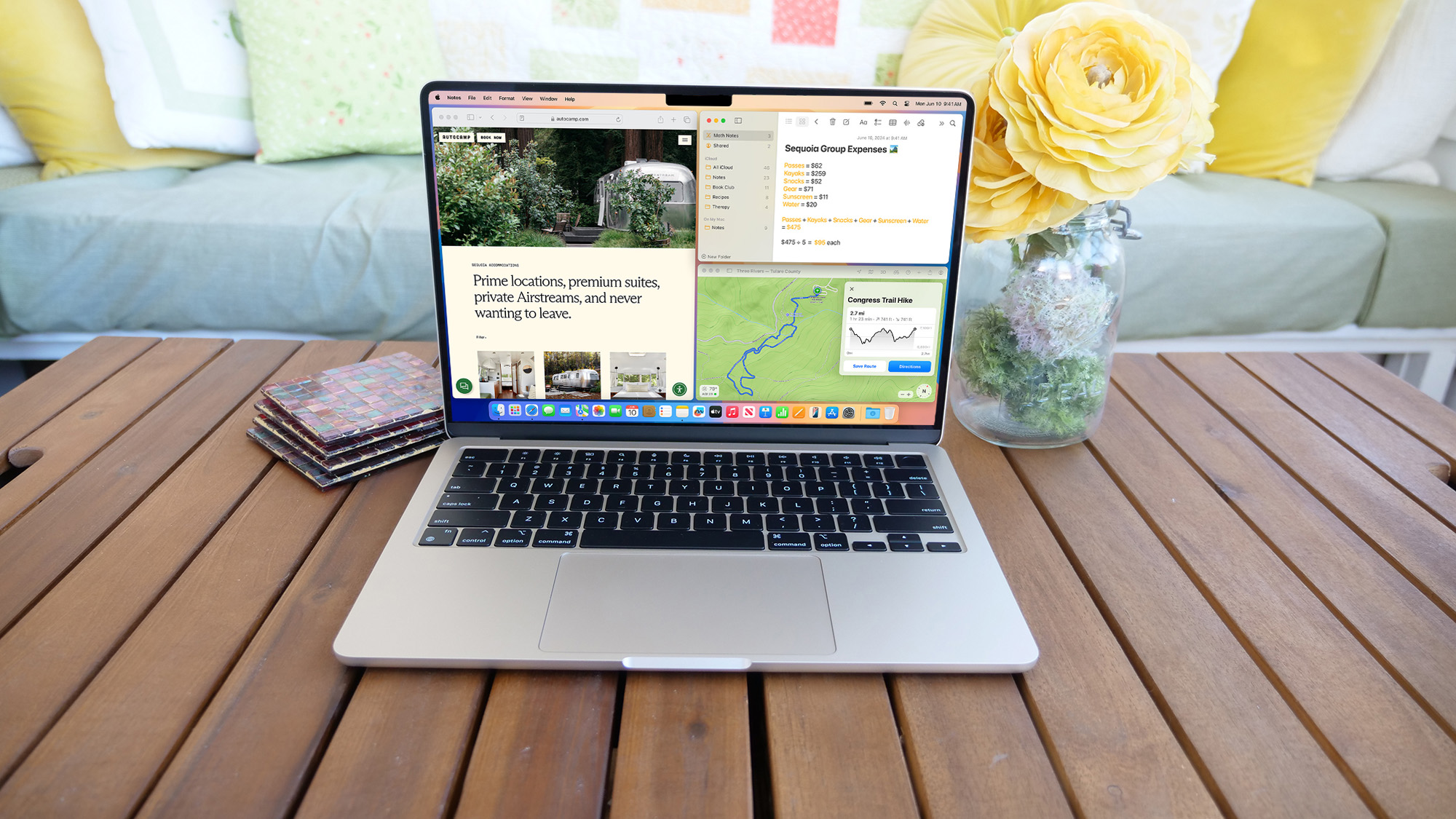
Over the last few macOS updates, one complaint has remained consistent: the poor, outdated state of Mac multitasking. Despite the computing advancements Apple, its desktop OS’s productivity options seem archaic compared to Microsoft Windows. Apple did bring an iPad-like Stage Manager tool on Ventura but its software chief and I both agreed it’s far from a tool most people would find handy. MacOS’s latest, 15th annual refresh, Sequoia fixes that and catches up to Windows in more ways than one.
While the previous couple of macOS updates did little to influence most Mac owners’ day-to-day workflow, Sequoia has the potential to dramatically upgrade their experience. From a new, convenient multitasking mode to a series of AI-powered features to the ability to manage an iPhone from a Mac, macOS Sequoia is one of the most practical updates Apple has rolled out for its computers. Many of these changes may be the result of peer pressure too, as they have been available on Windows 11 for a while now. I’ve been living with macOS Sequoia’s public beta for weeks now; here’s what’s it like to use it.
A multitasker’s heaven
If it weren’t for an app called Magnet, I would have switched back to a Windows PC a long time ago. Magnet replicates Windows’ snap multitasking gestures on a Mac. Once enabled, you can drag an app’s window to one of your screen’s edges to instantly resize it into a split-screen tile. Similarly, move it towards a corner, and Magnet molds it into a 2x2 grid view.
On Sequoia, at long last, Apple has brought Magnet’s and Windows 11’s effortless window tiling natively to macOS.
Without Magnet, I found multitasking on my Mac cumbersome. Its built-in split-screen mode was not only limited to two apps but also forced me to work in a dedicated, full-screen workspace. Switching to a third app required me to leave that workspace altogether for a different one. The only way to resize a program’s window was to drag its top into my preferred size and layout manually.
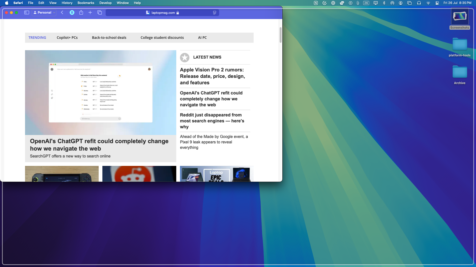
On Sequoia, at long last, Apple has brought Magnet’s and Windows 11’s effortless window tiling natively to macOS. It works just like it does on Windows as well: click and hold a window, move it to the edge or a corner, and it will offer to resize it automatically. While Apple’s implementation is smooth and fast, it feels like a case of “too little, too late.”
For one, Microsoft has vastly improved its window-tiling gestures lately, allowing you to skip dragging apps altogether and resizing them into a split-screen arrangement in a click. Hovering over a Windows program’s maximum button opens a dropdown of layouts you can select to activate. You can hold the Option key on a Mac to skip the dragging, but you’ll still have to direct the software where you want it, which doesn’t apply to corners. I also miss Magnet’s custom keyboard shortcuts, which let me immediately adjust a window’s dimensions into my usual setup.
Your iPhone screen comes to your Mac
Another highlight of macOS Sequoia is its iPhone management skills. You can now wirelessly mirror and control your iPhone’s screen and notifications. Alerts chime in alongside your Mac notifications, and you can respond to them like you would with an app installed on your computer. I’m also glad I can type on my iPhone using my computer’s keyboard.
Since I installed Sequoia, I rarely unlock or pick up my iPhone while I’m on my Mac, and that’s been a huge lifesaver.
It’s all surprisingly seamless despite the lack of a wired connection, and the refresh rate is so lag-free that you can even play iPhone games on your Mac if you’d like. Sadly, I have not found an iPhone game compatible with my Mac’s keyboard input. Since I installed Sequoia, I rarely unlock or pick up my iPhone while I’m on my Mac, and that’s been a huge lifesaver.
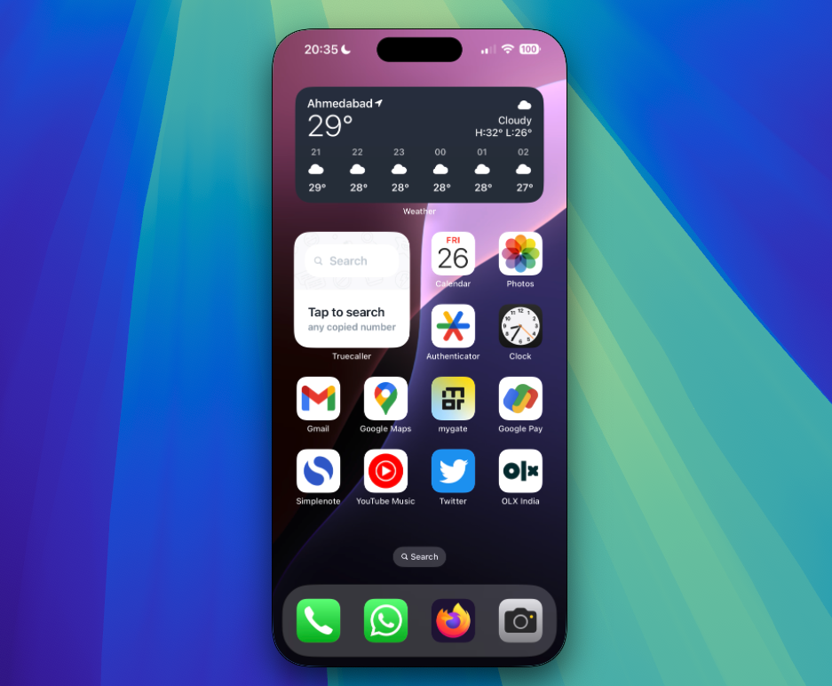
However, I wish Apple had developed a separate new app that housed all your iPhone’s data and access like Windows’ Phone Link software. Since all your iPhone and Mac notifications now stack in a single space, it can feel cluttered if you rely heavily on them. One notable feature missing on the current Sequoia beta build is the ability to move files like photos and videos between your iPhone and Mac by dragging and dropping across apps. That’s expected to arrive later this year and make for a natural and useful addition to Apple’s suite of Continuity functions.
Handy new features like the Password app
MacOS Sequoia also spins off Apple’s Safari passwords into its own manager app. Its multi-column design resembles third-party programs like 1Password, but that’s where the similarities end. While Apple’s Passwords app is convenient and fast for people living inside its ecosystem of services and products, its functionality is fairly barebones. Apart from lacking advanced tools, it doesn’t even tell you how strong the new password you’re creating is, nor is it available on Android. I’ll be, therefore, sticking to 1Password for now.
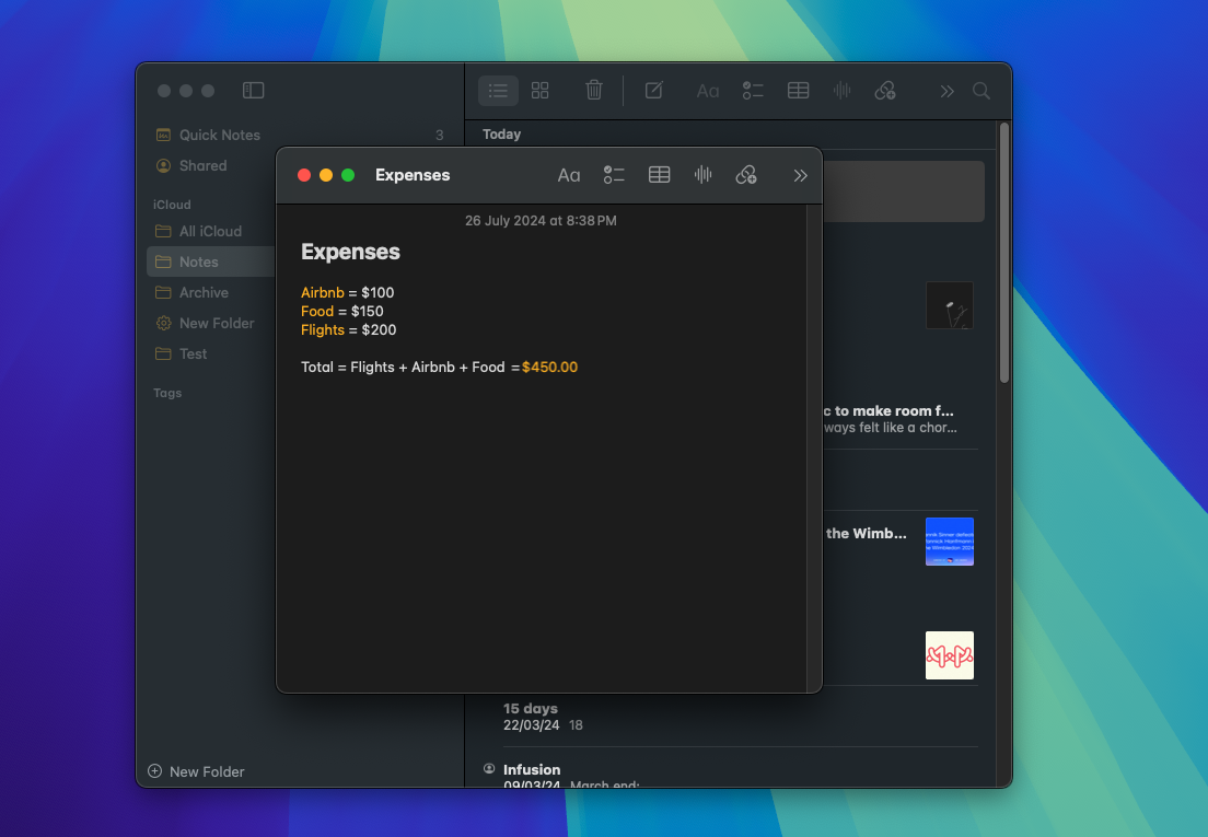
In addition, there are several more handy new features throughout macOS Sequoia. Video call apps like Zoom and FaceTime prompt you to preview your screen before you share it so you can clean it up if needed. The control center also includes an easy toggle that lets you choose between sharing your entire screen or just a specific app window. The Notes app can do math now, which means you can evaluate expressions in line and solve them by entering an equals sign.
Apple Intelligence isn't here yet
Of course, macOS Sequoia’s headliner, the set of Apple Intelligence features, is yet to be available. Once they roll out, you have access to ChatGPT-like writing tools, allowing you to generate and summarize text and images inside apps like Mail. More importantly, it marks a new era for Siri, which, thanks to a richer language understanding, will soon be better aware of your context and let you fetch information without always explaining it first. Punching in “Show me the files this person sent me,” for example, will bring up all the data you’ve been sent from the contact you have on your screen at the moment.
Outlook
On the surface, macOS Sequoia may not seem like a substantial update. But in reality, it’s been one of the more exciting ones for me as a longtime user since it improves the experiences I actively go through every day, such as multitasking and iPhone notifications. I haven’t noticed any bugs or performance drops until now, either, except for the fact that it breaks the selective screenshot tool.
Sequoia carries forward the kind of balance Apple has sought to strike in recent updates, by refreshing both the features we routinely access, like Sonama’s lockscreen overhaul and the company’s in-house ecosystem apps, as opposed to before, where those outside its walled garden felt out or were made to believe the focus of attention had shifted to iPads. Though so far I haven’t found much use for Generative AI, I’m optimistic about Apple Intelligence revitalizing Siri, as it would make finding information and files so much less of a headache.
You can download the MacOS Sequoia public beta now, but it's not recommended that you do this on your primary laptop. Unless you have a spare MacBook, you should probably wait for the full official rollout later this year.


