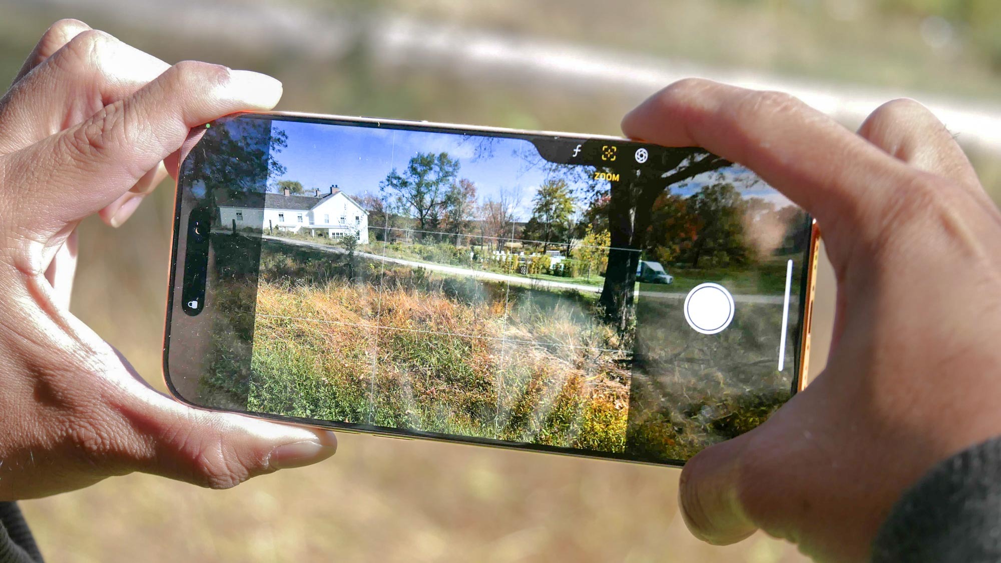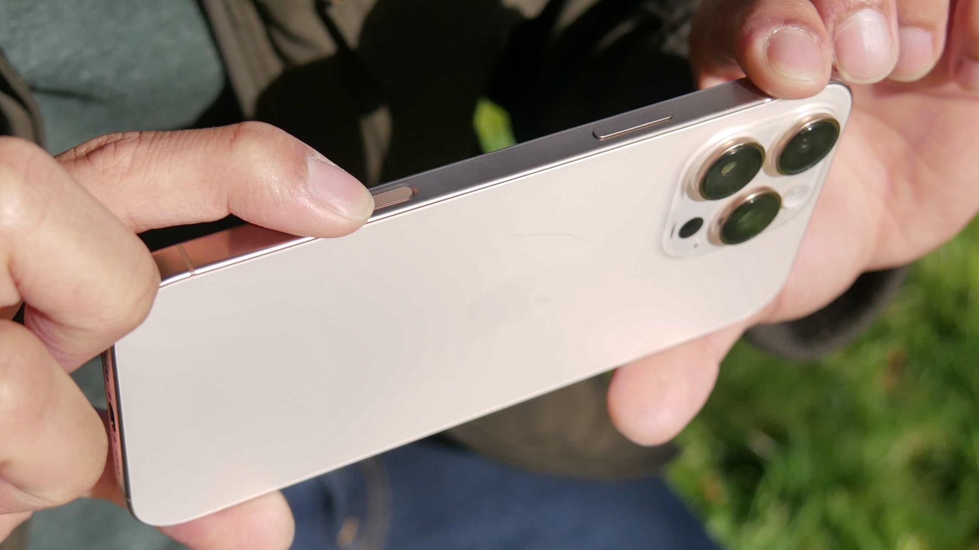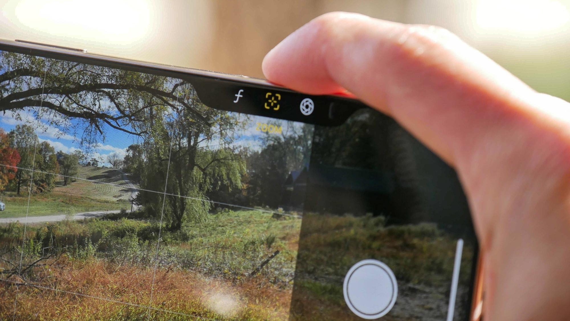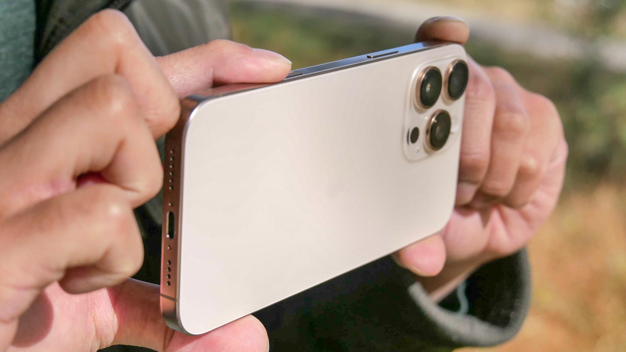
For the last few generations now, we’ve seen iterative design changes with the iPhone. While aesthetic changes are inevitable, new additions have often been more questionable,
In 2023 alone, we saw the introduction of the Action button and titanium frame with the iPhone 15 Pro. And this year yielded what’s arguably the biggest physical addition to the iPhone’s design in years with the Camera Control button. Apple undoubtedly made a point to put a spotlight on this new "button" during its Glowtime event, giving users a new way to take access to the most popular features at their fingertips.
I’ve been using this new feature for the last month with my iPhone 16 Pro Max to better get an understanding of what it offers, all to find out if it’s overhyped or underrated. So what do I think about Camera Control? Well, I just hope that Android phone makers don’t copy it.
It doesn’t enhance my workflow

Any time Apple introduces something new, I scrutinize those changes to see if they have any practical impact on my workflow. Since I’m well versed with handling a professional camera — my Panasonic Lumix S5 to be exact — I was hopeful that the Camera Control button would streamline my workflow — but it doesn’t really do that.
Quite frankly, the Camera Control button simply is just another way of accessing all the stuff in the Camera app that I could do with a couple of taps. It’s what I like to classify as a glorified quick access button. And I’ll admit, it does that, by launching me into the Camera app with a quick press. But beyond that, I find that Camera Control is not as intuitive in giving me more control over the camera’s functions.
Take for example what I use Camera Control most for: zooming. I feel like I have to constantly swipe over the Camera Control button to get from 1x all the way to the maximum at 25x zoom with photos. I went as far as timing myself to see if it’s any faster than relying on good ol’ pinch zooming with my fingers. Guess what? Camera Control is a lot slower.
The same applies to all the other functions: exposure adjustment, faux aperture control, and styles. These settings and options can all be quickly accessed directly through the camera’s interface, which I find is much faster to do than using Camera Control. And don’t get me started on why Apple decided to have the option for "cameras," which essentially gives me the same zoom toggle options (0.5x, 1x, 2x, and 5x) found right in the camera interface.
All the options make it complicated

I’m still on the fence about the action to switch between the modes with Camera Control. The two-press action feels clunky in my opinion, especially when you’re switching from one to another. It just makes for added complications, which goes against the fundamental principles of the iPhone. Instead, it should be intuitive.
I understand that Apple wants to give iPhone 16 users quick access to these features, but the double pressing and swiping makes it all convoluted — so much so that I can guarantee you that you’ll end up using one or two of the Camera Control options at most.
From the moment it was announced, I instantly related the Camera Control button to the knobs often found on the edges of professional cameras. In fact, there are usually two of them: one for the shutter control and the other for aperture.
For me, I think the better implementation would be to keep the swiping gestures with the Camera Control button locked to one specific function — with the ability to switch between them through the camera’s interface. Perhaps there could be a scroll wheel of some sort that would effectively switch between all the existing options? Regardless, the button is just reinventing the wheel.
All control, but no real control

It comes down to control, right? That’s the premise behind the iPhone 16 Camera Control button, but as a confident photographer, it doesn’t really do that for me. What Camera Control lacks is the ability to customize it. I suppose that’s what the Action Button is for. However, I would rather keep it focused on camera specific functions.
One example that I love would be able to customize the Camera Control button to take burst photos when it’s held down, or perhaps have it function as a gif animation creator (similar to how Samsung’s phones do it). I’m not saying that I’m giving hope on the Camera Control button, but it’s overhyped in its current iteration.
As for Android phones? This is one Apple trend they don’t need to copy.


