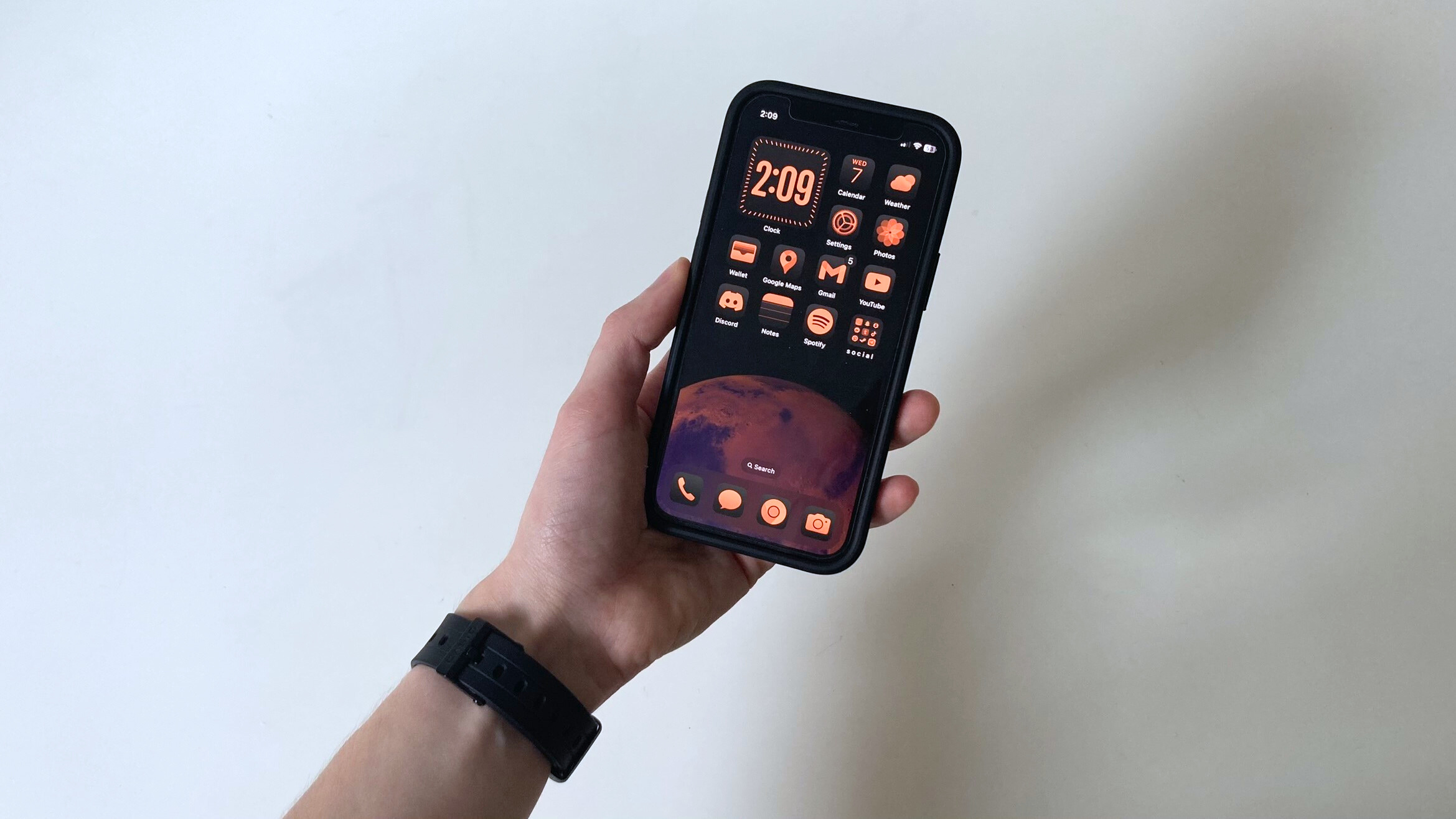
This week, Apple released the third public beta version of iOS 18, and after using it for a while, I was surprised to find myself thinking, iOS has never looked more like Android.
iOS 18 brings a plethora of new features, from Apple Intelligence to long-awaited home screen customization options and UI overhauls. The beta versions are incomplete sneak peeks at the full version of iOS 18 coming this fall, but they still offer a look at what Apple has in store.
I joined the Apple Beta Software Program, so I’ve been getting a hands-on look at iOS 18 before the full release comes out. Many features, particularly Apple Intelligence, are still under wraps, but many major features are already available in the latest beta release. I have a few favorites, including the home screen, control center, and one feature that surprised me.
Here’s a sneak peek at iOS 18, my early first impressions, and one major drawback that might disappoint iPhone users in the full release.
iOS 18 home screen customization: Dark mode, tinted icons, and more
I love iOS, but I used to be a die-hard Android fan, partly due to the greater freedom for customization. Apple has been reluctant over the years to loosen its hold on the home screen’s design. That’s finally changing with iOS 18.
Apple kicked the doors of customization wide open, allowing iPhone users to natively change the appearance of app icons (without using a bunch of shortcuts) and place apps anywhere on the home screen, with no grid layout required. I admit, I was impressed by my first look at the new customization options in the latest iOS 18 beta.
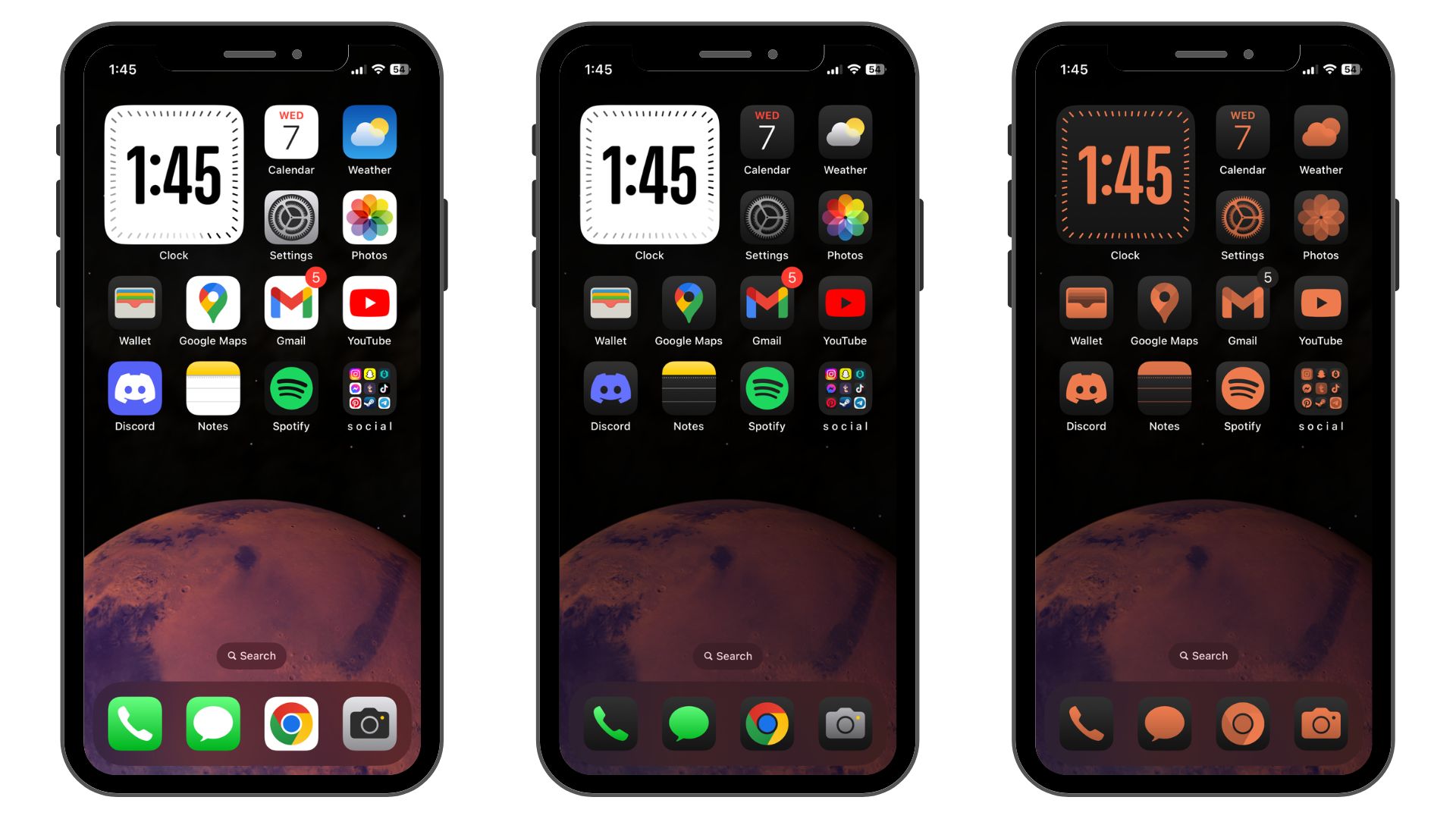
There are now four app icon styles: Light, Dark, Automatic, and Tinted. Light mode is the standard, full-color app appearance. Dark and Tinted are a whole new look.
Dark mode recolors app icons and folders with black backgrounds instead of the typical gray, white, or multi-colored ones. Logos and details are still in full color, as are apps that don’t have a dark mode icon.
About a third of my non-Apple apps, like Discord and Spotify, had dark mode icons, but most don’t yet. Of course, that will probably change once the full version of iOS 18 launches and more people begin using the new dark mode.
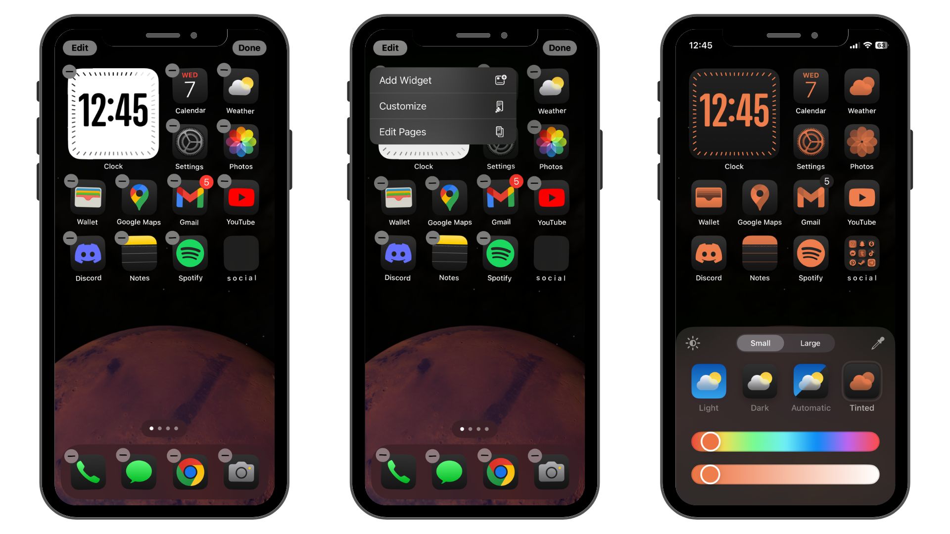
The tinted icon style is a little different. This mode recolors every app icon, including all non-Apple apps. It's basically a duo-tone color filter. You can choose the color and how dark or light it is, or even choose a color from your background if you want your app icons to match.
The tinted mode isn't for everyone, but it will be perfect for anyone who wants a minimalist look for their iPhone. It's also an excellent alternative to dark mode for those who prefer all their app icons to match since many non-Apple apps don't have dark mode icons yet. I decided to opt for dark mode since I like a bit of color on my home screen, but the tinted icons also look great.
After years of seeing Android reskins and app themes inspired by iOS, it's an odd reversal.
Accessing all of these customization options could be a bit more straightforward. From the home screen, you have to tap and hold to enter customization mode, then tap "Edit" in the top left corner and choose "Customize" from the drop-down menu.
While this new customization is great for iOS users, it reminded me of numerous different themes and launchers I used to use on Android. The dark mode icons even look similar to an old launcher theme that was once a favorite of mine.
After years of seeing Android reskins and app themes inspired by iOS, it's an odd reversal. It's not necessarily good or bad that iOS is beginning to resemble Android more, but it does diminish one of the most significant advantages Android has always had over iOS.
Inside the new Control Center in iOS 18
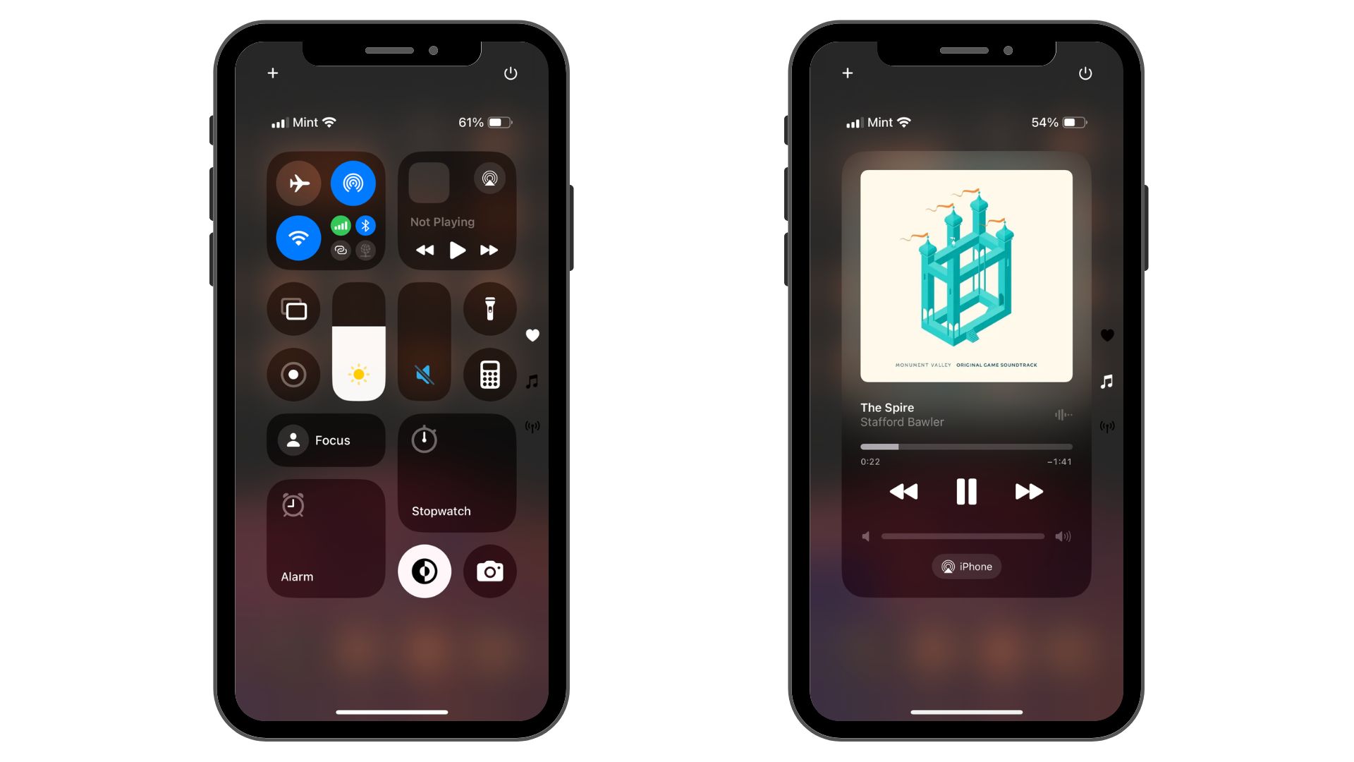
The home screen customization options in iOS 18 are nice, but when it comes to sheer practicality, the redesigned Control Center is unbeatable. I had a field day reorganizing mine with a custom layout and custom widgets.
One of the first things you’ll notice about the new Control Center are the additional views. You can now scroll through a page of favorite controls, music controls, and connectivity controls. When you go into customization mode, you can also add your own pages to organize different widgets and resize and rearrange widgets.
You can also change the controls at the bottom of the lock screen now. The flashlight and camera have always been fine for me, but you can swap them out if you want quick access to another app.
Even in its somewhat limited state, the new Control Center is noticeably more useful.
The only downside with the current beta version of iOS 18’s control center is the lack of third-party app controls. Right now, you’re still limited to Apple’s built-in controls for its own apps. At WWDC 2024 back in June, Apple mentioned that third-party developers will be able to create controls for their apps, so it sounds like those controls will be available eventually, hopefully by the first full public release of iOS 18.
The new Control Center is noticeably more useful even in its somewhat limited state. I never used the Control Center much in older versions of iOS except for things like changing my screen brightness.
However, that might change – for me and many other iOS users. The new customization options for the Control Center allow you to tailor it around what’s useful to you, whether condensing your utility apps into your Control Center, creating a space to access favorite apps quickly, or simplifying music controls.
My favorite part of iOS 18
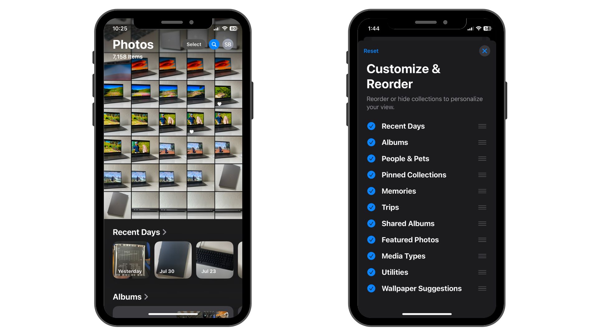
I thought my favorite part of iOS 18 would be home screen customization, but I admired the overhauled Photos app more. Apple gave it a complete makeover, and I’m a fan.
When you open the redesigned Photos app, your recent photos library greets you at the top of the screen, and a new selection of menus is below. These are a mix of automatically generated collections and your albums. They include Recent Days, Albums, People & Pets, Pinned Collections, Memories, Trips, Shared Albums, Featured Photos, Media Types, Utilities, and Wallpaper Suggestions.
Memories are collections of photos the app generates based on locations, people, and photo types. When you tap on one, you can view the collection of photos as still photos or as an automatically generated movie (a slideshow with some animations). My iPhone automatically created collections with photos from a trip to the UK, pictures of my cat, and photos from a local park.
Memories are collections of photos the app generates based on locations, people, and photo types.
The Trips section works similarly by collecting photos based on dates and locations. It automatically pooled all the photos from my trip to the UK into one pre-made album. I already manually made an album for that trip, but this could be a convenient feature for future vacations.
Similarly, the Recent Days section generates rotating albums of photos you’ve taken over the past month or so, compiling them based on date. I didn’t find this section as useful as the others since my recent photos are right above it in my main photo library. It could be helpful if you want to quickly find a picture you snapped a week or two ago, though.
If these new Photos app features sound a little overwhelming, don’t worry. You can customize and reorder all of them by scrolling down to the bottom of the list of collections. When you tap “Customize and Reorder,” you can move around or deselect collections so you only see useful ones. Manually-created albums are still the same and located right below the “Recent Days” collection.
What about Apple Intelligence?
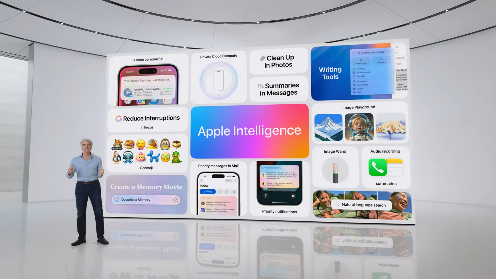
You may wonder how I’ve been using iOS 18 without dipping my toes into Apple’s new AI platform, Apple Intelligence. Unfortunately for myself and many other iPhone users, Apple Intelligence is only available to people with an iPhone 15 Pro or iPhone 15 Pro Max, along with a handful of iPads and Macs, at least right now. I’m loath to give up my iPhone 12 Mini since Apple abandoned its small phones, but it seems like an upgrade might be needed in the future if I want to use Apple’s new AI features.
It’s still unclear whether this current requirement will apply to all users in the full release of iOS 18. Apple discussed how it will use cloud computing to handle AI tasks that iPhones, iPads, and Macs can’t handle locally.
So, it’s possible older, less powerful iPhones could rely entirely on cloud computing to use Apple Intelligence. However, it’s also possible that Apple will only open the feature to iPhones that are powerful enough to run Apple Intelligence locally, which, at least right now, only includes the iPhone 15 Pro and Pro Max.
That will disappoint many iPhone users. We’ll know more about the situation as we get closer to the full release of iOS 18, which will likely be in September. However, there are also rumors that most Apple Intelligence features won’t launch until iOS 18.1 or later, meaning even iPhone 15 Pro/Pro Max users might not get Apple Intelligence until October or potentially even later in the fall.
Even without Apple Intelligence, iOS 18 brings some much-needed quality-of-life updates and fun new customization options. We’ll cover all the latest news and rumors surrounding iOS 18, Apple Intelligence, and Apple’s upcoming fall iPhone event where the full iOS 18 release should happen alongside the iPhone 16 launch.


