Android 12 was a huge step in a new direction for Google’s mobile OS. Not only did Google overhaul Android’s look with its twelfth annual update, but it also redesigned many of its core functions. Since this significant update, Google has been on a spree to polish up the rough edges and include the features it missed. So it’s no surprise that, like Android 13, the latest Android 14 update is an incremental package with several under-the-hood fixes and a couple of much-needed additions.
Android 14, now available in beta for a handful of Pixel phones, doesn’t house many new features most people would care about, and if you were expecting at least a few major user-facing changes after a tepid Android 13 release, you’re in for a disappointment. Above all else, Android 14 appears to accelerate the groundwork Google’s been laying for some time, including improvements to the password-less sign-in experience, and software for large-screen devices like the company’s upcoming Pixel Tablet.
Yet, ever since I loaded Android 14’s first beta on my Pixel 6, I’ve come to appreciate the handful of upgrades it brings to day-to-day activities such as the much cleaner back gesture, and the ability to block apps from hijacking your screen for notifications. Here’s what it’s like to use it.
Back to the future
It’s been nearly half a decade since Android switched to navigational gestures from fixed, on-screen buttons, and Google is still not done refining them. With Android 14, the back gesture no longer looks like an unfinished prototype. It’s got a facelift that’s visually appealing and practical. Unlike the existing, skinny arrow, it’s now bolder and has a Material You background that adapts to the rest of the screen’s colors.
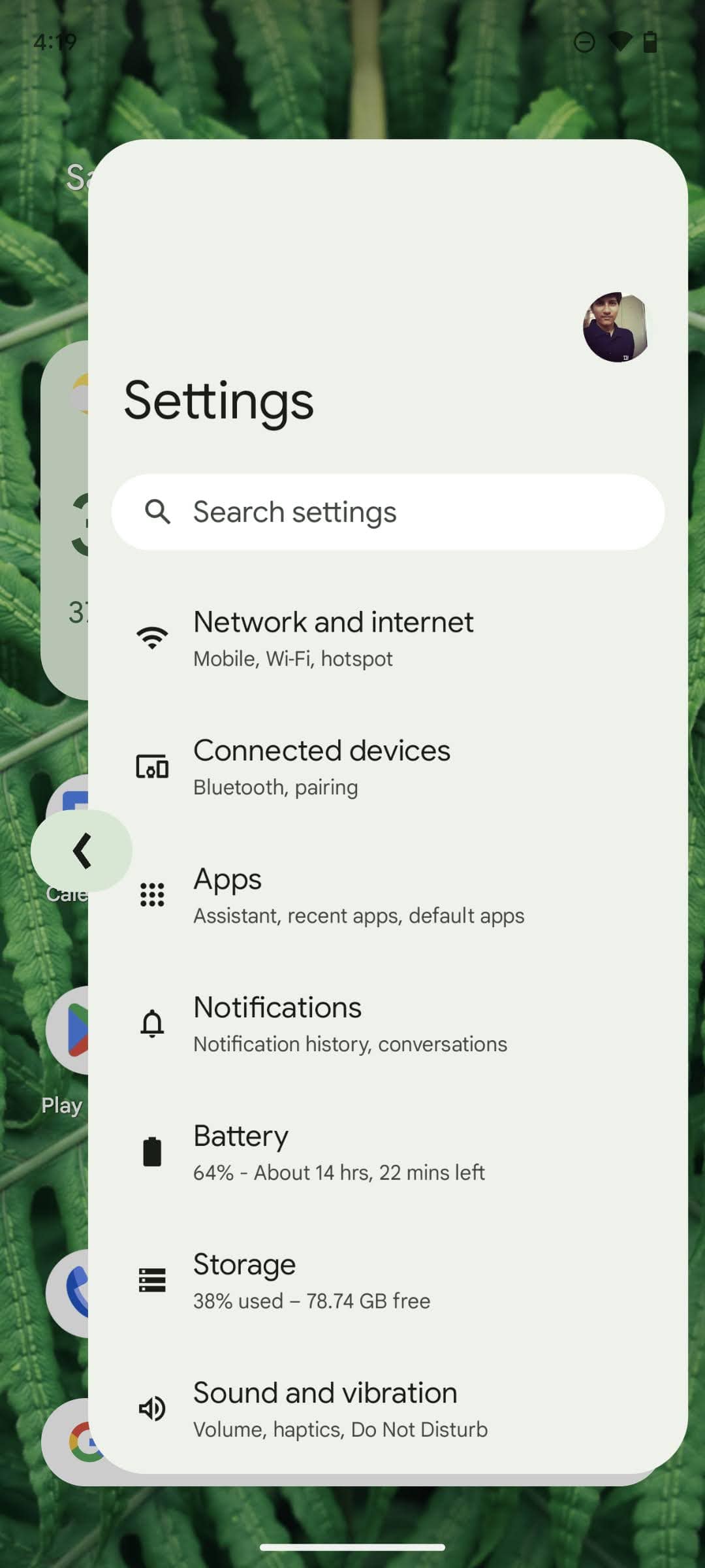
More importantly, on Android 14, we can finally see the predictive back gesture in action. You don’t have to guess anymore whether swiping from the left or right edges will open a new side menu or take you back to the previous screen. When you do so, and hold the gesture for a second, Android will show you a preview of what will happen so that you can decide whether to execute or abandon. There’s also a snazzy new animation for the transition, which makes the experience far more user-friendly and less clunky. However, at the moment, it only works on a couple of apps like Google News.
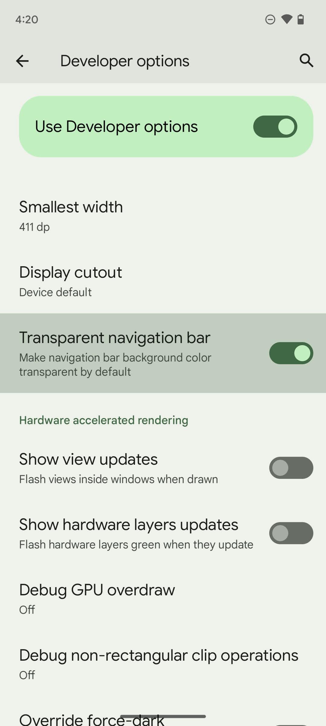
Another minor, yet key change Android 14 offers is a consistently transparent navigation bar. Before, on apps that didn’t bother to support it, you’d have to deal with an ugly black strip underneath the nav bar taking up crucial screen space. On Android 14, you have the option to force a transparent nav bar across all apps from the developer options, and it works fairly well. I’ve not run into any crashes nor bugs so far.
Sharing is caring
The Android 14 addition that arguably may end up with the biggest impact, though, is the superior share sheet. Because Google didn’t allow developers to personalize the share sheet to match the app’s purposes before, we’ve witnessed how some have implemented their own, and that has led to an awfully frustrating and often slow experience.
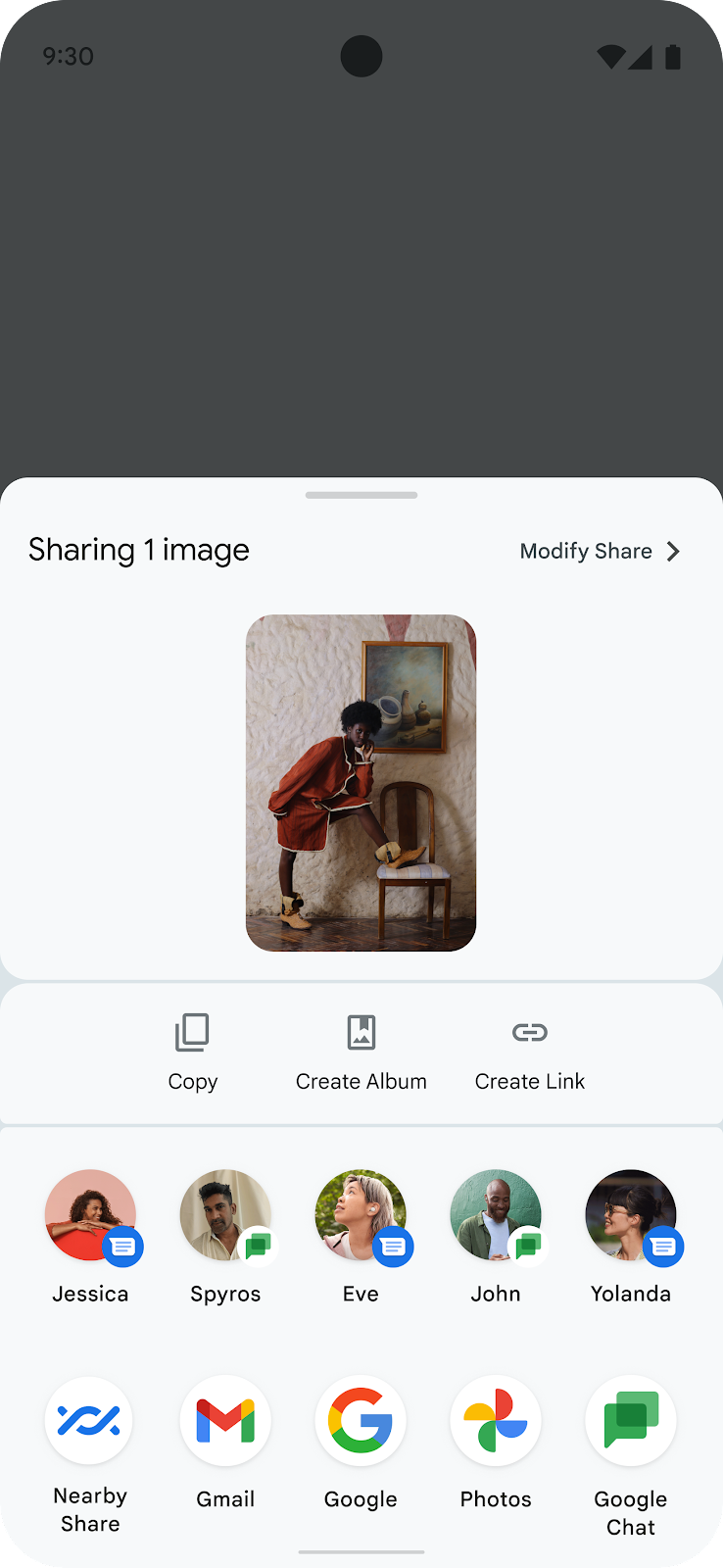
Android 14 fixes that — it lets apps pin a few shortcuts of their own at the top of the share sheet. On top of that, the grid underneath is sorted based on what you’d need the most at any moment. On Google Chrome, for example, you’ll find options like “Send to your devices” when you share a link. Although I couldn’t test this as apps haven’t been updated for it.
A few other notable improvements include a built-in accessibility tool to flash your phone’s screen and camera flashlight for incoming calls or notifications, a lava lamp-like background effect for the media player widget in the notification shade, and an option to prevent apps from sending full-screen notifications. Though that final addition is largely to control intrusive apps, I ended up using it on the Clock app so that I don’t have an immediate option to snooze my alarms, and the Phone app to prevent it from interrupting whatever I’m doing at a moment. If I want to snooze the alarm or pick up an incoming call, I can always do so from the notification panel.
Though the current Android 14 version is low on UI tweaks, that might not be the case in later iterations. Google is expected to follow Apple’s lead, and soon offer more lockscreen customization. The beta build houses several hidden features that will allow you to personalize the lockscreen clock’s size as well as colors, and at long last, pick the two shortcuts on the bottom corners.
Private Android reporting for duty
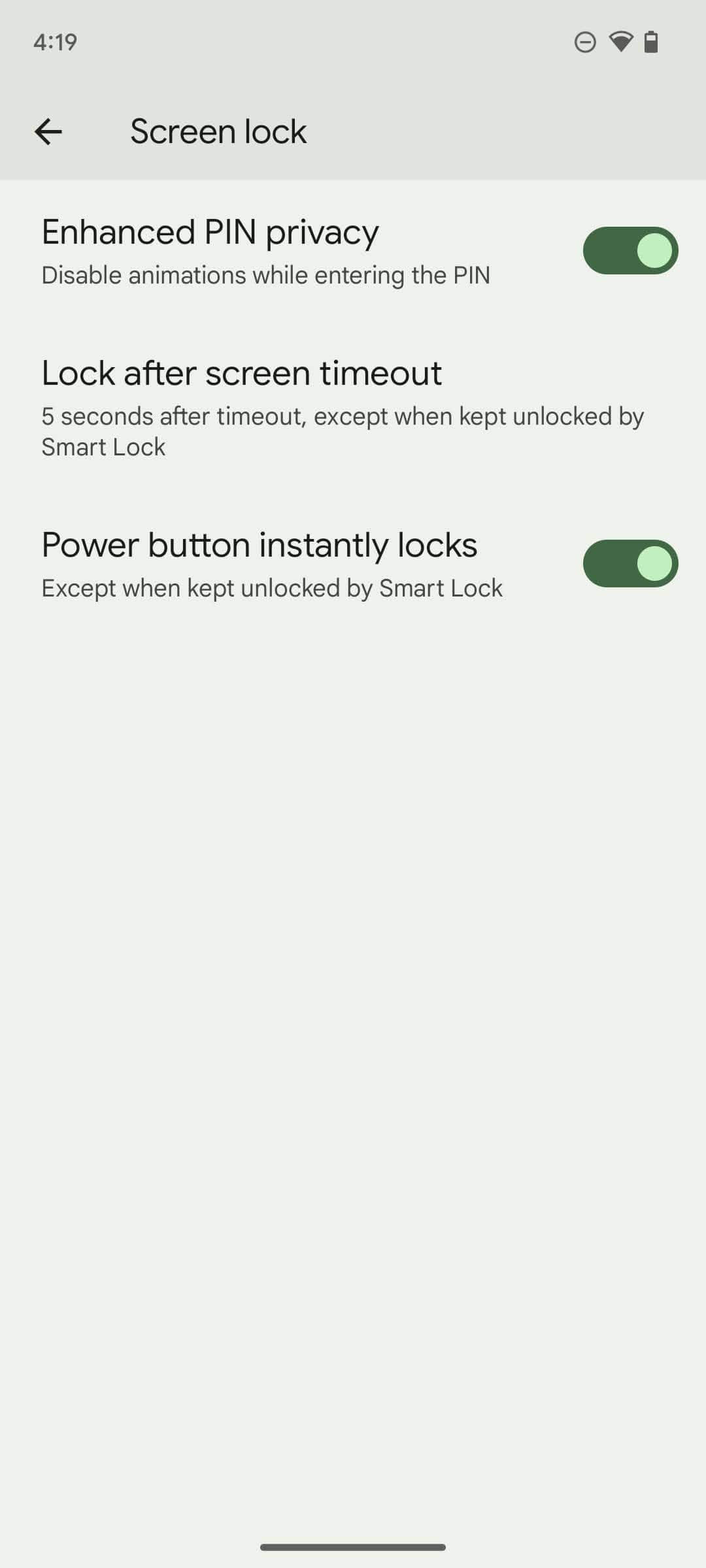
Android 14 offers several, handy privacy upgrades too. You can disable the animations that pop while you’re entering your lockscreen PIN, making it harder for thieves to spy on your code in public places before stealing your device. Plus, Google is mandating the use of Android’s new photo picker, which lets you share access to selected photos instead of your entire gallery. It was first introduced on Android 13 but kept optional, and hence, not many developers adopted it.
Google’s also cracking down on apps that misuse the accessibility permission to track you by restricting access to sensitive data only to the apps Google has vetted. In the past, several major Android security breaches occurred via the accessibility permission — meant to aid challenged users — and it’s nice to see Google finally address it.
The rest of the Android 14 is more about the future than the now. A new login module, for example, will allow devs to easily offer a passwordless sign-in option next to the traditional methods like “Sign in with Google.” In the run-up to the Pixel Tablet’s launch, Google is also gearing up to roll out more Apple-like Continuity abilities with this update, specifically picking up calls you get on your phone from your tablet and better support for physical keyboards such as touchpad gestures.
Bottom line
For most people, like Android 13, Android 14 will come and go unnoticed, and for Google, that’s not a cause for concern. Over the past few years, Google has switched its strategy to put less emphasis on one-time grand, annual updates and more on round-the-year regular releases for the elements that matter most to users. Each of Google’s homegrown apps is refreshed frequently from the Play Store, its Pixel lineup gets a drop of exciting features every couple of months, and security patches are automatically applied when needed. Plus, it axed the dessert name tradition.
The reason Apple’s yearly updates are still so significant is that it also includes its apps in them. If you glance over the iOS 14’s list of new features, most of it is just app updates that Apple could have dispatched directly from the App Store.
There’s not much to write home about Android 14 and the success of its most glamorous additions, like the updated share sheet and the predictive back gesture, depends on how soon developers adopt them – and many of the more exciting ones such as lockscreen customization haven’t arrived yet. Until then, I would barely be able to tell my Pixel 6’s software had gone up by 1.0. The good thing is it also doesn’t touch what wasn’t broken.
You can sign up for the Android 14 beta from here on a compatible Pixel model. If you’re on the Android 13 beta, you can even choose to skip Android 14 altogether.


