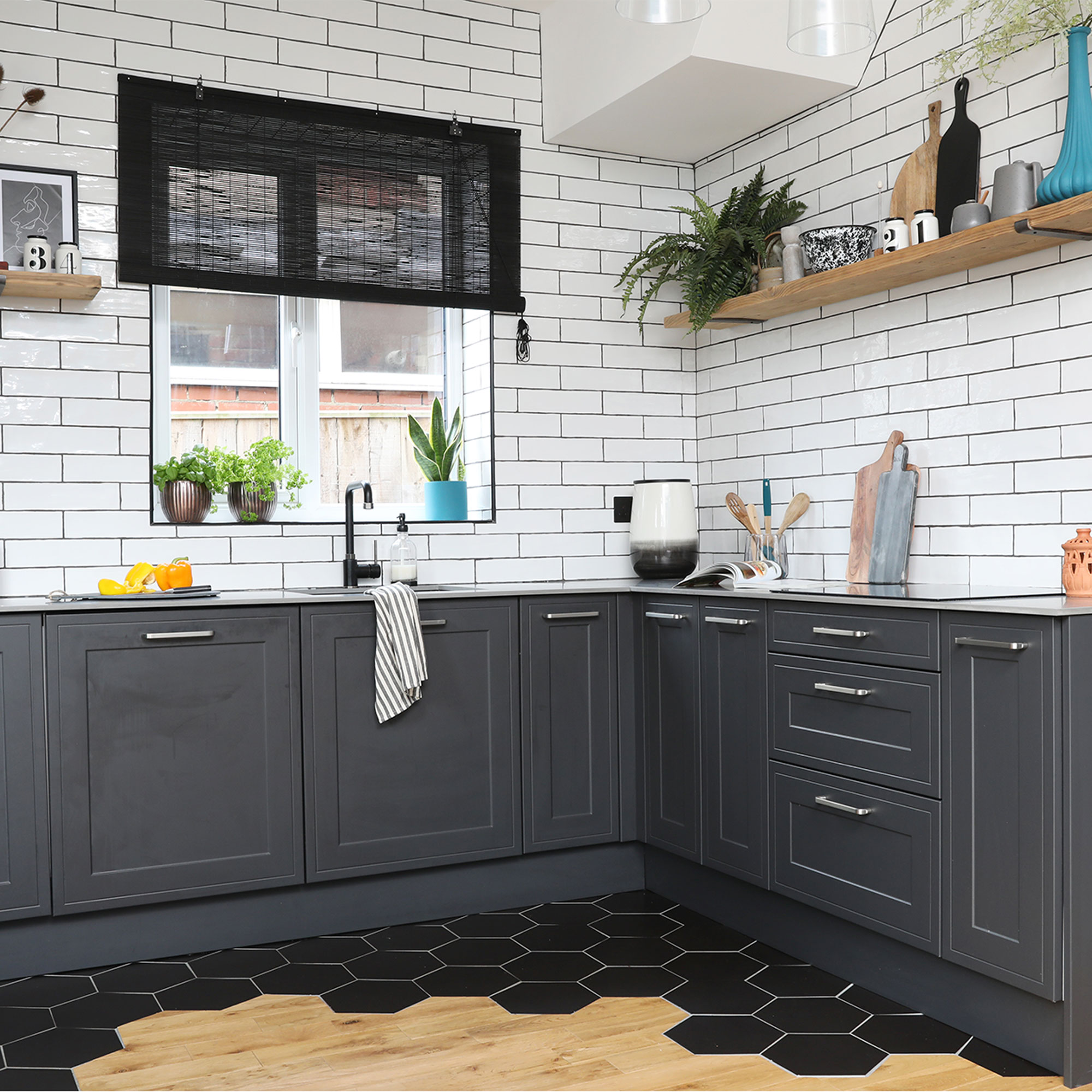
Renovating a tired and awkwardly-shaped kitchen turned into a labour of love for this home owner. After devising the kitchen’s new layout and assembling and fitting the units himself, he then turned his hand to tiling the walls, building a bespoke shelving unit and designing the kitchen’s striking transitional flooring - saving himself thousands along the way.
‘I wanted something a bit different of the kitchen,’ says the homeowner. ‘I was going for a look that had a mix of the traditional but with modern industrial touches through the tiles, lighting, black taps and accessories. Lots of display space was a must too, along with room to entertain.’
Modern black kitchen units

‘When I bought my first home in 2019, I wanted a place with character that I could put my own stamp on. This 1930s house was ideal but it needed a lot of work. Luckily, I could stay at my parents’ house while all the messy building work was done, like new central heating, windows, re-wiring and knocking through the kitchen and dining room. The small C-shaped kitchen layout was over 15-years-old, but I managed to sell the old units and put the money towards building materials.'
The kitchen before
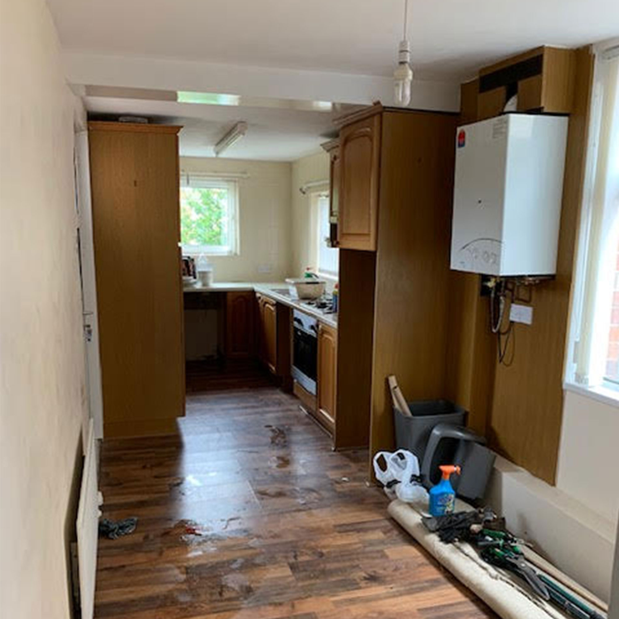
'With the original kitchen, all the cabinets were squeezed into one end of a long, narrow space and there was a separate dining room, so I needed to re-think the small kitchen layout completely.'
‘The kitchen space looked much bigger when the wall was knocked down, but it was such a long room that I added a partition wall to create a broken-plan utility area at one end. The uPVC back door was turned into a full-sized window and I added double patio doors in the dining room to let in as much light as possible. As the kitchen and dining room had original floorboards but the utility had a concrete floor, we had to screed everything to make it level.’
Re-worked layout

‘After creating several moodboards, a black and grey colour palette emerged. I toyed with getting a colourful kitchen, but with a black kitchen idea, I thought I could always paint the walls or add colourful accessories in future. Although plans were drawn up at a few different showrooms, Magnet had the Shaker style and compact laminate worktops that I liked. I got a good deal as they weren’t selling many kitchens during lockdown.’
Sleek worktops

‘As my dad’s quite handy, we did a lot of the work ourselves, including fitting the kitchen over two weeks. It was cheaper to choose the flatpack option rather than pre-assembled units, so we treated it like a giant Ikea project. I did pay a specialist to fit the kitchen worktops though.’
‘I love the thin compact laminate worktop, which is so durable and doesn’t mark. You get the look of marble but for half the price.’
Unique transitional flooring
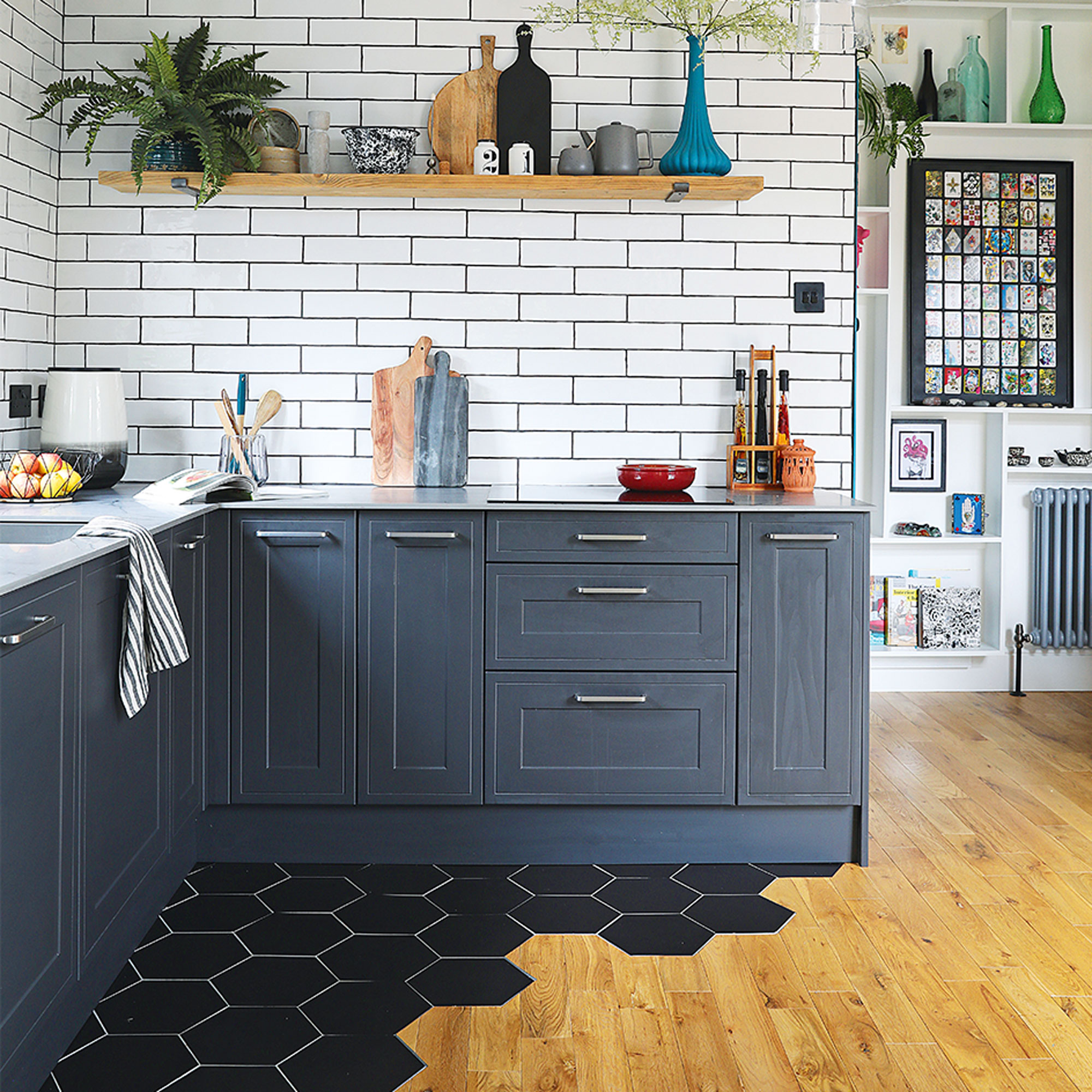
‘I’d seen the transitional kitchen flooring in a restaurant and really wanted hexagonal tiles in the kitchen with a wood floor in the dining area. A friend laid the floor tiles first, then me and my dad laid the wood flooring up to it.'
'We spent about four weeks on that job as it took a while to calculate the right thickness so everything lined up perfectly.'
Classic metro wall tiles
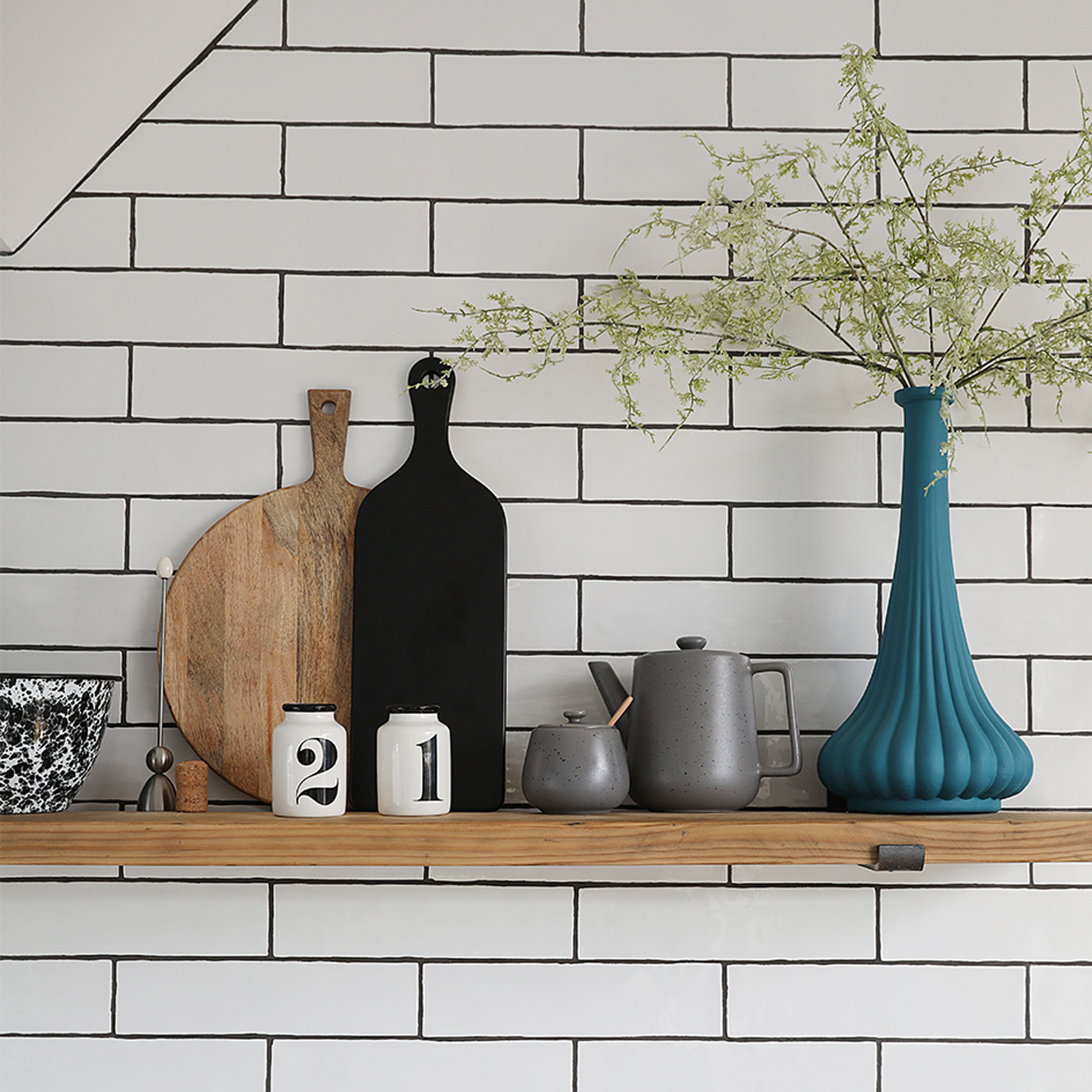
'I also saved money by tiling the walls myself, having previously done my sister’s kitchen tiles. You can always save money by doing the labouring side of a job as well. For instance, my dad and I pulled the cables through for the lights before an electrician connected everything together.'
‘As there’s a bulkhead for the stairs on the ceiling, I kept it simple and open with shelves rather than wall units. Tiling right up to the ceiling gives an industrial factory look.’
Quirky dining area

‘Although I’ve kept the original features as much as possible elsewhere in the house, the look in here was more modern. In the kitchen diner area removed an alcove cupboard and took out the gas fire before building out a new section around the chimney breast with a wooden frame. This was plaster boarded and skimmed, along with the rest of the walls. There’s an opening for decorative logs and a ledge for propping a mirror and displaying accessories.’
‘The feature wall is painted in Marine Blue by Little Greene. It has a strong pigment that gives a lovely vibrant colour. The Tolix chairs from Facebook Marketplace were just £25 for six as they’d been left out in someone’s garden and needed re-spraying. The feather headdress print is from Green Lili.’
Bespoke built-in shelving
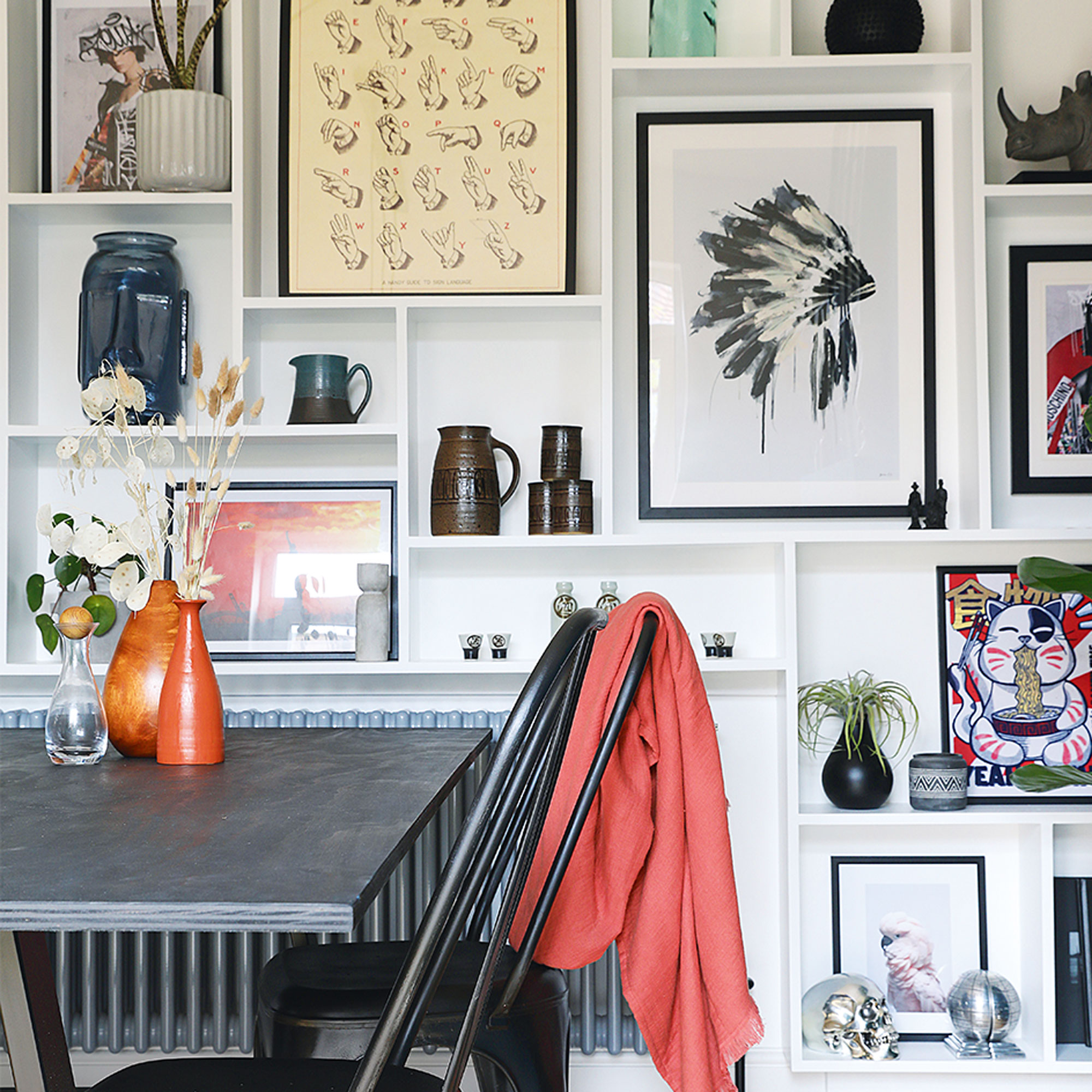
‘The floor-to-ceiling shelving was another idea I saw on Instagram. As I’m a graphic designer, I used my work software to plan it all out so I could display different-sized prints and vases. Then I taped it out on the wall and built the shelves from MDF that I had cut to size locally.’
‘Some of the boxes for the gallery wall shelving were designed for specific prints I’d already bought, then I filled in the rest as I went along.’
Artistic arrangement
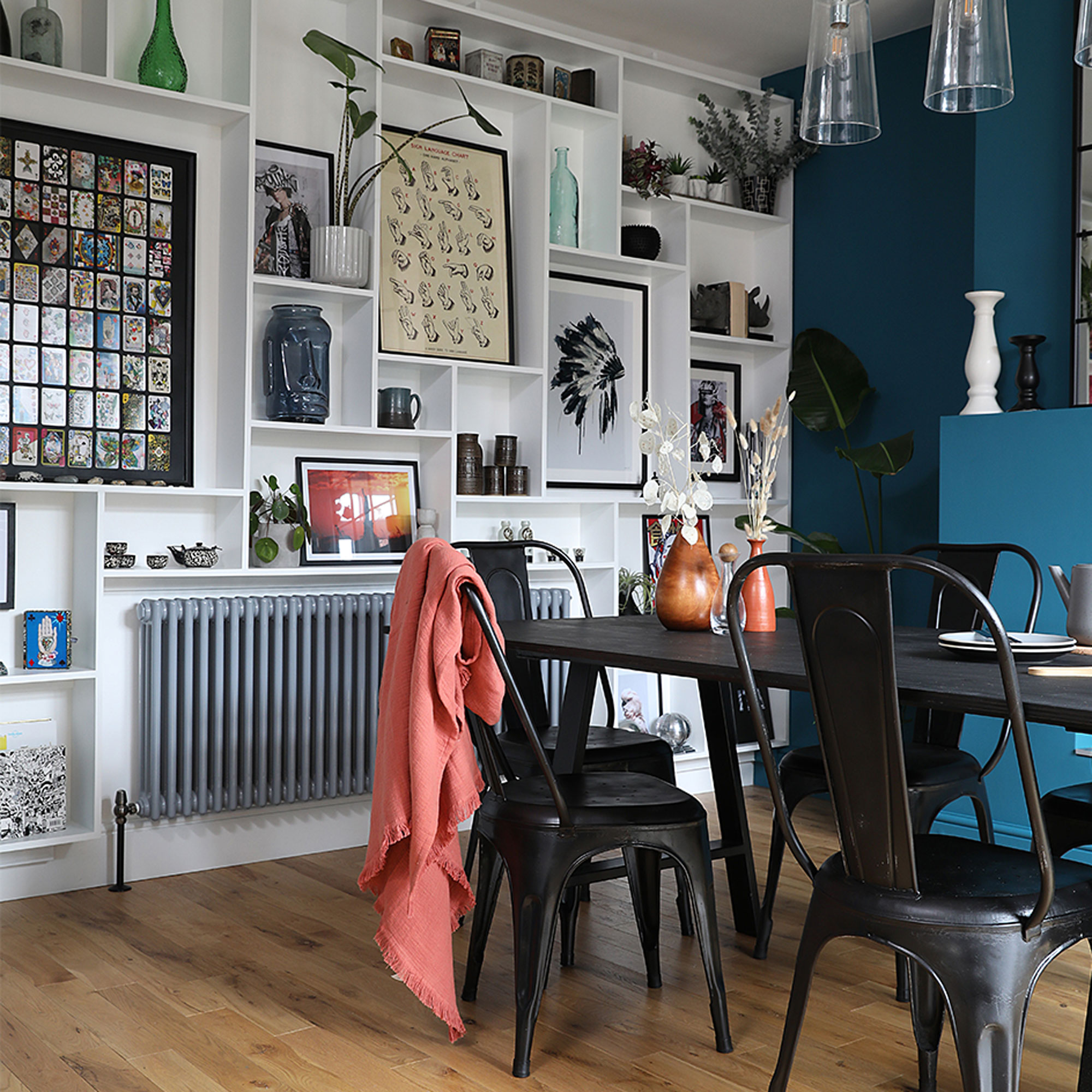
‘Although there were big delays – I couldn’t get a plasterer after the first lockdown and I ended up living with my parents for almost two years – I’m really pleased with the end result. Everyone has been amazed at how much my dad and I have done ourselves. The only thing I would change if I did it again would be the position of the radiator in the dining area. It breaks up the line of the shelving wall so I’d probably have a vertical design in the alcove instead.’
Relaxed dining area

‘I made the dining table myself using cheap A-frame legs from Amazon and a plywood top that I sanded and stained. You can still see the vein of the wood and the resin finish makes it fully wipeable.’
‘The floor is my favourite part as it’s a bit unexpected, and I love the open-plan dining layout. It worked so well when I had all the family around at Christmas. When you come in the house and see the dado rails and picture rails in the hall and front room, I like that it’s a bit of a surprise to see this modern space at the rear of the house.’


