Farrow and Ball's Cola is an incredible color. As the name suggests, it's a deep brown, but with red pigments to it that adds warmth and vitality. I've used it to great effect in my den, covering the walls and doors in this rich, comforting brown, creating a space that is perfect for movie nights, for hunkering down in.
Using browns in this way is a big color trend, with earthy tones cropping up in designer schemes, running the gamut from soft beige to dark wood tones. 'I am always finding myself harking back to the colors we see in nature,' says the interior designer Tom Morris, who uses brown in almost all of his projects. 'I do like a lot of brown. It can be very rich, very inviting.'
So when it came to painting my wooden stairs, I thought the leftover tin of Cola would be the perfect option. The first thing you see when you arrive at my home, it would be the on-trend, daring shade that would set the tone for the rest of the house. As Tom said, it would invite you in. And it worked so well in my den, that it would be a no-brainer here, as well as providing a decorative through line from the den downstairs to the upper levels.
But now, I really regret it.
How it started....

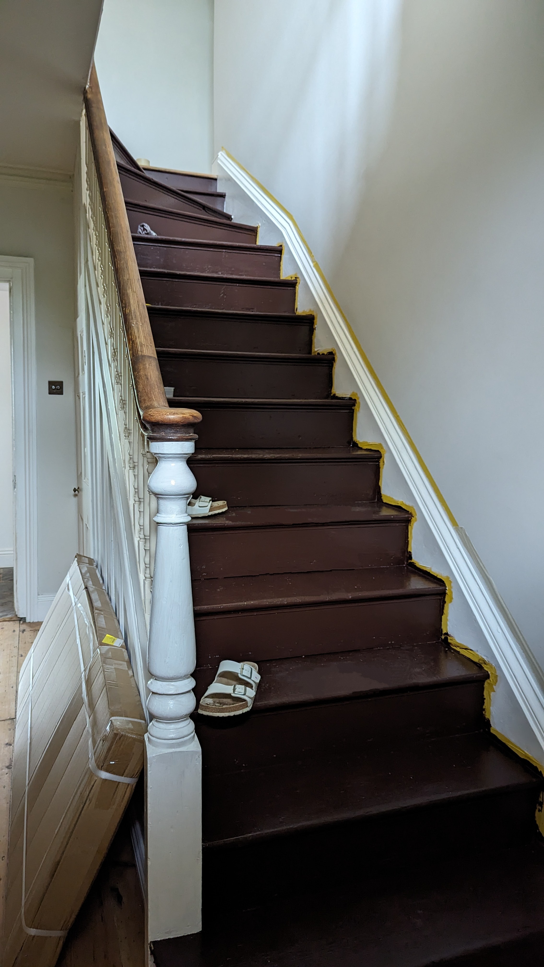
Here's what my stairs looked like just as we'd finished the last coat. You can see the decorator's tape still fixed as we waited for it to dry. (Excuse the shoes, we painted the stairs in alternate batches so that we could walk up and down them, and those shoes were markers as to which ones were safe to tread on. Smart, huh?!)
As an aesthetic paint idea, I stand by it. Cola is such an opulently pigmented paint color that it seems to glow, radiating the red tints in it, almost gleaming. 'The rich color of Cola, being the reddest of our browns is irresistible, feeling deliciously intimate and somehow grand at the same time,' says Farrow and Ball's Joa Studholme, who develops all the brand's colors.
And next to the Slaked Lime Mid Modern Emulsion by Little Greene on the walls, it's a brilliant contrast, the chocolatey velvet hues playing off the stony gray. But, almost immediately after this picture was taken, I started to regret our choice.
...and how it's going

One of the appeals of decorating with brown for the stairs was because we have two big dogs, who regularly get muddy, and who we have to bring upstairs to shower off. Their dirt won't show, I thought to myself.
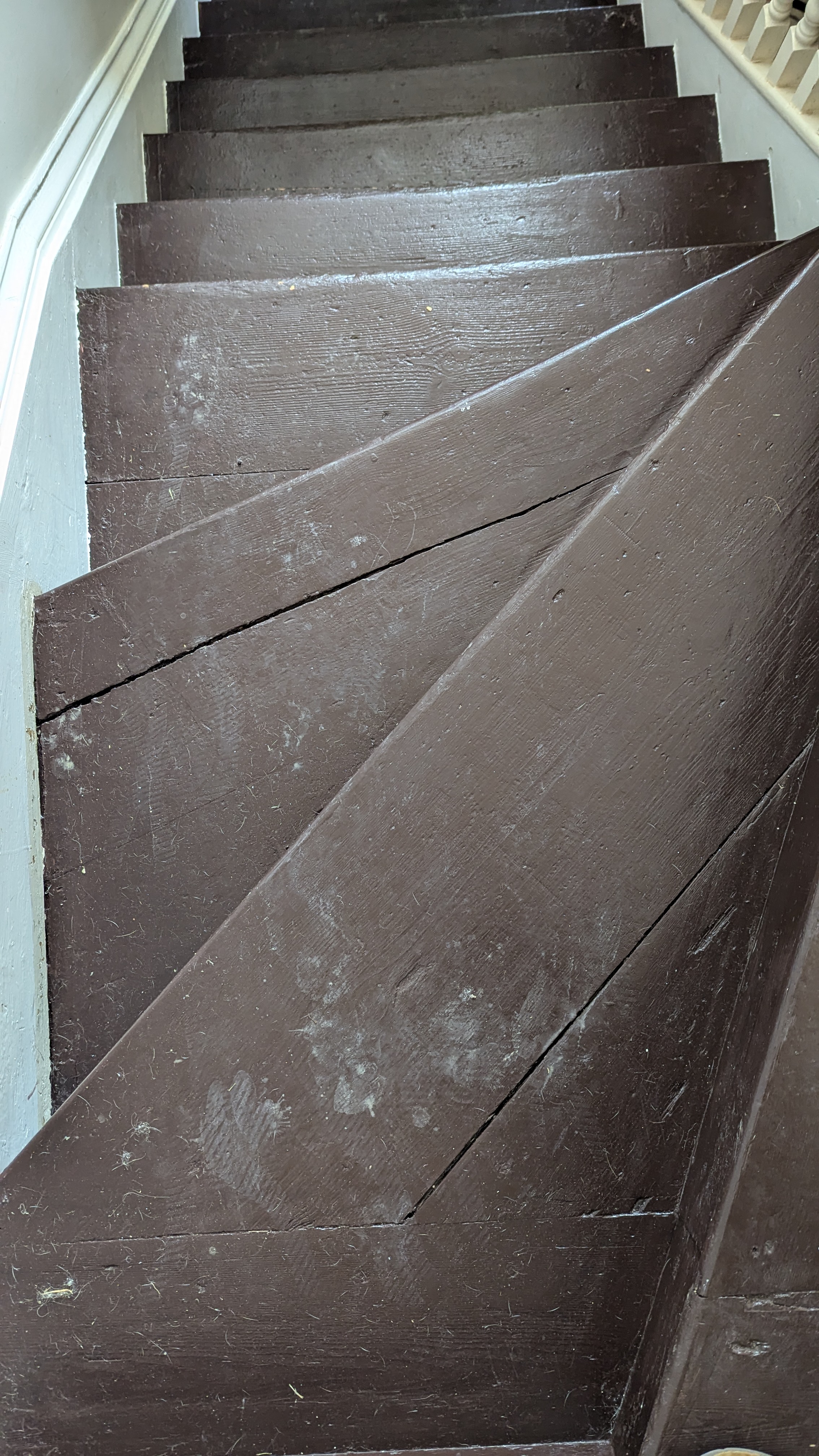
But as you can see from this picture, it's not the mud on their paws I have to worry about, but the dust, and the grime. In fact, the dust on all our feet, even when wearing house slippers, immediately leaves marks like footprints in the snow. Except a lot less charming.
No sooner have we cleaned the stairs – with a damp cloth and a little bit of soapy water – do they show footprint marks again, shining out against their back background as if highlighted. If I was fastidious about them, I'd be wiping them up to five times a day (as it is, I've sort of given up, wiping them only when we have visitors coming and just trying not to look too closely the rest of the time).
'You should always avoid dark colors when it comes to stairs,' Ruth Mottershead tells me, the creative director of Little Greene (the epitome of too little, too late!) 'It looks great but they can get so dusty.' You're telling me.
I ask her what I should have done instead. What I will do when I inevitably decide to repaint them real soon. 'I would recommend a mid-strength tone, or something light like our Portland Stone or French Gray,' she says. Both shades are at the same end of the spectrum as the Slaked Lime Mid I have on the walls, and would harmonize together well. 'They reflect the light, making the room feel big,' Ruth continues. 'And they're easily wipeable.' I mean, so is my Cola, but that doesn't mean I want to do it endlessly.
'At Little Greene, we have a specific floor plant, or you could you a satin, which has a 35% sheen level,' Ruth advises. 'It can take scrubbing or can take wiping.' In her own home, she has painted the balustrade in Ambleside and is about to use Portland Stone on the stairs down to her basement. 'It's made up of so many pigments, and will work in many different lights,' she says.
What should I do instead?

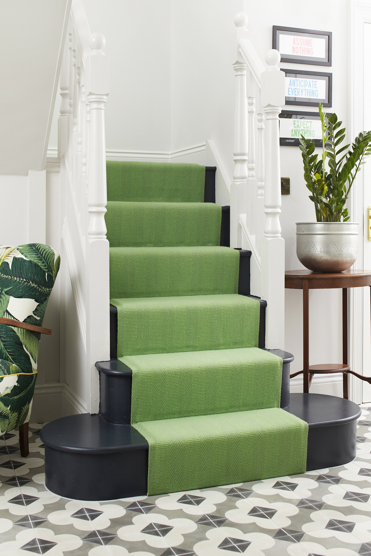
What we really want to do is add a stair runner – like in this image, showing how well it works with dark stairs if you pick a vibrant hue as a contrast. We'd shied away from carpet because of the dogs and their muddy paws, but at least my own dusty footprints wouldn't show up so much.
And of course, there are other parts of the stairs to paint if you feel warned by my mistake yet still want to create an effect.
'Painting the spindles and wainscoting allows you to better appreciate all the woodwork in a brighter, more modern way, while leaving the newel posts and railings in their stripped-back wood tone helped round out the historic feel,' says Merrill Lyons of Brooklyn's Lyons Studio, and what I might do is strip everything back and paint the spindles instead.
But that's another project, for another time, and whatever I do I'll be sure to speak to Ruth beforehand instead of after.


