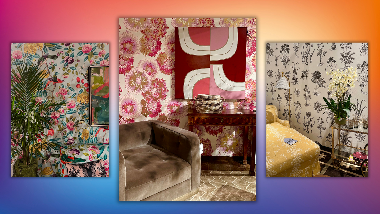
Every year, the New York City Housing Works hosts a benefit known as Design on a Dime, where celebrated interior designers gather for a high-profile, swanky gala before unveiling a public shopping experience curated by the designers themselves. Specifically, these renowned interiors mavens craft unique and personalized vignettes using donated merchandise and furniture that consumers can then shop at up to 80% off retail prices.
Yesterday, I took a stroll through the massive event space to get a look at what some of these designers came up with and how they used the donated pieces to evoke their personal taste and style. And as I moved from room to room, a few overarching interior design trends stood out.
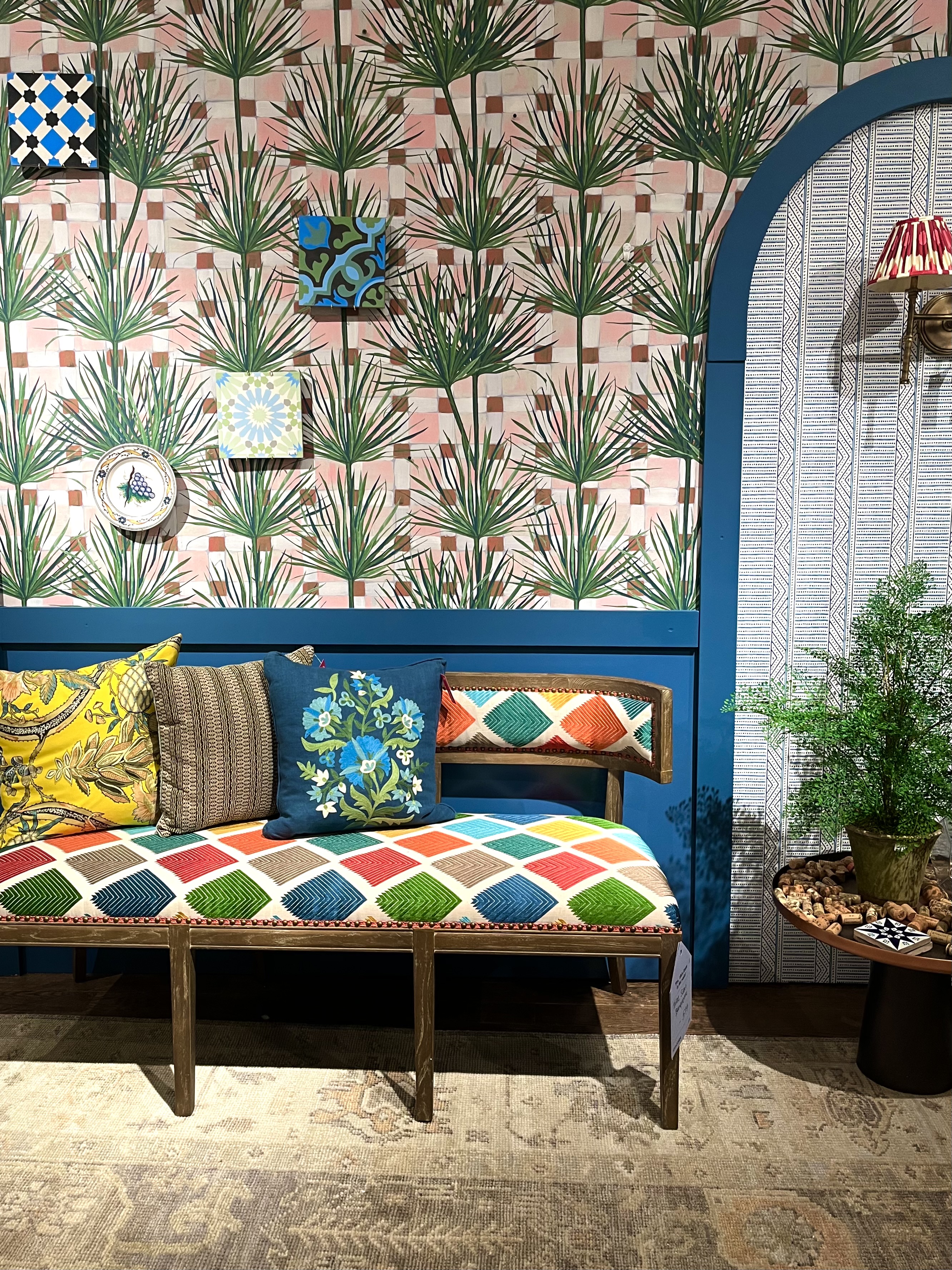
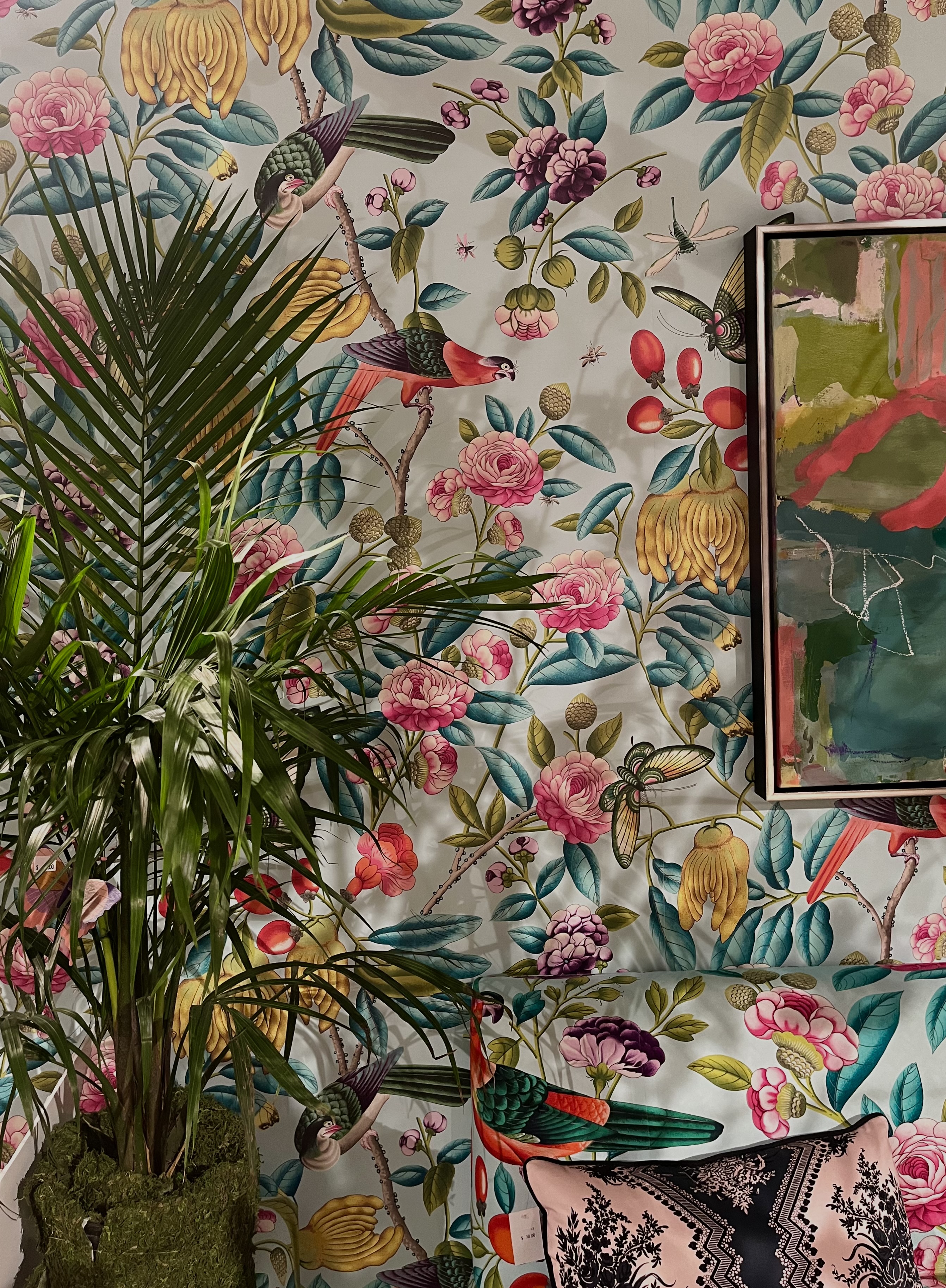
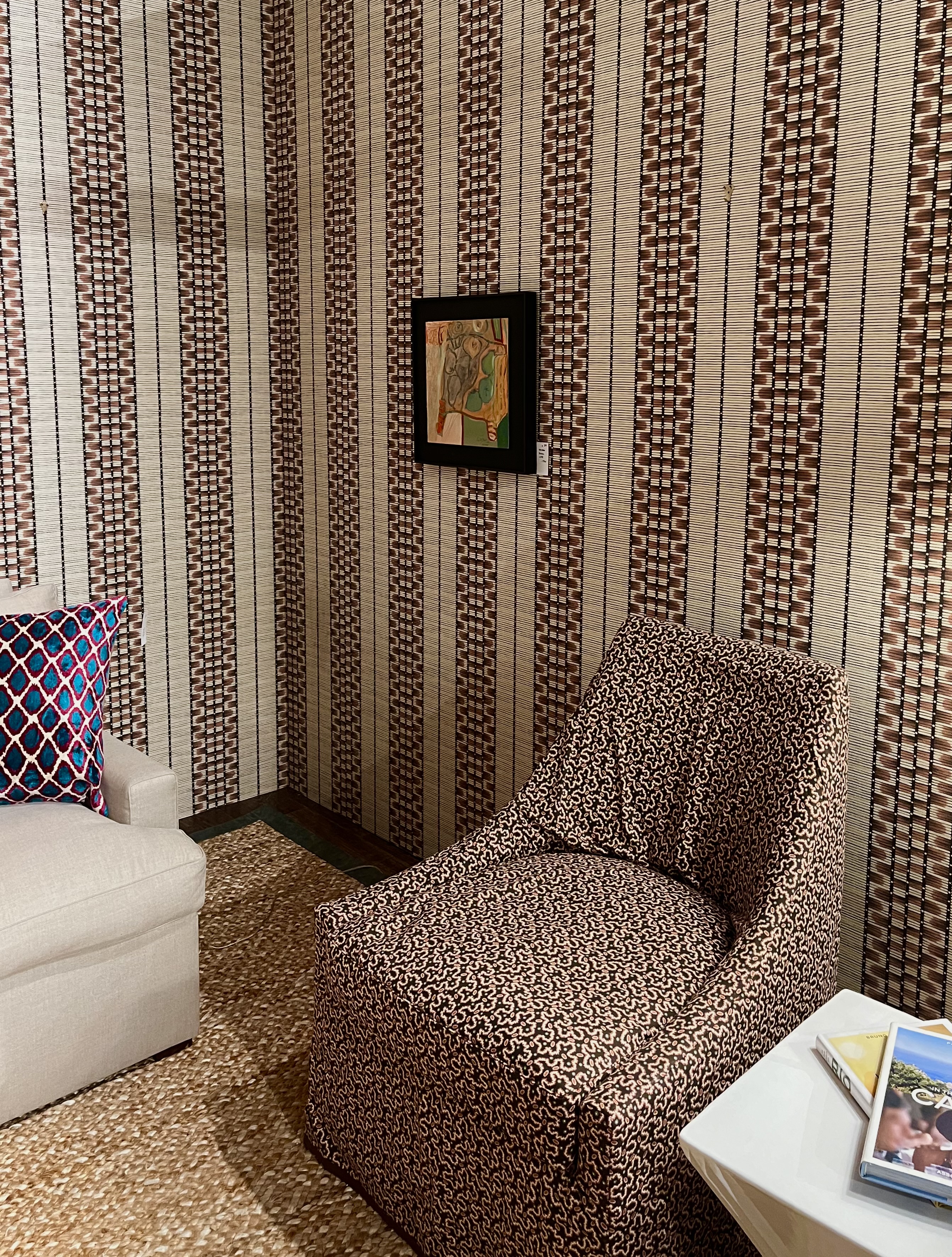
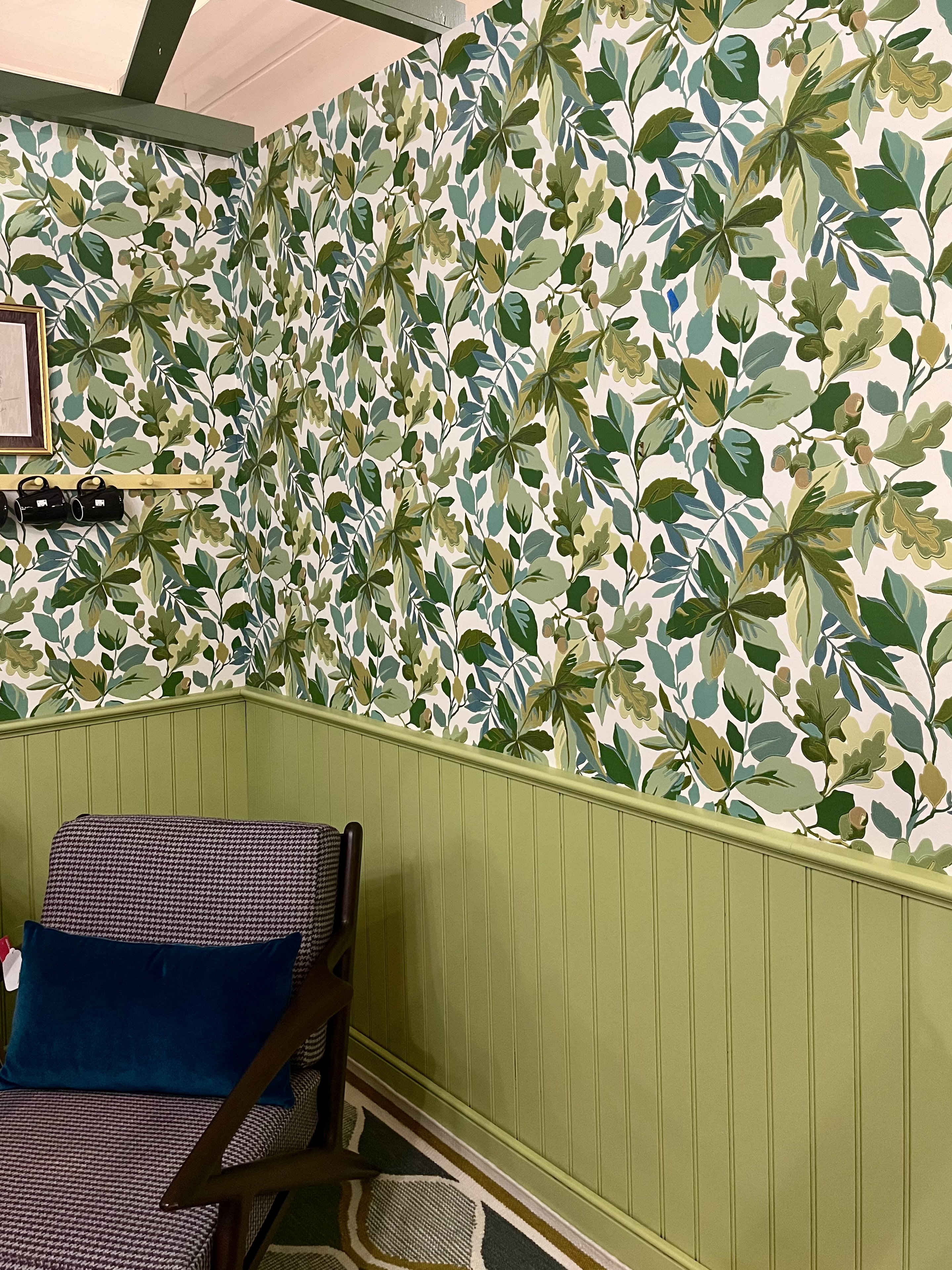
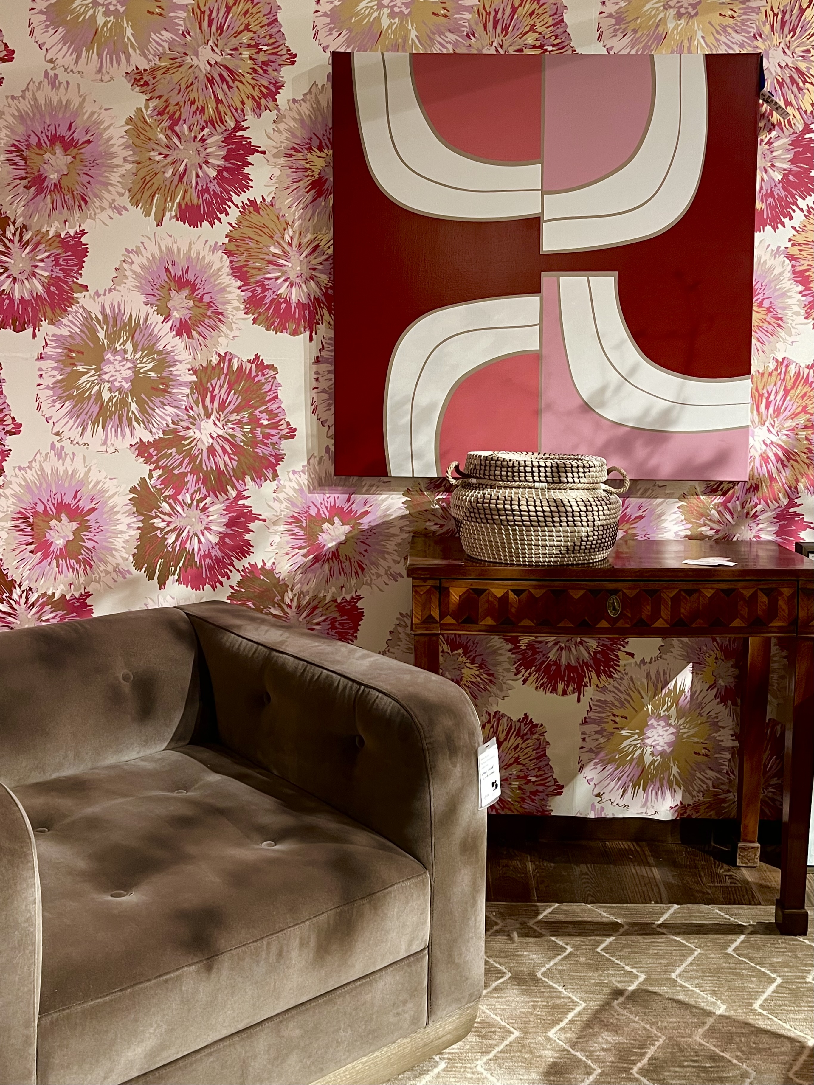
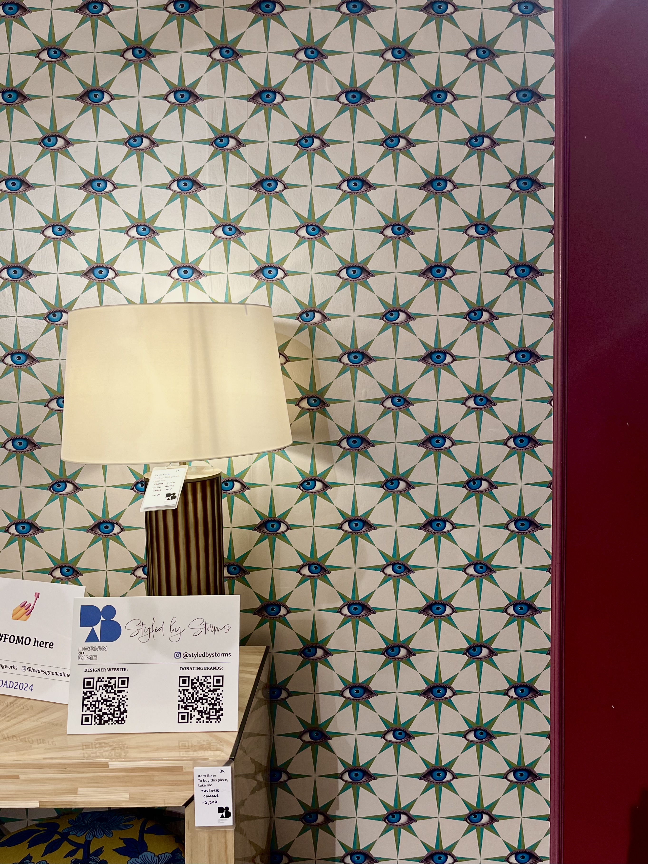
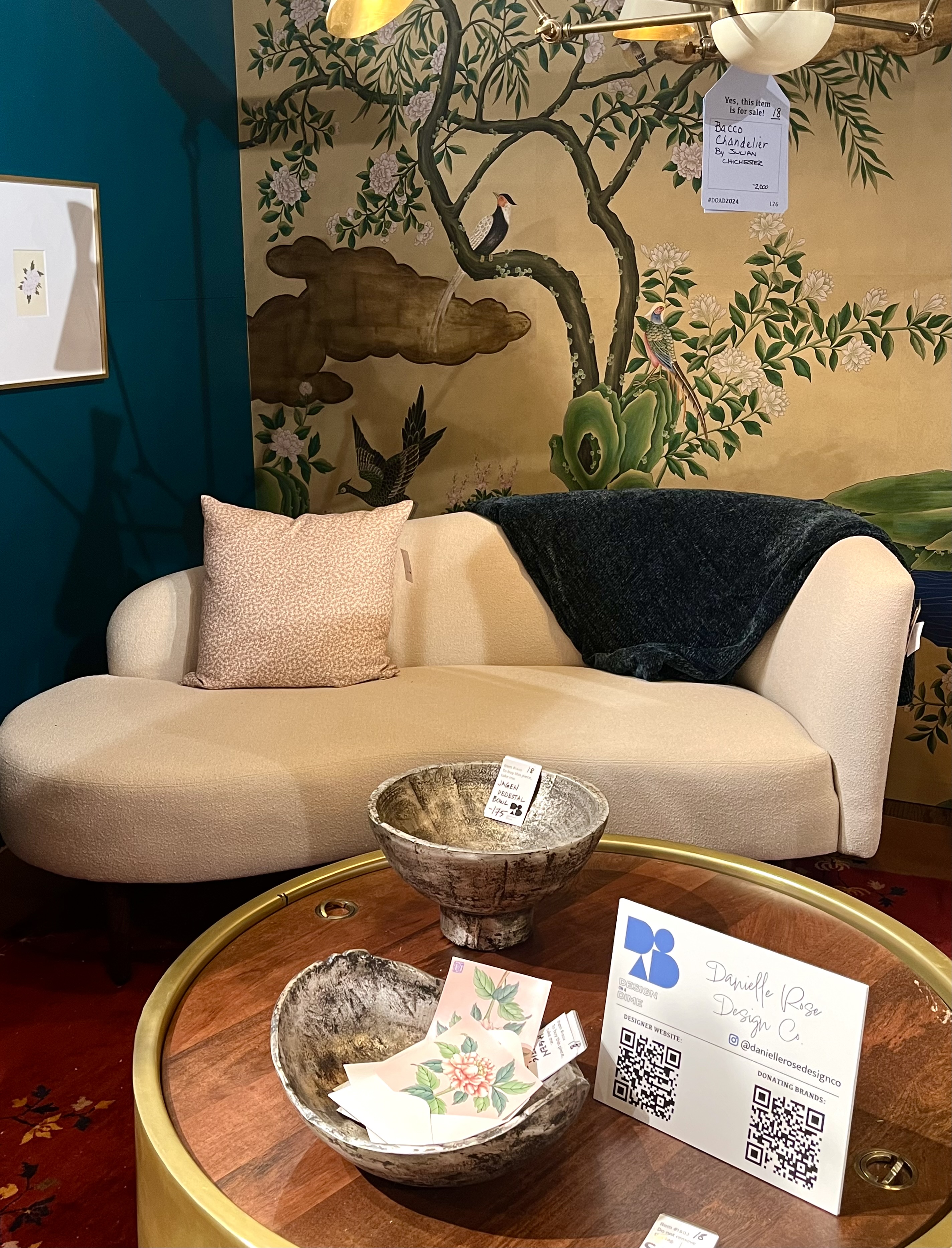
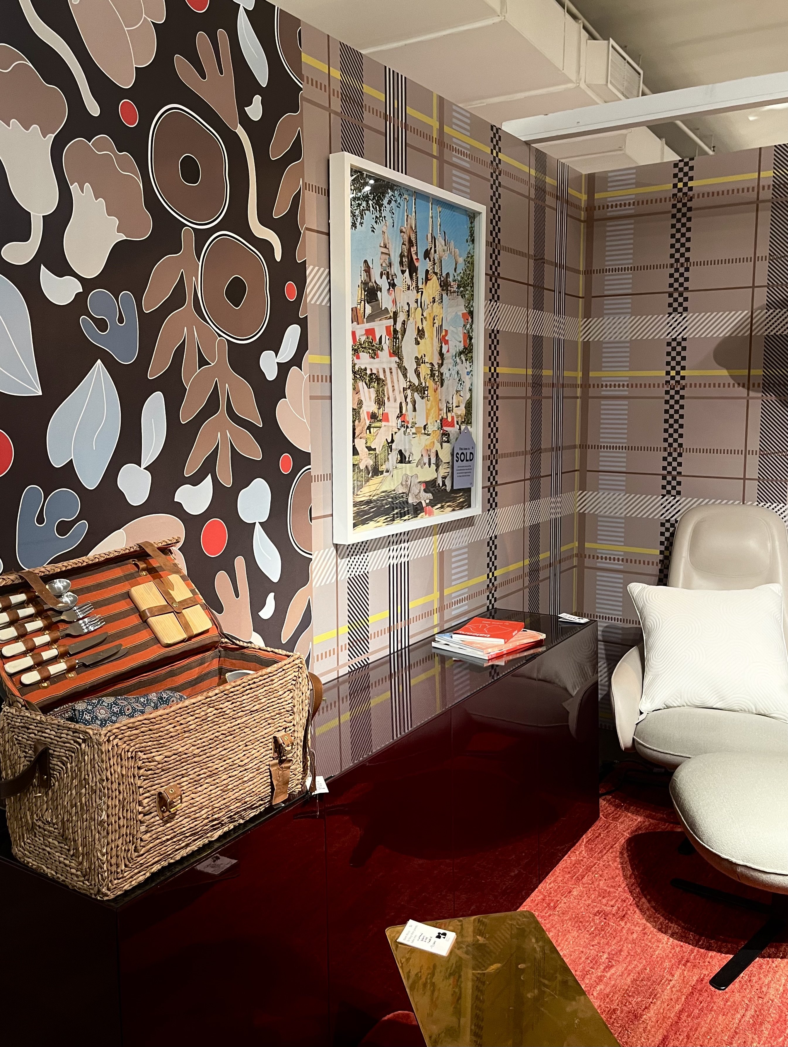
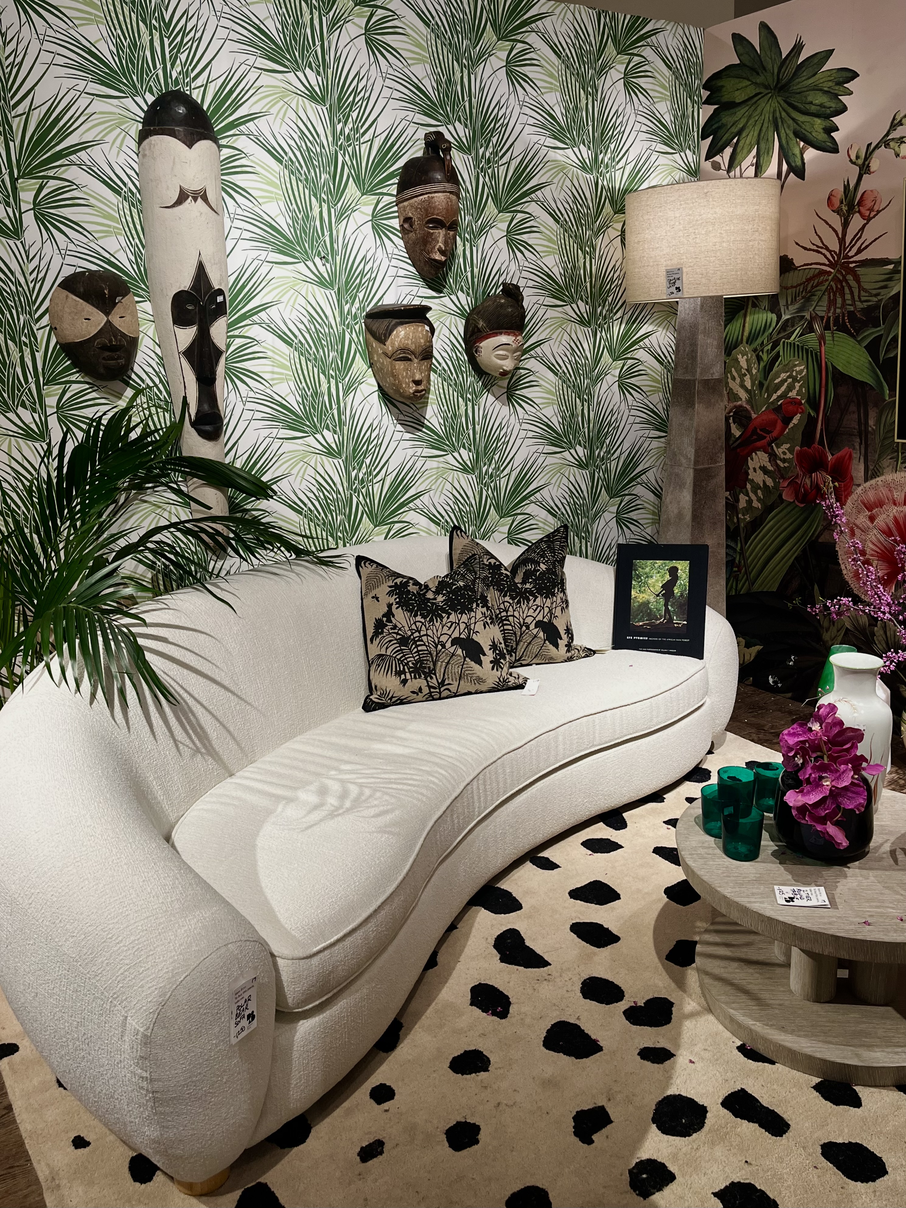
For one thing, funky, patterned wallpaper adorned almost every wall. Designers used wallpaper to tie their vignettes together, or to zhush up an otherwise lacking space. Some teams, like Apartment 48 and Keith Carroll Design, went for total maximalism: mismatched decor, loud colors, and clashing patterns (all executed tastefully, of course).
But others, like the calvary at Kerri Pilchik Design, went for a busy but understated print instead, one that underscored the elegance and luxe simplicity of the vignette it surrounded.
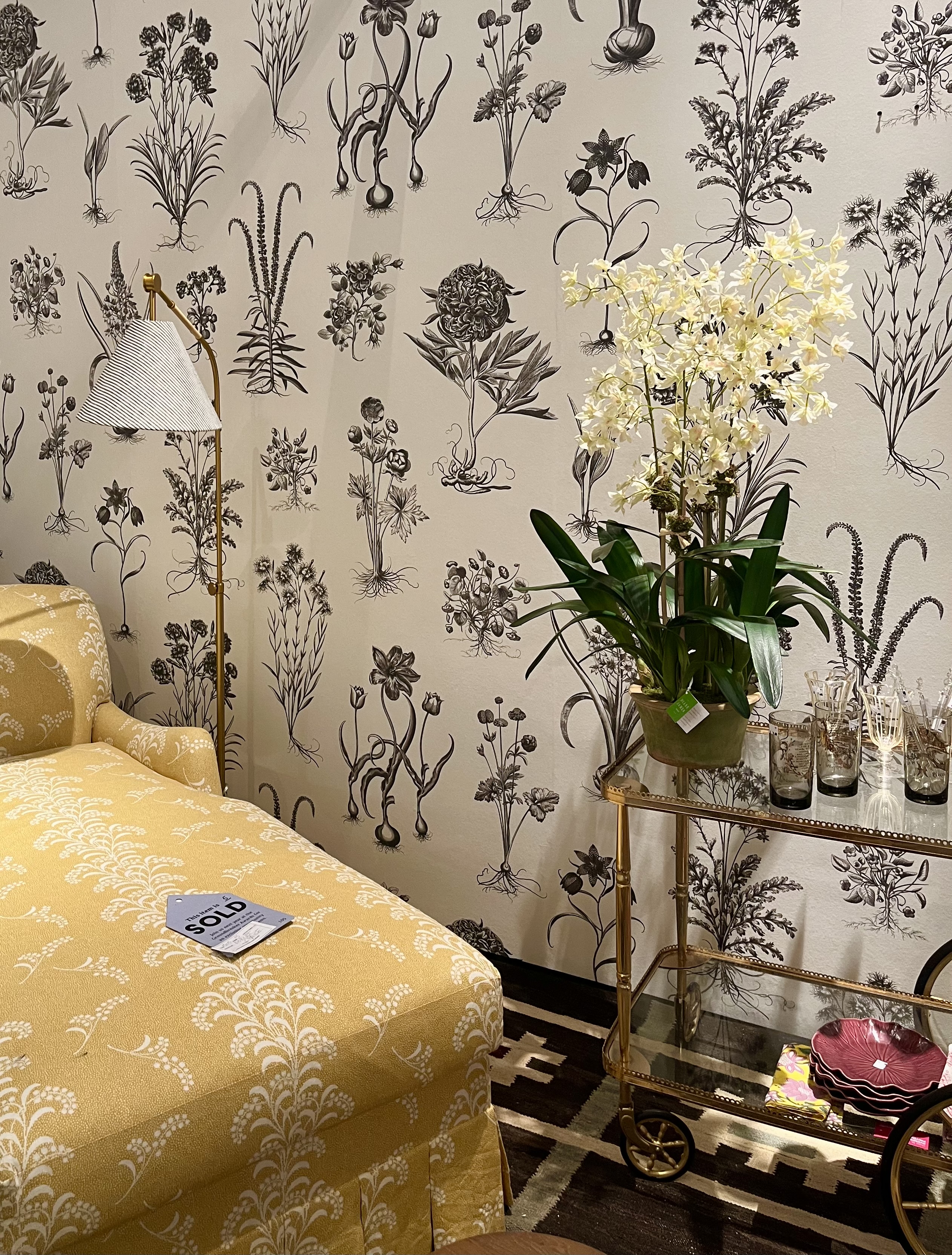
But regardless of print, the rooms that were wallpapered stood out far more than those that were decorated in paint alone. Other designs that stood out to me (in descending order): These vertical stripes, courtesy of the design team at Brian J. McCarthy Inc.; this bright green botanical motif, selected by The Rath Project; the bright and bold pink florals of a vignette by Philip Gorrivan Design; the unexpected and omnipresent eyes of Styled by Storms' curation; the Chinoiserie vibe in Danielle Rose Design Co.'s space; the completely clashing combinations from Ghislaine Viñas' vignette; and the palms of J.L. Goodman's expertly-decorated room.
Aside from colorful, crazy wallpaper, statement lighting was the next big thing at this year's Design on a Dime. I was mesmerized by the unique pendants, luxurious chandeliers, and avant-garde string lights that illuminated almost each and every room, their shine just as beckoning as the patterns on the wall.
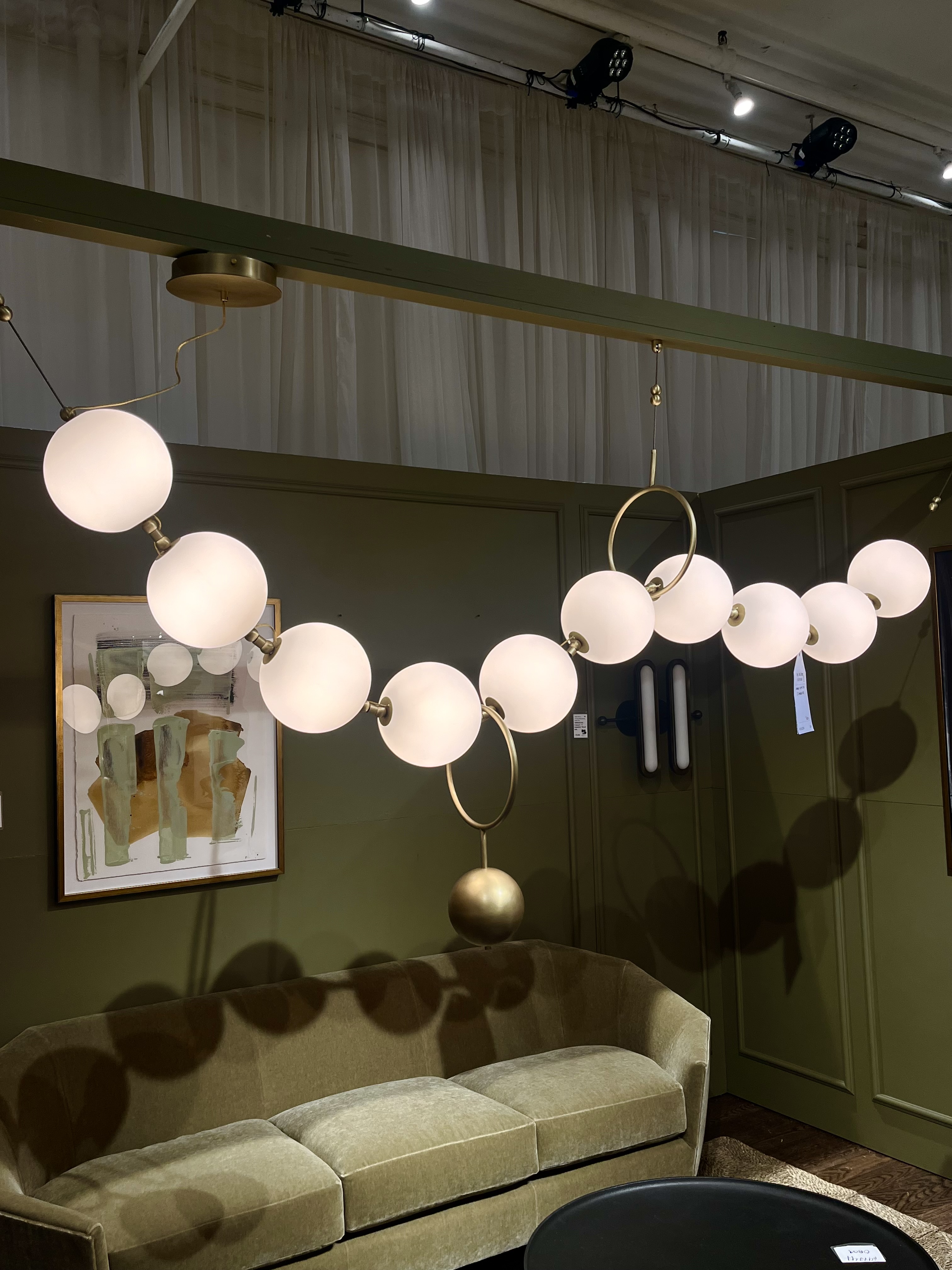
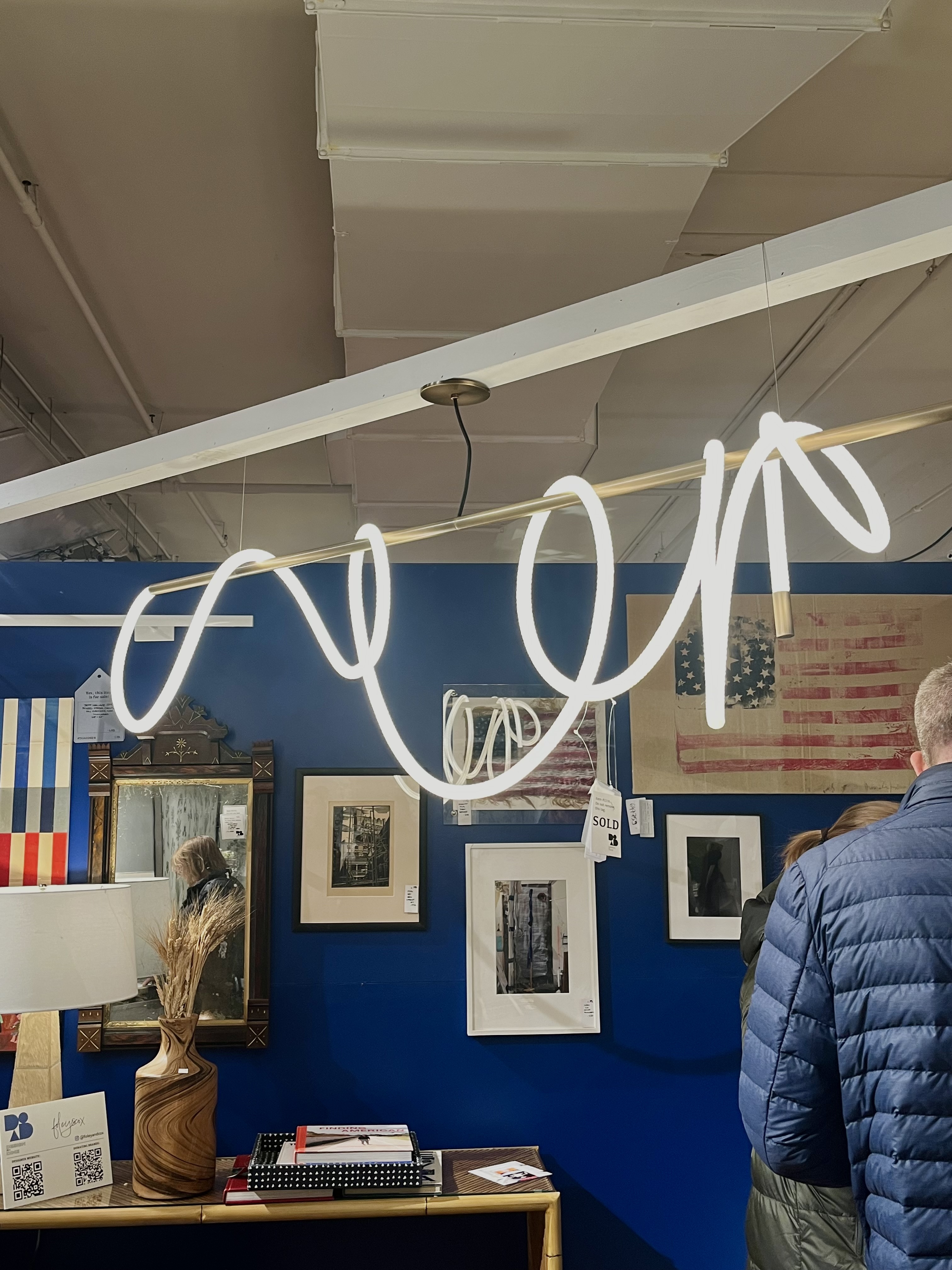
My favorite piece was the necklace-esque string of orb lights in a room designed by B. Berry Interiors — I wanted to wrap it around my neck and walk around, as though it were a scarf or an extra-large piece of jewelry. Equally as whimsical was a flexible rod light draped atop the vignette curated by foley&cox. I saw a similar piece elsewhere, in a different cubicle, but I couldn't stop staring at this placement, in particular. If you needed a reason to try something different for your kitchen light, let me tell you: designers want you to go bold.
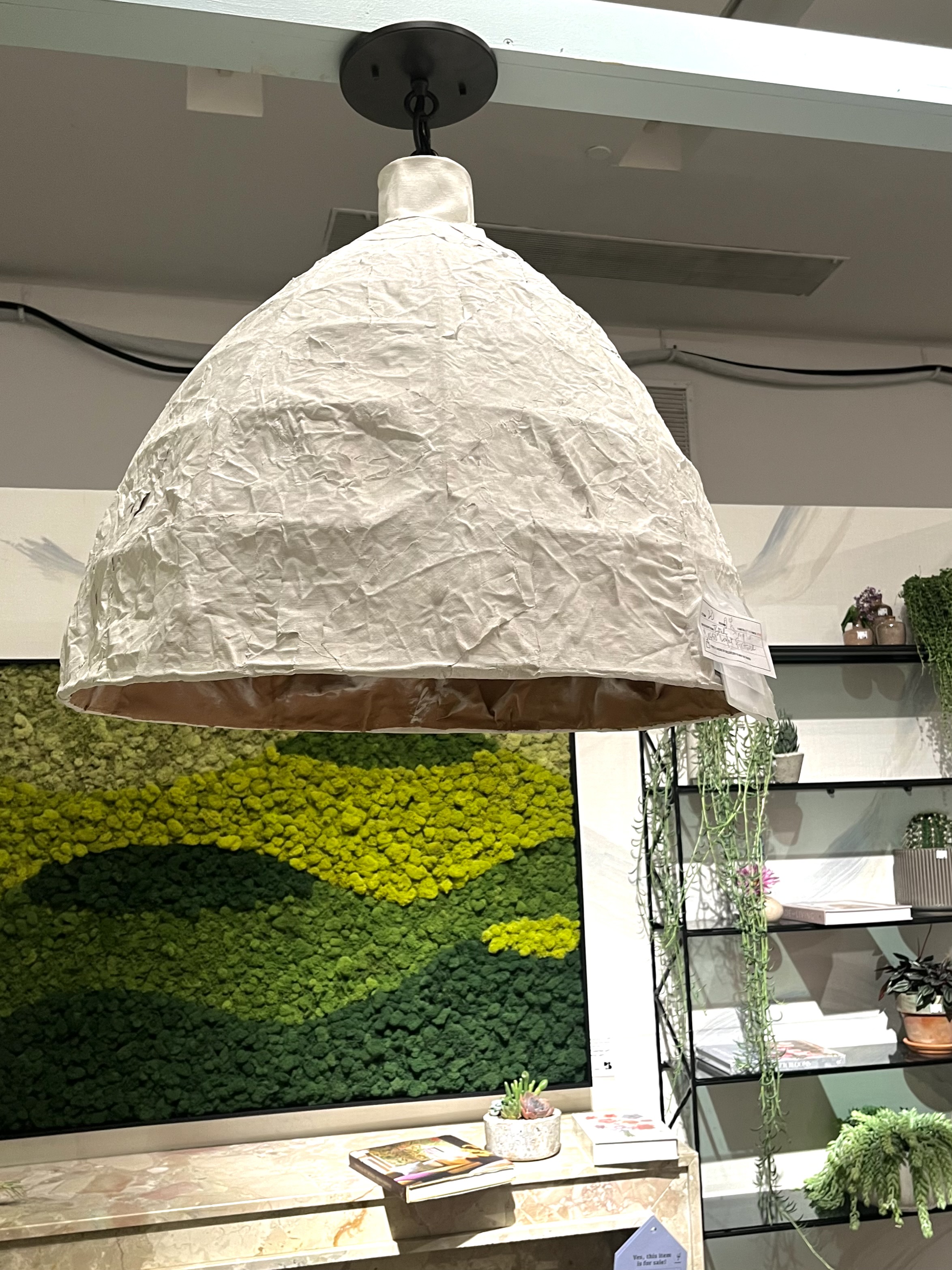
Of course, it wasn't all so new age. For something a bit more traditional but nonetheless striking, I was quite taken by this paper mache-looking pendant hanging above the room curated by Wesley Moon, Inc. + Tyler Banken Landscape Design. As you can tell in the background of the photo below, the space was punctuated by plants and greenery, as well as artwork made of what looked to be moss. Very organic, very natural, which tied into the look of the light.
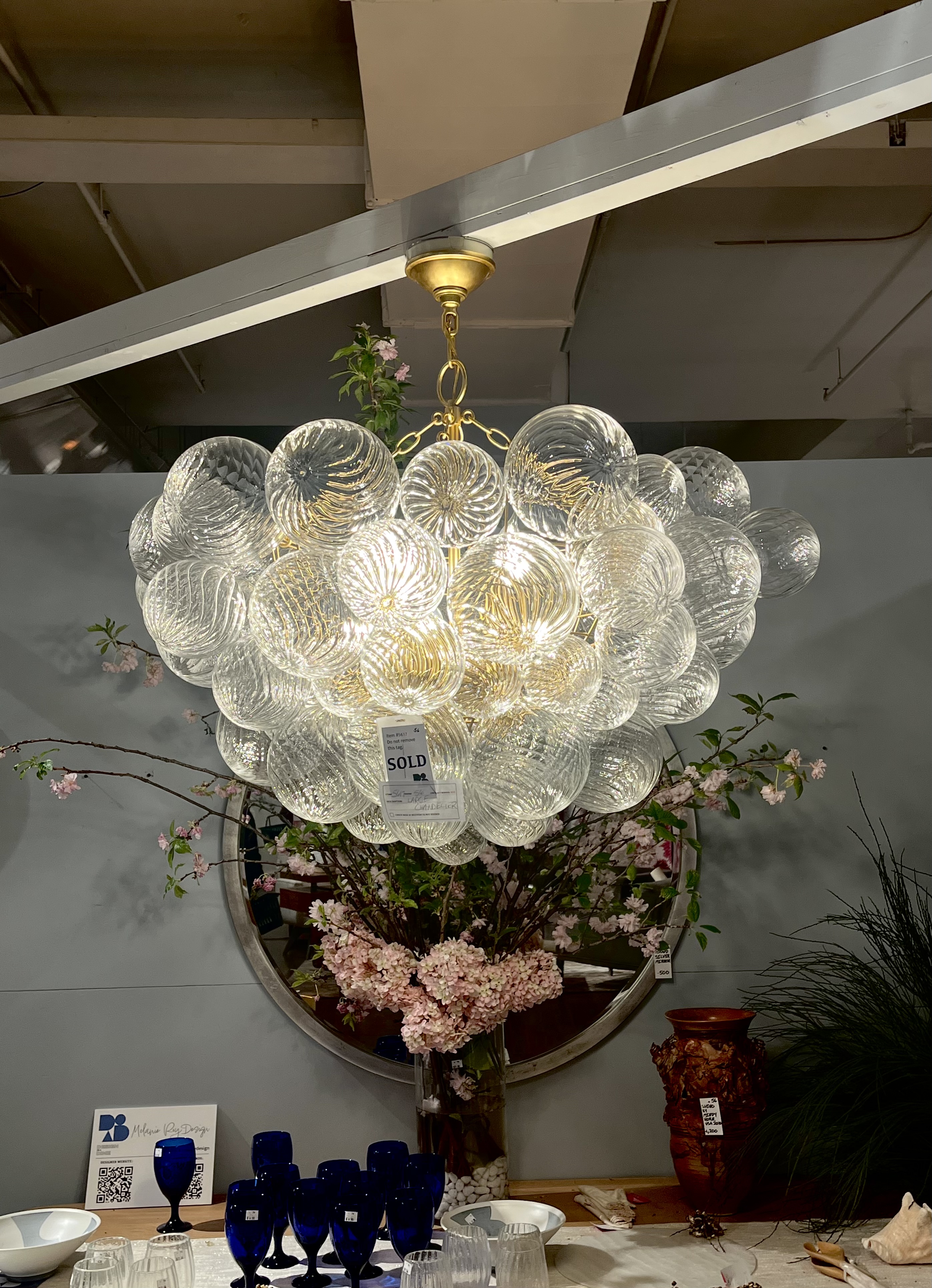
But it was right back to the glitz and glam when I found this gorgeous chandelier serving up a dose of old Hollywood glam and whimsical design in a space curated by Melanie Roy Design. I couldn't get enough of the glass orbs all bunched together, and they honestly felt quite durable and substantive up close. A sure-fire win!
Being the style editor that I am, though, I couldn't end this article without offering you some shopping options that match the trends I've outlined here — and I'm pretty excited about what I've managed to find. If you have the time, I'd recommend visiting Design on a Dime yourself ... but otherwise, this quick little edit will have to do!
Statement Lighting
Price: $186
This lovely white pendant is not only affordable, but channels the same energy and look as the one I spotted at Design on a Dime. I think this would provide an excellent organic touch to your kitchen, living room, or office.
Price: $449.99
Was: $649.49
It's not the same as the cluster chandelier I spotted out and about, but it's pretty dang close. And it's on sale! How beautiful.
Price: $179.99
Was: $212.99
This modern chandelier is draped in a silicone light tube akin to that which was wrapped around one of the spaces I saw yesterday. It looks like it would cast a lovely soft light (and serve as a quasi-art piece, as well).
Patterned Wallpaper
Price: $336
If designer advice isn't enough to sway you, what about Kate Hudson? The actress uses this very Morris & Co. wallpaper in her home — and I have a feeling it would have looked right at home in the event space yesterday.
Price: $2.29/sq. ft.
This abstract print is busy enough to still be exciting but simple enough to match with the rest of your decor. Plus, it's peel & stick (and Bobby Berk!).
Price: $349
How elegant and luxurious is this Venetian ivory print from CB2? It plays into the botanical wallpaper trend, but the coloring is so versatile and almost regal.


