Do you smell that? The scent of iOS 17 still baking in the oven, wafting over from Cupertino, CA? Well, if you can't smell what Tim Cook is cooking, everybody else knows that a reveal of the next iPhone OS is coming at the WWDC 2023 event. And I'm hoping Apple is taking requests.
The iPhone's App Library felt like a perfect idea upon arrival. A place where Apple does your app sorting for you. Debuting in 2020's iOS 14, the App Library arrived to help you have fewer manually-adjusted home screens — using the iPhone's digital brains.
And It worked. Now I just have the one home screen, and I keep all the apps I don't use as regularly in the App Library. The only problem is that the App Library isn't actually as intelligent an app organizer as it should be.
While Apple's original press release declared that the App Library "automatically organizes all of a user’s apps into one simple, easy-to-navigate view, and intelligently surfaces apps that may be helpful in the moment," my recent experience feels like this section of the home screen needs to get smarter.
Or, more simply put: Apple should let us fix the App Library's mistakes.
iOS doesn't always know how to sort apps
We all manage our clothing dressers differently, and so it's no surprise that the App Library exists alongside the regular, editable, home screen. But the App Library's fails are so notable that they make me ignore its sorting. I've only recently realized I only use that screen for the alphabetical view of apps you get from the search field (tap the top field, or pull down on the screen).
What does iOS 16 get so wrong? Well, it thinks the OKCupid dating app is a social media app. Wrong, Siri, it's a dating app. Not that the App Library has a "dating" folder. It has an "other" folder, where I can find the other dating apps I use. (Sidenote: dating apps are hell, and I envy those who are too old to know what they're like)
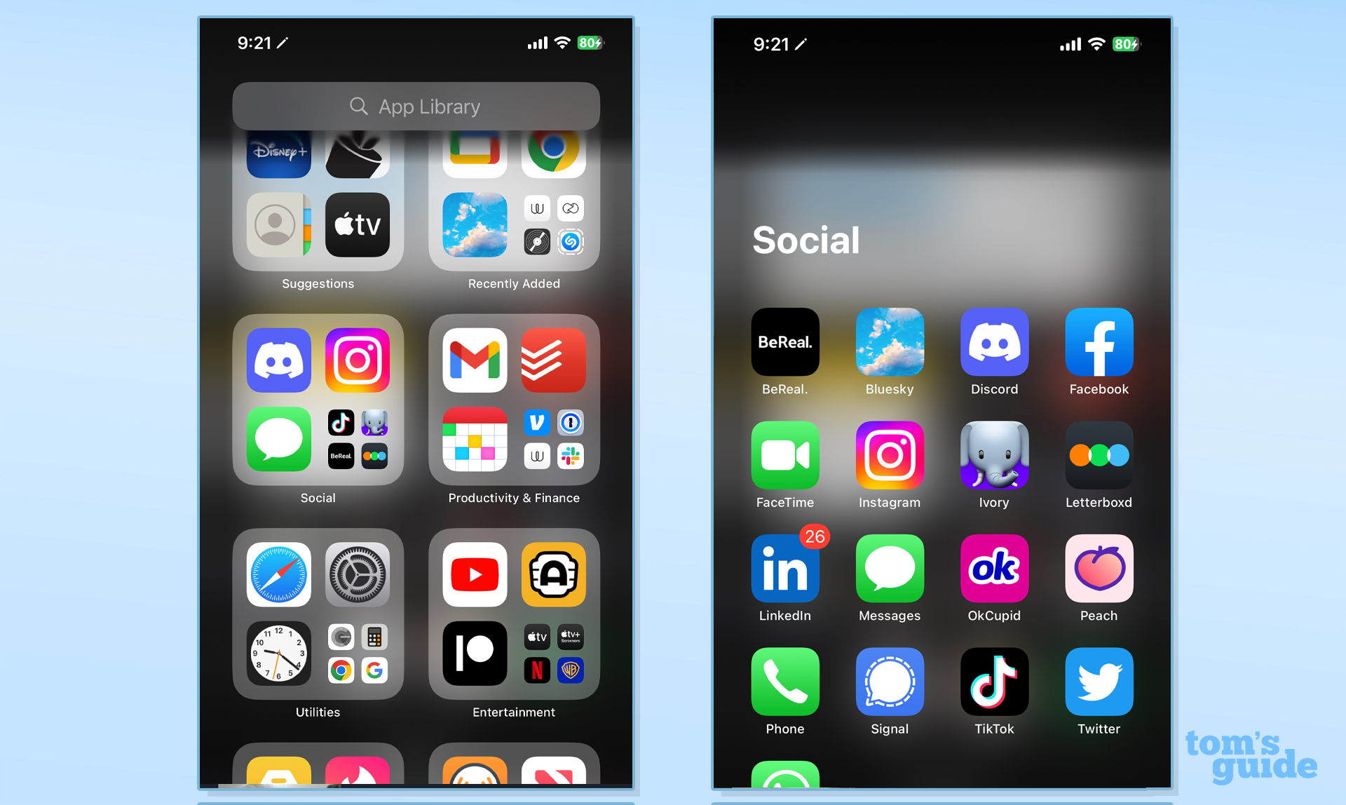
Yes, I could also make similar claims about other apps not 'belonging' in a 'Social' folder. Messages, FaceTime, Signal and WhatsApp are technically social apps, but they're not Social Networks. They're more "messaging." But I digress. My Other folder doesn't just have dating apps, by the way. It also has two of Netflix's mobile games (Oxenfree and Poinpy).
So while, for the most part, my App Library is well sorted, it would be very easy to fix this flaw. If only I could long-press on an icon, and drag it to another the right folder, that would be great. Apple would probably say "that's what the home screen is for," and I get that.
Outlook: Let us make the iPhone better
I would love Apple to consider a quote from Pedro Pascal's character in the mostly-bad Wonder Woman 1984: "life is good, but it could be better." Yes, the App Library (which has been around for over two years now) is helpful, but it's time for it to evolve.
And with WWDC 2023 about to arrive — it'll be here before either of us know it — I thought this was a good time to try and shout into the tech news world and hope Apple hears me. Either smarten up the App Library, or let us put the final touches in. Neither is a bad idea, and the latter wouldn't be a sign of weakness.

