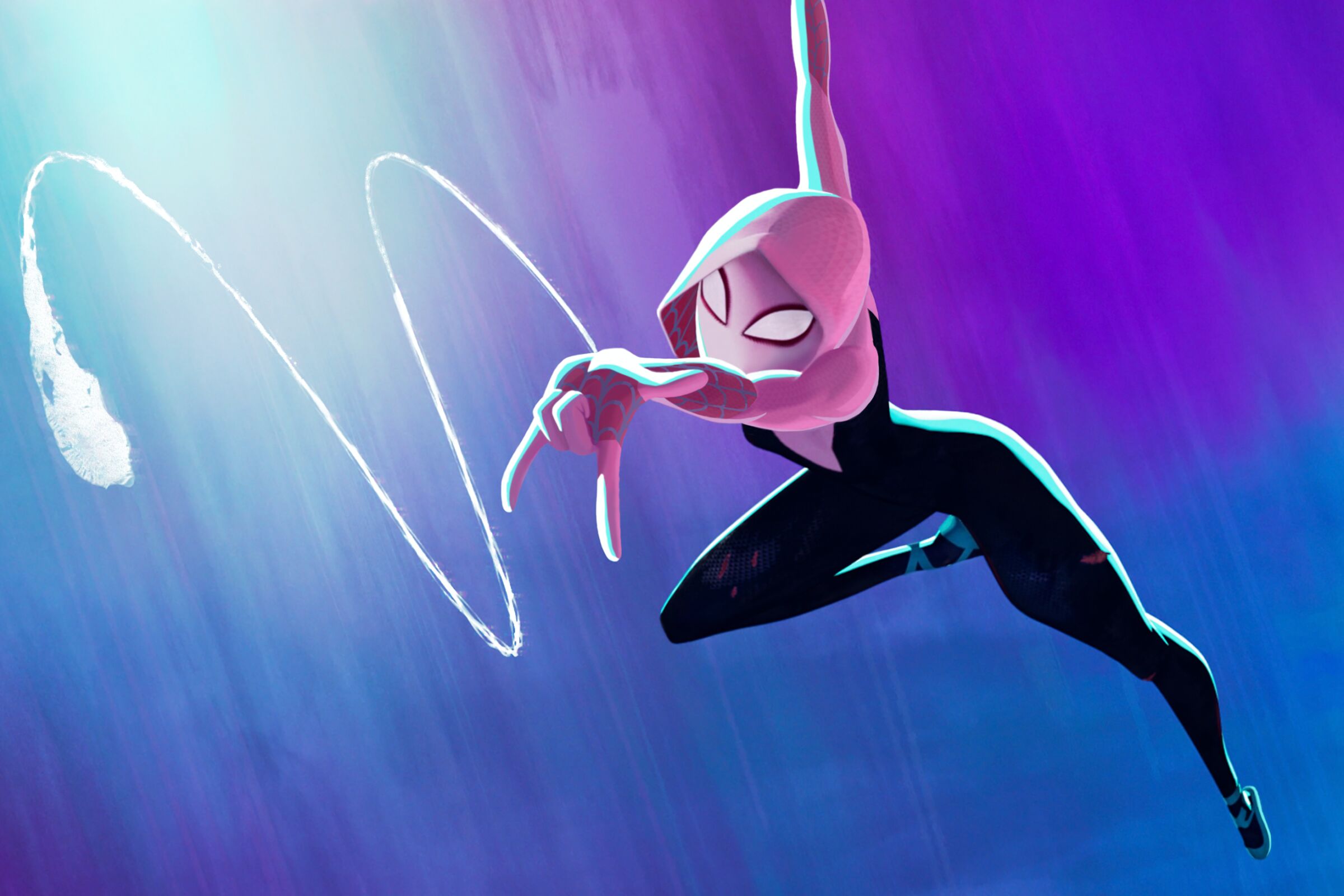
It's only early June, but we may already have the most visually gorgeous film of the year, thanks to Spider-Man: Across The Spider-Verse swinging into cinema screens across the world over the last few days.
Like the previous film in Sony's franchise about the animated adventures of Miles Morales and the fast-increasing number of interdimensional spider-people he encounters, Into The Spider-Verse, Across The Spider-Verse's reception has been rapturous, be it from critics – 95% 'fresh' reviews on Rotten Tomatoes – film fans – 9.1/10 and currently sitting in the top 20 for the best films of all time on IMDb – or general audiences – $120 million in the US alone on its opening weekend, with at least $100 million more coming in from across the world as figures are revealed this morning. (If you want to make your own film, can we suggest these animation tools?)
But aside from the story, the animation and frankly stunning visual design of the many dimensions our characters traverse is getting rightful praise too.
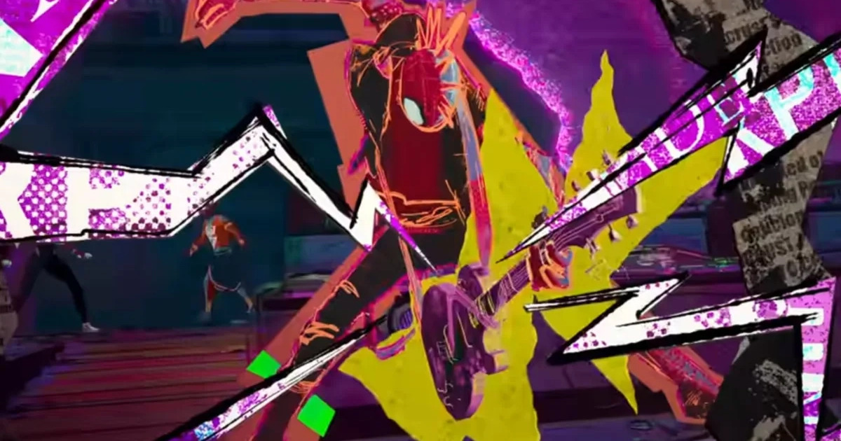
Each world is designed to different styles, each based both on the nature of its spider-person's characteristics and the comic runs they are pulled from. The stark differences, for example, between the look of Spider-Punk's anarchic cut-out scrapbook style (above) and Spider-Man India's richly detailed and vibrant Mumbattan (below) make it clear that each respective character not only comes from a different physical world, but also underlines their different personalities. It's a brilliant example of how a character design is reflected in their surroundings, and vice-versa.
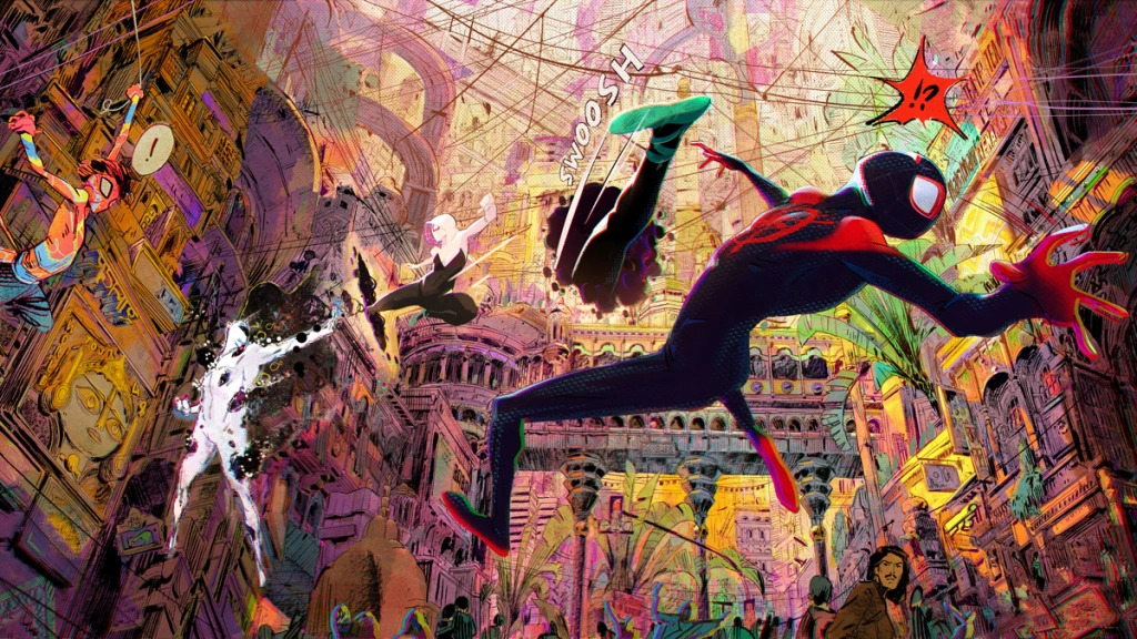
Critics haven't been stingy on superlatives either. Wendy Ide of The Guardian says: "There’s not a frame of this rich, kaleidoscopically detailed animation that isn’t dazzling," while Liz Shannon Miller of Consequence of Film gushes: "Across the Spider-Verse isn’t just visual flare and delirious shifts in style; in the film’s more intimate moments, the character animation on display is so good that at times it’s possible to forget that these aren’t flesh-and-blood actors on the screen."
Jordan Farley from our dear friends at Total Film rightly points out that "the 'living comic book' aesthetic has been refined and advanced exponentially" here," while David Sims of The Atlantic elaborates on the visual design's importance for the story: "Across the Spider-Verse avoids seeming like a physics lesson because its visuals are consistently thrilling; the most static bits of dialogue still pop because of how daring the animation is."
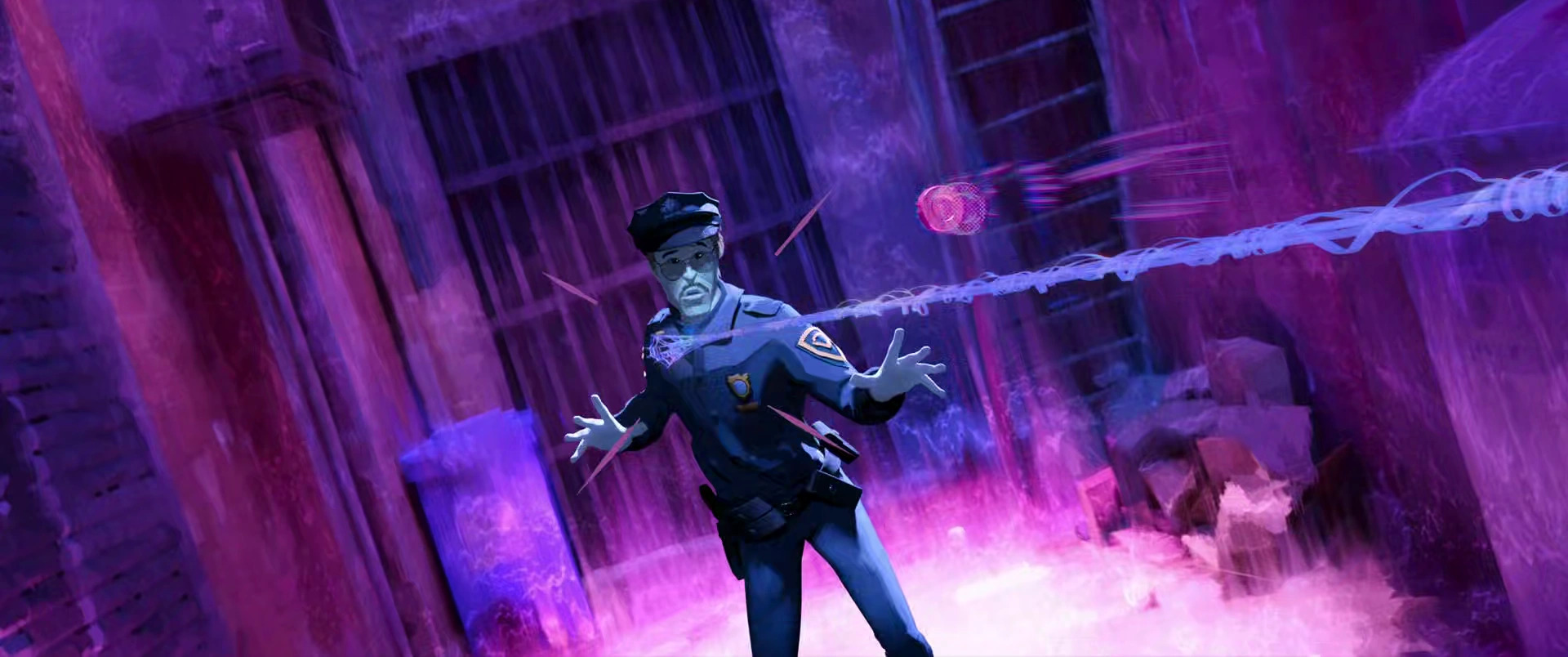
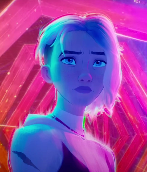
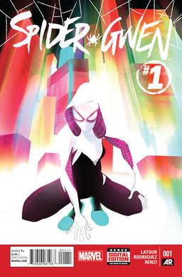
But of all those worlds, my favourite, and no doubt also that of many of the millions of people who have already seen the film, is Gwen's dimension of washed-out watercolour, constantly shifting in shape and colour, designed according to producers Phil Lord and Chris Miller as a "mood ring".
As the dynamics, tension and atmosphere of a scene shift, so do the colours of Gwen's hair, skin, and even surroundings transform, lending her world an intoxicating sense of subjectivity and fluidity. I found my eyes repeatedly swimming in waters of indeterminate backgrounds, disappearing and reappearing doorways and hallways, and the fluctuating presence and intensity of its people, centred around her, let's say, tumultuous relationship with her policeman father.
It's a thing of singular beauty in a film full of visual splendour, and should inspire anyone to at least dig up some watercolour paints and start creating liquid worlds of their own, or, if you're particularly inspired, to get yourself some animation software and start creating animated films of your own.


.jpg?w=600)


