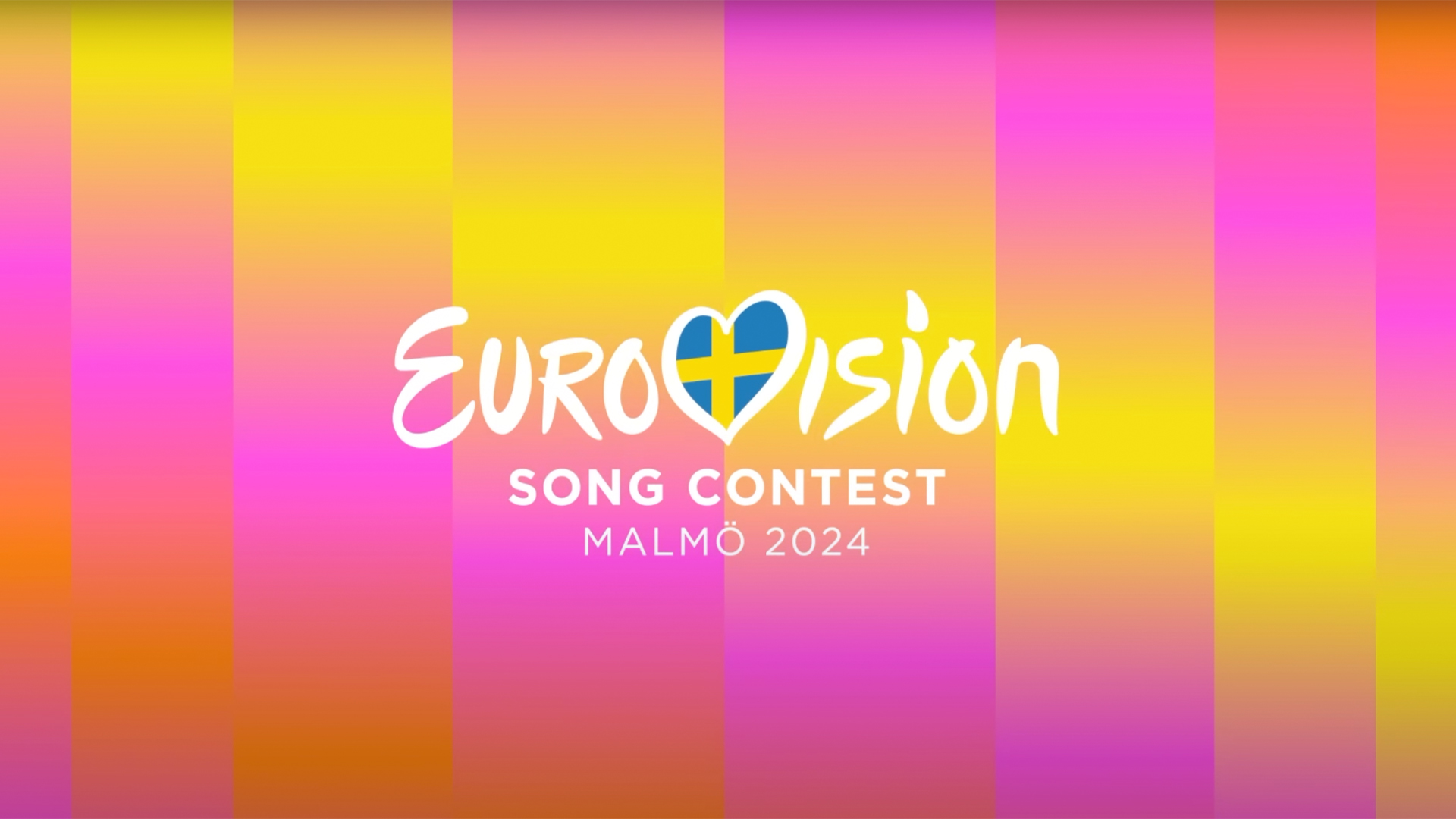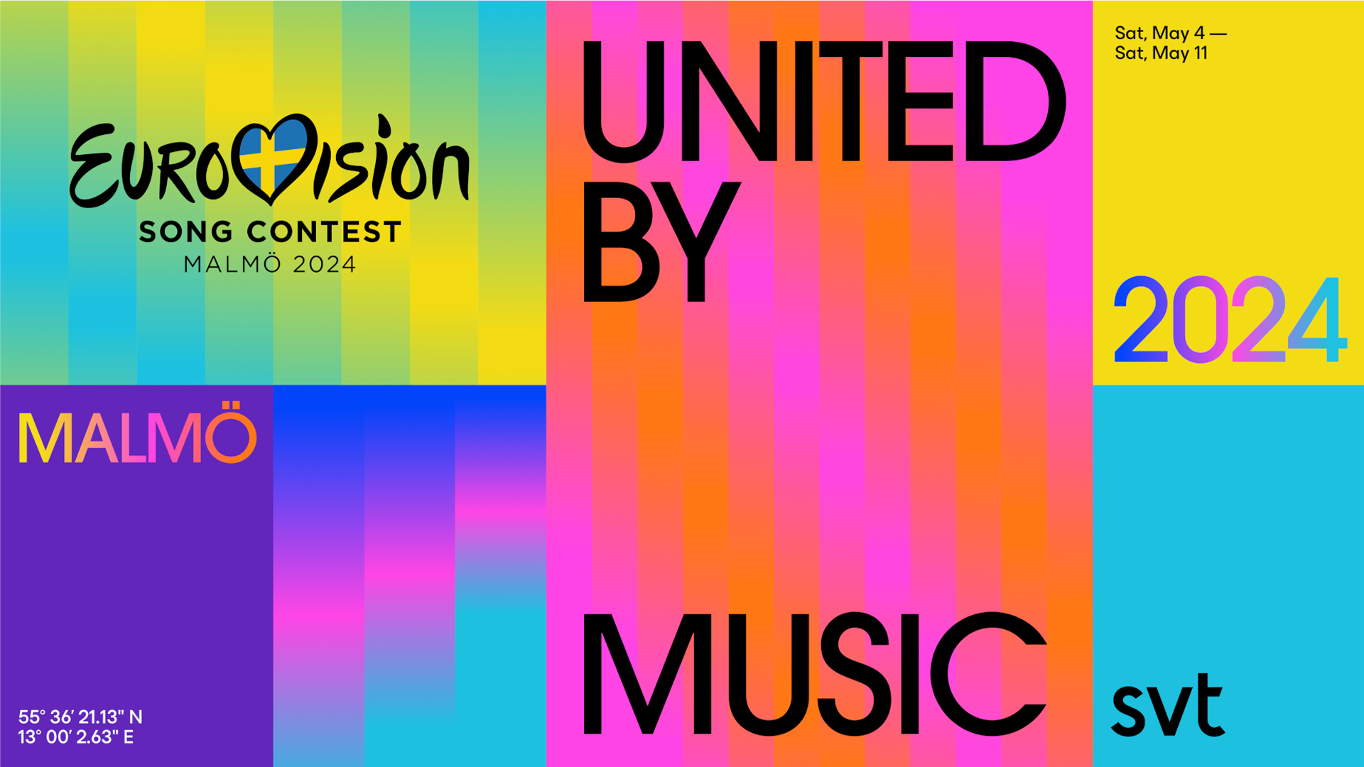
The new visual identity for the Eurovision Song Contest 2024 has been released, and this year's host country, Sweden, is going bold and beautiful. The vivid artwork, referred to as 'The Eurovision Lights', debuted earlier this week, hinting that next year's song contest will be a stylish evolution from its history of camp cheesiness.
Whether or not you're a fan of the new visual identity, one thing's for certain – it's colourful, quirky and quintessentially Eurovision. Current logo trends dictate that minimalism is hot and Sweden's Eurovision identity certainly feels cool and contemporary (albeit a little safe).

The art theme was created by design agency Bold, in collaboration with the production agency Uncut. Swedish broadcaster SVT and the European Broadcasting Union (EBU) debuted the design on the official Eurovision website, revealing a colourful blend of static and dynamic assets. The visual identity takes inspiration from the Northern Lights and sound equalisers, adopting a bright undulating gradient design that is enhanced by animated elements, creating an almost hypnotic effect with its wave-like motion.
The vertical lines running through the design create an almost pixelated effect that is both scaleable and adaptable to the requirements of the visual identity. “Our goal is to use clean, simple gradients as basic building blocks to create a Eurovision identity that is bright, modern and forward-looking,” says design director at Bold, Sidney Lim, in a press release.
50 years after ABBA's 1974 Eurovision win, it seems fitting to return to such a cultural hub of the song contest's history, however, I can't help but feel that the design is a little lacklustre. Given the anniversary of ABBA's win, it would've been refreshing to see a retro revival or '70s motifs that nod to Sweden's Eurovision history. Despite this, while the design is certainly understated, it holds a certain classy appeal that feels stylish and sophisticated – a modern yet playful reimagining of Eurovision's camp past.
For more design inspiration, check out how the 2023 Eurovision visual identity was made, or take a look at Pinterest's design predictions for 2024.


