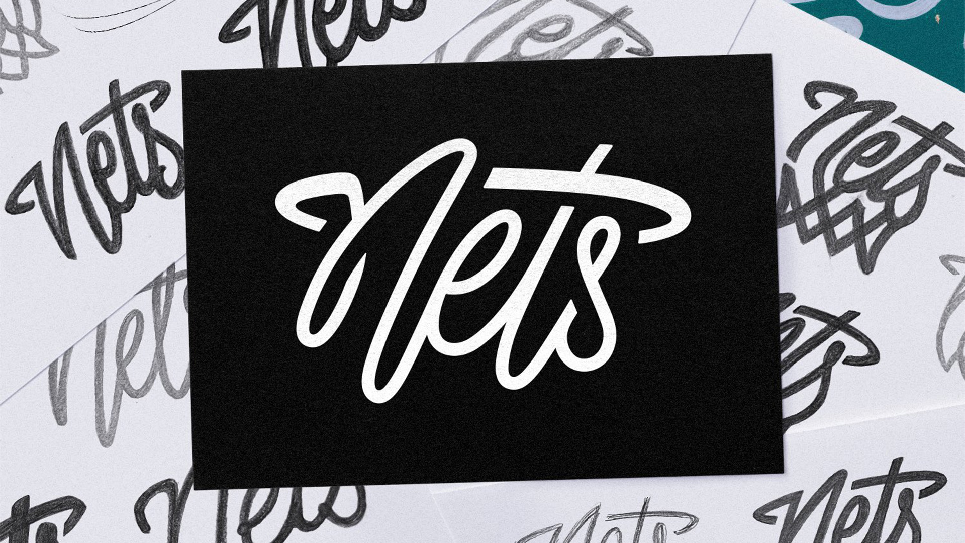
Basketball team the Brooklyn Nets have unveiled a brand new logo, and gauging by fan reactions it's safe to say it's a slam dunk. Receiving praise from supporters and design fans alike, the new secondary logo design features "nods to Brooklyn’s unique style" with a stylised cursive wordmark that's contemporary and clean.
Sports logos are more than just a design – they're an emblem of a fanbase's identity – so it's integral that a new logo wins the hearts of supporters. With its crafty hidden design and stripped-back look, the new Nets logo is a stylish expansion of the team's already iconic identity.