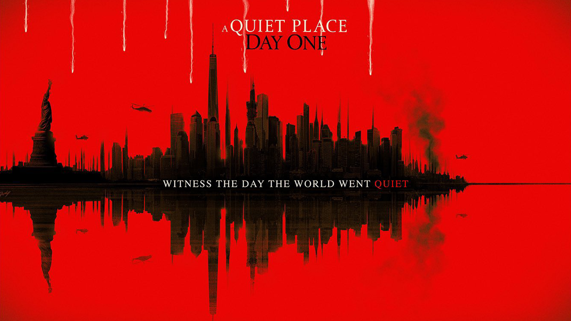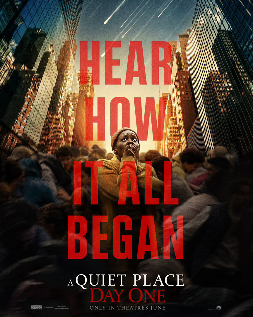
The early promotional posters for A Quiet Place: Day One were a little underwhelming, to say the least, so when the new poster dropped I was naturally a little sceptical. In a triumphant redemption, the latest poster is a stunning return to form, combining clever visuals with sleek design, and it seems fans (myself included) can't get enough.
The best film posters are often bold and graphic, giving the audience a taste of what's to come without being too revealing. The latest Quiet Place poster is no different, embodying classic design and reinstating the faith of the franchise's fans with subtlety and style.
New poster for ‘A QUIET PLACE: DAY ONE’In theaters on June 28 pic.twitter.com/RsOaQqXP3PJune 1, 2024
The new poster was created by graphic designer and digital illustrator Doaly On the surface, it appears simple yet effective, depicting a cityscape against a bold red background. The gauzy watercolour effect of the design is 'reflected' in the surface of the water, creating a hazy parallel into an apocalyptic world flipped upside down. A fleet of helicopters paired with rising smoke creates a sense of foreboding, heightened by the simple black and red colour palette.
But the real ingenuity of the design emerges when you take a step back. From a distance, the reflected cityscape becomes a soundwave that falls silent. For anyone unfamiliar with the film's premise (although the name is pretty telling), A Quiet Place is all about staying silent for your survival in a world plagued by bloodthirsty alien invaders. The poster is an ingenious nod to the film's cutthroat tension, expertly building subtle anticipation and intrigue.

The poster rightfully received high praise online, with one X user commenting "Including the cityscape into the sound waves is a great design," another added, "Design team absolutely cooked with this one." It's even attracted some potential new fans, with one user commenting "I haven't seen any of the Quiet Place movies, but this poster makes me want to watch them."
For more from the franchise, check out these alternative Quiet Place: Day One posters that expertly nail subtle creepy design. If you're after more design inspiration, take a look at the best horror film posters of all time and see if you agree with our top picks.


