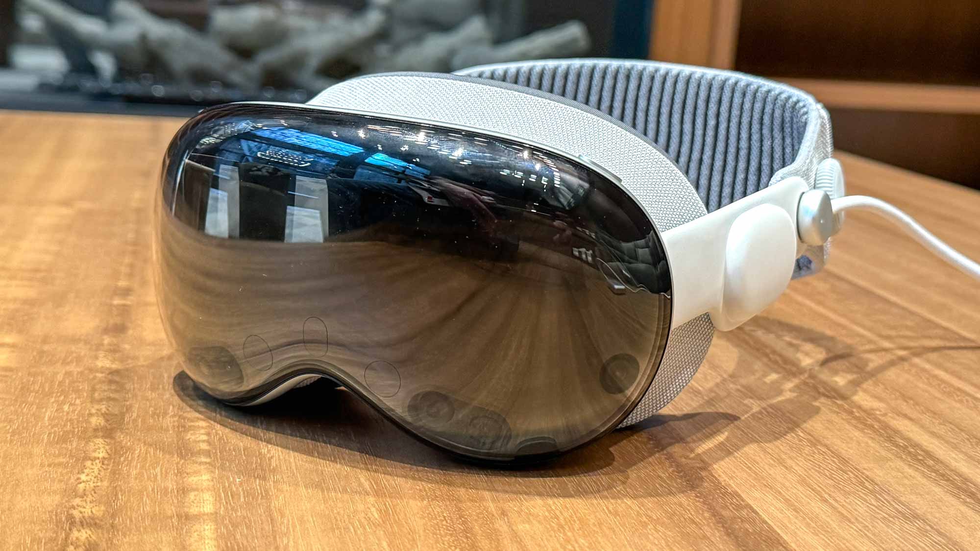
Apple Vision Pro entered the market in January 2024 on a wave of hype almost unmatched in consumer technology. Tom's Guide's global Editor in Chief Mark Spoonauer called it a "revolution in progress" when he reviewed it earlier this year. General consensus has settled on Vision Pro being a watermark device in computing but, thanks to a price tag that'll give you vertigo, a product largely for enthusiasts and early adopters.
Those of us based outside the U.S. have had to wait even longer to try out the device. Apple only launched the device in the likes of Canada, France, Germany and my native U.K. a little over three months ago. Meaning we've had to sit on the sidelines and wait patiently for the "spatial computer" to make it to our shores.
Now it's here (with a British price of £3,499 to match), I can add my voice to the chorus of those who have taken it for a spin. My feedback will probably be similar to that which you've heard from US-based reviewers and journalists who have lived with the device for some time. That is to say; it's incredible — but it's also a sign of things to come more than a must-have device right now.
To caveat this properly: I was given a demo of Vision Pro at Apple's London HQ and got a maximum of around 30-45 minutes with the device. I only got to test three apps: Safari, Photos and Apple TV. That's not enough time to properly assess a product, but it's enough to form some early impressions. So, if you'll indulge me, I'd like to give you my two cents (without repeating what others have already said) on what I think is a fascinating device — and what it means for all of us.
3 things I liked
Attention to detail
Apple's attention to detail is pretty well established at this point, but the small touches in visionOS still made an impact on me. Probably because they were literally right in front of my eyes.
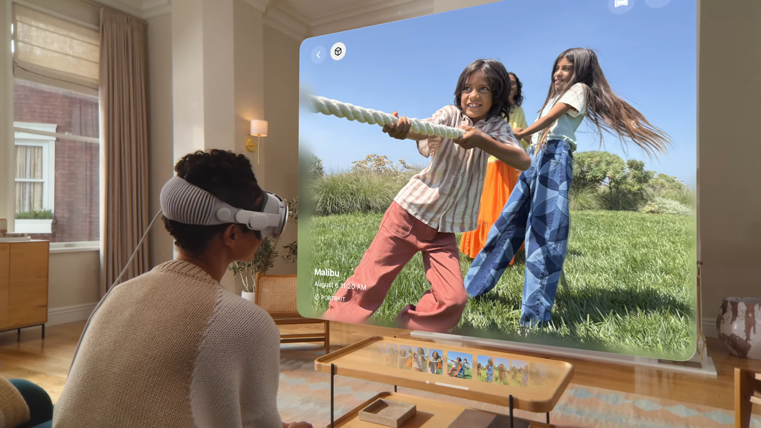
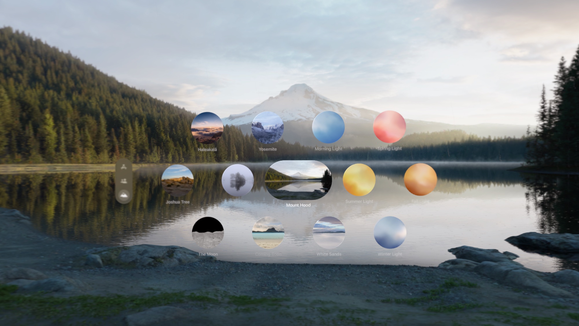
It's simple stuff, but the transitions when swiping through photos in the Photos app were seamlessly animated without a hint of stutter. In another example, I called up a YouTube video in Safari and watched it while using the Bora Bora beachside Environment feature. This envelops you in panoramic scenery if you're more interested in VR than AR and I was amazed to see the shifting light patterns of the floating YouTube video reflected in the virtual sands on the beach.
Upping everyone else's game
The reason for my visit to Apple to try the Vision Pro in the first place was to take a look at Submerged — the first piece of scripted content developed and shot especially for the headset. My colleague Mark also got a chance to watch the short film and wrote about it here.
While I was amazed at the immersive nature of watching a piece of content like this, I couldn't help but pay attention to things other than the story. The set design, the costumes, the acting itself — all of which is heightened when you're using Apple's headset to watch content as if you're there. Just like HD and then 4K gave talented filmmakers a whole new canvas to work with (we'll not talk about 3D TV here), this does the same. And it will force those who want to be taken seriously by Vision Pro wearers to up their game by providing the best possible experience.
That same sentiment goes for app developers and game makers, too. Any time a potentially new platform is given a boost by such a high calibre product, the cream rises to the top.
The interface is more intuitive than I expected
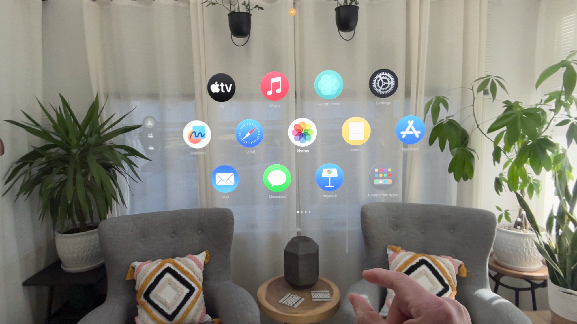
It must be strange to look at from the outside; someone pinching their fingers and moving their hands apart in mid-air. But that's how you operate Vision Pro in conjunction with the eye-tracking software that acts as a cursor. Within ten minutes, I had come to terms with how to use it — and you don't even need to lift your hands to do it.
I'm left-handed, and deliberately tried to use both hands to catch the system out or try and see where the limits were. And, providing you're looking at the exact bit you want to interact with, it just worked flawlessly. As I said at the beginning, this was a controlled environment, but even so I was pleasantly surprised with just how easy it was to interact with the device.
Finally, anyone who regularly uses the AirPods Max or any of the best Apple Watches will appreciate the Digital Crown on the device. If you want to shift your view or re-center a window, a quick long press on the Digital Crown button will do so.
1 thing I didn't
It's too heavy
I promised I would try to avoid what others had written about Vision Pro, but this one's unavoidable — there's no getting away from the weight of the device. Apple has done all it can to make the headset comfortable and, in the flesh, it's more compact than it appears in pictures. But there's no getting away that it's still too heavy. We're talking about the weight equivalent of wearing a 12.9-inch iPad Pro on your face. The 1.3- to 1.4-pound bulk is heavier heavier than the Meta Quest 3, and I could really feel the effect after 30 minutes.
I'm blown away by the amount of tech packed inside the Vision Pro, but I'm convinced Apple is in this for the long haul and, just as with other products in the company's stable, Vision Pro will be improved and iterated on long into the future.
