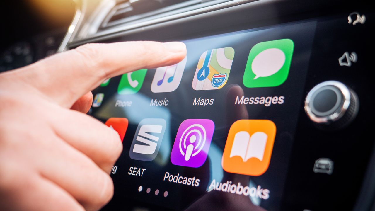
So I recently discovered something shocking about Google Maps on iPhone. While the app itself is more or less the same as the Android version, the same is not true for Google Maps on CarPlay. In fact, the whole experience couldn't be more different from what I've always assumed it would be like.
I'm primarily an Android user, and I only really use iPhones for work reasons and don't even have a SIM set up. So when I jump into my car, I've always got my Pixel 10 Pro plugged in with Android Auto up on the main infotainment screen. So imagine my shock when I finally opened up Google Maps on CarPlay and saw just how different it was from the Android version.
Foolishly, having used Google Maps on both Android and iPhone as a solo app, I assumed Google would offer a similar level of consistency in the car. But that's far from the case.
It's like travelling back in time
A brief look at Google Maps on Android Auto and you have all the makings of a modern navigation app. To borrow a phrase from Apple, it just works, and it's rather hard to describe the experience in any other way. You have a recreation of the standard Google Maps interface, albeit squashed into whatever-sized screen your car offers, alongside various features that operate as pop-ups on the main navigation screen.
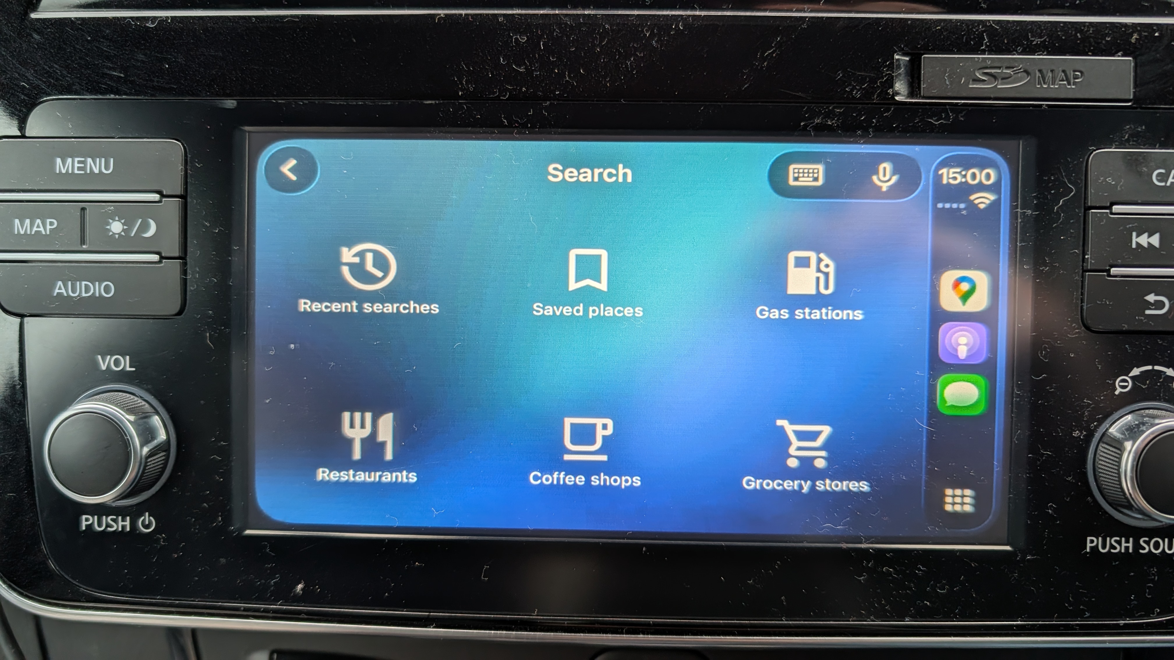
Destination search, recent search history, a compass, incident reporting, zoom, quick settings — they're all usable and accounted for without covering up the entire map.
You can even use the touchscreen to move around the map, with the same gestures that are usable on your phone screen. The touch controls have been a little janky for me, but I've always assumed that's because my car is now 7 years old and never had a particularly good touchscreen to begin with.
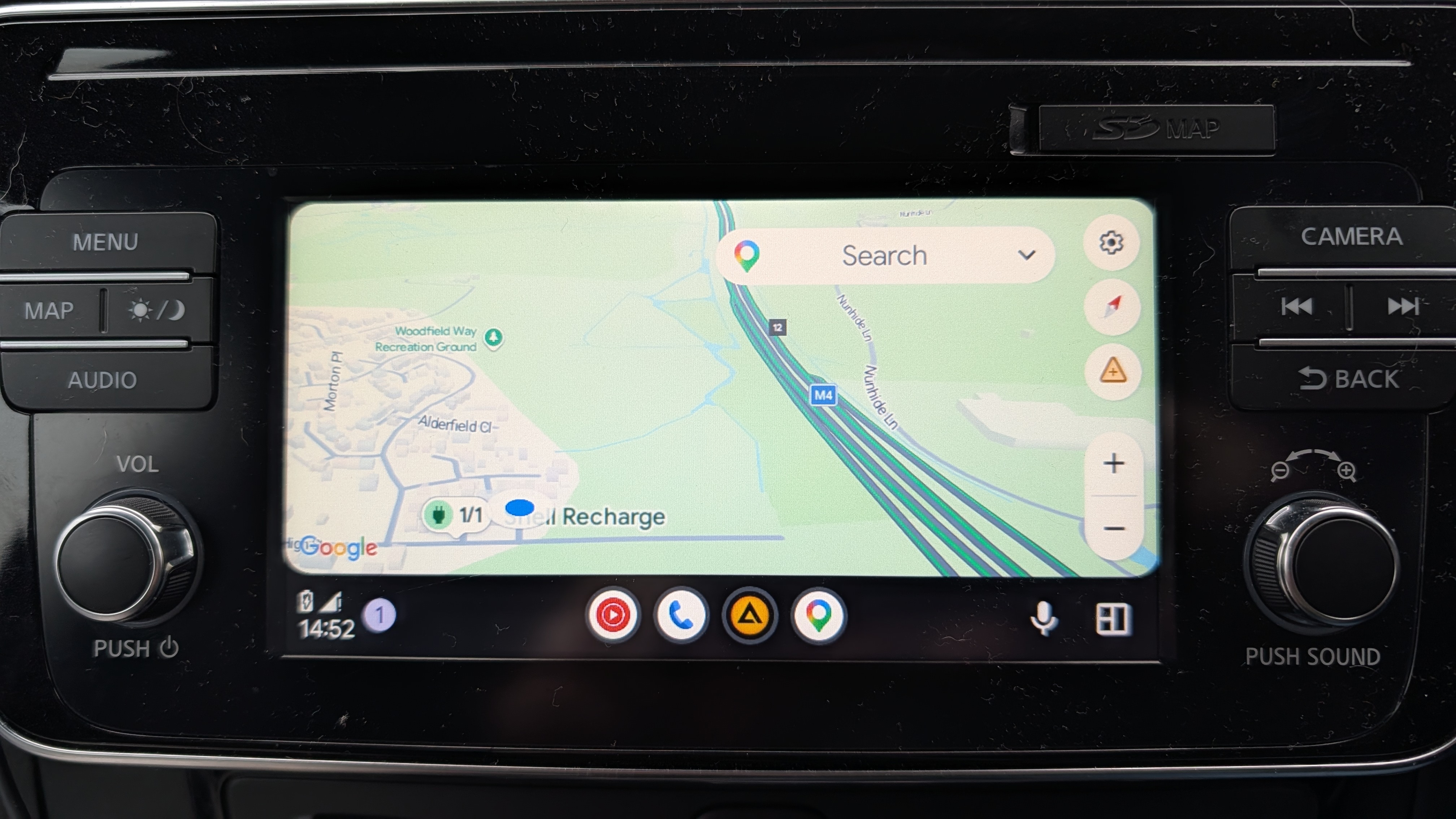
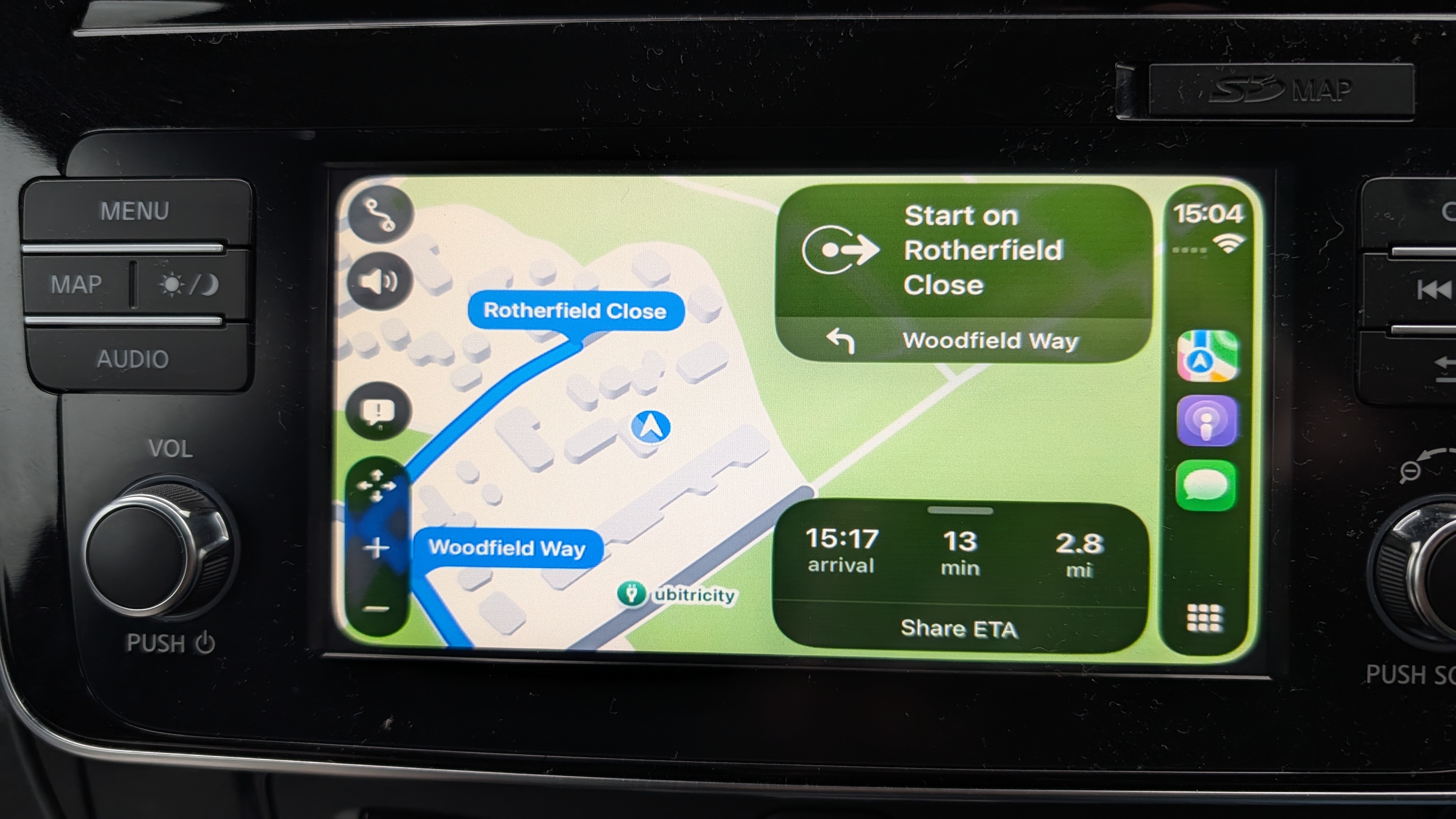
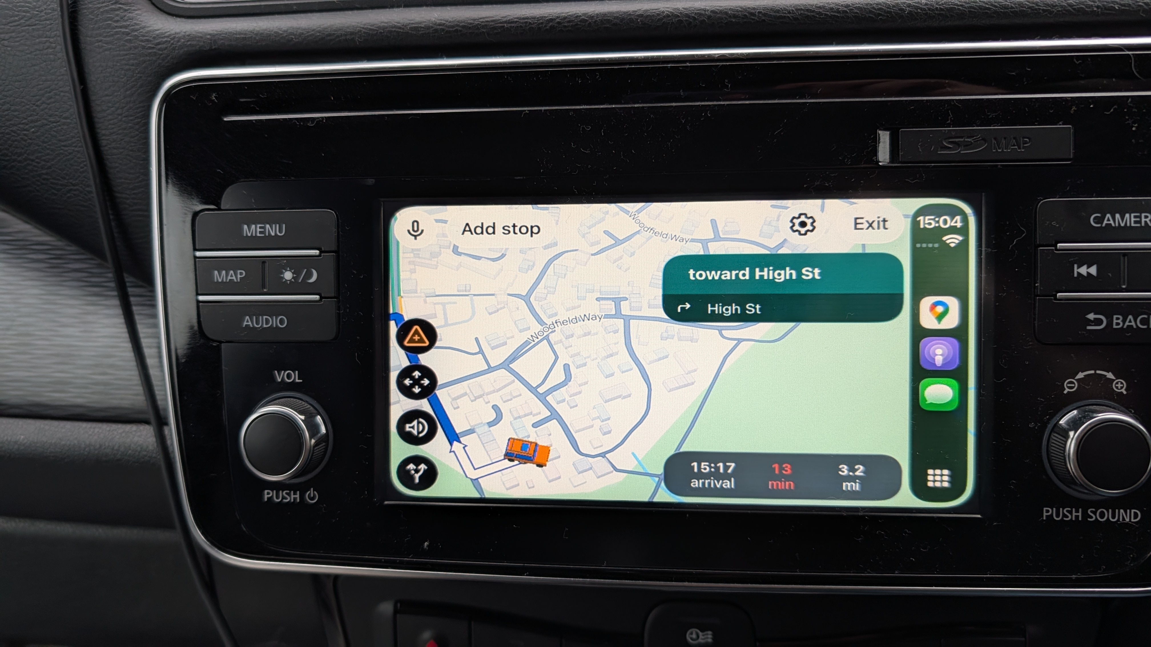
Jumping over to CarPlay is almost like going back in time. The different features and menus cover up the entire screen, and the only movement around the map you can make is with a set of arrow keys. These are all fairly small details on their own, but combined Google Maps on CarPlay looks dated and old-fashioned.
It took me a few minutes to realize that the look of Google Maps on CarPlay looks a lot like Apple Maps with a Google skin. Which shouldn't be the case.
It took me a few minutes to realize that the look of Google Maps on CarPlay looks a lot like Apple Maps with a Google skin. Which shouldn't be the case.
I will not make bold claims about how much more fully-featured Google Maps is on Android Auto. I've checked as best as I can, and the only thing I can see that Android Auto Google Maps has compared to CarPlay is the option to toggle on 3D buildings in the car. Or at least, that's the case in my region, and I can honestly say I don't think iPhone users are missing out on much there.
Still, I couldn't get over the fact that CarPlay Google Maps looks so dated compared to Android Auto. Considering how many people actually own iPhones, you'd think Google would be doing everything it could to try and compete with Apple Maps — which has a lot more system-level support as a result of it being an Apple app.
Google may not be able to integrate with Siri, but there must be something it can do, right? Well, at least part of the problem might be with Apple itself.
Apple has rules for CarPlay navigation apps
Considering Apple is known for implementing a bunch of rules app developers have to follow, I decided to check out the CarPlay developer's guide to see what was going on. It turns out, there are a lot of rules on what you can and can't do with a navigation app if you want it to be compatible with Apple's in-car software.
For starters, there's a rule that prevents developers from drawing "windows, alerts, panels, overlays, or user interface elements in the base view." Base view is the area with the actual map portion of the app. Naturally, Apple has limits on the number of buttons and icons that can appear on Base View, too, and it all may well preclude Google from using its overlay menus as it does on Android Auto.
It doesn't completely get Google off the hook for offering crappy menus, but it does explain why CarPlay doesn't offer the 1-to-1 Google Maps experience you'd find on Android Auto. And this explains why Waze follows a lot of the same rules, even if its unique art style helps it stand out more.
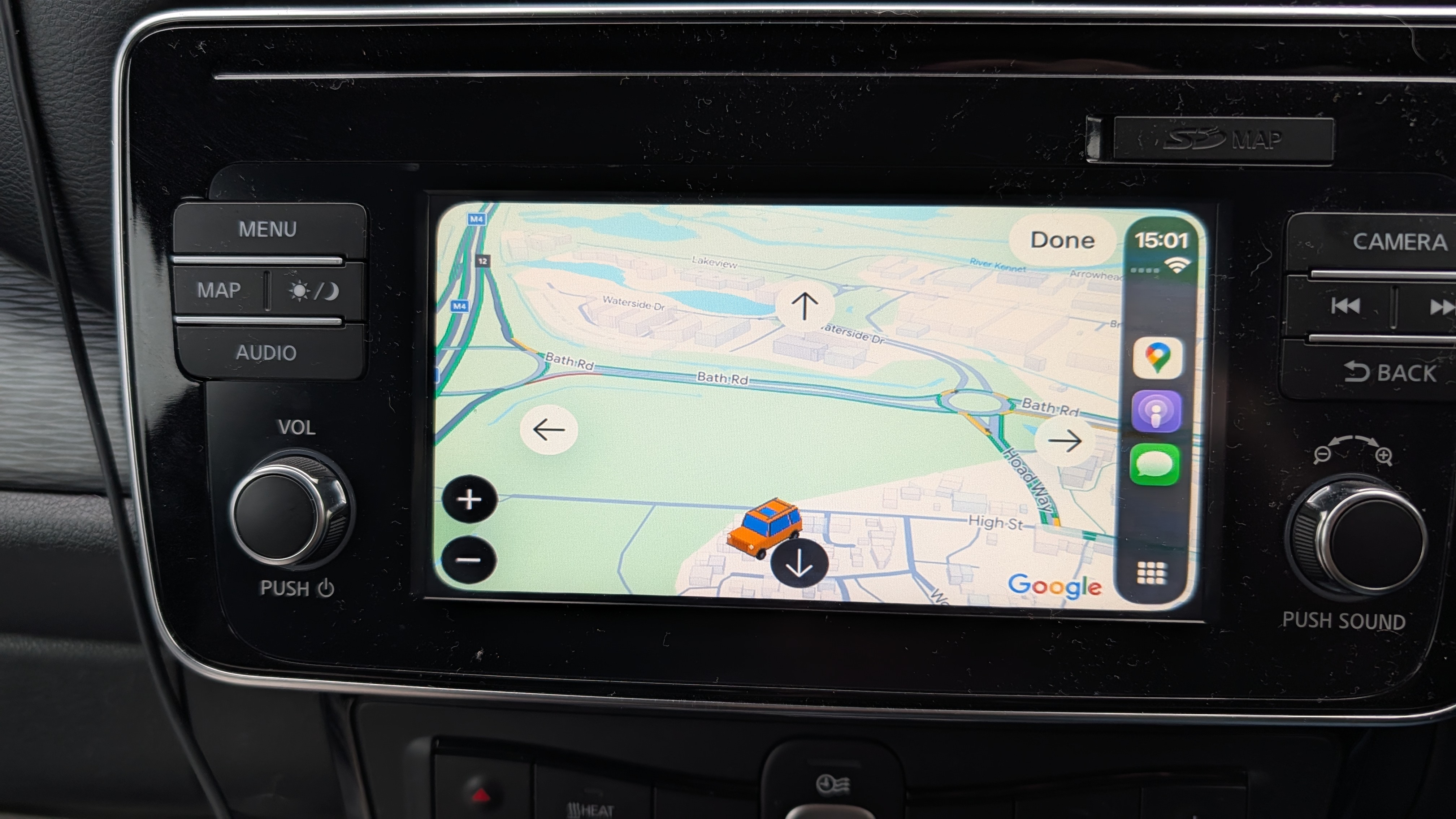
Apple also mandates the use of "panning mode" buttons because "drag gestures are not available in all vehicles." That was actually one of the things I was most confused about, and while I see some of the logic, I still can't understand why my car didn't let me move the map around with touch controls, because they're not prohibited. I guess I just have the wrong kind of screen. Thanks again, Nissan.
I'm not saying rules are bad. Driving is inherently dangerous, and Apple has a responsibility to ensure apps on its platform are safe and easy to use while you're driving. You can't plaster the map view with a bunch of windows and ads that will only serve to confuse the driver, and potentially cause problems.
The fact that Apple has rules in place to ensure a navigation app's voice prompts "work concurrently with the vehicle’s audio system" and " must provide turn-by-turn directions with upcoming maneuvers" makes me wonder what kind of nonsense app developers have tried to pull in the past. Because those are pretty basic and important features to have.
Plus, I'm sure there are plenty of ways Google Maps could work within the rules without making itself look like a terrible Apple Maps clone.
Bottom line
When your rules seemingly force all the competition to look more-or-less identical to your own app, I feel like you should take a step back and try to come up with a better system that allows for a bit more creative freedom. Then again, this is Apple we're talking about, so the odds of that happening are slim.
Google can definitely do a little bit more to make its CarPlay app look a little bit less, well, awful. I know my car's screen doesn't help, because it makes CarPlay look a little more blown-up and pixelated than it needs to be, but it doesn't change the fact that Google Maps just looks kinda bad. And if your app looks bad, why would people want to use it over the (arguably) more capable Apple Maps?
When people are declaring that an app is better on Android Auto, a platform with an awful lot of haters as it is, then you're definitely doing something wrong.

Follow Tom's Guide on Google News and add us as a preferred source to get our up-to-date news, analysis, and reviews in your feeds.