As Editor-in-Chief of Ideal Home, I've written countless articles about using colour, constantly encouraging homeowners to be braver, and embrace colour. And a downstairs loo is the perfect place to start when it comes to bold decorating choices.
There are a few things that make a cloakroom a great opportunity for a bold makeover. Size is the main factor. Usually, the downstairs loo has been cleverly squeezed in and has a tiny footprint. This means that giving it an update is not only quicker than trying to tackle other, bigger rooms but it can also be done on a budget, as you won't need a lot of materials to do it.
Our downstairs cloakroom is a tiny space, with no natural light. When it came to injecting personality and transforming the space, colour was the obvious answer. So when we finally decided to revamp the room recently, I wanted to follow my own advice, push the boat out and paint the downstairs loo a bright colour.
Colour-drenched downstairs loo makeover
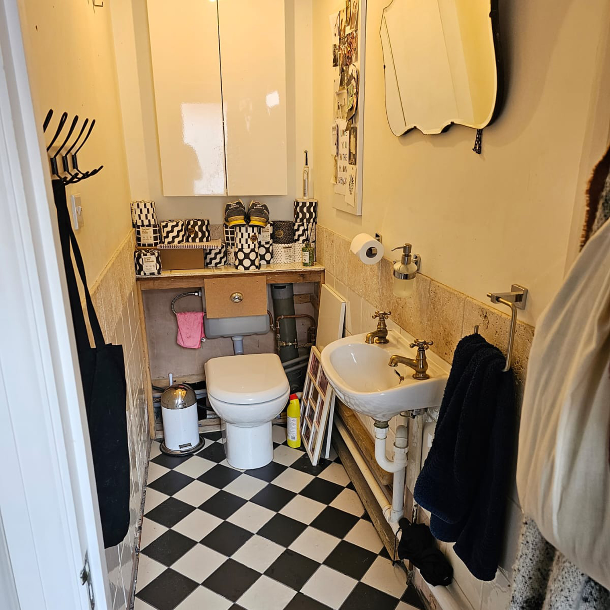
Before

Our drab downstairs loo used to be a total dumping ground. We have a small hallway, so it was used it as a coat cupboard. You had to push your way past walls hung full of jackets to get to the toilet, fishing behind them to try to find the light switch. There's no natural light in the room so it was always dull and dark, and the faux-stone wall tiles felt dated and drab.
The room was left in an even worse state after major building work on our kitchen last year. The downstairs loo did benefit from new floor tiles during the renovation, which were laid in the hallway and loo after installing underfloor heating throughout the ground floor. But in order to access the pipework, the plumbers had to rip off the boxing out behind the toilet. With no budget (or energy) to tackle making it good, it stayed as it was until it finally made its way to the top of our DIY list a couple of months ago.
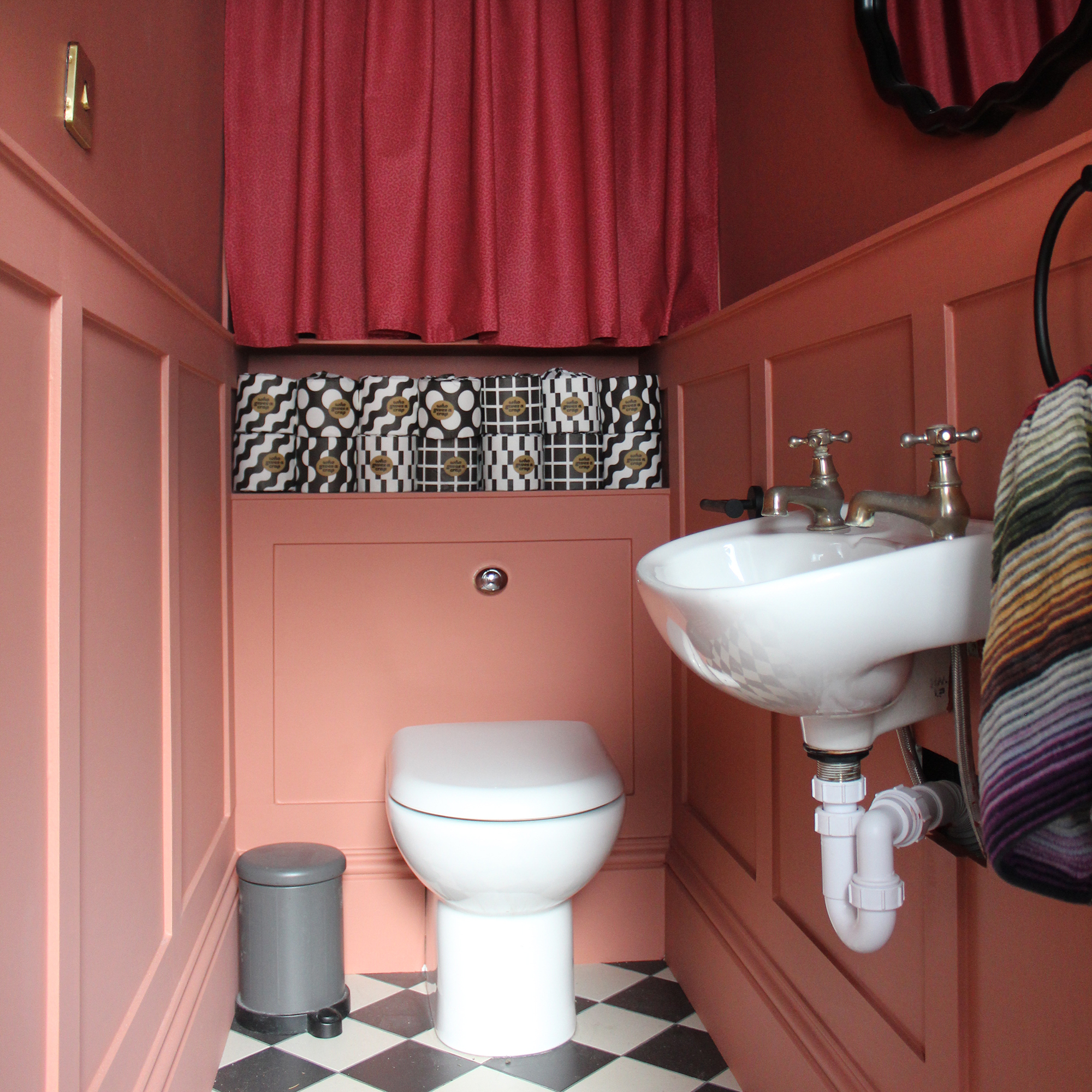
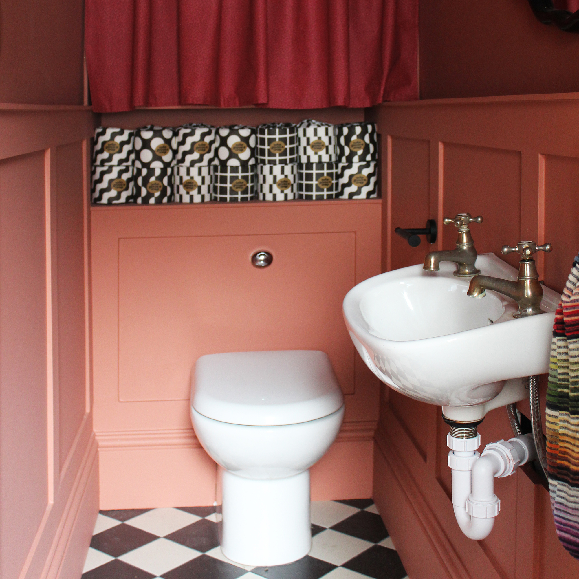
After

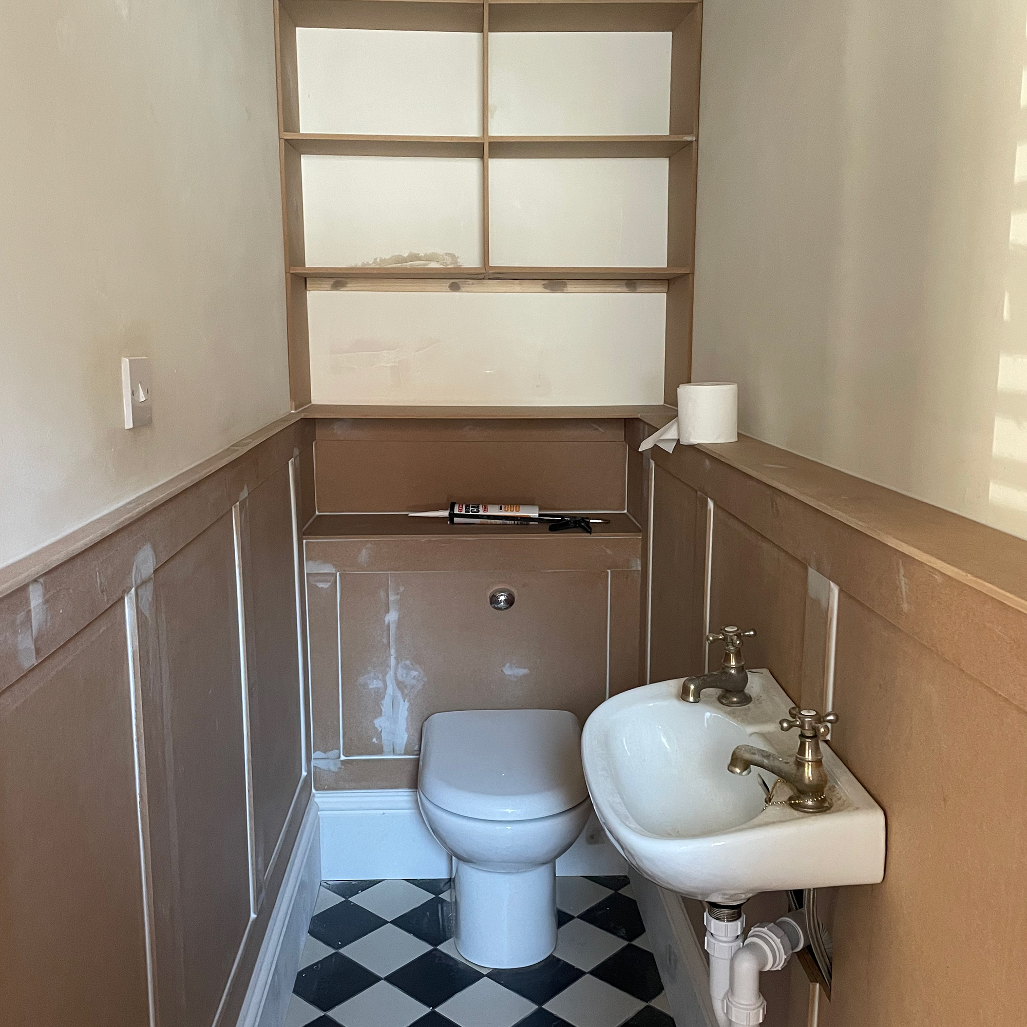
With our kitchen transformation having eaten up almost every penny from our renovation budget, we wanted to give the downstairs loo a smart update without spending much cash so an easy DIY project was on the cards. We're pretty handy DIYers, and inspired by some of the brilliant wall panelling ideas I've been seeing everywhere, we decided to knock up our own using budget-friendly MDF.
We went for half-height panelling on the walls, and boxed in the pipework on one wall to create a shallow ledge above the basin which is handy for hand wash or a scented candle.

Seduced by all the on-trend red shades I’ve been seeing everywhere, I decided that this was my perfect opportunity to have a go at colour drenching and paint the walls, woodwork and ceiling all in the same dramatic colour. So far so good, but I was so impatient that I didn’t take my time when choosing the bathroom colour properly. It wasn’t until the room had had its first coat that I realised I made an error, and the red wasn’t quite what I’d had in my mind.
With time at a premium, I really wasn’t thrilled with the idea of having to start over, so it was extremely tempting to crack on with the paint I’d already chosen, but it wasn’t just that I didn’t love the colour, it actually set me on edge and the shade made me anxious. I want it to be a space that I feel happy in, so I knew that I would have to suck it up and repaint.
I took my time trying out some other testers and ended up switching from intense red to a much softer earthy shade of terracotta (Red Earth from Farrow & Ball) that I am head over heels in love with. It feels friendly and cocooning, rather than triggering the fight-or-flight response I had to the previous hue.

To maximise as much bathroom storage as possible, built-in shelves line the back wall. I decided to screen off the shelves using curtains rather than cupboard doors because I thought the fabric would soften the scheme, and also provide an opportunity to introduce more colour and pattern.
I bought the curtain fabric online, and made the curtains myself to save money. They hide all the clutter that's stored on the shelves (clutter is one of those bathroom mistakes making your room feel smaller) – everything from old batteries waiting to get recycled, to spare toiletries and cleaning products.
To finish the room, I treated myself to a new wall mirror (the Wiggle mirror from John Lewis) and a smart new bathroom light idea. In total the wood and paint cost us under £300, and the final scheme gives me a happy hit every time I go into the room.


