Change is hard – and for font nerds, it can be downright painful. They really feel the difference between Arial and Helvetica, and they know that Comic Sans is an embarrassment, and that Papyrus might be pure evil.
I'm not necessarily one of those people, but I don't appreciate change – especially in fonts.
Last year, Microsoft announced that it was changing its Microsoft Word default font from Calibri to a new sans-serif font known as Aptos. Calibri had a nearly 20-year run. It succeeded Times New Roman, a serif font that has served as the default font since the word processing application's inception (the dictionary defines a serif as "a slight projection finishing off a stroke of a letter in certain typefaces").
When Word launched in 1983, I'd argue that some were still writing on typewriters (most likely IBM Selectrics with those typeballs) that were probably still using the classic serif font.
Modernity, though, required the shaving of those serifs for a cleaner look – at least I assume this was Microsoft's thinking when it switched to Calibri. I never liked the font; it was dull, and not even as interesting as Helvetica, or my favorite, Helvetica Narrow (if you're interested, the font you're looking at right now is Open Sans).
I got used to it, but only because, as the default font, it was what I automatically saw and typed in every time I used Microsoft Word. Some say "familiarity breeds contempt," but in truth it just breeds familiarity. You can, by the way, easily customize Word's default font. From the Format tab, you select Font. Choose the font and font size you like, and then select Default and click OK. If your Word is still stuck on Calbri (or, god forbid, Abadi MT), you can quickly switch to the font and style that turns you on.
Even so, when I read that Microsoft was switching up the default font I was a little worried. What if Word went back to a serif style or chose something more ornate? What if, heaven forbid, Microsoft chose a font that looked like Comic Sans?

Aptos, though, is none of those things. It manages to be clean and clear, but with just a little style.
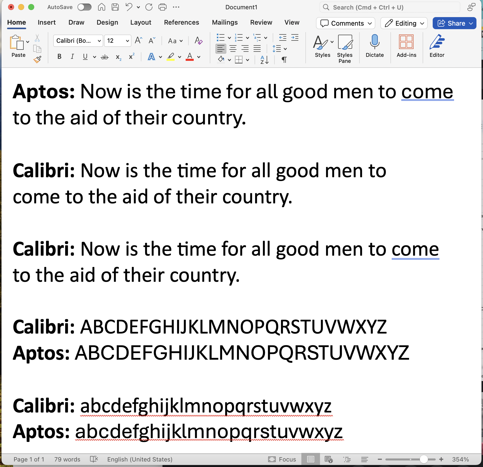
Instead of a thin, straight, vertical line for a lowercase 'L', Aptos's l takes a tiny curve just before the stem reaches the baseline. Letters like 'z' are a little wider. The ear of the 'g' – that small stroke that projects from the top of the letter – starts thin and gets a bit thicker while also gently arching up. 'S' curves in on itself more, and the lowercase 'o' is just a bit more open.
Put simply, Aptos is a beautiful font that instantly elevates the default typing experience in Microsoft Word. Unsurprisingly, though, not everyone is thrilled with this 'upstart' font.
So long, Calibri. Can't say "we hardly knew ya" after 17 years, but I'm not cool with this new #Aptos upstart.cc @LanceUlanoff @glennf @artchung @kevinjdelaney @frerejones https://t.co/EvDpOwZwH9 pic.twitter.com/5ZW49e71uCMarch 11, 2024
If I have one criticism of the new font it's that its more open approach means each letter, word, and sentence, takes a little more space. Aptos offers 12 variations that include Light, Bold, Sem-Bold, and Black, but there's no Narrow option. I wouldn't mind seeing someone develop that.
I know; it's just a font. But the fact is that fonts matter for readability, and even for setting a mood. Comic Sans is silly, informal, and worthy of comic strips, while Times New Roman is formal, official, and good for a legal document or a bill. Papyrus is good for nothing, and should be avoided at all costs. Aptos fits the bill as an every-person, every-situation font. It brings me just a little bit of joy, and I don't miss Calibri a bit.


