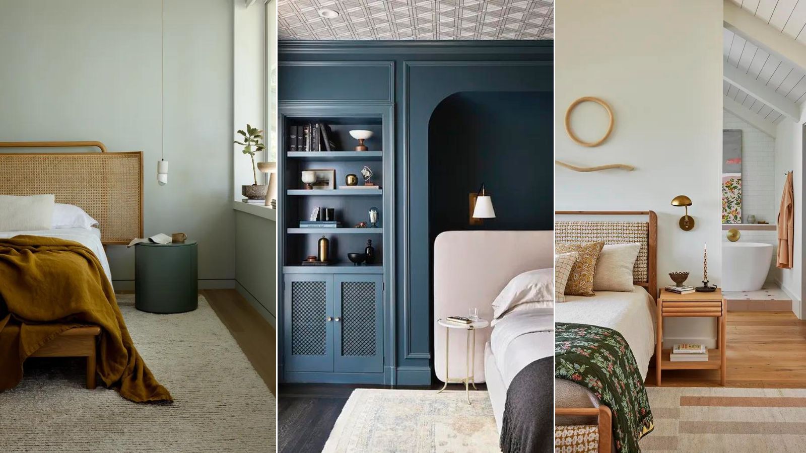
Bedrooms are meant to function as many things. A place to unwind, a place to get dressed, a place to be romantic, to read, to wake up and feel energized to get on with the day. Because of this, they often end up having a lot of things in them, to serve all those needs.
But the San Francisco-based designer Regan Baker, founder of Regan Baker Design, knows how to put the perfect peaceful-yet-personality-filled space together, and it's as much about what to leave out as what to include.
'Bedrooms need to feel personal as the first thing,' Regan told me. 'They should be calm and inviting, and pay homage to who you are. You might want furniture, but it'll need to be textural to help create a tactile environment.' As with every room, what ends up in the finished space needs to be an edit so as not to overwhelm it. Here is what Regan says you can leave out.
1. Intense colors
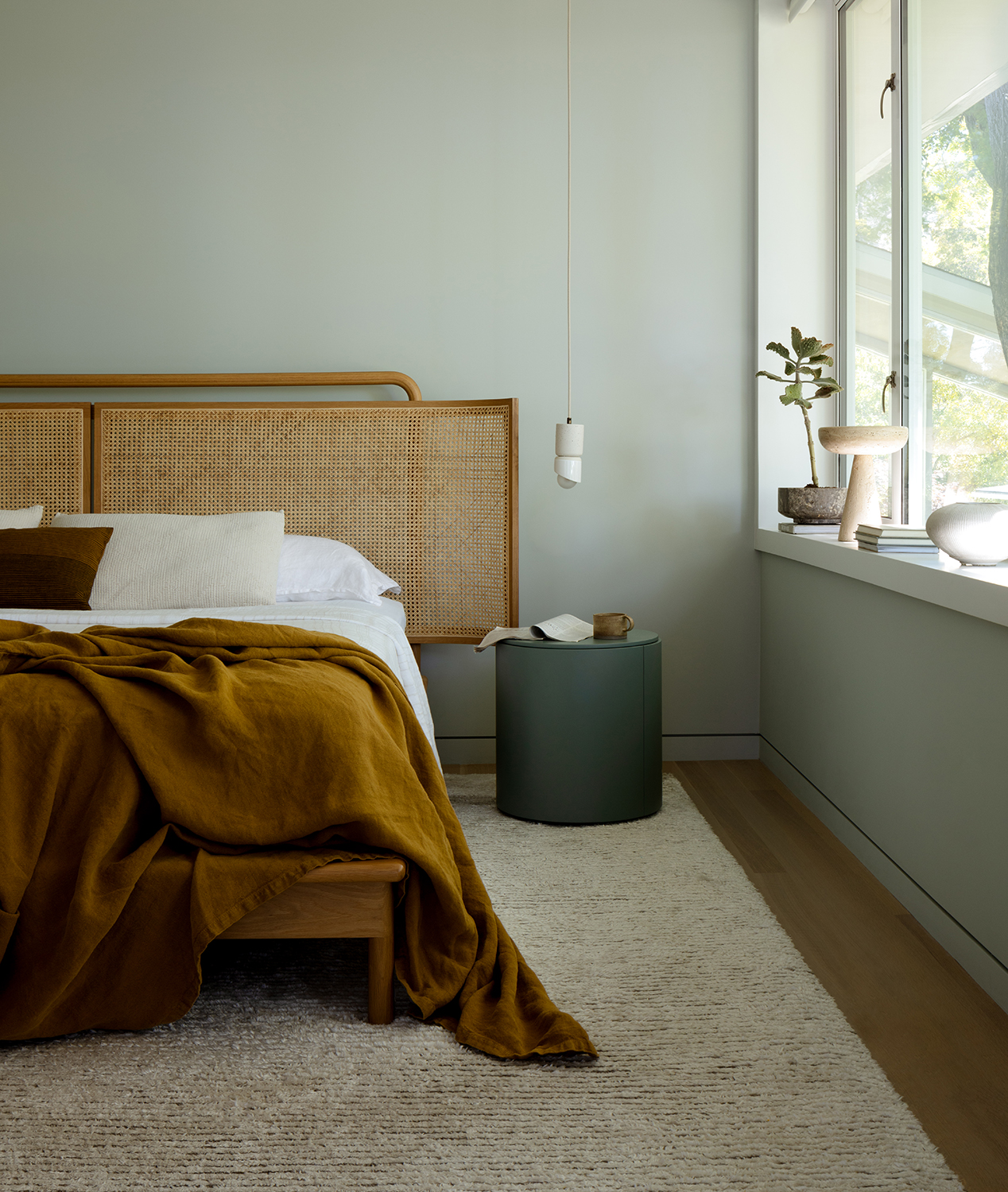
The first thing you don't need in your bedroom is bold colors. They don't help create the environment most of us want in these sanctuary-like spaces. 'I often go for blues and calming tones as bedroom colors, because bedrooms are places for respite,' Regan explains.
She thinks that fiery colors have totally the wrong effect, and have no place here. 'I would shy away from red and orange as they're too intense,' Regan adds. 'Whites are great, and my favorite color is green – I love nature and it's an easy way to bring that feeling you get when you're outdoors into the home.'
2. Seating
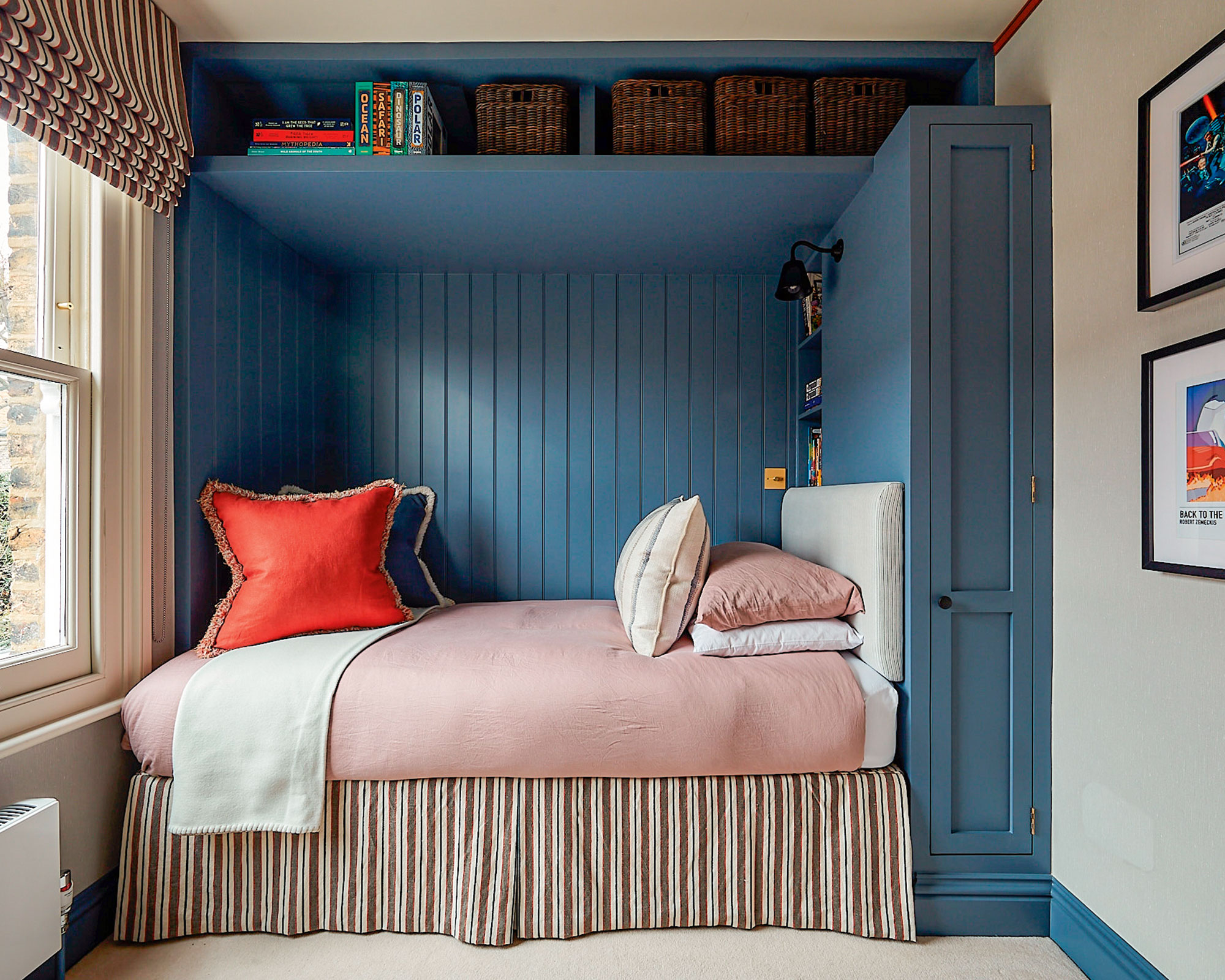
While hotel bedrooms almost always come with comfy seating, if recreating that vibe at home those chairs tend to end up as places to leave semi-clean clothes.
So Regan suggests they aren't the best use of space in a bedroom. She explains, 'Chairs and benches are nice, but if your bedroom is small then you definitely don't need them. When it's a tight space, this should be one of the very first things to go.'
3. Too much storage
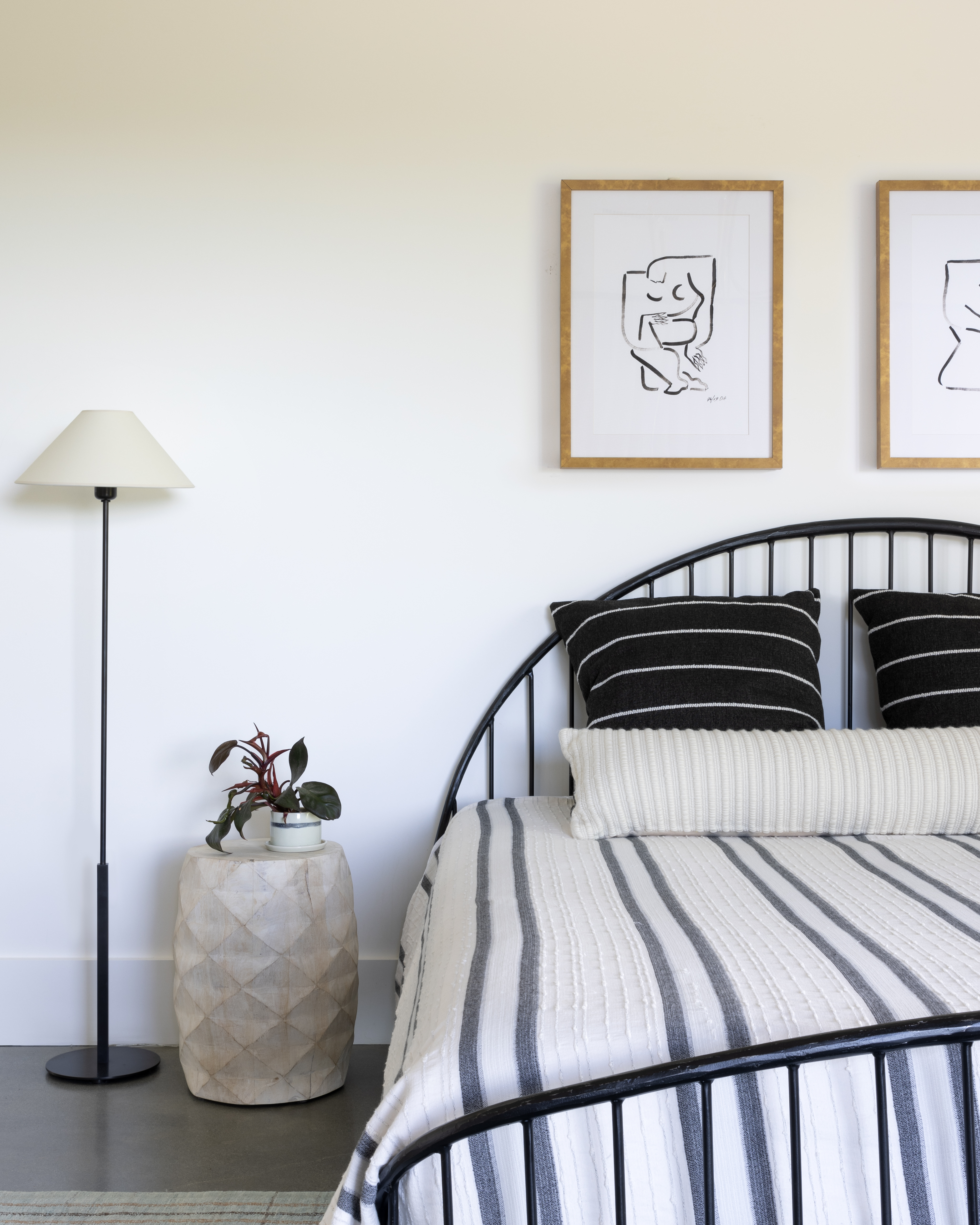
Yes, you can have too much of a good thing, and if you have too much bedroom storage, you'll only be encouraged to keep too many things in it, ruining the calming vibe. 'You really just need a place to put something on the side of the bed,' Regan says. 'A glass of water, a book if you love to read, things that are easily accessible.'
She recommended to me a nightstand with a drawer, that way you can have your essentials near by but not all on display. 'A drawer to hide away that book, your phone, and some chapstick is ideal,' Regan says.
4. A big overhead light
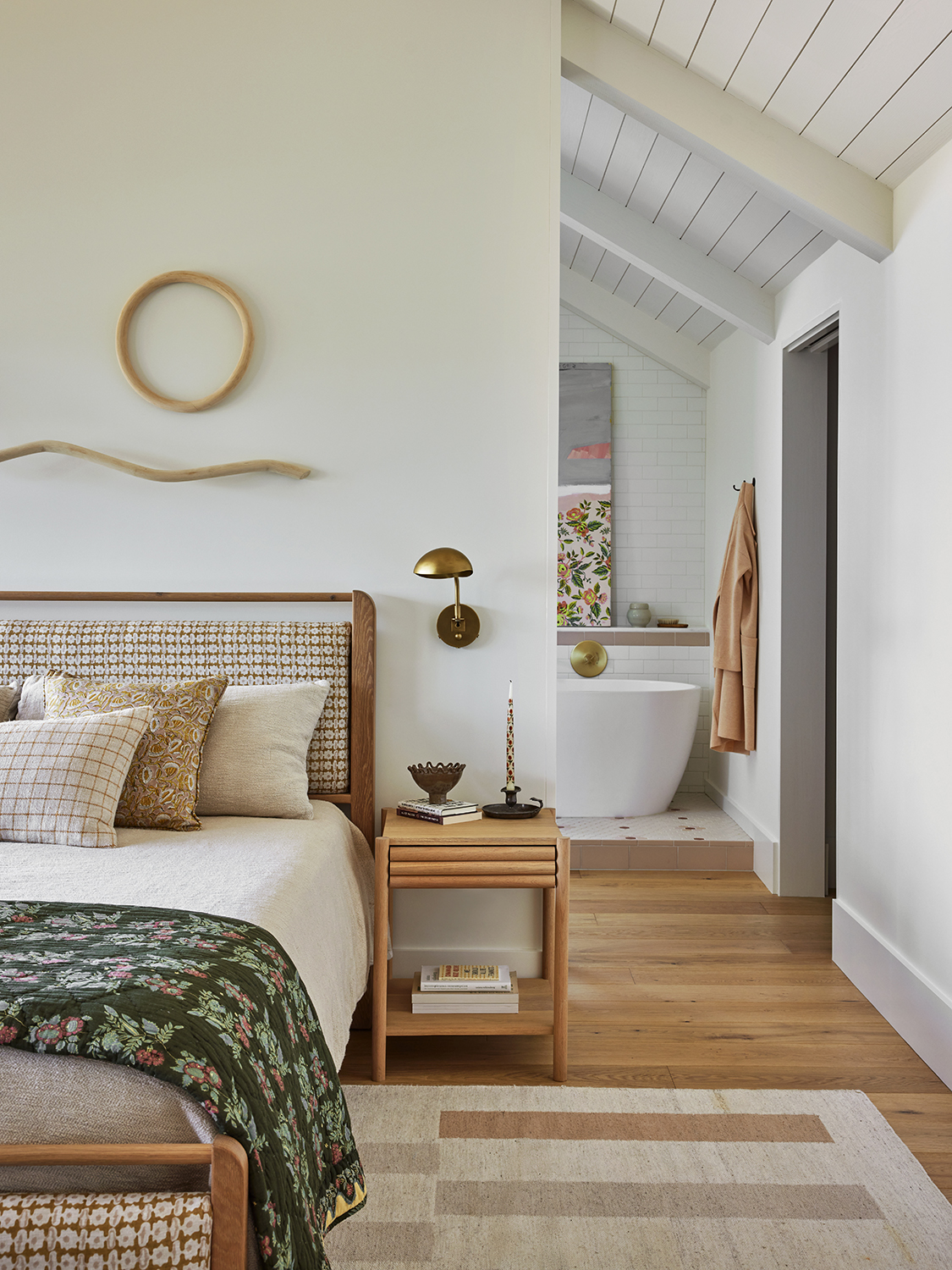
It's been a big design trend of late to claim that the big light is dead, and to rely on the softer glow of lamps instead. Nowhere is this more pertinent than in the bedroom, where gentle illumination is exactly the vibe you're going to want.
'I love wall sconces,' Regan says. 'Not only are they softer than overhead lighting but they give you extra table space on the nightstand, too. Super harsh lighting is never going to be required in a bedroom – cool lights remind me of hospitals. For bedroom lighting, you want warm and inviting. On a wall light, you can direct the shade so if you're reading while a partner is trying to sleep then everyone can be happy.'
5. Jarring contrasts
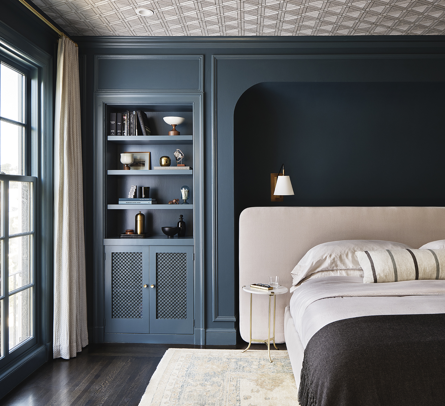
Unlike other spaces, where you might want to pick out the architectural details or built-in elements using clever color tricks, in a bedroom, you want everything to feel very cohesive and easy on the eye.
'If you’re adding built-ins to a bedroom, avoid painting them in contrasting colors to the walls and other surfaces, instead paint them the same color as the walls,' Regan says. 'There will still be a textural difference and a focal point, but it won't be loud or overbearing or cause any visual headaches.'
6. Duvet inserts
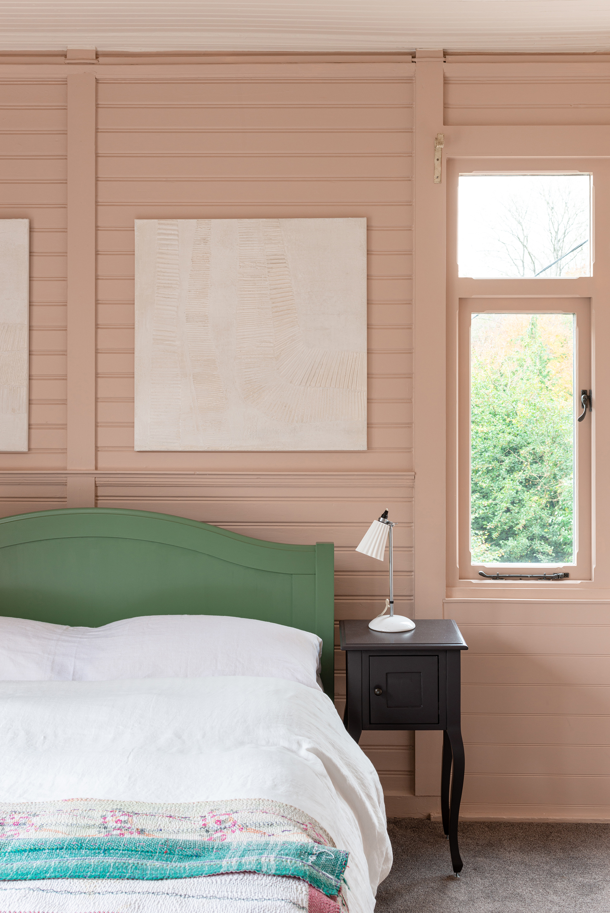
In colder climes (and don't forget that Regan works out the perma-misty San Francisco) people may be tempted to add duvery inserts to their bedding. A thick, fluffy blanket that goes inside a duvet cover, you'd think that it would be a good solution to keep you warmer at night. But actually, it's an unnecessary extra and adds bulk to your bedding setup.
'They get really hot, they're like weighted blankets, and beds look so much more tailored without them' Regan explains. She told me that many of her clients favor Brooklinen bedding instead, whose duvets are 'intelligent' enough not to need the insert to keep you warm.
7. Too many pillows
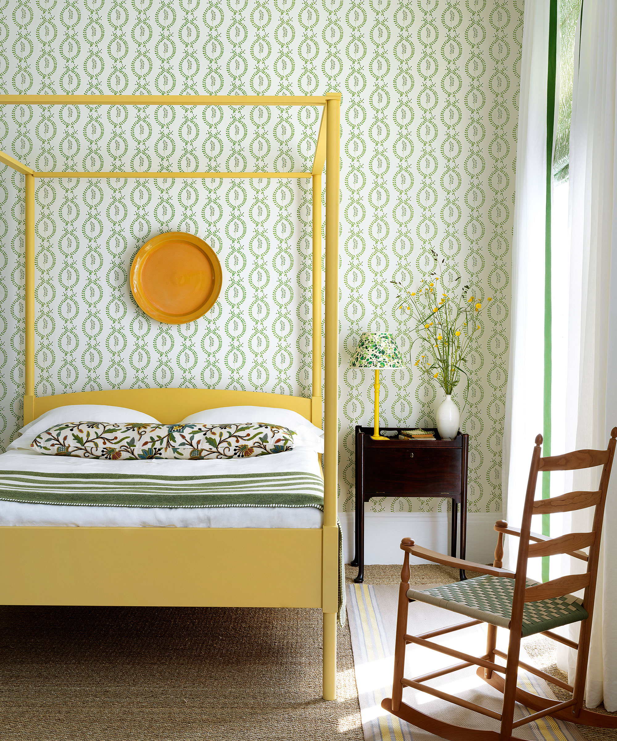
While a bed covered in pillows may look plush and inviting, Regan told me that not only do you not need all those extras in your bedroom, they can become an impractical addition if you go OTT.
'I love pillows, but if you have too many of then you have to be ok with moving stuff onto the floor,' Regan says, of a chore that gets old fast. 'Seriously, who has the time to then put them back on the bed the next morning, only to then take them off once again at night? These days I tend to have just bolsters.'
8. Hardwearing fabrics
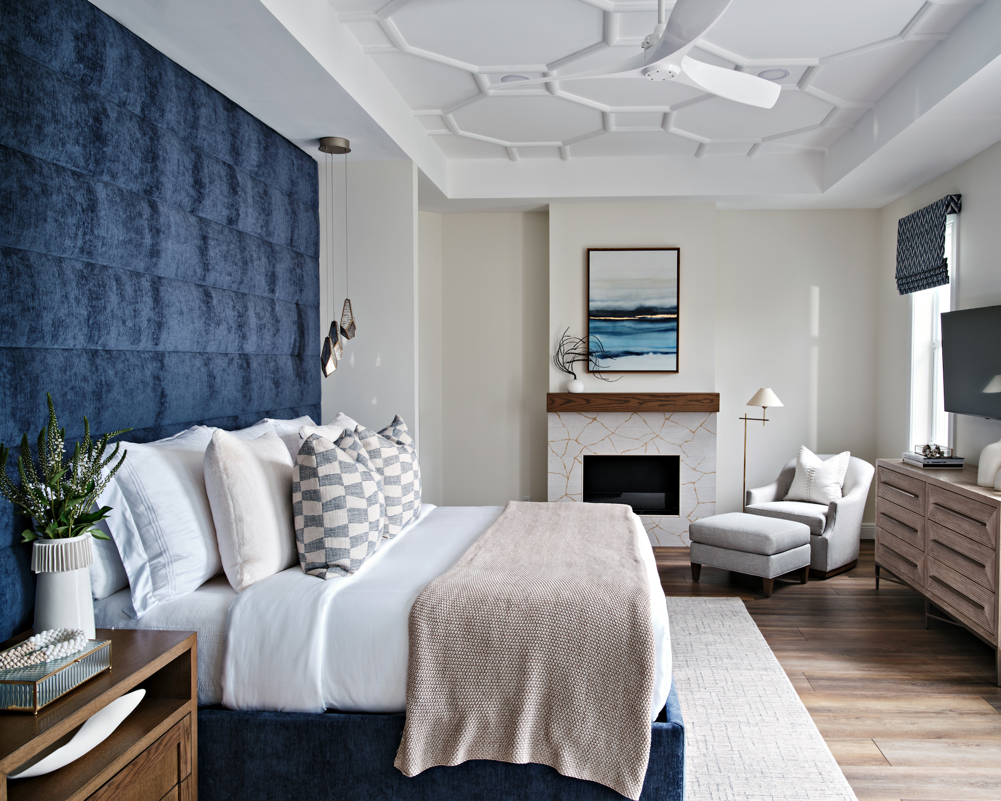
An unexpected option for something you don't need, but in a bedroom, practical and durable fabrics aren't a high priority. Whereas in a more lived in space like an entryway or living room, which is high traffic and likely to have to deal with muddy feet at times, a bedroom is low traffic, will rarely see outdoor shoes, and so the focus can be on comfort.
'Softness is key,' Regan rightly tells me. ' You can get away with sheepskins or even silk in a bedroom. It's a light traffic area, so curating layers of soft materials can work well here, in a way it wouldn't in say your living room.'
What you choose to have or not to have in your bedroom is of course personal. For me, all of Regan's tips make total sense, bedrooms should be calm, clutter-free spaces that prioritize comfort so keeping things minimalistic, with a soft color scheme and even softer lighting is always a fail-safe approach.


