Sulking Room Pink is one of Farrow & Ball’s bestselling, most popular and iconic shades. But if you’re not sure what to pair with this dusky pink shade, I’ve asked interior designers and a paint expert about what colours go with Farrow & Ball’s Sulking Room Pink – and they delivered.
Dusky and earthy pinks are replacing beige in 2026 as more people ditch ‘safe’ neutrals and embrace more colour. So I predict that Sulking Room Pink, described as a muted, powdery rose shade, is about to become even more popular than it already is. And even though certain shades pair with it especially well, Sulking Room Pink is a surprisingly versatile paint idea.
‘I love the muted character of Sulking Room Pink,’ says Francesca Leat, owner, director and head designer at Francesca Leat Interiors. ‘It has a lovely deep tone to it that complements almost every colour palette and therefore I wouldn’t rule out any particular colour. It works well in formal entertaining areas (especially where there is little natural light) for a cosy and elegant feel as well as in bedrooms for a more feminine look.’
Perfect for pink living room ideas, as well as for bedrooms, decorating with Sulking Room Pink can entail a fully colour-drenched space – but if you’re after a more complex colour scheme, these are the 3 shades that go with it the best.
1. Softer pinks or neutrals
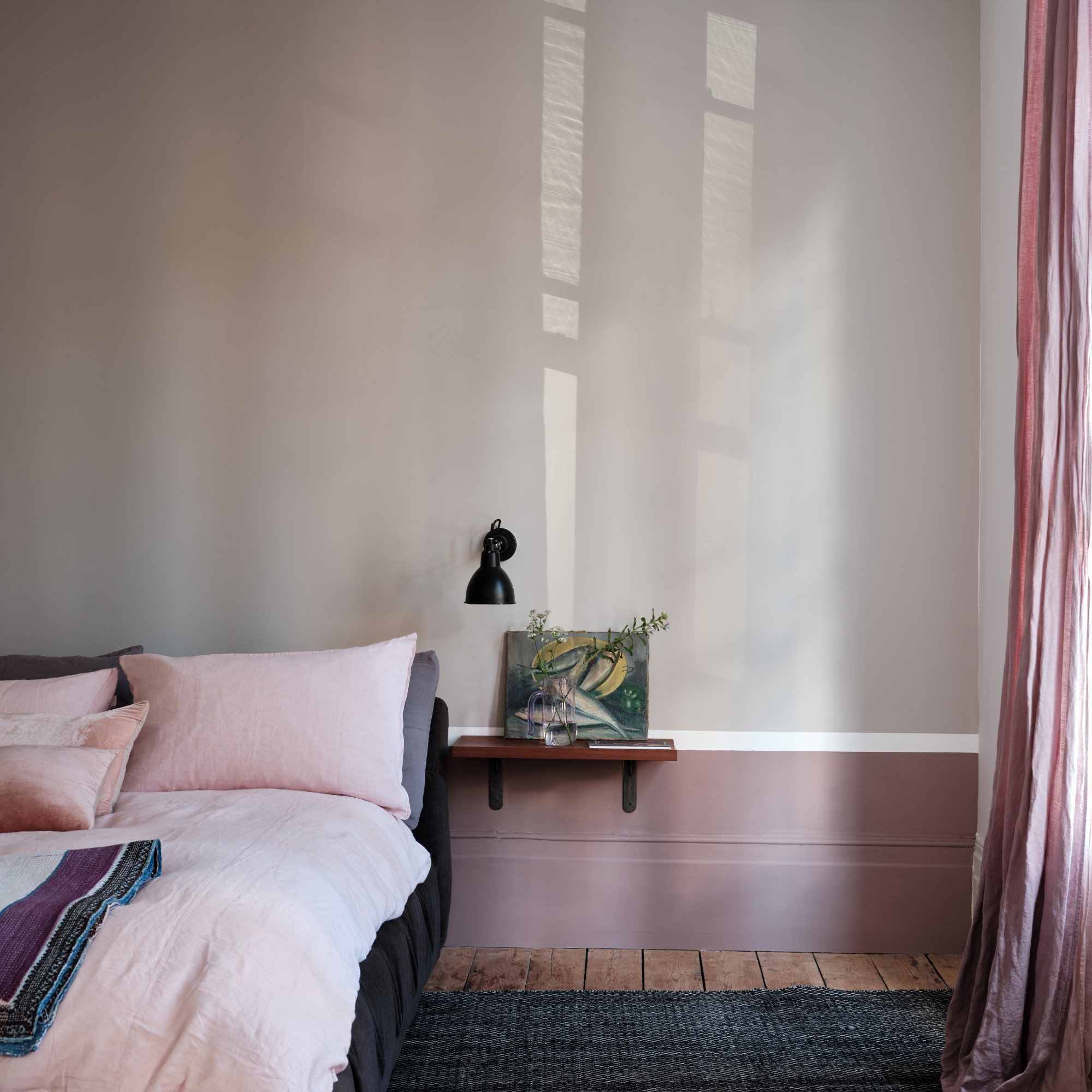
You can create a double-drenching scheme by pairing Sulking Room Pink with a softer shade of pink, whether that’s Farrow & Ball’s popular Setting Plaster or one of the predicted Farrow & Ball shades to be big this year, Scallop.
‘Scallop's even tones paired with Sulking Room Pink give a luxurious feel to a kitchen and create a smooth palette that feels elegant and inviting,’ suggests Michael Rolland, managing director and paint expert at The Paint Shed, a Farrow & Ball stockist.
Alternatively, a number of warm neutrals pair very well with Sulking Room Pink. Farrow & Ball’s website suggests one of the brand’s most popular shades, Skimming Stone.
‘For something more subtle, I would combine it with paler neutrals – warm whites, or stone tones,’ says interior designer Lucy Van der Gucht. ‘These allow the colour to feel elevated rather than decorative. The key with Sulking Room Pink is balance – it’s a colour with depth, so it benefits from being paired with tones that either ground it or gently lift it, rather than compete with it.’
Scallop is one of the 12 new Farrow & Ball shades released only last year. But it's already one of the most popular colours and the new go-to pinky neutral.
2. Dark green
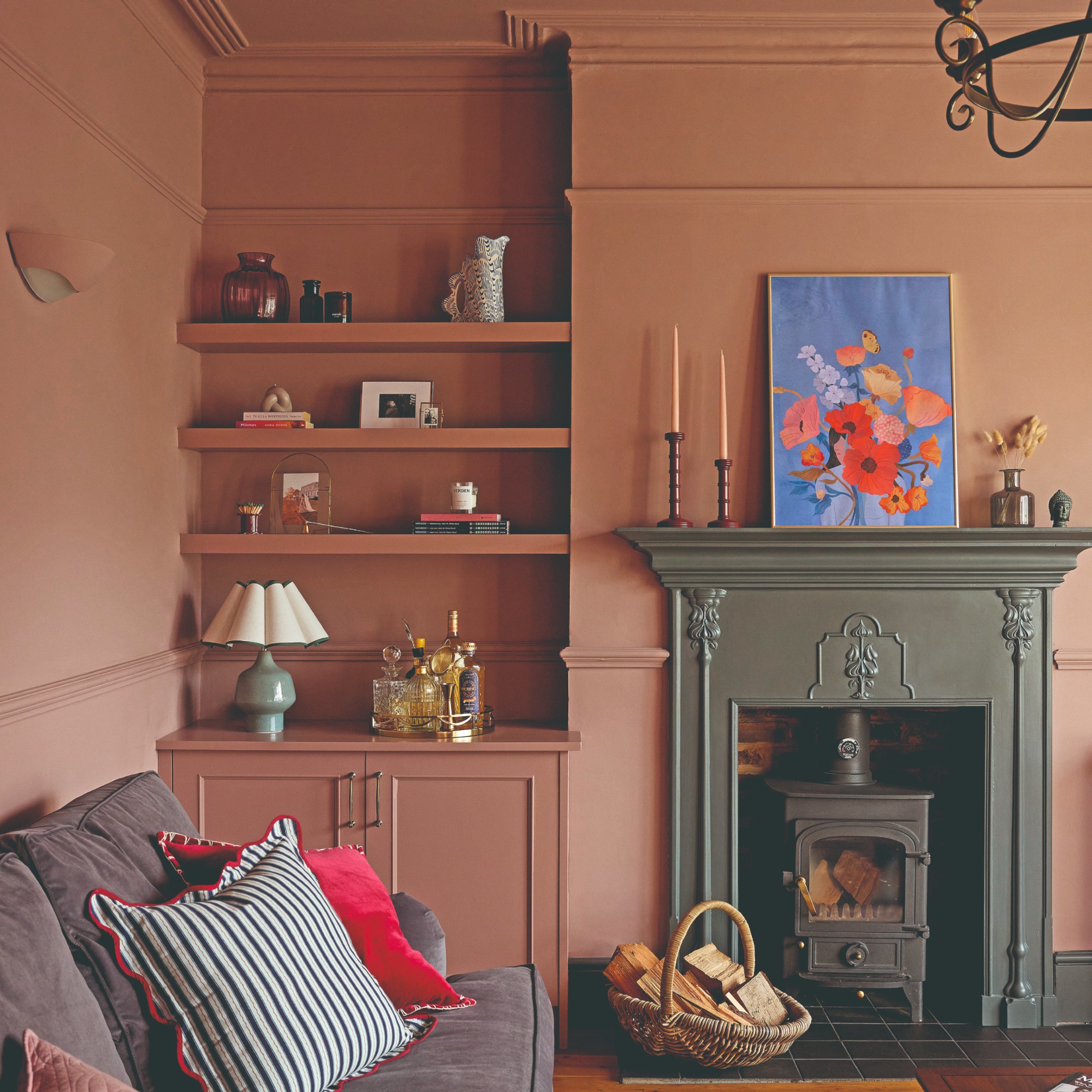
If you’d prefer to lean more into the cosy nature of the colour, which was originally inspired by the shade often used in boudoirs, then a dark green shade like Farrow & Ball’s bestselling green, Green Smoke pairs perfectly with it. And as Lucy Van der Gucht already said, Sulking Room Pink responds well to shades that either lift it or ground it. And this is a case of the latter.
‘Sulking Room Pink works particularly well with deeper, grounding tones like mid to dark greens, which bring out its warmth and stop it feeling too sweet,’ Lucy explains.
This is exactly what Kim and Stewart price have done in their living room (pictured above) which is colour drenched in Sulking Room Pink with the exception of the fireplace picked out as an accent in dark green.
As the name suggests, Green Smoke is a dark shade of green that's always smoky, owing to its blue undertone.
3. Burgundy
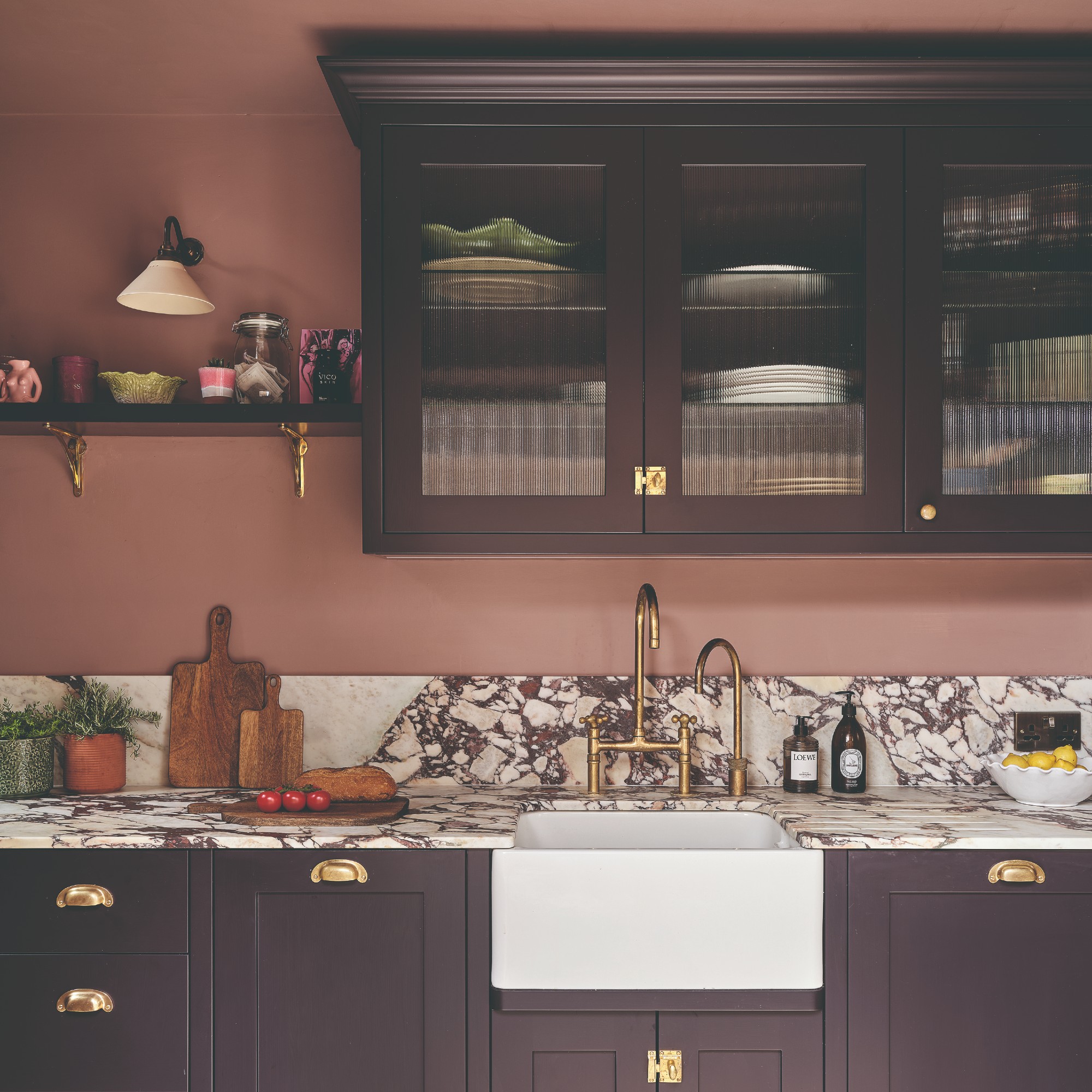
Once upon a time, pairing pink and red was almost unthinkable. But in recent years, it’s a go-to stylish colour combination. And the elevated version of this is a dusky pink like Sulking Room Pink paired with a deep burgundy shade.
‘The best colour to pair with Farrow & Ball's Sulking Room Pink is a deep burgundy red such as Little Greene's Bronze Red, as this pairing is the perfect combination of elegance and intensity. The combination of Sulking Room Pink with Bronze Red is best used in spaces that thrive with a moody effect, like an office or a home library,’ Michael at The Paint Shed says.
Alternatively, you can go for a shade that’s even darker but still has that red undertone. The perfect example of this is model Charli Howard’s kitchen where the walls are painted in Sulking Room Pink and the cabinets are covered in Farrow & Ball’s Paean Black. This is a red-based black hue but in Charli’s kitchen it looks almost like an aubergine or a plum shade, depending on the lighting.
If I was to choose a deep burgundy shade to pair with Sulking Room Pink, I'd go for Graham & Brown's colour of the year, Divine Damson.
Lucy Van der Gucht concludes with a final piece of advice, ‘Sulking Room Pink works well in bedrooms and sitting rooms, where its softness feels cocooning rather than overpowering. It’s a colour that responds well to layering – so it tends to work best in rooms where you can introduce texture, contrast and a mix of materials, allowing it to feel part of a broader scheme rather than a standalone statement.’
If you enjoyed reading this, sign up for the Ideal Home newsletter for all the latest home decor trends and inspiration delivered straight to your inbox