It's in the name: cool blue. This shade says cold, and with that, I assumed uninviting. But I can no longer ignore the rise of this pale, sky blue. I am seeing it everywhere I look, from my own social media feeds to the houses on the pages of Homes & Gardens. Cool blue is the color of 2026 so far.
Blue is, of course, a timeless shade, as versatile as a neutral, and there's always a certain blue that's topping color trends. Right now, it's a cool, muted blue that's powdery but not as soft as a powder blue, and uplifting but not quite as bright as a sky blue. Named recently within Pinterest's 2026 palette, it's a shade that's set to dominate this year.
As a once-skeptic about how these cooler shades work when you still want your home to feel warm and inviting, I asked designers how to work with cool blues in a way that's not going to make my rooms feel icy.
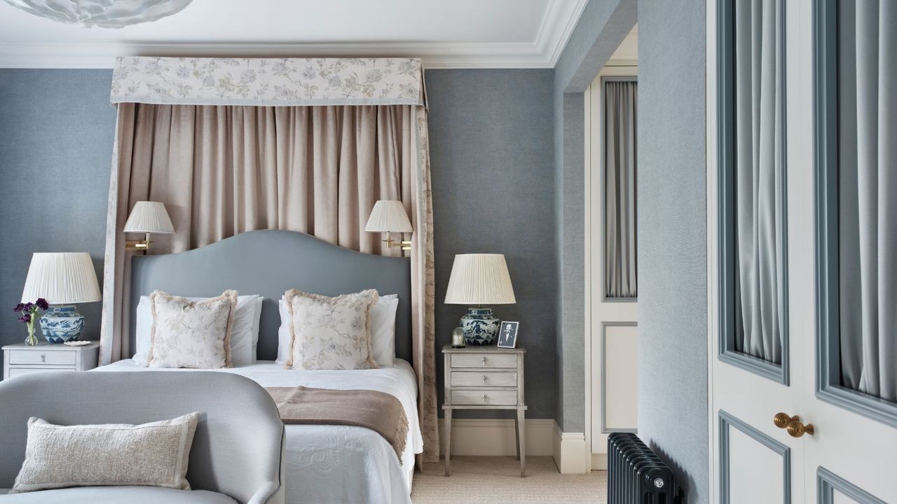
'Cool blue can feel beautifully classical and elegant, think of Robert Kime’s pale blue sitting rooms and bedrooms layered with warm textiles and dark wood furniture. Equally, it can feel very contemporary, especially when used in a full color drench,' explains color expert Harriet Slaughter explains.
Harriet addresses my immediate concerns with the color leaning too cold to create cozy spaces by telling me it's about the shades I can pair it with. Combining this on-trend shade with warmer hues is her simple solution.
Sharing the colors that go best with pale blue, Harriet explains 'I love pairing it with bright red accents for a flash of warmth, or with natural materials such as oak, sisal carpet, and brass detailing. In simple color theory terms, orange sits opposite blue on the color wheel, so cool blue is a wonderful way to temper rooms with very warm or orange-toned timber floors.'
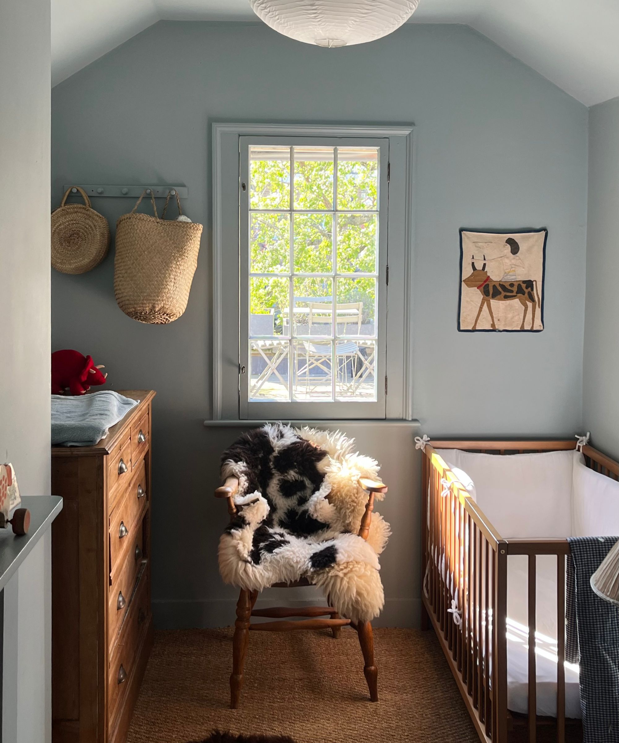
'I chose to paint my son’s nursery in ‘Celestial Blue’ by Little Greene,' she continues. 'Although it reads as a cool blue, this particular shade leans slightly warmer, which makes it perfect for creating a cozy, restful space. I decided to drench the room ceiling, woodwork, and all, which made for a very cocoon-like space.'
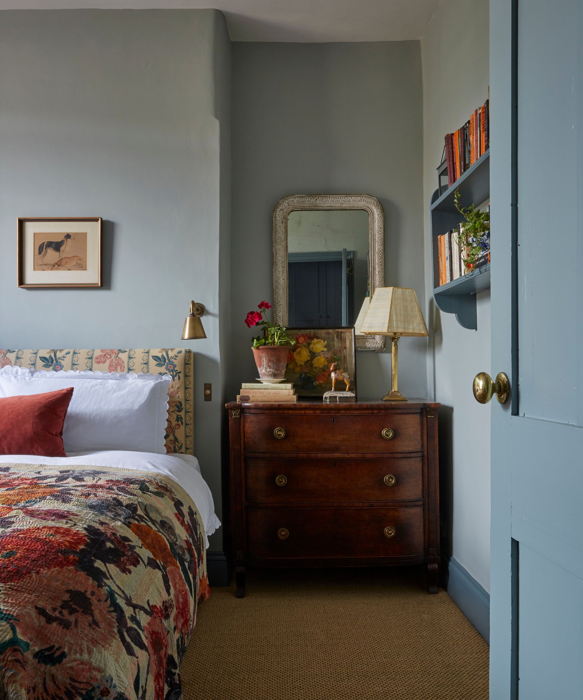
With soothing, gentle qualities, it's hardly surprising that Charlotte Boundy chose to use a subdued blue in the guest bedroom of her home. But like me, she also tends to steer clear of cooler colors in her home, but makes an exception for cool blues.
'Whilst I don’t often gravitate towards cooler colors in my interiors, there is something about Light Blue by Farrow & Ball that I return to time and time again,' she explains. 'It has an unmistakable gentleness, a traditional blue with a softness that never feels cold and seems to shift beautifully over the course of the day.'
'Light Blue is not a color that clambers for attention or risks falling out of favour; it endures. It sits as naturally within the pared-back simplicity of a contemporary interior as it doesn’t amount to the layered textures and gentle patina of a country house, proving that the most lasting colors are often the most understated.'
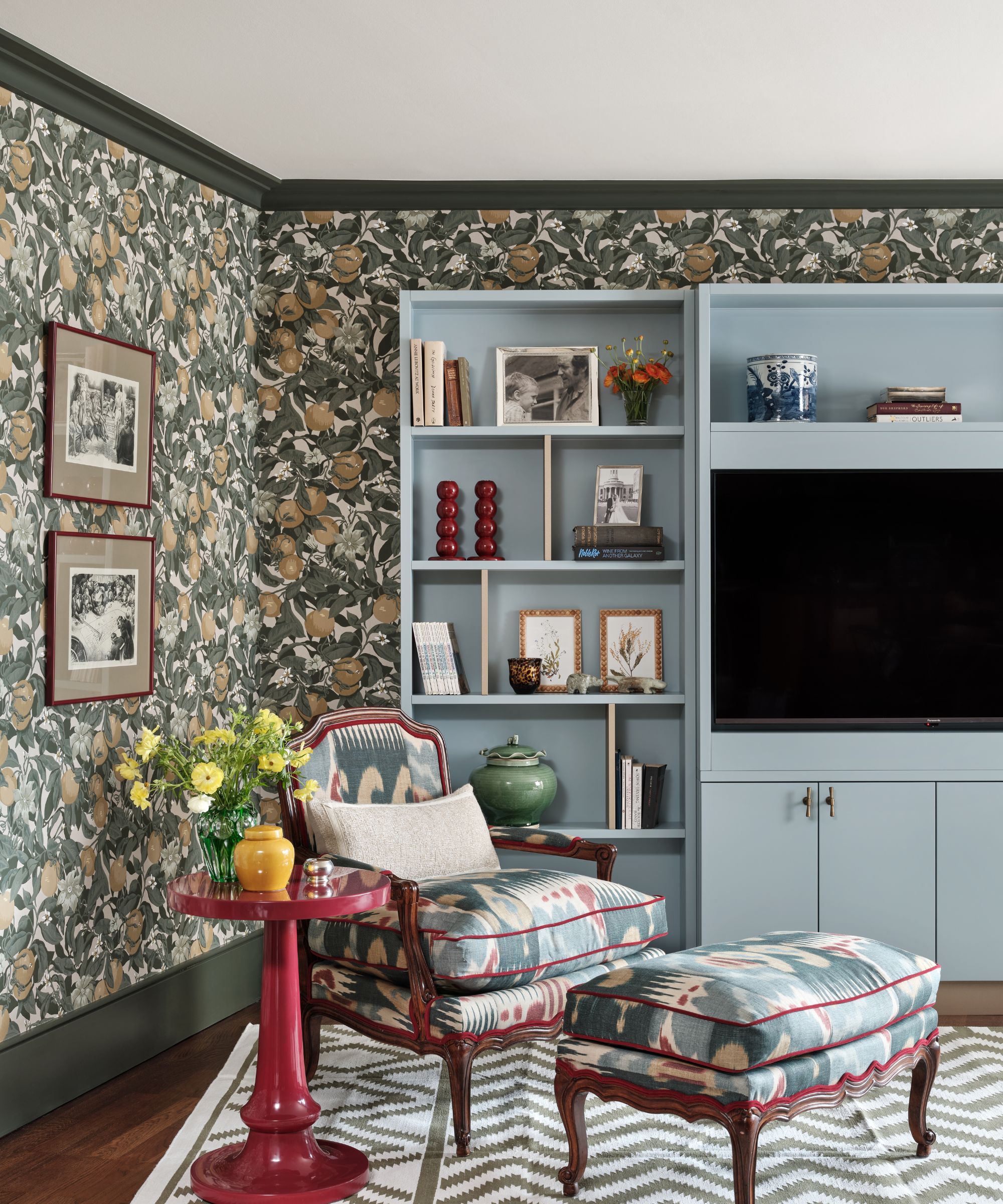
A calming color that bridges the gap between neutral and striking, cool blue can provide a grounding touch to a room with a lot going on, as proven with this eclectic living room designed by Rebecca Hughes.
'Soft, pale blue is one of my favorite colors to use because of its inherently calming and restorative nature,' explains Rebecca. 'It evokes the quiet of the sky and sea, which makes it particularly well-suited to spaces where relaxation is a priority. In bedrooms, cool blue creates a serene, airy atmosphere.'
'I love using pale blue on bedroom walls as a gentle backdrop, paired with a warm creamy white on trim, ceilings, or bedding to keep the space feeling balanced and inviting. The warmth of the creamy white prevents the blue from feeling too crisp, creating a soft, harmonious contrast. Layering in natural textures – such as wood furniture, linen bedding, woven rugs, or subtle brass accents – adds depth and warmth.'
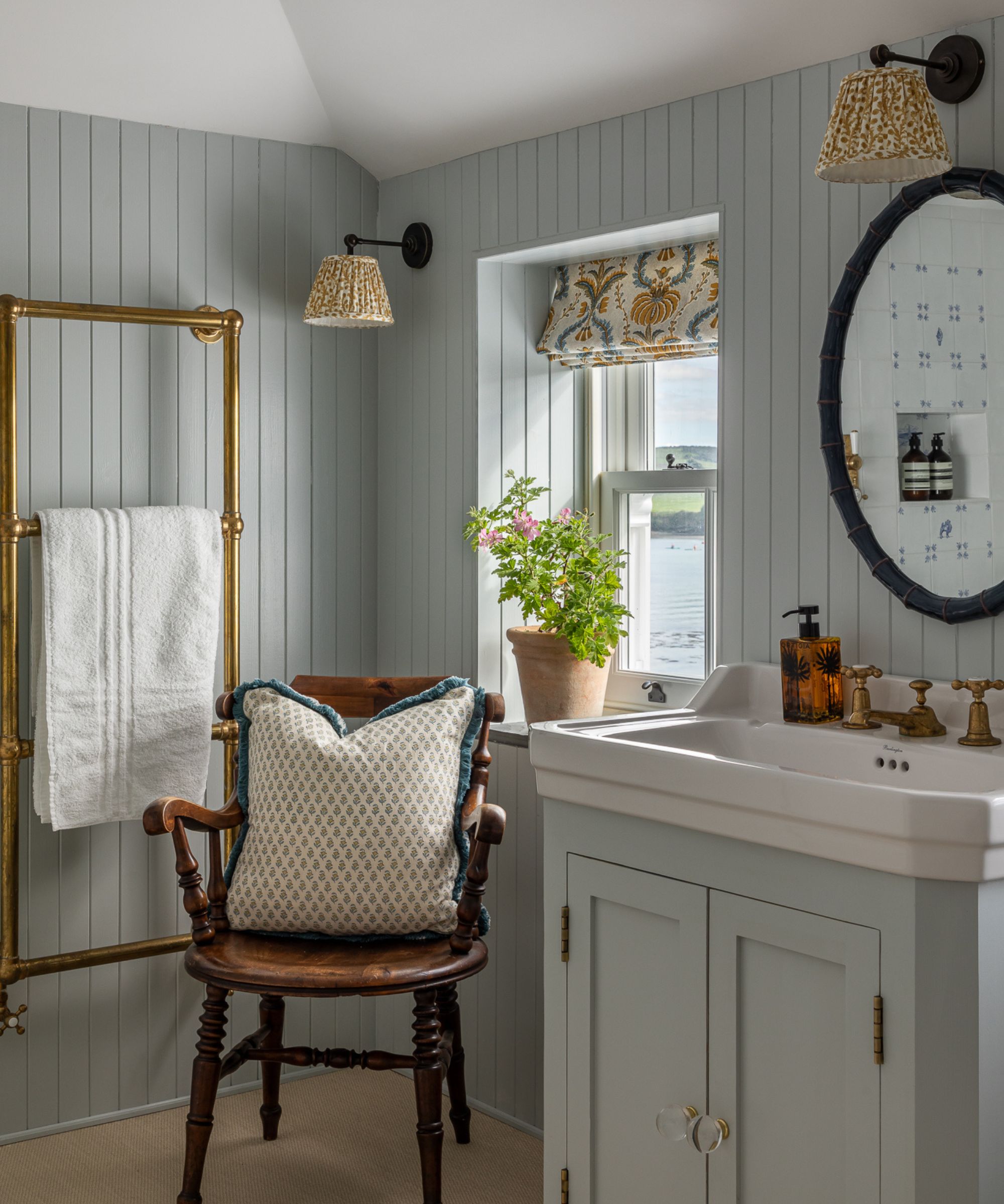
While cool blue could sound sterile in a bathroom, when balanced with lived-in accents, it can provide tranquillity and calm that's so fitting in a room designed for getting ready or slowing down.
This blue bathroom, designed by Leonora Birts, is proof that cool blue creates character in a bathroom, particularly when balanced with vintage details. She explains, 'I tend to use cooler blue colors in either bathrooms, or kitchens. Rooms where there is a lot of natural space and light, so the room doesn’t feel too cold and dark.'
'If you're using a cool blue in the home, you have to balance it with good levels of decorative lighting and warm colored fabrics. I love the combination of blues and warm yellows.'
Shop Cool Blue Decor
From whimsical lighting to elegant bookshelf decor, these six cool blue picks will bring a cool, calm, and collected feel to your home.
A subtle yet classic choice, this linen throw pillow will uplift an empty armchair or bed with a subdued dose of blue.
Delicately fluted, this charming vase is finished in a cool blue glaze, perfect for jumping on this year's color trends.
Inspired by mid-century shapes, the Ingleman table lamp couldn't be cooler. Place it on a bookshelf or nightstand for a serene yet warm feel.
For a dose of blue that packs a punch without overwhelming your scheme, try this herringbone throw blanket draped on an armchair or sofa.
For a subtle pop of blue that uplifts your bookshelves, try this Addison Ross picture frame. Made from pale blue enamel, it'll make your favorite photograph feel even more special.
Perfect for a coffee table or nightstand, this charming candle might be small, but it'll bring a relaxing calmness to any space it's placed in.
Alright, I am sold. Cool blue works in the right space, paired with the right colors and the right layered decor. But this is a chameleon shade, and it will totally change depending on the room and the light it gets, so be sure to order plenty of samples before you commit to a paint color.
'If I had to choose a favourite color, cool blue would certainly be up there,' Harriet tells me. 'It is calming and incredibly livable, but it does need thoughtful placement as it can sometimes feel a little cold, and I would generally be cautious in north-facing or naturally gloomy rooms.'