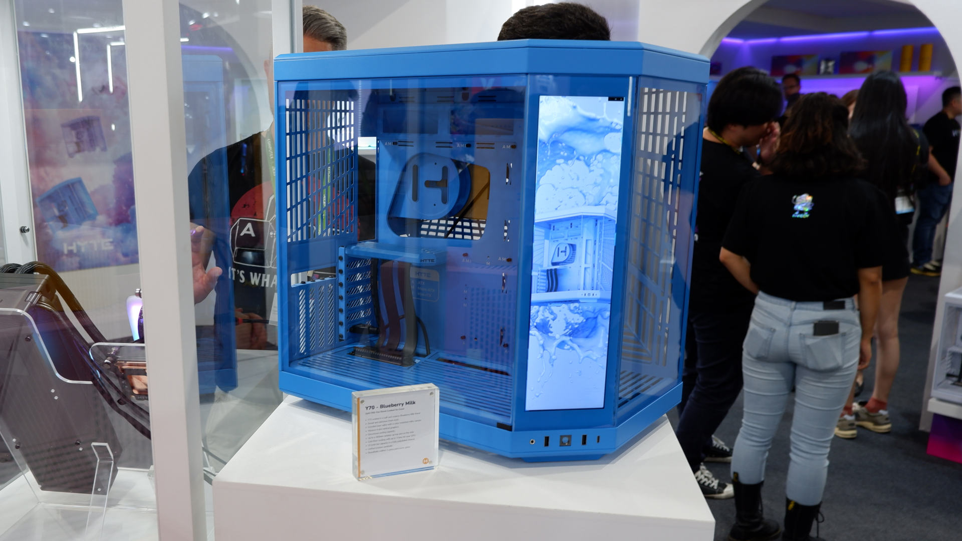
Some enthusiasts like a PC case that's all about functionality of form, sporting great airflow or lots of external connectivity. Others want it the other way around, with RGB so bright the PC could double as an air traffic control tower. But you can have both, you know, or at least that's what Hyte is suggesting with the new Y70 colour options and extra spiffy touchscreen, on show at Computex 2024.
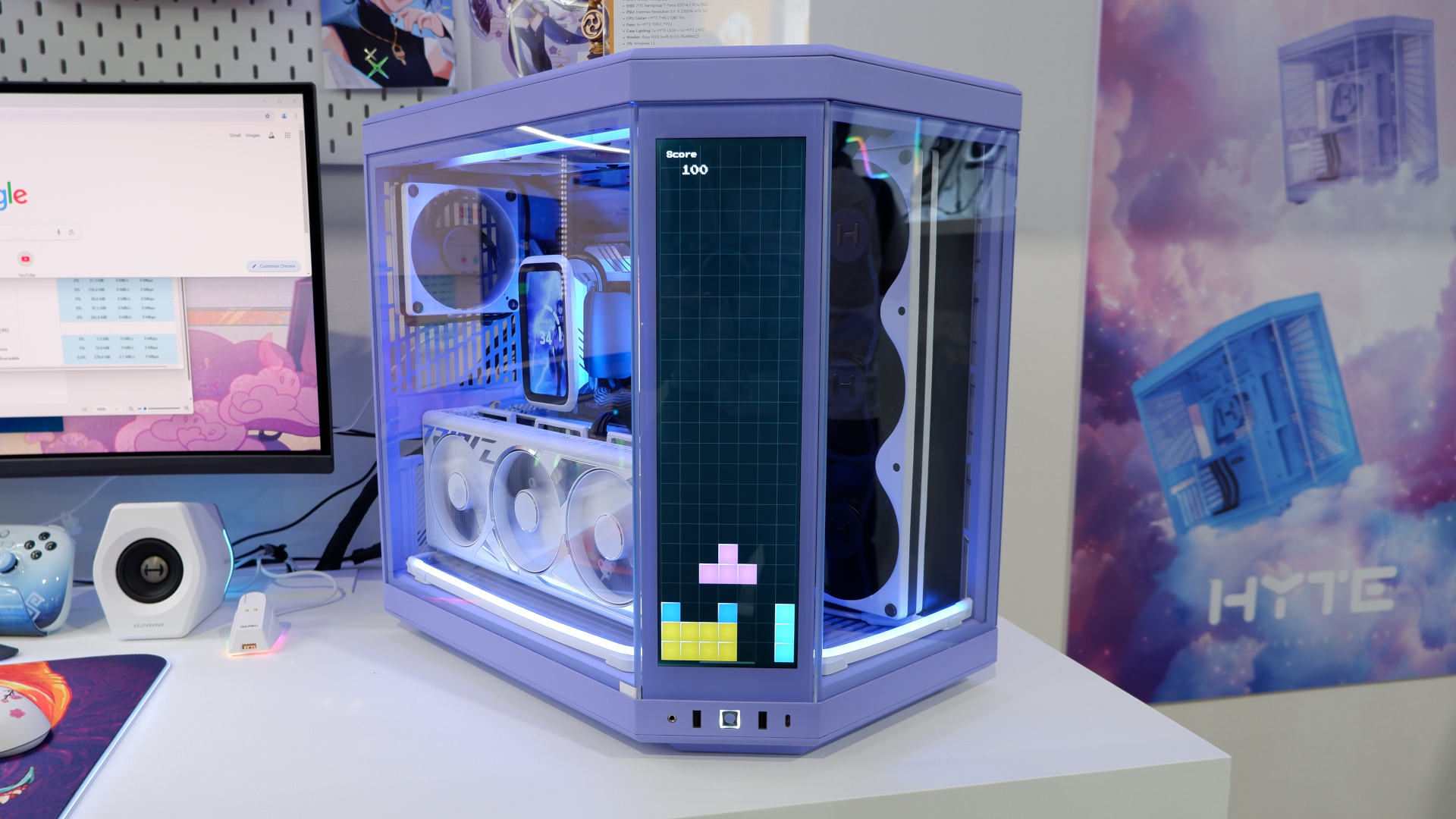
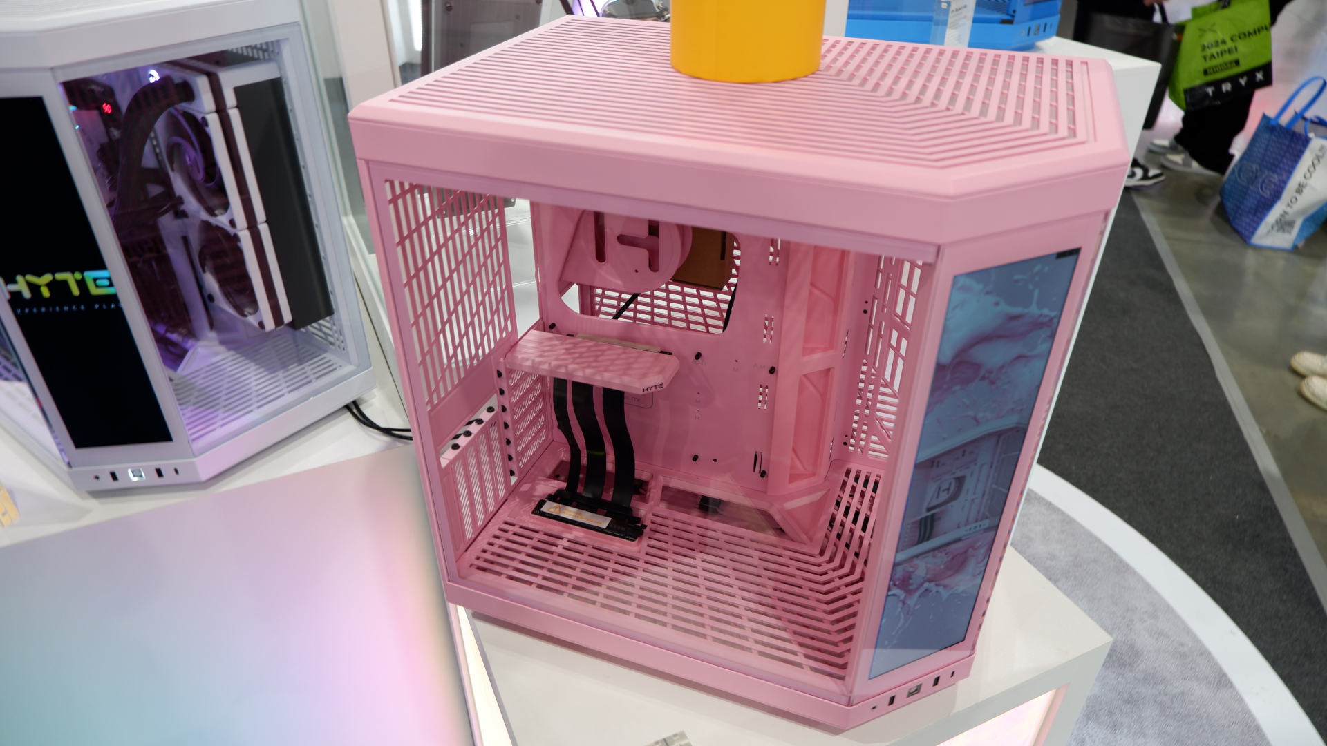
Joining the four current colour options (Snow White, Panda, Pitch Black, and Black Cherry), you'll soon be able to get a Hyte Y70 case in Strawberry Milk, Taro Milk, and Blueberry Milk—pink, purple, and blue in everyday terms. Examples of each scheme have been on display at Computex 2024 and I have to say that Blueberry Milk is my favourite by far. It's bright and fresh-looking, and a great change from the usual straight black or white that the vast majority of PC cases come in.
The purple one—sorry, Taro Milk—is a little too dark in colour for my tastes. I think it'd be nicer if it was a tad brighter. The Strawberry Milk option doesn't float my boat but I should imagine that it's likely to be very popular.
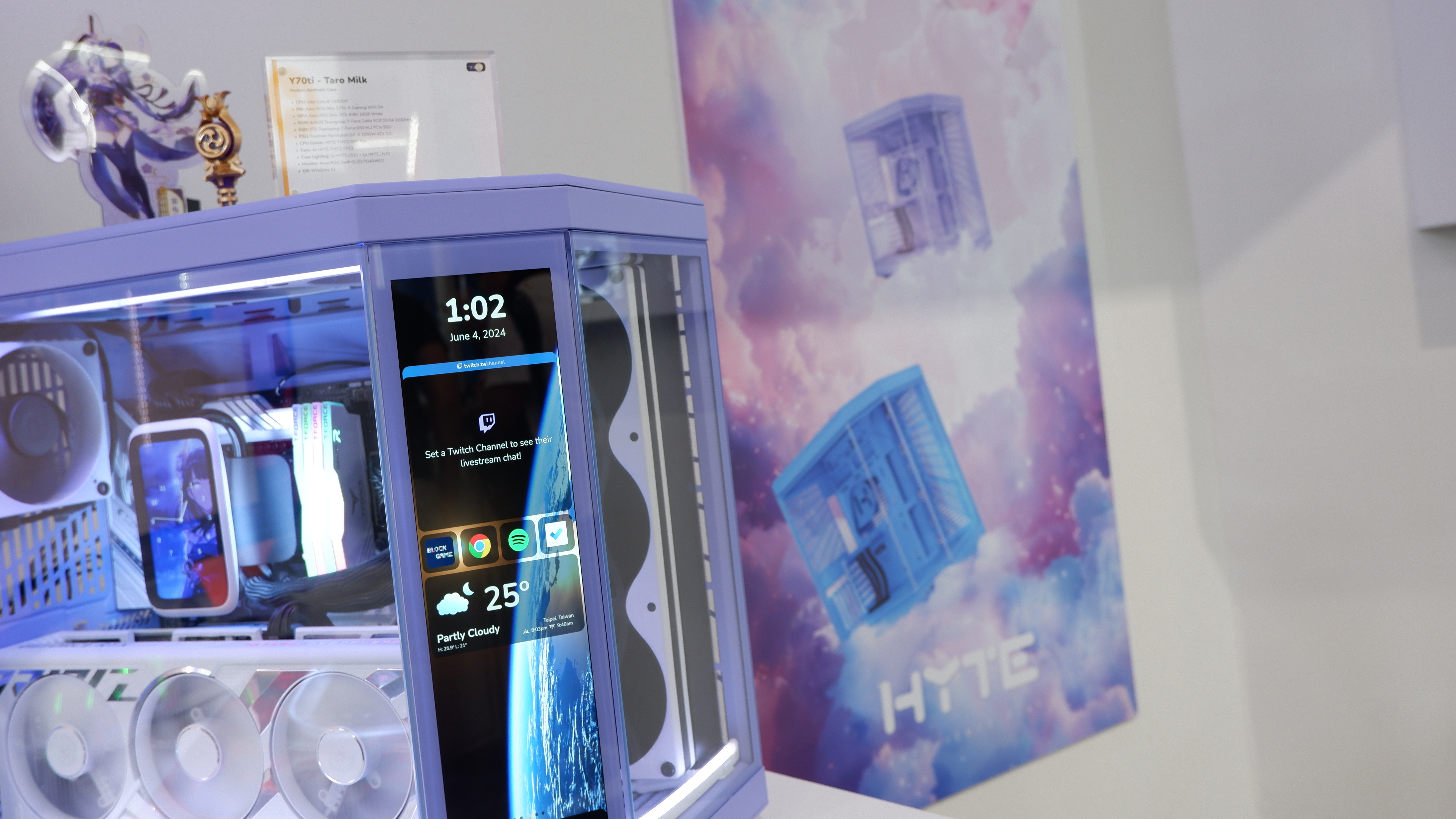
One thing to note is that these new colours are only available, at the moment, for the standard Y70 case in Hyte's store. If you've been eyeballing the Y70 Touch model, with its 14.1-inch touchscreen, then you might be disappointed to know that this is still using the current colour scheme.
Hyte has been displaying another version of the Y70 Touch with the new colours at Computex, so I at some point in the future you'll probably be able to select from all the new colours in the Touch range.
Speaking of which, Hyte also showcased its new Y70 Touch Infinite—apologies, 'touch infinite'—case at Computex. It sports a slightly larger screen (14.5-inch) than that in the Touch (and yes, it's Touch, not 'touch') but the resolution is a lot lower, at 688 x 2560, compared to the Touch's 1100x3840.
However, the new touchscreen is brighter (350 vs 300 peak nits), with a higher contrast ratio (1,500:1 vs 1,200:1), and slightly wider viewing angles (89 degrees vs 85). Weirdly, though, the touch aspect of the panel has been reduced, from 10-point multi-touch down to 5. Both panels have 60 Hz refresh rates, though the new one has a slightly faster response time.
So, is the Y70 touch infinite better than the Y70 Touch (gah, I really don't like how the name isn't capitalized)? That all depends on whether you like side screens, displaying cool animations or stats about your PC and games, needs to be high resolution or just bright and colourful. The Y70ti is $20 more expensive than the Y70t, with the pre-order price coming in at a cent under $380.
Yeah, you read that right. Nearly four hundred bucks for a case with a touchscreen is quite something. The standard Y70 case is a more palatable $220, even for the new colours, but the latter aren't expected to be shipped until September. If you fancy splashing out on a Hyte Y70 touch infinite, orders should start shipping in July.
Yes, they're very pricey and the design isn't going to be to everyone taste's but I have to say that I do like the new blue Y70 scheme. Dammit, Blueberry Milk.
