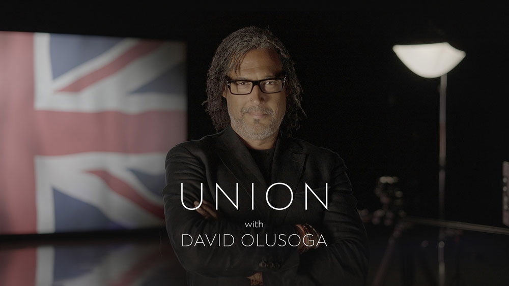
BBC Two's new series Union explores the history of the United Kingdom, delving into issues of national identity, social class and inequality spanning centuries. It's a series steeped in vivid imagery, from art to maps and everything in between – and it needed a rich set of motion graphics that struck just the right tone.
That was the task presented to Joe Hockney, Motion Graphics Lead at VFX studio Lux Aeterna. His team created the stunning motion graphics that run throughout the four-part series. Hockney explained to us exactly how the graphics were made, including the challenges of working with archival material, the team's process and his personal highlights. See one of the most important sequences below, the union flag, then read on.
01. Tell us about the work you did on this series
Lux Aeterna completed all GFX across the four part series that began airing on BBC Two on 2nd October 2023. The relationship with both David and the director Francis Welch was already well established, as our Creative Director and Co-founder, Rob Hifle, has collaborated with both on different projects in the past.
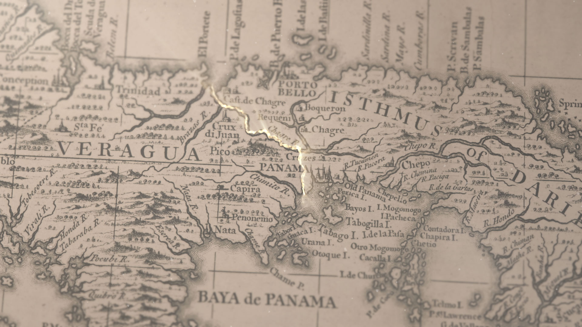
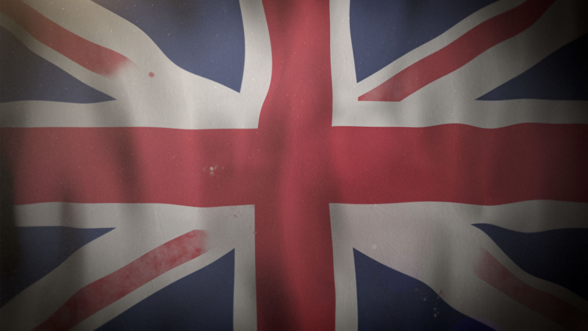
The scope included visual elements such as historical archives, maps spanning centuries, and the intricate design of the Union flag. The latter plays an iconic role in the series, due to it being about the formation of the United Kingdom.
What was the creative process? What were the most important considerations?
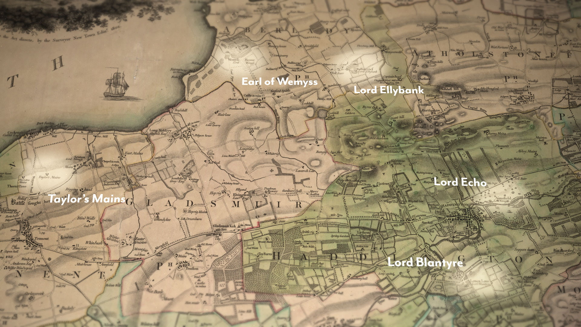
We had a lot of historical material and archive documents to work with. The goal was to turn these historical, often low resolution archive footage, into graphics that visualised the narrative of the docu-series.
We used 3D lighting, dust effects, and precise compositions to complement the aesthetics of the specially filmed footage and synchronise seamlessly with the pacing of the documentary. We worked very closely with the edit team on this project, as the work involved longer sequences of shots. We worked in synergy with the edit room to ensure the pressing and composition of the scenes were perfected.
Due to the wealth of the archive documents, we also worked to complete the look through artificial camera work and the aforementioned lighting. This helped to glue the aesthetic together.
We used After Effects for motion graphics and occasionally integrated Cinema 4D and Nuke to complete this.
What inspired you?
We took our inspiration from the incredible archive that the production team unearthed for this series. The strength of the storytelling throughout the programmes really demands that any graphics be sympathetic to and not overpower the narrative.
How did you ensure your graphics were in the right style for the series?
It was all about historical accuracy and we had the achieved maps, flag designs and documentation to refer to. The goal was to ensure the graphics were accurate while delivering an aesthetic that has the feel of a traditional BBC historical documentary.
Tell us about a key scene you worked on and your process
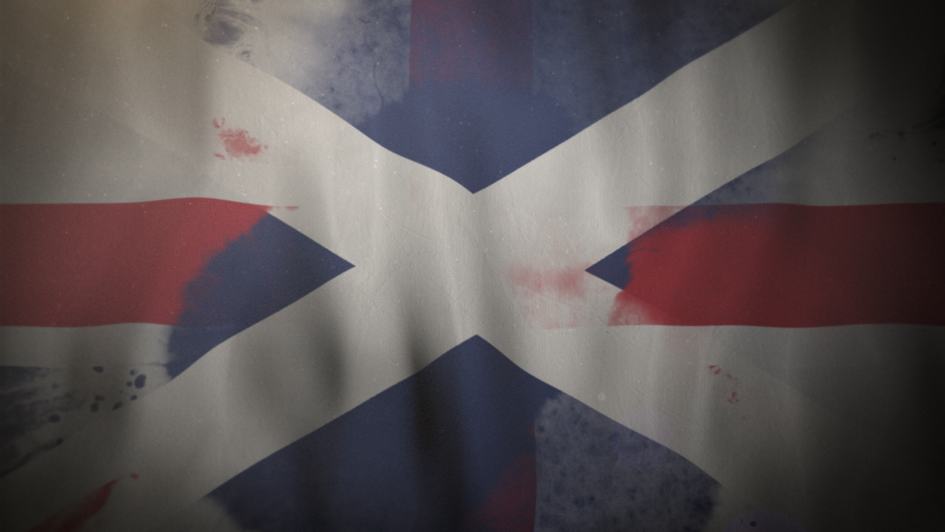
We were asked to visualise the evolution of the flags of the United Kingdom, visually telling the story of the union between England and Scotland along with the later addition of Ireland. Several beautiful archival drawings show the suggested design for this first flag of the union and our graphics aimed to bring that process to life. We used cinema 4D and After Effects to create the looping animation of the flags and blend between them, covering the twists and turns of the series and our Isles’ history.
How did you work with others/together on the project?
As mentioned, we had a very unique situation on this project in that we got to collaborate closely with the edit room. Typically GFX and VFX teams don’t integrate with the edit side of post, so this was a great opportunity to work in synergy on the longer shots. The close collaboration and communication definitely aided with delivering a finessed visual.
Likewise, both David and Francis worked very closely with us to ensure the visuals were both accurate and brief. The longstanding relationship with Rob certainly helped here, as he’s familiar with their way of working – together and individually.
What challenges did you come across in the process? How did you overcome them?
The amount of historical information and documents we were working with. Especially the low resolution archive footage. We had to elevate the quality of the visuals through motion graphics while keeping them historically accurate. Thankfully we’re specialists in the areas of history, natural history and science VFX and Rob’s decades of experience really supported the team here. As mentioned, we also worked continuously with the edit team and kept in constant contact with David and Francis, so ultimately communication and experience helped to overcome these challenges.

What's your favourite part of the finished work?
To see the graphics sit seamlessly within this banner series is immensely satisfying. Some jobs call for the graphics to shout whilst others demand subtlety and a finer touch. In this instance the graphics appear regularly but are intended to never be too overt, adding and layering to the story told and the deftness with which it is handled.
Which part of the process did you enjoy most?
It’s always a pleasure to see a show come together, we were involved from a very early stage and that ongoing relationship really allows you to understand the aims of a series. The shared purpose and clarity of vision allows you to take a more confident hand in the work you produce and the process as a whole becomes smoother.

You can watch the series on BBC iPlayer now.
