
Learning how to make an artist website is essential if you want to display your work online in a professional way but don't have the resources to hire a web designer. A website isn't the only option for promoting and selling art online, but it's the way that gives you most control, and it looks more professional than relying on social media alone.
In the guide below, we'll walk step-by-step through how to create a website for artists, from choosing the best website builder for artists to picking from among the best web hosting for freelancers. We'll also look at what to consider when designing your site, what to include, how to add ecommerce functions so you can sell your work and how to promote your site.
How to make an artist website
Before you start
Before you get started, it's worth thinking about why exactly you want to create a website for art. It might seem obvious, but defining a clear objective can help you decide what you need from the site.
You might want a website to serve as an online portfolio to promote your work to potential clients, in which case the focus will be on showcasing your work. Or you might want to sell physical or digital work directly through the site, which will require ecommerce tools if you want to provide a checkout and direct payment options.
A website isn't the only option in either case. We have a guide to the best places to sell design online, and you can even sell on Instagram. Other options may have the advantage of a lower initial cost in terms of time and money and a chance to reach a existing audience.
However, if you're presenting contact details to a prospective client, a personalised URL will often look more serious than an Instagram handle or a portfolio on a branded site. You also get to present your work the way you want, without being constrained by the layout and specifications of a platform with a rigid UI. Just bear in mind that creating a website for art is only part of the work because people aren't magically going to find it, so you will need work to promote your site.
Choosing a website builder for an artist website
To make an artist website, you'll need a content management system (CMS). For convenience, many websites for artists today are created using website builders. There are lots of options, and the best one for you will depend on whether you have skills in web design or coding (or want to learn), how much control you want over what your site looks like and how big your budget is.
Many of the most popular website builders for artists eliminate the need to know anything about html or CSS by proving customisable templates to choose from and a simple drag and drop interface. Wix is popular for its low prices, while we think Squarespace is aesthetically better for visual art thanks to its clean, minimalist templates. There's also Jimdo, which we found easy to use.
Both Wix and Squarespace have several plans, which makes them highly scalable, giving you the flexibility to start on a the cheapest plan and move up if you decide you want to add things like a checkout later.
You could also save on paying for a website builder by opting for an open-source CMS like Wordpress. This is free and it gives you more flexibility. It's not overly complicated either, but it's a much steeper learning curve initially, it's more time-consuming, and you'll still need to pay for hosting, which is often included in website builders' plans. That takes us to the next step...
Choosing hosting for your artist website
Most website builders also provide hosting, but if yours doesn't, or if you choose to design your site from scratch, you'll need to choose your hosting. This is where you store all the data that makes up your website, including its code, text, images and video, so that anyone with a web connection anywhere in the world can view it and interact with it.
In the early days of the internet, you could host this stuff on your own computer. But these days, with billions using the web, that's not a viable option. Hosting companies use their large arrays of powerful computer hardware, commonly known as 'server farms', to store it for you.
There are several types of web hosting, but websites for artists most often use shared hosting because it's the cheapest and it does the job for small low-traffic sites. With shared hosting, your site is stored on the same server as many other sites, which allows economies of scale. However, it might not allow enough bandwidth if you're building a large and complex website with high traffic, and the fact that your site is on a single server can present a risk of down time if that server is down for some reason.
Another option is VPS hosting, which provides more bandwidth, potentially allowing your site to load more quickly. The next option up is cloud hosting, which spreads your website data across different servers, usually around the world, increasing security and reducing the risk of your site being offline if a server is down. This is worth considering if you have a large art business and need to be sure that your site will be online at all times. There is also dedicated and managed hosting, but this would be an unnecessary expense for most artist websites.
How to design an artist website
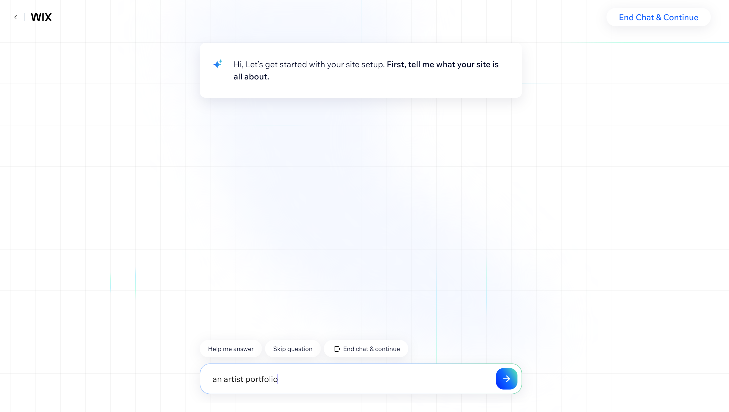
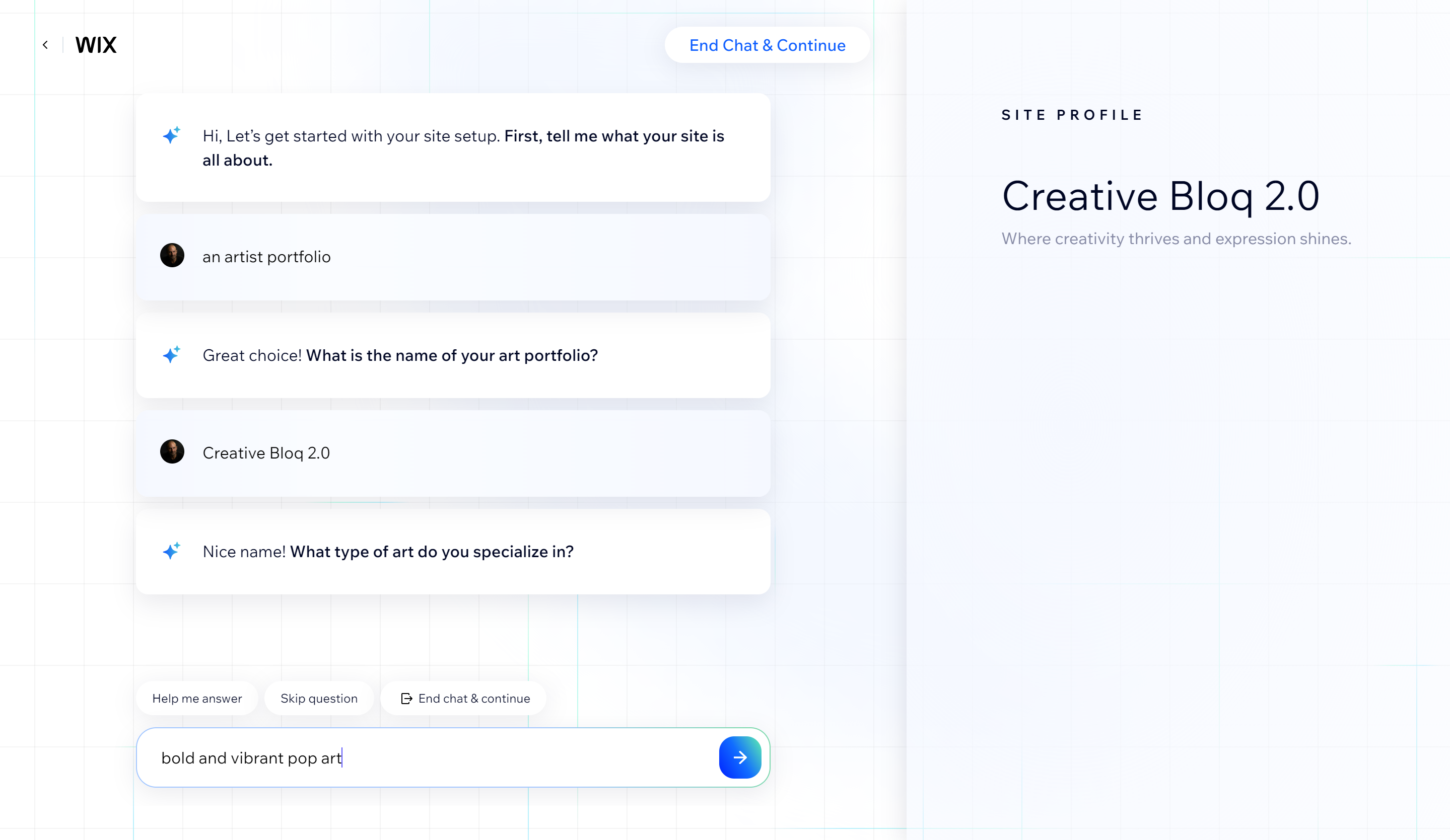
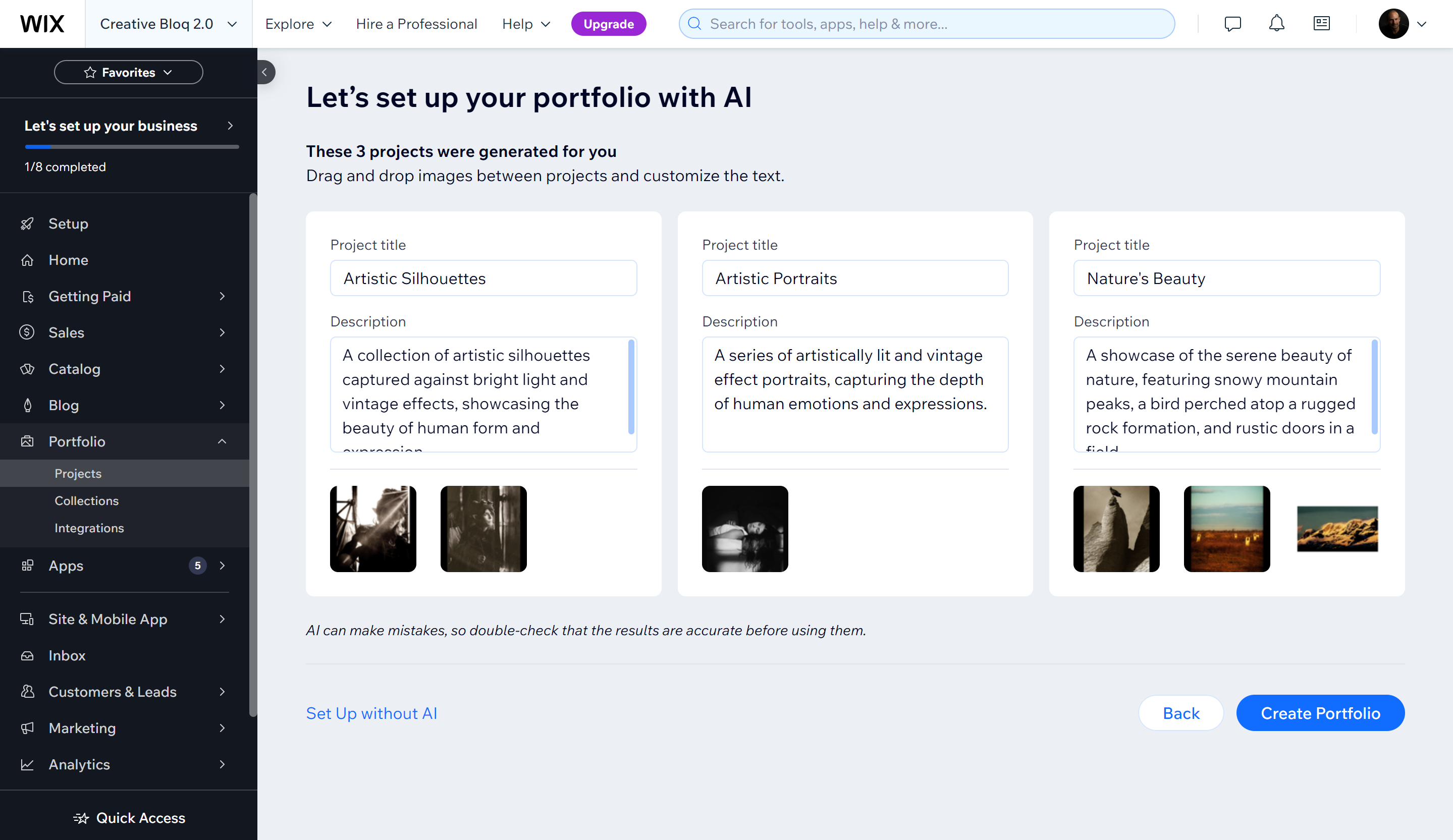
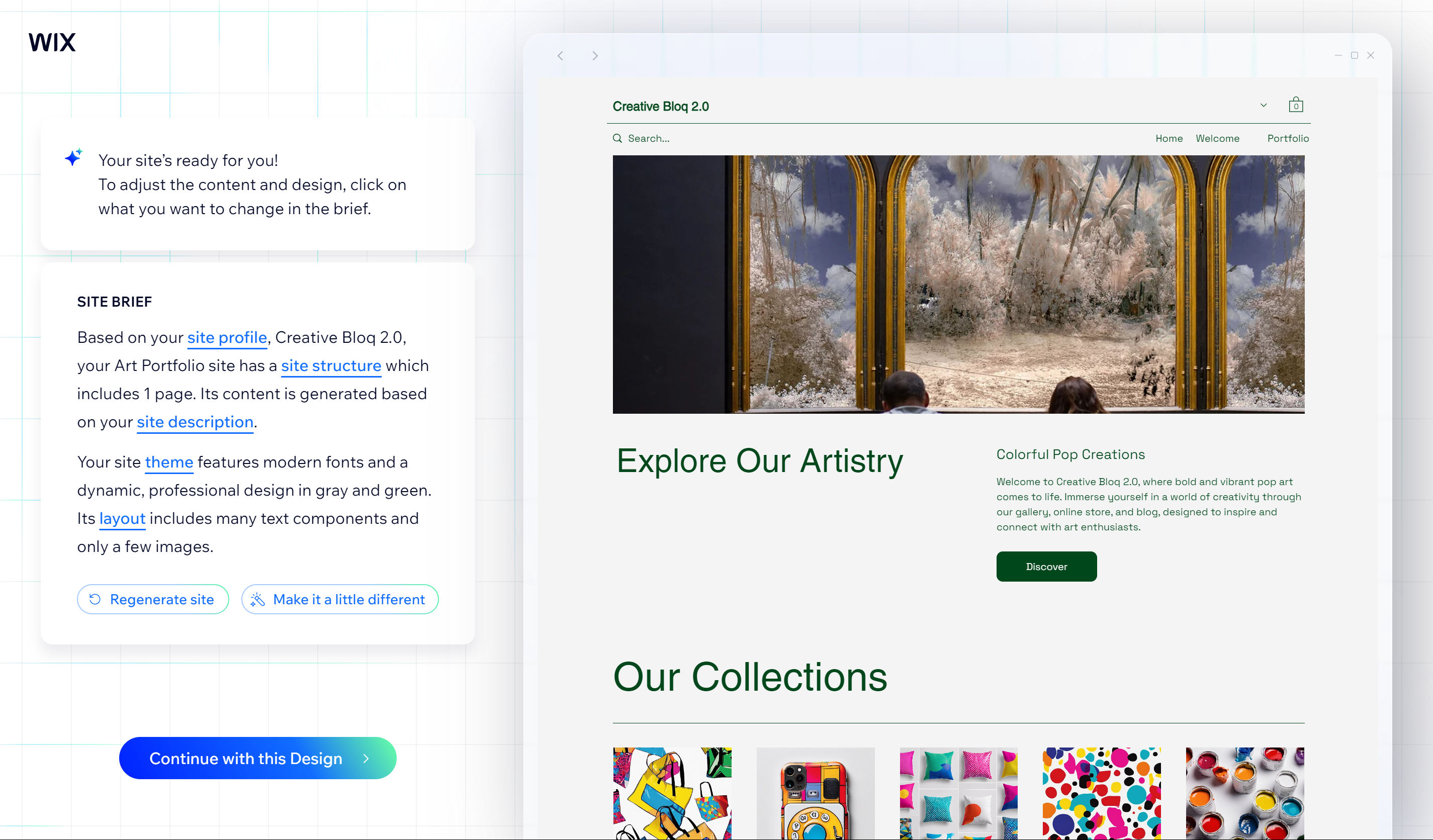
Once you've chosen a website builder and hosting for your artist website, you can get down to actually designing your site. The process will vary depending on the builder you choose. Some website builders now have AI web building tools, which aims to make the process more quick and easy than ever. You simply answer some questions about your work and what functions you want on the site, upload some images, and, in theory, you could have a website in a matter of minutes.
Alas, the reality is that, like with many things that involve AI, the results often aren't very good. If you just want to get a site online as quick as possible, it's worth giving it a go. You'll probably have to ask the AI to try again several times, and you'll definitely want to change any text descriptions that it proposes. But if you find the AI is just turning out generic designs that have nothing to do with your answers, it could easily become more time-consuming than just going the old-fashioned root and picking a template yourself, which also gives you more flexibility.
Choosing a template for an artists website
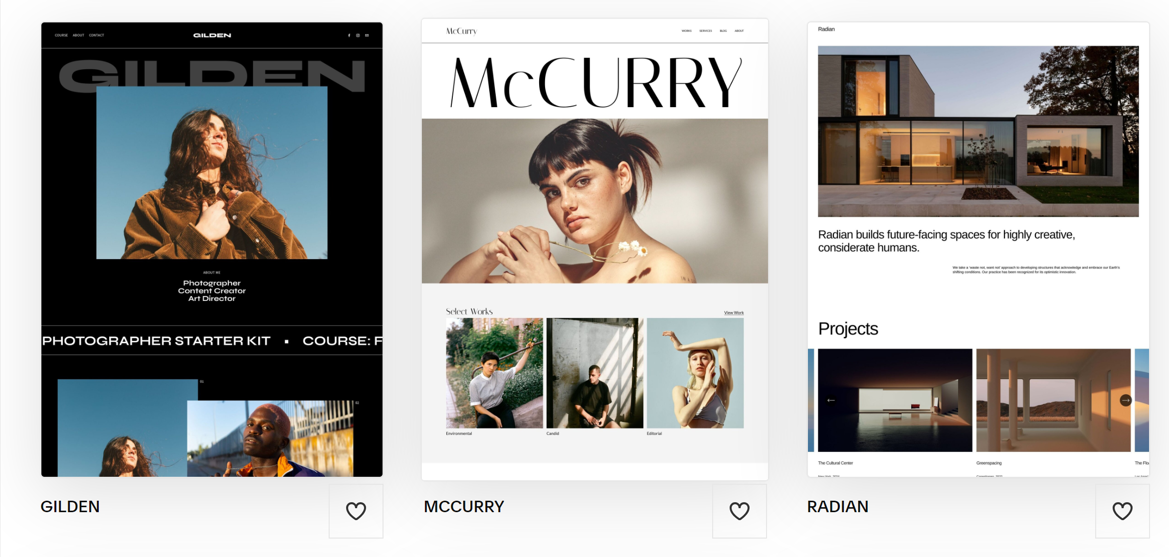
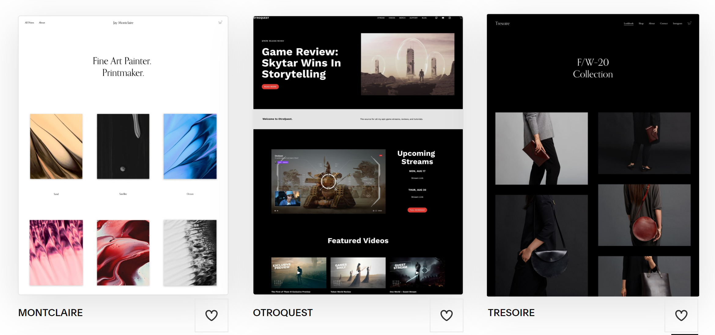
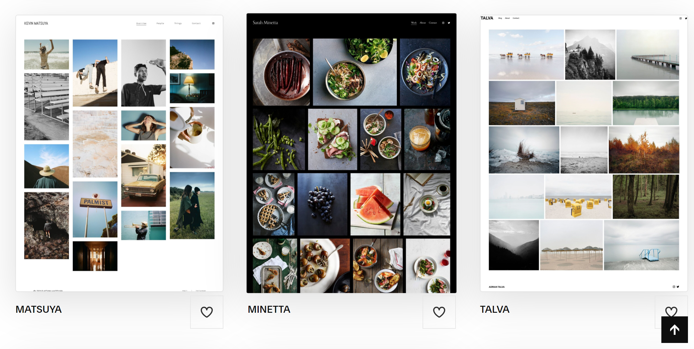
If the AI option isn't cutting it, then it's best to give it the shove and opt to choose a template instead. This allows you to pick the look you want from your site from a wide range of options, which you'll normally be able to customise to your liking.
There's no right or wrong type of template to go for, but many artist opt for a minimalist approach to let their work do the talking. You'll probably want a template that provides plenty of space for images, but the structure will depend on how much work you want to show, at what size, and how much you want to say about it.
If you have lots of work and want to showcase your versatility, you could go for a template with lots of images blocks at the same size. If you prefer to focus on key pieces, you might prefer a template that uses fewer large images with lots of space around them so the work stands out. You could also seek out a template that allows for a mix, with a large main image and the option to add smaller images below or in a dedicated gallery or portfolio page within the site.
You'll want to choose a look that reflects the character of your work. A minimalist design with lots of empty space can look more elegant and allow your work to do the talking. It can also be more usable for visitors, who will be able to easily find their way around. Some artists prefer an asymmetrical structure, which might stand out if it looks novel and different.
It's often best to have an idea of what you want your website to look like before you start browsing. Take a look around the internet. Look at the sites of artists you know and admire and check out our own pick of the best design portfolios for inspiration. Starting with at least a general idea of the style you want can help prevent you from getting distracted by all the options, which can be overwhelming.
Editing a template for an artist website
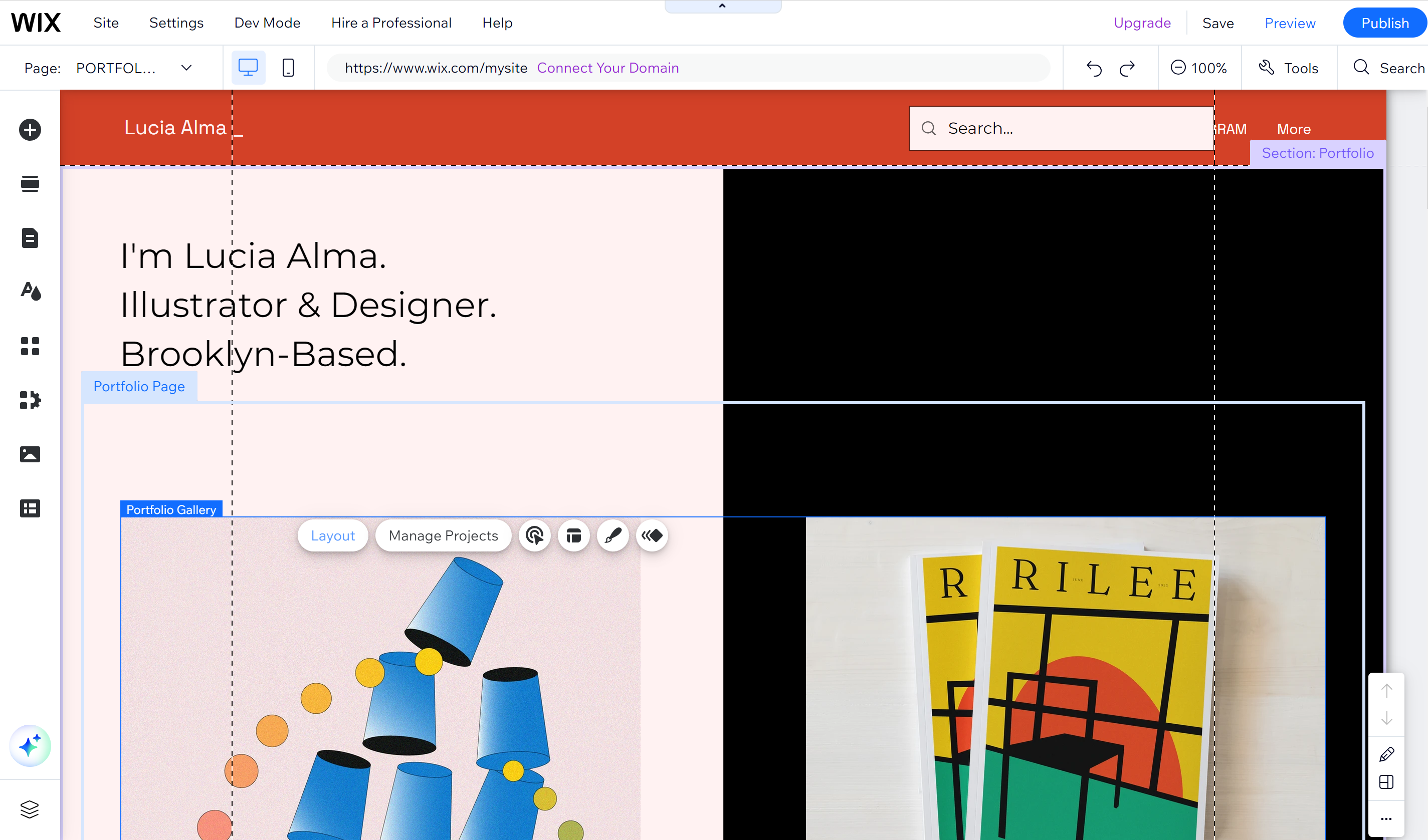
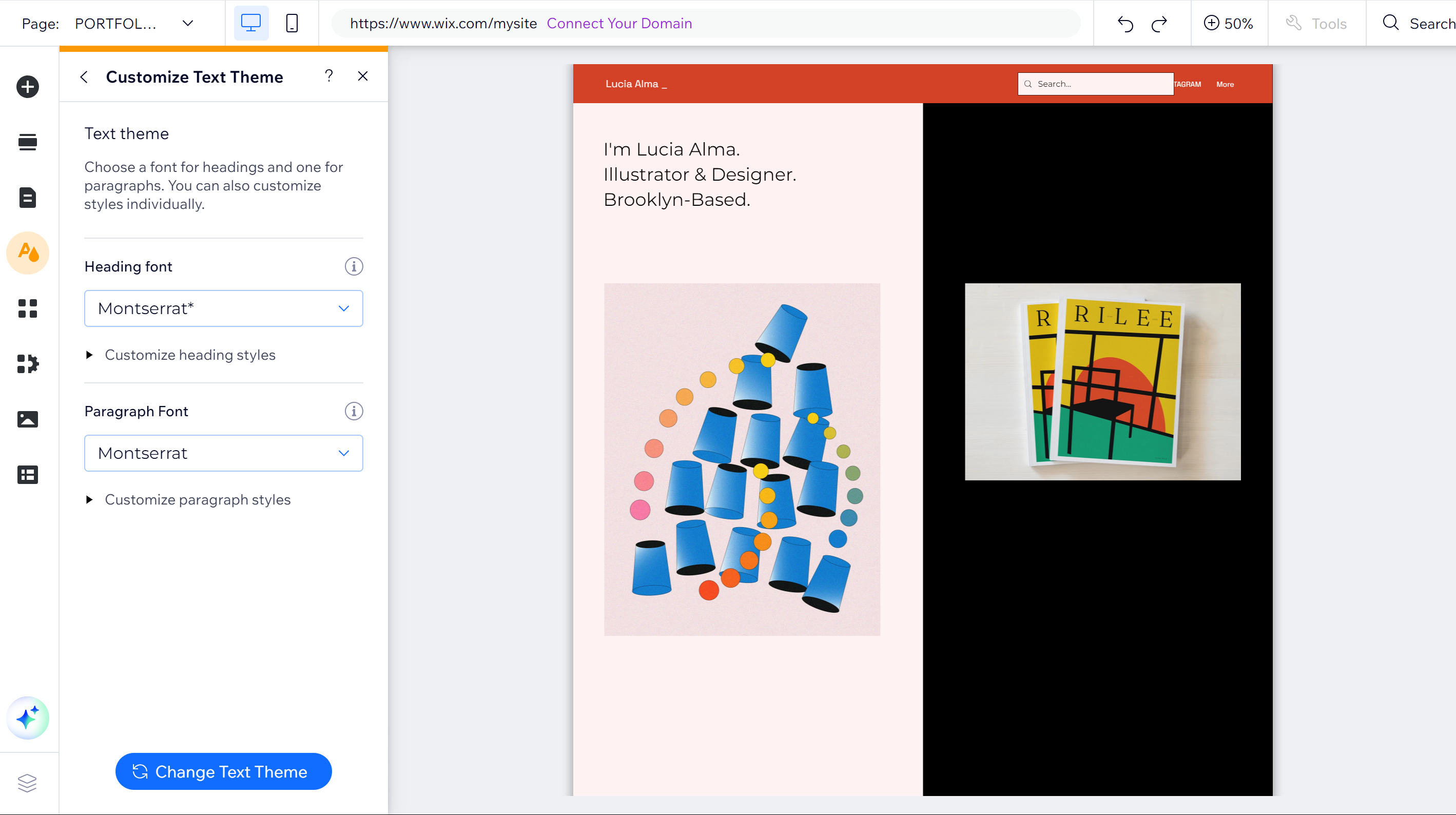
Whichever template you choose, you should be able to edit it to make it more closely suit your needs. You'll be able to add or remove elements and sections and add and organise the pages and menu if you want more than one page on your site. You'll normally be able to change the fonts and colour palette and choose apps to add things like social media icons.
The main ways to display images and other projects are portfolio pages, gallery sections, and image blocks. Portfolio pages display sets of content in two-tier structure: the landing page and projects. You an add gallery sections to display a set of images on a page, and you can usually change their layouts and add image descriptions and clickthrough links as desired. Image blocks are used to add single images in different layouts. These won't automatically display in a cohesive layout like a gallery section, but you can arrange them into columns and rows.
Remember to consider how your site will look on mobile as well as desktop. Many website builders will allow you to easily switch between desktop and mobile view and to make specific changes to how the site looks on mobile specifically.
Register a domain name
Some website builders have limited free plans, but they usually include a web address with their own branding in it, such as wix.com/myartistwebsite. It's an option if budget is tight, but for a more professional-looking presentation, you'll need to register a domain name, and that has a monthly or annual cost.
If you're not out to claim a domain name that's already owned by someone, this can seem unfair, but what you're paying for is for someone to rout the domain name to the right server. Your hosting company/website builder will probably give you the option to register a domain through them, which is often the easiest way, but you can also register a domain via a different company.
Choose a domain name that's as simple, memorable and relevant as possible. A good domain name is easy to say and understand when read out loud, so try to avoid using symbols or other elements that could be confused. Most often, you'll want to use your own name or brand, but you might need to get creative if the name is already being used. Registering a domain name will be more expensive if someone has already registered it in the hope of making a profit if someone wants to use it (this is known as domain name squatting), so it can be worth checking the cost of different names.
Selling art on your website
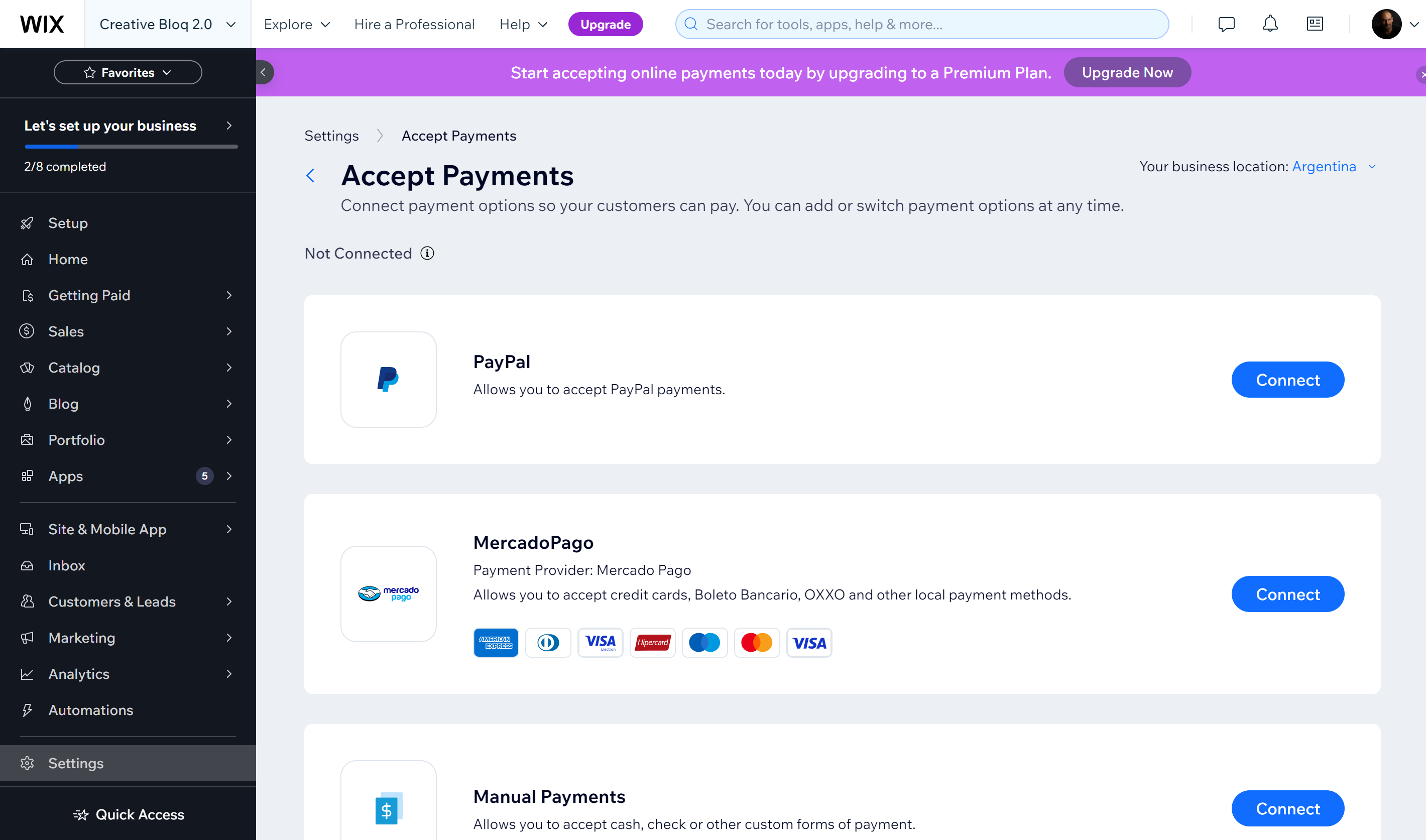
If you used a website builder, you will probably have been asked at the outset if you wanted to add a store, in which case, you will automatically be taken through the process of choosing payment options and adding shipping and a checkout. You'll often need to pay for a premium plan to make these choices live. This is an advantage of going with a webside builder with scalable plans, since you can always choose to add this later.
When setting your ecommerce options, you'll need to decide what payment methods to accept. This could be cash or bank transfer. Customers often like the convenience of paying by card, which will usually require a payment provider like Paypal. If your web builder doesn't offer an ecommerce function of its own, you may be able to connect a platform like Shopify, which also has its own website builder.
If you don't want to sell directly through your site, but you want to sell services on a project-by-project basis, you could add a form block to your site to capture potential leads. You could also set up an invoicing panel allowing you to send invoices to the client once a project is running. Forms can also be used to capture visitor info to help with marketing later: you can invite people to sign up for an email list or newsletter, for example.
Publish your site
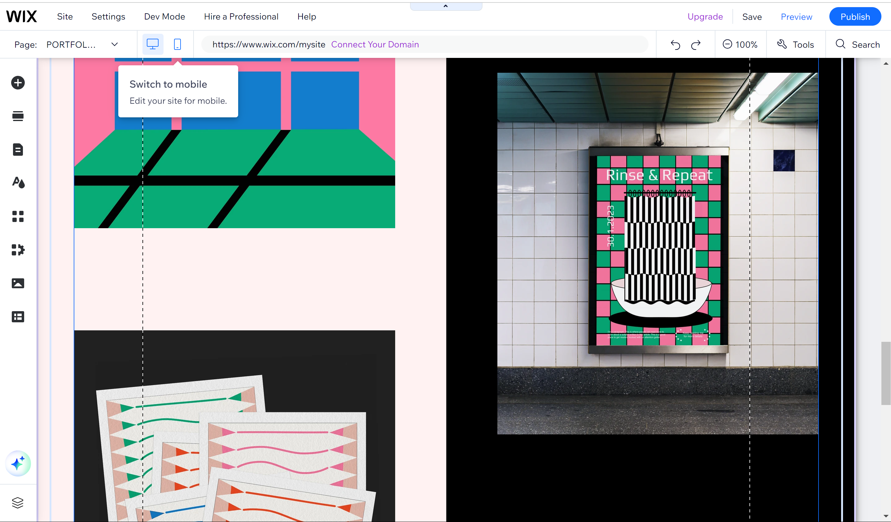
Once you're happy with the design and functionality of your site, you'll be able to preview and publish. Remember to preview on both mobile and desktop. Once you publish, that's it. Congratulations, your artist website is live.
The bad news is that this is only the start if you want people to know your site exists and to find it. To get started, make some noise to let people know you've launched your site: make posts on social media and tell existing clients. Add a link to your site in your profile on any platforms you're already active on, and put the site on your business cards or flyers if you have physical collaterals.
You'll also want to make sure your site is optimised for search engines. There are lots of things that can play a role here, but you'll want to at least make sure you've added meta tags and keywords for relevant topics that potential customers might look for. Most website builders will have their own SEO metrics that can provide guidance.
Ensure your site title, SEO titles, page titles, blog post titles and headings are clear and user-friendly. While you'll want to keep navigation titles concise, SEO titles can be made longer, giving space to include keywords. Use keywords in headings, but don't use the same text for more than one heading, and use heading sizes consistently across your site. Adding alt text to images can help Google understand what they depict while making your site more accessible.
Also ensure SSL. Some search engines penalise sites that don't have this security feature. providing a secure connection. SSL-enabled site addresses begin with https rather than http. You can check your site's performance with Google Search Console.
FAQs
What should I include on my artist website?
Whether you're seeking to attract potential buyers, clients or employers, the most important thing to include in your artist website is a portfolio of your work. That doesn't mean you need to include everything. Focus only on your best work because a portfolio with just five excellent pieces will usually make more of an impression than if those same five pieces are mixed in with less impactful work.
Aside from this, you'll probably want to include an 'About me' page with a brief biography so people know who you are. You don't necessarily have to detail your whole CV and background but at least a few highlights and a bit of personality. Mention what makes your art different. You might also want to include a list of clients or awards you have received. You'll also want to include contact details so that people can get in touch and links to your social media accounts so people can follow you and see more of your work there.
How much work should I include on my artist's website
As mentioned above, I'd recommend only including your best work if you're using the site as an online portfolio. It can be tempting to throw in everything you've ever done to make yourself look more prolific, but most people aren't going to have the time and patience to scroll through a huge amount of material, and the inclusion of less outstanding pieces can reduce the overall impact.
This means you have to be ruthless, and pare it down your work to a minimum (unless you genuinely think all of your work is showstopping). But also bear in mind that if you're done work for well-known clients, their names may also carry some weight.
Another thing to bear in mind is consistency. Sometimes an artist might want to show versatility, but clients will often be attracted to a specific style. If you have worked in several different styles, consider separating these into different sections so that each part of your portfolio looks consistent rather than a mix of random work. Also think about what kind of work you actually like doing and would like to be commissioned for in the future and include this in your portfolio (and avoid showing any kinds of work you don't want to do).
This might be different if you want to sell work directly through your site, but in this case I'd still think about what work is most likely to sell and include less rather than more initially. You can always add more at a later date if things take off.
How can I protect the work on my artist website?
Some artists have concerns that if they upload their work to their website, people will be able to steal it, pass it and pass it off as their own or use it to train AI. Some people add watermarks in the form of a semi-transparent text or a logo, but there are now tools that can remove some watermarks quite easily, and making your watermark larger and more complex probably isn't going to look great for showcasing your work.
A less drastic option is to upload your art at relatively small file sizes. The resolution needs to be good enough for your work to look good on a screen, but that doesn't need to be at maximum quality. Lowering the resolution might not prevent the possibility of someone using your work on social media, but it should at least make it less usable for print without someone having to go to the trouble of upscaling it. Using smaller image sizes also has the advantage of faster loading times for your site, which can also benefit SEO.


