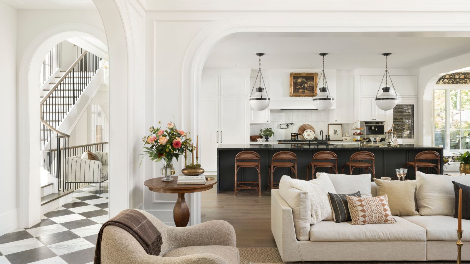
This new-build home, completed in February 2022, looks as though it has stood here forever. Comfortable in its skin, the seven-bedroom home certainly makes a lasting impression. The interiors are exquisitely curated to match the home's elegant architecture and together they put this house among the world's best homes.
Vancouver-based Interior designer Kelly Deck worked with Formwerks Architectural from early on in the build. The owners' brief? 'It started with the simple description – minimal Parisian,' says Deck. 'They wanted the blend of old and new that our firm thrives on creating. In the end, the project evolved to be more traditional than minimal and the home itself is a very inviting and cozy place to spend time.'
The house is located on a hillside in the long-established neighborhood of Altamont, West Vancouver, Canada. This lush neighborhood sits at the base of the Cypress Mountain, a short walk to the ocean.
Designer Kelly Deck shows us round, sharing the secrets of her many design successes.
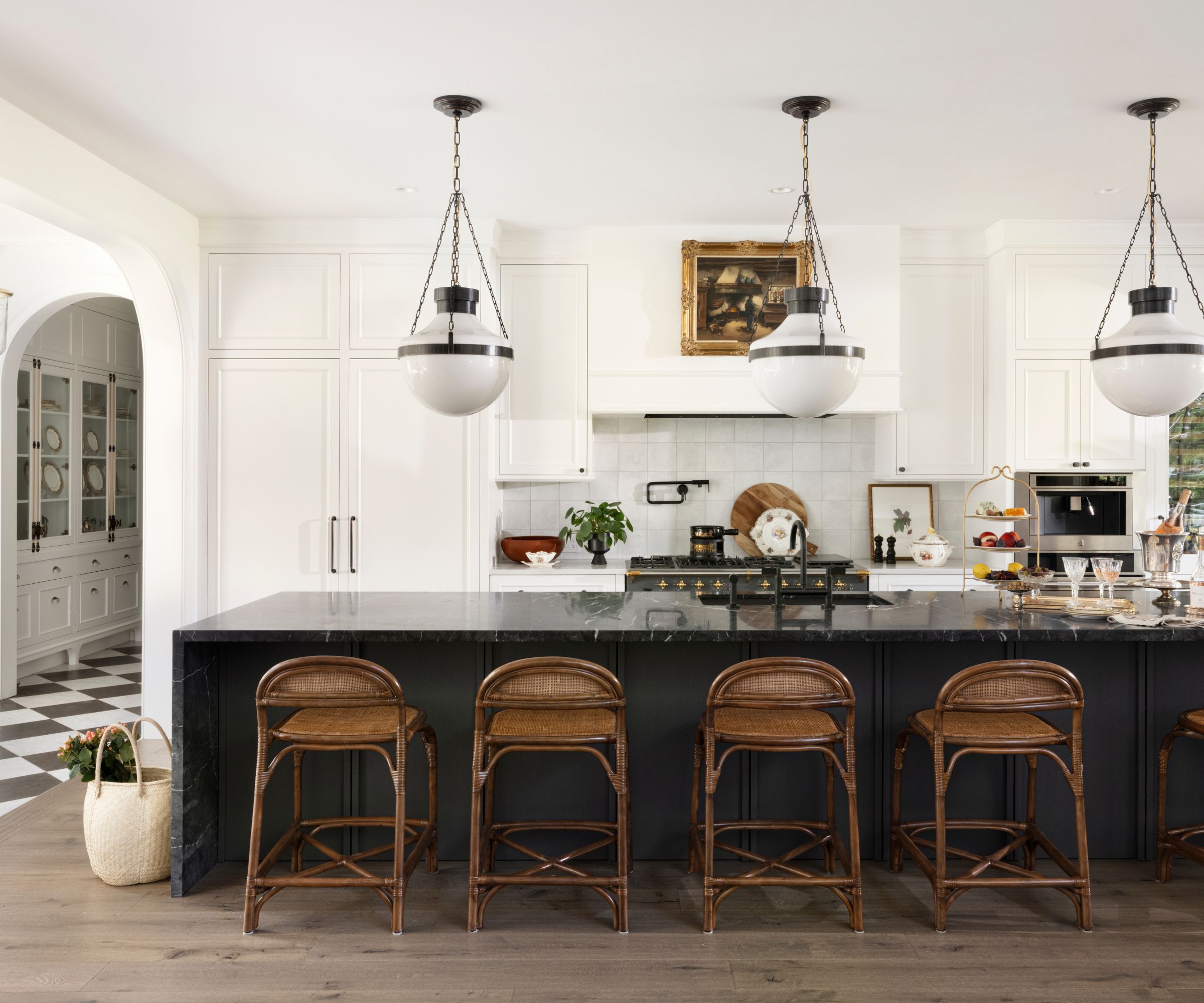
'We took a contemporary approach to creating a traditional home,' says designer Kelly Deck. This is clearly demonstrated in her kitchen ideas, where the overall impression is of a classic space with inspiration drawn from midcentury style and earlier periods. Look closer though and you realize that it's a very contemporary black island at the heart. 'This anchors the room and it is well accented with traditional café-style pendants and warm wood bar stools,' says Deck. The wooden flooring is Kentwood's Bainbridge Brushed Oak which meets the hallway's traditional checkerboard tiles (Ann Sacks Carrara Bianca & Pierre Noir Field Tiles in Tumbled Finish) to complete the classic Parisian illusion.
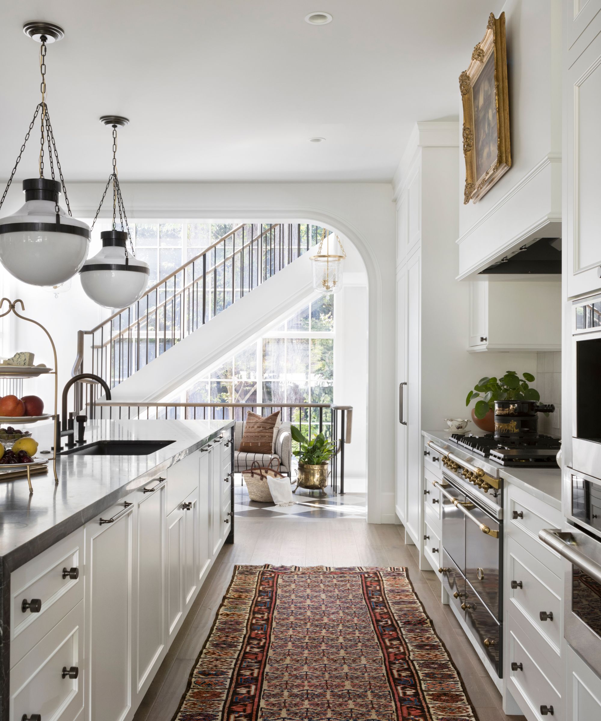
Further vintage touches give the kitchen added character, with a picture in an antique gilt frame above the range cooker, and a well-loved runner in earthy tones softening the edges between old and new.
Grigio Carnico Marble Slab in Honed Finish is used for the countertop, with cabinetry by Sage Cabinetry, and pendant lamps by Circa Lighting.
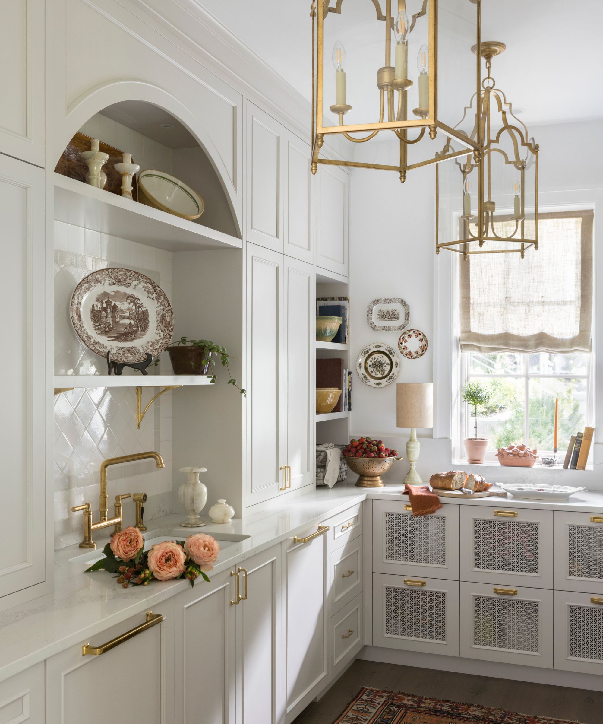
The elegant butler's pantry really is like stepping back in time, yet with all the conveniences a modern cook – or butler – could wish for. So how did designer Kelly Deck achieve this delicate balance, and pull it off with such style?
'A French green (Benjamin Moore OC-27 Balboa Mist) was used on the cabinetry to give the room a lightly nostalgic feeling. Unlacquered brass fixtures and hardware were selected knowing that they would patina over time and look aged,' she says. The French Gilded Lanterns are from Circa Lighting.
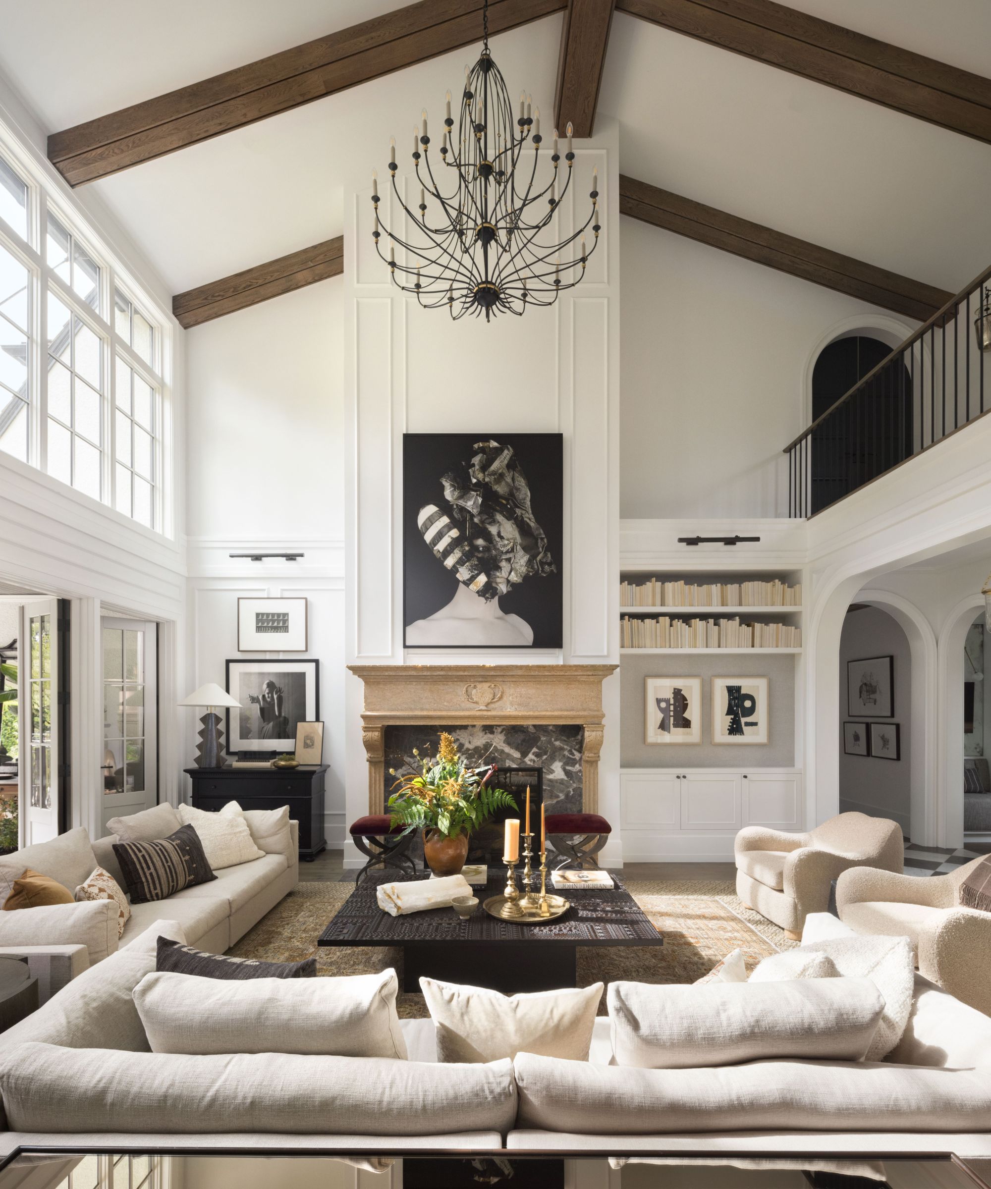
In the great room, an open-plan living space open plan to the kitchen and adjacent dining room, living room ideas feature a color combination of warm neutrals, black, rust and cognac which create a relaxed and layered atmosphere. Deck used an antique limestone fireplace that originally sat in the office of the director at a Chicago hospital at the turn of the century. Above it is a striking artwork by Lyle Reimer. The chandelier is from Currey & Company, the sofas from CF Interiors and the French curve stool and sisal area rug are from Restoration Hardware.
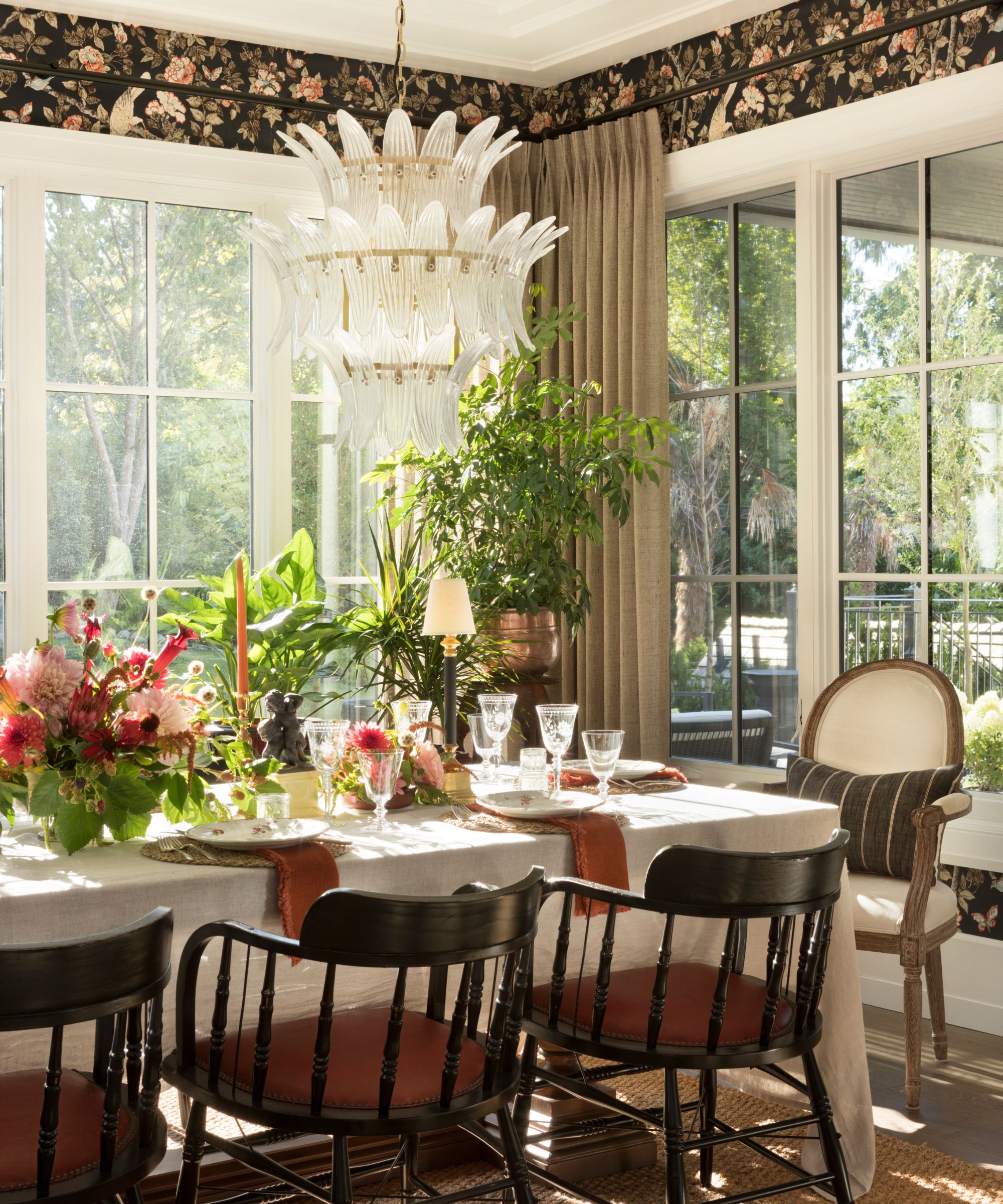
Surrounded in floor to ceiling windows the dining room looks out onto the landscaped garden, creating a lovely connection between inside and out. Explaining her dining room ideas, designer Kelly Deck says: 'The formality distinguishing casual from formal dining was forgone in this home. The one dining room is located off the kitchen rather than between the kitchen and great room. The aim was to keep the dining area intimate and cozy for family meals.'
And the décor choices? 'We wanted a wallpaper that was rich and distinctly traditional. The tones in this Sanderson paper play beautifully off the colors in the great room adjacent,' explains Deck. The chandelier is from Noir Furniture, and the dining table from Restoration Hardware. The chairs are from Scott Landon Antiques.
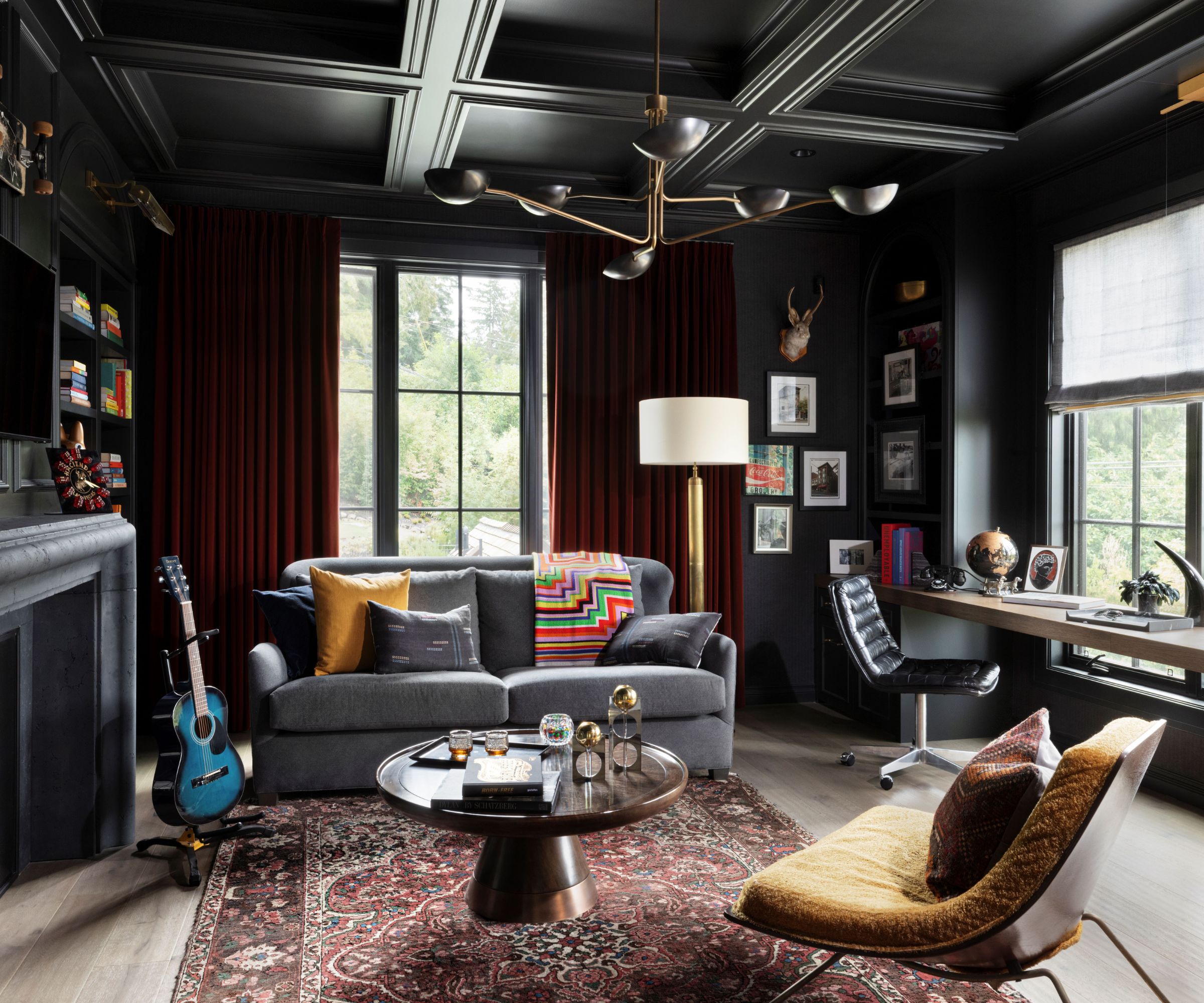
This is above all a home of rich and intriguing contrasts, vividly illustrated in the two home office spaces. His, above, with dramatic, almost black walls (Sherwin Williams SW 6994 Green Black) incorporates one of the most challenging aspects of this design and build – a secret staircase to the main bedroom hidden behind a bookcase. The sofa is from Lee Industries, the ceiling light by Lawson Fenning.
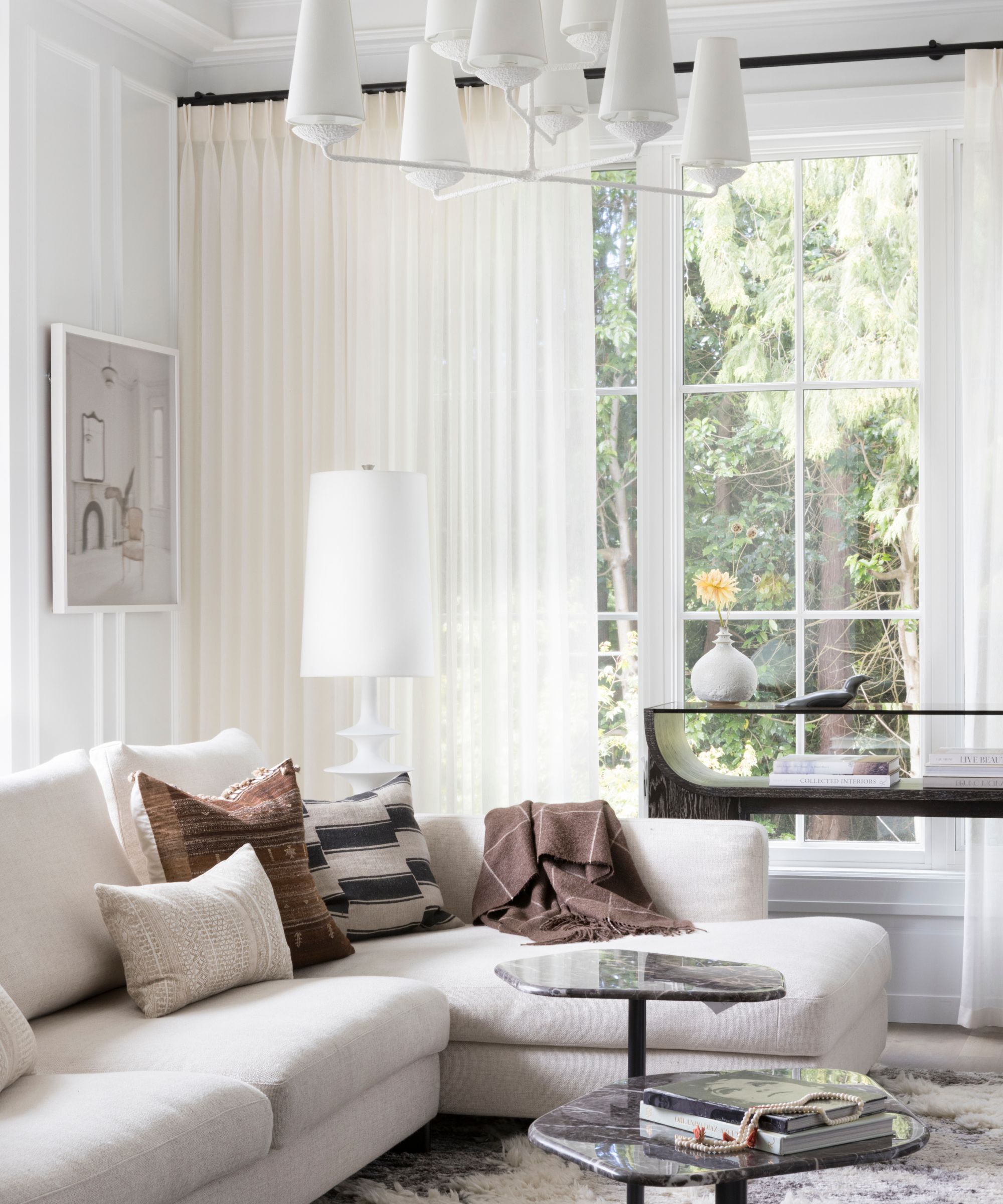
Home office ideas for her created a much lighter, brighter space. The ceiling is wallpapered in Coordonné's Dalia in brown for a textural and cozy finish. The chandelier and floor lamp are both from Circa Lighting and the area rug is from Sura Socrates.
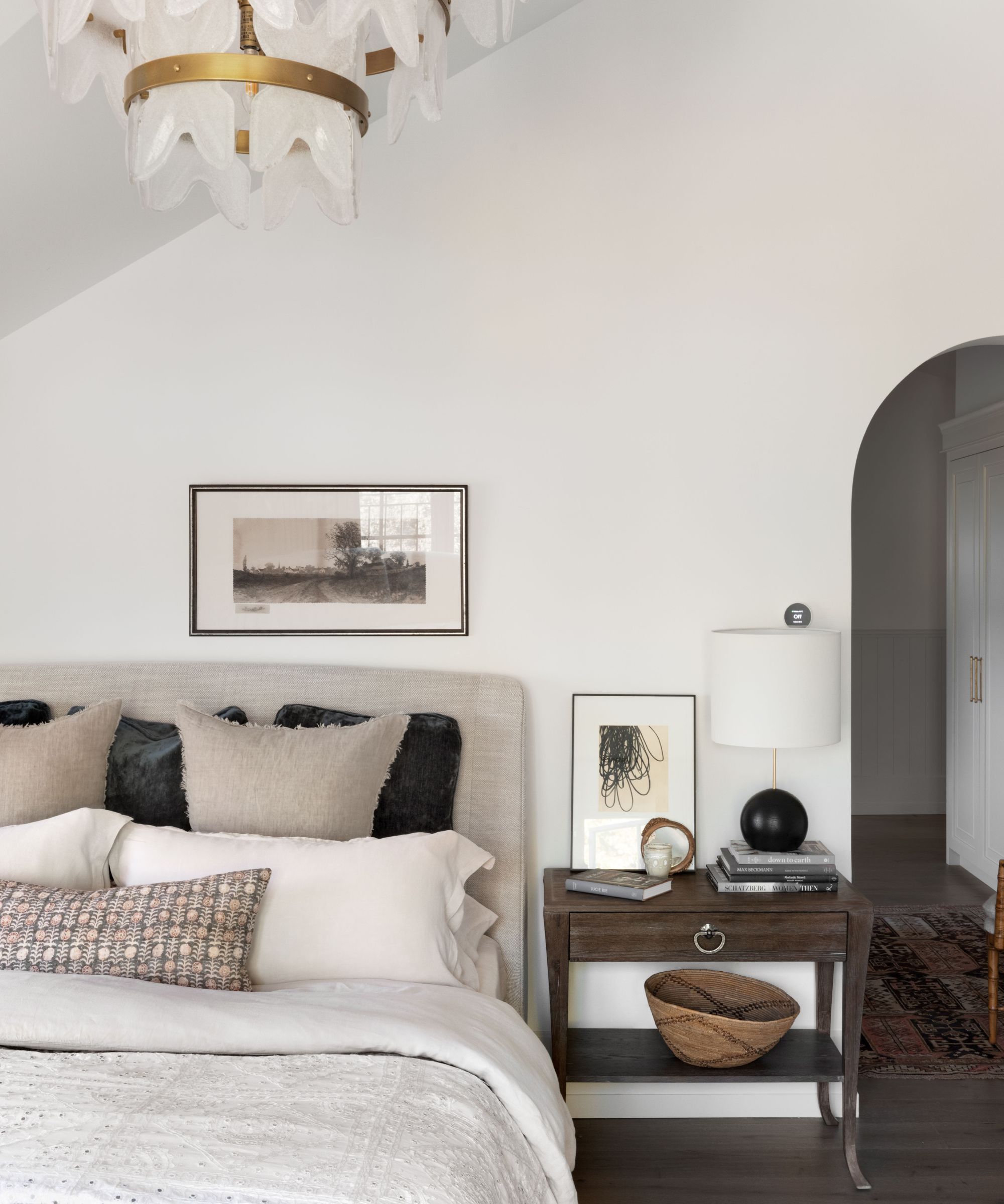
Explaining her bedroom ideas for the principal suite, designer Kelly Deck says, 'Our jumping off point was the linen-colored marble in the ensuite bathroom. We matched this to the millwork and finishing carpentry for a quiet and serene atmosphere. In the bedroom furnishings we used a combination of wood, white, linen, anthracite and grey-blue for a slightly masculine feel.'
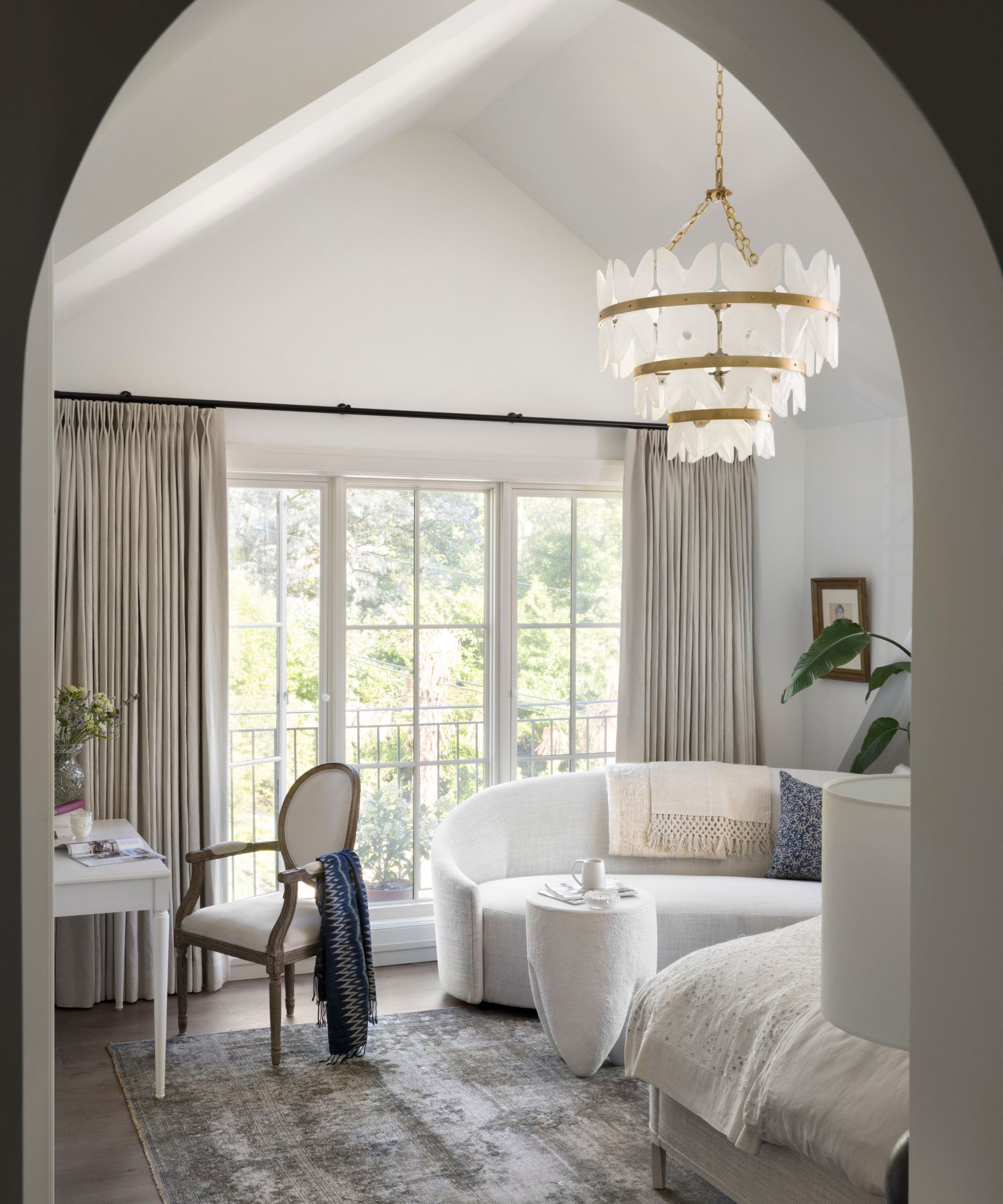
The chandelier is from Arteriors, the accent table is from CF Interiors, and the French writing desk and chair are both from Restoration Hardware.
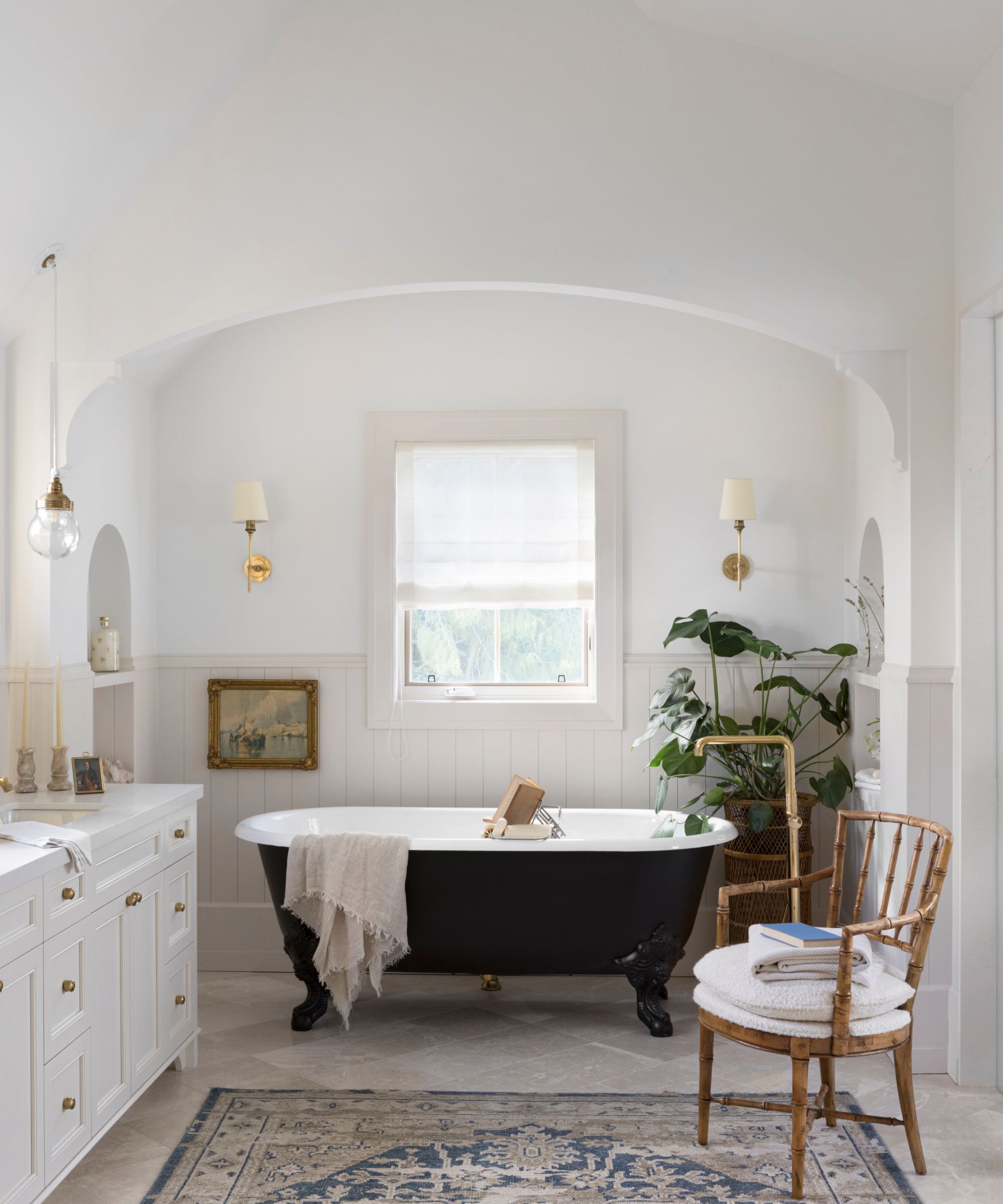
As we saw above, the bathroom ideas in the primary bathroom actually prompted the bedroom themes, with the Botticino Marble flooring in honed finish providing the color inspiration. A traditional roll-top bath, and vintage chair and rug extend the illusion that this home has been around far longer than its one-year anniversary. But it's not just about creating an illusion, or even about blending old and new: this home is above all a relaxing, welcoming and interesting place to be, and designer Kelly Deck has achieved that in style.
Interior design: Kelly Deck Design
Photography: Ema Peter
Styling for photography: Debbie Frederickson
Architecture: Formwerks Architectural
