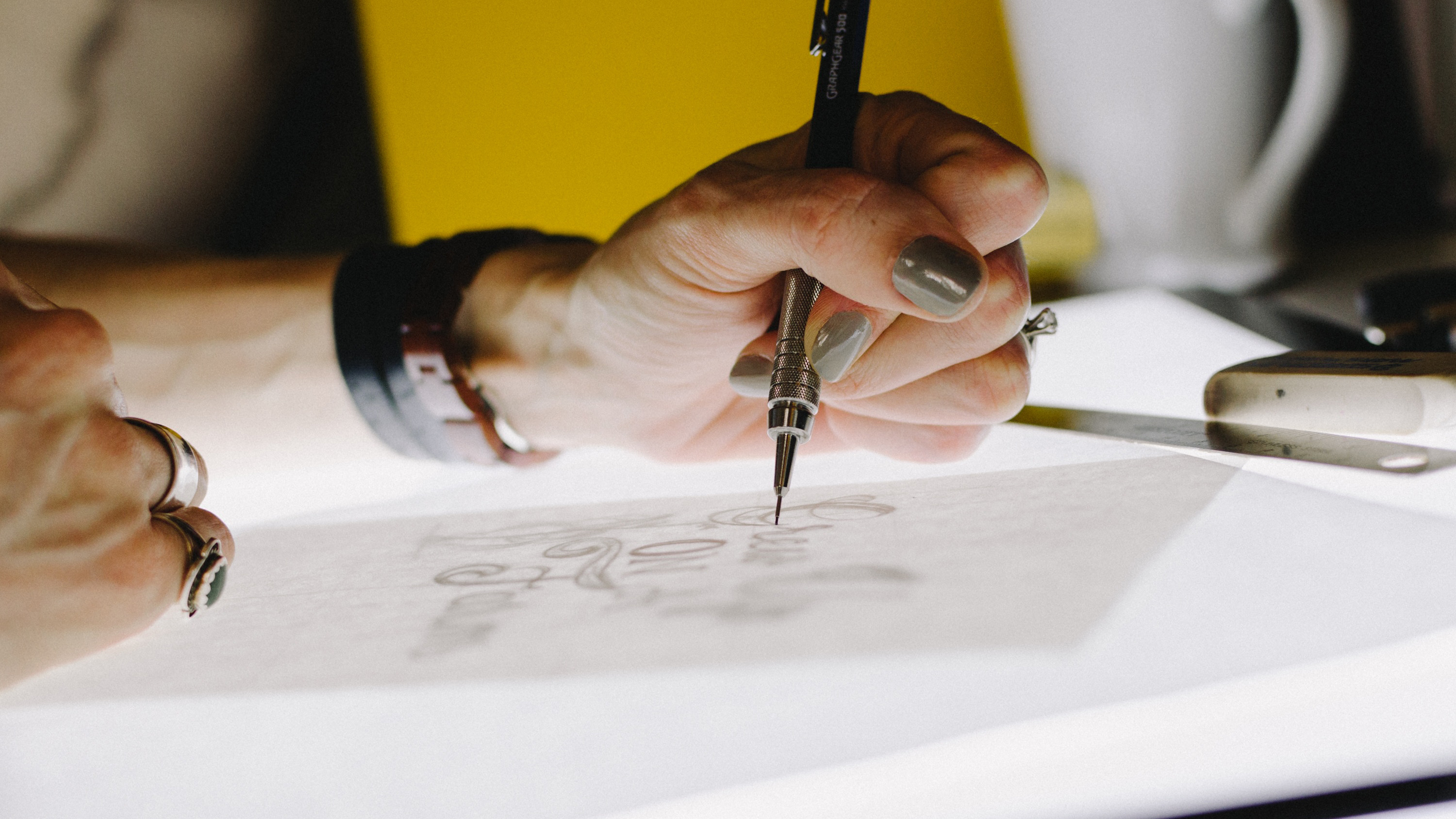
Fonts play a crucial part in any graphic design project. Whether it’s an album cover, product packaging or a poster design, using the right font can help with the storytelling and message that you want to convey to the audience, who you ultimately want to invest in the idea, product or service.
Alessia Mazzarella from design studio Typeland
Tom Foley (Executive Creative Director) and Tom Rickner (Senior Studio Director) from Monotype
Alexandra Lunn, who runs a self-titled branding and design studio in London
Font design might already form part of your work as a graphic designer, or maybe you're looking for new work opportunities. This article will help get you either started or refresh your skills. Check out our guides to the best professional fonts and best free fonts for designers for more great starting points.
It's currently Typography Week here at Creative Bloq, in association with Monotype. Check out our dedicated page to find out more.

01. Learn the fundamentals of typeface design
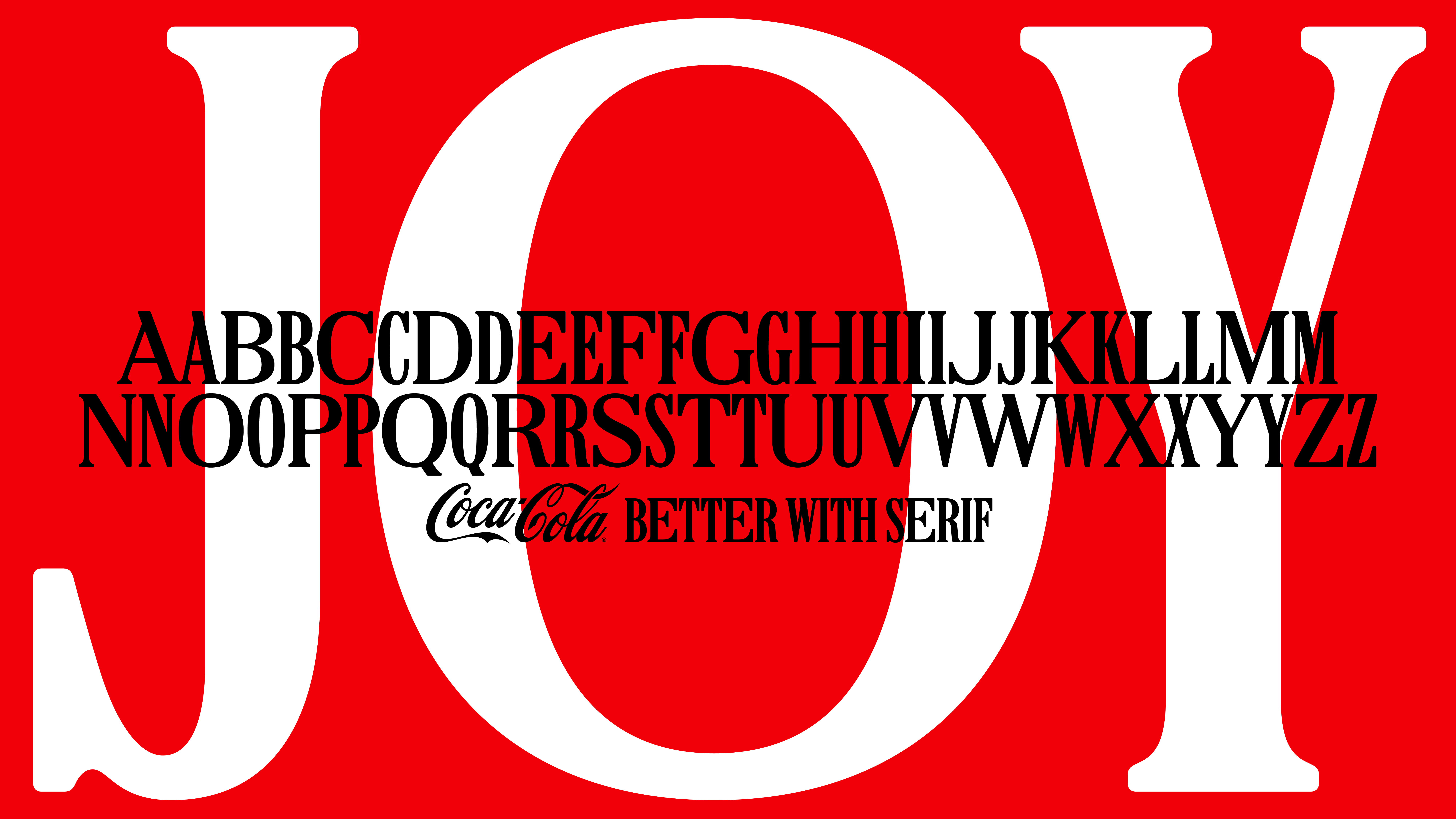
Typeface design employs creativity, experimentation, and expression, and every designer develops their ways of using those. Whichever way you work, you’ll still need to understand the guiding principles of typeface design to help you produce something that will look good, read well, and convey the right message to the reader.
Tom Foley: “Process is about doing things in the right order, and not overworking at each stage of the typeface design process. The process gives you more time to be creative because you know how to take the idea from sketch to font file in the quickest manner. Every typeface designer will have their own process, but there are some well-established industry norms you can start from.”
Alessia: “Some designers sketch on paper, others start with notes about qualities they aim to achieve. Some build from skeletons, while others dive straight into outlines, or the stark contrast of black and white shapes on screen. The key is to find what works best for both the designer and the project in question, while consistently evaluating every decision along the way. A typeface can be experimental and exploratory, or it can be designed for a specific function. As long as the purpose is defined and every design decision is made in service of that goal, the project is on the right track. After that, it is a matter of developing certain technical abilities in understanding the construction of letterforms, visualising related shapes, handling curves, and learning to see the effect of changes made to drawings at a larger scale, when the drawings are reduced to smaller sizes.”
02. Find inspiration and ideas

As creatives, we can find ideas in the most unexpected of places, around us every day, and of course in what has come before in an artistic field. But where can you find ideas that will specifically influence typeface design ideas? Our experts have a few ideas:
Alessia: “Inspiration should serve as a starting point for your own ideas. It doesn’t have to come from other typefaces, it can be drawn from architecture, art, fashion, or any number of fields. The broader the sources the better, as it doesn’t limit the possibilities to pre-existing examples.”
Alexandra: “Study existing typefaces critically. Analysing what makes a well-designed typeface successful can provide valuable insights and inspiration. Also staying curious and open to experimentation will keep the design process fresh and enjoyable.”
03. Utilise useful resources for beginners
Like all creative pursuits hands-on experience and practice are the key. Learning, making mistakes along the way, and most importantly having fun while you do it. There are options to help you along the way, ranging from online tutorials and books to full graphic design courses that include typeface and typography. Our experts have shared a few of their recommended resources below:
Alexandra: “There are several great resources for budding type designers. Books like ‘Thinking with Type’ by Ellen Lupton and ‘The Elements of Typographic Style’ by Robert Bringhurst are excellent starting points. Online platforms such as Skillshare, YouTube, and sites like Typedrawers also offer tutorials and community support.”
Tom Rickner: “To begin with, I have found no better on the theory of type design than ‘Theory of Type Design’ by Gerald Unger. Next, I think there is no better tool than Glyphs App (for MAC). It is the most powerful tool out there that is still user-friendly.”
Font creation tools are just one way to play around with ideas and get a hands-on learning experience, but if you want to take things further our round-up of the best typography courses may help set you on a new graphic design journey.
04. Practise the basics of typeface design
Draw, proof, revise, polish – your four steps to achieving your first font design, but within those steps, there is a lot to learn and process, so the key is to start simple. Alexandra recommends “starting with the basics: get a good grasp of understanding letter anatomy and the principles of type design. Start with a few key letters such as H, O, N, and P which cover a range of letter forms (straight lines, curves, ascenders and descenders). From there expand to the full alphabet focussing on consistency and rhythm. I also emphasise the importance of critiquing and revising, as this is where much of the learning happens.”
05. Consider the end goal when working on a brief
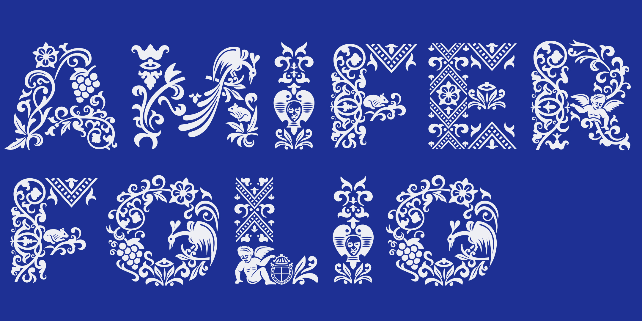
When you have practised and honed your skills and you’re ready to start designing a fully-fledged typeface, or you have briefs to work on for clients, it’s important to think about the end goal of what you want to achieve. Alexandra emphasises how big a part that plays in the design process. “The end purpose is a significant influence on the design process. For example, a font meant for long-form reading requires clarity and legibility, whereas typefaces for bold campaigns can be more experimental and expressive. Regardless of purpose maintaining balance and readability is crucial.”
Part of the initial process is figuring out the storytelling, personality, and what the font will convey, and then you’ll move on to the technical aspects and characteristics of the font. Alexandra adds “Focus on key characteristics like style, contrast, and proportion; ensure that everything is consistent in terms of weight and positioning. Understanding the function of the typeface – whether it’s for display, text, or logo use will also guide design decisions.”
Tom Foley also encourages all you budding typeface designers to look at optical correction. “This is the difference between mathematically consistent and visually pleasing letterforms. Generally, letter forms or typefaces that are mathematically consistent look incorrect. This is a common challenge for those new to lettering and typeface design. To improve this apply principles of optical correction which are quite simple and easy to learn. Karen Cheng’s ‘Design Type’ is a great place to learn about optical corrections and the typeface design process.”
06. Understand Text Typeface v Display Typeface
When you start designing with an end purpose in mind, understanding the distinction between text and display types and how they are used will help your project progress. Alessia advises, “A common start is drawing the basic distinction between a ‘text’ typeface and a ‘display’ typeface – the former is what is understood to work well for longer text, and the latter for shorter text e.g. titles, headlines. For ‘text’ typefaces the criteria are more obvious, they must work well in extended settings, provide an even texture, and maintain good readability through their design features. For ‘display’ typefaces, the brief often depends on what specific qualities or features are meant to be evoked, and the criteria for their interpretation can be pretty wide.”
07. Try papercutting and craft techniques
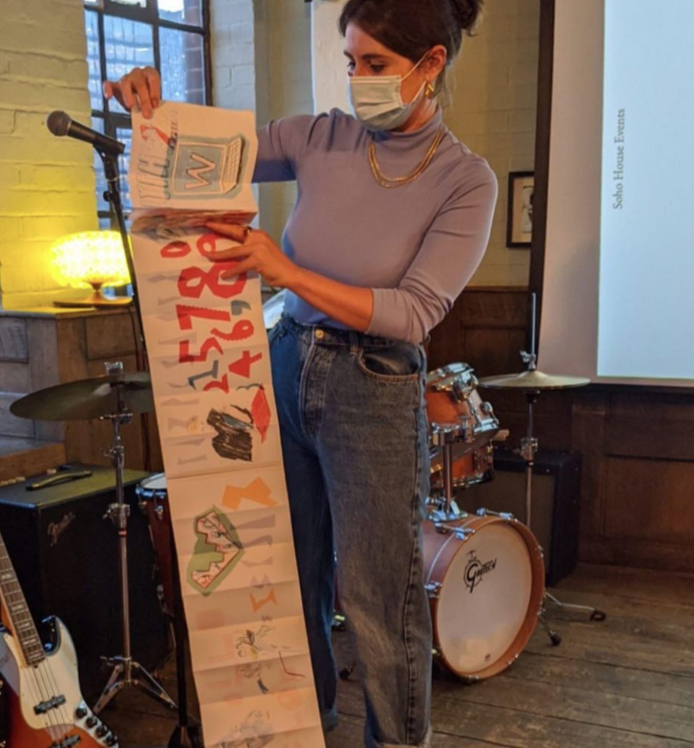
A paper-first approach is nothing new to designers, and many prefer to use a sketch pad before going digital, but have you considered trying sketching and then paper cutting to bring your ideas to life? When Alexandra teaches the basics of typeface design, she encourages experimental papercutting as part of the early stages of the process. Using this craft technique hand in hand with sketching avoids any limitations of digital software in experimentation, and is a good indicator of the flow of your ideas. An organic, hands-on approach can be a relaxing way to start the process and save time when you do move to digital with your ideas.
This article was produced as part of Typography Week, held in association with Monotype.


.jpg?w=600)


