Nobody wants to be buried beneath an avalanche of notifications. Sure, you could turn them off, but how else would you know when your crush likes your Instagram story? Luckily, iOS 16 has the answer: letting you receive notifications, but on your own terms.
Apple added a new feature with iOS 16 that lets you change how notifications appear on your iPhone. With iOS 15 (or earlier), they tend to take over your screen. But with iOS 16, you can choose from three different ways to display notifications, including one that hides them almost entirely, giving you a proper view of your chosen lock screen wallpaper.
Remember: you need to have iOS 16 installed to use these notification options. It’s currently in beta, but we expect it to be released in September.
Now, let’s clear some room for that stunning wallpaper of yours.
How to clean up your lock screen
With three options to choose from, you’re sure to find one that works for you, and switching between them takes just a few taps:
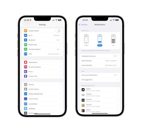
- Open the Settings app on your iPhone running iOS 16.
- Tap “Notifications.”
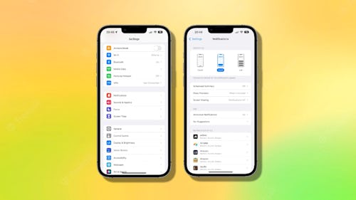
- The display options are shown in the “Display As” section at the top of the screen with a preview showing how notifications will be displayed. Tap the selection that you want and the change is applied automatically.

Three different notification display options are available.
- “Count” turns notifications off but displays a number at the bottom of the screen. Tap it to see all of your notifications.
- “Stack” shows the latest notification at the bottom of the screen and places all older notifications behind it.
- “List” is the option you’re used to, and displays notifications in a list on the lock screen.
The option you choose will depend on which best suits your notification needs. While the Count option may be good for clearing space, seeing those numbers piling up may give some people anxiety. Stack, on the other hand, may still be too much clutter for anyone hoping for a significantly cleaner lock screen look.
And if you decide neither are for you, the default List view is always there to welcome you back.


